Relativity Theory
Vol V, Issue 166
“Put your hand on a hot stove for a minute, and it seems like an hour. Sit with a pretty girl for an hour, and it seems like a minute. That's relativity.”
― Albert Einstein
DASHBOARD
AGENDA
CROSS-ASSET DELIBERATIONS
What does today’s title of The Quotedian have to do with Albert Einstein’s Relativity Theory? Absolutely nothing, of course.
However, we will dedicate this Sunday’s edition not only to our usual weekly review of market performance but also take the opportunity to look at some relative graphs (aka ratio graphs).
Relative graphs are an excellent way to identify new, emerging trends that may be hidden under the hood. And in today’s world of ETF, options, financial structuring etc. it should be possible to capture such relative trends without great obstacles.
In my personal arsenal of investment tools, I also use something called relative strength to identify which asset class, sub-asset class, equity sector, commodity and so forth is currently heading the rat race. I cleverly call it αReS 😂.
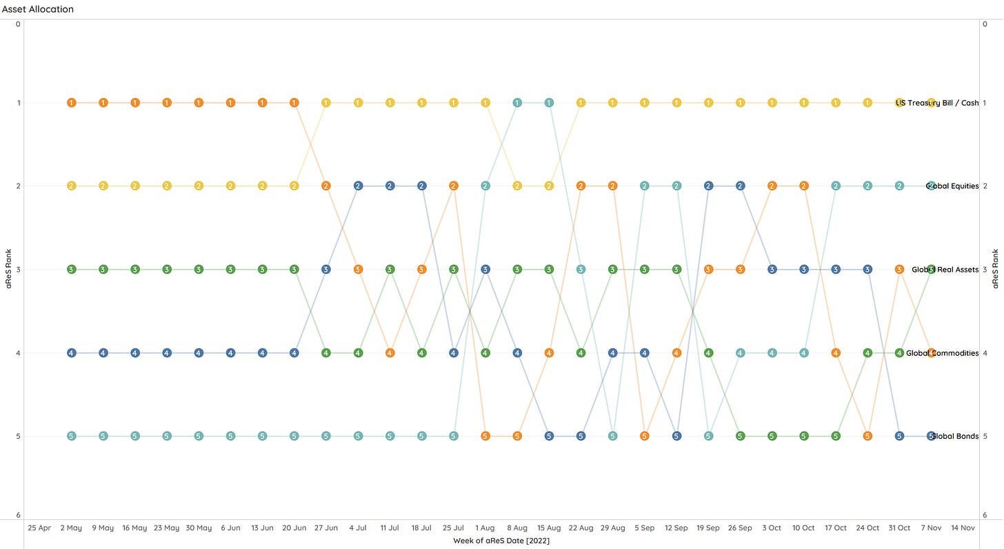
At the highest level (major asset classes), such a relative strength chart looks currently as follows:
Each ‘point’ in the graph above represents a specific week’s ranking, with the most recent rank on the far right of the chart. I.e., the table looks back about six months. We then hence can identify, for example, that equities have been working their way up in the rankings since the mid-October bottom:
However, it also shows how erratic and relatively short-lived the equity upside corrections have been in the current cyclical bear market.
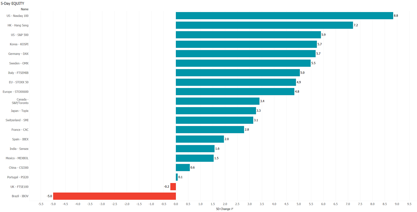
So let’s use this as a segue to look into last week’s equity markets performance:
No doubt, a very good week for equities, especially for US stocks, where the CPI ‘beat’ led to a massive risk-on rally. One of our readers (Obrigado Antonio!) asked on Friday in the comment section, how far this rally could go, assuming we are still in a cyclical bear. The obvious answer is of course that I have no clue! But by applying some chart voodoo (aka risk management discipline), we could identify two possible targets:
The first one (light green oval) is about three percent from Friday’s closing and is the confluence of the downward trend resistance (black dashed line) and the 200-day moving average (blue line). Should prices continue to move up from there, the second target could be at around 4,300 and change (dark green oval), where the July to August rally ended and which is also the 61.8% retracement level of the entire down move so far. A drop below 3,900 could be a first warning sign of a trend stall, with a drop below 3,700 confirming the likely resumption of the bear.
Given seasonal tailwinds into year-end, my main scenario would be a run up into the 4,300 zone, so about another 8% or so from here.
Ok, finally some relativity theory … stocks bottomed (for now) on October 14th, but interestingly enough, have small caps stocks (Russell 2000) compared to large cap stocks (S&P 500) bottomed already six months ago, back in May:
This is particularly interesting because small caps stocks also topped on a relative basis nearly a full year before large-cap stocks started turning down in absolute terms. Canary anyone?
It is an even clearer picture when relativizing small caps to Nasdaq stocks:
But also large-cap stocks (S&P 500) have been outperforming the Nasdaq in a meaningful manner:
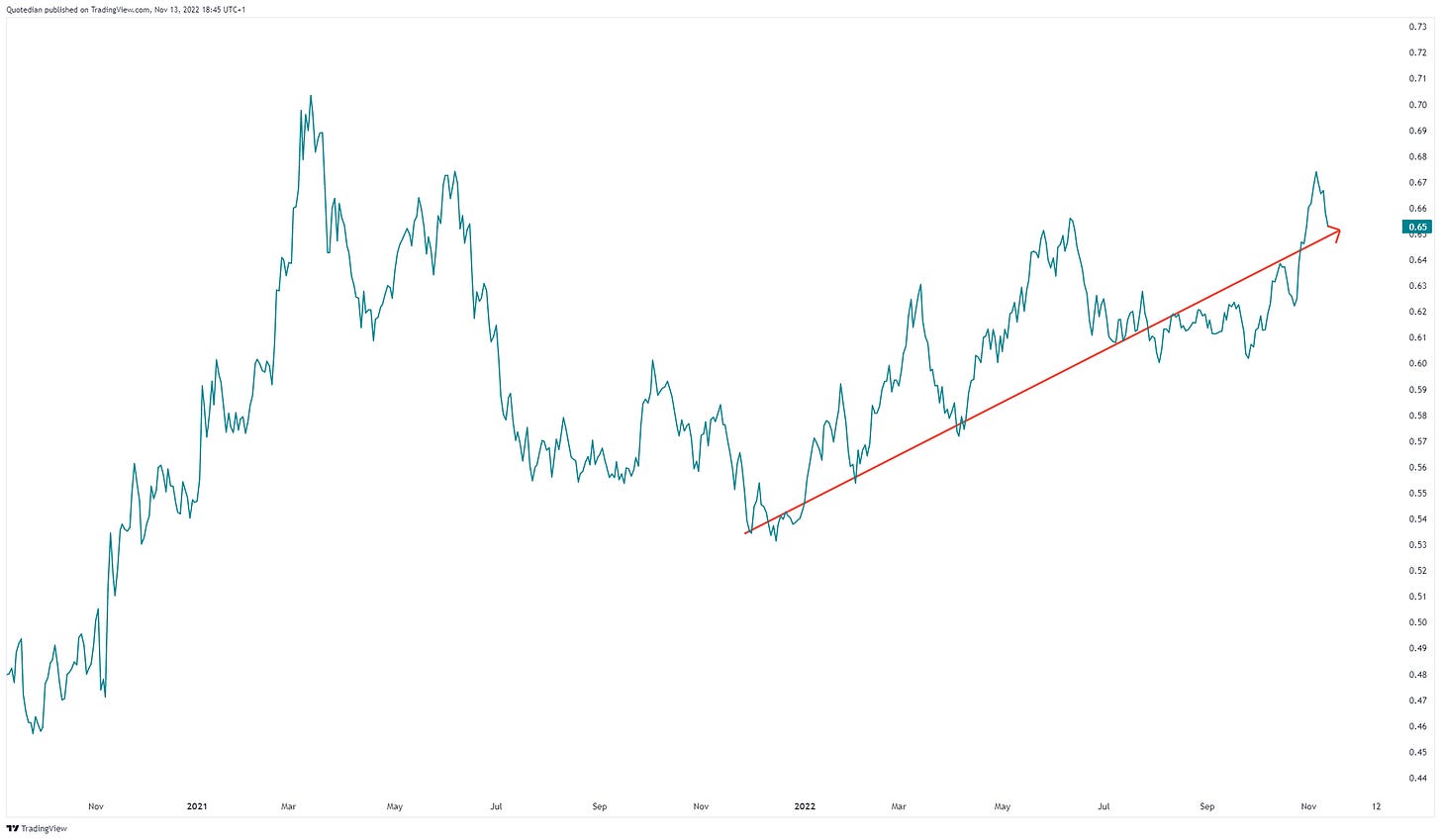
Another factor worthwhile having a look at is value over growth. I here use the iShares Russell 1000 Value (IWN) and Growth (IWF) ETFs:
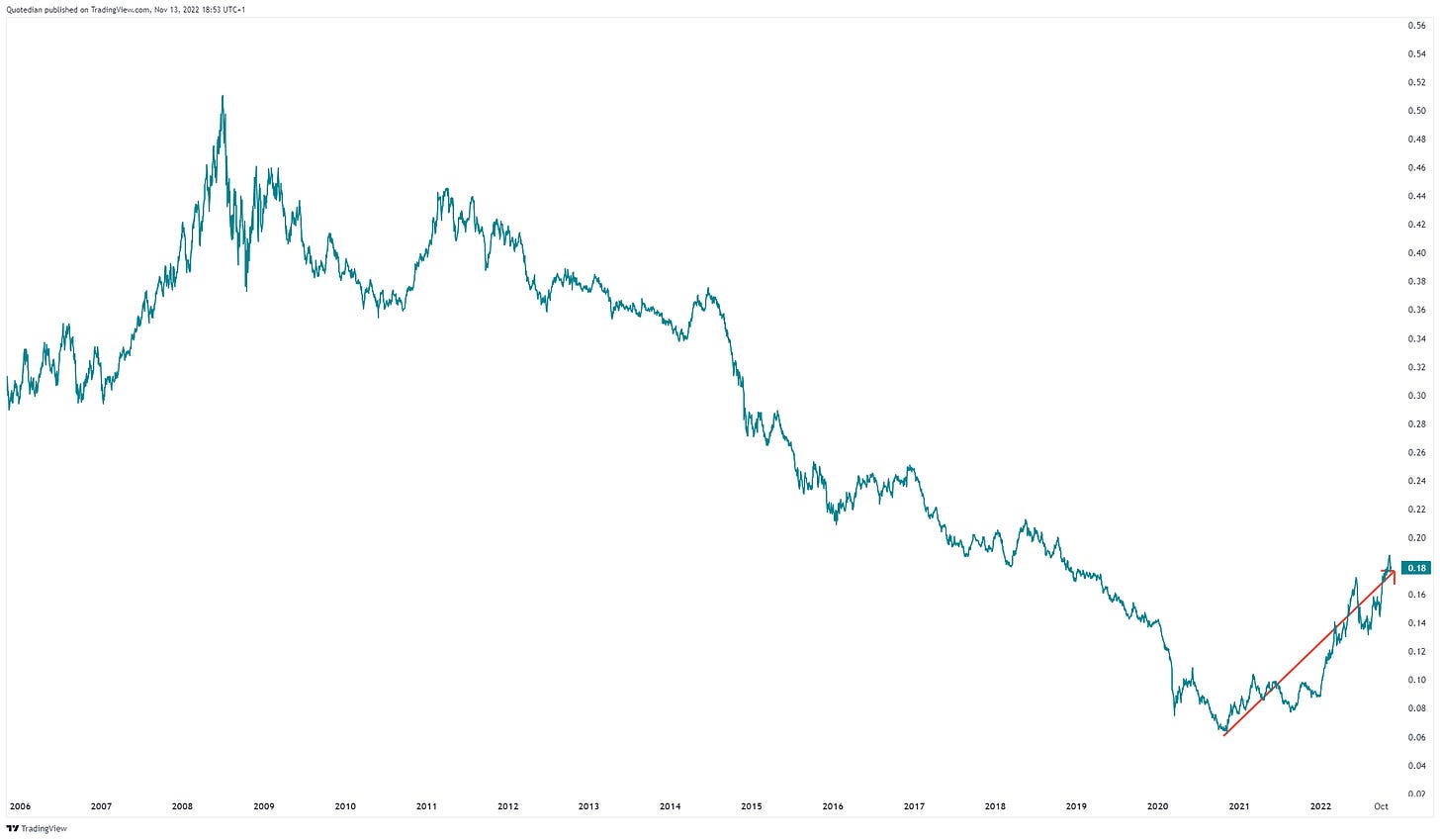
Outperformance reinstated since the beginning of the year, but how much more upside is there? Let’s zoom out a few years:
Wohoooo! Way to go!
Ok, time to review last week’s equity sector performance:
Taking our αReS approach again, and looking at US equity sectors, we quickly identify that Energy has been the name of the game for most parts over the past months:
However, I believe it is noteworthy that Industrial and Materials stocks have been working up the ranks over the past few weeks:
Here’s the Energy relative outperformance versus the broader market on a graph:
But, let’s also zoom out here a few year, even though I suspect you already know the resulting picture:
Despite the massive rally over the past two year, the energy sector is still only 5.4% of the S&P 500 - far away from its 15% glory over a decade ago:
It also stands out that Technology continues to be more than 25% weight of the S&P 500. If you believe that we are in a period of structurally higher inflation and hence higher interest rates, then maybe it is worthwhile considering other, less tech-heavy indices …
Ok, time to move into bonds … Fixed income markets finally also got a breather, with anything not Asian performing very decent over the week:
Whilst the bond (TLT) underperformance versus stocks (SPY) persists
in absolute terms, both were up last week, which can only be good news for those poor souls trapped in an inflexible 60/40 allocation portfolio:
Indeed down ‘only’ 15% now, recovering from the 21.4% MDD back in October.
Ok, needing to speed up things a bit, let’s have a quick look at currency performance for the past five days:
If your name is not Brazilian Real then you had a good week, actually a very good week, versus the US Dollar.
Currencies are of course always a relative game (EUR relative to USD, GBP relative to CHF, etc.), so no need to go into a whole bunch of relative charts here. The key take-away from last week is the broad dollar weakness, which as we have discussed on several occasions, is an absolute must for the risk-on trade to become meaningful.
Looking at the US Dollar index (which is relative to a basket of other currencies), we actually see that our contrarian Frontpage indicator once again has worked beautifully:
Also, there still seems to be room tothe downside for the US Dollar over the coming weeks to months (which does not mean countertrend rallies can happen).
Finally, we could conclude that a lower USD should equal higher commodity prices (which are usually priced in USD), but, nope, close but no cigar:
Quite the mixed picture there.
The following αReS chart is a bit messy (promise to improve),
but I wanted to highlight Silver and Gold, which are both moving up interestingly:
These are clearly two commodities we can easily invest into (e.g. via ETFs) and hence are worth following. Gold seems particularly interesting, relative to Bitcoin for example:
Ok, I wanted to put up much more, but Sunday evening has arrived and Dinner is close to being served. Never let the wife wait!
Have a great evening and see you on Tuesday!
André
P.S. Forgot to add the Top 25 performing stocks and their performance last week. Here you go:
CHART OF THE DAY
Ok, too many charts already today. Fitting in another here in the COTD section would make our collective head blow up, hence let me leave you with two pictures I tripped over somewhere on the net this week.
The first one would be titled: “THE photo of 2023”:
The second one would deserve the comment: “SHORT Forbes”:
Thanks for reading The Quotedian! Subscribe for free to receive new posts and support my work.
DISCLAIMER
Everything in this document is for educational purposes only (FEPO)
Nothing in this document should be considered investment advice
Past performance is hopefully no indication of future performance


