2023 - The Year that Twitter broke the Banks
The Quotedian - Vol VI, Issue 19 | Powered by Neue Privat Bank AG
“It's not whether you're right or wrong, but how much money you make when you're right and how much you lose when you're wrong.”
— George Soros
DASHBOARD
CROSS-ASSET DELIBERATIONS
Housekeeping: Please note that this Quotedian was mostly prepared on Sunday, 26th March, but could not be sent until now for ‘technical’ reasons. Hence, the Dashboard, the statistical performance data and most charts do not include today Monday but rather refer to markets as per Friday’s closing.
No better way to start today’s Quotedian with a wise-crack quote from the man who broke the Bank of England some 30 years or so ago.
Times are probably gone where one man and his dog hedge fund can bring a major central bank to its knees, but it seems we now live in a world where an unlikely bunch of investors (hedge funds, retail, others) with their social networks (Twitter, Reddit, others) can bring the entire banking system down.
Social networks have proven their prowess several times in recent past, with the global COVID-Panic and ensuing ridiculous lockdowns probably the mmmhh … most extreme … examples.
Last week, yours truly suddenly a little bulp (ESG conform low energy LED, of course) moment,
where I suddenly imagined a possible acceleration of the financial death-spiral to the downside, softly helped by ill-placed tweets, posts and by not-so-innocent hedge funds and the Reddit et al cohort. It follows, that being an eternal optimist capitalist, I started to try to figure out what asset could profit from a continuation and even acceleration of the global bank run and the first obvious answer was Gold. But actually, it is not the perfect answer. By all means, I am not and never have been a fan of cryptocurrencies, but what better and more efficient way to take your money out of a bank than buying some Bitcoin, Ethereum or Solana?
That is of course NOT what I would do, but I could imagine this to be the knee-jerk reaction of younger generations - and some not so young and some hedge funds and some big fund managers and some investment banks and some … etc. etc. etc.
And there we have it … a possible trend!
I got so ‘excited’ with that thought, I had to put a time stamp on it which I did here:
Now, here’s the important part: Whenever I get so excited about a trade, I am either aeon too early or simply wrong. Caveat Emptor!
In any case, we will cover those charts further down again, so, stay tuned…
The good old Quotedian, now powered by Neue Privat Bank AG
We are hiring! Are you a Senior Relationship Manager looking for a new home for your proven portfolio of HNWI/UHNWI clients? NPB provides you and your clients with a flexible and highly entrepreneurial platform. NPB prides itself on being fiercely independent, with the sole mission of providing excellence in private banking & asset management services to our wealthy private clients. Interested? Send me a note and your CV to ahuwiler@npb-bank.ch
After this lengthy introduction, let’s keep it ‘short’ and simple, reviewing the weekly performance data and some charts.
Starting with equities, here’s the performance of global equity benchmark indices last week:
Given all the dramatics surrounding the global banking system and the Fed hiking by 25 bp on Wednesday, that’s actually a remarkable positive outcome - unless you’re overweight Brazil and/or India of course.
Though I cannot avoid thinking that equity markets are somewhat in denial mode (aka see no evil, hear no evil) mode, given what’s going on in bond markets.
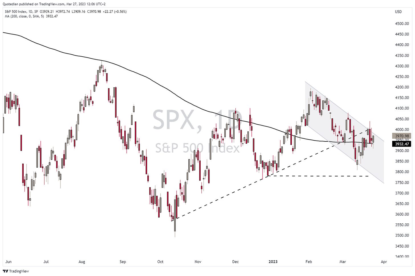
The chart of the S&P 500 has become pretty unambitious, with the index trading around the 200-day moving average and no clear direction:
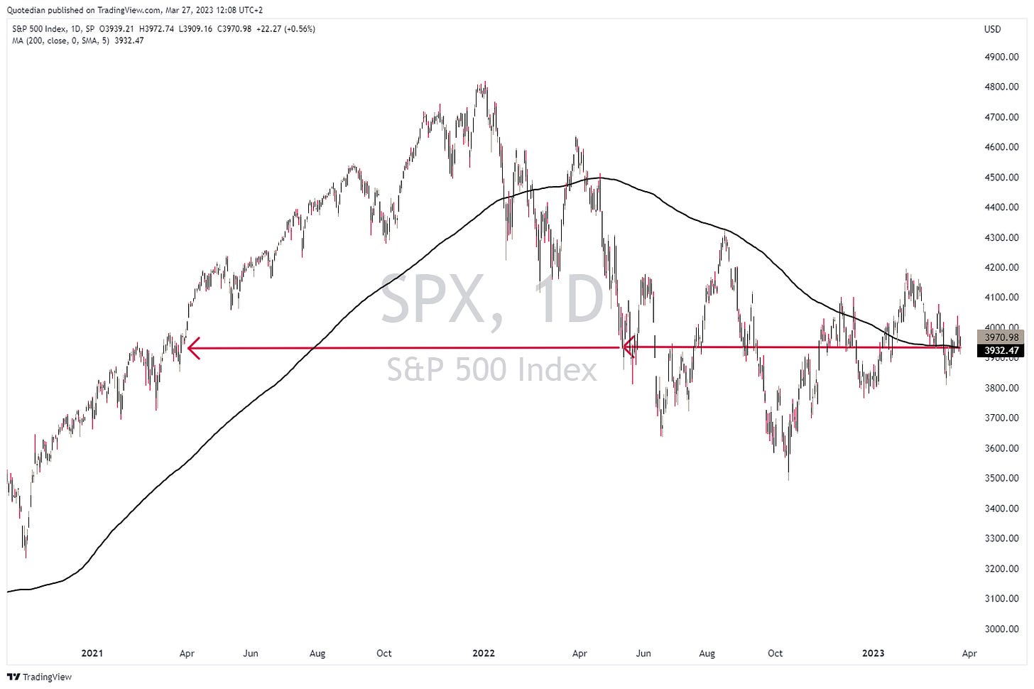
As a matter of fact, zooming out on the same chart, we note that we have not gone anywhere since May of last year and are actually at the same level of even two years ago:
Bulls and bears lose alike …
One avid reader (thanks Hervé) pointed out a possible shoulder-head-shoulder pattern on the S&P, with an implied price target of 3,670ish (-7.5%):
A trader could short, placing a stop loss above the right shoulder (4,050), risking 2% of capital deployed. That’s a nearly 1:4 risk/return reward - not bad for a possible short-term trade set-up.
Let’s turn to global equity sector performance and what was hot and what not last week:
To my mild surprise, financials actually eked out a small gain on a global level! That deserves some closer observation …
US Regional banks, which had been under attack by hedge funds and investors alike (see opening comments), dropped below key support on Friday, but were able to recover by the time of market close and today Monday added some more (2 hours before closing):
Similarly, European banks had their second Lehman Credit Suisse Deutsche Bank moment on Friday, but were able to recover from the worst losses by Friday close and added some more today:
But of course, does the flattish result for the week hide the brutal volatility lived by banking stock investors. Here’s the STOXX 600 Bank ETF again, as a weekly close-up:
To finalize the equity section, let’s also have a quick look at our lists of top performing stocks (YTD) on both sides of the Atlantic and their weekly return. Here’s the US list first:
NVDIA’s flight is absolutely astonishing … and so is Meta’s (Facebook) recovery!
And now the European list:
Three out of the top six performing stocks are defense stocks - coincidence?
Turning to fixed-income markets, the performance table reveals that it has not been a bad week for bond investors:
The above table would suggest that yields traded flat to lower, but credit spreads probably also narrowed. But let’s check for ourselves.
Starting with yields, here’s the one on the 10-year US Treasury:
Indeed somewhat lower. What about the shorter end of the curve? Here’s the chart of the 2-year Treasury yield:
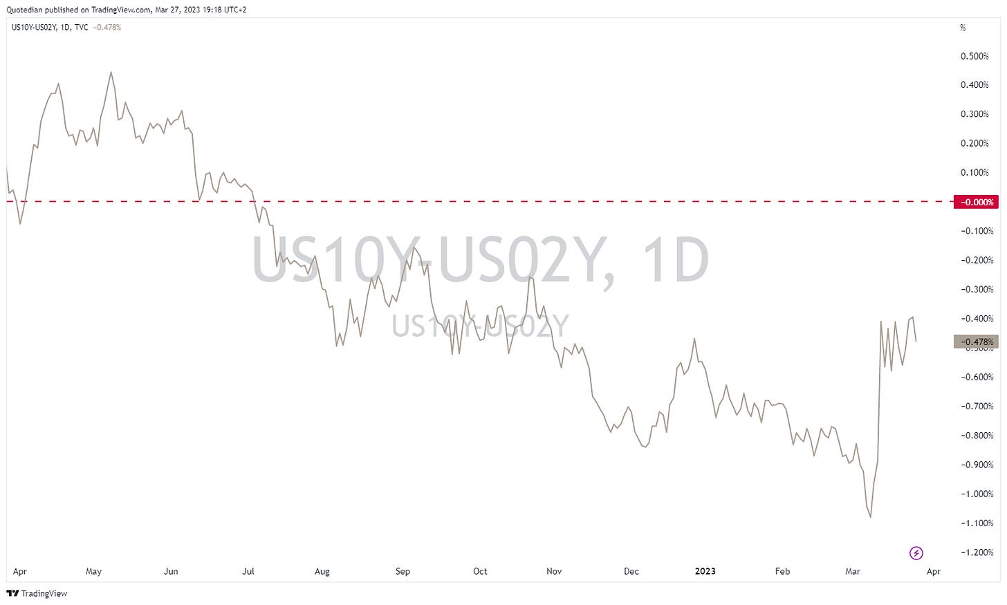
Also lower and slightly more pronounced so. Which of course, can only mean that the curve (10-2y) has steepened further:
Indeed. But here’s the bad news:
Recessions happen do not happen after inversion, but after inversion when the curve starts to steepen again (upper clip). Equities tend to take their worst hit also at that moment in time (lower clip).
German bond yields (as proxy for the European rim) have dropped less than their US cousins. Here’s the German Bund:
Checking in on Credit Spreads, the following chart reveals a slight narrowing in the IG spreads (lower two lines), but a sideways consolidation in the HY segment:
A close-up of the US HY sector CDS chart reveals the increasing stress the financial sector is experiencing:
On we go diving right into currency markets, where only other Dollars were weaker than the US Dollar itself:
This probably stems from the Fed having hiked 25 basis points only and the market assuming that we are at peak rates:
My guess would be that peak maybe yes, but that we will ride the slope down on the other quite immediately again … I have my doubts. Peak and then plateau sounds more realistic too me. Or at least I would hope so, because the chart above implies emergency cuts by the Fed this year. Go figure…
Anyway, the EUR/USD chart is trying to put in a series of higher highs and higher lows, with a move above 1.10 clearing the way to around 1.19 - technically speaking. Here’s the daily chart of this currency pair
and here the weekly, also looking pretty bullish given the renewed upside in the MACD:
Let’s finish the currency section
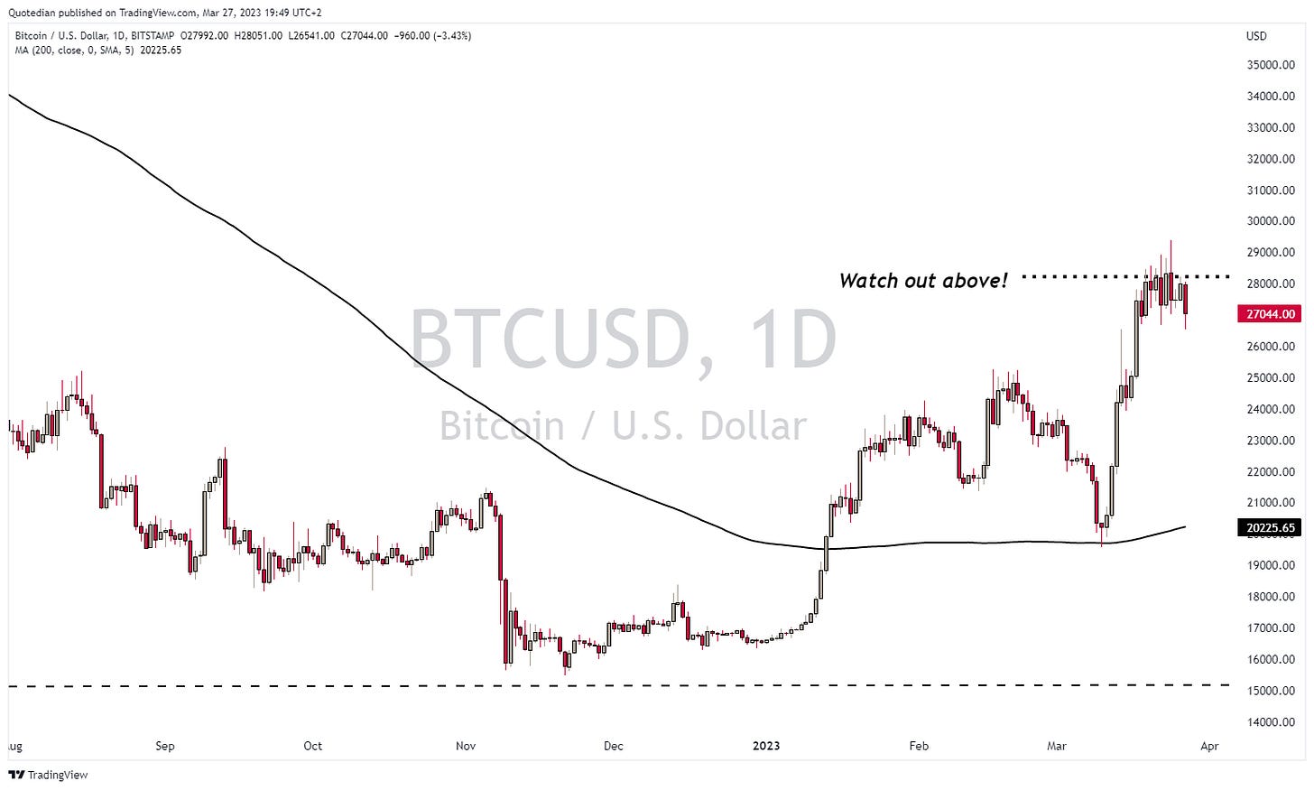
with Bitcoin, which is the other chart I put a time stamp on last week:
It also went for a moment above that “danger” level, but then quickly retreated back down below. All in all the jury is still outstanding - it will be interesting to observe over the coming sessions whether the relative calm of the past two sessions can prevail, or, if equities are in denial of something worse around the corner.
This is then also true for Gold, which was ready to break higher, but so far has been rejected at major long-term resistance:
Oil has recovered from the lows of last week, but continues to be disappointingly low for all “the end is nigh” proclaimers:
Here’s the chart of WTI:
Here are the performances over the past week of some popular commodity futures:
Let’s wrap it up here - make sure to hit Like if you Like and leave a comment in the comment section if you feel ‘commentish’.
Stay safe,
André
CHART OF THE DAY
Several ‘indicators’ (bond yield, yield curve, oil price, implied fed funds, others) are flashing a possible recession. However, equities are holding up astonishingly well. Are they in denial? Or is something else at work? Time to consult our magic indicator:
The red line is the magic, secret-sauce indicator, the grey line is the S&P 500. And there’s the likely explanation for the equity market behaving relatively well.
Thanks for reading The Quotedian! Subscribe for free to receive new posts the moment they are published.
DISCLAIMER
Everything in this document is for educational purposes only (FEPO)
Nothing in this document should be considered investment advice
The views expressed in this document may differ from the views published by Neue Private Bank AG
Past performance is hopefully no indication of future performance


