“Never forget the six-foot-tall man who drowned crossing the stream that was five feet deep on average.”
— Howard Marks
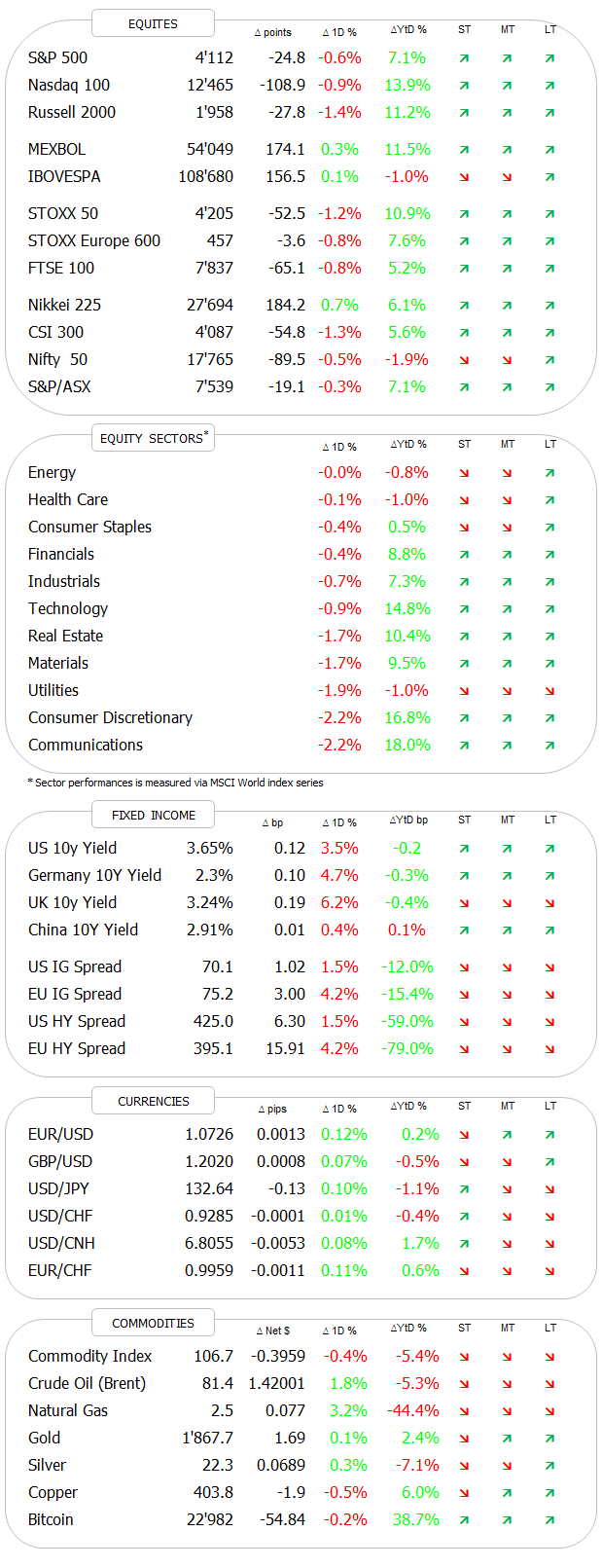
DASHBOARD
[Dashboard updated shortly after European market close]
AGENDA
CROSS-ASSET DELIBERATIONS
Unfortunately I had to miss sending out the usual weekly review edition of The Quotedian for technical reasons (“Dog ate my homework” kind of excuse). But the upside to this is that you get this Quotedian on a Monday evening - a bit like Monday Night Football in the US!
Also unfortunately, for truly technical reasons, I have to skip the usual stats on the previous week’s performance for different asset classes. Do not despair however - instead we will just have a look at a bunch of charts. And there’s a lot to look at after the week just gone by - earnings, rates, central banks, eco data, etc, etc, etc…
So, let’s dive right in!
The good old Quotedian, now powered by Neue Privat Bank AG
NPB Neue Privat Bank AG is a reliable partner for all aspects of asset management and investment advice, be it in our dealings with discerning private clients, independent asset managers or institutional investors.
Starting with equities, let me get the bad news right out of the way:
The graph above shows the seasonality of the stock market, proxied by the almighty S&P 500, since 1950. I.e., it shows the average monthly return by each calendar month and it shows us that February is the second “worst” month for the stock market - on average.
This is of course quite fittingly with the current narrative that markets may have gotten a bit head of themselves in January (and October/November) and need a breather. Which in turn also fits with the market having to newly assess the path of interest rates after last week’s employment data in the US.
Now, before you sell all your stocks and go hiding under the bed ‘til March, go back to the top of this document and read the “Quote of the Day” again.
Pulling out the daily candle short the S&P 500, we note that indeed the rejection has taken place as the index moved into overbought territory (RSI - lower clip) in combination with some of the most bullish sentiment reading (not shown) in months as discussed last week in this space.
IMHO, a correction could, if it indeed unfolds, take the index as far back as 3,800 (blue line) without endangering the current uptrend.
Similarly, European stocks (SXXP) are also at the danger of putting in a short-term top, after an even more fantastic run than their US peers:
There’s also a negative divergence to between price and momentum indicator to be observed (red arrows), but again, the index could drop a full seven percentage points without really endangering the uptrend in force.
The following chart tries to show just how strong the current year has been for the STOXX 600 Europe index (black line):
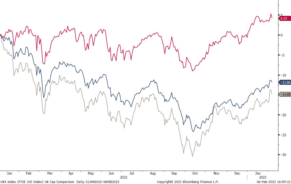
Turning to the UK market for a moment, it still takes most people by surprise when you point out to them that Footsie was at an all-time high last Friday:
I mean, how can it be with all that’s going on (or not) on that small island up north?!
The following chart would suggest that the strength is confined to the FTSE 100 internationally exposed megacap companies, whilst the more domestically focused small- and mid caps give a picture closer to reality:
Looking at some Asian markets for a moment, with all that’s going on in India regarding the Adani empire, the overall market (BSE100) is holding up pretty decently:
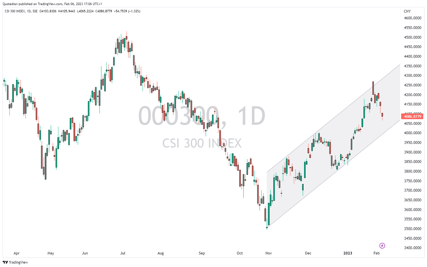
In China, the CSI300 has already corrected a bit further than its Western counterparts, but also continues within a well-defined uptrend:
And zooming out on the same chart, reveals that the potential upside is substantial:
Last but not least, a market I would continue to hold a (long-term) eye on is Vietnam. The VNINDEX closing above 1115 would be final confirmation for the reboot of the long-term bull market:
Let’s finish off the equity section with an observation regarding sectors. Here’s the YTD performance of the eleven S&P sectors:
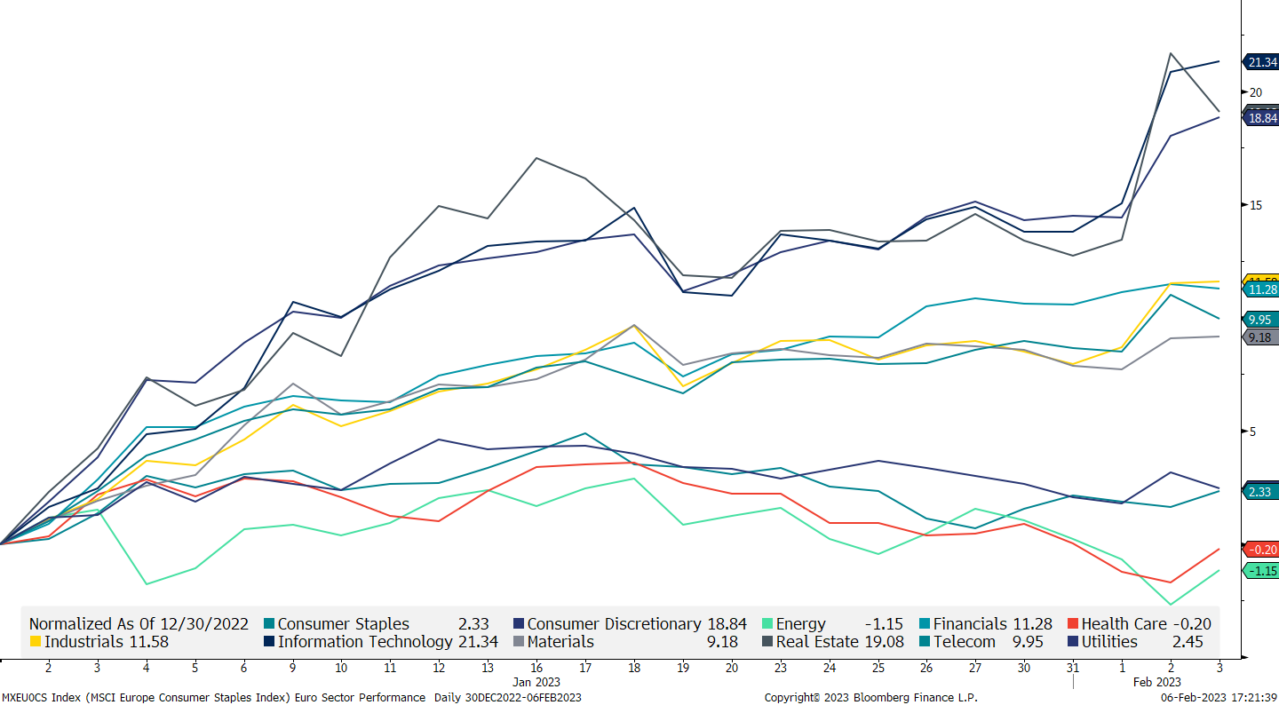
And here the same for the SXXP:
The point here is that in both cases the performance difference between best and worst is in excess of 20%, whilst the performance difference between the two indices themselves is less than 4% … make sure to use your (analysis-) energy wisely!
Moving to fixed income markets, that was quite the week that the rate-complex saw last week.
First, yields dropped fast as the Fed increased rates as expected but was probably to dovish in the ensuing press statement and conference.
OR…
Jerome Powell “knew” about Friday’s 517k NFP reading about to be released and thought the market will sort itself out thereafter. Which it did. Here’s the yield on the 10-year US Treasury over the past five days:
Definitely a new assessment by market participants taking place post Friday’s numbers.
But not only did the job numbers surprise to the upside, so did the ISM index, being reported at 55.2 versus 50.5 expected and 49.6 previously reported. In general have the economic surprises on both side of the Atlantic been to the upside recently. Here are the Citi Economic Surprise indices for both economic areas:
European rates saw a similar strange head fake post the ECB meeting last week, with yields dropping despite a hawkish Lagarde. However, ECB members were out in spades today, given the hawk-talk, subsequently pushing rates higher again. Here’s the 5-day chart of the Bund:
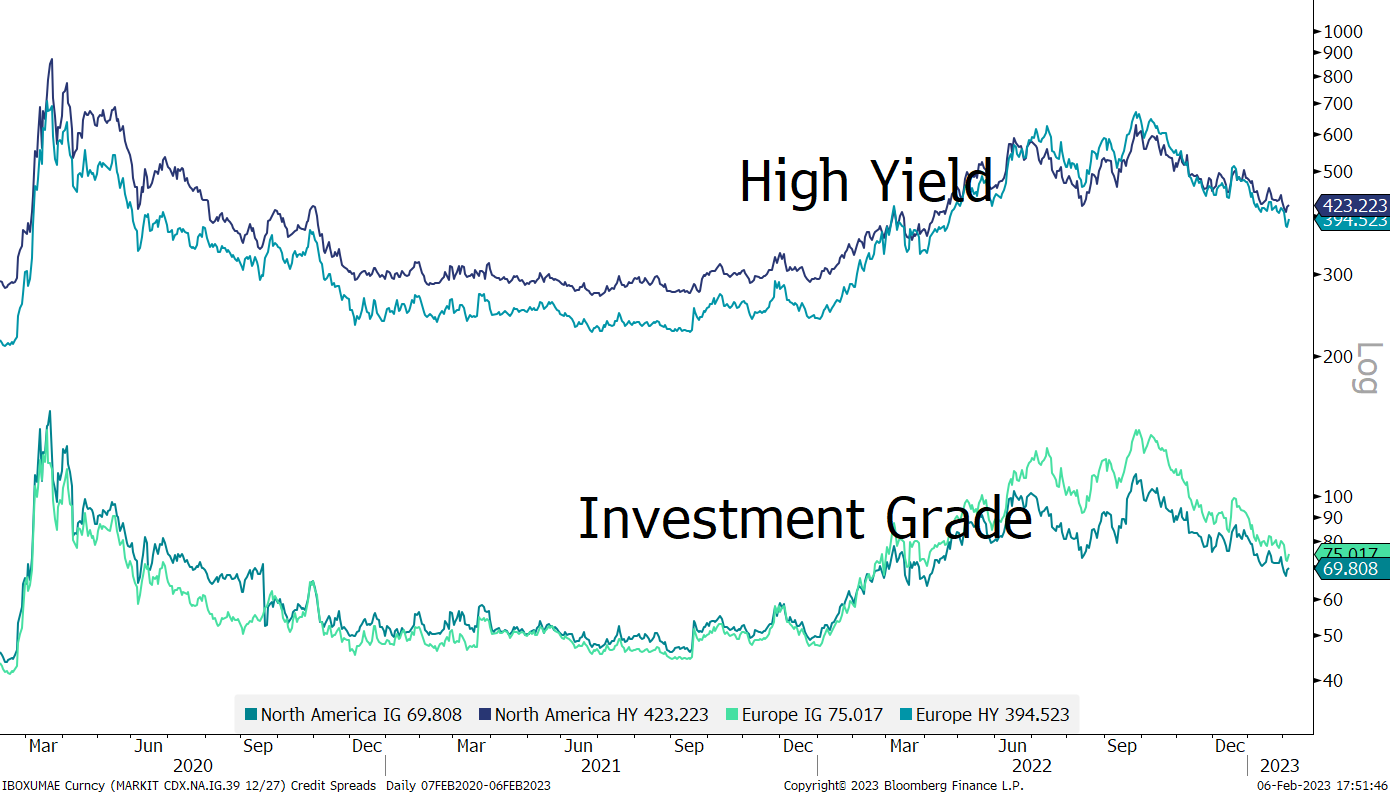
Nothing new on the credit spreads front, where spreads continue to happily tighten, not showing any worries of economic, earnings or any other kind of recession:
Here’s another, partially scary way, to look at yield spreads - this is the chart of the yield of a BBB corporate bond index minus the 90 days US Treasury bill:
In other words, if different asset classes ‘compete’ for capital, the lowest rated investment grade bonds have the worst argument in their favour compared to the risk-free rate in close to 40 years …
SWIFTly (no pun intended) moving into the currency realm, the past five days have been a period of vindication for the US Dollar:
The greenback topped out more than four months ago and had lost 12% (Dollar Index) of its value since then:
And of course, the turnaround happened just as the last remaining bulls threw in their collective towel just as key support (blue line) was broken …
For the EUR/USD cross, the short-term uptrend channel (grey shaded) remains in place for now, but even if broken, only a dip below 1.02 (blue line) would endanger the medium-term uptrend:
As discussed further up, economic data has lately been surprising to the upside in Europe and the US, with the latter providing larger surprises. Should that trend continue and the correlation between the EU-US spread (blue line) and the EUR/USD (green line) hold up as it has in the past, then that aforementioned 1.02 support may well get tested:
And finally, to end today’s letter, let’s have a look at some commodity charts. Last week we spoke about Gold and how it may be ready for a ‘breather’ after the strong rally of the past few months. However, as the US Dollar got sold off post-FOMC, the yellow metal first shot up to new recovery highs, before collapsing after Friday’s economic data releases:
The picture remains bullish, but a pullback to $1,800 would not be surprising.
Time to hit the send button. If all goes well, The Quotedian will be back Wednesday evening/Thursday morning.
Stay safe,
André
CHART OF THE DAY
There is one chart I omitted in the commodity section, just because it is so all-important to all cross-asset relationships, it really, really deserves its day in the sun as “Chart of the Day”.
Eggs.
Thanks for reading The Quotedian! Subscribe for free to receive new posts the moment they are published.
DISCLAIMER
Everything in this document is for educational purposes only (FEPO)
Nothing in this document should be considered investment advice
The views expressed in this document may differ from the views published by Neue Private Bank AG
Past performance is hopefully no indication of future performance


