

¡Ándale!
Vol VIII, Issue 19 | Powered by NPB Neue Privat Bank AG

“Those are my principles, and if you don’t like them… well, I have others.”
— Groucho Marx
Enjoying The Quotedian but not yet signed up for The QuiCQ? What are you waiting for?!!

Apologies for the late shipment of this week’s Quotedian - the weekend weather was simply just to sunny to not be sitting lakeside and sipping fine white wine …
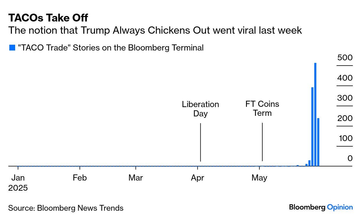
But moving away from wine, for some reason traditional Mexican food dishes have made into this weeks Quotedian …We all have heard by now of the TACO (Trump Always Chickens Out) acronym and trade. As a matter of prove how popular this term (which refers to the US administration not having a very high tolerance for market and economic pressure, and will be quick to back off when tariffs cause pain) John Authers from Bloomberg showed the following graph in his daily column this morning (2/6):
Even Trump heard of the TACO trade and he didn’t like it:
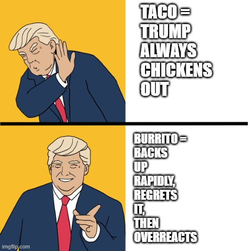
I am not sure what the original source is but I got it via Le Shrub and his fantastic Substack (click here), where he refers to someone smart and witty came up now with the term BURRITO.
The BURRITO trade is when Trump Backs Up Rapidly, Regrets It, Then Overreacts!
And here’s the danger that could lead to the next leg lower in (equity) markets. Trump has been called out via TACO and may now go full BURRITO …
In any case, in a market where everything can change come the next Tweet X, let’s take the opportunity that it was month-end over the weekend and take a step back to look at the longer-term picture via the performance tables and our monthly charts.
In the following series of performance tables, grey is year-to-date performance in %, whilst red represents the performance numbers for May. E.g., here’s the table for performances of major asset classes:

Let’s dive right in then, by looking at individual asset classes.

Starting with equities and taking a look at major global indices, we note how bad an idea it would have been to “Sell in May and go Away”:

Not one index above closed lower over the months and a near double-digit performance of the Nasdaq 100 catapulted that index directly back into positive YTD territory. Let’s start with that index then for our monthly candlesticks chart review:

Those two last recovery candles are impressive!
However, that relative 2000 & 2023 double top to the S&P 500 continues to hold:

The S&P 500 as a monthly standalone chart is two percent away from printing a new monthly all-time closing high and has worked its way above the 10-month moving average (ca. 200-day MA equivalent):

The symmetry and beautifulness of the long-term uptrend channel continues to amaze:

And talking of beautiful picture, the ratio of US to EAFE stocks is turning upwards right at the lower end of its long-term uptrend channel:

Was exodUS™ then nothing but a bad dream? Probably not.
Turning to Europe, we note that the broad STOXX 600 Europe index is less than 1.5% from a new monthly closing high and less than three precent from a full new all-time high:

Scrolling back up to our initial performance table, we note that Spain and Germany lead the equity pack. Starting with a look at the first, we note that the IBEX never closed below its 10-month MA and is running from record close to record close:

Switzerland’s SMI continues to lag in this recovery, continues to trade below its 10-month MA and still stand at least seven percent below the previous ATH:

Over in the Far East, Japan’s Nikkei 225 index continues in its ‘typical’ consolidation period:

Remain patient and exposed.
In Hong Kong, the HSI has been stuck in a wide range around 23,000 for four months now, seemingly waiting for 10-months MA to catch-up:
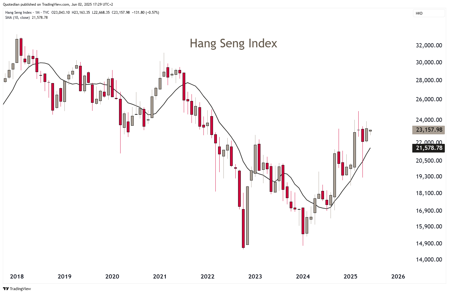
Watch for possible break higher later this month.
In India the BSE500 moved back up above its long-term MA in May, giving the final confirmation of the resumption of the secular uptrend:
In the UAE, the DFMGI has not only already taken out the February highs, but has also exceed the previous cycle high (not ATH!) established back in 2014:
Moving on to sector performance, here is how the eleven main economic sector have fared at a global level in May (and YTD):

Down beaten Technology and Consumer Discretionary had stellar monthly performances in May, but continue to show negative YTD readings. The change in guard of market leadership becomes very obvious when checking the top performers: Industrials, Financials and Utilities are the new Generals.

In terms of factor performance, the one factor to rule them all, like it or not, continues to be Momentum:

US small cap, apparently the mother of all Trump trades, on the other hand remains the disappointment of the year post-COVID era:
Finally, here are the list of the best performing stocks this year in the US (S&P 500) and Europe (STOXX 600) and how the have behaved over the past six months. My wild guess (lol) would be that most winners continued to, well, win.
Here’ the US list:

Only four out of twenty-five stock did not add to their already juicy gains. Also, note the different underlying tone in sector distribution as compared to last year.
Now on to Europe:

Industrials and Financials anyone? And, I have mentioned this before, but to drive the point home: Last year (and most of the previous years too) it was the US list that showed triple-digit gains early on in the year - this year the honour goes to six European companies.

Turning to fixed income markets and their performances, a small warning on the performance table below: The indices used are the old Barclay bond indices, a widely accepted industry standard. However, their most common use is usually in USD, unhedged. Hence, with the Dollar widely lower this year, foreign currency (FC) is having a positive impact on Total Returns:

E.g., the Global Treasuries index ( ) is up 5.7% year-to-date. However, the hedged version of the same (H03432US) is up ‘only’ 1.5%. I will be working on this indices over the coming month(s) to improve the picture.
Let’s focus on some monthly rate charts then, starting with the one on the 10-year US Treasury yield:
From a technical analysis (TA) point of view, this chart looks like a consolidation pennant (dashed lines) which is about to be resolved to the upside. Which of course would mean downside for bond prices. Zooming further out, makes this upside breakout look even more likely:
But can this be? Did US Treasury Secretary Bessent not say they want to have lower 10-year yields? Yes, he did, but you do not always get what you wish for. For now, work with a range assumption of 4.25-4.75%, but get very bond shy on a move above 5%.
Markets (and CEOs) hate uncertainty and the current US administration has introduced a lot of that over the past few months. This will likely further slow down growth and keep the rates a the short-end low, whilst little fiscal discipline should continue to push rates a the long-end higher. Expect the following line to continue to rise:
In Europe, longer-term yields (proxied via the German Bund below) should remain range-bound for the coming months:
Swiss 10-year government bond yields are on the brink of falling back into negative territory:
Whilst 2-year rates have achieved that doubtful honour already back in April:
But the one bond market we should all pay special attention too, continues to be the Japanese one (JGBs). The 40-year JGB yield is down to 3.07% after an intra-month high in May of 3.70%, but this is stuff that can deeply upset the plumbing of global financial markets:
The extremely popular long Mexican Peso, short Japanese Yen carry trade, which brought its participants annualized returns of 30% from COVID to mid last year, saw its first “unwind” in August of 2024:

The August ‘24 disruption was felt on bond- and equity markets around the globe (and nearly managed to disrupt my only annual holiday too!). A “second act” could be very painful …

The common European currency (and its relative stock markets) has long been a laggard versus many other peers. E.g., versus the US Dollar, the Euro lost more than 40% of its value over more than a decade (2008-2022). I think it is safe to assume that investors simply don’t like all the regulations (aka red tape) and business-unfriendliness imposed by those mad hatters in Brussels. But what markets hate even more than red tape, is uncertainty. And a lot of that has been installed in Washington DC over the past few months. Hence, this explains the following currency performance table (all currencies versus the USD):

The monthly US Dollar Index chart looks definitely like it has put a top in place:

(Disclaimer: Note, I did not write: The monthly US Dollar Index chart looks like it has put a definitive top in place.)
On the EUR/USD, after a short consolidation, the next measured move could take this cross to anywhere between 1.1650 and 1.1850:

On the USD/JPY chart, 140ish seems to be the key level to watch:

To highlight how important that level seems to be and how much the potential for a massive Yen up move (USD/JPY down move) is once it is taken out, let me zoom out on the same chart again:

Here’s the chart that explains you why the 2-year Swiss Government Bond yield is negative and why the SNB will take its policy rate into negative territory in due course:
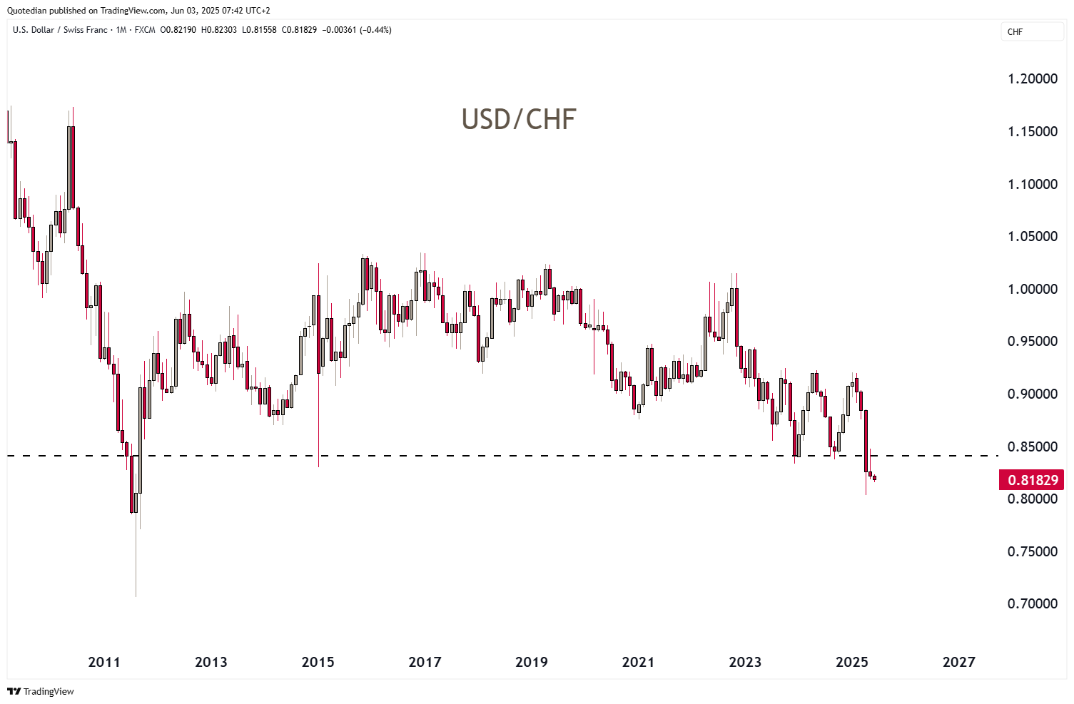
We are now clearly below key support of 0.84 and at the levels where the SNB pegged the Swissy to the Euro and did massive FX market interventions. What does the EUR/CHF then look like?

The introduced peg in September of 2011 was 1.2000. Today’s rate is 0.93 and change. Go figure.
In the realm of cryptocurrencies, Bitcoin had a very good month, taking it back above the 100k level, but Ethereum had an outstanding rally of 40%, albeit it remains deeply negative in terms of year-to-date returns:

Here’s the long-term chart for Bitcoin:

And here’s the same again with that election pattern overlay we have been studying for a while now:

And here’s the Ethereum chart for completeness purposes:


The commodity segment continues to be dominated by precious metals this year, albeit Gold & co took a small breather in May:

Checking in on the monthly gold chart, which now also contains the first two sessions of June we are reminded that “the trend is your friend until the very end at the bend”:

Let me zoom into the daily chart on Gold quickly, as it is important to highlight that less than two percent are need to set a new (closing) ATH and surpass key resistance:

Whilst Silver, just like Gold, took a breather in May, it has started June with a bang, taking prices to new cycle highs:

Let us refresh this long-term Silver chart from last year then:

Crude oil prices (WTI) are trying to recover from their April, recession-inducing post-Liberation Day slump, but remain well below ex-support now turned key resistance:

Alright, time to hit the send button. I hope you enjoyed this week’s tasty TACO wrapped into a BURRITO!
Stay safe and ¡Ándale!

In reality, you need no other Disclaimer than the one above, but just in case:
Everything in this document is for educational purposes only (FEPO)
Nothing in this document should be considered investment advice
Investing real money can be costly; don’t do stupid shit
Leave politics at the door—markets don’t care.
Past performance is hopefully no indication of future performance
The views expressed in this document may differ from the views published by Neue Private Bank AG