April Fool's
The Quotedian - Vol VII, Issue 13 | Powered by NPB Neue Privat Bank AG
"If every fool wore a crown, we should all be kings."
— Welsh Proverb
It’s April Fool’s day today and it is also the thirteenth (13) issue of the Quotedian this year - what could possibly go wrong?
But joking aside (I hope), being the 1st April today (2nd by the time of publishing), can only mean two things:
Don’t believe a word of anything you here today (excluding the writing in this letter of course)
It’s a new month, which means we get to review the one (March) just gone by with our usual arsenal of statistical tables and monthly candle charts!
Make no (market) fool of yourself. Let us help you with your investments. Be it bespoke or fully delegated. Get in touch now!
Contact us at ahuwiler@npb-bank.ch
Also as usual, the performance table show the March performance with blue (positive) and light blue (negative) bars and the year-to-date performances with grey (positive) and red (negative) bars:
Most charts are monthly candle charts, i.e. where each bar (aka candle) represents the price action of one month:
Most parts of this letter are written on April 1st, hence, given that between looking for Easter eggs and catering to family needs, the descriptive part will be a bit shorter and especially probably less cynic than usual.
Who knows, maybe the latter will broaden even further our readership base?
Starting our month-end review as usual with a look at equitiy markets, we note that it has been a fifth consecutive up-month for stocks, as described in last Thursday’s QuiCQ.
Talking QuiCQ, have you not yet signed up to our new, daily quick overview over the most important market data, a witty quote and a chart of the day??!! Hurry! Sign up right now:
Here’s how some of the major benchmarks around the globe have performed in March and how they are faring on a YTD basis:
A few observations worth mentioning:
Japan continues to fly
Europe (STOXX 50) beating S&P 500 for now
Spain had a double digit month (10.7%) that took YTD negative performance to nearly ten percent up on the year
India is up, but one of the ‘lagging’ markets this year
The only benchmark down in March (Brazil), was already the weakest a month ago
Some monthly charts now. Starting with the S&P 500:
The S&P 500 closed at a new monthly ATH in January and has never looked back. Whilst the distance to the 10-months moving average is becoming a bit stretched, it is rather a sign of long-term strength than that of a tradable correction, checking the immediate past ( 2017 - 2018; 2020- 2022) experiences.
The Nasdaq had a achieved the feat of a monthly close at a new ATH a month earlier (December ‘23), and show a similar pattern of unabated strength:
The correction that started in January of 2022 took two years to get investors back to break even and, as they say:
“The wider the base, the higher in space”
So, is all this upside still driven by the Magnificent 7 stocks only? The following chart answers this question with a clear, resounding NO! It shows the monthly % performance difference between the Mag 7 and the entire S&P 500. As we can see, the dominance of only a few has become much less, which means a broader participation to the upside by many other stocks.
A quick glance at US small cap stocks (Russell 2000) now:
This definitely feels like the 2-year plus range has finally be broken. At a minimum, don’t be short small caps for now!
Turning to Europe, the broad STOXX 600 Europe index hit closed at a new monthly ATH in February:
The narrower Euro STOXX 50 index is not quite there yet, but is approaching rapidly:
You can be as bearish as you want, but buying a market that finally makes a new ATH some 25 years later simply cannot be a bad idea.
Switzerland’s SMI continues to offer catch-up potential, especially after the SNB was one of the first “majors” to cut rates:
Overweight.
Britain’s FTSE-100 (Footsie) index continues to be a Rocky Horror Picture show, but the close at a new ATH in March could bring momentum-seeking trend followers back on the plane:
Rushing over to Asia, let’s start with the almighty Indian equity market:
At a first glance, all seems honkey dory, at least amongst large cap stocks (Nifty 50) shown above.
However, a glance at small cap stocks, here proxied via the iShares MSCI India Small Cap index, shows that the motor under the hood has been sputtering:
This has mainly to do with the India market regulator commenting on the speculative frenzy that had been taking over Indian stocks. The question is, was the intra-month correction down to the 10-months MA it, or is more to come?
Hint: I don’t know the answer.
Over to the land of the rising sun, where … oh, FFS, just see for yourself:
Interestingly enough, in US Dollar terms, the index has not quite yet reached a new ATH (which it did in Yen terms in February of this year):
In China, the CSI 300 is, once again, arriving at its moment of truth:
Can the downward sloping trendline (dashed) be broken this time, after a not unimpressive and little commented 15% rally over the past three months?
And finally, it seems the equity correction in the GCC region is over:
Turning to equity sector performance, this is what happened in March and during 2024 so far:
Communications and Technology are leading - as usual
Consumer Discretionary is lagging - not as usual … AAPL, TSLA?
Energy had a month similar to the IBEX seen at the beginning of the letter, where one month performance lifted the index from negative to very positive YTD.
Let’s have a look at the US Energy sector via the SPDR Energy Select Sector ETF (XLE) for a moment:
That was one impressive candle in March (second last), that brought the XLE into a 5% vicinity of the 2014 highs. Remember the leitmotif of this letter?
“Looking for the forest? Listen to the trees!”
And the trees are telling you something’s cooking in the energy (geopolitical?) segment.
A good segue into our Top 25 performing stocks (YTD) and their monthly fortunes. Let’s see if some energy stocks managed to make that top of the pops. Here’s the US list:
Well, not bad, four energy stocks are in the top 25 this year so far. Let’s check back at a later stage if we can bring it to five or more.
Now let’s check in on the top-performing European stocks:
Uh…oh…not one energy stock!
Maybe our Relative Strength ranking charts give some feedback on what is going on?
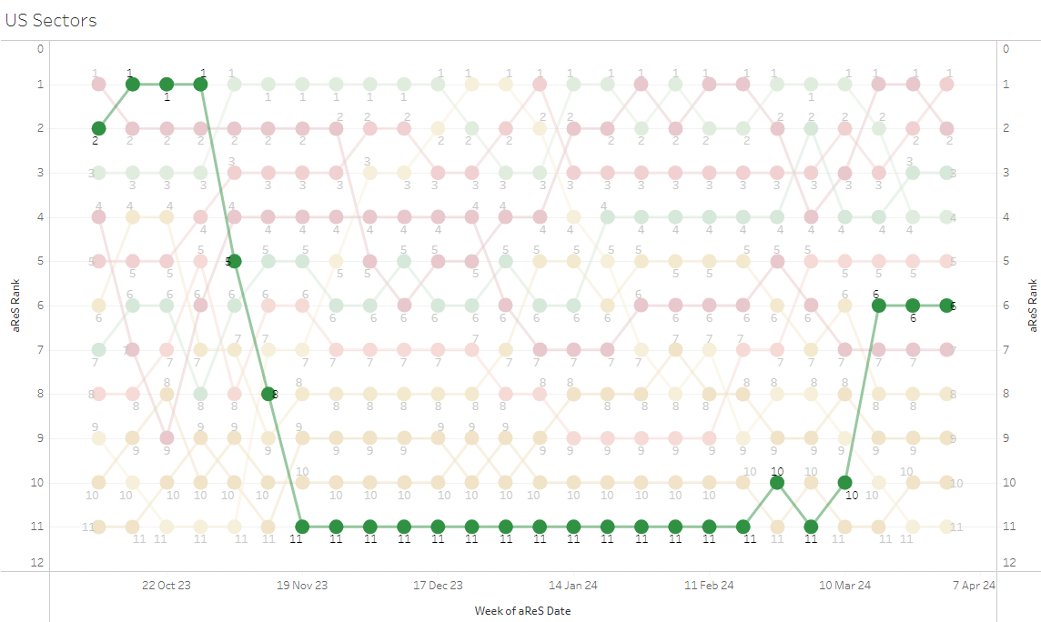
Here’s our propriety aReS model for US sectors (energy highlighted):
And here is the equivalent for EU sectors (energy highlighted):
Indeed the energy’s sector strength seems to be focused in the US for the time being.
And finally, as we are talking factors already (are we?), here is the performance of factors in the US over the past month and year-to-date:
Momentum continues to absolutely crash it, but interestingly enough did US small cap and small cap value also have a pretty decent month, leaving only the latter with a tiny negative YTD performance.
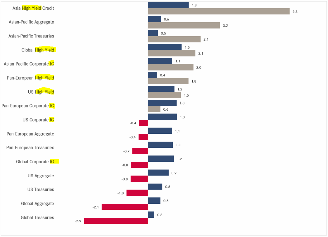
Switching into the fixed income section now, let’s first check in on MTD and YTD performances:
All different segments were able to eek out positive performances in March, but roughly half continue to show a negative year-to-date return.
Bonds have many risk factors, but the two most important ones are interest rate risk and credit risk. Clearly, the latter has been friendlier to bond performance so far this year. Below the same table again, with the strategies containing most credit risk highlighted:
Time for some monthly FI charts now. Here’s the one yield to rule them all - the US 10-year Treasury yield:
Admittedly, a tough chart to read, at least to me. The 10-month MA is not of great help either. But, all in all, the benefit of the doubt goes to a scenario of higher yields, and ergo, lower bond prices. Let’s check on those prices quickly via the iShares 20+ Year Treasury bond ETF (TLT):
Indeed, not a bullish picture there.
The chart of the German Yield equivalent (Bund), as proxy for European rates, is even less clear to me, even more so as the 10-month MA is flattening out and yields trade below it:
Could these two different yield pictures between the US and the Eurozone be due to slight divergence between inflation surprises for the two zones shown in the chart below?
Perhaps.
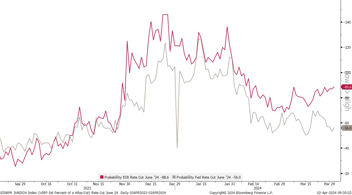
Or is because Futures market give an 88% chance for a June rate cut by the ECB, compared to the 56% chance for a US cut in June?
Also perhaps. At a minimum, a pattern of divergence is starting to become visible.
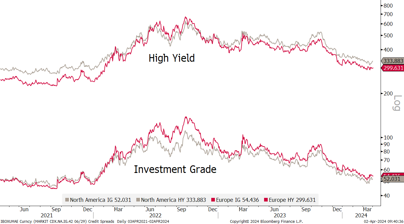
Checking in on credit markets, we already know that credit spreads have been contributing positively to total return this year, hence the following chart should show us four contracting lines:
BINGO!
Over to currency markets now …
As usual, first the performance table of major currencies versus the US Dollar:
Seemingly, the Greenback is not have a bad year at all, which stands somewhat in contrast to the ongoing rally in risky assets…
Remembering the increasing divergence between US and Eurozone (EZ) yields from the rates section above, we should see a following EUR/USD rate (red), correlating with a falling Bund-Tens spread (grey):
Yep.
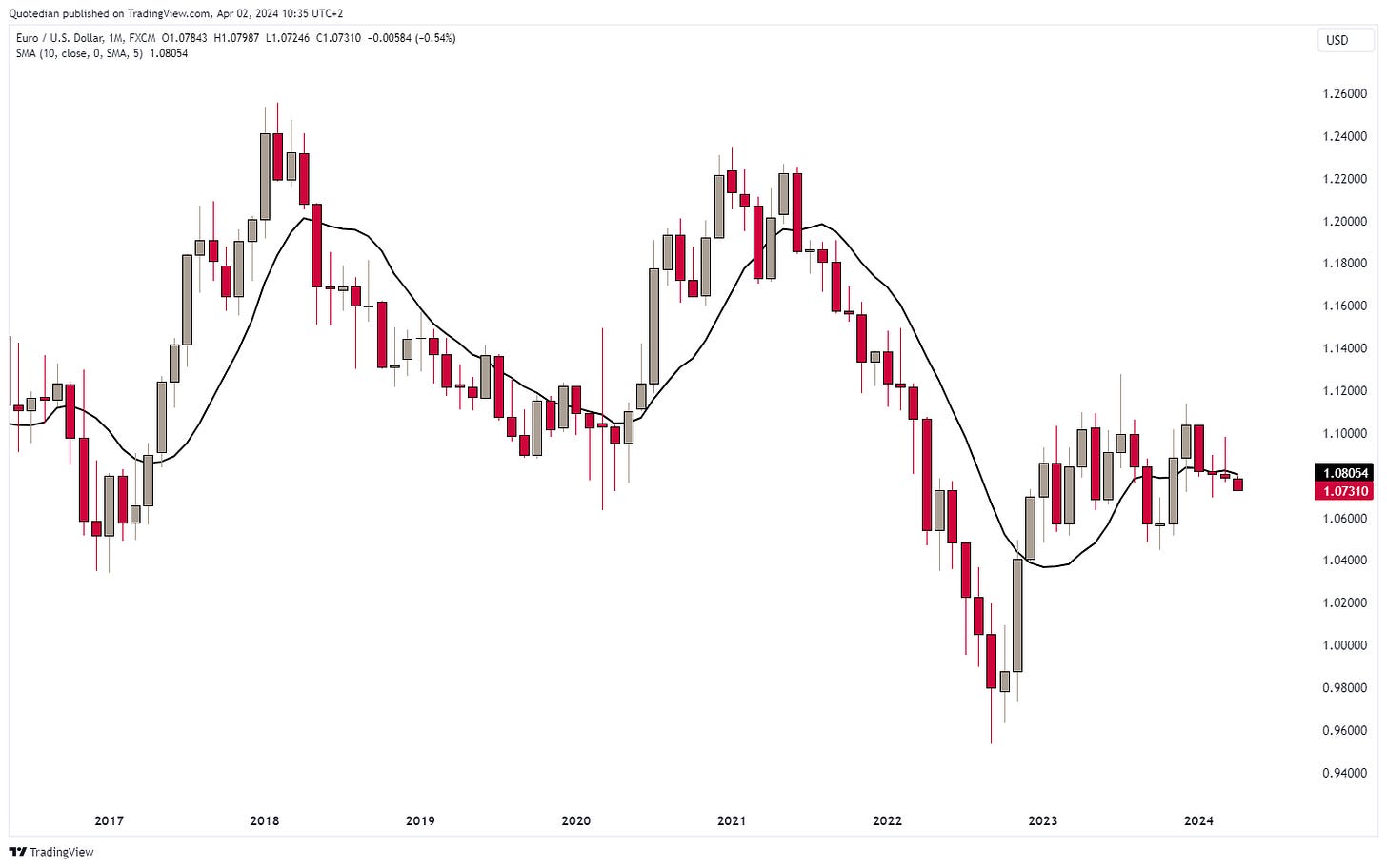
Let’s have a look at the monthly candle chart of that currency pair (EUR/USD) then:
The truth is that this cross has gone nowhere for the past 16 candles, or nearly one and a half years. Breakouts and breakdowns seemed imminent at various points in time over that period, but did not materialize in the end. The current picture is increasingly bearish, but again, wait for a clear break before committing meaningfully.
Dollar versus the Yen now:
The Bank of Japan (BoJ) was the last major central bank to hike interest rates, abandoning 17 years of ZIRP and NIRP. And the Yen reacted by … losing more terrain versus the US Dollar and other currencies. Clearly, the market was already position for the hike, plus, it was a rather dovish hike.
We are now at intervention levels - but should the BoJ fail to do so, we have price targets north of 160:
Just as the BoJ started their hiking cycle, the Swiss National Bank started to cut rates to the mild surprise of many. Hence, the Swiss Franc is one of the few currencies the Yen was able to eke out a gain:
The USD/CHF cross has been signalling the SNB move since beginning of the year:
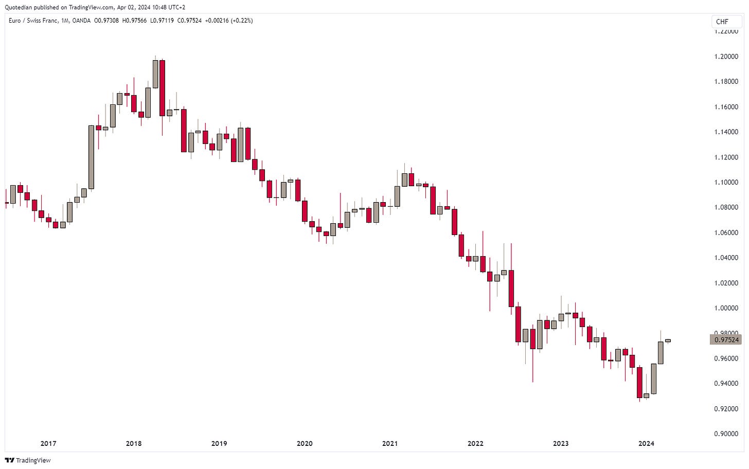
The Euro is closing in on parity versus the Swiss Franc:
And of course, to finalize the currency section, we should also give consideration to cryptocurrency performances:
In comparison to Dogecoin and Solana, Bitcoin ‘paused’ in March, being up ‘only’ 14.7% ….
April will see the widely expected Bitcoin halving (click here to see the countdown), which will be interesting to observe. Will it be “buy the rumour, sell the fact” as was initially case after the launch of the Bitcoin ETF, or will the cryptocurrency just march onwards toward $100,000? For now, here’s the chart:
Finally, in the commodity section, let’s first check on ‘sector’ performances:
Except for Livestock, where the argument for some profit taking in March after a fantastic year-to-date run can be made, all sectors closed higher. And this is the face of a higher US Dollar… Is inflation staging a comeback?
Here are the performances of some popular commodity futures:
The first observation that sticks out for me is that two markets of the same ‘sector’ (energy), namely Gasoline (red) and Natural Gas (grey) futures, can be top and bottom performers, but obviously, correlations come and go:
Crude oil (Brent and WTI) are also at the top end of the performance table, let’s check the chart of Brent:
Hhmmm, this starts smelling as yet higher price ahead.
Time to check in Gold now:
Again, bullish and even more so given that the US Dollar (in which the price of Gold above is charted) has been rising too. But here also, correlations come and go (lower clip):
In the performance table of individual futures above, I luckily omitted to show the return of Cocoa futures … up some 140% as I type (and probably up more by the time you read) it would have distorted the table too much! Here’s the monthly chart:
Somebody seems to be squeezing that market … maybe think of reselling those Easter Bunny chocolates you have found on the black market … best in exchange for Bitcoins!
For me it is time to hit the send button and for you it is time to hit the like button. Quid pro quo!
Coming full circle now to our April Fool’s title of today’s Quotedian, here is probably the best April Fool’s prank ever:
The US yield curve (10s-2s) inverted on April 1st 2022. Two years later no recession, no stock market crash (rather huge gains) and still no recession in sight.
Everything in this document is for educational purposes only (FEPO)
Nothing in this document should be considered investment advice
The views expressed in this document may differ from the views published by Neue Private Bank AG
Past performance is hopefully no indication of future performance


