Bearable
The Quotedian - Vol V, Issue 130
“First of all full disclosure, I’ve had a bearish bias for 45 years and it had to work around, I like darkness.”
Stanley Druckenmiller, September 2022
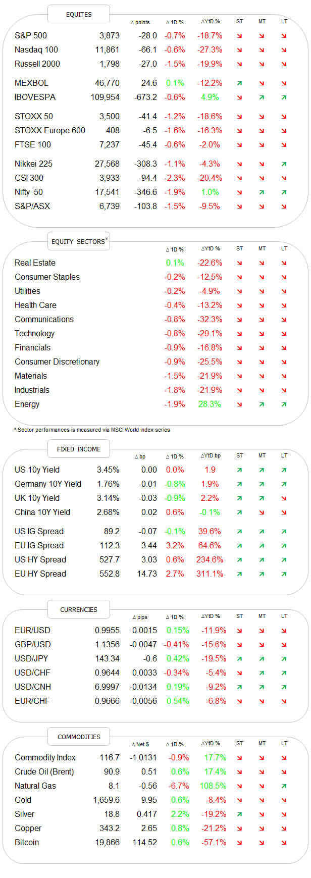
DASHBOARD
AGENDA
CROSS-ASSET DELIBERATIONS
Today’s title and picture of The Quotedian are of course a sheer coincidence and have absolutely nothing to do with the current market environment!
But just in case you missed it, last week was not a particularly friendly week for the riskier assets in your portfolios. So, let’s dive right in and do our usual Sunday round-up for the week gone by.
Apropos missed it, I did miss mentioning in Friday’s issue an important profit warning by FedEx - a company at the very pulse of the global economy. However, after noticing my miss on their probable profits miss, I tweeted out the following to all of my followers (all eighteen of them - sigh!):
[Click on this phrase to be taken to the full Tweet]
The message is of course that you should follow @TheQuotedian if you use Twitter ;-)
This is what the profit warning did to FedEx’s share price:
Accordingly, the entire market was caught yet again on a weak foot on Friday, though the session should not be taken too seriously, given the quadruple witching distortion going on. But undeniably, any chance on a positive pattern we were discussing earlier in the week is now gone, with the downside clearly the vulnerable side now:
The only “hope” stemming from the partial recovery towards the session’s end comes from a candlestick pattern called a “Hammer” (circled green), which has the potential to indicate a short-term bottom. Though looking at what our 24/7 VIX is doing over the weekend, I would not make an oversized bet to the upside on Monday morning:
As mentioned further up, it was a tough weak (Freudian misnomer) for nearly all major markets, with the indices in the US and their long-duration constituents getting by far the most stick:
The weekly results for sector performance will then also not come as a surprise:
I will also add in here a new statistic, which is the weekly factor performance. Please not that this is beta (pun not intended), i.e. work still under construction. Also, we will use European factor performance for this week, in order to avoid being so US-centric:
It is clear then from the above table that value was the place to (relatively) be, and growth should have been shunned.
Before we turn to fixed income markets, I also think it is instructive to look at the four or five largest components of the S&P 500, which make up an estimated ~22% of the index weight:


All in all, the major components of THE global equity benchmark are not spelling bright, blue skies ahead…
Ok, turning to fixed income markets, we will not lose too much time trying to figure out what the trend for yields is (spoiler: UP):
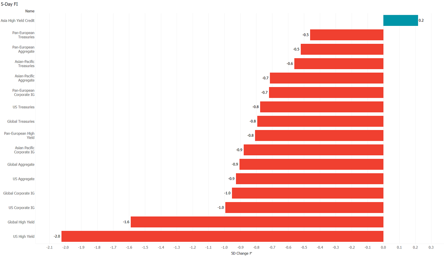
Accordingly, the weekly performance statistic on major fixed income benchmarks holds nothing nice for us:
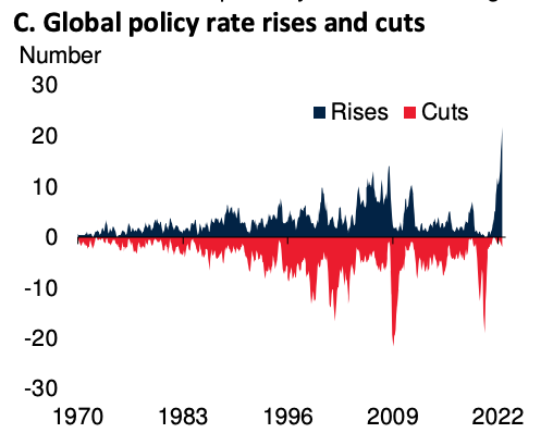
The rise in Global yields should not come as a surprise, given that central banks around the globe are hiking rates at the fastest pace since the introduction of fiat money in the 1970s:
But it is not only rate hikes that are tightening financial conditions. According to the following chart, governments are also tightening fiscal stances to a larger degree than during the hay days of austerity after 2010:
All this has led to bonds falling even more than stocks, making it a bloody tough year for any asset allocator and an especially f.cked up year for the 60/40 guys. But given how stretched the stock-to-bond ratio is, a reversal may be at hand soon:
The question nobody wants to hear the answer to is of course whether this ratio will reverse via rising bond or falling stock prices or a combination thereof. So, let’s not ask the question then …
To finish off the bond section, consider the following chart on US 30-year fixed mortgage rates:
It has doubled in less than a year and is back to levels last seen when the GFC started unfolding.
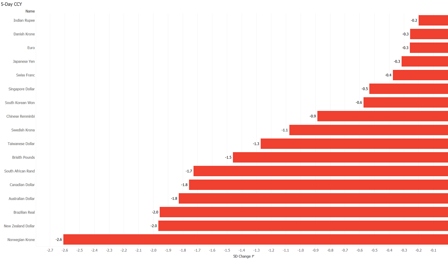
I will be really short on currencies today, with one picture, one chart and the performance table. None of the three needs any lengthy explanation …
The picture:
The chart:
The table:
Would you agree? All said?
Moving into commodities, we discussed earlier this week how Gold had broken technical long-term support:
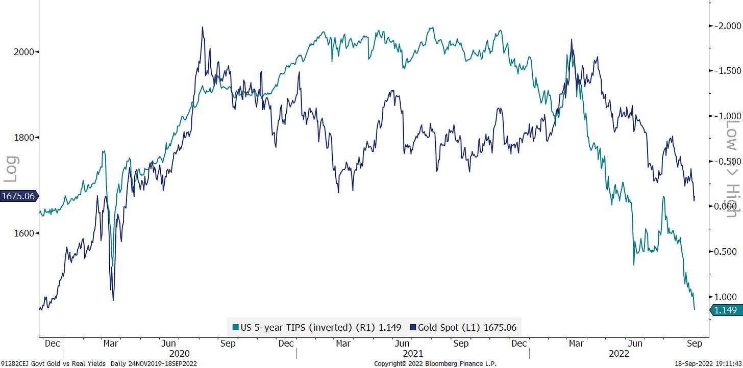
Why is gold so weak, with all that is going on. Well, once again, it is weak versus the US Dollar, but somewhat less so versus non-Dollar currencies:
But the other correlation that continues to hold up and hence explains the Gold/USD weakness, is the one versus real rates (inverted below):
The other commodity segment under continued spotlight last week is of course energy, which is showing some signs of weakness again. Here’s oil for example:
Rising recession fears are putting a heavy lid on energy prices, but I insist that structural underinvestment for nearly a decade will keep a secular backwind behind the oil price.
To round everything off, here’s the commodity performance table for the week:
CHART OF THE DAY
In the fixed income section above we observed a chart on the US 30-year fixed mortgage rate and how it was hitting its highest level in some fifteen years.
Today’s COTD takes that rate (blue line), inverts it (LHS) and pushes it six months ahead and then compares it to the US Home Construction ETF (ITB, green line, RHS).
As usual, when using two different y-scales, there is some degree of chart crime being committed, but nevertheless, with an important positive correlation for the past 10 years plus, some more pain may lay ahead for homebuilders.
Stayt tuned…
Thanks for reading The Quotedian! Subscribe for free to receive new posts and support my work.
DISCLAIMER
Everything in this document is for educational purposes only (FEPO)
Nothing in this document should be considered investment advice
Past performance is hopefully no indication of future performance










This COTD makes a good couple with the COTD from Vol V, Issue 112