Hot Air
The Quotedian - Volume V, Issue 116
“Words empty as the wind are best left unsaid.”
— Homer
DASHBOARD
AGENDA
CROSS-ASSET DELIBERATIONS
Given the number of times I swore at the steering wheel yesterday, it seems that most people are now back from their holidays - in Europe at least. In the US, a lot of investors may still be on late summer leave, with a long weekend ahead (Sep 5 = labour day), and this was seemingly noted in yesterday’s largely unexciting session. Or maybe it was just unexciting compared to Friday’s market action?
In any case, yesterday’s relatively ‘boring’ session and the fact that the most exciting economic data (an oxymoron?) is packed into the back-end of the week (US - ISM & NFP / EU - CPI & PPI), will make for a shorter Quotedian today. Let’s dive right in …
The US session was one of a weak opening, then most of the session dedicated to reclimb to breakeven, only to face renewed selling pressure in the last half hour of trading. Here’s the S&P’s intraday chart
Decliners outpaced advancers by about three-to-one and only and only two (guess which) out of eleven sectors were up on the day:
I say “guess which”, because those are also the two top sectors in our relative strength model and have been so for quite a while now.
Zooming out to a daily chart on the S&P 500, you will remember how we discussed in Rejection only two weeks ago how the index had been rejected at its 200-day moving average (blue). Well, it is now interesting to observe that the same index is just in the vicinity of another widely followed moving average … the 50-day (black):
May the squeeze begin!
Asian equity markets are providing a mixed picture this morning, though green seems to be the dominating colour outside the Chinese equity complex.
Equity futures on both sides of the Atlantic are trading in positive territory as I type.
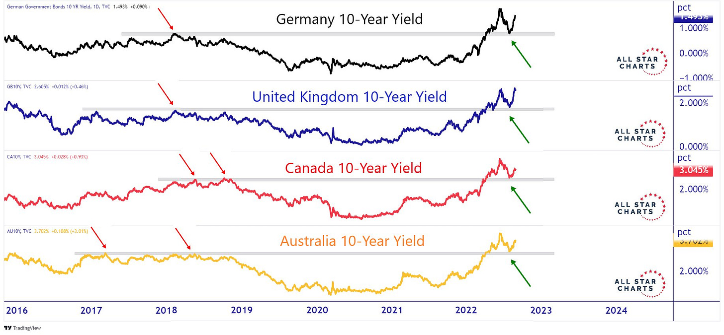
In the fixed income space, still no firm move in either direction, despite (or amid) the hawkish central bank tone around the globe over the past few days. But looking at the following chart, we realize that the move higher in yields is still firmly in place:
Some of the shorter-term yield moves are nothing but astonishing putting them into the context of recent history. Here’s the 2-year yield on US Treasuries for example, now at its highest since 2007:
German Yields are not quite there yet
But look at Swedish rate, where the Bond market has not been nationalized yet (as compared to in the Eurozone…):
The only country not having given a hawkish tone over the weekend, was Japan, which serves as a perfect segue into the currency section, as the impact on the USD/JPY exchange rate was immediate, with the currency pair quickly closing in on the early July highs just below 140:
And here’s a chart on the EUR/USD cross-rate, to which some last-standing Euro bulls try to hang on to:
It shows a positive divergence between price and a momentum indicator (RSI), which would argue for a resolution of the pattern to the upside. I have my doubts …
In commodity markets, clearly natural gas was in focus after an initial, early rally on the back of fears of Russian shutting down supply more than just the three “maintenance” days was violently reversed on the following headline:
*EU PREPARING POWER MARKET EMERGENCY INTERVENTION: VON DER LEYEN
This seems one of the “whatever it takes" moments, which are usually just a bag of hot air and are becoming more and more common in the Euro area, hinting at some level of desperation …
In any case, here’s the chart on Dutch Natural Gas, showing yesterday’s >13% price drop following the headline:
Unfortunately I am (once again) running out of time, and the moment has come to hit the send button.
Enjoy your Tuesday!
André
CHART OF THE DAY
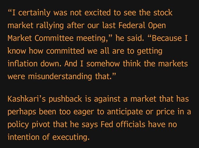
One of the more important ‘happenings’ of yesterday’s session, was a follow-up by Minneapolis’ Fed President and FOMC voting member Neel Kashkari, on Friday’s comments by Lord of the Hawks Powell:
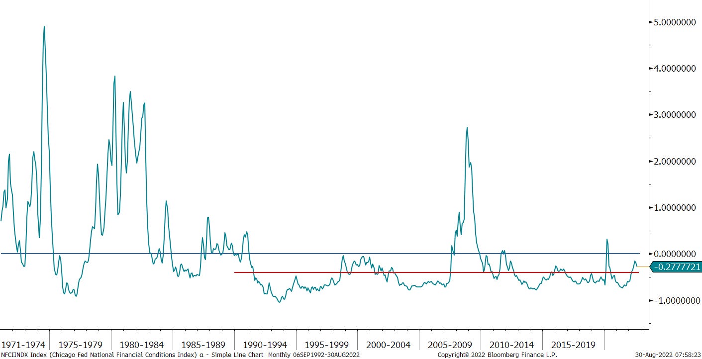
Boom! as my kids would say. Right there in your face. The Fed is on a mission to reduce the wealth effect by tightening financial conditions. There are two main financial conditions indices I am aware of: The Chicago Fed’s FCI and the version calculated by our friends at Goldman Sachs. The next two charts show both of them, with the average line drawn since inception (blue) and the average line since an arbitrarily chosen 1990.
Of course, the question is how much overshoot the conditions should be tightened. Stay tuned …
Thanks for reading The Quotedian! Subscribe for free to receive new posts and support my work.
DISCLAIMER
Everything in this document is for educational purposes only (FEPO)
Nothing in this document should be considered investment advice
Past performance is hopefully no indication of future performance


Lord of the Hawks🤣