

It is what it is
The Quotedian - Vol V, Issue 104

“Buy bonds, wear diamonds”
— Wall Street Adage
DASHBOARD

AGENDA

CROSS-ASSET DELIBERATIONS
This will be a short edition, with just some key observations, as the holiday continues to be extremely tough …

Anyway, as mentioned, some observations only today.
The first one is a continuation of the rant I have been on for the past two or three weeks and I start feeling like an old man shouting at a TV (which is probably what I am, sigh). Stocks went up over the past few weeks because they expect weaker economic growth (aka recession) and ergo the end of the tightening cycle. Now stocks go up because economic data is somewhat better than expected. In both cases, equity investors are digging their own graves.
But in the meantime, it is what it is…
Stocks had another strong up day on Wednesday, apparently and as aforementioned on better economic data. The S&P is about to breach the high from the June rally at 4,176 and hence would break the pattern of lower lows and lower highs for the first time since the beginning of the year:

The last excuse for bears would then expire at around 4,300. So, the whole decline from the top would turn out to be just another of those typical corrections:

Albeit typical should probably be written in ALLCAPS, as it was/is/may be the 4th largest intra-year correction in JPMs super interesting chart above. Though, and this is important, the graph above measures the drawdowns and yearly returns during the entire deflationary period of the past forty years, where the point could be made that the regime may have changed to inflationary. Stay tuned…
In terms of sector performance, yesterday “longer duration” stocks were in favour, whilst energy stocks got hit badly:

Basically, just a confirmation that the whole rally is about snapback and short covering, but there I am shouting at my TV (screen) again…
Bond yields moved higher on the improved economic readings, approaching the recently breached support zone now from below, testing it as a resistance. The US 10-year yield chart remains extremely interesting with its potential shoulder-head-shoulder pattern:

High yield spreads continue to contract, confirming the positive bias of equities for now. Here’s the BofA US High Yield Spread Index:

The US Dollar has found some footing over the past two sessions, after weakness since mid-July. Here’s the chart of the USD Index (DXY):

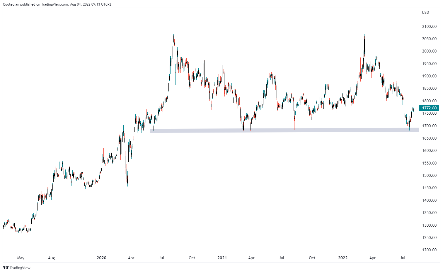
Finally, moving into the commodity space, the chart of Gold continues to be pretty constructive, building up on the rebound from the key support zone at 1,700:
At the same time, Oil is struggling to hold above support, but so far has not completely broken down yet:

Ok, time to hit the send button. Back over the weekend with the weekly round-up.
Enjoy!
CHART OF THE DAY
And what if everything was just a bad dream? The ratio of Nasdaq to S&P 500 is turning up from the long-term support line. Was this just a necessary pull-back to work off an overbought condition? Stay tuned …

LIKES N’ DISLIKES
Likes and Dislikes are not investment recommendations!

Energy stocks (XLE)
Long some Gold (direct or via short puts)

DISCLAIMER
Everything in this document is for educational purposes only (FEPO)
Nothing in this document should be considered investment advice
Past performance is hopefully no indication of future performance