

It's a Material World
Vol VIII, Issue 22 | Powered by NPB Neue Privat Bank AG

"The stone age didn’t end for lack of stone."
— Sheikh Ahmed Zaki Yamani
Enjoying The Quotedian but not yet signed up for The QuiCQ? What are you waiting for?!!

Last week we skipped The Quotedian as we were fully tied up with the publishing of our NPB CIO Outlook for Q3/2025, of which you can find a copy in our Press Room on our website:
And/or you can watch and listen to the executive summary presented by Avandré 😉:
The outlook, together with its accompanying 100+ pages strong chart book holds many gems. The one we want focus on as introduction to this week’s Quotedian and inspiring the subtitle “It’s a Material World” is our view of an upcoming relative outperformance by the (basic) materials sector.
One of the key charts arguing for materials to shine over the coming weeks to months is the following:
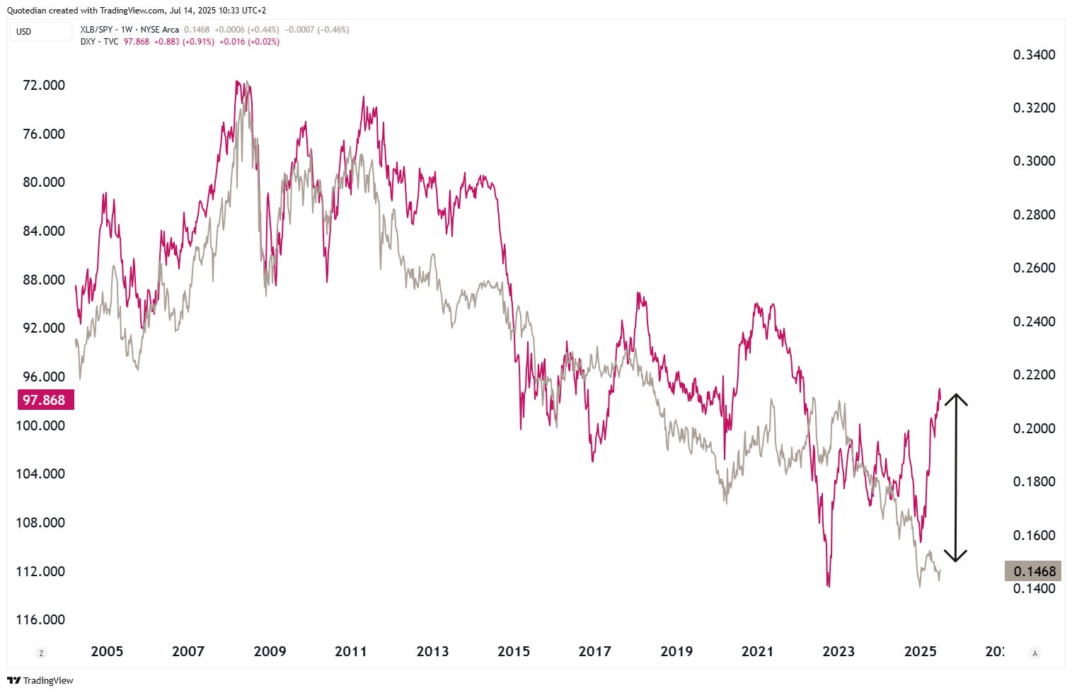
The grey line is the ratio of the SPDR Materials ETF (XLB) to the SPDR S&P 500 ETF (SPY) whilst the red line is the Dollar Index on an inverted scale (lhs).
The elevated correlation between the two is clearly visible, but can also be shown in ‘official’ correlation calculations (see lowest clip):
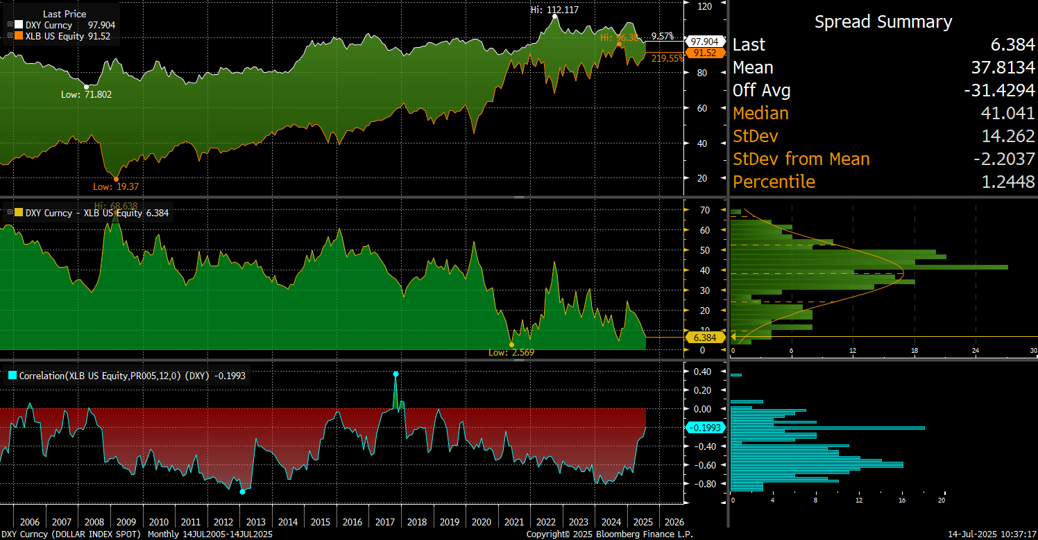
In the correlation calculation above the US Dollar index is NOT inverted, leading to this high negative correlation. Also, we used here the XLB only and not a ratio to the SPY for ease of interpretation.
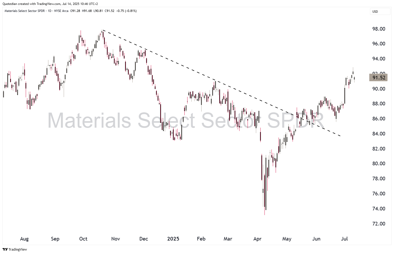
Looking at the chart of the XLB on a stand-alone basis, we note that the sector has picked up 26% since the April lows,
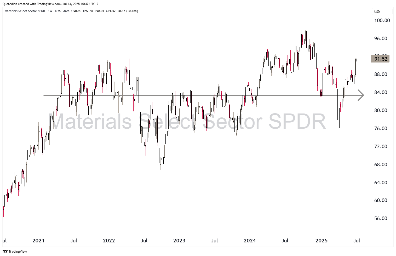
but has gone nowhere over the past five years:
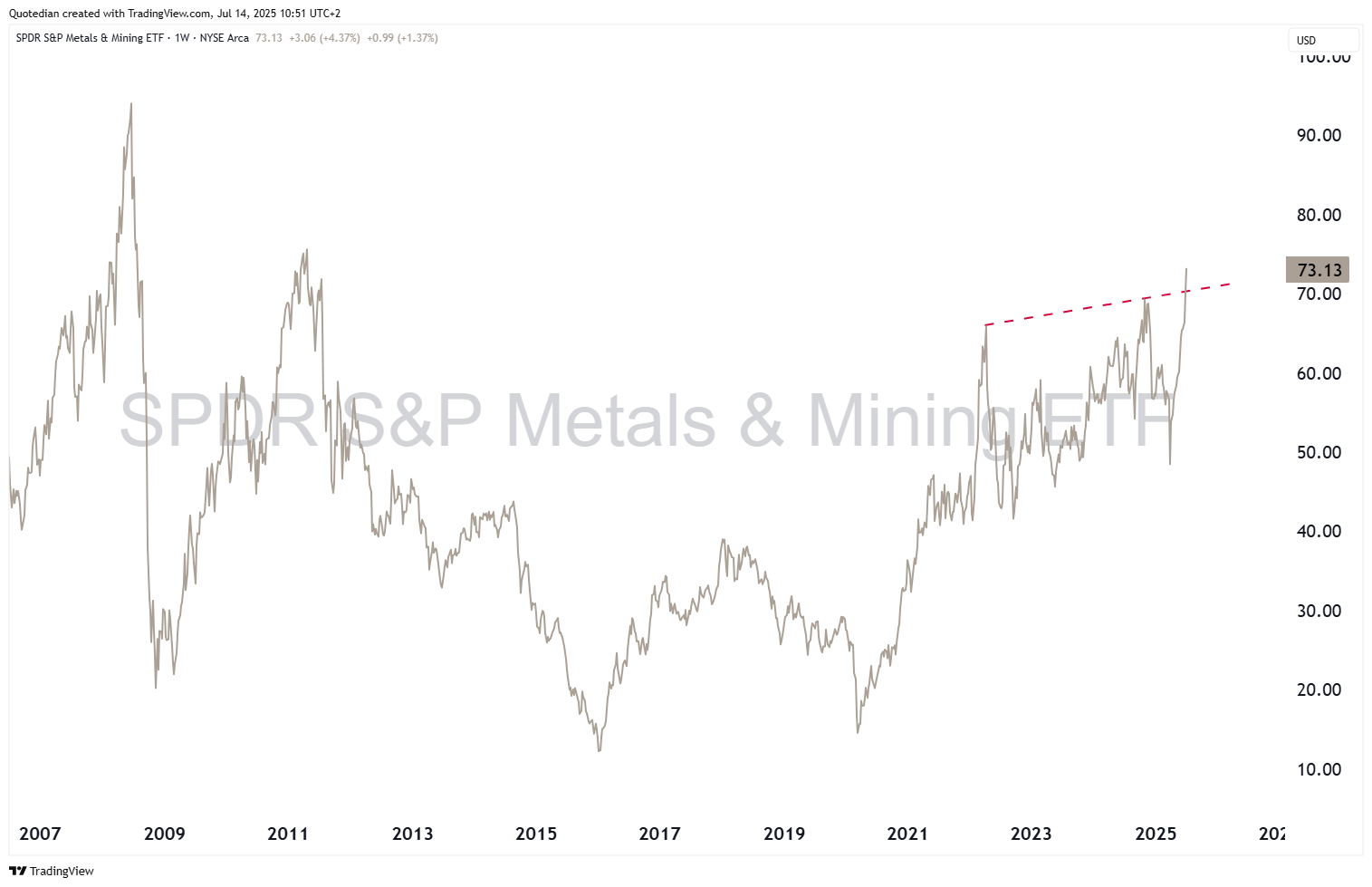
However, if we take a sub-segment of the materials sector, namely the metals & mining sub-industry, using the SPDR Metals & Mining ETF (XME) as a proxy, we note a much sharper rally (+60%) has taken place already:
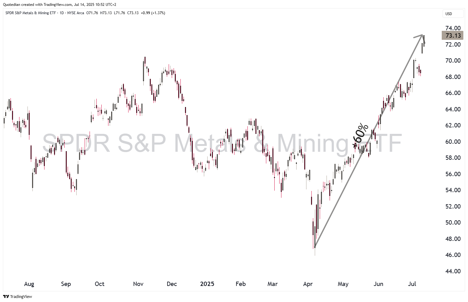
The longer-term chart reveals that indeed new cycle highs have been reached, but not all-time highs:
And here’s yet another interesting way to look at the sector:
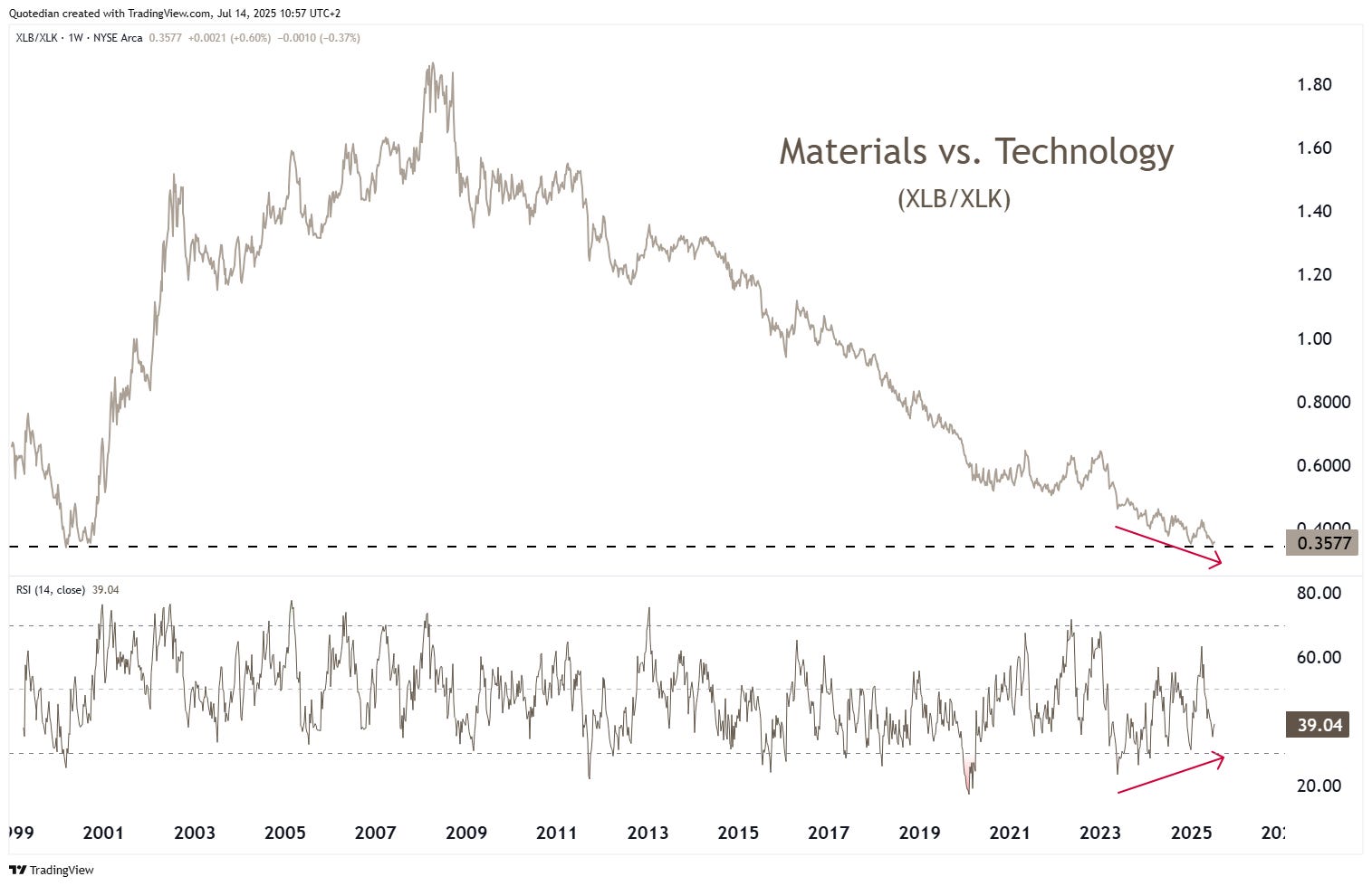
The chart above shows in the upper clip the ratio between material (XLB) and technology (XLK) stocks. The lower clip shows the 14-period RSI (Relative Strength Index) of the ratio. The two main observations are that 1) material stocks are as ‘cheap’ versus the technology sector as they have not been since the Dotcom-bubble and ) price and momentum indicator are showing a positive divergence. Both argue for materials stocks maybe starting to outperform tech stocks:
“Leave Silicon Valley for the Mesabi Range.”

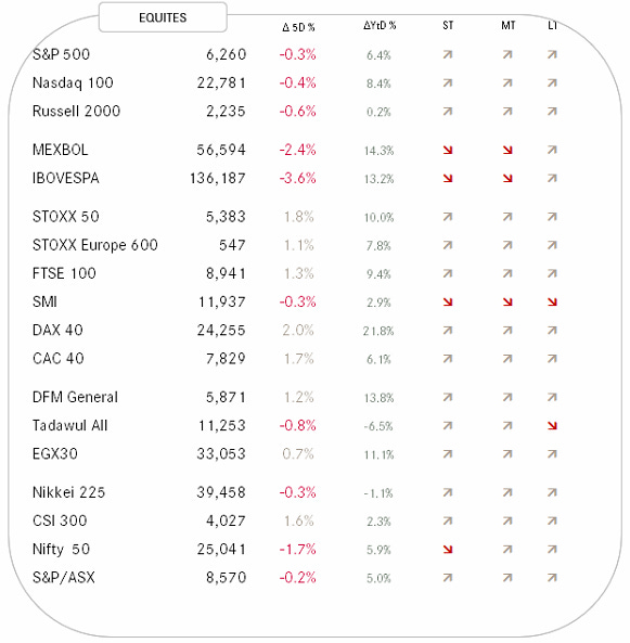
Below the developments of major global equity markets over the past week and year-to-date and their respective short-, medium- and long-term trends:
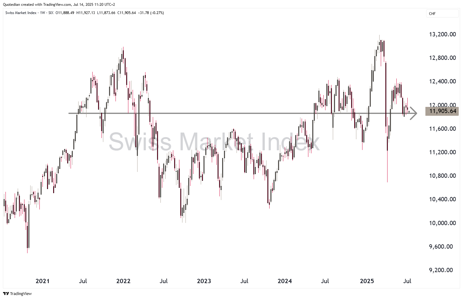
The SMI stands out immediately, with all three trend arrows pointing lower. Here’s the daily chart of this index:
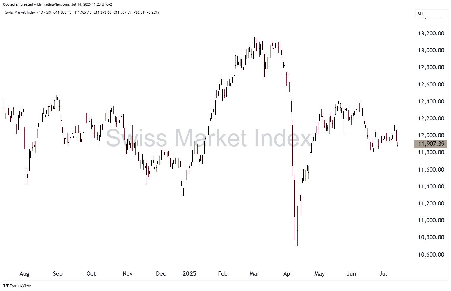
Really not a constructive picture and the weekly chart reveals that the index has gone nowhere over the past nearly five years:
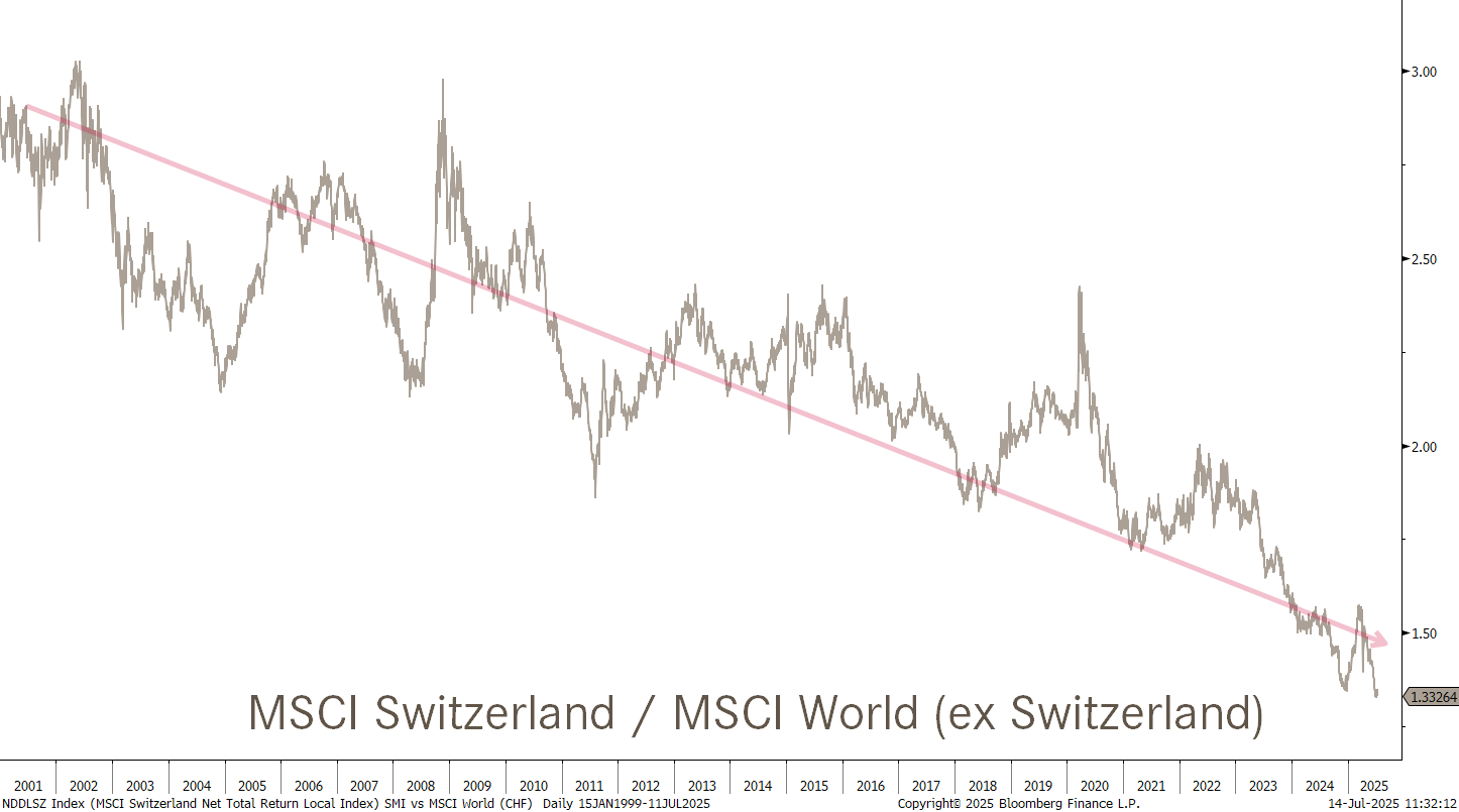
A relative chart of the Swiss equity market to the global stock market reveals that this under performance is not exactly new, but rather has been ongoing for over two decades, with only short periods of relieve in between:
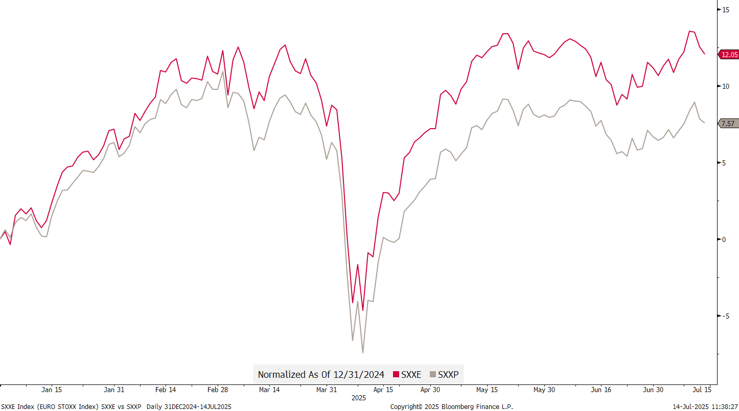
Switzerland’s underperformance would than also at least partially explain the underperformance of the STOXX 600 index (grey), which includes Swiss, British and Swedish stocks, to the Eurozone-only focused EURO STOXX index (red):
The absolute chart of the STOXX 600 index continues to ‘feel’ a bit top heavy:

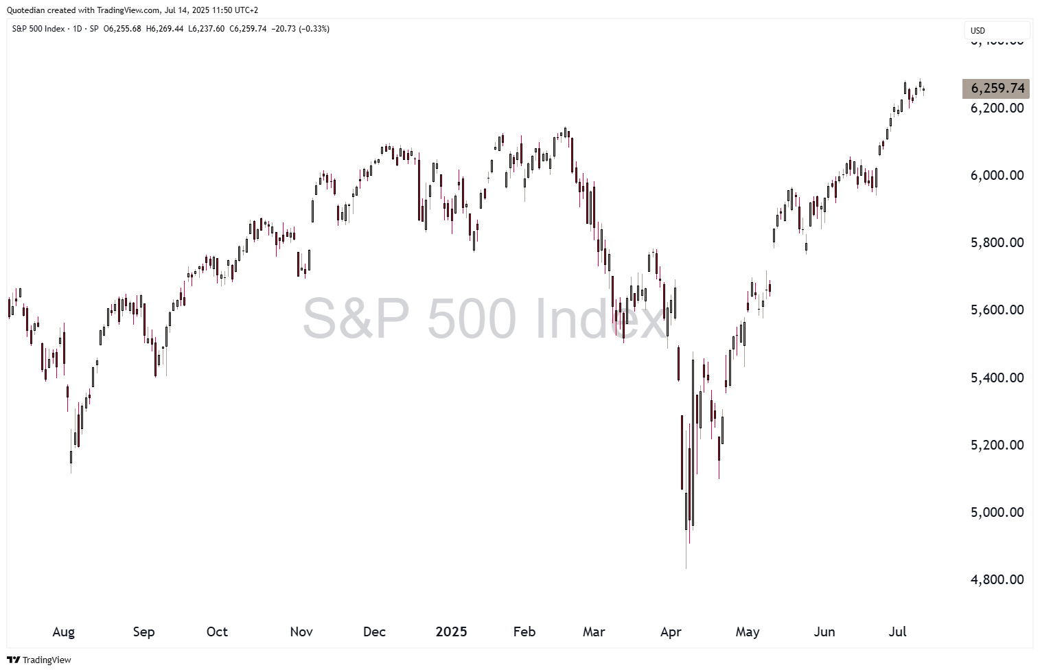
Hoping over the Atlantic, we note that the S&P is not looking sooo toppish, but rather is reaching new ATH after new ATH:
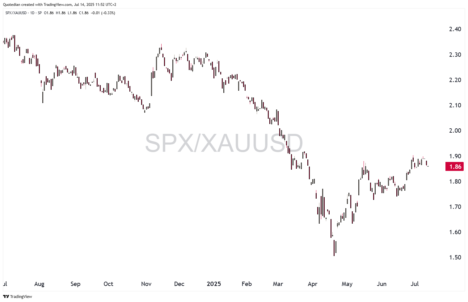
But is this only because the US Dollar is ‘collapsing’? After all, the index does not look equally great when studied in Gold (remember JP Morgan saying: “Gold is money, everything else is credit”?):
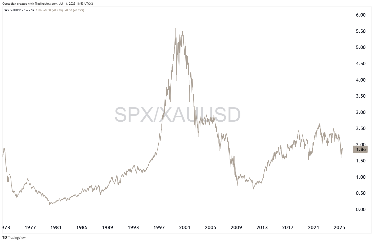
Actually, this exercise is getting quite depressing when looking at the same chart over a longer-term period:
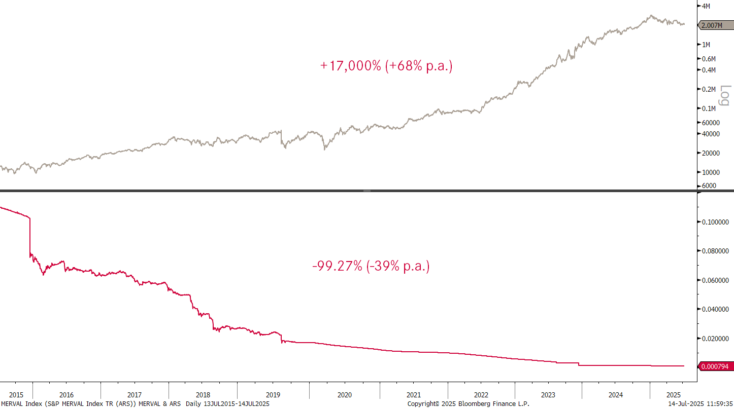
Not that I would ever compare the US to Argentina (for reasons only known to me), but the Merval also did great whilst the Peso was in free fall:
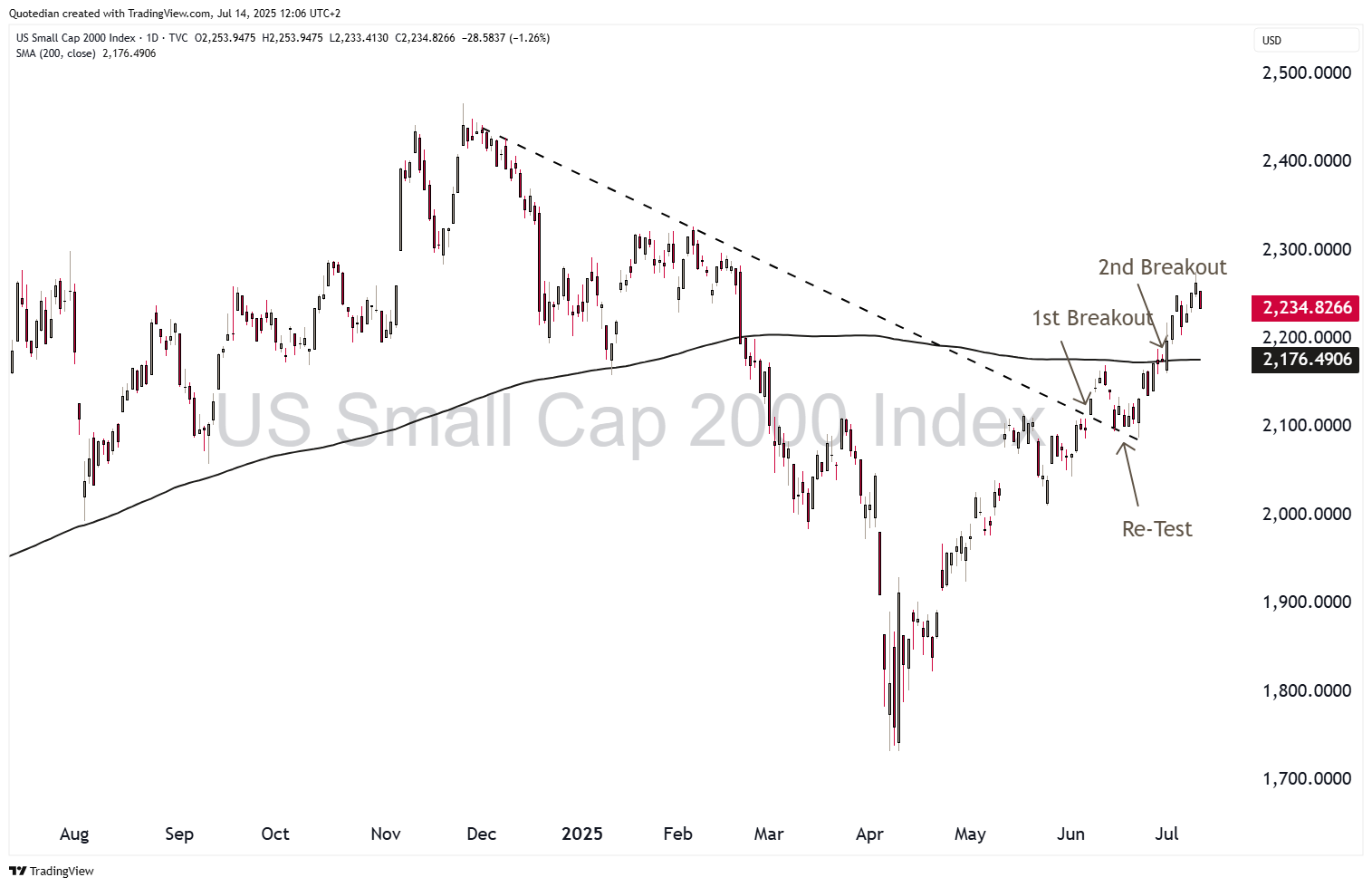
But back to more pleasant ‘things’ … the breakout of the Russell 2000 (small cap stocks) looks sustainable:
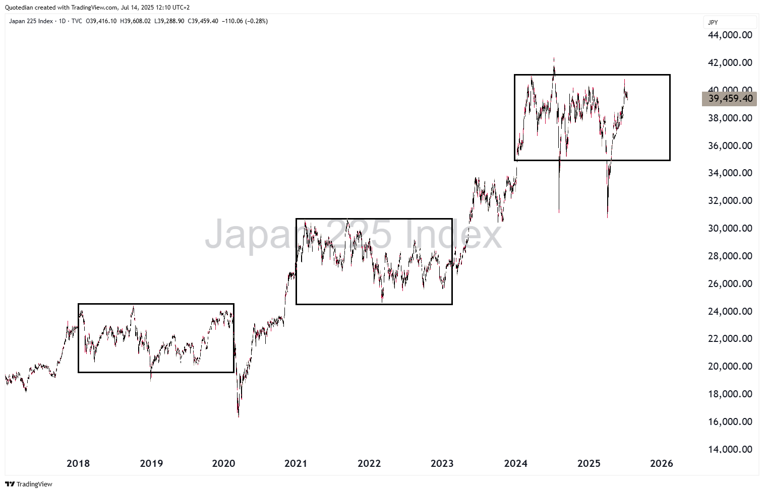
Over in Asia, Japanese stocks continue within their consolidation window,
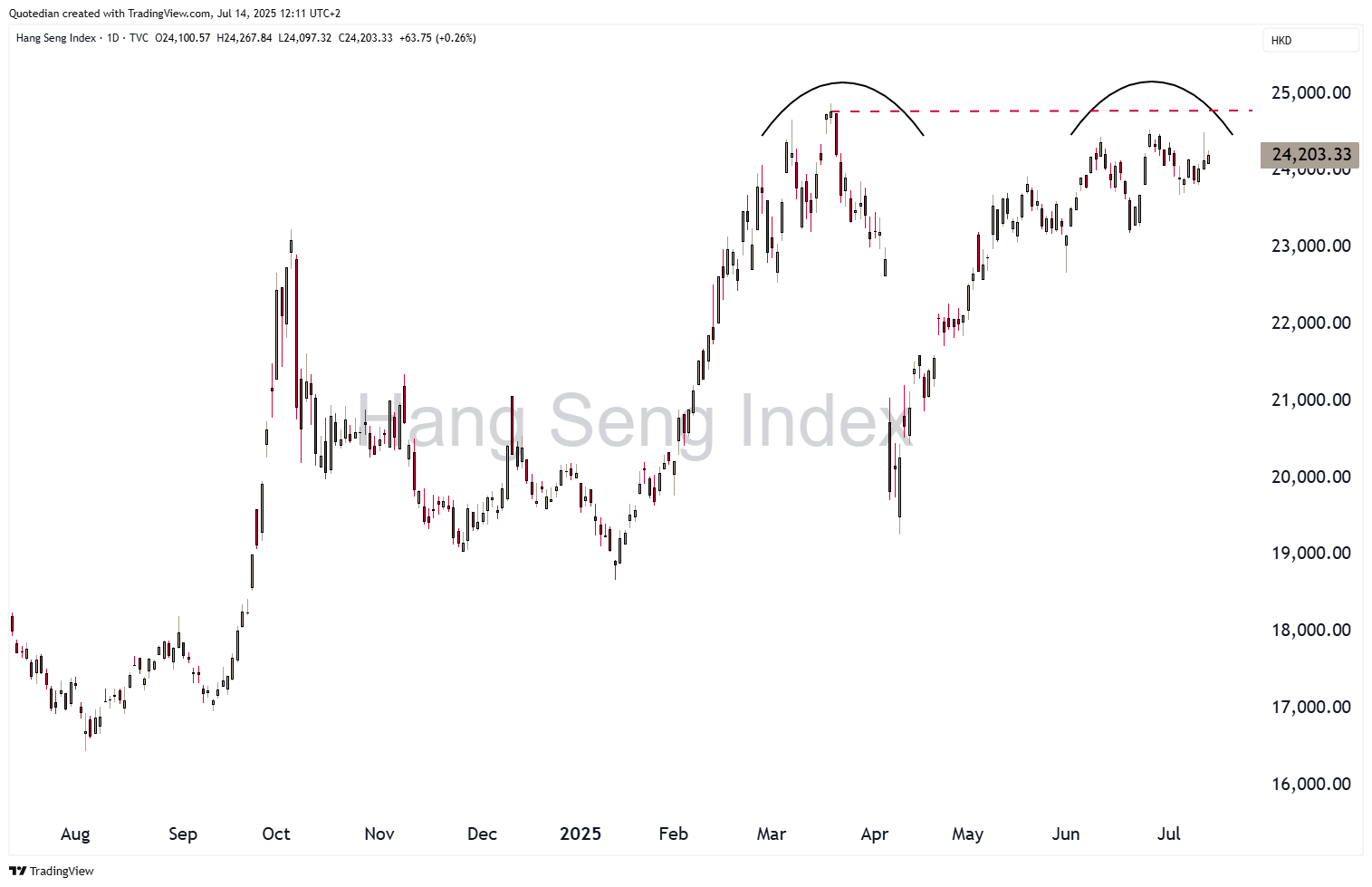
whilst Hong Kong’s Hang Seng index is at the danger of putting in a double top:
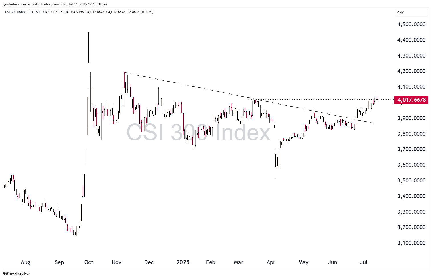
But Chinese mainland stocks (CSI300) are suddenly showing signs of life again, with the index looking really pretty bullish if 4,020 (dotted line) can be exceeded:
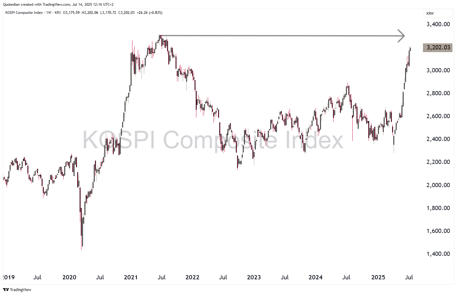
One market we probably did not pay enough attention to is South Korea’s KOSPI:
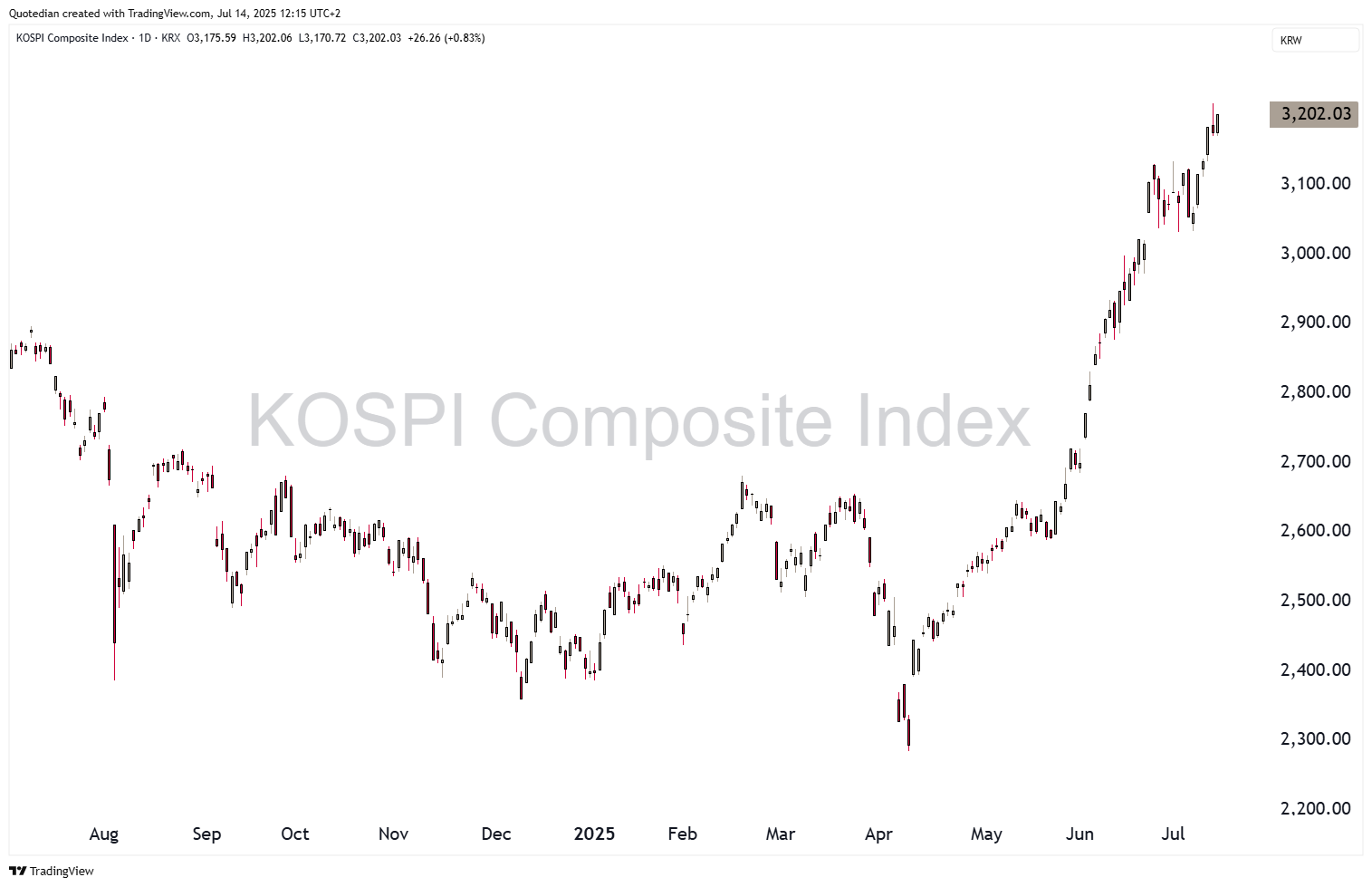
Up 33% year-to-date, it is the best performing index in wider Asia and the longer-term chart reveals that we are quickly closing in on the 2021 all-time highs:
In terms of sector performance over the past five days and year-to-date, we find the following scene:
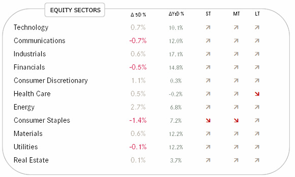
Except for the (defensive) consumer staple stocks, trend arrows are pointing upwards pretty everywhere.
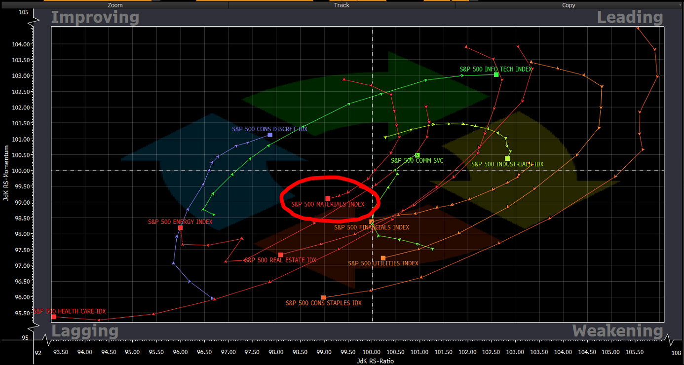
We already expressed our ‘love’ for the materials sector, though Bloomberg’s Relative Rotation Graph (RRG) model would suggest there’s not too much of a rush to get invested, as the sector remains in the LAGGING quadrant (US market):
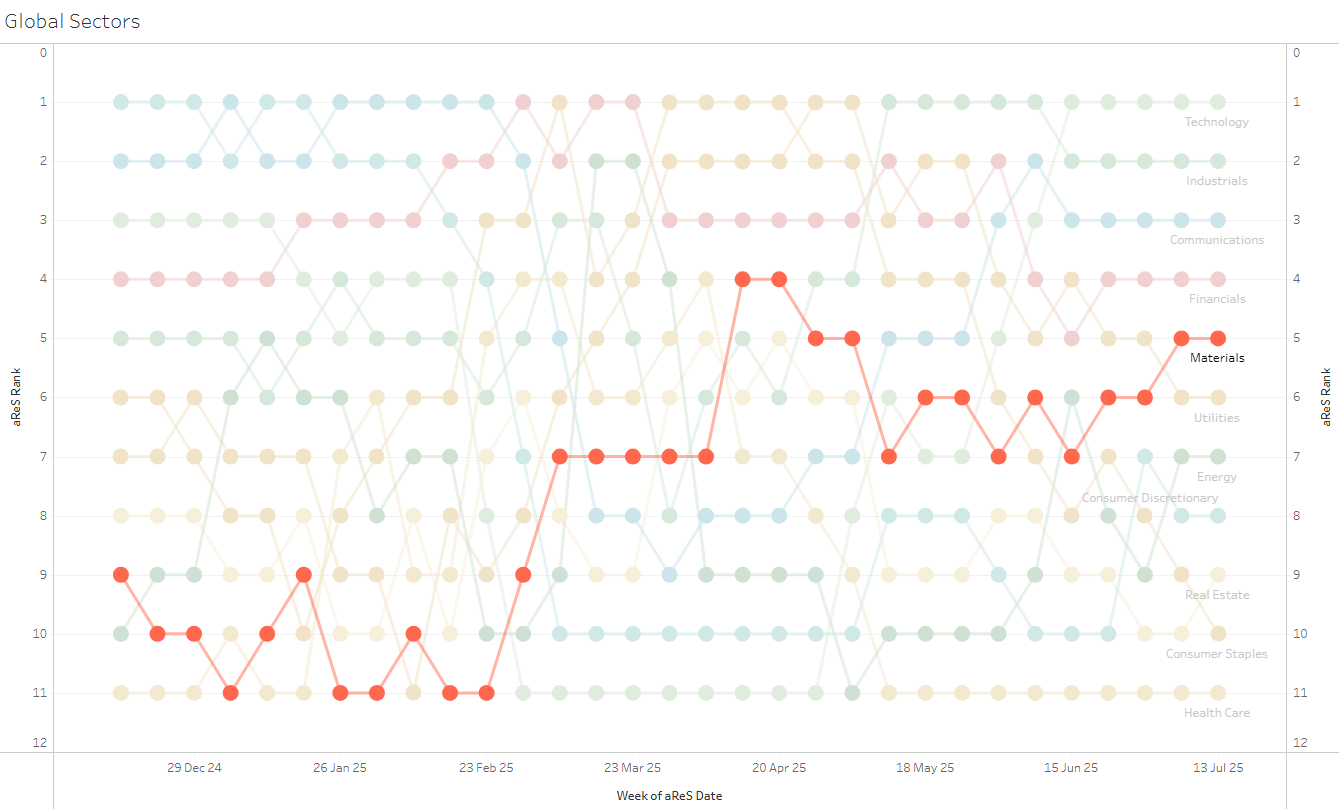
Our own aReS™ ranking model is somewhat more positive, placing materials on a global level in the top 5 and improving:
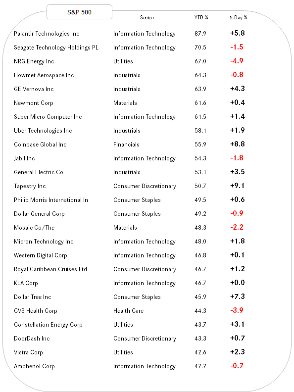
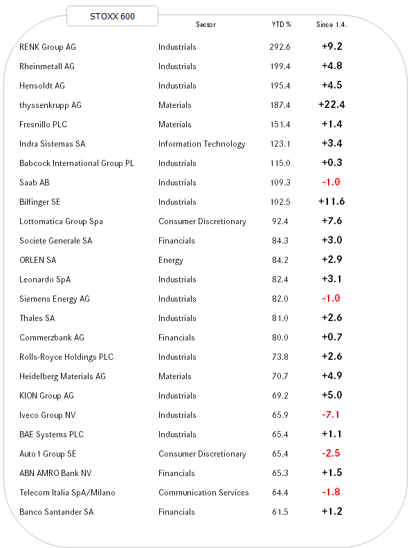
Nearly last but definitely not least, here are our usual lists for the best performing stocks in the US and Europe on a year-to-date basis and how they have performed over the past week.
Remember, strength💪🏻begets strength💪🏻 😉
Here’s the US list:
And here the European equivalent:
Now, just as before we leave the equity section and you started feeling bullish as hell and all, consider this:
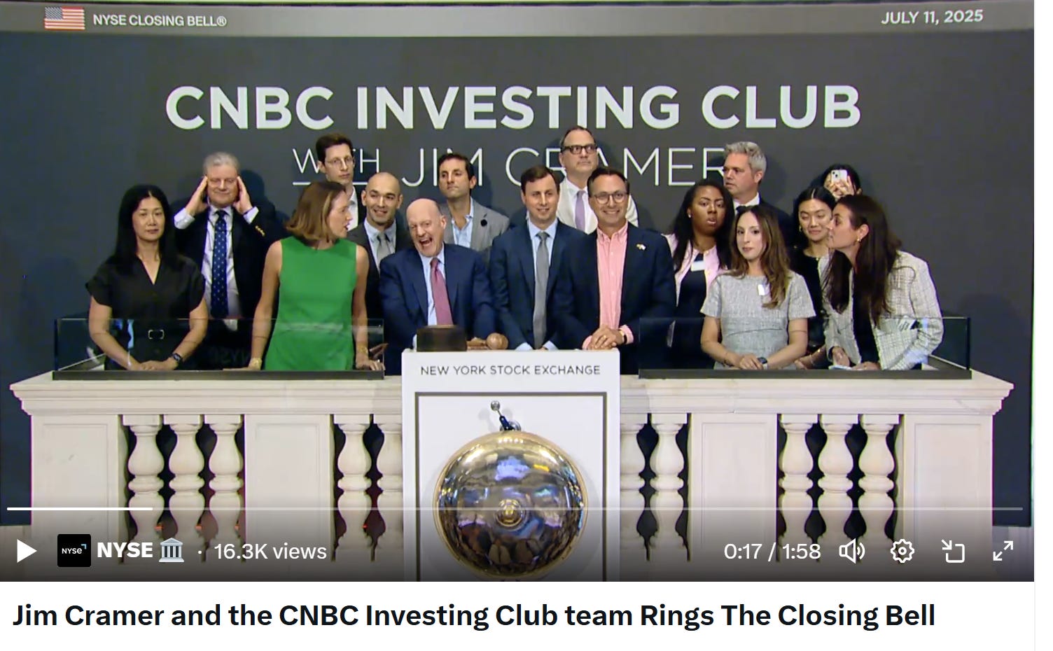
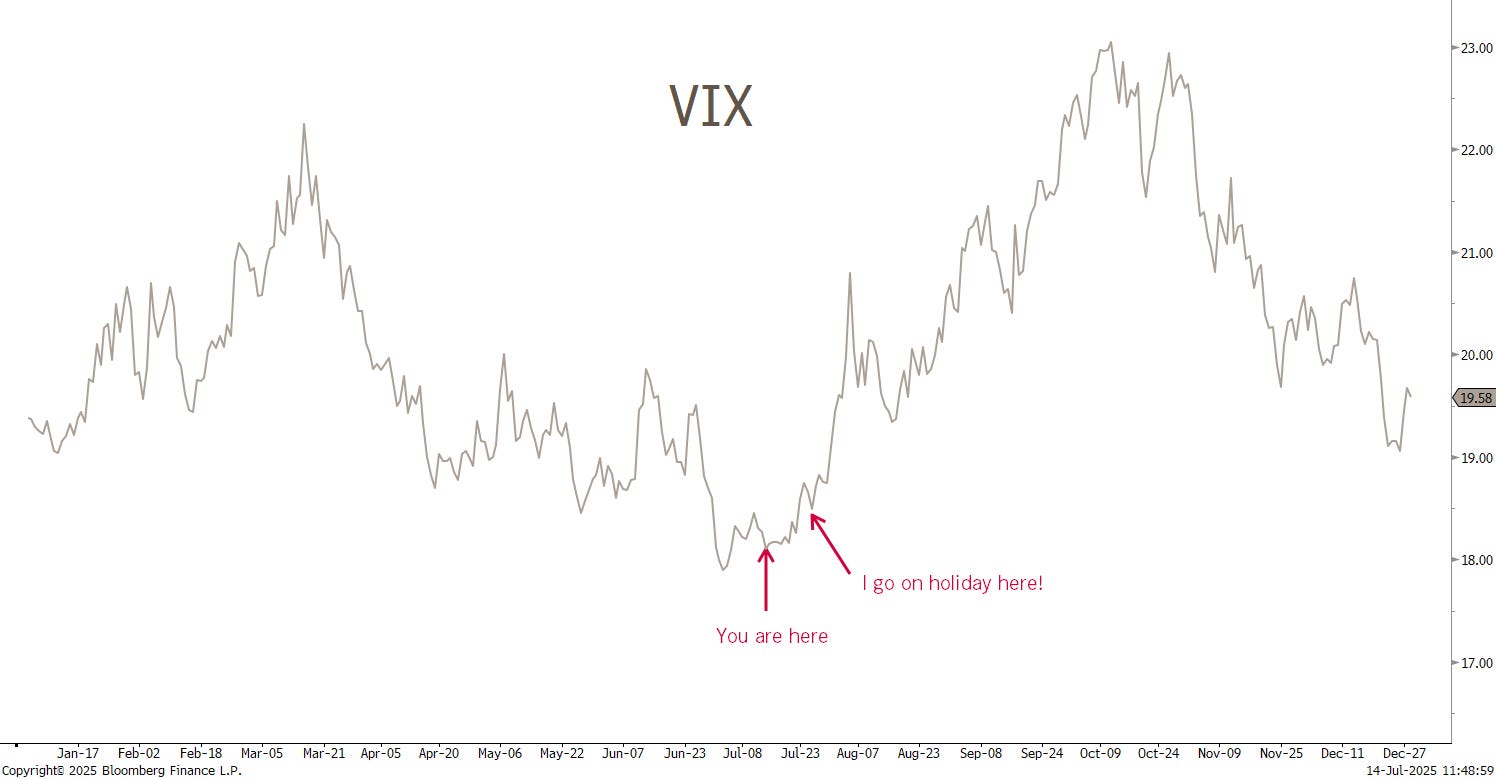
Yes, this is Jim Cramer ringing the bell on the New York Stock Exchange last Friday (11/7) … I know the saying is that “they don’t always ring a bell at the top”, but …
… couple that with the seasonility chart of the CBOE S&P 500 volatility index, better know as the VIX and an undeniable pattern of all hell breaking lose when I leave for summer holiday (last year’s edition: the Yen-carry trade sell-off) and it may be a good time to buy some protection:

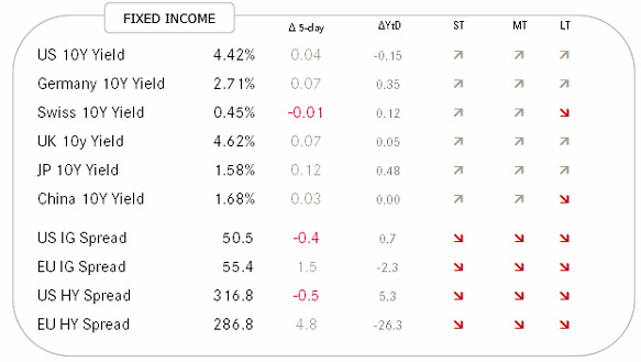
In the fixed income space, the direction for most government bond yields is to the upper side, according to our trend model:
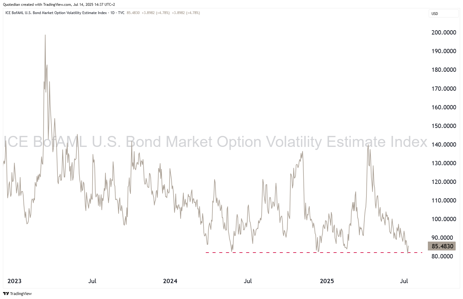
Probably most importantly, has bond volatility, as measured by the ICE BofA MOVE index, or in short the MOVE come down quite substantially after a dramatic volatile period post Liberation Day:
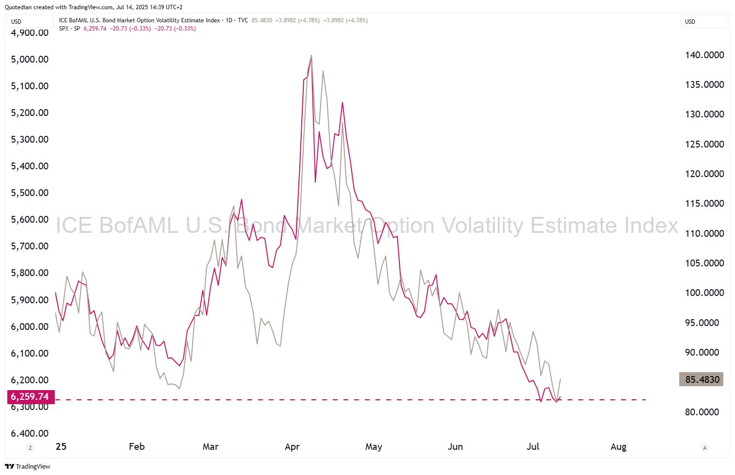
The drop in the MOVE (grey) has been beneficial for the stock market (S&P 500 - red):
The ‘relaxation’ of the bond volatility is somewhat surprising, given that Fed Boss Powell is under attack from all sides to step down rather sooner than later:
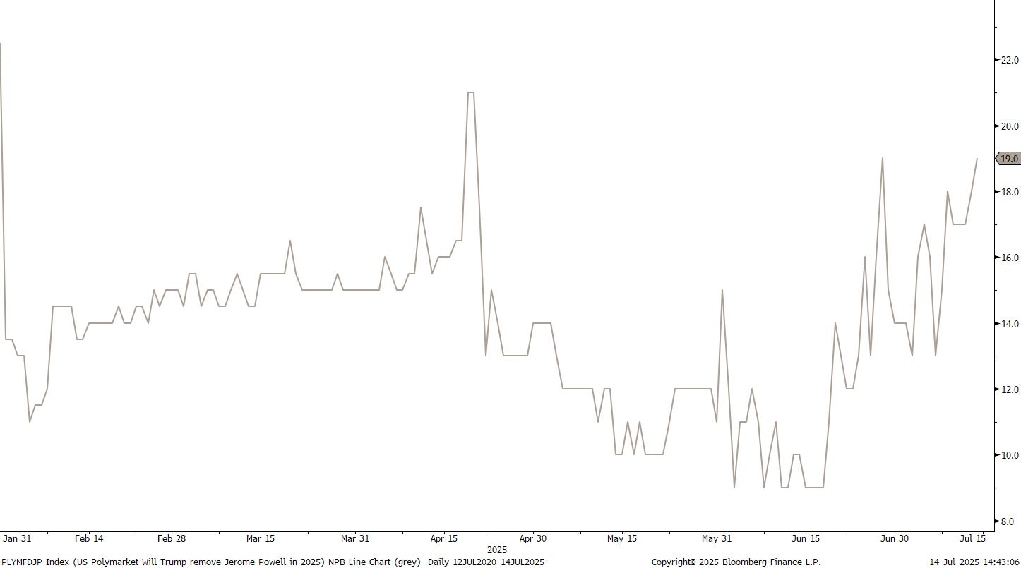
One source suggested this morning that removing Powell would add 40 basis points to the 10-year. Is this why rates are higher today:
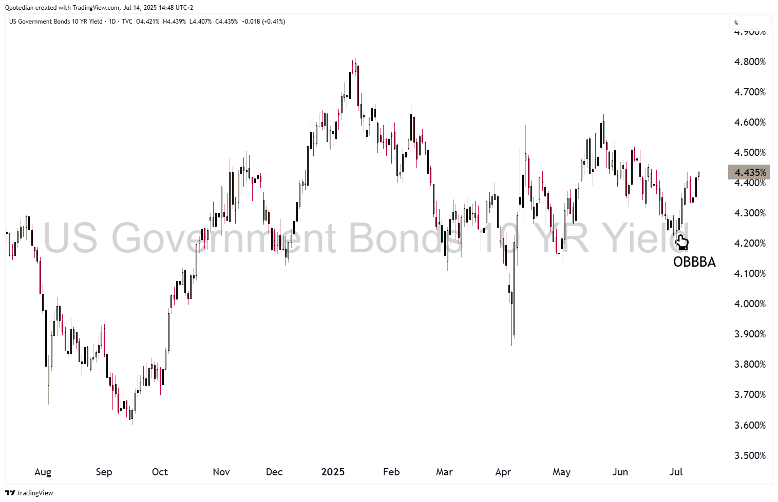
Or is it still reminiscent inflationary pressures since the approval of the OBBBA?
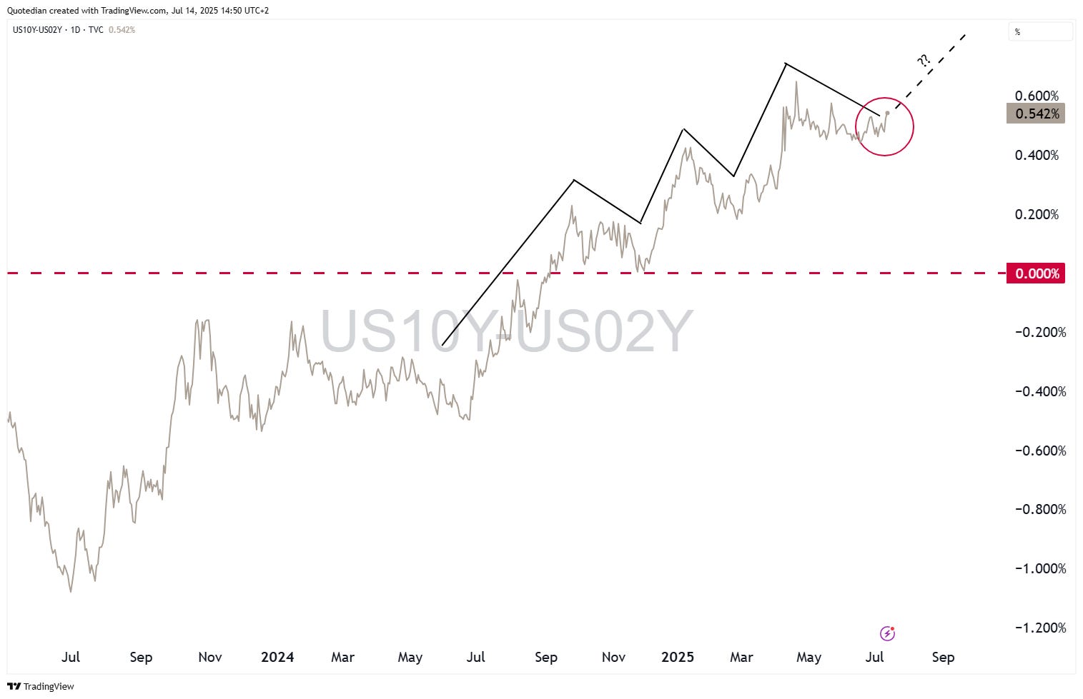
Is the next stair-step in the yield curve (10y-2y) underway?
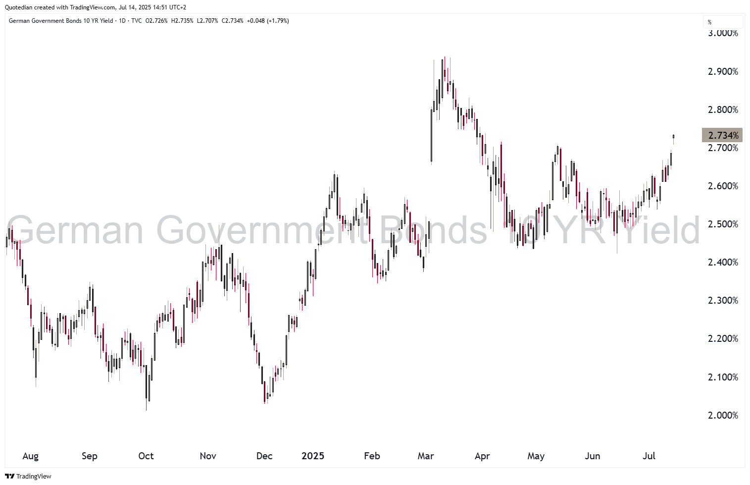
German 10-year yields (as proxy for the Eurozone) are five basis points higher this morning after Trump “granted” Europeans a 30% tariff starting August 1st:
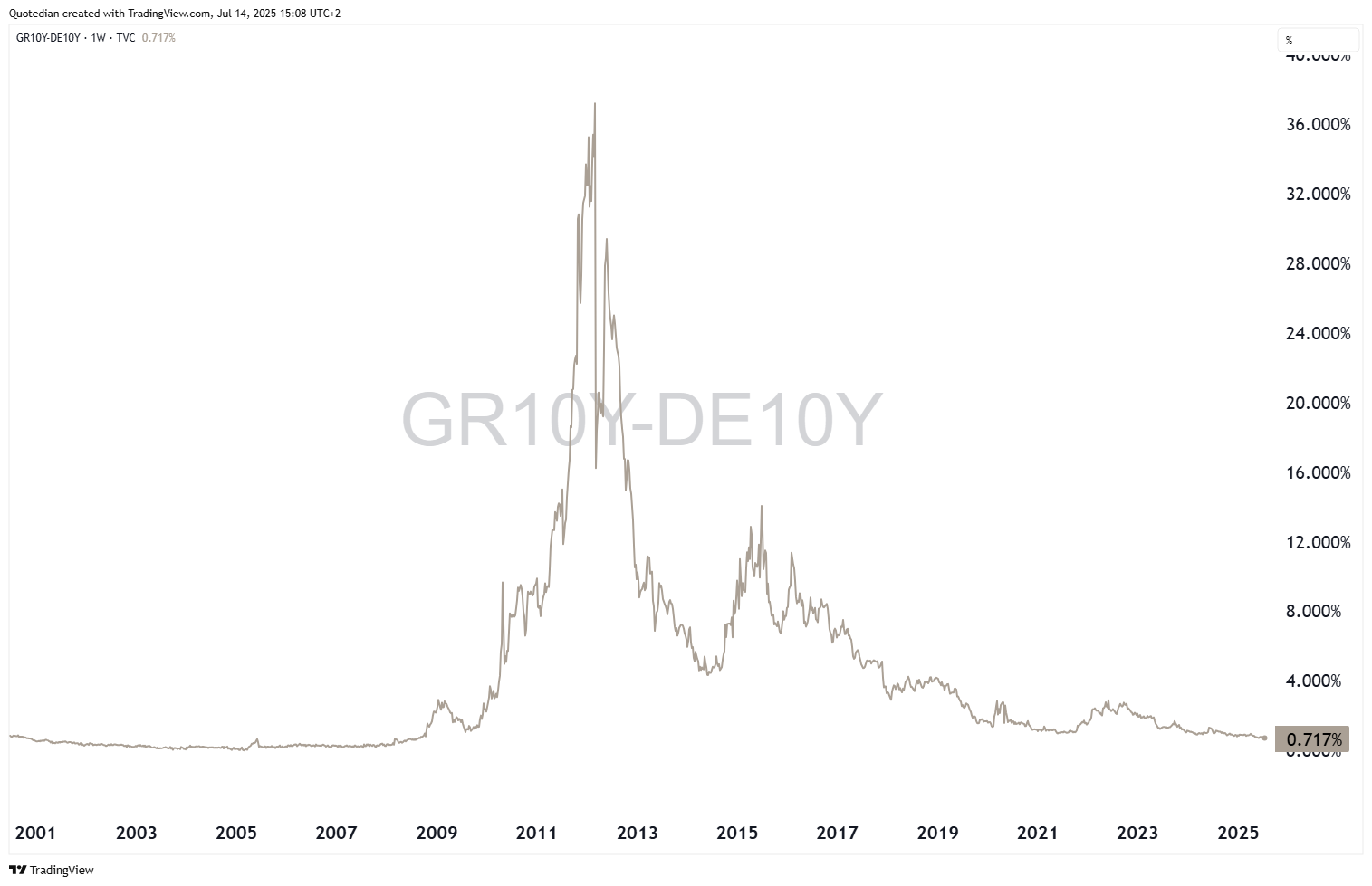
Staying in Europe a moment longer, it is now 10 years since the Greek drama unfolded, with the country teetering on the brink of eurozone exit, shutting its banks, imposing capital controls, and defying creditors in a dramatic referendum — only to ultimately accept harsher bailout terms in a stunning political U-turn that marked the climax of Europe’s sovereign debt crisis.
The Greek—Greek 10-year yield spread has come a long way since then:
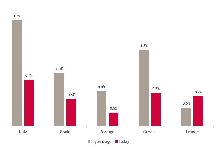
Related, here’s one chart out of our 120+ pages strong Q3 chart book, showing that over the past two years the entire Club Med has narrowed their bond spreads over the German Bund, with one exception: France!

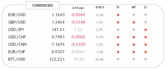
Here are some of the most important FX crosses:
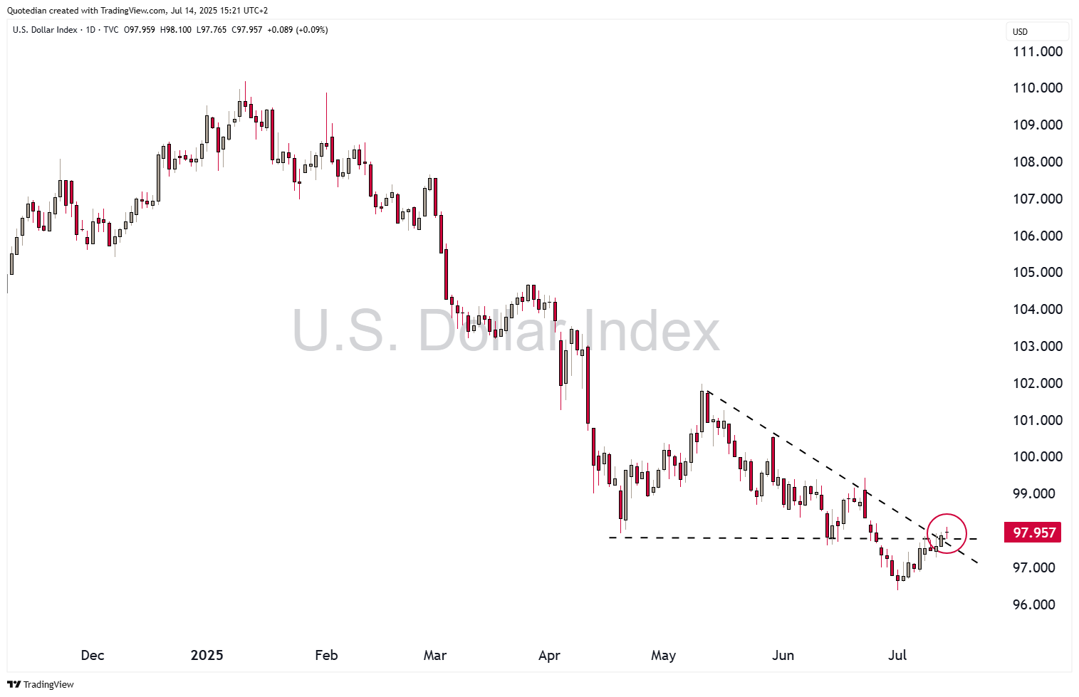
The US Dollar is continuing its consolidation period and today’s move of the Dollar Index (DXY) to 98.00 has improved the short-term outlook a bit further:
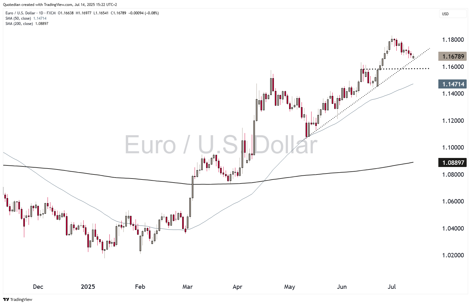
However, versus the Euro, the Dollar recovery still feels to be on weak legs:
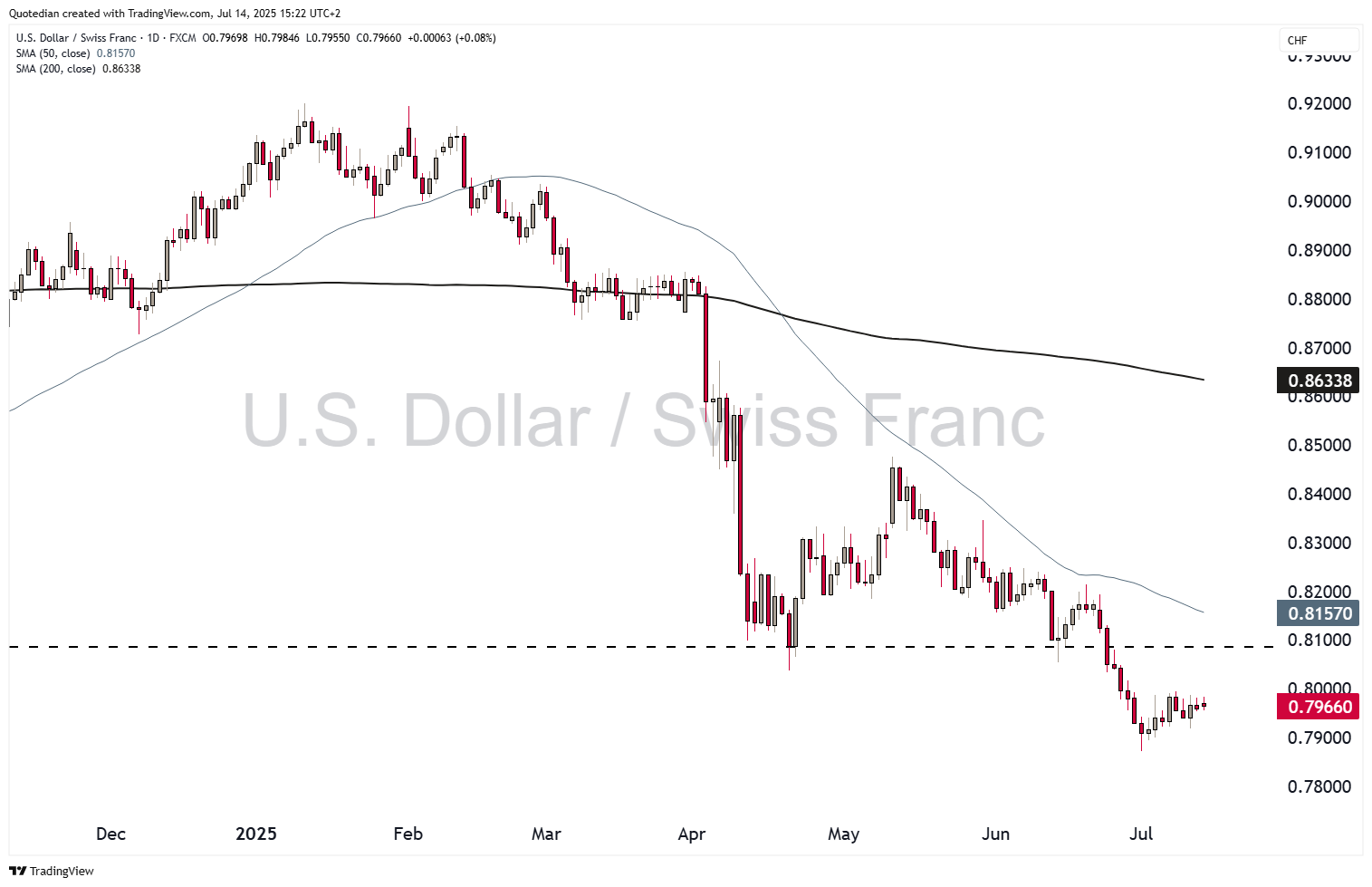
And even worse versus the mighty Swiss Franc:
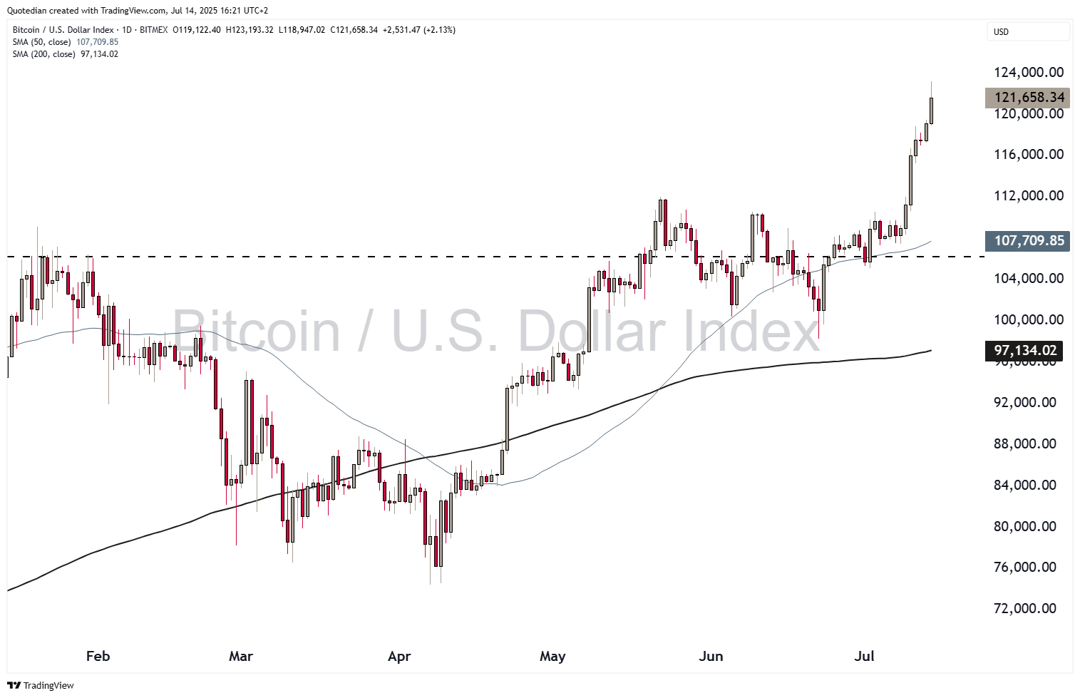
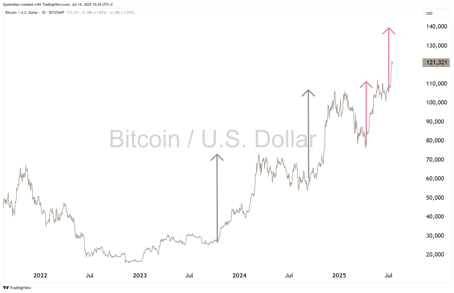
In cryptocurrencies la-la land, Bitcoin has broken out to the upside and is putting in ATH after ATH:
If the pole & flag pattern continues to hold, USD140,000 should be the next target:

Finally, in the commodity space, it will come as no surprise that we are bullish on many segments here too, given our positive outlook on materials and negative view on the Greenback.
But just as an investor nowadays cannot say he’s bullish on emerging markets but rather has to define which emerging market, the commodity segment is too large and diverse to be able to be generally bullish on commodities.
Against equities, commodities are ‘undervalued’ since years:
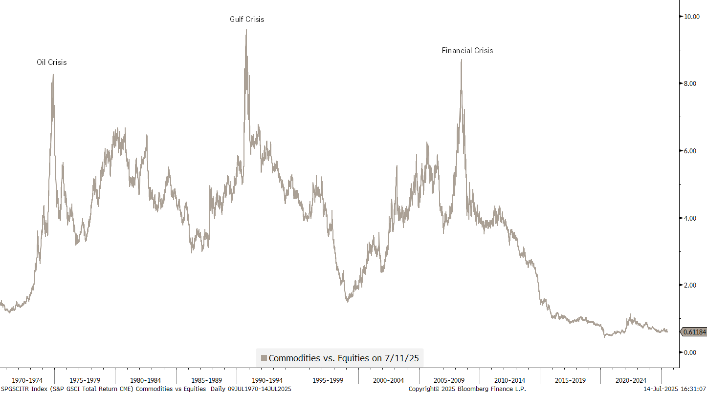
The wait has been long and continues for now.
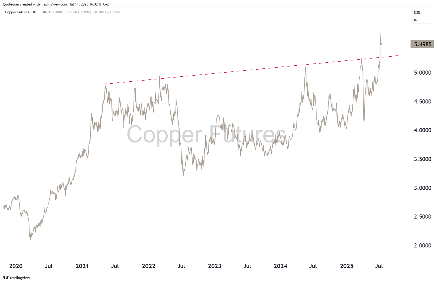
Copper joined the party last week, but on the back of the proposed 50% tariff from one Mr Trump:
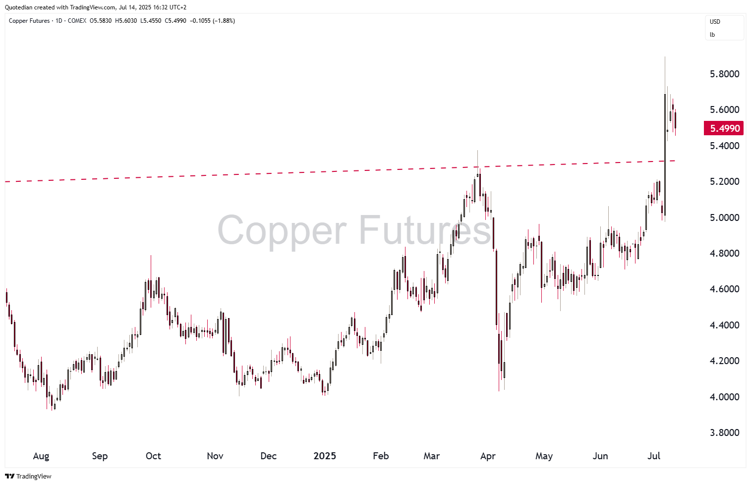
Still, in charting terms, the breakout was important:
The big commodity missing to make the rally really take off is of course oil, which has a 30% weighting in the Bloomberg Commodity index (BCOM) and a 40%-plus weighting in the S&P GSCI Commodity index.
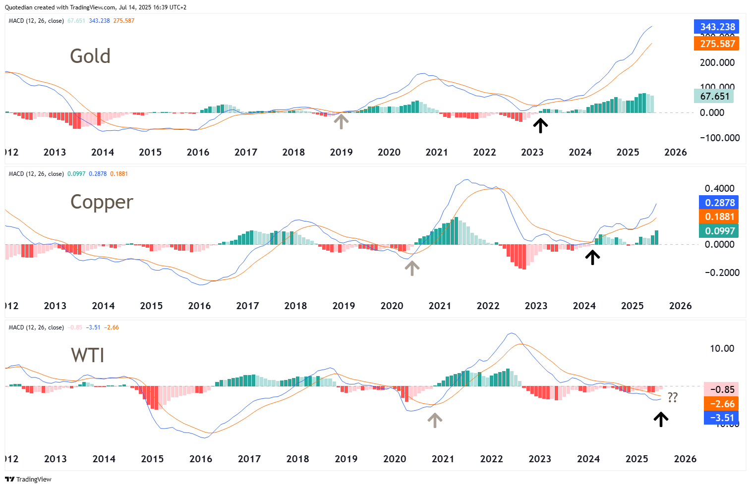
Here’s an interesting theory. Gold moves first, followed by copper, then followed by oil. This was the case in the 2019-2021 cycle (grey arrows) and may be unfolding again:
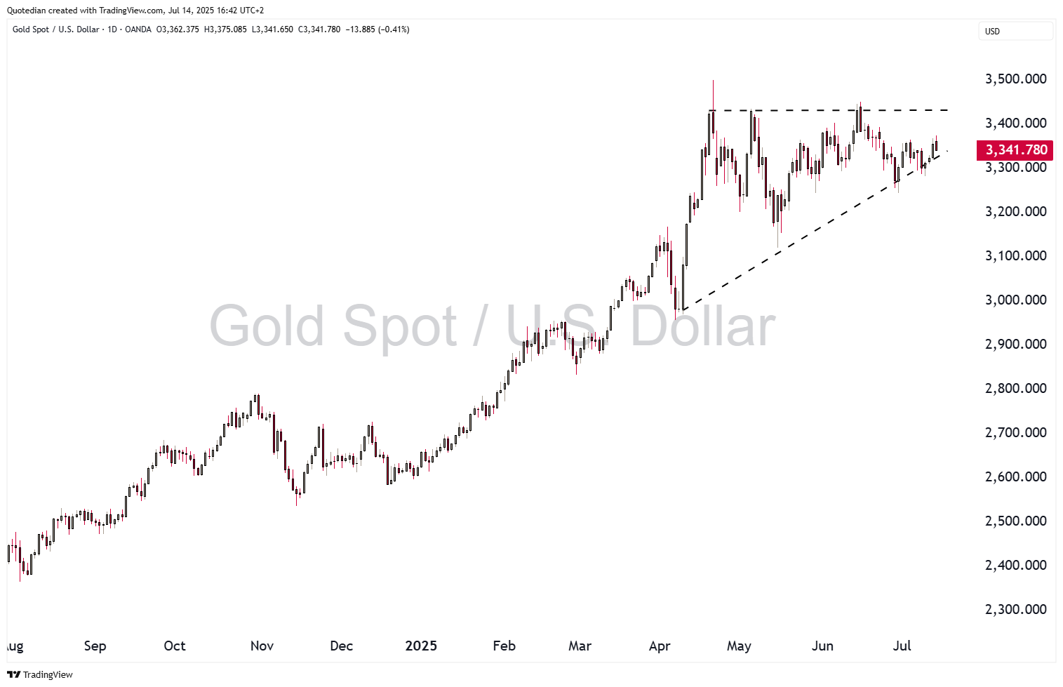
Speaking of Gold, the yellow metal is still consolidating:
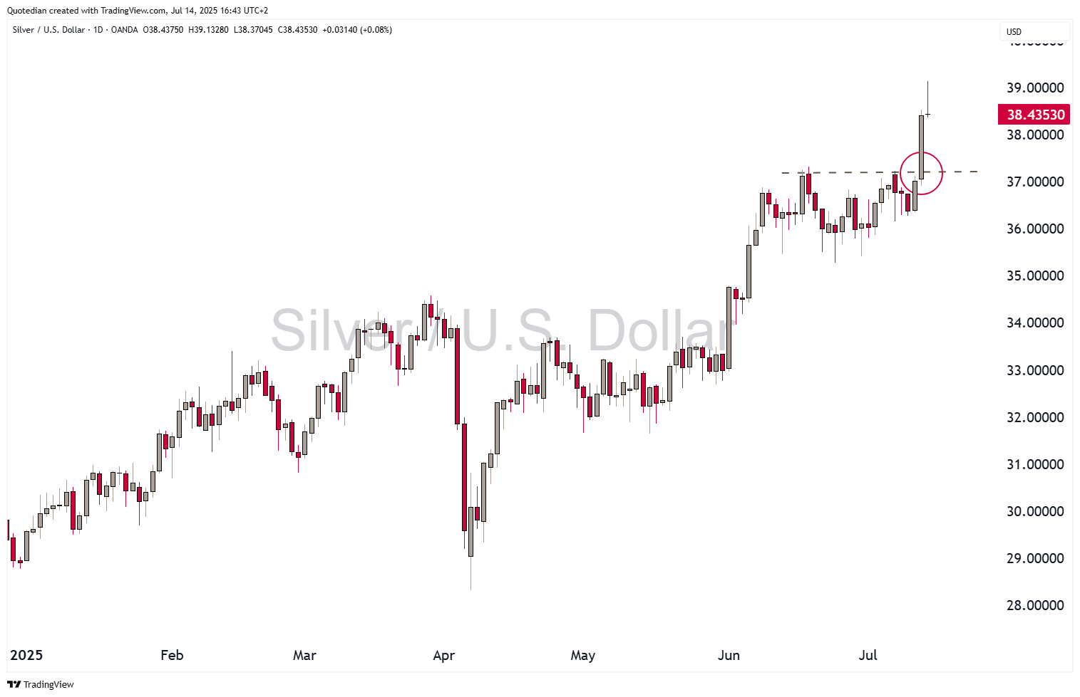
However, silver is breaking out to new highs:
Ok, enough for this week. CPI and PPI are due in the US tomorrow and Wednesday - make sure to stay abreast with our daily (Tue-Fri) QuiCQ letter:

In reality, you need no other Disclaimer than the one above, but just in case:
Everything in this document is for educational purposes only (FEPO)
Nothing in this document should be considered investment advice
Investing real money can be costly; don’t do stupid shit
Leave politics at the door—markets don’t care.
Past performance is hopefully no indication of future performance
The views expressed in this document may differ from the views published by Neue Private Bank AG