

Max Payne
The Quotedian - Volume V, Issue 115

“While higher interest rates, slower growth, and softer labor market conditions will bring down inflation, they will also bring some pain to households and businesses.”
Jerome Powell, August 26th 2022
DASHBOARD

AGENDA

CROSS-ASSET DELIBERATIONS
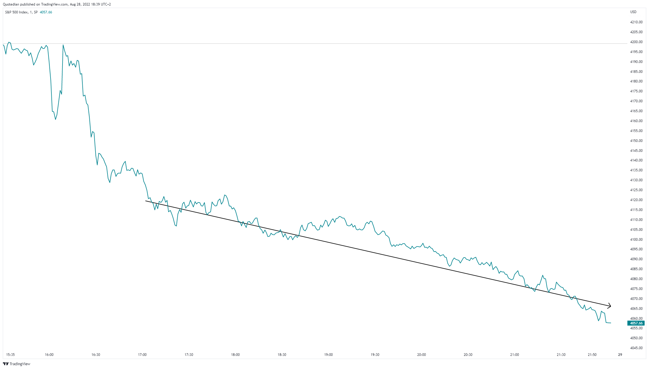
Today’s title is of course a wordplay on a) what Powell said during his Jackson Hole speech and b) what investors got to feel following the fore-mentioned speech. For equity investors, one picture is probably worth more than a thousand words, to explain Friday’s bloodbath:

Ouch! 8 minutes and 4 pages are all it took Mr Powell to great havoc on equity markets. But to be honest, we all should be surprised that we all were surprised by the Fed’s hawkishness - after all, they have been telling us all year what they are up to:

I prepared the chart above a few months ago and updated it following Friday’s Jackson Hole comments. “Plus ça change, plus c'est la même chose “ …
Just before taking Friday’s session (analytically) apart, here are some more ‘jewels’ from friend Jay (emphasise mine):
"The FOMC's overarching focus right now is to bring inflation back down to our 2% goal."
"Our responsibility to deliver price stability is unconditional...There is clearly a job to do in moderating demand to better align with supply. We are committed to doing that job."
"Restoring price stability will likely require maintaining a restrictive policy stance for some time. The historical record cautions strongly against prematurely loosening policy."
"We must keep at it until the job is done. History shows that the employment costs of bringing down inflation are likely to increase with delay, as high inflation becomes more entrenched in wage and price setting."
Ok, with that out of the way, let’s look at the market hubris and search for some potential survivors (spoiler alert: very few).
As already made clear from the market heatmap further up, not one sector was in the green, with energy stocks getting the least stick, but still down in excess of one percent:

Five(!) stocks in the S&P 500 printed green on the day,

none in the Dow and less than four per cent of the Russell 3000’s constituents closed higher.
Remember we spoke about negative dealers’ gamma on option markets last Thursday and Friday? Well, as much has it helped to propel stocks higher on Thursday, it is clearly visible how it worked in the opposite direction on Friday, forcing option dealers to sell for hedging purposes evermore:
Of course, did the S&P with its 3.37% loss on the day break the lower line in the sand we had defined in Wednesday’s Quotedian. And by the way, we had a poll on this, remember? The question was which ‘line in the sand’ would break first and turns out, we got it largely right:

Just one petition, on this. Participation to the poll was disappointingly low; please cast your vote next time, it makes it just much more fun. All votes are anonymous and as so often in investing, there are no right or wrong answers…
Anyway, here’s the updated chart then:
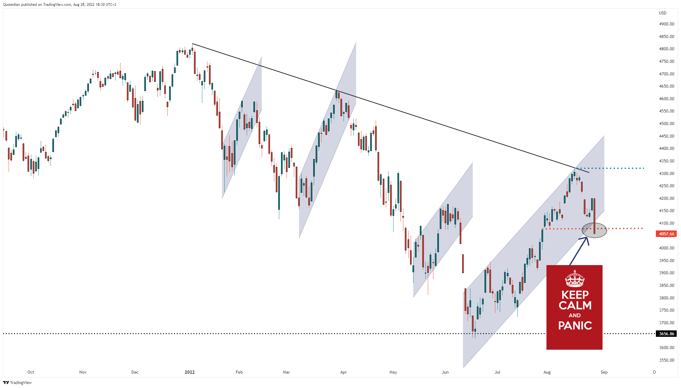
Bar a turn in the market tomorrow morning the way for prices to (fastly) move lower seems well-swept and open. With futures markets still closed it is difficult to know the direction for tomorrow Monday, but taking our favourite 24/7 VIX indicator, aka Bitcoin, as a proxy, it seems unlikely for now that stocks will open up higher:

Just before we turn to fixed income markets, and as it is The Quotedian’s Sunday edition, let’s also take our usual look at how stocks have fared over the entire week. Here are some of the major equity market indices around the globe:

Most losses came on Friday, but definitely not a good week for equity investors. Anywhere to hide in the sector allocation?

Yes, energy stocks continue to be the star performer and given that strength begets strength, probably will continue to be so.
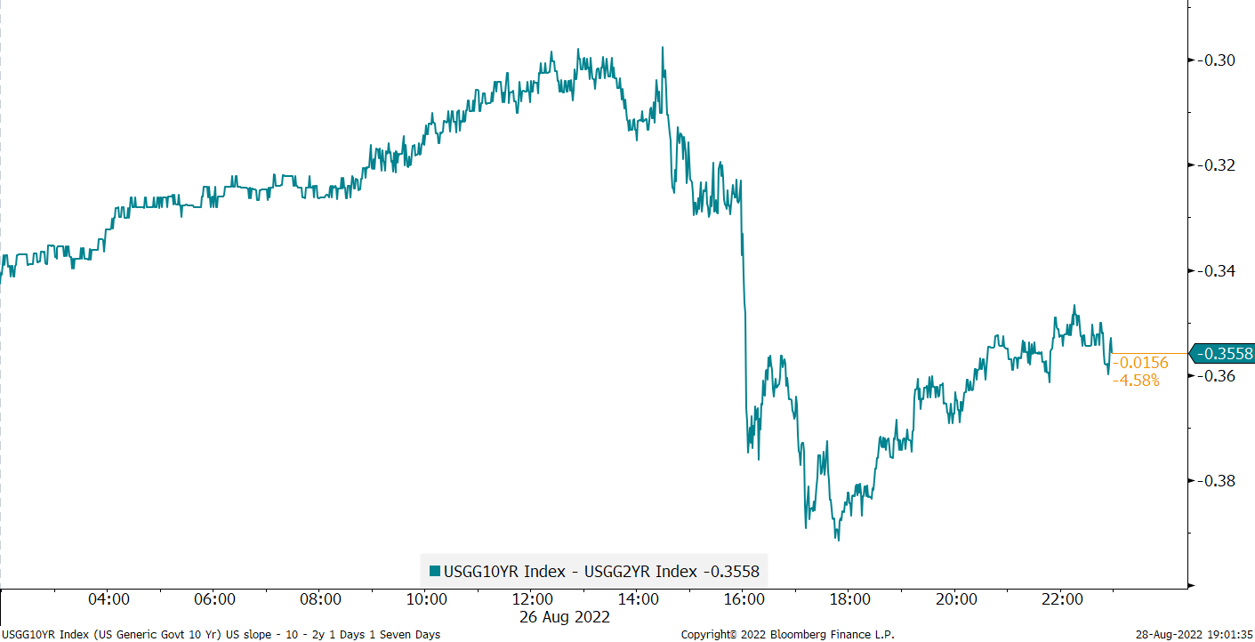
Ok, so how did bond yields react to Friday’s Powell speech and subsequent equity sell-off? Well, surprisingly little would be the answer. Here’s the intraday chart of the US 10-year government bond yield for example:

A big, fat nothing-burger as the Americans would say. Right after the infamous speech, the curve inverted somewhat more (a trend that had begun already on Tuesday) but by the time of the close, the 10y-2y spread was about where it had started. Here’s the intraday chart on that:
Credit spreads however were a whole different story altogether though, as you can gather from the performance data in the Dashboard above. Here’s the 2-year graph on the most important credit spread benchmarks:

This spread widening translated for example into a 1.6% drop in the iShares iBoxx High Yield ETF (HYG), which was its fourth largest price decline this year and has the potential to upset any bullish chart picture:

Time then to review the weekly performance of major fixed income benchmarks:

Quite the comeback for Asian High Yield bonds, but everything else was on the disappointing side. And this is unlikely to change for the coming weeks to months …
Over to currency markets then, where we start with the weekly performance review of currencies versus the US Dollar:

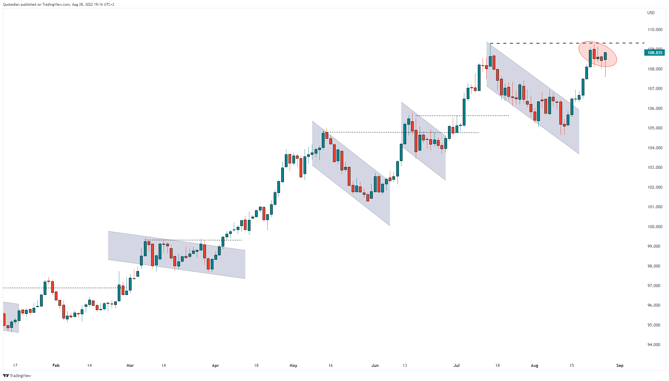
Pretty clear it was a generally good week (yet again) for the greenback, even though the USD index (DXY) continues to trade below important resistance at 109.30:
A short-term pullback is possible, especially if other central banks try to equal or eclipse the Fed’s hawkishness over the coming days, though I feel that eventually and largely unfortunately the US Dollar will continue to move higher. Why unfortunately? Because a USD move higher would probably signal further turmoil for risky assets ahead …
Let’s finish our Sunday review then with a look at a few commodities, starting with the 5-day performance table:

So, we had a stable to strong US Dollar AND rising commodity prices (which are usually measured in USD) - this to me says a lot about the strength of the backwind for commos …
Looking at oil, the chart on Brent made some important progress this week, improving the picture for bulls substantially by moving above the downward sloping short-term trendline (dotted) AND the support line (dashed) it had recently broken to the downside:

Don’t be fooled - if the “hike rates until something breaks” narrative prevails (which it likely will), a sharp sell-off in oil in expectation of an economic recession is anytime possible. Longer term, however, the path higher seems set.
Ok, at the outset of today’s letter I said that a picture was worth more than a thousand words, and here we are with the word count at 1,372 … Time to hit the send button!
Enjoy the rest of your Sunday and don’t forget that “sharing is caring”!
André
CHART OF THE DAY
A few months ago I wrote that this (secular) bear market will end when certain conditions are met. One of those was the Apple (AAPL) would trade at below $100, which I derived from a 200-period moving average, which had in previous down turns been the area of support:

Of course, there was some (transitory?) egg on my face as the stock rallied sharply since the middle of June. However, I could bite myself as last week it was my intention for several days to feature an update on AAPL in this section, with the conclusion that it was a good time to reconsider that bearish trade. With Friday’s nearly four percent drop in the share price, did I miss that opportunity?

Perhaps, perhaps not. Stay tuned …
Thanks for reading The Quotedian! Subscribe for free to receive new posts and support my work.
DISCLAIMER
Everything in this document is for educational purposes only (FEPO)
Nothing in this document should be considered investment advice
Past performance is hopefully no indication of future performance