

Newton Rulez!
Vol IX, Issue 06 | Powered by NPB Neue Privat Bank AG

“To every action there is always opposed an equal reaction.”
— Isaac Newton
Enjoying The Quotedian but not yet signed up for The QuiCQ? What are you waiting for?!!

Using Sir Isaac Newton as introduction AND title to this week’s Quotedian is a braver decision then you at first thought would think, given his track record as an investor:

But in this case we will refer rather to his law of universal gravitation, which describes gravity as a force by stating that every particle attracts every other particle in the universe with a force that is proportional to the product of their masses and inversely proportional to the square of the distance between their centers of mass.
Simplified and adapted to the investment world:
What goes up, must come down.
And so we are at the prices of precious metals in general and silver in particular!
Just last week, I wrote in the Quotedian dubbed “Ghidorah” following lines:
Having been invested in Silver all the way along, I start calling it a day here. A move above $120 is likely, but what is not likely at all is that Silver will then stall and STAY at that higher level.
Or, as rule #4 of famed Technical Analyst Bob Farrell outlines:
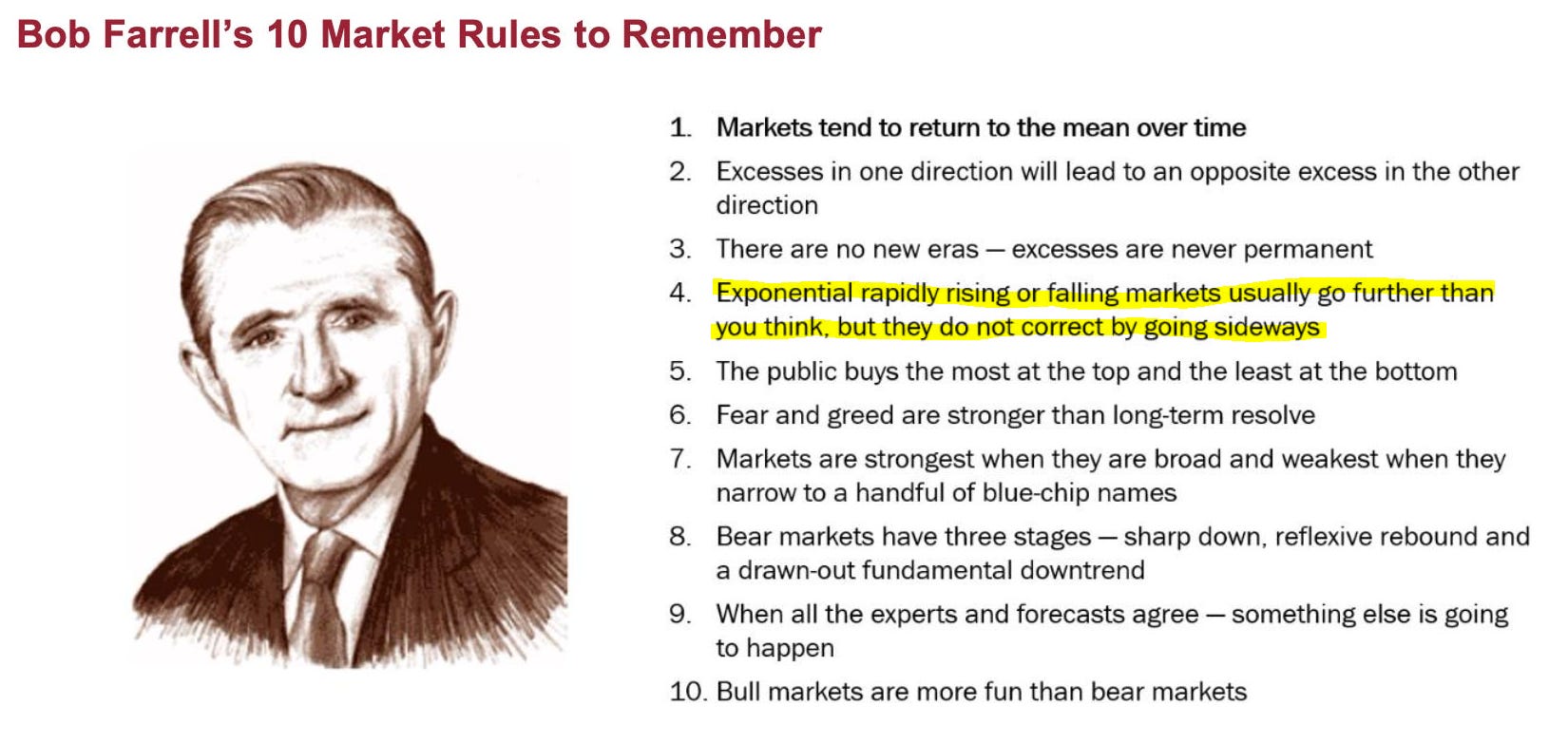
I am usually better at admitting the egg on my face (i.e. being wrong), but in this case I will take the victory lap 😉🤩

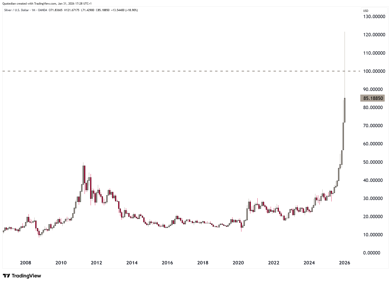
And here is what happened to Silver (pay close attention to the last candle to the right, which was Friday 30.1.):
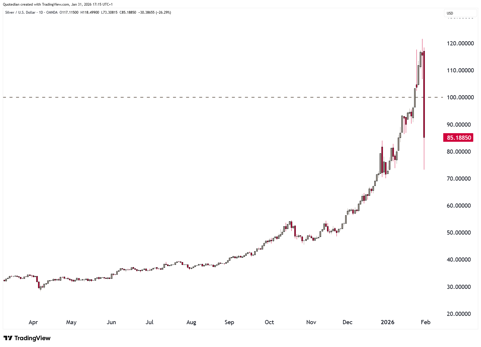
Excuse my French, but that was $42-plus, or 38%, intraday drop highest to lowest. Blimey!
It was the second biggest daily %-move in Silver since the late 1950ies, (the biggest move was in the early 1980ies as the Hunt Brother tried to corner the silver market),
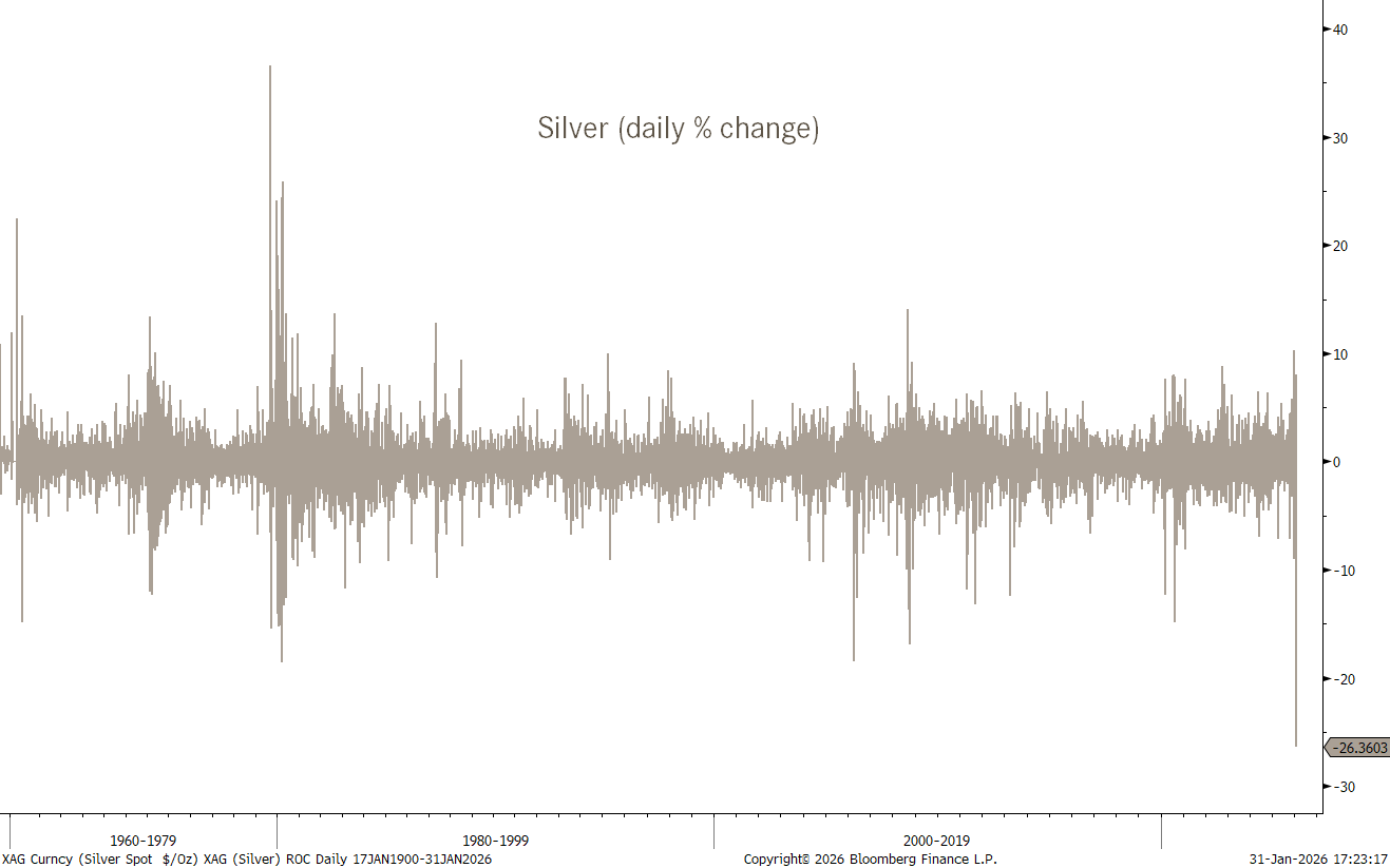
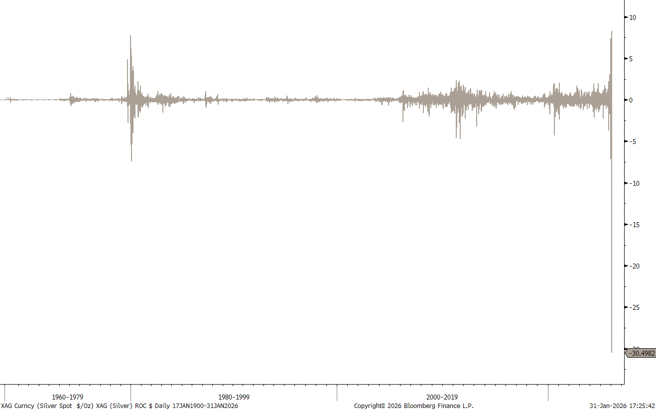
but the biggest Silver move ever in money ($) terms:
And now it get’s strange and then creepy.
And the strange thing about thing about this is, that on the month, Silver still closed up 18%!
And now to the creepy part … we really all should just be shouting “Nothing to see here!”

, as actually is everything is going exactly to plan:
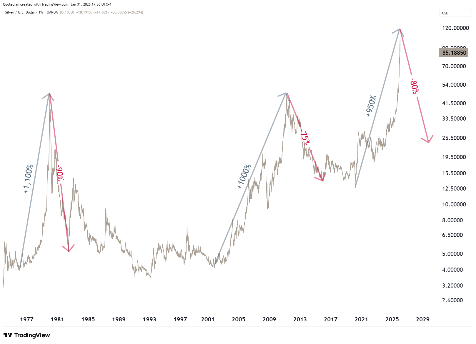
First prices advance about a thousand percent (done), and then drop 70-90% over a multi-year period (work in progress).
Onwards…
This week’s Quotedian focuses on the monthly statistical performance stats and throws in one or the other monthly candlestick chart, plus we discuss why February may be the true harbinger of volatility.
Off we go!

Despite, or maybe amid, all the geopolitical ramblings (Venezuela, Greenland, Iran, others) that have been going on since the beginning of the year, most stock markets have shown decent returns in those first weeks:
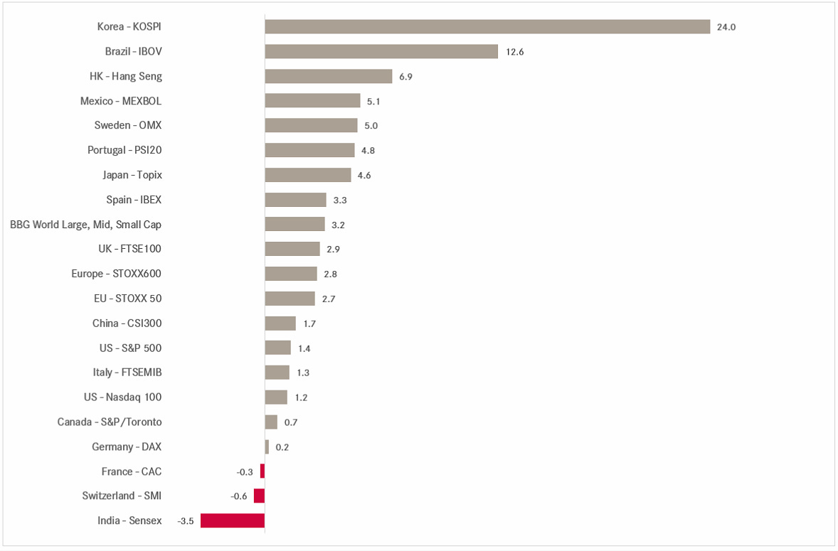
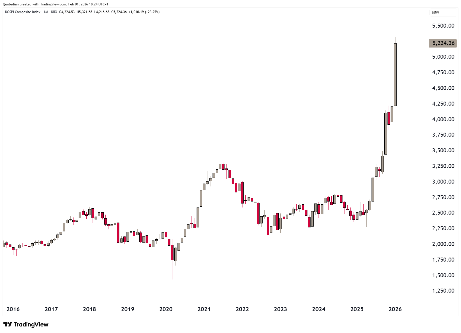
The KOSPI in South Korea and the IBOVESPA in Brazil stand out as the largest gainers. The first is moved big time by index heavy-weights Samsung Electronics and SK Hynik, which are up 34% and 40% respectively on the back of their memory business.
In Brazil, the gains seem more related to a possible political shift, or at least hopes thereof, with government elections to be held in October of this year. Also, the Brazilian equity market carries a forward P/E of about 11x, one of the cheapest out there.
Comparing Korea’s monthly chart,
to that of Brazil,
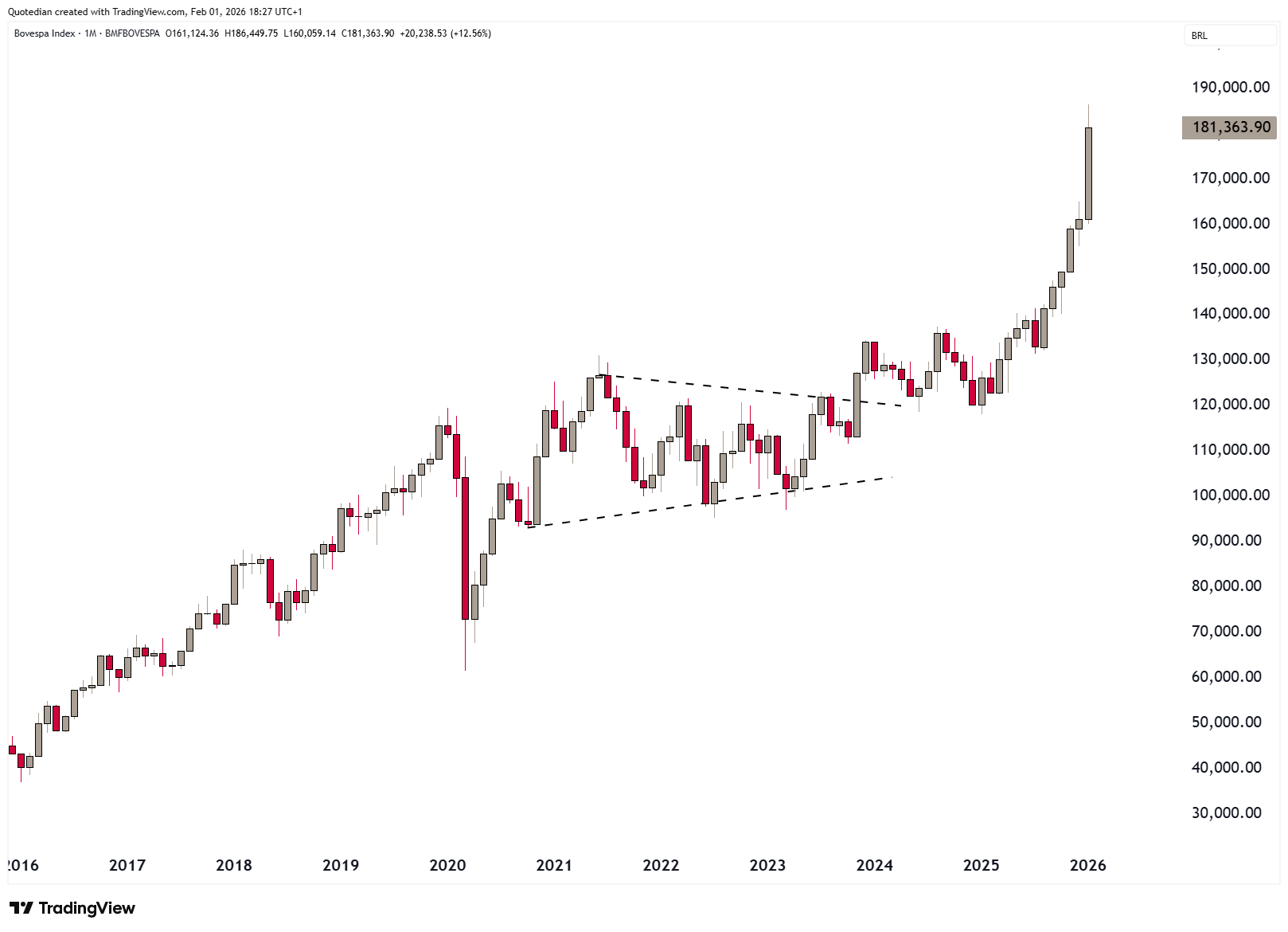
the latter seems more orderly and more, well, appetising.
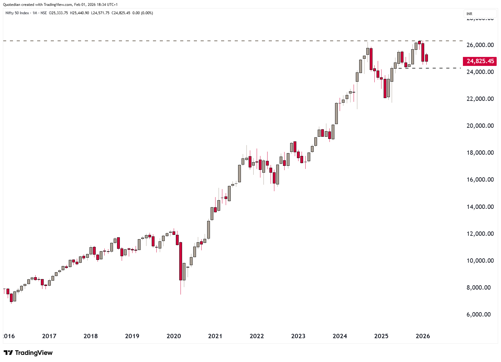
At the lower end of the scale we find Indian and Swiss stocks. In India, it was likely the fear of a new tax on equity (derivative) transactions to be implemented by the government, which was confirmed this morning (1.2.2026):

Let’s see on Monday if it is “sell the rumour, buy the fact” or if there is more downside ahead.
The monthly chart shows it’s been a tough year and a half for Indian equity investors, at 24,000 on the BSE must hold to not worsen matters:
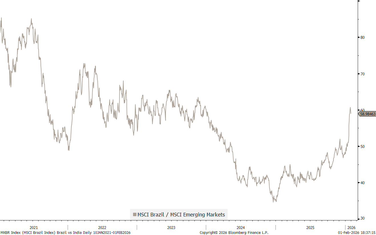
We already discussed last week and in our NPB 2026 outlook that on a relative basis, India has become a ‘krass’ underperformer versus the rest of the EMs:
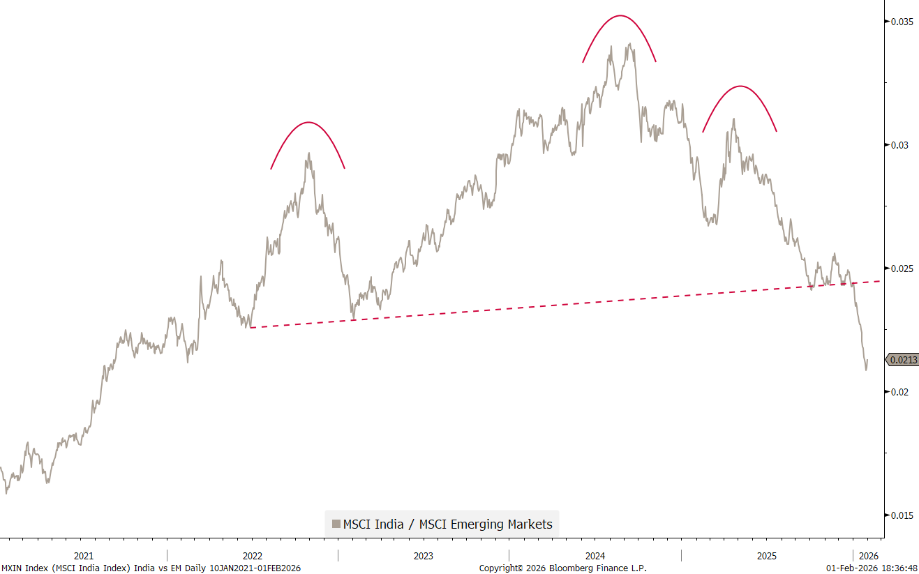
With the Indian equity market’s P/E double that of Brazil, maybe long Brazil, short India is the pair trade to hold in your portfolio?
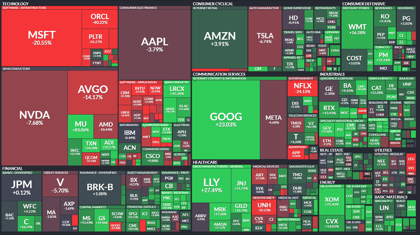
Moving on quickly, the almighty S&P 500 has got a tad stuck,
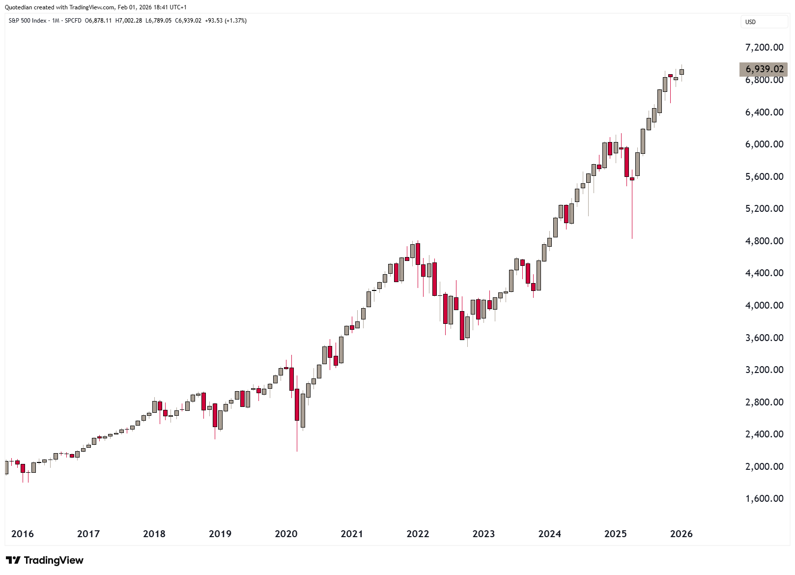
mainly due to five (MSFT, AAPL, TSLA, NVDA, META) of the Mag 7 stocks having got stuck over the past three months:
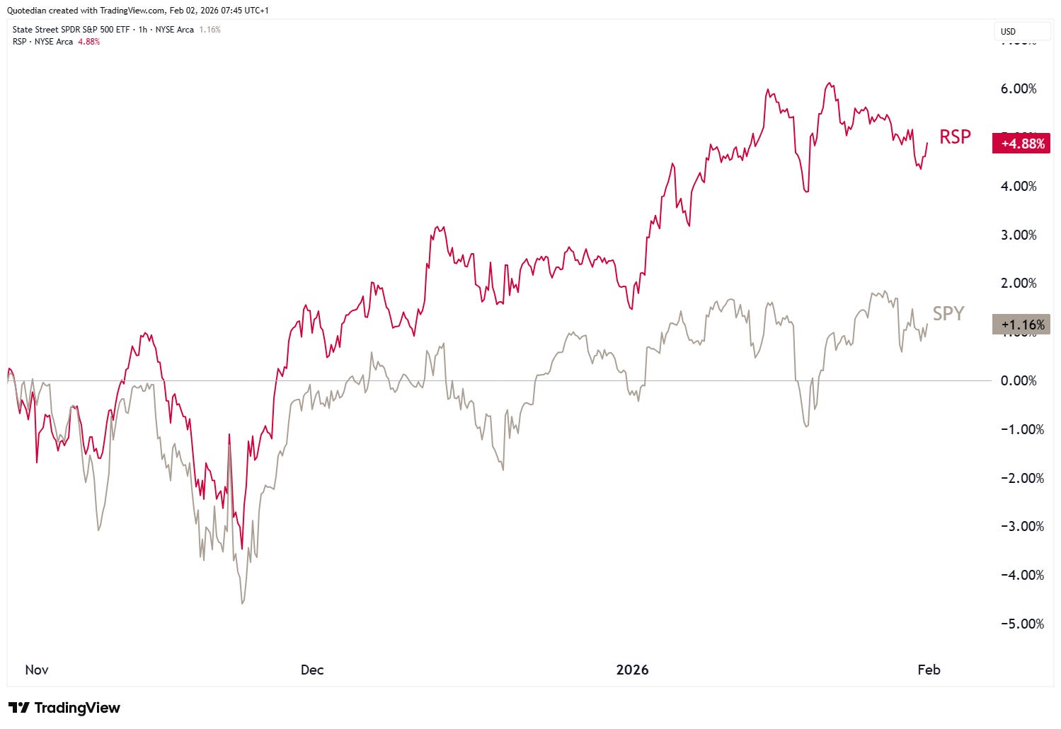
Accordingly, the equal-weight version (RSP) of the S&P 500 has been doing better than the ‘normal’ cap-weighted (SPY) version:
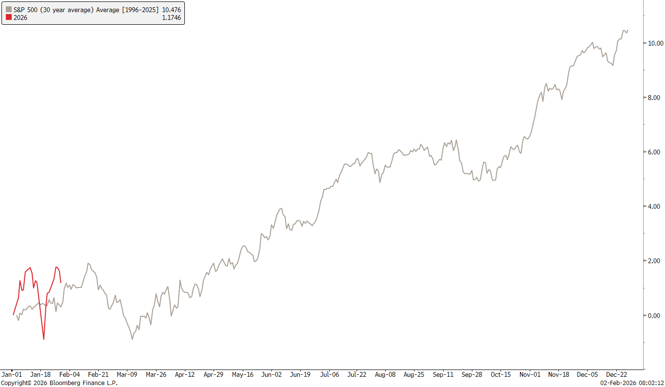
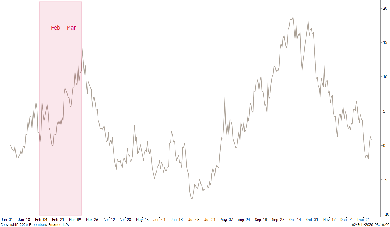
Seasonally, the “easy” mid-October to early February period is coming to an end, and given this morning’s weakness we may indeed have found an early stop to the what seemed a tired uptrend anyway:
Accordingly, volatility also gets, uuhmm, more volatile from here until about mid-March:
So, could markets be in for more than a simple sector rotation and maybe even a medium-term correction?
Let’s have a look at the sector performance and then one very telling sector relative chart.
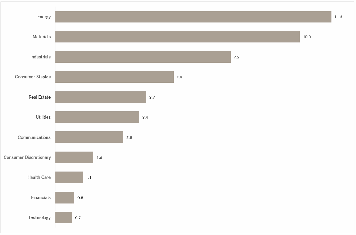
January’s rally has been lead by ‘commodity-related’ sectors such as materials and energy, but what we want to focus on here are consumer staples outperforming consumer discretionary stocks by a wide margin.
Take the ratio of ETFs on US discretionary (XLY) and staple (XLP) stocks as a proxy, we see a possible shoulder-head-shoulder reversal pattern unfolding:
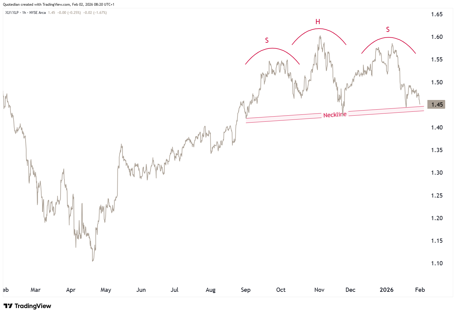
Implication here is that if staples outperformance accelerates, investors are positioning themselves more defensive. Watch this space …
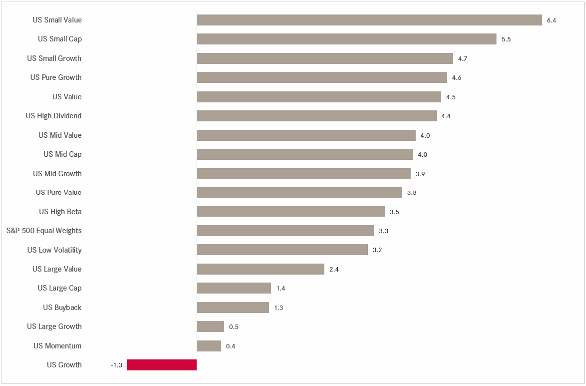
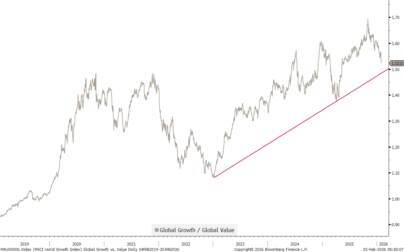
Not unrelated, the factor performance table also suddenly shows value factors much more at the upper end of the performance gamma and US growth as a clear underperformer:
Hence, not quite as clear as the shoulder-head-shoulder pattern on the XLP/XLY chart above, but still approaching an important trend line, is the ratio of Global (MSCI) growth to value stocks:
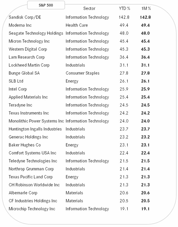
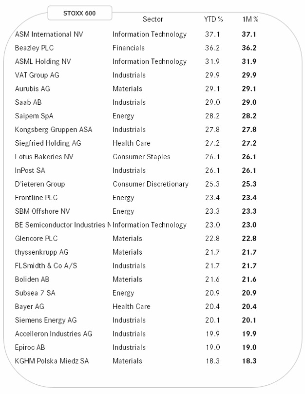
To finalize the equity section, here are the best performing stocks in the US (SPX) and Europe (SXXP) in January and hence on year-to-date basis.
As a reminder, the idea of looking at these tables is that winners remain winners, or as we often put it:
Strength Begets Strength
Here’s the US list:
And here the European equivalent:

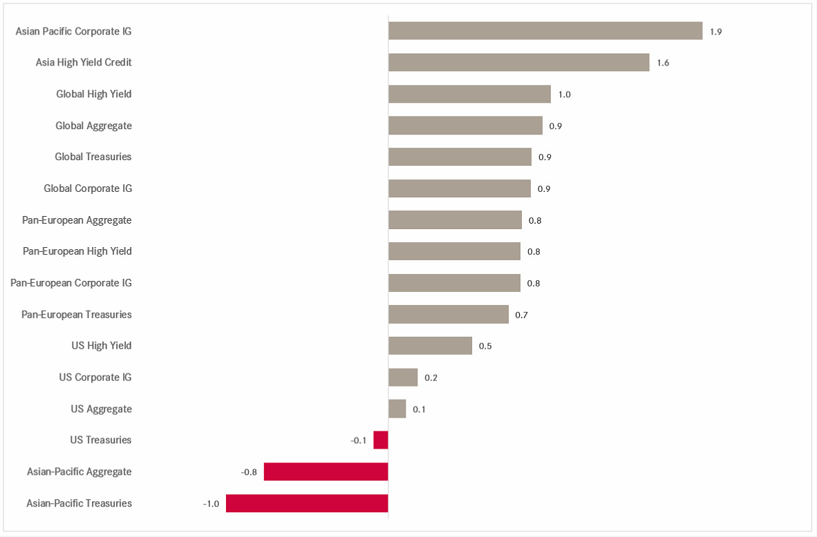
Most segment of the fixed income market had a solid start into 2026:
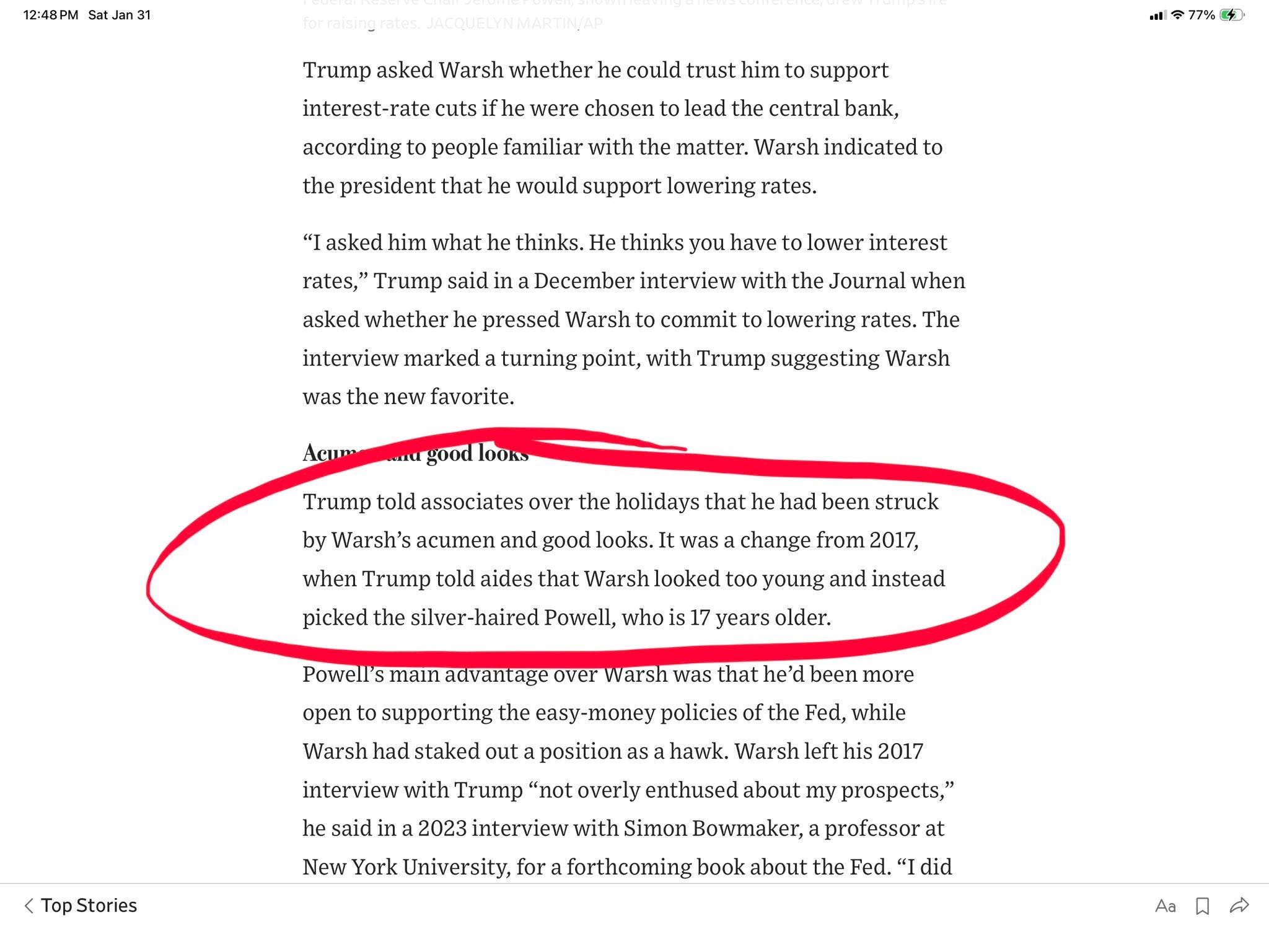
One of the key themes has of course been the nomination of the new Fed chair to be, which was resolved last Friday. Enter Mr. Warsh, which apparently was chosen not least for his good looks:
Cliff Asness of AQR fame had a hilarious post on X on this over the weekend (click here).
And of course, did the following ‘cartoon’ with magic seers capability need an update:

Hence, with Warsh a few centimeters taller than Powell, we should expect the Fed’s policy rate to increase over time, which I think to remember was not President Trump’s main idea …
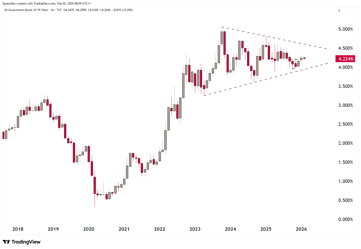
On the monthly chart of the US 10-year Treasury yield chart we are still patiently waiting for a resolution out of the triangle, likely not due before Q2/2026:
Other global treasury markets have been relatively quiet too, with the exception of Japan’s JGBs, which have gone parabolic over the past three months. Here’s 10-year version:
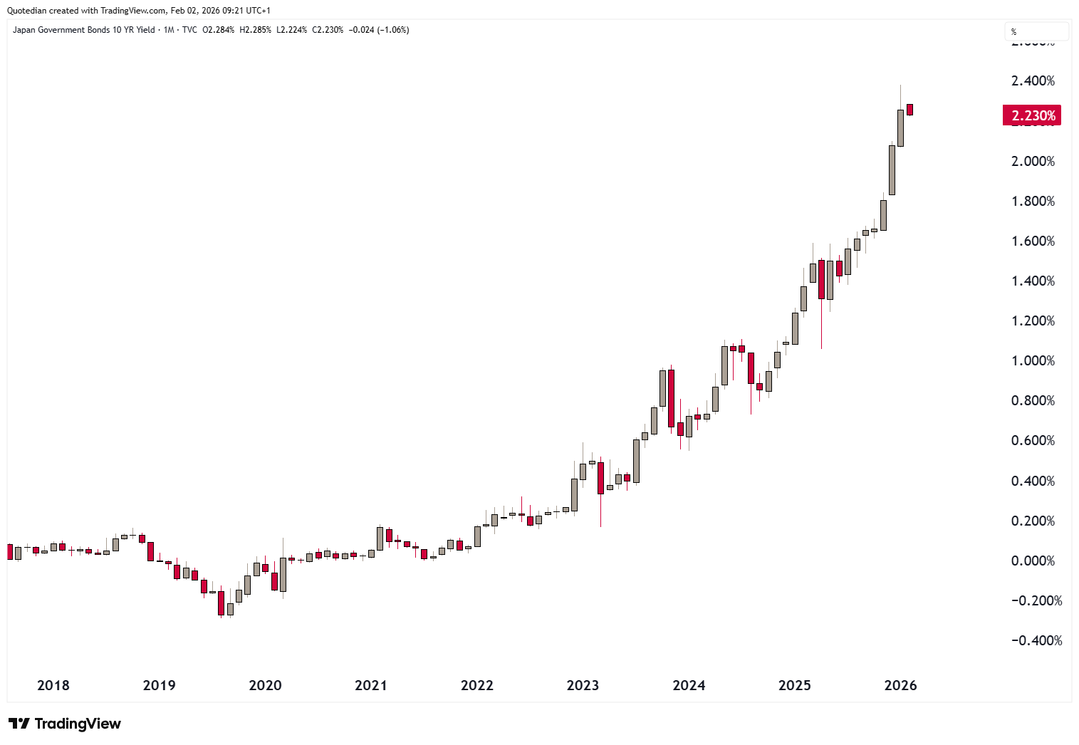
And this chart truly shows the magnitude of the “game changer” in Japanese yields:
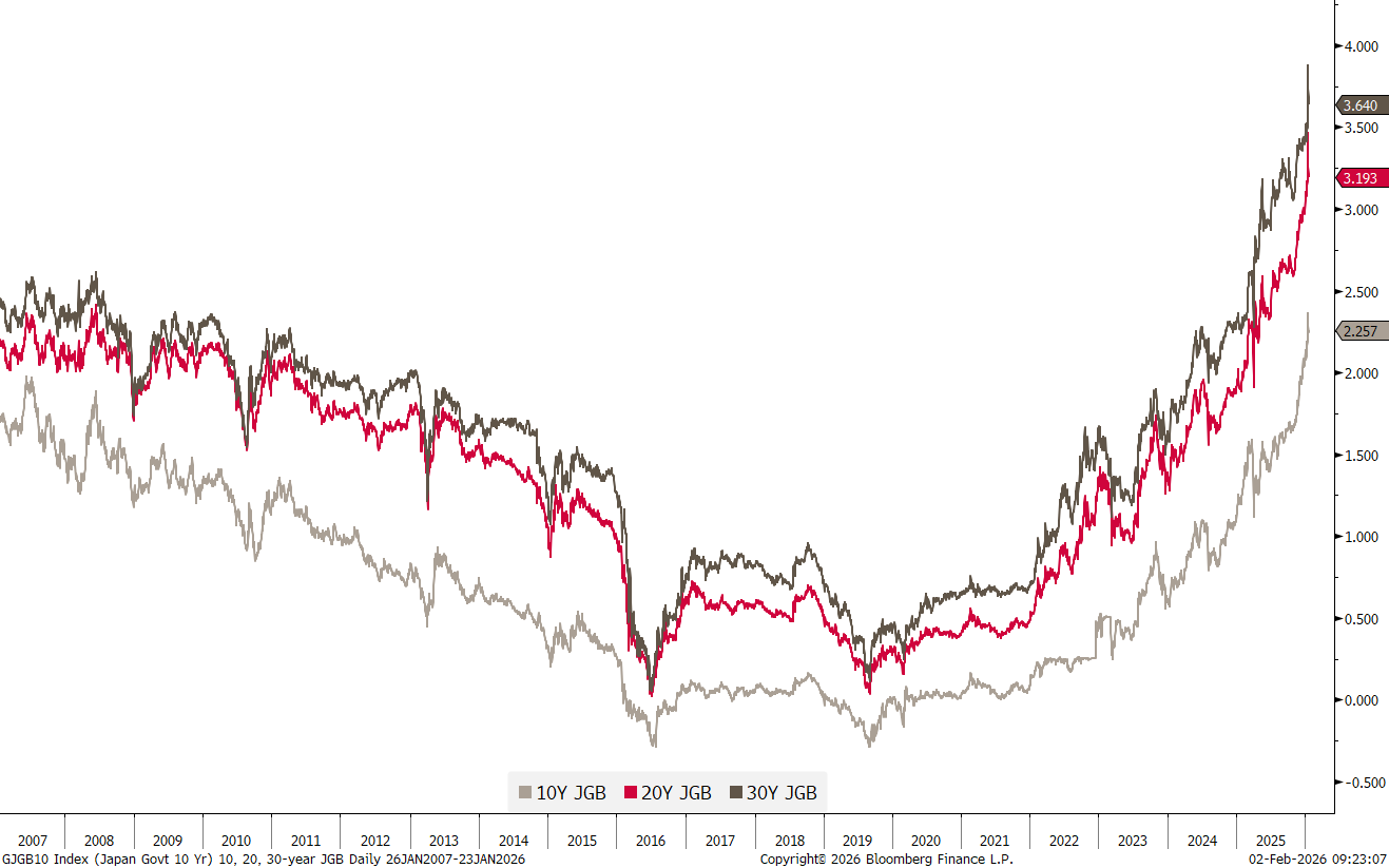
Luckily for the global carry trade, at least IMHO, is that real yields have remained low:
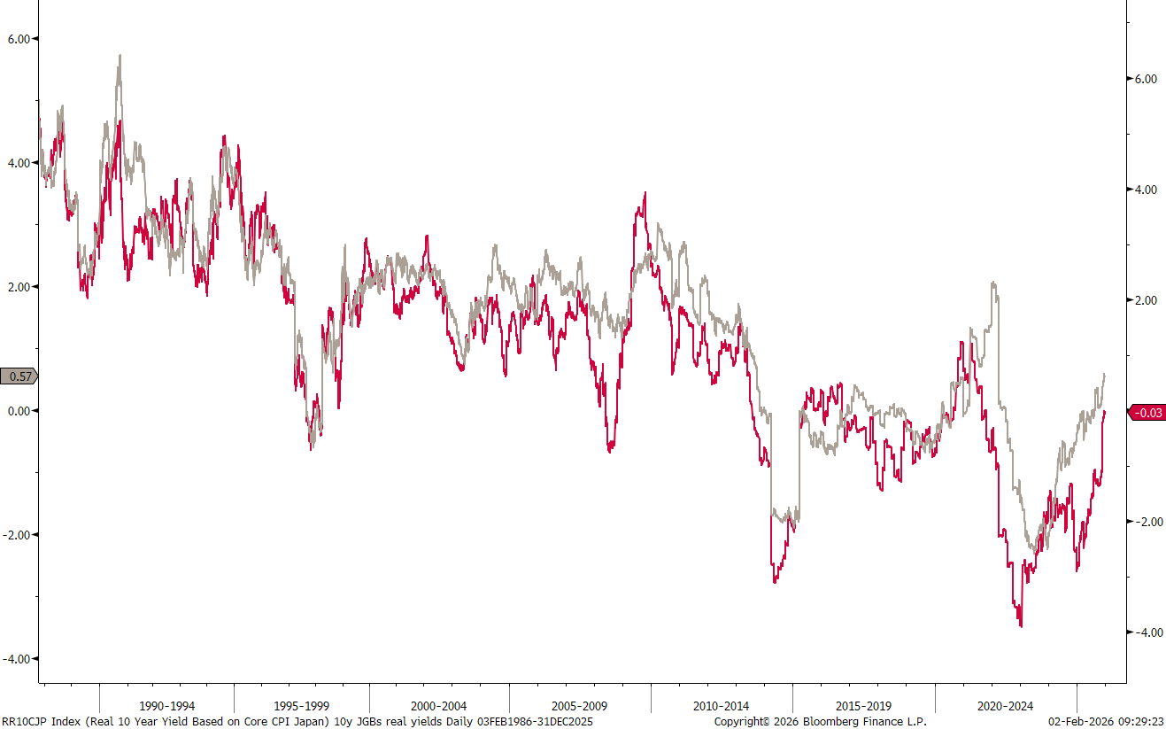
Though carefully watch that acceleration underway since Q1-2025…

In currency markets, here’s the performance of a selection of global currencies versus the US Dollar:
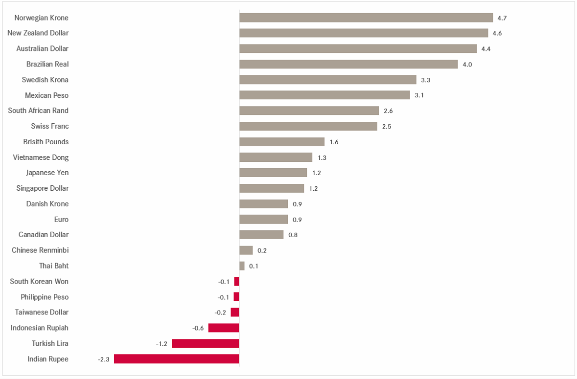
In other words, the Greenback has continued to lose territory versus most other currencies in 2026, after an already dismal 2025.
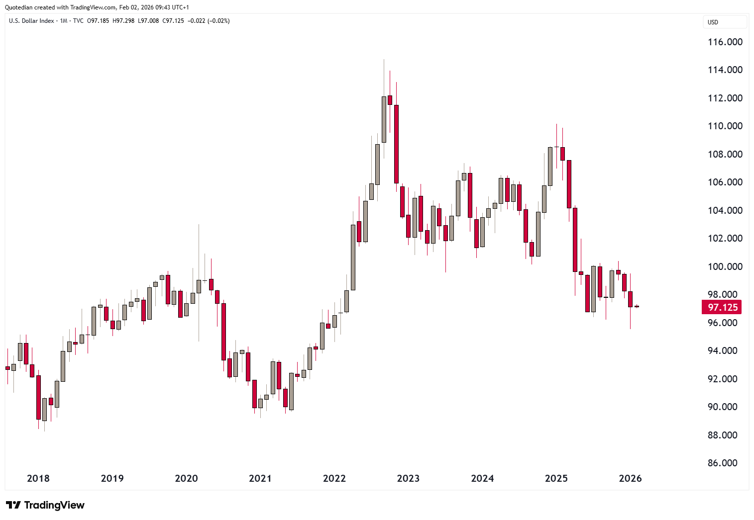
Here’s the very unexciting monthly chart of the US Dollar Index (DXY):
It gets infinitely more interesting however if we zoom in to a daily periodicity:
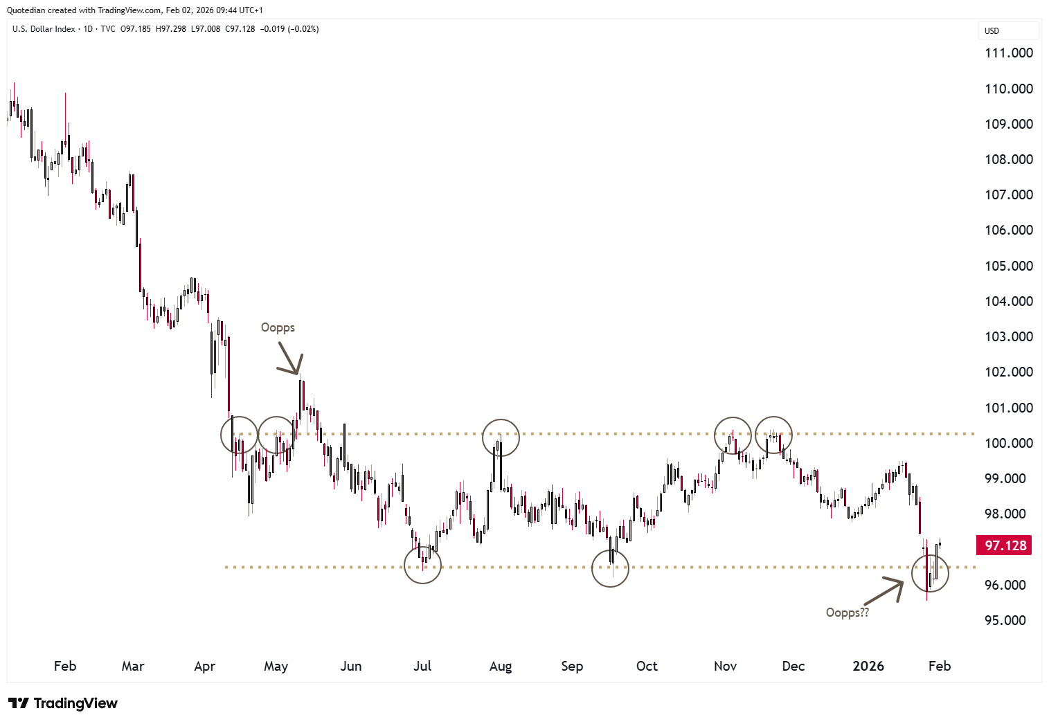
Will the break lower last week, turn into a bear trap? For now, chances of that are high, though I would remark that given the 20% and 40% price collapses in Gold and Silver respectively, the US Dollar has been exceptionally NOT strong.
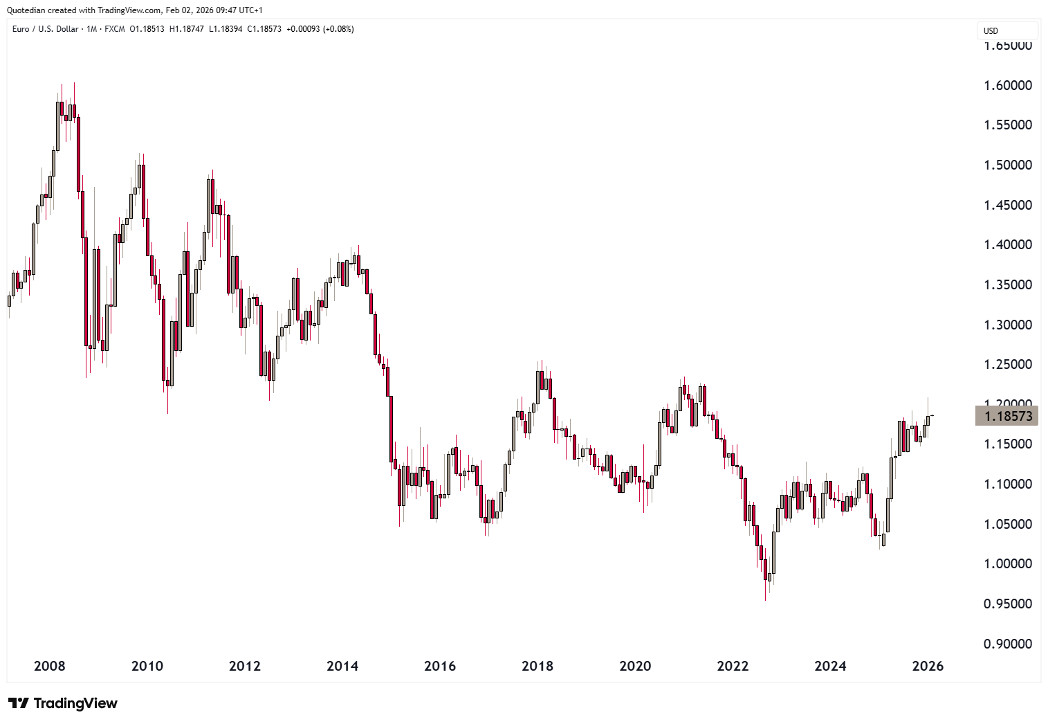
To me, it seems that the path of least resistance on the monthly NotEUR/USD chart is upwards:
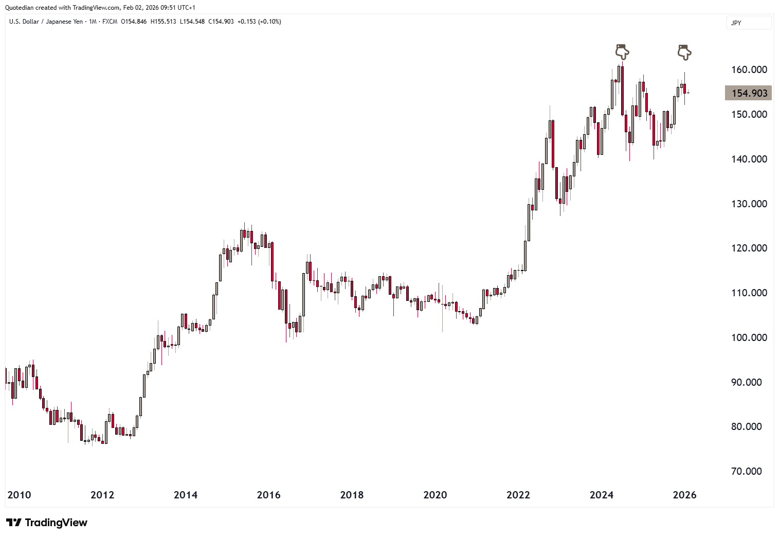
The USD/JPY seems to have found its new lid at 160, a level not set by market participants, but rather by the BoJ/MoF:
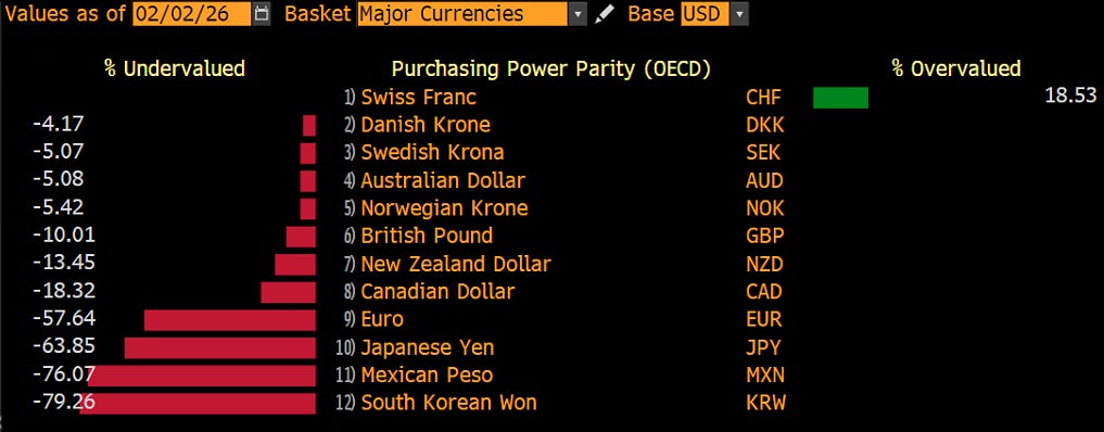
Definitely, from a valuation (PPP) point of view, only the Swiss Franc remains even more expensive than the Dollar:
Prepare for more Dollar weakness.
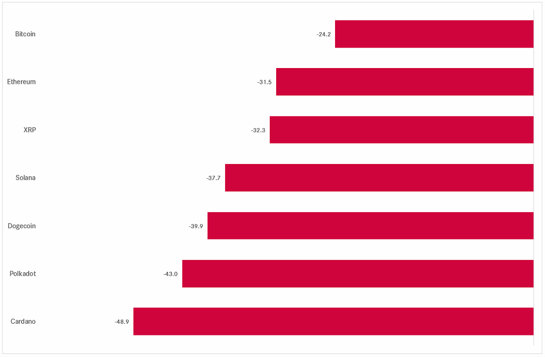
Cryptocurrencies have gone full risk-off in January,
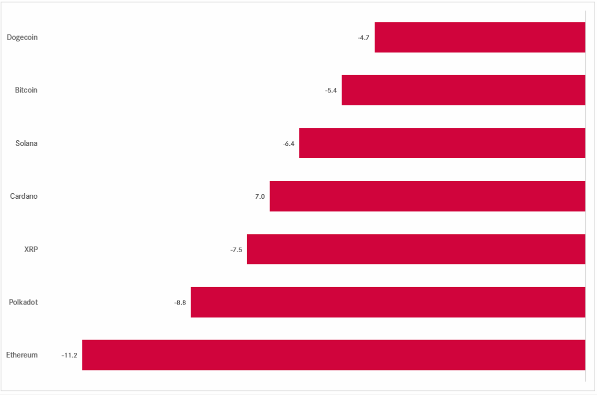
with all of them being in a bear market now, having fallen more than 20% over the past three months:
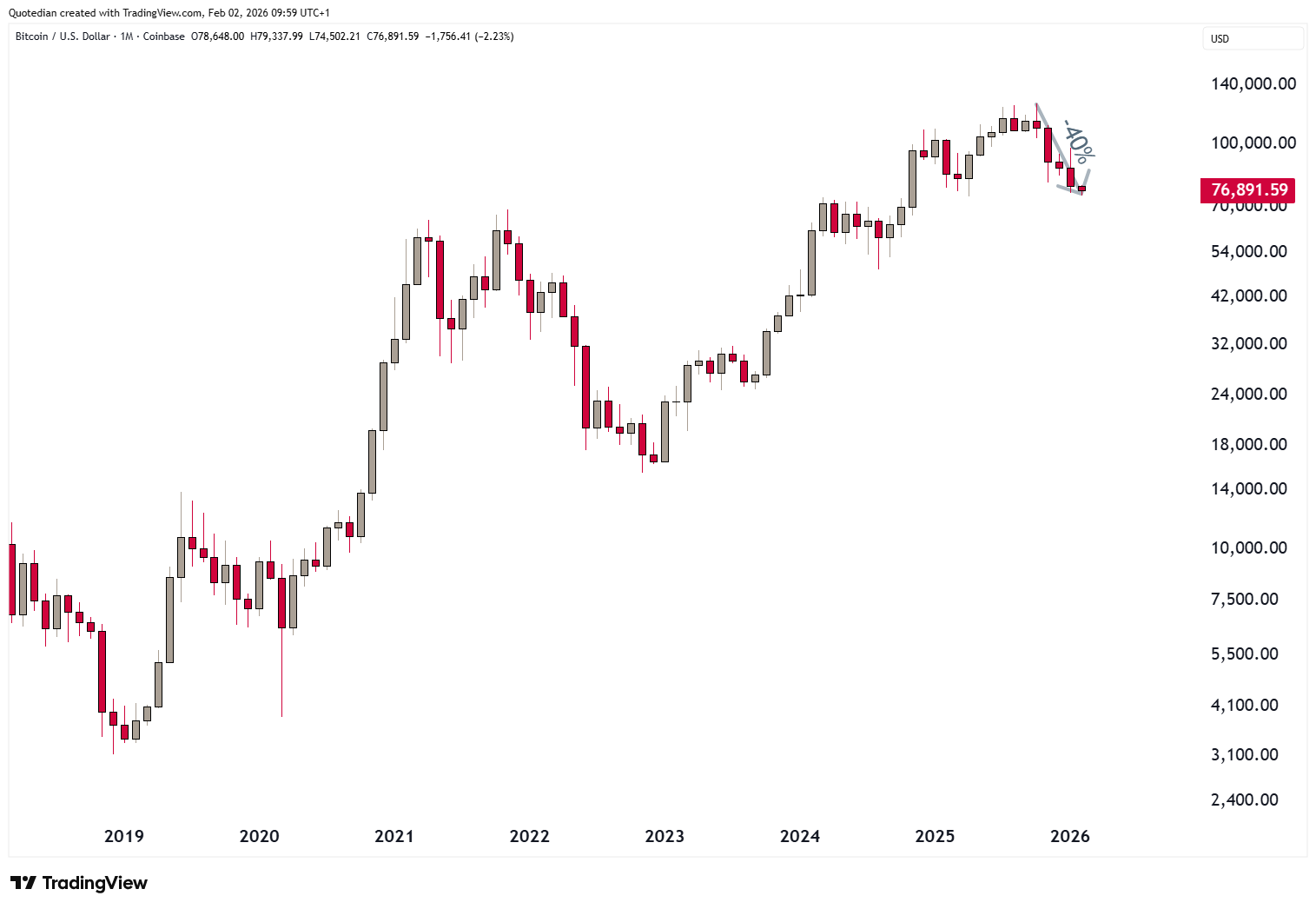
For visual inspection, here’s the monthly Bitcoin chart:

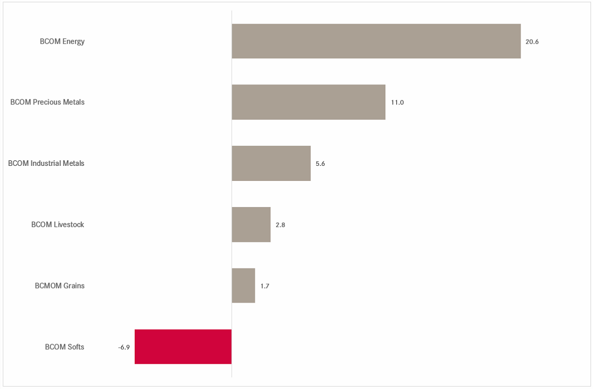
Finally, in the commodity space, we have already extensively deliberated about gold and silver at the outset of this week’s letter.
Here are the January, and hence year-tod-date performance of commodity ‘sectors’:
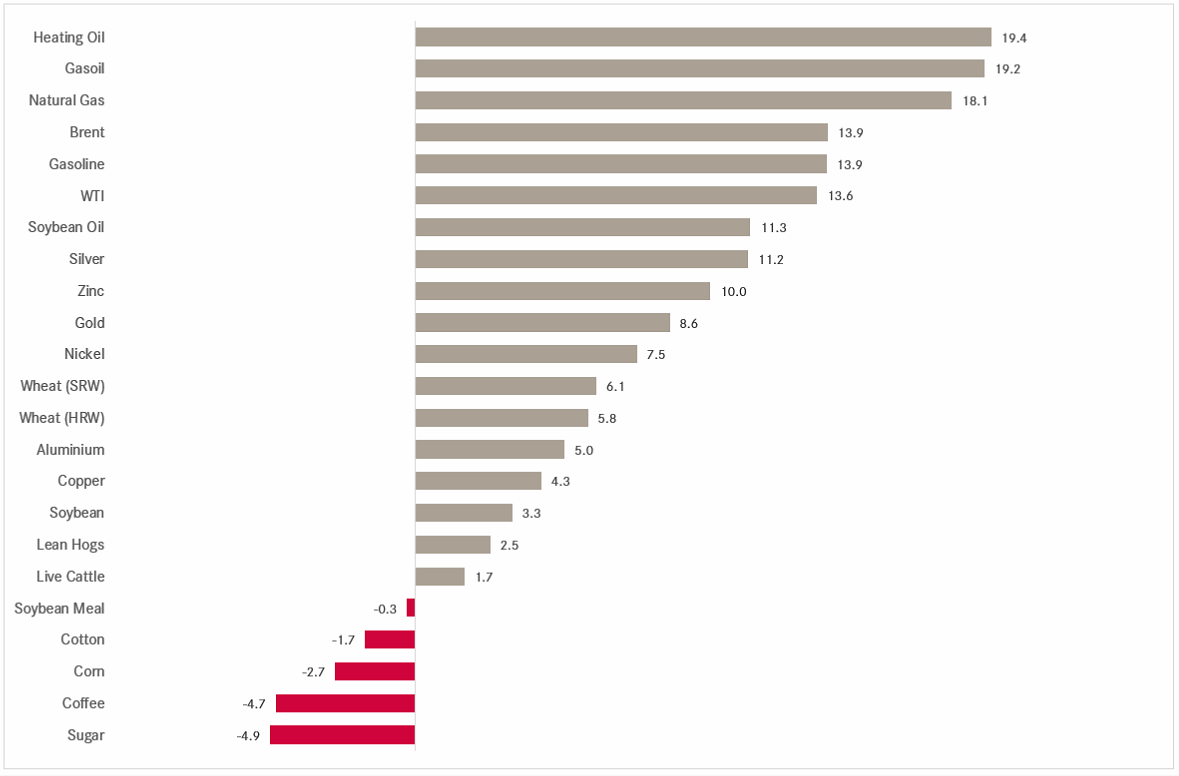
And here the same for some popular commodity futures:
As I showed in a LinkedIn post (click here) on Friday, the missing puzzle piece in the global commodity rally had been crude oil:
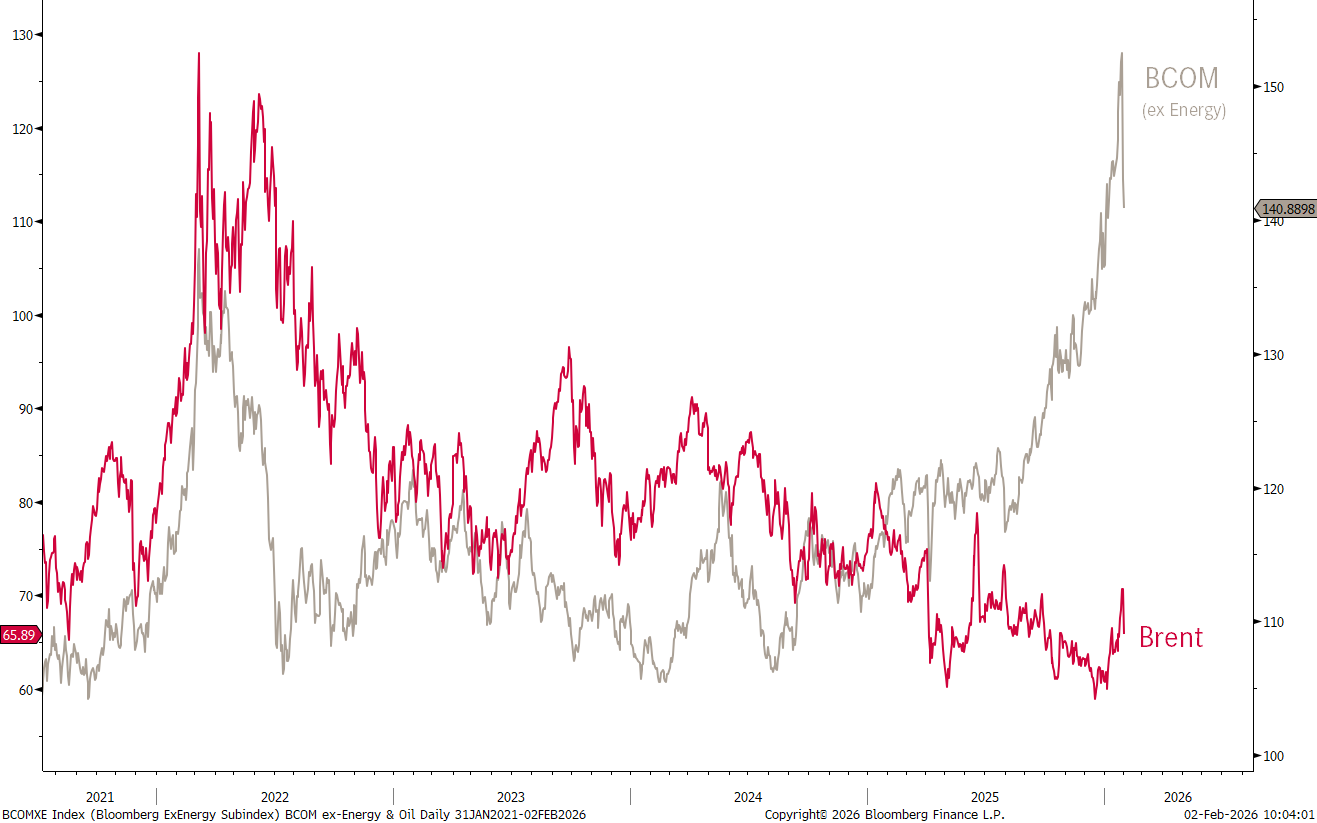
But maybe only until now …
Alright, that’s all for this week. With markets beginning the new week as volatile as it ended the last, it deserves all your attention and focus.
May the trends be with you!
André

In reality, you need no other Disclaimer than the one above, but just in case:
Everything in this document is for educational purposes only (FEPO)
Nothing in this document should be considered investment advice
Investing real money can be costly; don’t do stupid shit
Leave politics at the door—markets don’t care.
Past performance is hopefully no indication of future performance
The views expressed in this document may differ from the views published by Neue Private Bank AG