

Perspectives
The Quotedian - Vol V, Issue 113

“Everyone Has Two Eyes But No One Has The Same View”
— Anonymous
DASHBOARD

AGENDA

CROSS-ASSET DELIBERATIONS
Expecting a dull market day ahead, I started today’s letter early yesterday. focusing less on the immediate happenings, but rather on some big picture items and some of the underlying trends. As it turns out, it indeed was quite a quiet day, albeit a generally good one for risky assets (i.e. equities). Maybe one or two intra-session observations at the end, but on to some of the themes, I wanted to get off my chest…
One point I meant to write about for quite a while now is QT (Quantitative Tightening). QT started at the beginning of June but is, at least to my understanding, really picking up in early September (though I have no hard data to confirm that). If you believe that QE (Quantitative Easing) lead to an asset bubble (and there’s some proof of that), then the logical conclusion would be that QT deflates that asset bubble again (putting it mildly). Let’s check with this simple comparison between the asset bubble (aka S&P 500) and QE (aka the Fed’s Balance Sheet):

Here’s the same graph again, with the 2022 ‘boxed’. An avid observer could argue that the stock market fell whilst the Fed’s balance sheet (BS) was still rising:
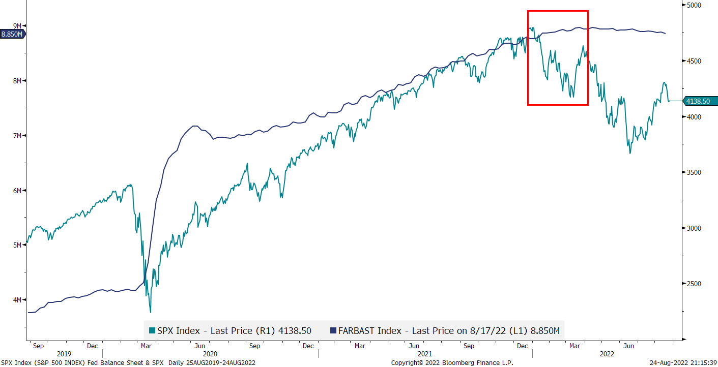
But of course, we savvy investors know that the stock market is a discounting mechanism and hence anticipated the BS shrinking ;-)
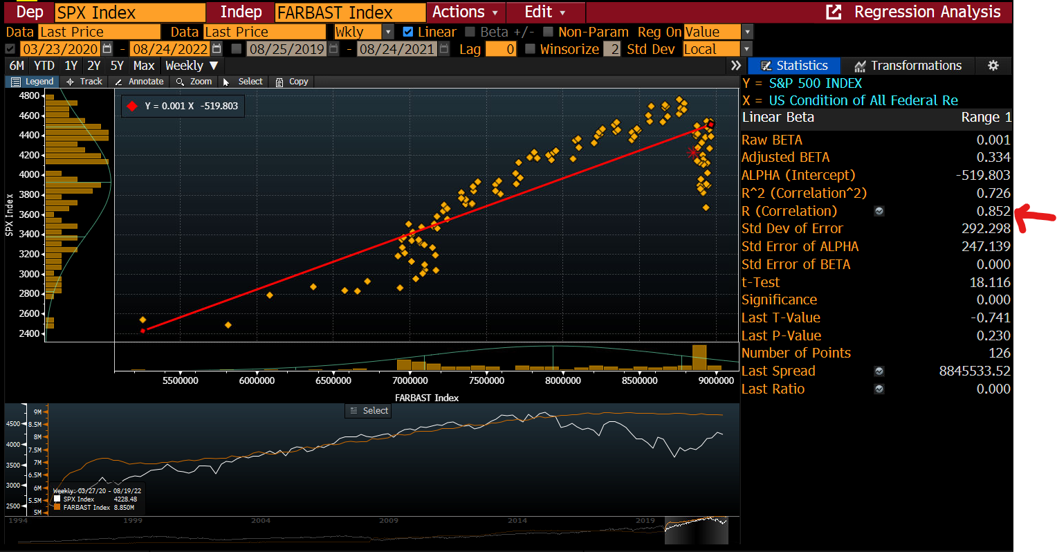
A quick n’ dirty regression analysis between the two since the last major expansion of the balance sheet, which for some strange reason coincides with the COVID stock market bottom, shows a very decent R of 0.85:
Now, the super-smart Kevin Muir at the Macro Tourist argued that maybe instead of using the Fed’s balance sheet only, we should rather subtract the reverse repo amount at the Fed and the Treasury General Account (TGA) also from the BS, as both can be liquidity providers or liquidity drainers. I will be lazy and take Kevin’s chart:

Nice fit, with R increasing to above 0.90.
Maybe all of this is a bit too much of an over-simplification and perhaps it is to a large extent mainly spurious correlation between the indicators shown above - BUT - I like simple! As somebody by the initials of LdV said:
“Simplification is the ultimate sophifistication”
Hence, in conclusion, if QT indeed picks up in about a week’s time, then headwinds should remain strong for risky assets.
Continuing with the recession/non-recession discussion (and yesterday’s COTD tried to make the point that we are already in at least a housing recession), the camp of ‘non-recessionistas’ argues how a recession is simply impossible with the economy at full employment. Let’s call BS (not balance sheet, the other BS) on that, as the following chart shows:

Low unemployment at the beginning is not a bug, but rather a feature…
Ok, time to look at some charts and graphs. Starting with equities, YTD energy stocks continue to be the star performers among the 11 economic sectors :

Our sector rotation model shows how it has also been a difficult year for CTAs, despite some well-established trends. After taking the top spot for most of the year, energy stocks experienced a fast and violent ‘washout’, but have now nearly regained the top spot again:

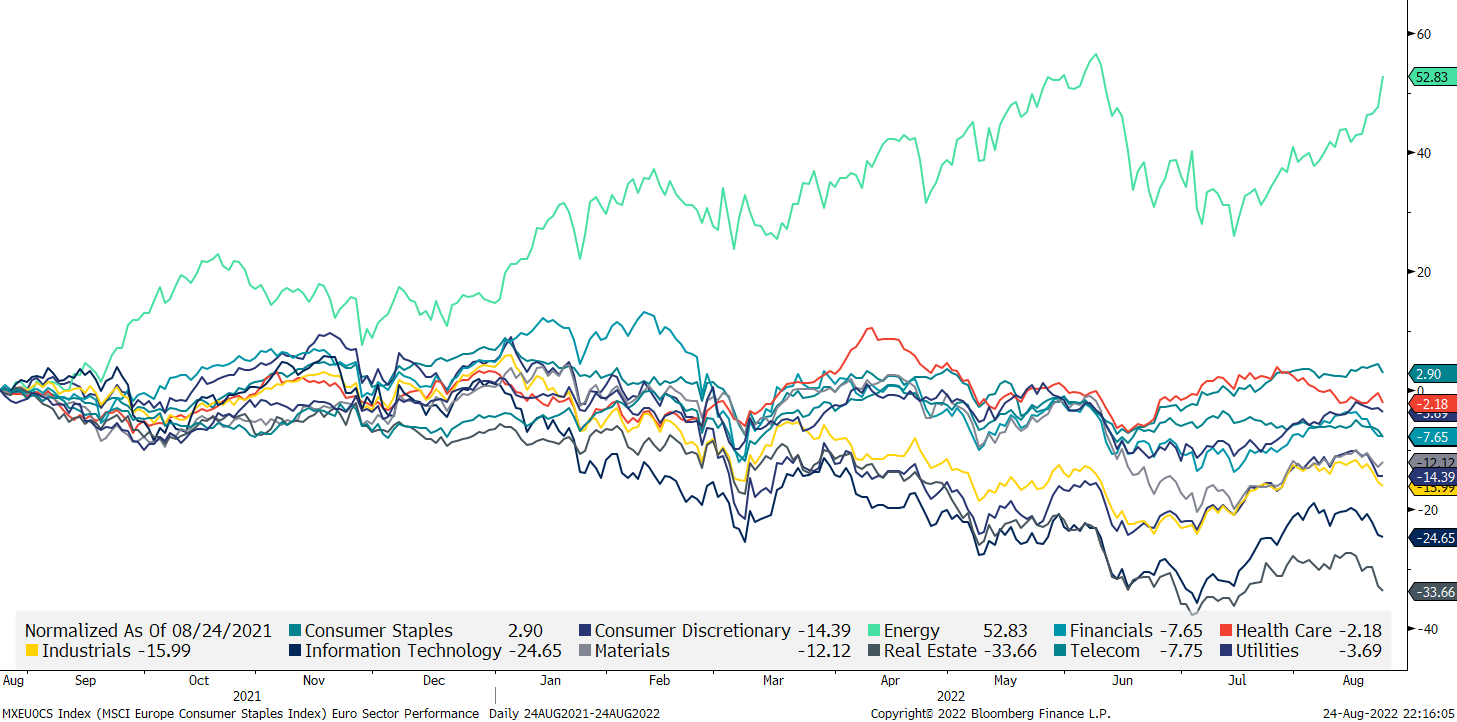
In Europe, the relative YTD outperformance of the energy sector is even more impressive:
Talking EU versus US, and trying to give it a positive spin, US stocks (SPX) now have failed to outperform their European peers (SXXP) for nearly two years. Hurrah!
Looking quickly at two factor charts, we first observe that small cap has been underperforming large cap (all MSCI) on both sides of the Atlantic for about 18 months now:

Or in other words, since interest rates have started picking up …
It is then no surprise to see Growth versus Value stocks on a global level (MSCI) giving a similar picture:

Alright, enough of volatile equities! Let’s have a look at boring bonds. Here’s are the MOVE (blue) and the VIX (green) index rebased to early 2021, with the MOVE being to bonds what VIX is to equities (what a phrase!):

Boring? Who said boring?! The recent pick-up in MOVE is of course troublesome - let’s stay focused on this one over the coming sessions…
Let’s look for a moment at the long-term chart (aka “The Chart of Truth”) on US 10-year yields:
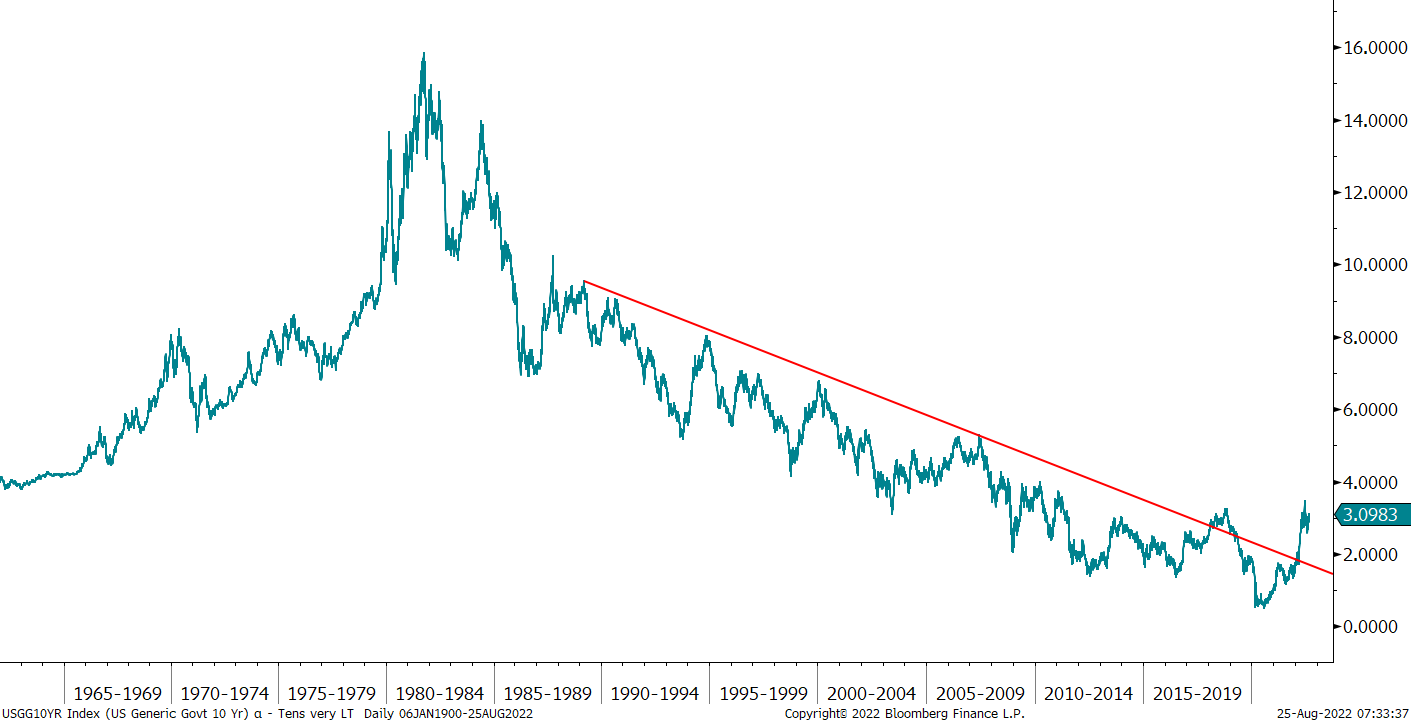
Clearly, the yield has now broken its 40-year downward trend and pattern of lower lows as we have moved into a higher inflation regime. Or has it? Let me play a little “mind trick” on you here - same underlying again:

AHA! Caveat Emptor!
Here’s another ratio for you: Stocks (SPY) versus Bonds (TLT), where the next leg up in favour of stocks seems to be underway:

But careful, as they say: You cannot eat relative performance! Well, actually in this context you can, but it is a bit more complicated. But I am digressing.
Let’s largely skip the currency space for today - the most important US Dollar chart was in Tuesday’s Quotedian (Risk Off!), but for your comfort, I reprint it here quickly:

Every time the rate-of-change on the USD rises in the manner it is doing so right now, something breaks …
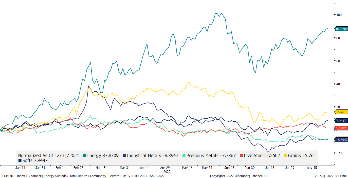
In the commodity bucket, the year-to-date performance race is of course clearly led by the energy segment, whilst it actually has not been an all THAT good year for other segments, comparatively at least:
No surprise then that Energy commos have been the dominant factor in our allocation model, as strength begets strength:

Overall, it feels like commodities are read for the next major move up, as much on the linear scale chart,

as also on the log chart ;-) :

Ok, high time to wrap today’s letter up!
As ‘feared’ at the outset of the deliberations, it was indeed a relatively calm day for markets, with stocks up, bonds down and little else going on. I will therefore refrain to give a deeper picture of yesterday’s session but will have a close look-up tomorrow on today’s happening. And interesting it could get, as:
The USD continues to be strong, which is a headwind to risky assets
The Fed goes into the Jackson Hole meeting theoretically still determined to tighten financial conditions
Commos have picked up again
AND, dealer gamma is negative, which should exacerbate moves in either direction due to hedging needs.
Time to hit the send button - enjoy your Thursday!
André
CHART OF THE DAY
In a dull session, this was the headline most talked about:

Of course, I immediately fired up my spreadsheet, and modelled this new input into my black-box, proprietary cryptocurrency model:
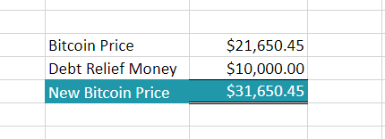
Eh voila!
DISCLAIMER
Everything in this document is for educational purposes only (FEPO)
Nothing in this document should be considered investment advice
Past performance is hopefully no indication of future performance