Rearview
The Quotedian - Vol V, Issue 138
“It's a recession when your neighbour loses his job; it's a depression when you lose yours.”
— Harry S Truman.
DASHBOARD
AGENDA
CROSS-ASSET DELIBERATIONS
Today, with the week, month and quarter just behind us, I will try to deliberate as little as possible, but instead flood you with stats and graphs. Hence, Credit Suisse, OPEC+, Tesla Car Sales, Kwarteng and other headlines knocking on our door will have to wait until tomorrow.
But just before we get started, here’s a message from our sponsor … just kidding! However, with respect to today’s QOTD, we (I) are officially in a depression now. Therefore, I ask you for a special favour, well, actually two favours:
Please hit the Like button at the end of this mail (only if you like The Quotedian of course). Click it today and click it everyday. It well help to grow our community
Share The Quotedian with people you think may be interested. It’s free after all!
Thank you!
Ok, with that out of the way, let’s get started. The following tables will show the monthly (thick bars) and year-to-date (thinner, semi-transparent bars) percent performance for the different assets. I will also throw in one or the other monthly candle chart, as the end of the month is always a good moment to get a big-picture update.
Starting with equities, September fully lived up to its reputation as one of the more volatile months of the year - to say the least…
It is not that I ran out of blue screen ink …
The charts don’t look pretty. The S&P is stair-stepping lower and the target we spoke about at the beginning of the year (3,000-ish) looks ever less outlandishly:
I will update our inverted traffic light chart for guidance on the secular trend on Tuesday, but the light is about to switch to red …
Similarly, the Nasdaq is sitting right on top of key support on the monthly chart:
And for small-cap stocks we either need to draw inclined lines or use a thicker pencil to argue that support has not yet been broken:
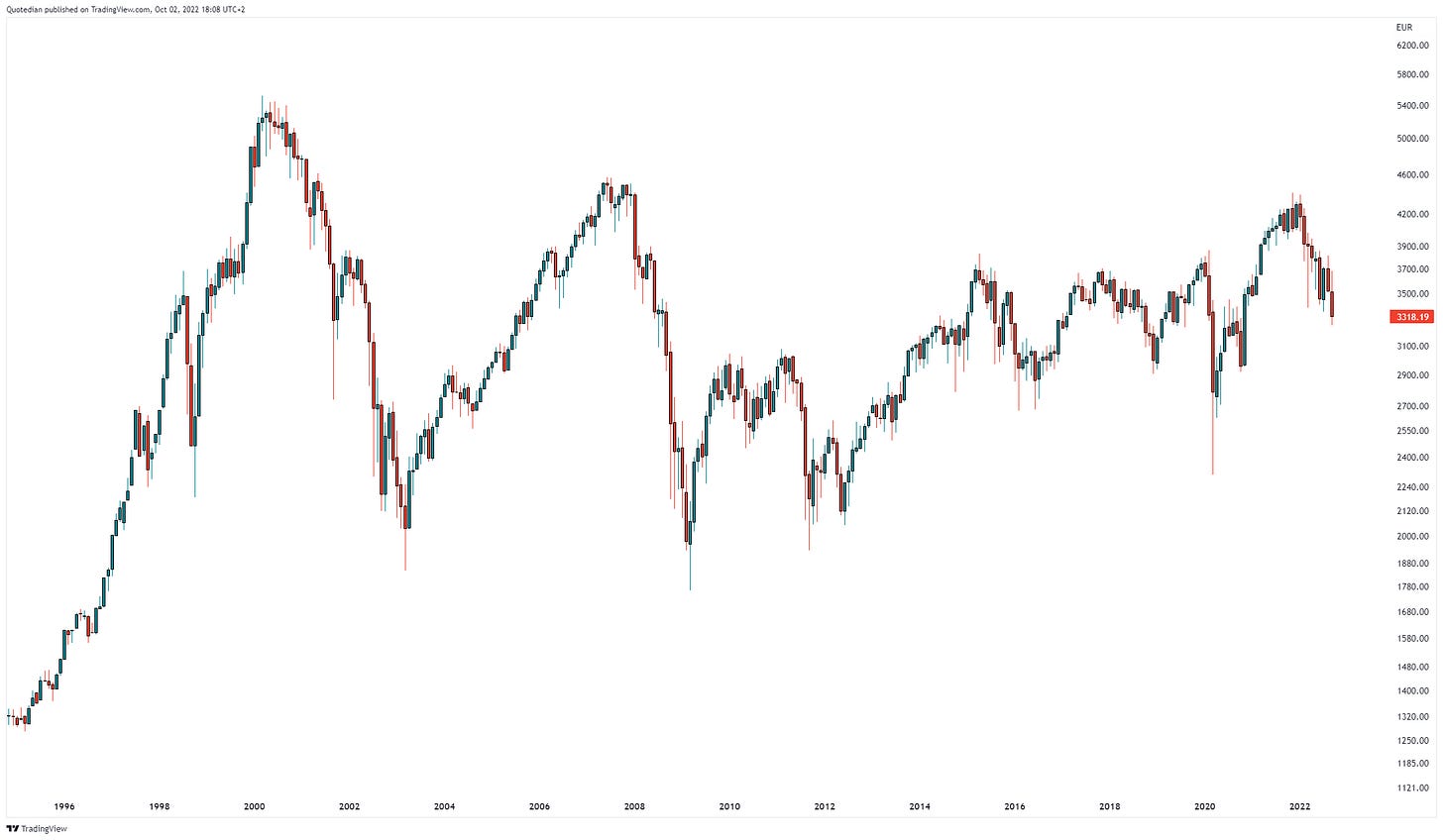
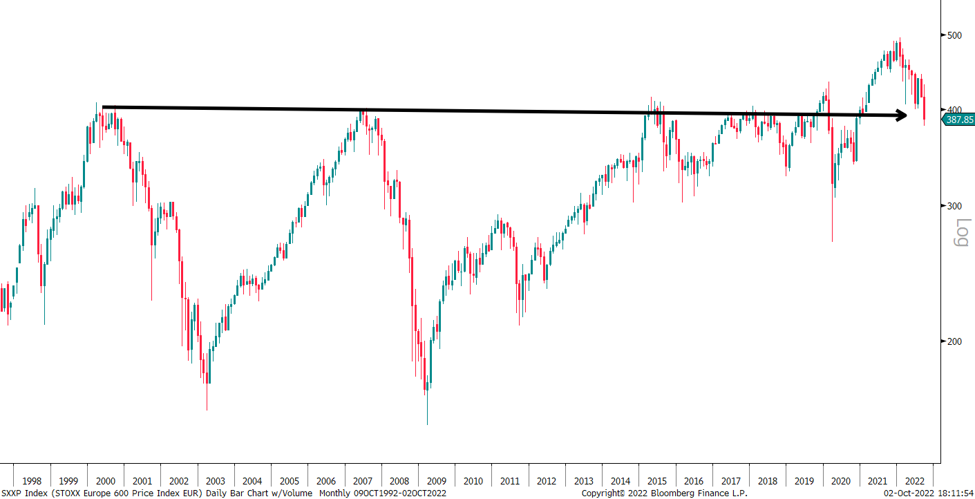
Europe is now firmly in its third (!) decade of nothingness:
Japanese stocks provided relative shelter so far:
But only as long as you had hedged the JPY-risk of course:
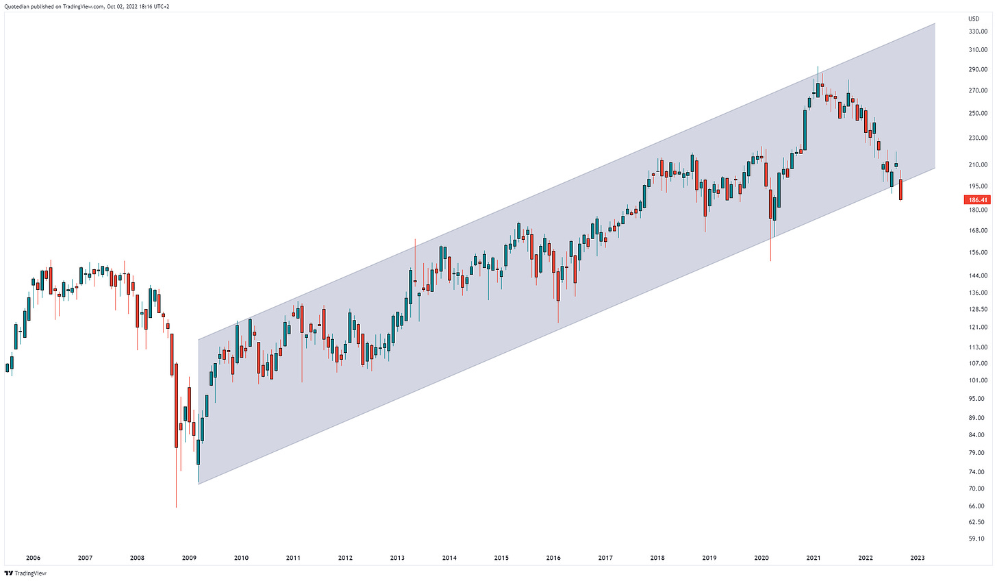
In Dollar terms, the Nikkei is actually dropping below key support as seen above.
Ok, let’s have a quick glance at the equity sector performance to see if there were any pockets of shelter:
Nope.
The only sector continuing to provide positive year-to-date returns is energy, but of course, we were all hopelessly underweight that segment to start with … (unless you read The Quotedian of course 🤪).
Looking at a monthly rotational graph of US sectors, we take note that it is mainly the defensive sectors (Utilities, Staples, Health Care) which are in the (relative) leading quadrant:
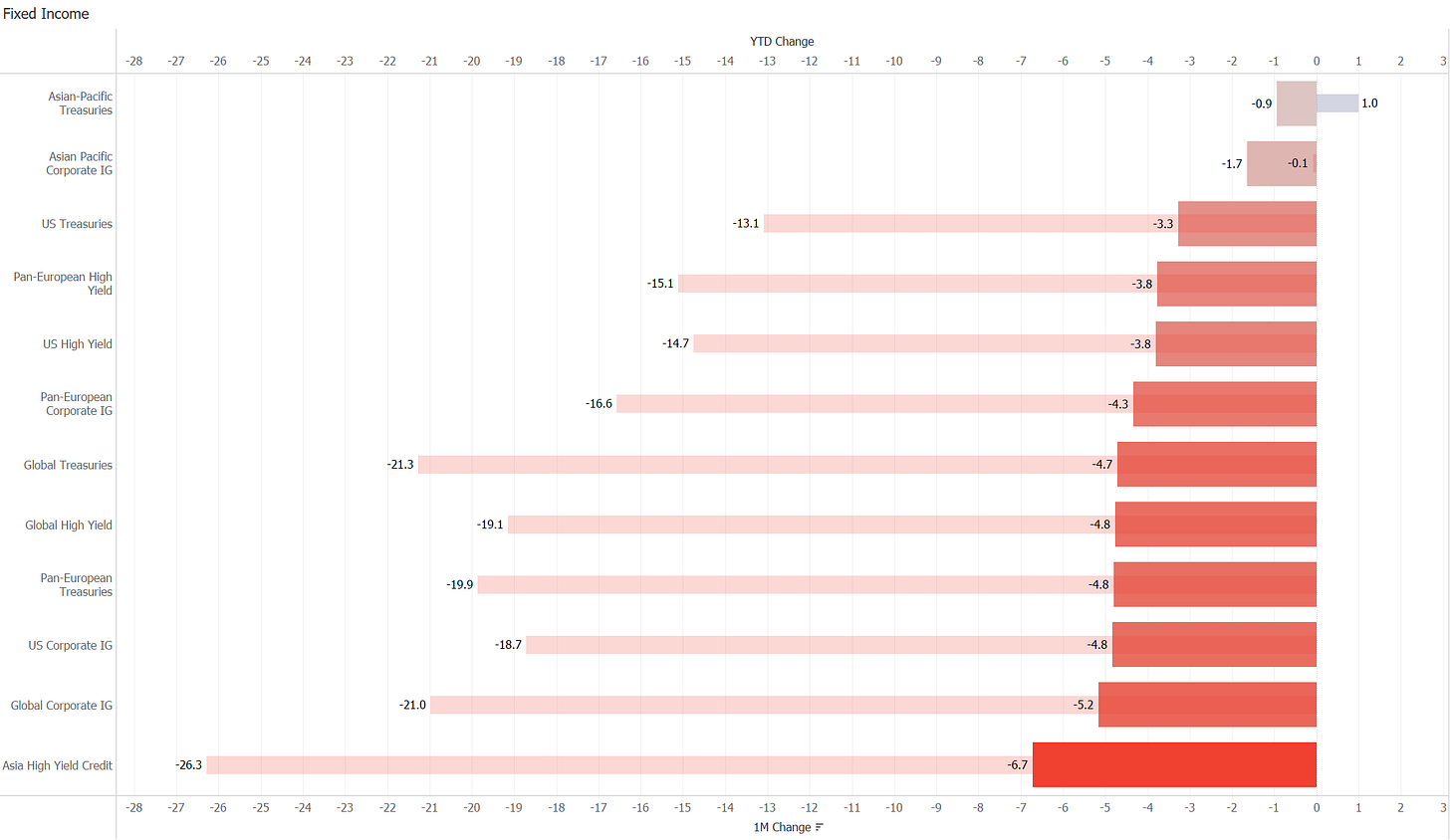
Time to move into fixed income then, where we of course already know that treasuries bonds have failed to act as equity hedge, and credit spreads have widened further too given the loss for risk-appetite by market participants:
Yet again another sea of red (I may be running out of red screen ink soon at this pace!) As fore-mentioned, it is a bit of a double-whammy for bonds at the moment, as they will pressure from the interest AND the credit element, which are of course the two most important inputs in establishing a bond price. Here’s the graphical explanation of a double whammy:
Let’s have a look how the first whammy (interest rate risk) looks on the monthly charts. Here’s the US 10-year Treasury yield, briefly hitting 4% last week, the highest level since 2008:
The 2-year chart of the same treasury is absolutely impressive:
Here is its 10-year-old UK cousin, including the blow-off top last week:
And finally, the more distant German cousin:
All of them have grown tremendously over the 18 months or so, though European yields (via the Bund proxy) seem to be lagging in relative terms.
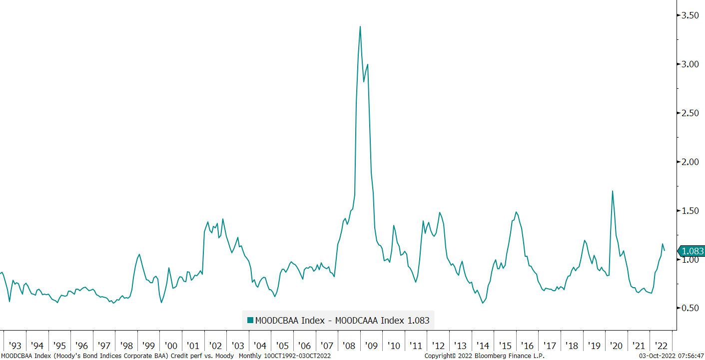
Credit spreads are elevated and in line with previous periods of financial distress, but far off the armageddon levels of the GFC:
Ok, time to assess how much havoc the Dollar Wrecking Ball has wreaked amongst currencies markets:
A rapidly rising US Dollar is a sign of draining global liquidity and liquidity is the life blood of financial markets. Hence, we need at a minimum a pause in the stellar advance of the greenback and probably only a reversal could bring some order back to equity markets. Here’s the monthly chart for USD index (DXY):
At this pace, the EUR/USD currency pair is on a fast-track to visit its early 2000s lows:
The British Pound has (Kwasi - ha ha) recovered the levels seen before last week’s Budget/LDI-Stress moment, but it did touch the lows seen in 1985:
Impressive.
The USD/JPY is still trading at multi-decade highs, despite direct market intervention by the BoJ/MoF:
To finish the currency section and as a nice segue into the commodity part, let me throw in a daily the chart of Bitcoin, just to show that the cryptocurrency has gone nowhere for the past few months, despite all the mess happening in other asset classes:
Crypto-winter hibernation?
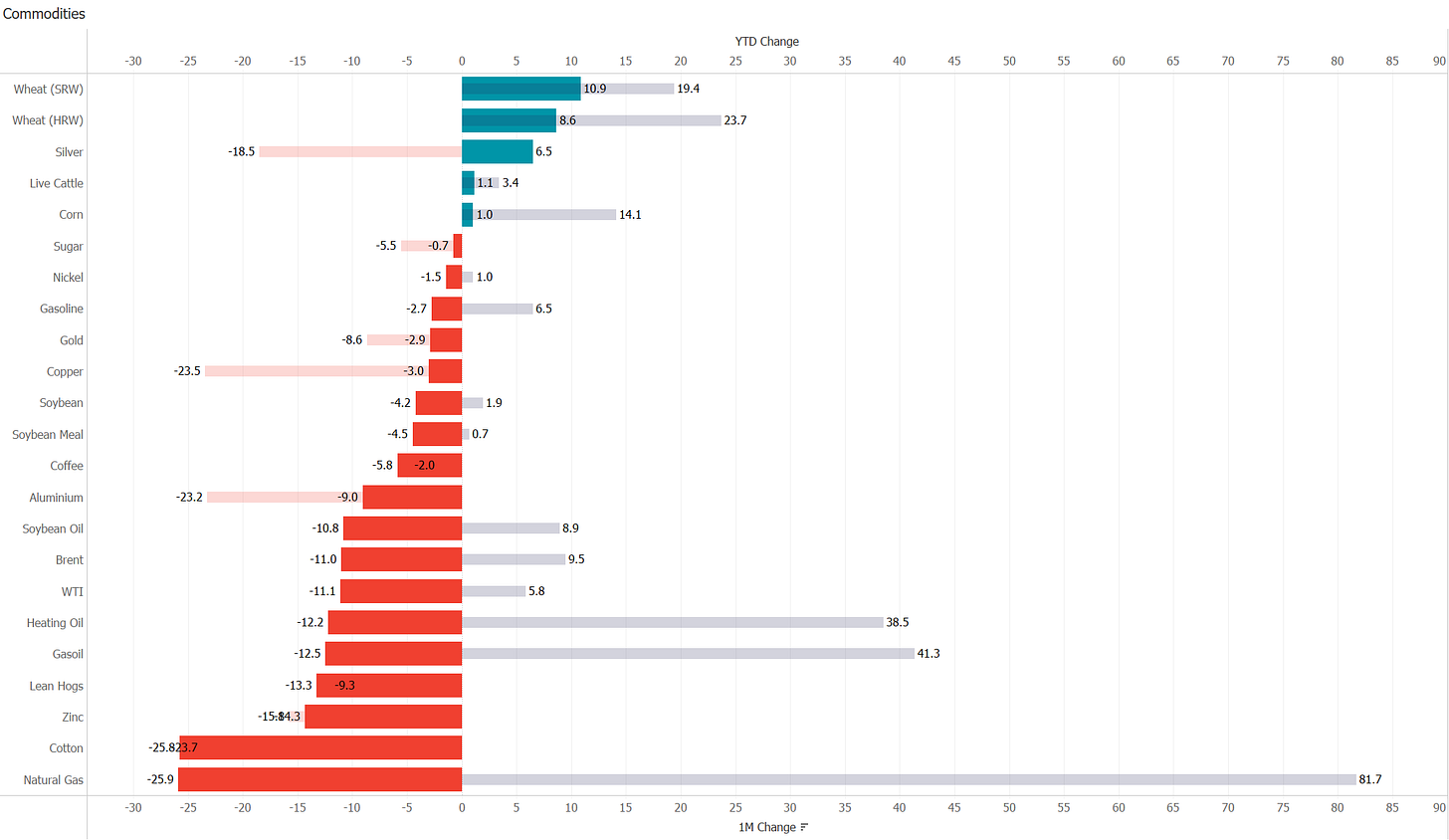
To round off today’s Quotedian, here’s the performance table for commodities then:
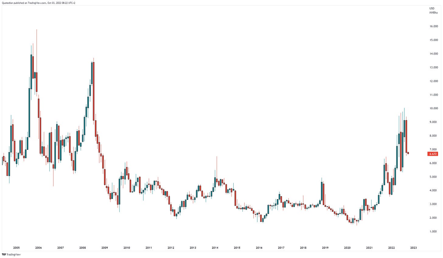
The table is a bit more difficult to read, given some of the extreme moves observed, with natural gas being the best example. Still up some 80%+ on a YTD basis, it gave back a quarter of its gains last month alone:
Some impressive large candles there over the past few months! Similar, the moves on oil (Brent) have been enormous over the past two years:
We have discussed Gold before, and how it has been disappointing given the inflationary AND market mayhem backdrop:
However, let’s not forget that measuring gold in other than US Dollars, the charts continue to look more constructive. As an example, here’s the weekly chart of Gold versus a basket of EUR, JPY, CHF and GBP:
OK, time to hit the send button, but just before that, a quick reminder:
Let’s grow our community and hence increase my visibility. This will be beneficial for everyone …
Hit that LIKE button
andShare the Quotedian with your friends/colleagues/family:
and tell them to subscribe:
That’s all I ask from you in exchange for one of the best macro/cross-asset newsletters out there (unbiased viewpoint 😇).
CHART OF THE DAY
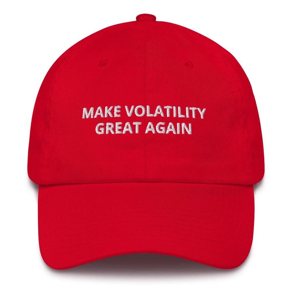
As we are already somewhat “overcharted” today, let me replace today’s COTD with the following image:
May the macro environment remain as fast and furious as it has been over the past ten months or (it will).
Thanks for reading The Quotedian! Subscribe for free to receive new posts and support my work.
DISCLAIMER
Everything in this document is for educational purposes only (FEPO)
Nothing in this document should be considered investment advice
Past performance is hopefully no indication of future performance











Great views and work André! Thanks!