Risk-Off?
The Quotedian - Vol V, Issue 110
"Having a little inflation is like being a little pregnant."
— Leon Henderson
DASHBOARD
AGENDA
CROSS-ASSET DELIBERATIONS
First of all, an apology, as my intention and promise was to send out this Quotedian yesterday afternoon, but as Mike Tyson (more or less) said: “Everybody has a plan until they get punched in the face”. On the bright side, you now can consume today’s longer letter during your Monday morning, sipping coffee and waiting for lunchtime to come ;-)
Let’s get going …
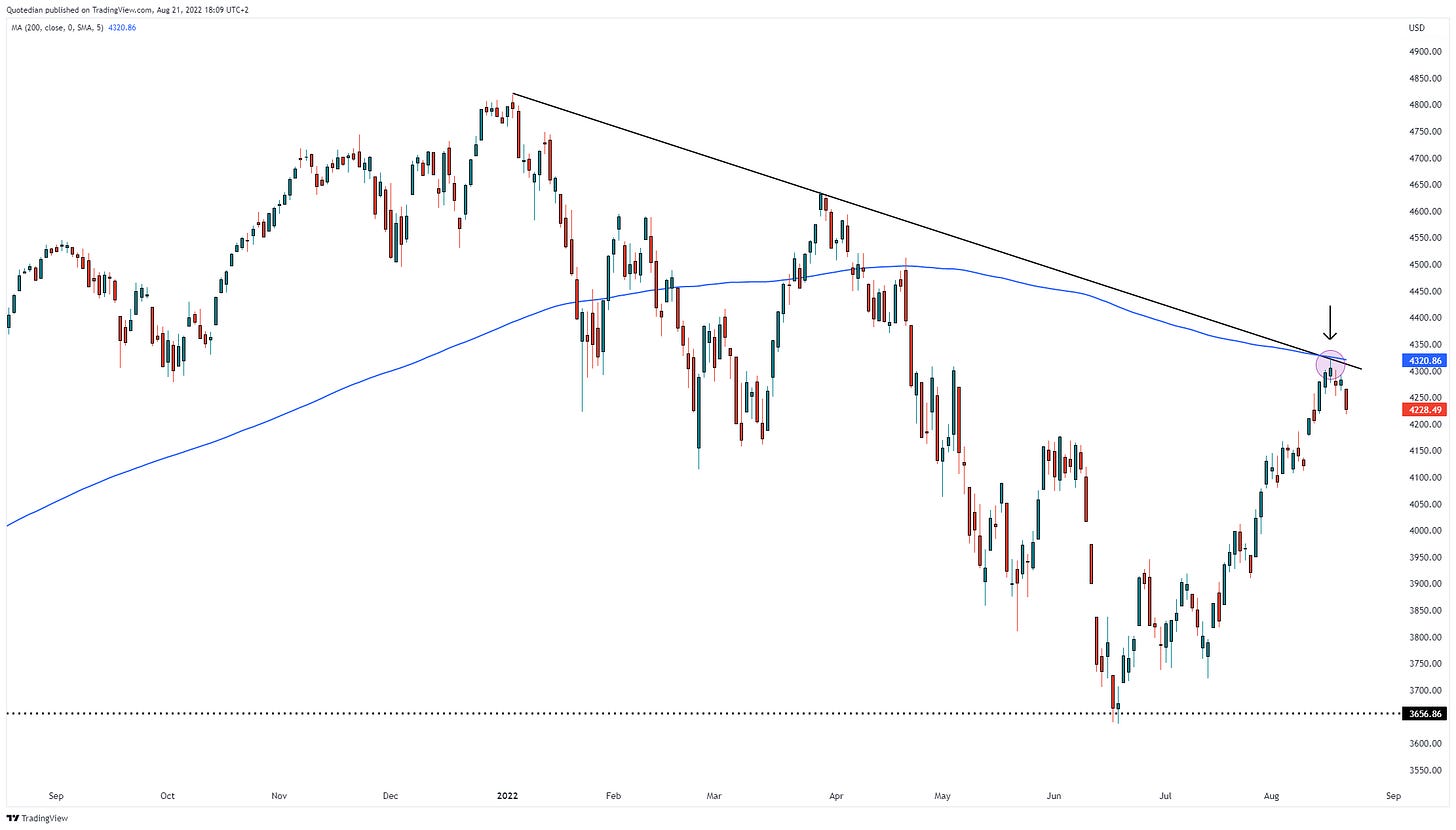
Last Thursday I highlighted in The Quotedian titled “Rejection” a daily candle chart of the S&P 500, suggesting that the index may be pivoting at its 200-day moving average. The 200d MA period is probably the most overhyped indicator around, but sometimes, like now, it just works like a charm. The index gave back another 1.3% on Friday, whilst the Nasdaq dropped over two percent. Here’s an updated chart of the S&P:
I am a firm believer that “news follows price”, and this time was not much different. IMHO, the main reason for markets turning into risk-off mode is the renewed hawkishness of FOMC members, as described in Friday’s “Who let the dogs out”. Maybe a better title would have been “Dogs that bark don’t bite … hopefully”, as investors after initially ignoring those hawkish comments on Friday suddenly had a change at heart and went into full risk-off mode.
For example, about 85% of the constituents of the NYSE Composite index were lower on the day, with a similar picture in the STOXX 600 Europe index (75% decliners). Similarly, only one out of eleven sectors eked out a tiny gain, with the leaders of the bear rally of the past weeks taking the largest hit:
Factors performance was also witness of the depth of the newly found risk-shyness of market participants:
For the week, most global equity markets ended lower than where they had started, tough some markets we had recently discussed (Japan, UK) continued to ‘shine’:
Equity sector performance shows that only three sectors gained on the week:
Finally, and before turning to bond markets, volatility (VIX, dark green) picked up somewhat during the past two days. Interestingly enough, vol-of-vol (VVIX, light green), or spelt out, volatility of volatility had picked up several sessions before VIX itself (blue arrows). We had seen a similar pattern on the opposite side (black arrows) before the interim June equity low:
This serves as the perfect segue into fixed income markets, where bond volatility (MOVE, light green), similar to VVIX, has picked up before and more violently than VIX (dark green):
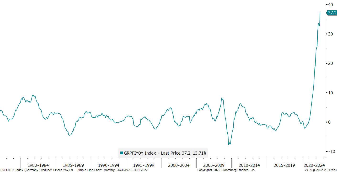
The pick-up in bond volatility was of course a direct result of the FOMC’s dogs renewed hawkishness ahead of this week’s Jackson Hole central bankers’ meeting, which is likely to guarantee a further increase in market volatility next week. But also, and clearly adding insult to injury, was Friday’s Producer Price Index reading. Quite frankly, I think a picture speaks more than a thousand words, and was seldom less adequate than in this case:
Bond yields rallied as a result, here’s the 10-year Bund yield graph:
US yields also advanced, especially at the longer end of the curve, further continuing the steepening we have been observing since early August:
This is not necessarily good news, as recessions tend to occur, not as the invert, but rather once they undo the inversion (bear steepener):
In short, the inflation/stagflation/recession theme is far from being off the table, with the UK also reporting their highest year-on-year price increase in forty years earlier this week. I mean, for FFS, even the Japanese are closing in on their highest inflation readings of the past 40 years:
The general lift in yields is then clearly visible in the bond market performance of last week:
Moving on into the currency space, the weekly performance table leaves no doubt that the risk-off mode found towards the end of the week meant also that King Dollar was sought after again:
The USD/JPY currency pair showed probably the most impressive $-rally:
But also the EUR/USD cross-rate has been pushed lower and a breach of the July multi-year lows seems imminent, with a much lower target (0.95?) becoming likely:
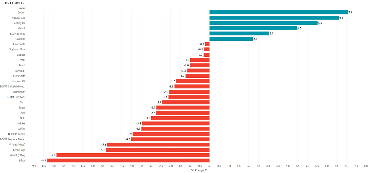
In the commodities bucket, Energy was of focus again last week, with natural gas especially in the spotlight after Russia decided to shut down Nordstream I once again for ‘maintenance’ purposes:
Here’s the chart of US natural gas (NG), showing that prices are close to multi-year highs:
Even though the low risk/high reward trade here would be to go short NG with a tight stop just above the recent highs, my guess here is actually that prices will break higher sooner or later. I have even read (credible) arguments that US natural gas prices (light green) will close their gap to European prices (dark green). This chart shows the price evolution of both since the divergence more or less began:
Higher gas prices should eventually also prove as a backwind to (crude) oil price, as substitution (oil for gas) in European industry is becoming ever more a topic. Tough for now, recession and hence demand concerns, are exerting downward pressure on prices:
Gold has now retraced 50% of its recent advance and seems to be on a road to nowhere. But even worse off is silver, which doesn’t seem to find any love neither from precious metal nor industrial use aspects:
Time to hit the send button - have a great start to the week and don’t forget to hit the like button at the bottom of this mail to support my work; but only if you like it of course ;-)
CHART OF THE DAY
The following chart from the fine folks at Nautilus Research was making the round through social networks over the weekend. It shows the current price development of the S&P 500 (red line) and compares it to similar paths in the past. There’s something there for bulls and bears alike. Make your choice and stay tuned …
DISCLAIMER
Everything in this document is for educational purposes only (FEPO)
Nothing in this document should be considered investment advice
Past performance is hopefully no indication of future performance


