

Rocket Man
Vol IX, Issue 22 | A NPB Original

"I would like to die on Mars. Just not on impact."
— Elon Musk

SpaceX (SPCX) has gone public via the largest IPO ever. From here: Caveat Emptor.
Stock markets are recovering and with certain corners of the market (S&P 500 equal-weight, Russell 2000) already having made new ATHs, chances are high that the uptrend is reinstated already
Bonds could rally further over the coming weeks, especially given the newsflow regarding ‘peace’ in the Middle East of the past few hours.
The US Dollar remains range-stuck; Bitcoin may be worth a dabble to the upside
Perfer Copper over Gold

Maybe this is the nth post/newsletter/Substack you are reading this weekend titled “Rocket Man”, but for nothing on earth (or outer space for that matter) I would forgo the opportunity to make reference to Elton John’s fantastic song with the same title:
And then there is this, of course …

Unbelievable that Elon’s and my combined net worth is now in excess of USD 1 Trillion!
Alright, continuing …
Today’s letter is not about bashing the SpaceX IPO, which took place last Thursday (bean counting) and Friday (price setting and trading), as I am too much of a 1970ies child, who grew up with especially this:
\" als eBook kaufen")
But also this:

And then, of course, this:

So, any dude (or dude-ess) with such a world-building drive as Elon Musk gets my full respect and the whole things feeds fully into my “positiveness” regarding the future of humanity.
Or, in other words, optimism is an equity investor’s best friend …
… HOWEVER, greed hallucination is his ruin!
And in the case of SpaceX, coming to the public market with a Price-to-Sales ratio of somewhere around 100x (believe me, the exact number is not so important at these lofty levels), it is greed hallucination an investor needs rather than optimism, to buy into this stock.
Maybe it is a good time to blow off the dust of Scott McNealy’s, then CEO of SunMicroSytems, words, pronounced a few years after the DotCom bubble burst:
At 10 times revenues, to give you a 10-year payback, I have to pay you 100% of revenues for 10 straight years in dividends. That assumes I can get that by my shareholders. That assumes I have zero cost of goods sold, which is very hard for a computer company. That assumes zero expenses, which is really hard with 39,000 employees. That assumes I pay no taxes, which is very hard. And that assumes you pay no taxes on your dividends, which is kind of illegal. And that assumes with zero R&D for the next 10 years, I can maintain the current revenue run rate. Now, having done that, would any of you like to buy my stock at $64? Do you realize how ridiculous those basic assumptions are? You don’t need any transparency. You don’t need any footnotes.
What were you thinking?
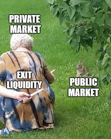
And this, even before I get started on Private selling to Public, as I already ranted in last Thursday’s daily edition of The Q (click here for the full post):
and the observation that we should be watching like a hawk whether these IPOs make money for PUBLIC MARKET investors vs treating them as “Exit Liquidity” for the PRIVATE MARKETS.
Unfortunately, I know the answer already.
But fret not, I will not go there again, but rather, and to finish off the topic, will get the better of me again and remind myself that I am of part of Gen X, where during my youth years Science Fiction was in full blossom. So, if you really can’t help yourself, consider SPCX a cryptocurrency-like investment with no anchor point for valuation, and go and buy a share of two of Elon’s Mars dreams - like that you will always be able to tell the alien wives/husbands of your grandchildren that you were there!
Please just don’t bet your entire portfolio on it and of course:
CAVEAT EMPTOR!
And now, for something completely different,
 | MUBI")
i.e., the rest of the markets!
Yes, indeed and against all rumours, ‘things' other than SpaceX exist out there.
For example, the S& 500, where BTW the brave policy-setting committee of Standard & Poors voted against a “fast track” inclusion of SPCX (despite having nearly the same ticker as the index - SPX).
As we documented last week, the (equity) market started correcting the week before last on June 3rd, just a day after the index hit a new all-time high (ATH):
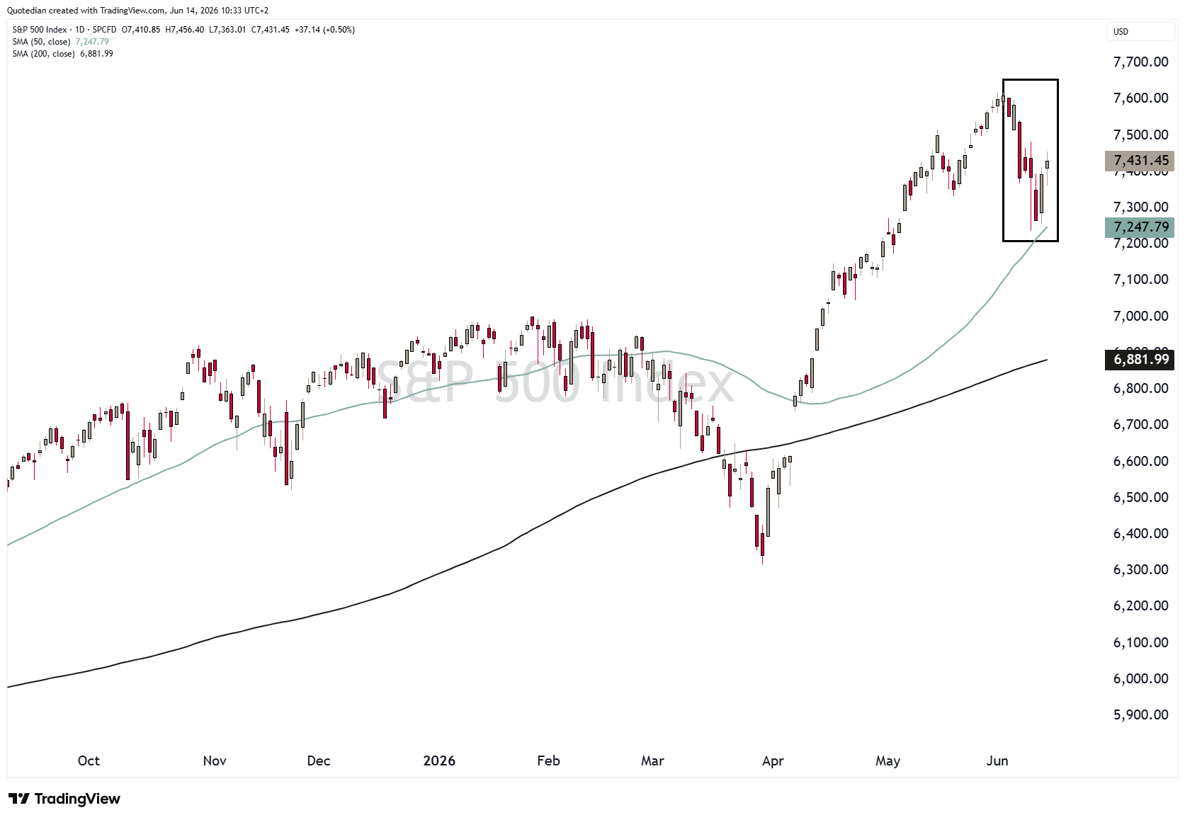
The index rapidly corrected just over five percent, lead by a sell-off mainly in the semiconductor sector, but also dragged down by weaker Mag7 stock behaviour. Now, you may have noticed on the chart above that the S&P 500 quite precisely sold off all the way down to its 50-day Moving Average (MA), only to turn higher again on a needle’s eye.
Hence, the question is: Was that it? And the unequivocal, clear-cut answer is: Possibly.
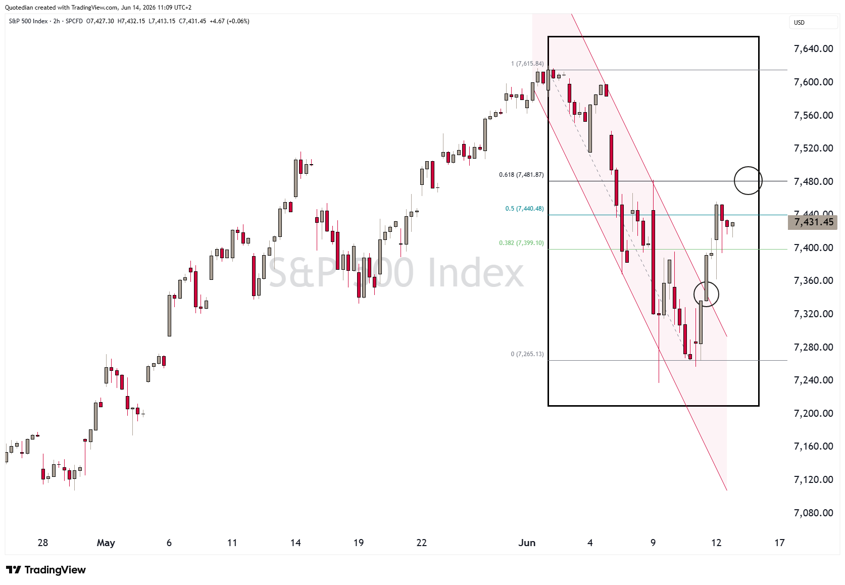
Same chart again, now on a two-hour time frame, would suggest that chances for a bottom are in, and traders can add above 7,480 to any longs:
But for us position-trading investors, we are actually in a set-up I really quite like. Let’s call it “The Lines in the Sand”-setup, and it happens when the S&P 500 is stuck in a smallish range, with clear upper and lower resistance, respectively support points nearby:
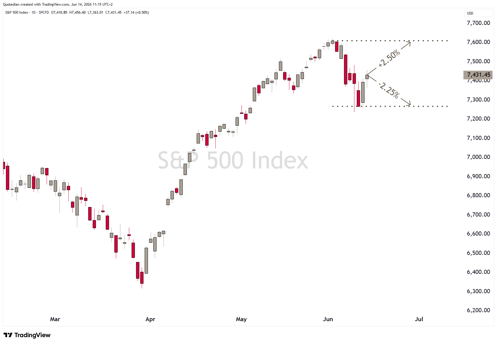
In other words, no need to take excessive bets risks right now, as we are roughly in the middle of the range of our sand lines. Go aggressive upon breach on either side!
HOWEVER, if you cannot be bothered to patiently wait for such a break, then make the bet to the upside.
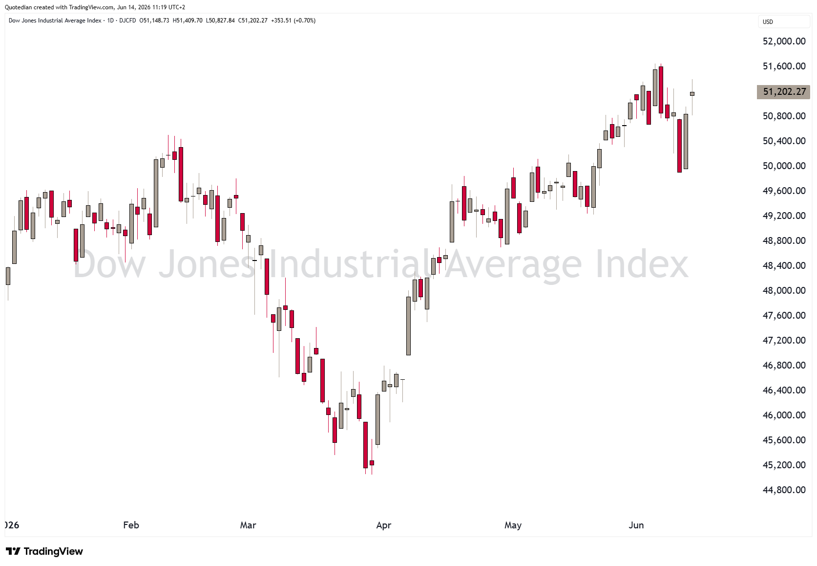
Not only because the DJ Industrial index is less than a percentage point away from a new ATH,
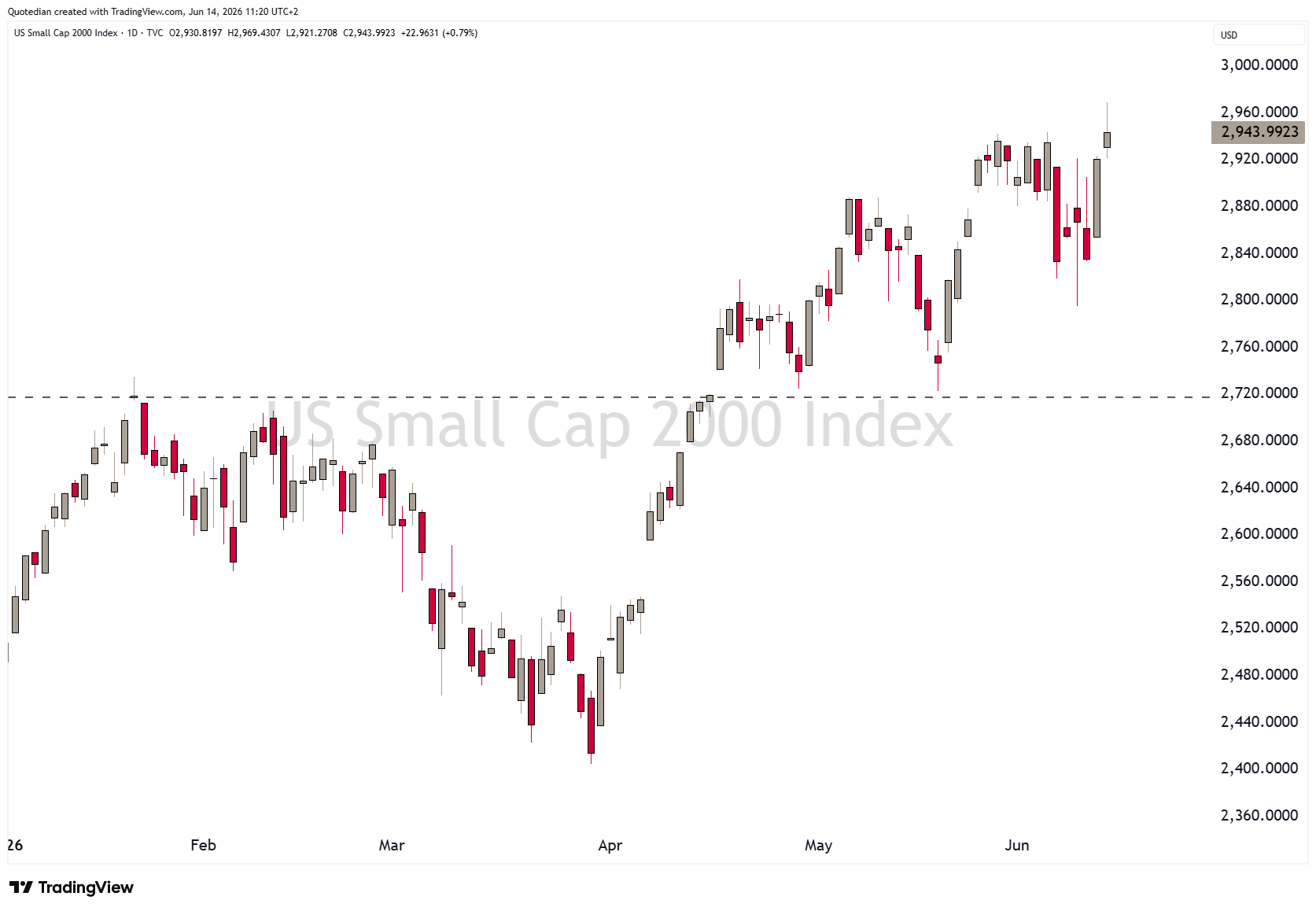
but especially because small-cap stocks (Russell 2000),
and the equal-weight S&P 500 (RSP),
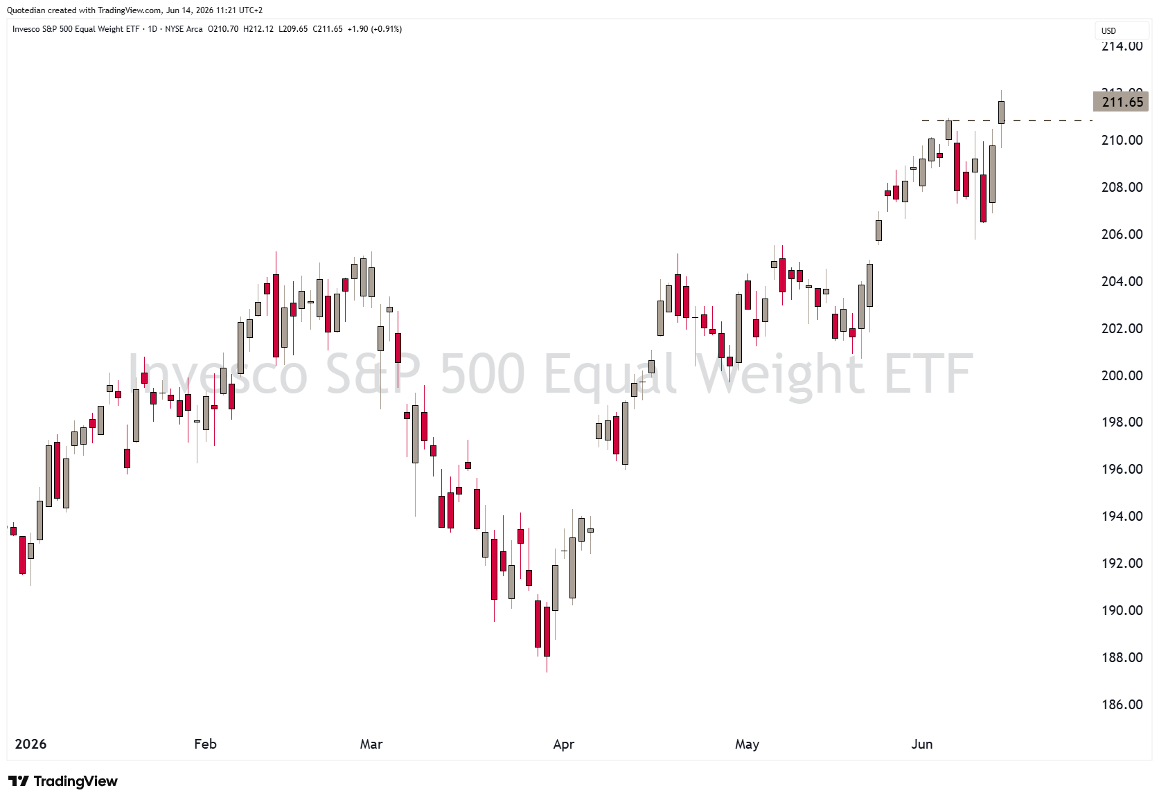
have already achieved that feat (of a new ATH).
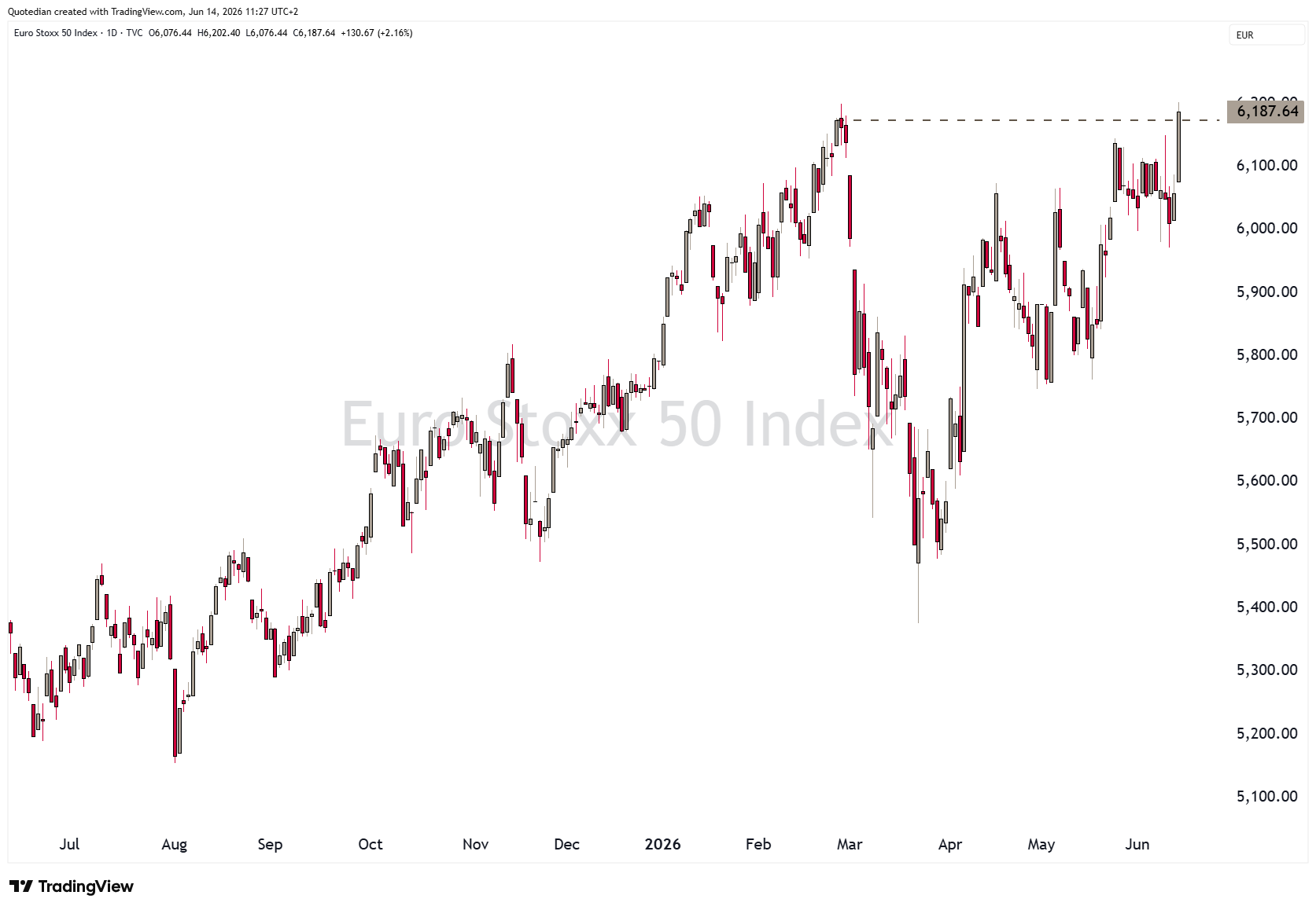
Turning to Europe, and this may come as a small surprise to you, the Euro STOXX 50 index, a narrow measure of the Eurozone’s largest companies, has also already hit a new ATH last Friday!
And the broader STOXX Europe 600 (SXXP) index is on the verge of achieving the same:
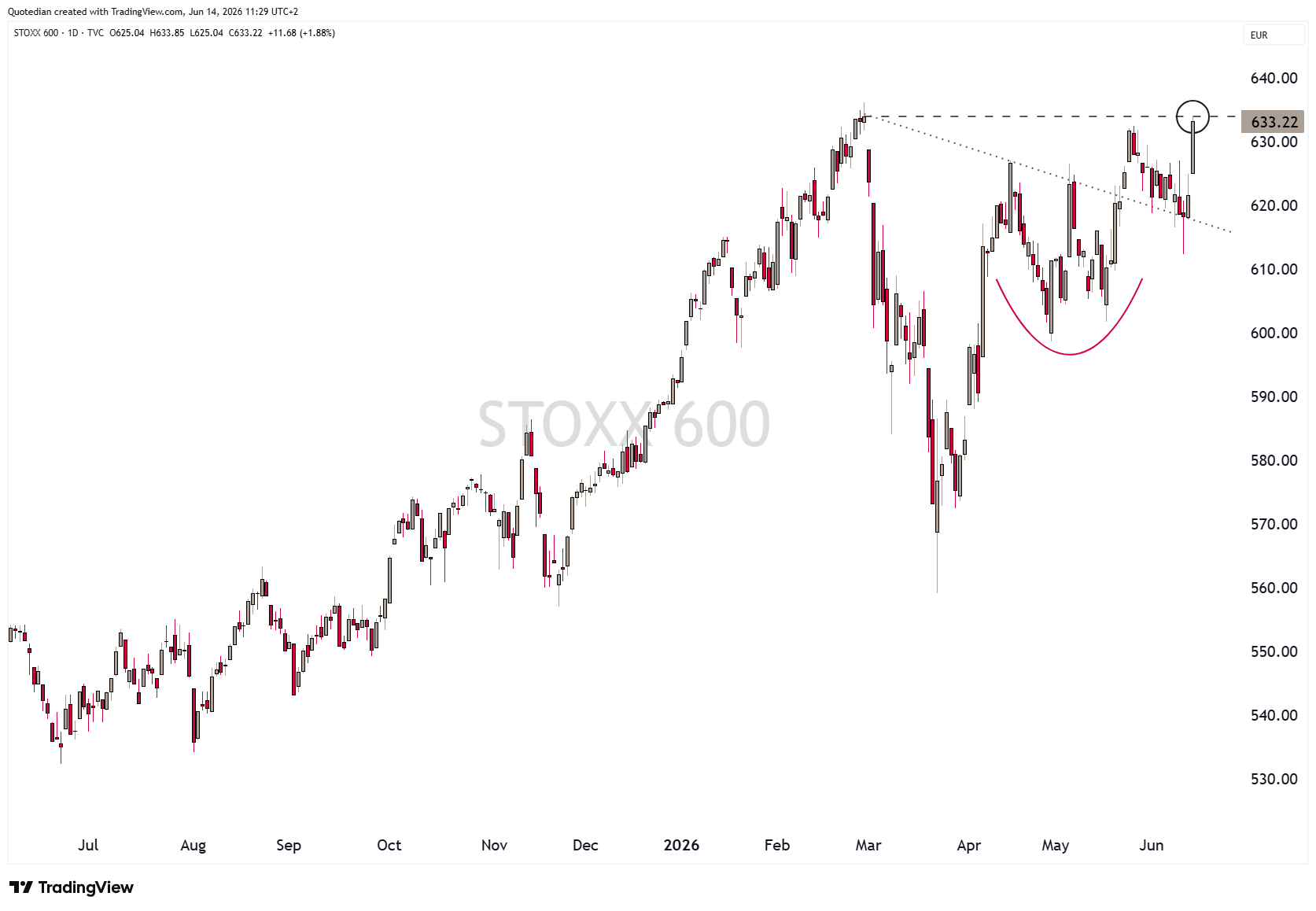
Actually, this all looks suddenly very bullish again!

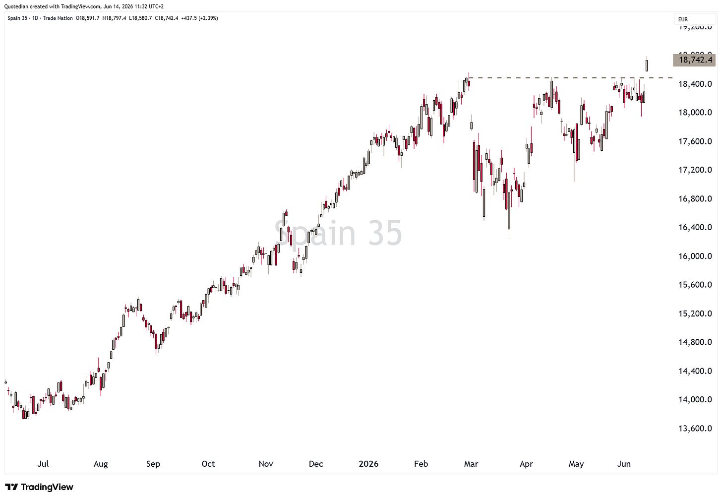
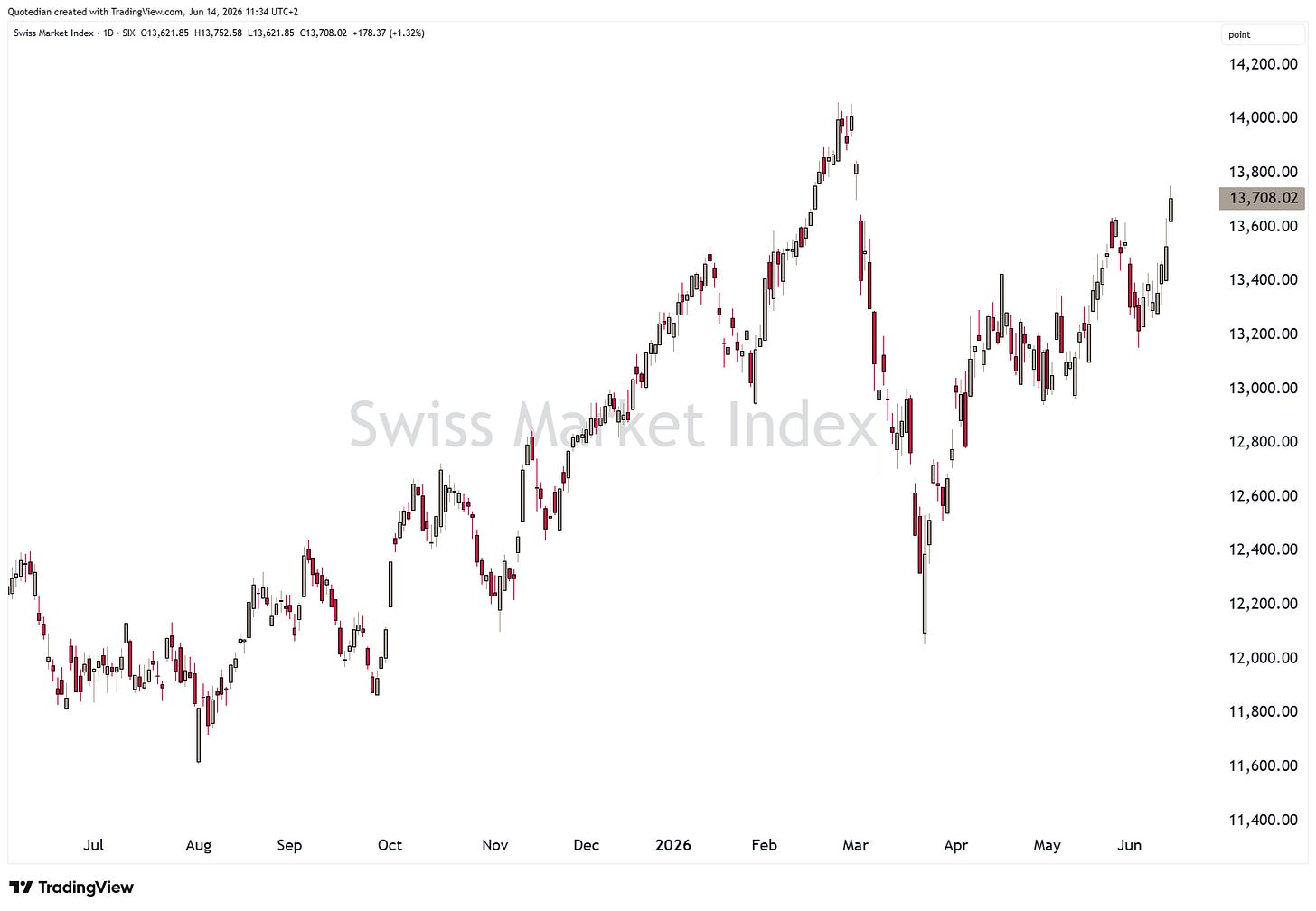
Two European markets to highlight:
Spain, which has proven to have one of the most robust economic growth in the Eurozone, looks super-bullish on the chart:
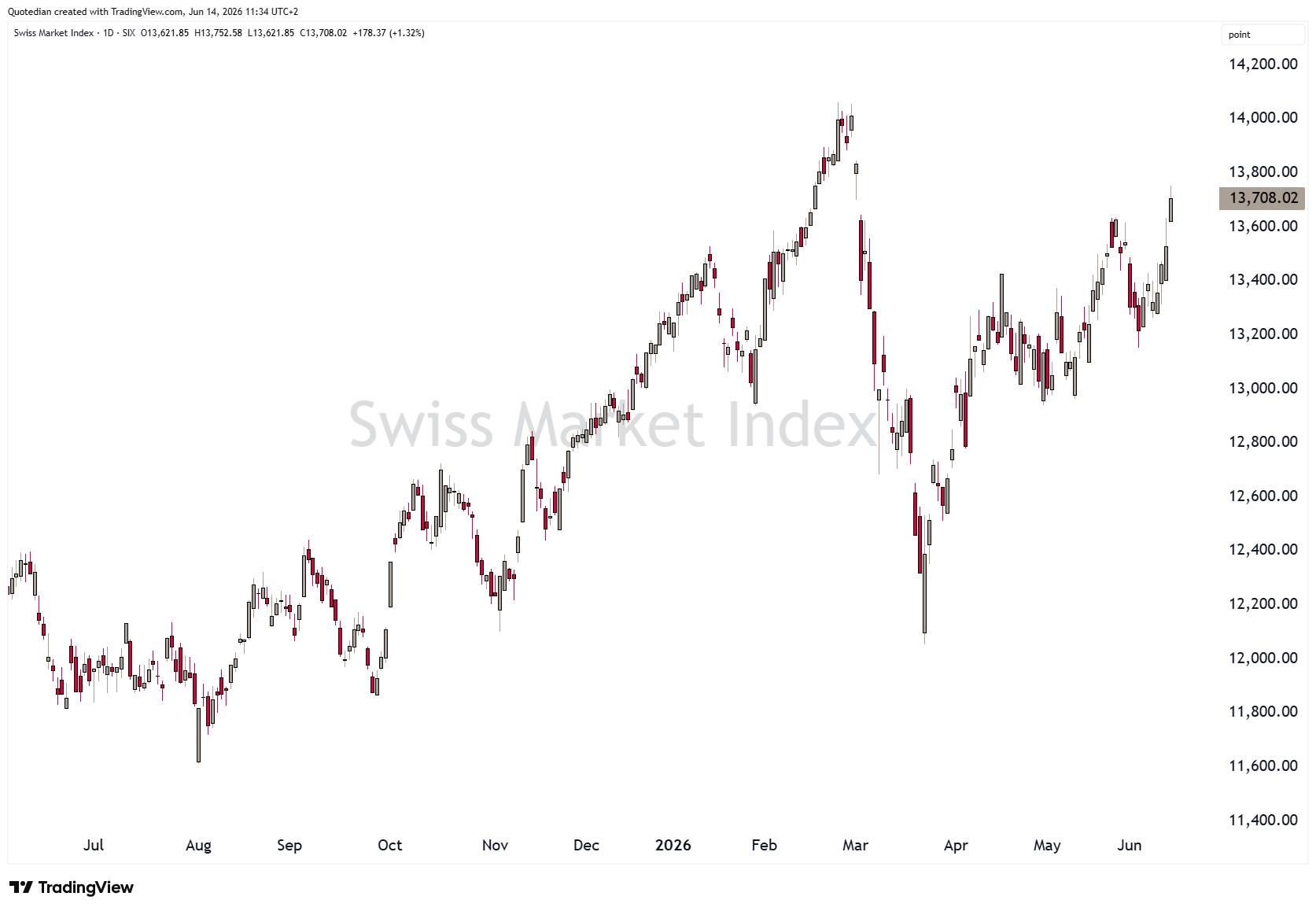
As does Switzerland’s chart of the SMI, even though is coming to play catch-up from behind:
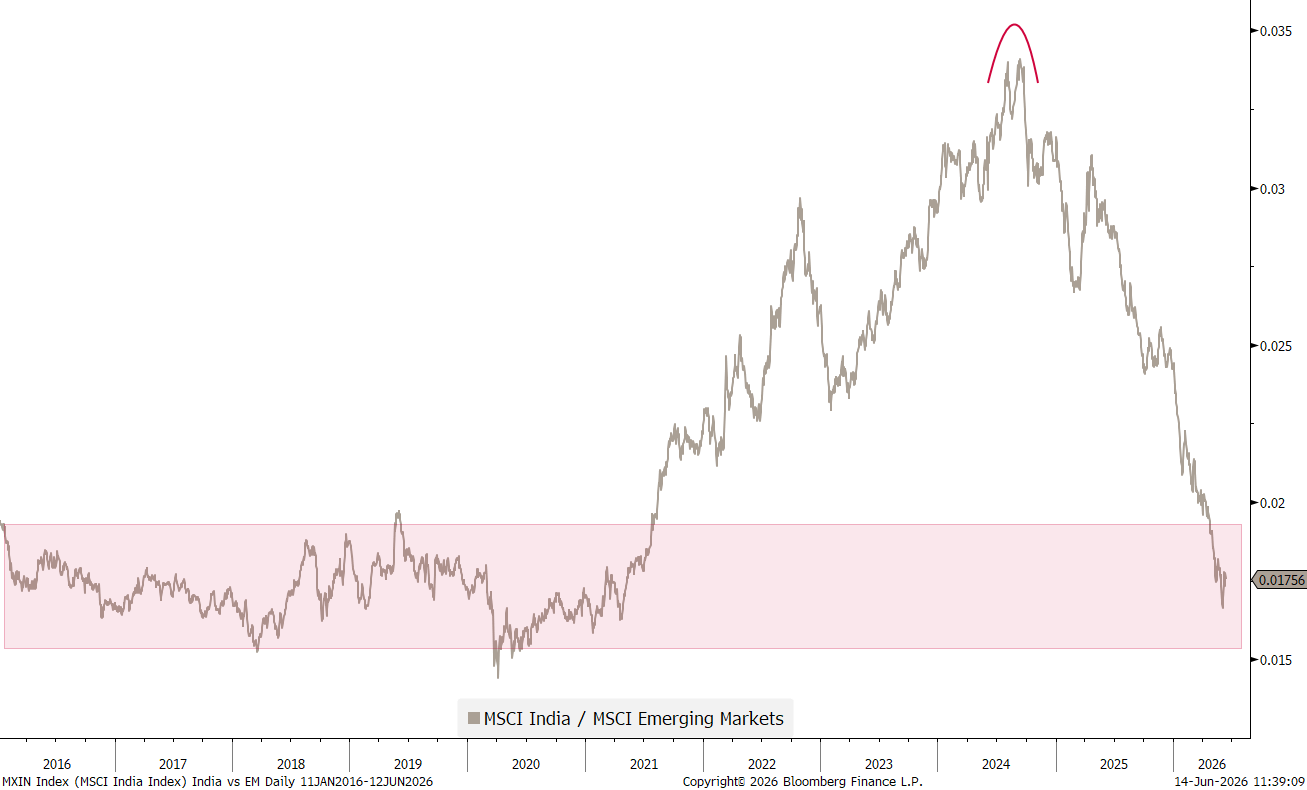
Turning to Asia, we look at only one chart and ask ourselves if the combination of the current relative level of the Indian stock market to the rest of the emerging markets, coupled with some hopes around the opening of the Strait of Hormuz, could be enough to warrant a recovery rally?
Alright, time to look where relative strength lies amongst the different sectors via our proprietary aReS™ model:
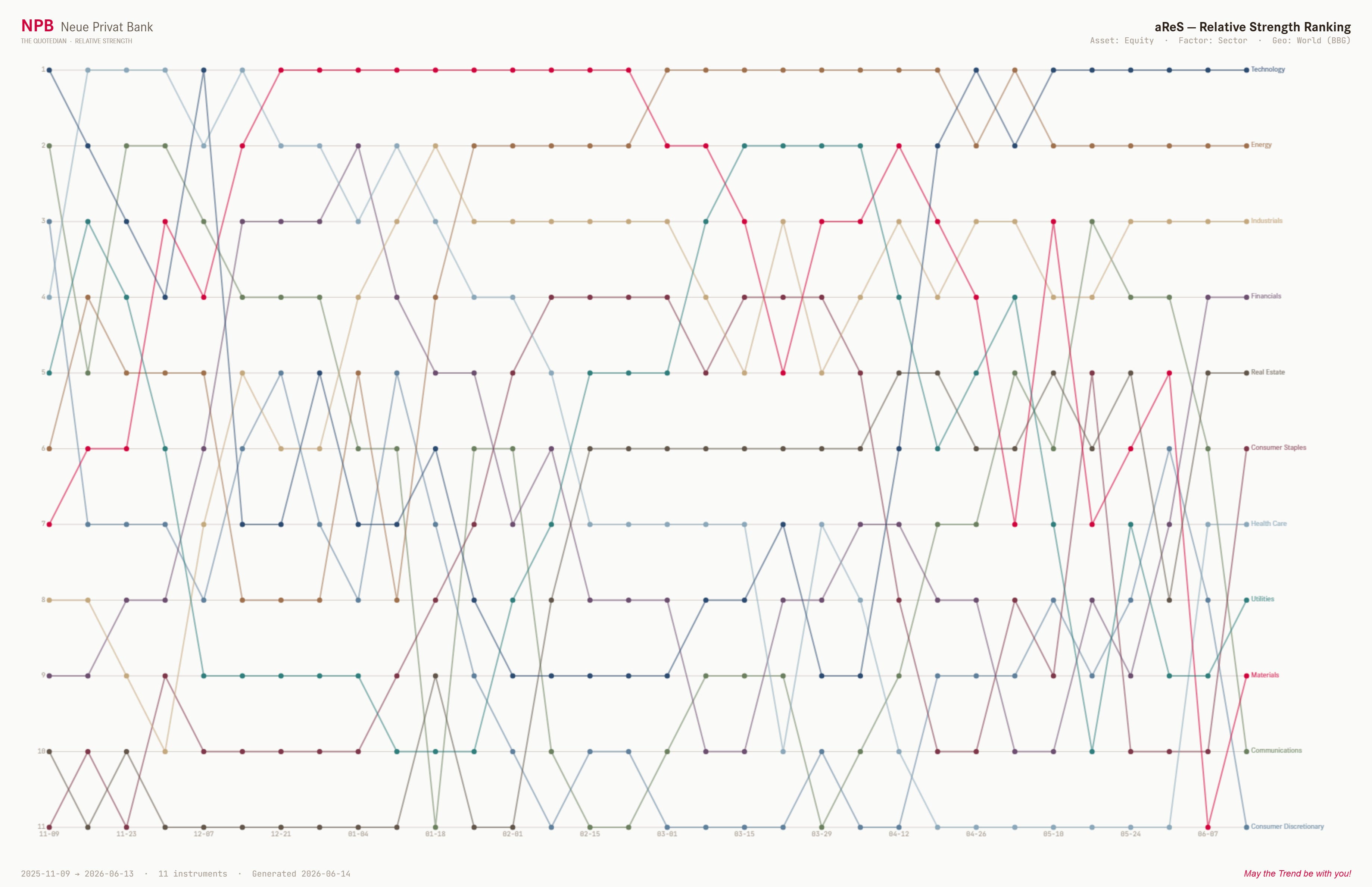
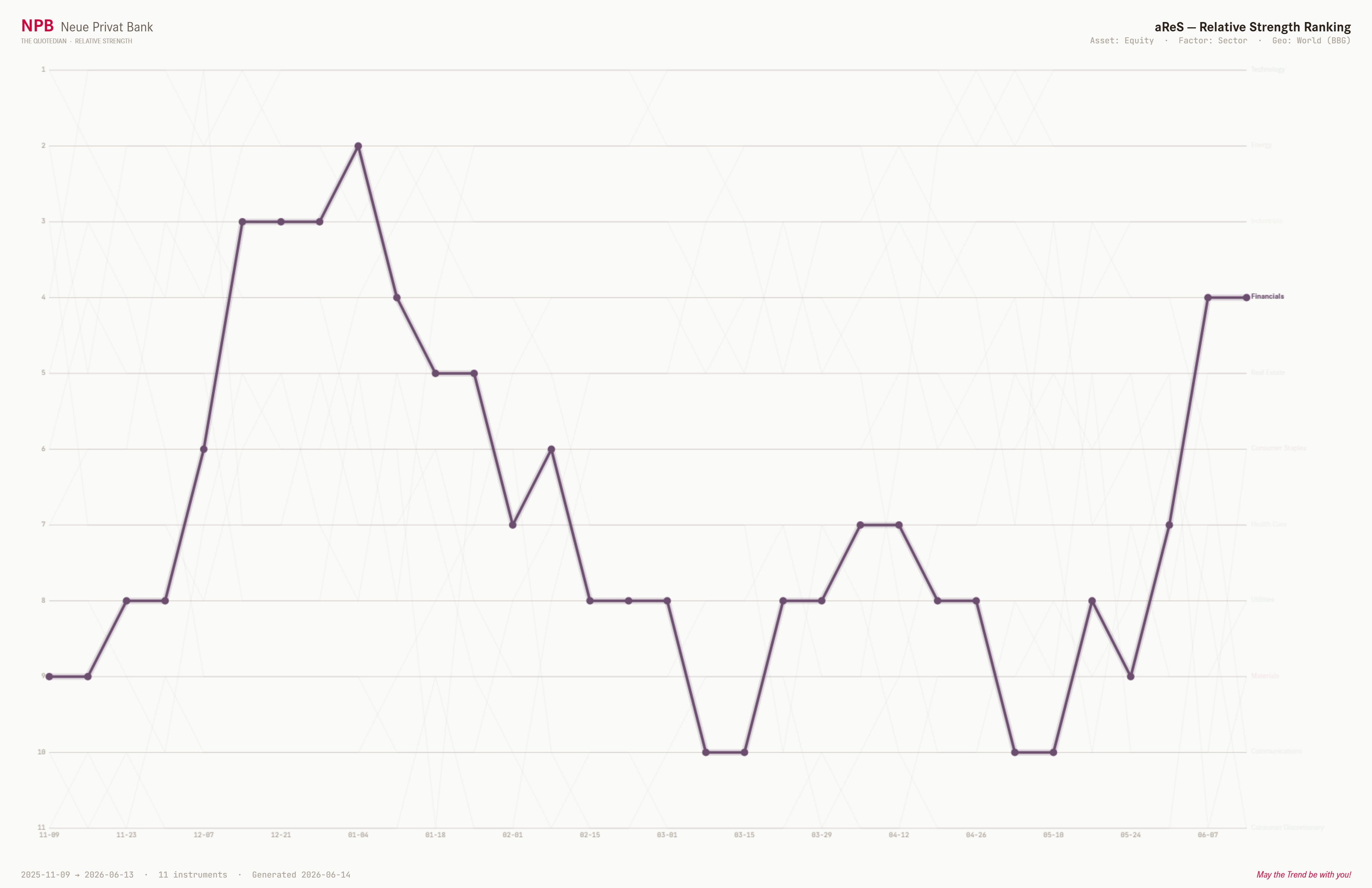
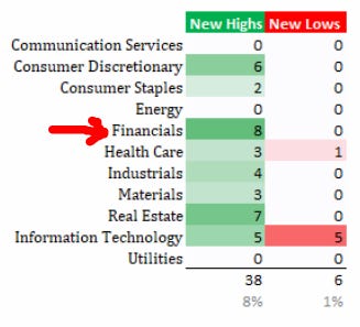
The overall ranking shows that Technology and Energy (is that the new 60/40 portfolio?) continue to lead. However, what I want to highlight is the climbing up the aReS™ ladder of financial stocks since early May:
So, was the for example, this list of stocks hitting a new 52-week high led by financials as much in the US,
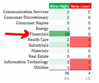
but especially also in Europe (SXXP):
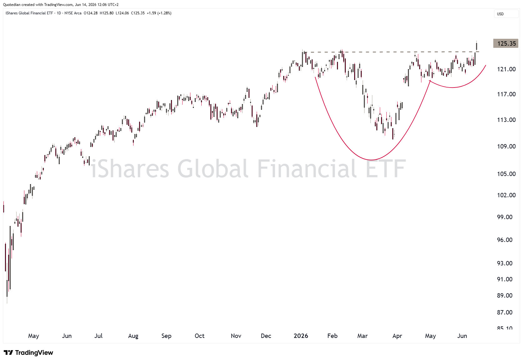
Definitely a sector to keep on the radar, not only because of the above, but also the following chart of the iShares Global Financial ETF as a sector proxy, which has just produced a major breakout:
What’s left now in the equity section is our usual glance at the best performing stocks in the US (SPX) and Europe (SXXP) and how they have fared over the past five trading days.
For sure there must be some previous winners to be picked up after the recent correction!
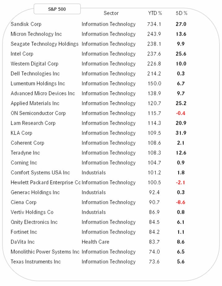
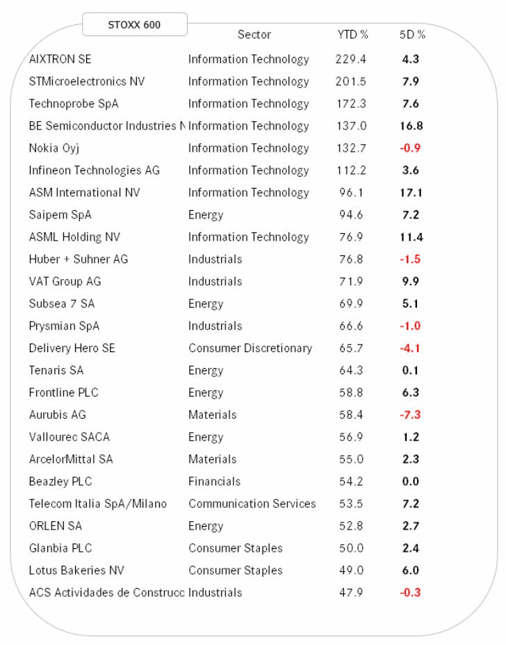
Oh! Not quite what I expected, to be honest…
Well, let’s turn to the fixed income space then, if there are no shards to be picked up anymore and that equity bucket list 😒
One item on my unwritten list of investment rules is: “With all evidence a move should happen, but it does not, is a strong sign in itself.”
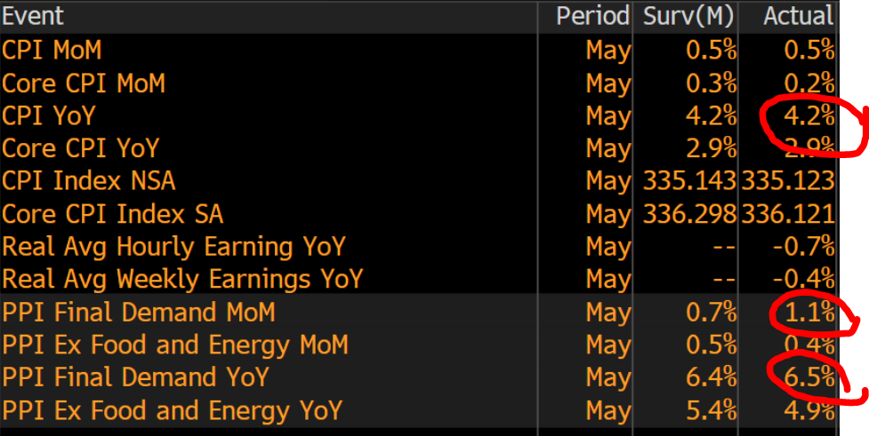
Point in case: Inflation numbers and the bond market.
Last week, we saw some horrendous price numbers in the US, which screamed inflation:
Hence, it is hard to talk this chart, which shows US inflation in four different ways, pretty:
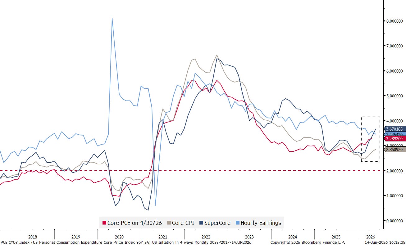
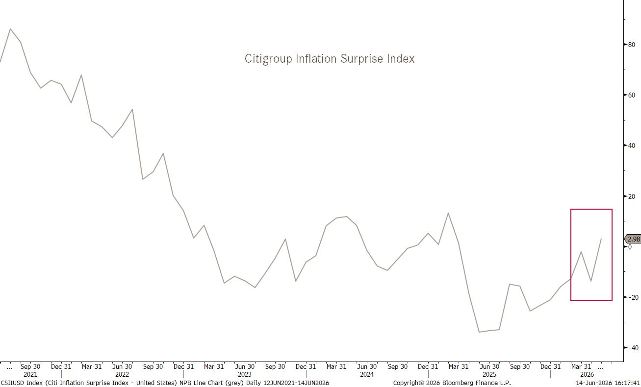
In other words, inflation surprises have been accelerating to the upside again:
However, measures of market implied inflation expectations, such as the 2-year Breakevens (grey) or the inflation swaps (red), completely failed to react to those “surprises”:
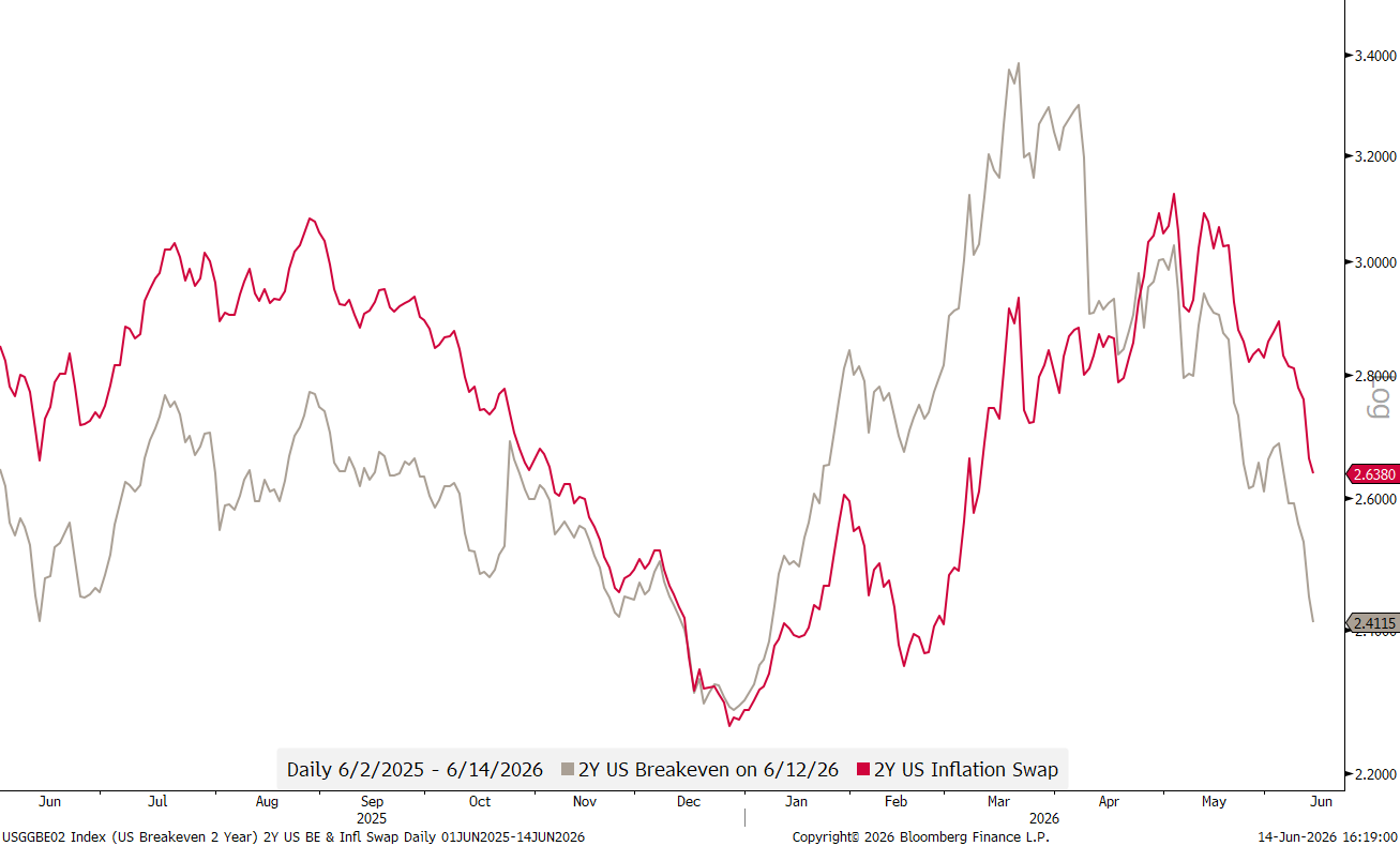
Quite “au contraire”, the drop accelerated.
So, what does this tell us? That those inflation numbers were already fully baked in and the absence of an even worse number calmed down markets? Or, the market is looking beyond the Iran war and sees the Strait of Hormuz (SoH) open again?
Probably, a bit of both.
Accordingly, US ten-year yields came lower last week and also show some interesting lines in the sand:
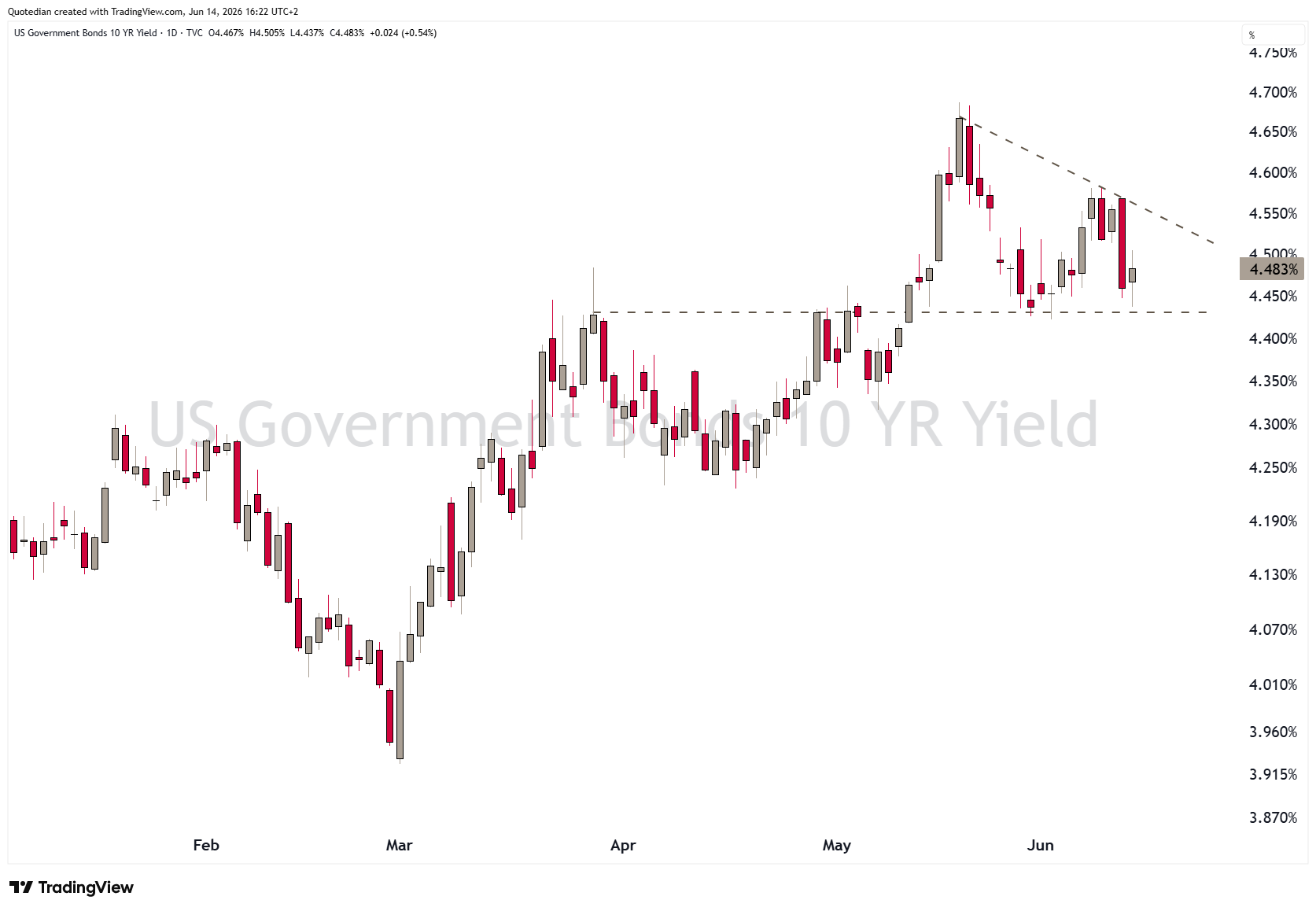
A drop below 4.43% could be very positive for bond prices, whilst a move above 4.57% would make us go full “risk-off” again for that asset class.
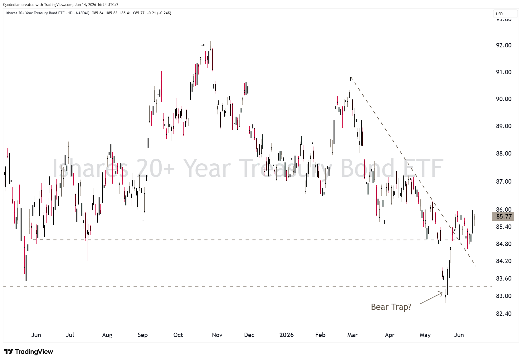
Visually, when looking at the iShares 20+ Years Treasury Bond ETF (TLT), it feels like there could be more bond price upside (yield downside) ahead:
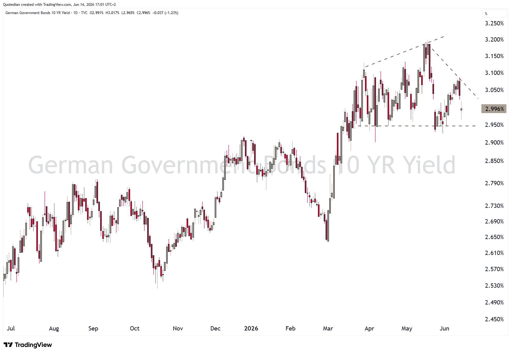
The “lines in the sand” are a bit more difficult to define on German Bund yields, but twisting my arm behind my back I would also call for a short-term resolution lower on yields, before the secular uptrend resumes to the upside:
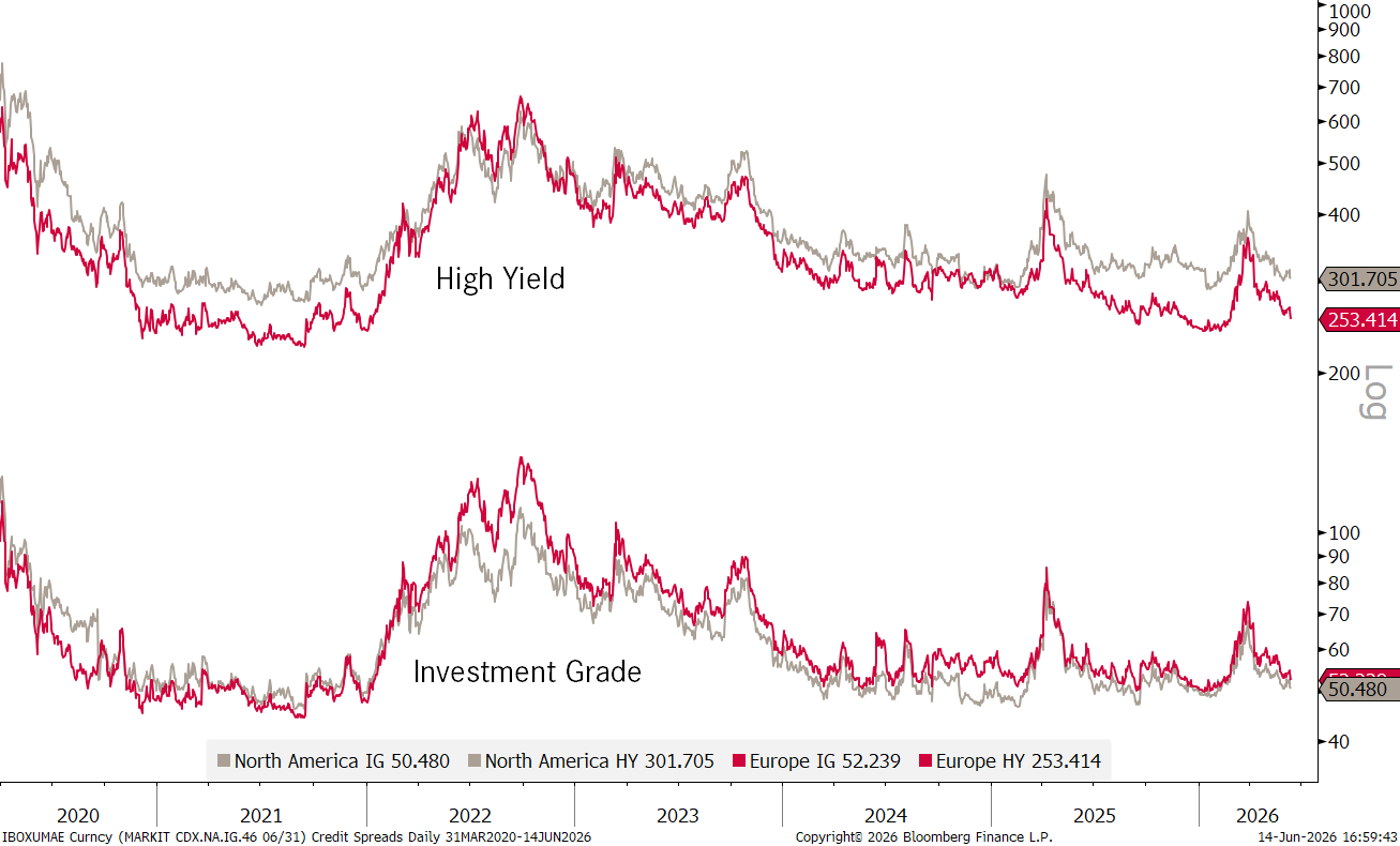
And from a credit spread risk point of view, still no news other than that incredibly tight spreads are becoming even tighter:
From a monetary policy perspective, we get a FOMC decision next Wednesday, and whilst no change is expected, it IS Kevin Warsh’s first intervention as the new Fed Chair:
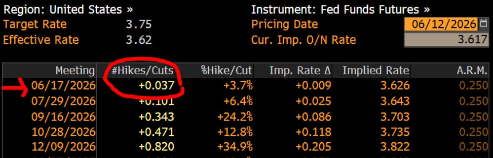
New central bank bosses have somehow a knack for messing things up early in their new jobs, so we are taking out our popcorn on Wednesday.

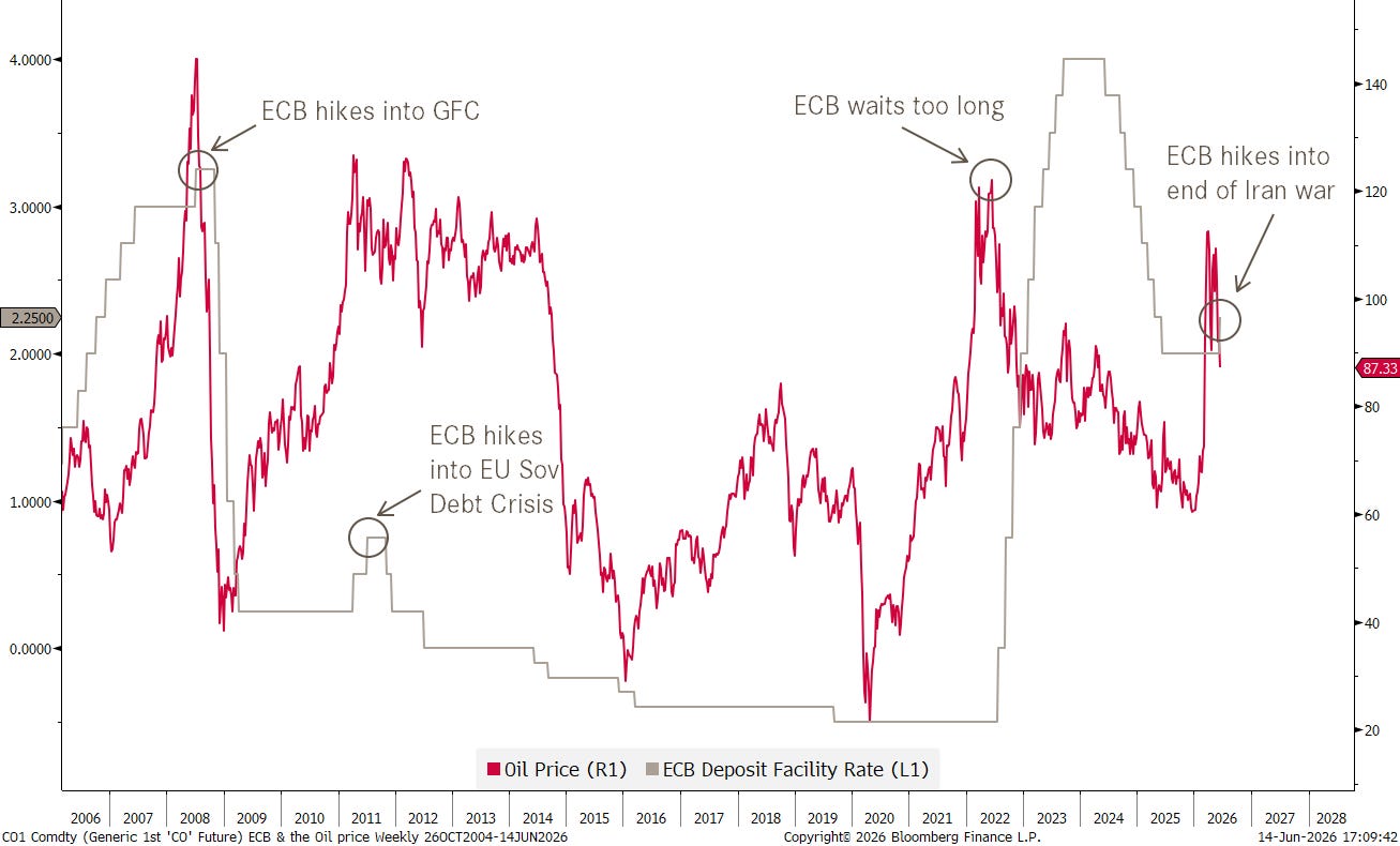
And then there’s the ECB, which of course could not help itself and HAD to hike in order to end the war in Iran (cough, cough) last week and setting themselves up for yet another policy blunder:
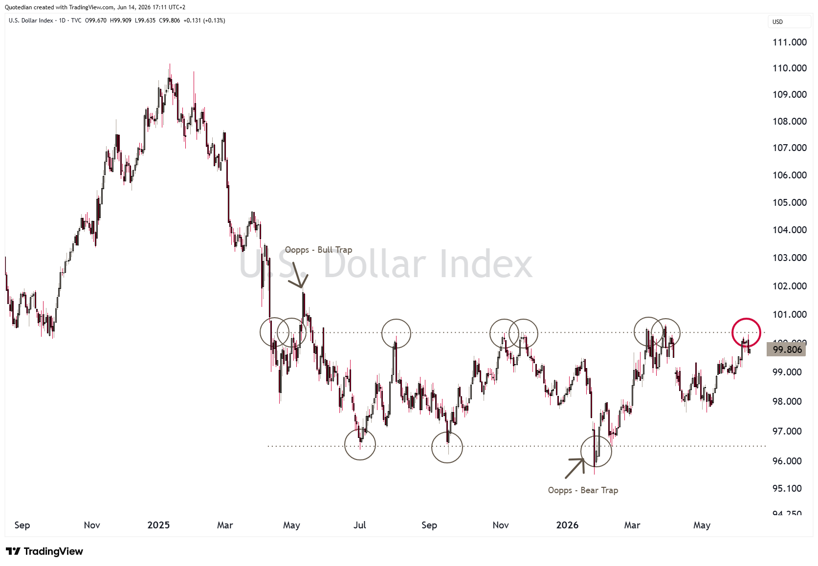
In currency markets, the US Dollar Index (DXY) remains moon struck range stuck, having been rejected yet once again at the upper boundary:
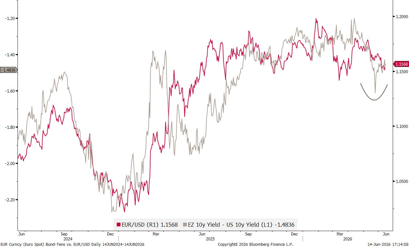
With USD yields increasing more rapidly than their EUR cousins until recently, the EUR/USD cross (red) has been under pressure. However, it seems the interest rate differential (grey) bottomed out recently (arc):
Bitcoin (upper clip) just saw a cross higher in its MACD (lower clip), which also exhibits a positive divergence between price and momentum indicator:
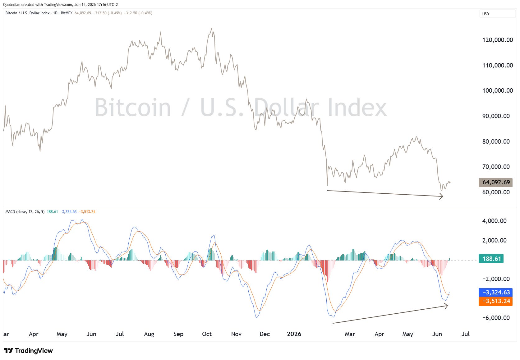
Worth a try on the long side?
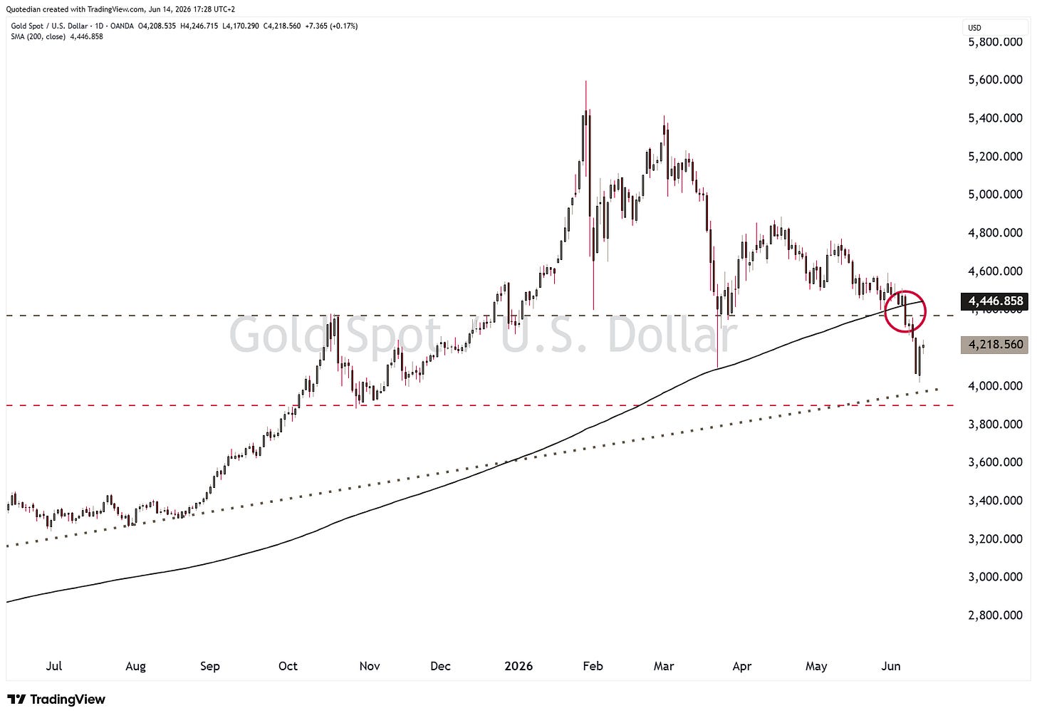
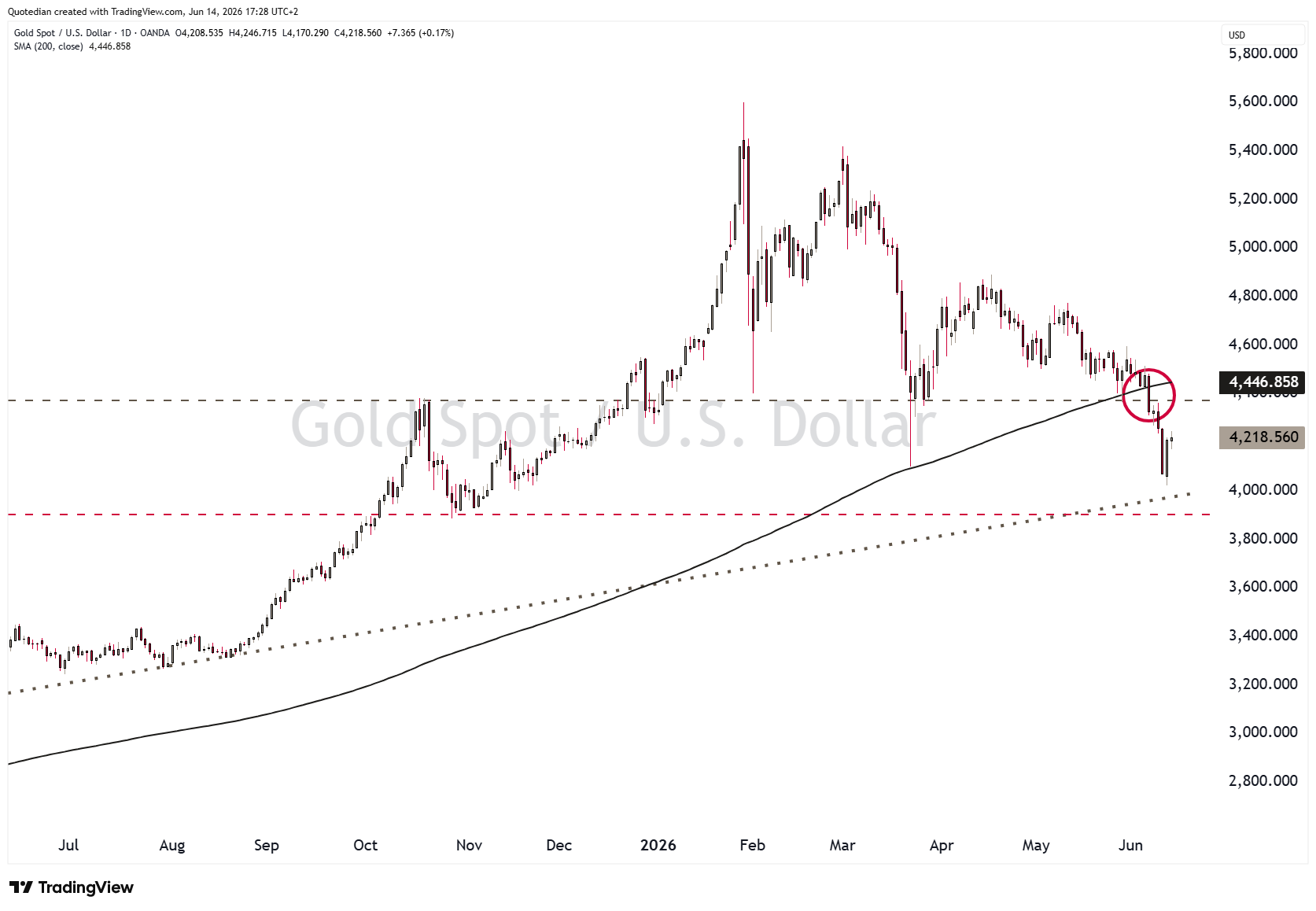
In commodity markets, we did lighten (aka kill) our exposure to Gold, which we communicated here, for three main reasons (and many smaller ones):
Gold itself broke several key levels (red circle) on its price chart, including its 200-day moving average:
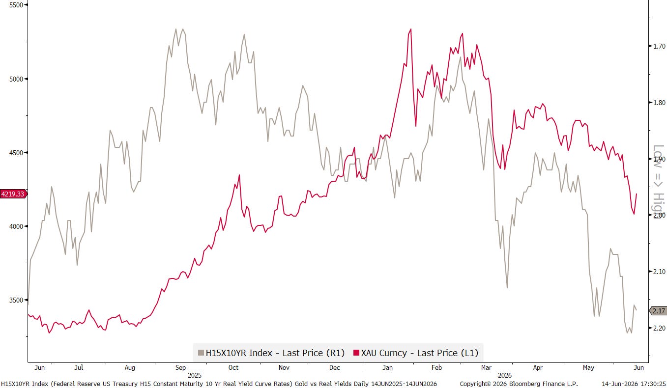
Real rates (grey) are rising, and even though in the past few years that relationship had been broken, we think that negative real-rates/gold price correlation should be heeded again:
We were invested in Gold via a physical ETF, which was absolutely fine, but did not allow options trading. Hence, in a scenario where we expect gold to move more sideways than directional, we will implement option strategies and-and-around GLD (SPDR Gold Shares)
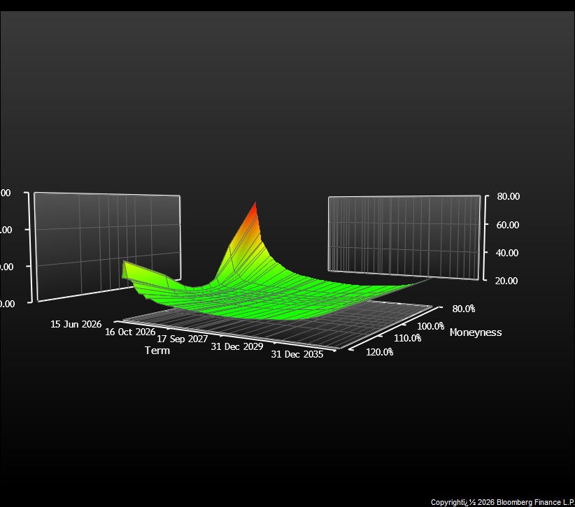
The Skew of Options on Gold (GLD) allow for lucrative option strategies


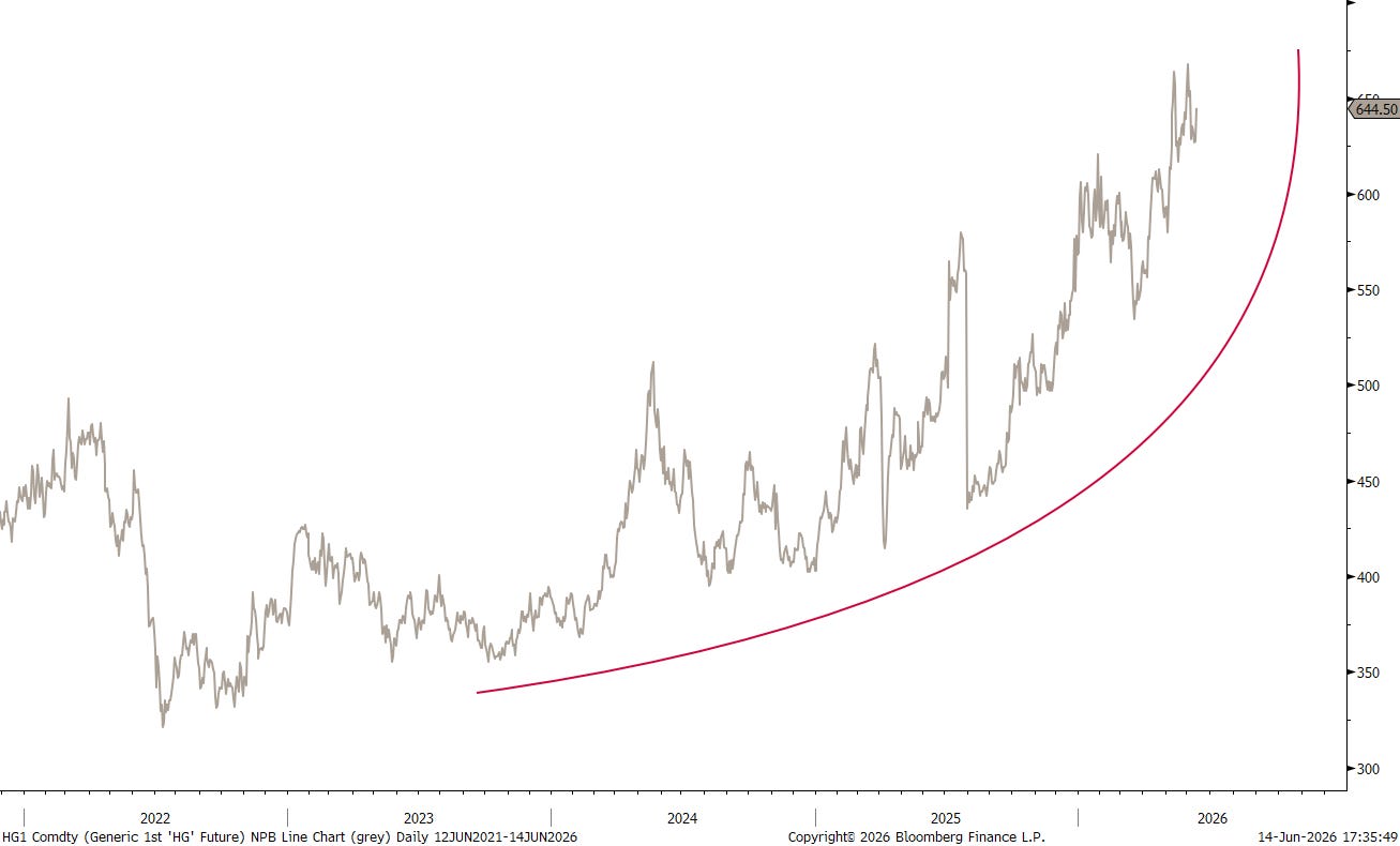
Where we have more conviction to trend continuation is on copper, where our long idea continues to play out, admittedly at an elevated degree of volatility:

So, to sum up all of the above, and adding the newsflow over the past few hours (Sunday night), which came in AFTER 99% of this letter had been written, equities and bonds are likely to continue their path higher. Bitcoin is worth a try to the long side, whilst the burden of proof for Gold lies with the bulls. I prefer the long copper trade. And, of course, if you cannot live without SPCX, then go and buy it FFS! Just do not treat it as an equity investment in your portfolio, but throw it into the same bucket as you have categorised your crypto-investments.
Now, be a good (wo)man and go and hit that LIKE-button (looks like a heart).
André


Everything in this document is for educational purposes only (FEPO)
Nothing in this document should be considered investment advice
Investing real money can be costly; don’t do stupid shit
Leave politics at the door—markets don’t care.
Past performance is hopefully no indication of future performance
The views expressed in this document may differ from the views published by NPB Neue Privat Bank AG