

Rotation, Rotation, Rotation
Vol VIII, Issue 9 | Powered by NPB Neue Privat Bank AG

"The three most important things in real estate: location, location, location."
"Rotation is the lifeblood of a bull market."
— Ralph Acampora
Enjoying The Quotedian but not yet signed up for The QuiCQ? What are you waiting for?!!

What to Real Estate investing is “Location, Location, Location” is in the lifecycle of an equity bull market “Rotation, Rotation, Rotation.” Hence, this week’s letter will try to have a glance under the hood of financial markets to figure out if any rotation has been going on amidst the increase of volatility we have seen over the past couple of weeks.
I am well aware that this is an end-of-month issue, during which we normally examine the longer-term picture via monthly charts and update our one-month (1M)/year-to-date (YTD) performance tables. We will still do all of the latter, but given the recent exceptional market moves and their short-term tactical importance, we will probably have fewer long-term (monthly) charts this time around.
I am sure we can return to our usual playbook after the dust has settled (🤞🏻) at the end of March.

Let’s start the equity section with the MTD/YTD performance table of major global benchmark indices. But first, a quick reminder that grey equals YTD performance and red represents the 1M development (all in %).

Woohooo!
One thing immediately stands out on the table above - Europe is smashing it (at least in stock market return terms).
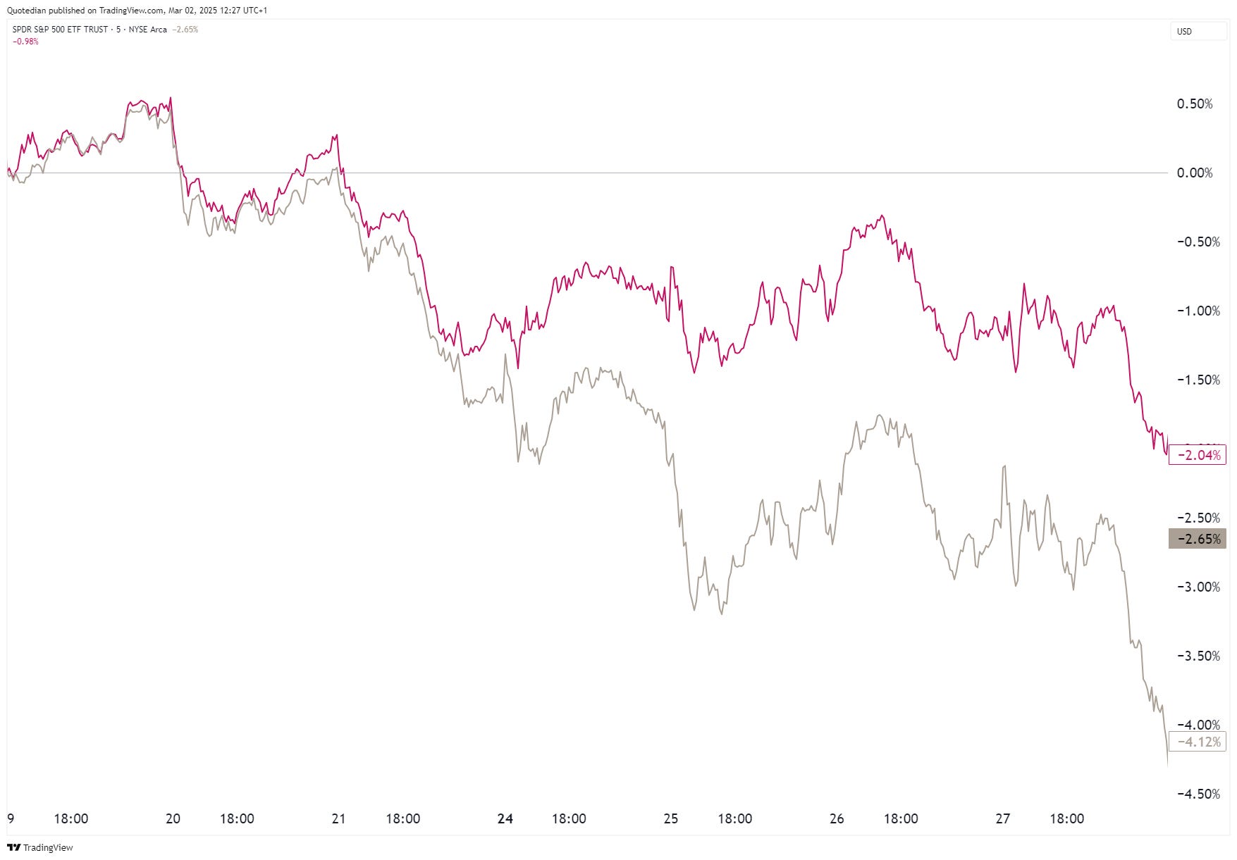
We have looked at this recently found relative outperformance of the STOXX 600 (SXXP) versus the S&P 500 (SPX) already in recent letters. As reminder, here’s the shorter-term picture:

And here is the long-term context:

The $36 Trillion question then is: can something more cyclical (let’s not even dream about secular) evolve out of this or will be just another tactical "two-day wonder”?
For sure, from a valuation point of view, this could (should?) easily be cyclical given that the price-to-book spread between the two countries is at its widest this millennia:

Just before we look at some markets in isolation now and see if we can detect any ‘internal’ rotations going on, let me show you two Global charts to sooth any panic that may have arisen over the past two weeks.
Here’s the Earth Index (Dow Jones Global):

Zooming in, we note we are about equal distance (3%) from a new all-time high and a level where below we should become a tad more defensive.

But, for now the burden of proof lays with the bears. Even more so, as Global breadth (lower clip) continues to expand:

Anything else you notice in the chart above? For example, flattish breadth for the US market, but continued global expansion?
Rotation anyone?
Now an update of the almighty S&P 500 index:

The index is approaching key support anywhere between 5,820 and 5,780ish, with the 150-day moving average (blue-grey line) having served well as a pivot point back in August of last year. Holding there, would mean we had one of those pullbacks (drop of 5% or more), which happen several times per year. A break of support would mean we need to brace for a correction (drop of 10% or more).
Let’s have a quick look at the market carpet since the beginning of the year:

Albeit if “feels” like the market has been correcting, there are actually more stocks up (302) on the year than down (199). A honorable mention goes to Kraft Heinz (KHC) which is exactly flat year-to-date!
It does not surprise us then that the equal-weight index (RSP) has been outperforming the market-cap weight (SPY) version since the beginning of the pullback (19/2/2025 - 27/2/2025):
This could explain why the pick up in volatility (VIX) has been relatively muted so far:

A far cry from the August ‘24 and even the December ‘24 experiences …
Now, let’s have a look at the Nasdaq:

We see on the smaller, zoomed inset graph, that the Nasdaq on Friday rebounded quite precisely where it had to.
Nevertheless, the pull-back top to Friday’s bottom was more than double that of the S&P 500, showing a rotation out of tech.
And I have a suspicion …let’s check:
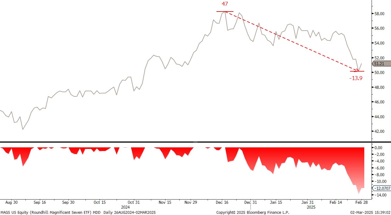
The chart above shows the Roundhill Magnificient Seven ETF (MAGS), which invests in exactly what is written on the tin. We note that the driver of the rally over the past years had a close to 14% drawdown since mid-December, which is its second-largest since inception (April 2023) of the ETF (the largest was in August of last year and lasted less than a month).
So, has this money left the stock market or has it rotated somewhere else?
Let’s check on that, but not before we look at some other regional/local market indices.
We already saw the recent relative strength of European stocks to their US cousins, now check the STOXX 600 chart on an absolute basis. Here’s the long-term, monthly view:

One last time, let’s compare this long-term view in comparison to what the S&P 500 has done over the same time:

Now, before I make the next observation, here’s a reminder about the political non-inclinations of yours truly:
"While I often reference politics in these pages, let it be clear: I hold no allegiance to any ideology, party, or political camp. If anything, I’m a political agnostic—aware of the impact politics has on markets but unconvinced that any one side has all the answers. My focus remains on how policies and events shape economies, not on picking teams."
Or, as it reads in the disclaimer at the end of every Quotedian:
Leave politics at the door—markets don’t care.
Ok, here we go. I am not sure what will happen at Monday’s market opening after the Zelensky-Trump clash on Friday evening, even less so as just as I am typing, European leaders (an oxymoron in recent years) are emergency meeting once again for seemingly the nth time over the past three weeks.
Lower European stocks, led by sell-off in previously peace-hope high-flying names (e.g. construction)
Higher European stocks, “patriotic” buying
A mix, with European defense names leading to the upside
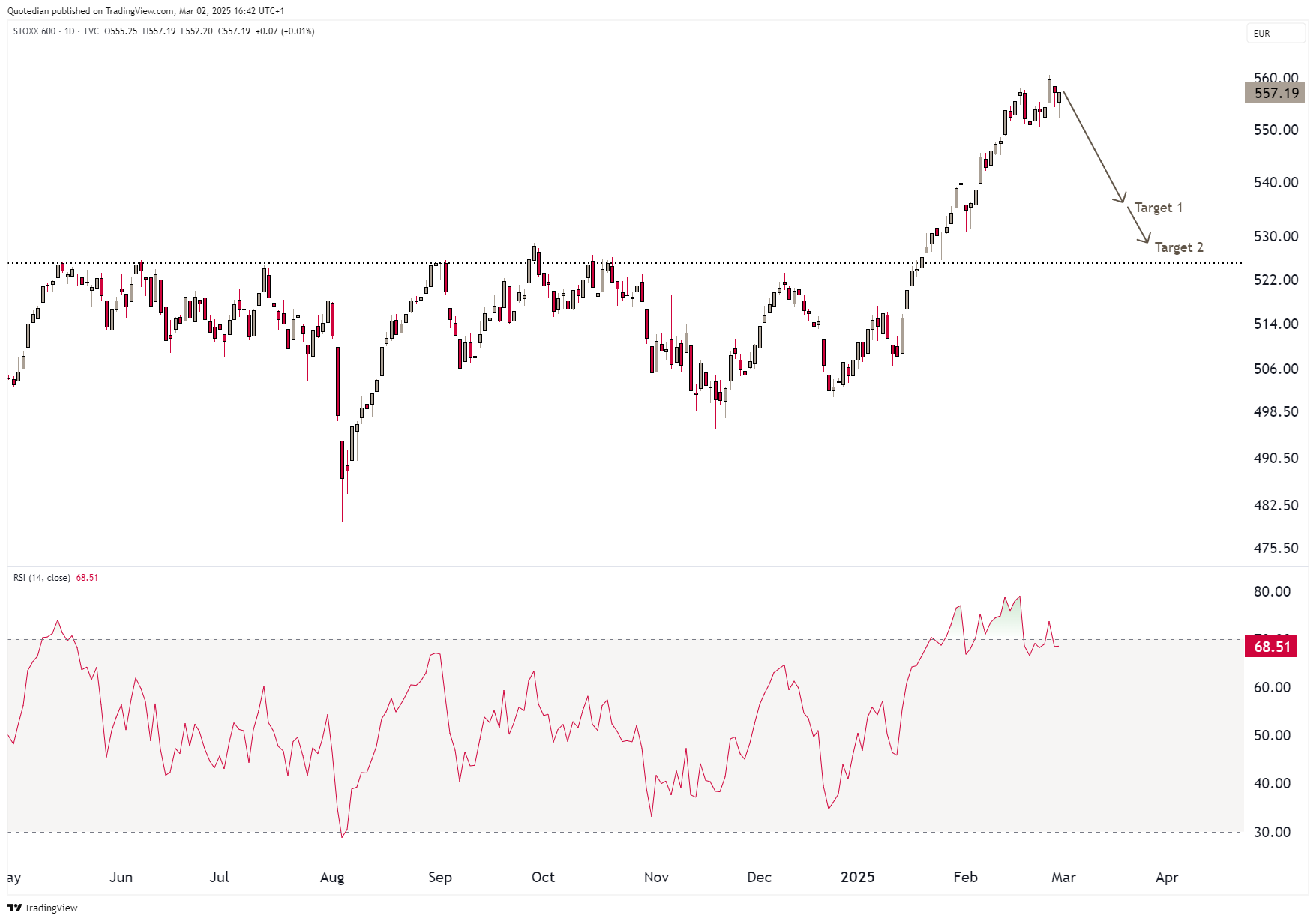
In any case, a “pause” to the European equity rally would be pretty welcome here as the following daily chart (+RSI) of the STOXX 600 shows:
Huge news in Switzerland last week - the SMI made a new all-time high on daily, weekly and monthly basis!!! First time since late 2021; here’s the weekly version:

Another market with a second (or third or fourth) spring, is the UK’s FTSE-100 (aka Footsie), which since breaking finally to a new all-time high in March of last year has been on a roll:

If the 8,810 can be exceeded, the conservative price target counts to 9,310 (~+5%):

Over in Asia, most attention currently goes to Honk Kong’s Hang Seng Index, where a the bull run has been so strong, it is difficult calling it a counter-cyclical move:

Having said that, zooming out we note that buy-and-hold investors are still waiting for their vindication:

Problem child of Asia is suddenly ‘Incredible India’. After the latest two percent drop on Friday, the BSE500 is within reaching distance over long proclaimed price target of 31k to 30k:
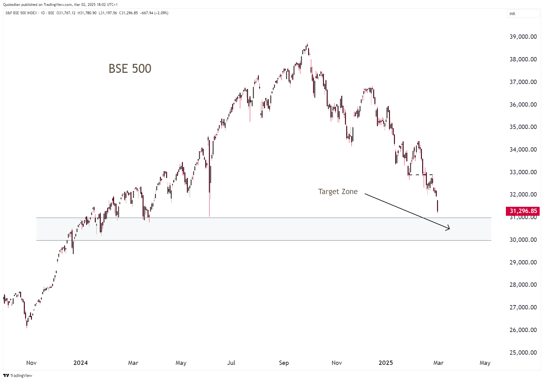
That level represents a cluster of measured Fibonacci retracements from different levels taken as starting point of the massive rally India has experienced.
Ok, time to return to our rotation theme, looking at sector performance now:

First, we note that rotation from bottom-performing sectors technology and consumer discretionary has taken place into health care and consumer staples (financials have been top of the table already for months).
Side note: this would explain at least partially the recent run on Switzerland’s SMI, where the top three stocks are health care (Novartis, Roche) and consumer staples (Nestle).
Bloomberg’s excellent RRG function confirms the current picture:

Second, the combination of the top three performing sectors points most likely to a mid-cycle slowdown, not untypical for the third year in bull market and which we are in now in this cycle:


It’s been a while since we have seen low vol and value in the top three (or top ten for that). Plus, the slowdown in Momentum strategies in February has been tremendous.
Here’s an interesting Value vs. Growth chart from GS via the formidable Kevin Muir at the Macro Tourist.
Over the past decade (GFC until COVID) it has been a growth hegemony. Since, the pandemic, the result is somewhat more mixed.
And here’s another chart out of the same corner. It shows that not all value is created equal, i.e. value creators versus value traps:

Ok, time to move on and check in on our two tables of the best performing stocks in the US and Europe on a year-to-date basis and how they have done over the past month (February).
Let’s start with the US,

and then directly continue with the European list:

Notice something? Yes, correct, NO RED!!
Further of notice, albeit of no surprise after we discussed sector rotation further up, the name of US tech and discretionary names is strongly decimated in comparison to last year.
Two more charts in the equity section and then I let you go.
The first demonstrates that Tesla (TSLA) is not a carmaker, but rather an expression of the high-growth tech narrative, a belief in disruptive innovation, and a leveraged bet on the future of AI, energy, and mobility:

Finally, the last chart in this section shows that we may only need to press our bum cheeks together for another two weeks:


Rotation is not only limited to within asset classes but also across asset classes (actually, the base reason for multi-asset diversification). The table below shows that some rotation into duration may have taken place in February:

Of course, not everything is about rotation now, as a likely reason for bond strength (yield weakness) has been disappointing economic data. Here’s the Citi Economic Surprise Index for example:

Now, let me overlay the chart of the 10-year yield, pushed back by two months:

Magic!
In turn, expectations for rate cuts implied by futures markets have been rising nearly tripling since mid-February:

Here’s the 10-year US Treasury yield on a standalone basis now:

Rangebound and we do not see an immediate catalyst for a break out of this range on either side.
The yield curve struggles to steepen further, torn between sticky inflation and the mid-cycle slowdown:

Let’s say it all together now: S-T-A-G-F-L-A-T-I-O-N!
In Europe, yields have come down too, though I doubt how permanent this will be, given that today’s Emergency meeting concluded in a call for more military spending:

By the time you read this, which I hope is the first thing you read on Monday morning (3/3), we should know more about the immediate direction of yields, if any.
Maybe the 10-2 year spread (Bund) is a giveaway here:

Not the same as US - growth (inflation) reigns.
The Swiss Conf (10-year) yield is spooky. I am not sure what is going on here and would be delighted to be enlightened by anybody who can shed more light, but those moves in February are not normal:

Credit spreads have increased a tad since mid-month, but continue to be tight in historical standards:

I know, the widening is hardly notable, let’s zoom in using Global Credit Spreads:

Two weeks don’t make a trend, but watch this space…

Now, let’s throw an eye on what currency markets have been up to. The following table shows the performance of a selection of currencies versus the US Dollar:

February overall has not been friendly to the Greenback.
But in all fairness, versus the Japanese Yen it was probably about JPY strength rather than USD weakness (red) as the interest rate differential (grey) between the two countries continues to narrow:

However, what makes currency investment/trading so damn tricky interesting is that interest differential is not always the only driver of direction. Take the EUR/USD (red) as an example, which has been weakening, despite a narrowing rate (grey) differential:

Staying with the EUR/USD cross, just when its seemed that the glittering wonder that is the Euro could break above 1.05 for further strength, the trend reversed:

Nevertheless, day of the Trump inauguration remains the top in the USD for now. Here’s the Dollar Index (DXY):

As aforementioned, the Japanese Yen is showing own dynamics and had it not been for the USD rally at the back-end of last week, the JPY could be heading toward higher levels (lower on the following chart):

Here’s a quick glance at Emerging Market currencies versus the Greenback, for completeness purposes only:

Cryptocurrencies … I struggle to find the right words … find themselves in a bloodbath since the beginning of the year:
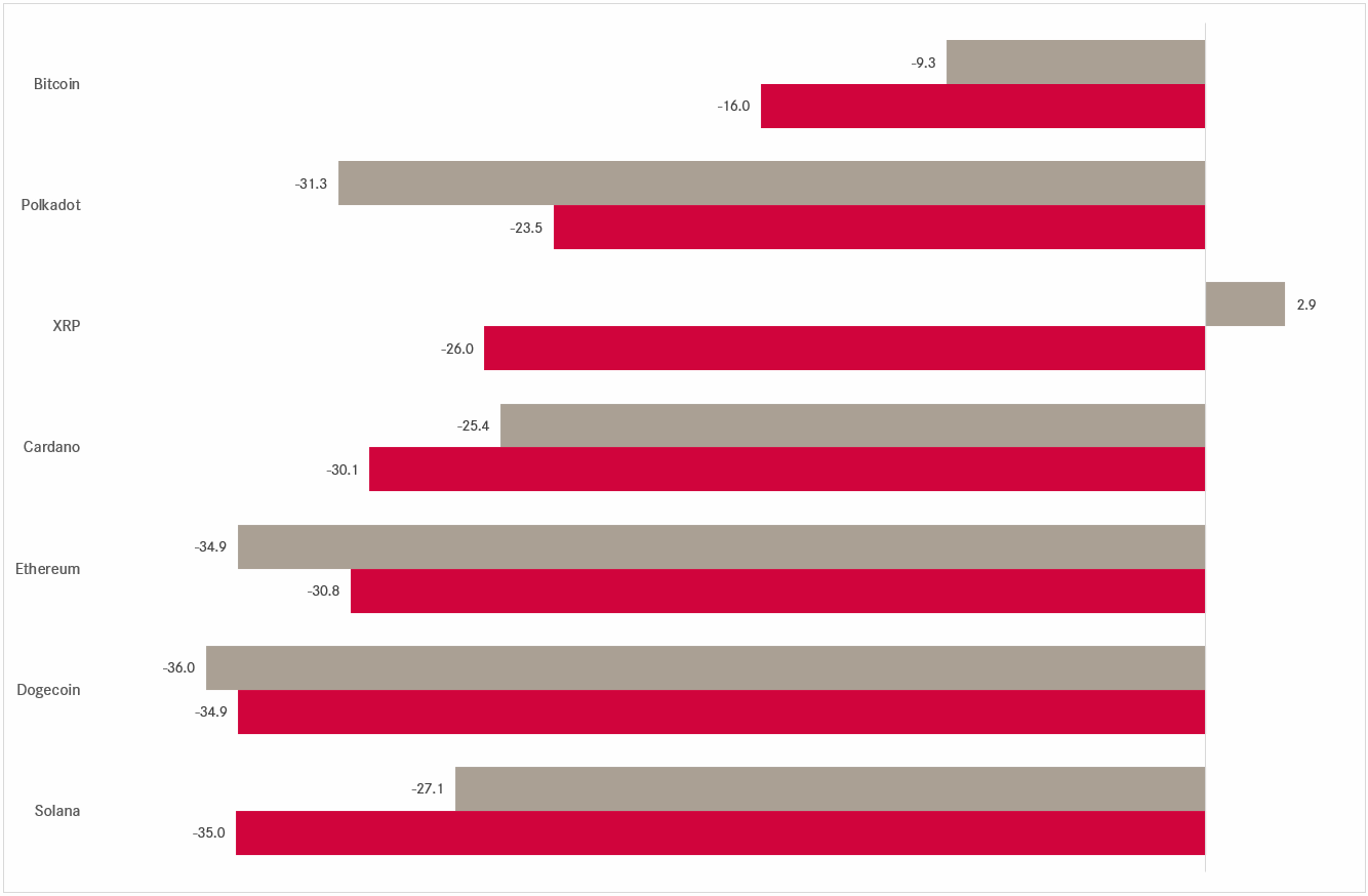
Now, in-line with their reputation for very high volatility, as I type on Sunday night close to 10 pm, Bitcoin is up nearly 10% on the day, improving a previously dire picture substantially:


Finally, moving into the commodity space we observe that raw materials, with the limited exception of live stock, are having a good year:

Are investors rotating into more tangible assets?
Let’s have a similar look at commodity groups via a newly introduced table, deriving performance from the Invesco DB commodity ETFs:

Here’s a look at the Bloomberg Commodity index:
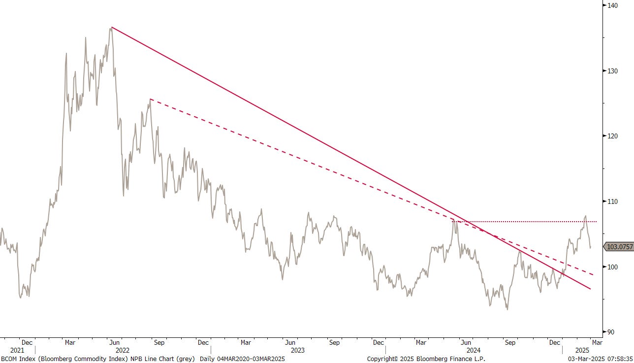
Well, that’s not really what we expected. That last dip down is a bit disappointing, but easily explained via index weights. Crude makes up over 20% of the index and Gold is around 15% index weight. Both commodities have seen weakness over the past two weeks.
Crude first, via the Brent chart:
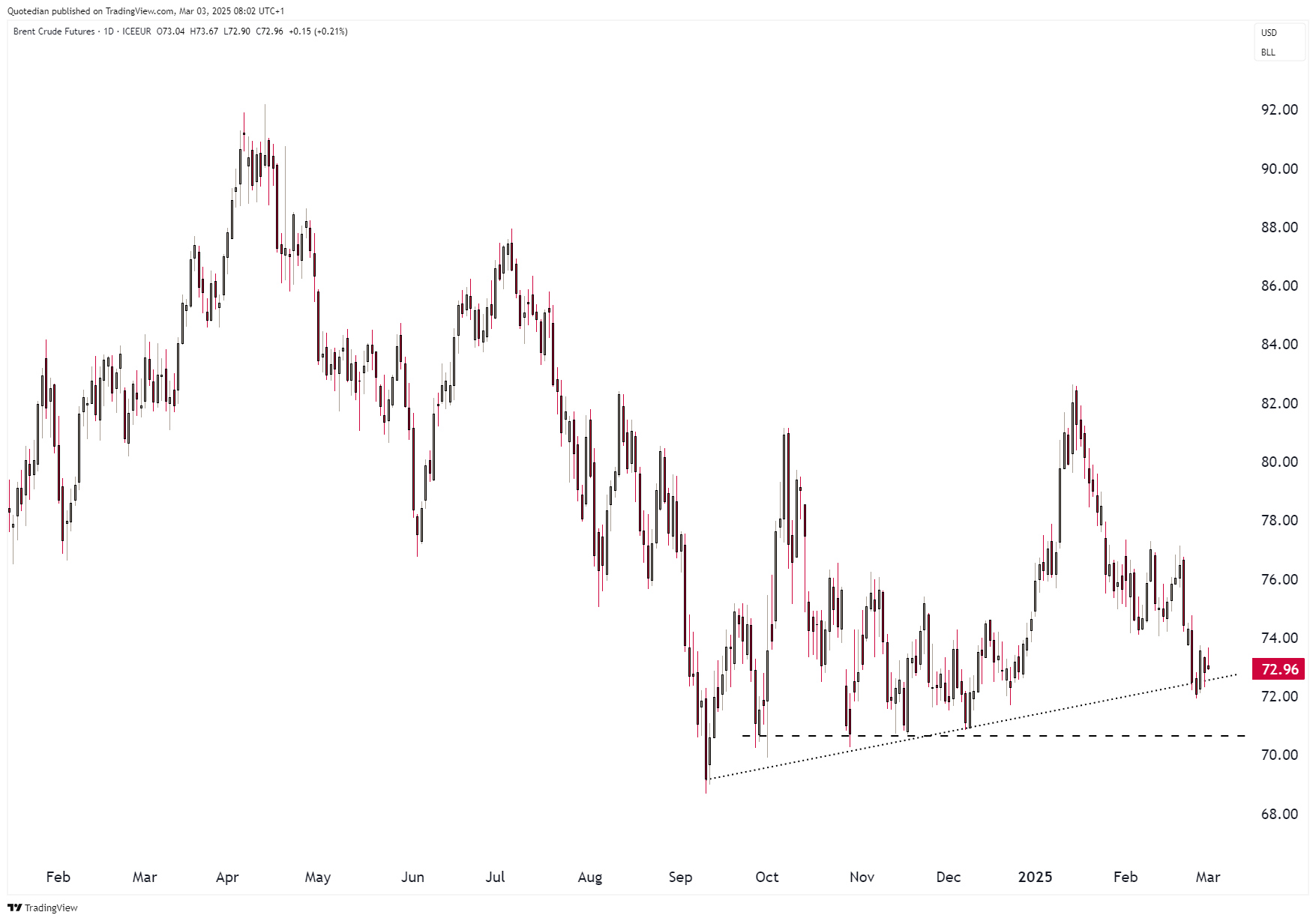
Crude has actually been under pressure since the beginning of the year, with weakness accelerating in late February. We are no however close to key support at $70, which all else equal, we expect to hold for now.
Turning to Gold, we recently recommended to increase tactically. The three percent pull-back last weak offers a great opportunity to “on-board” that tactical overweight in our portfolios:

At the most we see a drop to 2,800 (a 5% from the ATH), but I would not count on it.
I still need to check the source of the following chart, but if correct, retails is still not really engaged in Gold, especially in comparison to Bitcoin:

Here now a more detailed look at individual commodities via futures:

And very last, and maybe also very least (unless you a eat a couple of dozen of those per day), here’s the chart of egg prices, which continue to soar in the US, courtesy of an aviary flu breakout:

Which leaves us with this:
That’s all for this week from the Quotedian, but if you just can’t get enough, make sure you are signed up to the daily QuiCQ (Tue - Fri) for daily non-TL;DR updates:
Take care out there,
André

Everything in this document is for educational purposes only (FEPO)
Nothing in this document should be considered investment advice
Investing real money can be costly; don’t do stupid shit
Leave politics at the door—markets don’t care.
Past performance is hopefully no indication of future performance
The views expressed in this document may differ from the views published by Neue Private Bank AG