Sommerloch
The Quotedian - Vol VII, Issue 26 | Powered by NPB Neue Privat Bank AG
“Experience is a good school. But the fees are high”
— Heinrich Heine
Sommerloch is a German expression for a period, usually during summer, when very little is going on. The English equivalent would be summer recess, silly season … OR … summer slump! Literally translated it means summer hole and reminds us of that hole markets just have slumped into!
Today’s Quotedian, the first after my short summer break, is the end-of-month (July) edition, which, as usual, focuses on the longer-term picture. Admittedly, it is one of the tougher ones to write today, as I walk relaxed and freshly shaven into the office after a three week hiatus, just to be slapped right in the face with a 12%-plus drop in Japanese stocks, a 2% drop in European stocks and a Nasdaq futures at times indicating a 5% lower opening.
Definitely no soft landing for me - thank you Mr Market!
But as I said, let’s try to focus on the longer-term today and I will follow up with QuiCQ’s (www.quicq.ch) over the coming sessions to comment the shorter-term stuff (opportunities?) at hand.
Do not get carried away by short-term gyrations. Speak to us first!
Contact us at ahuwiler@npb-bank.ch
In our deliberations to follow below, we check-in on, as at every month-end, the performance of asset classes of the month just gone by and also put that into perspective of how the year went so far for those respective asset classes. All sorted top down by year-to-date (YTD) performance. The performance data is updated till Wednesday, 31.7. at around 17:30, when European markets closed.
For the charts, most of them will be monthly candlestick charts, however, they will be updated through today, Monday, August 5th. In other words, on monthly charts, the last candle is what happened in the first two to three sessions of August, the second last candle represents July’s market action.
Here’s the performance- and chart-legend key as a reminder:
After 34-years direct involvement in financial markets and investment decision taking I get the sneaking feeling, that my annual leave and market volatility exhibit a strong positive correlation. Here’s the VIX since beginning of the year:
Of course, during my holiday absence the VIX was “only” up some 85% or so (from 12 and change to 23 and change) - it is today’s “welcome back” blow-out to 62 that is putting everything out of proportion. I mean, on a weekly closing basis, the VIX is setting the bar very high for the narrative to follow:
Ok, with this out of the way, let’s have a look at July, which according to the little headlines I read was terrible for equity markets:
Unless you were a Latam-focused equity investor not so much really. Most indices held up pretty well, including a benign retreat in the Nasdaq (yes, of course I am ignoring the first 2-3 trading sessions in August.)
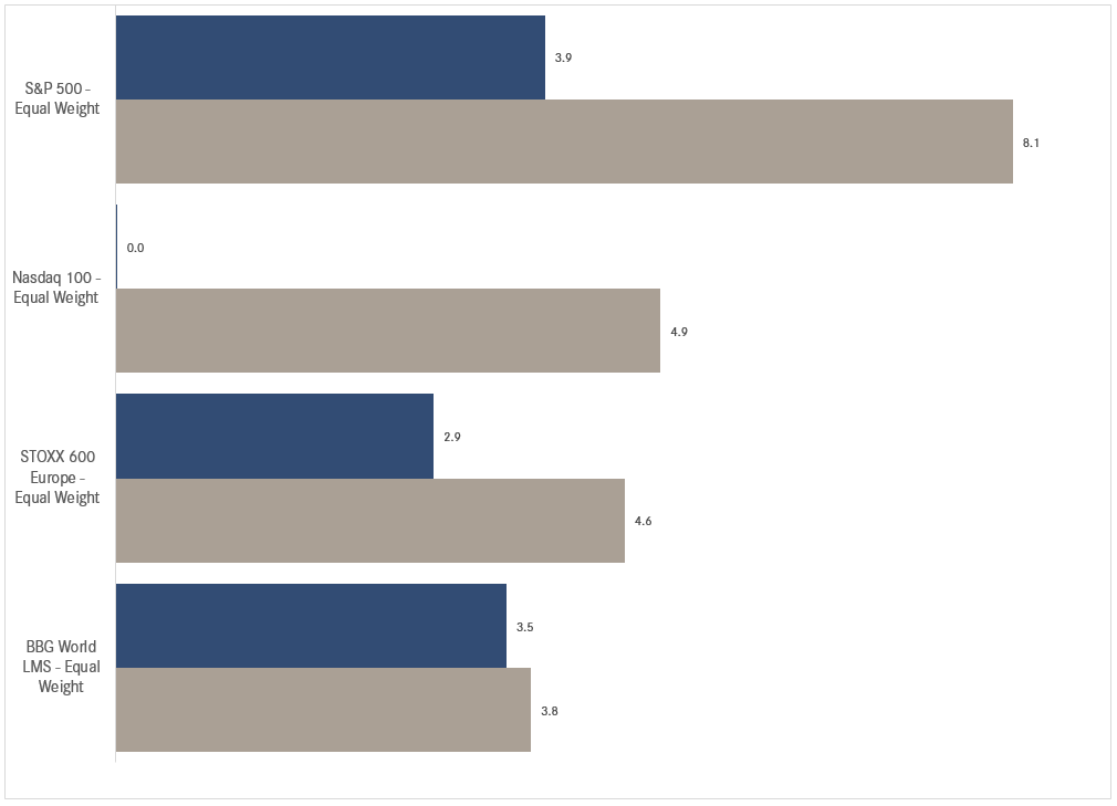
As we had suspected in our Q3 CIO outlook, some sort of rotation was due. This rotation, out of the largest cap weights (Mag 7) and their international equivalents is well visible in the monthly performance of the equal-weight indices:
In other words, the equity rally has indeed started broadening out as the following chart shows:
The advance-decline ratio (middle clip) had already started its ascend in early July and then accelerated exactly at the time the S&P 500 market-cap weight index (SPX - top clip) topped out and the S&P 500 equal-weight index (SPW - bottom clip) reached a new ATH shortly thereafter too; before starting to falter in early August.
It will now be interesting to see if that trend continues after this week’s panic moment.
Time for some monthly candle charts, starting with the S&P 500:
Key support seems to be at 4,780ish on the S&P - let’s see if that makes sense on the daily chart too:
Here, the chart suggest some support in form of the 200-day moving average (MA) at around 5,000 - but a drop to 4,600 could also be a possibility if the rock-bottom of the uptrend in place since October 2023 should be tested. But given the VIX already trades at above 60 today …
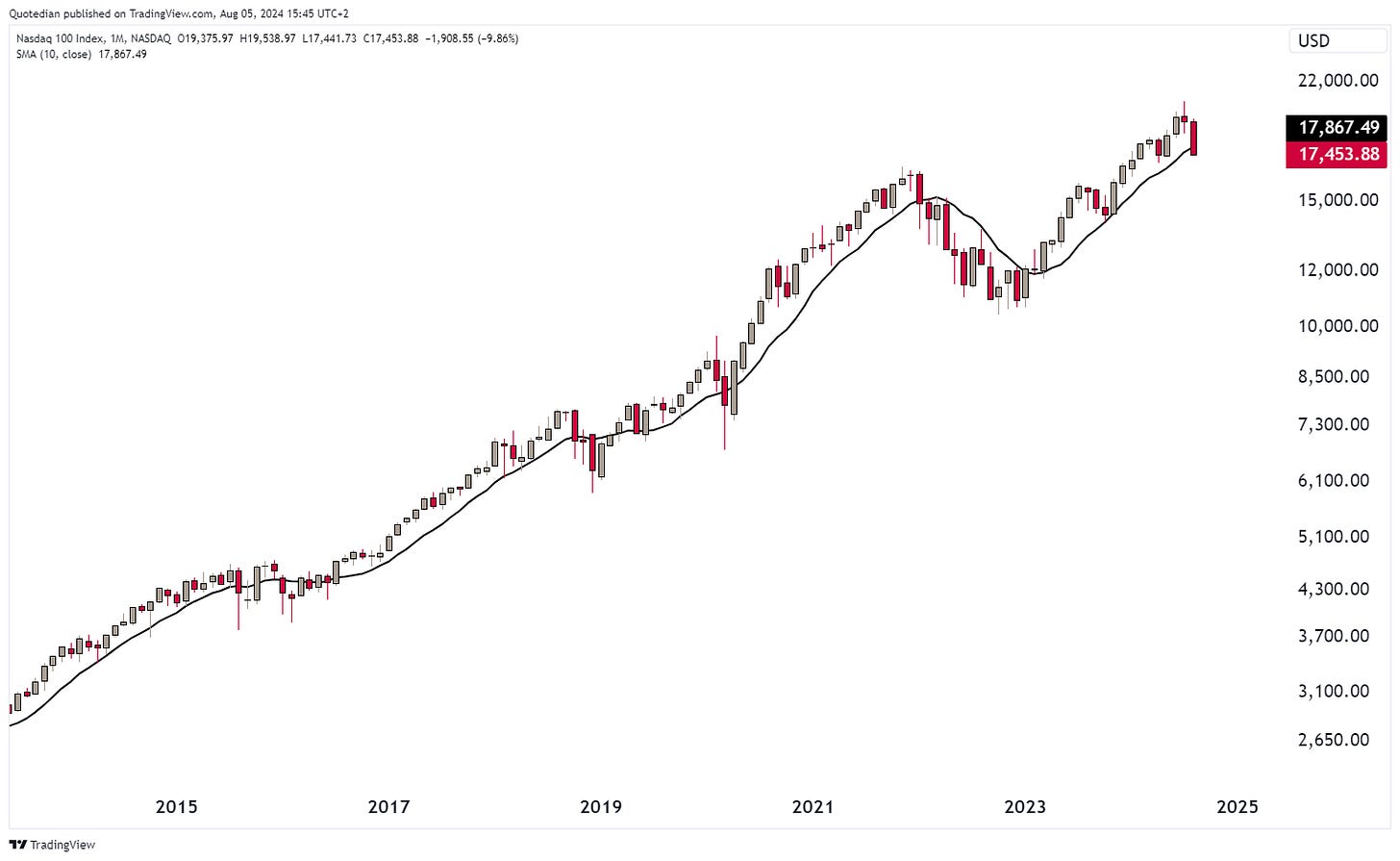
Now let’s pull out a monthly chart on our beloved Nasdaq index:
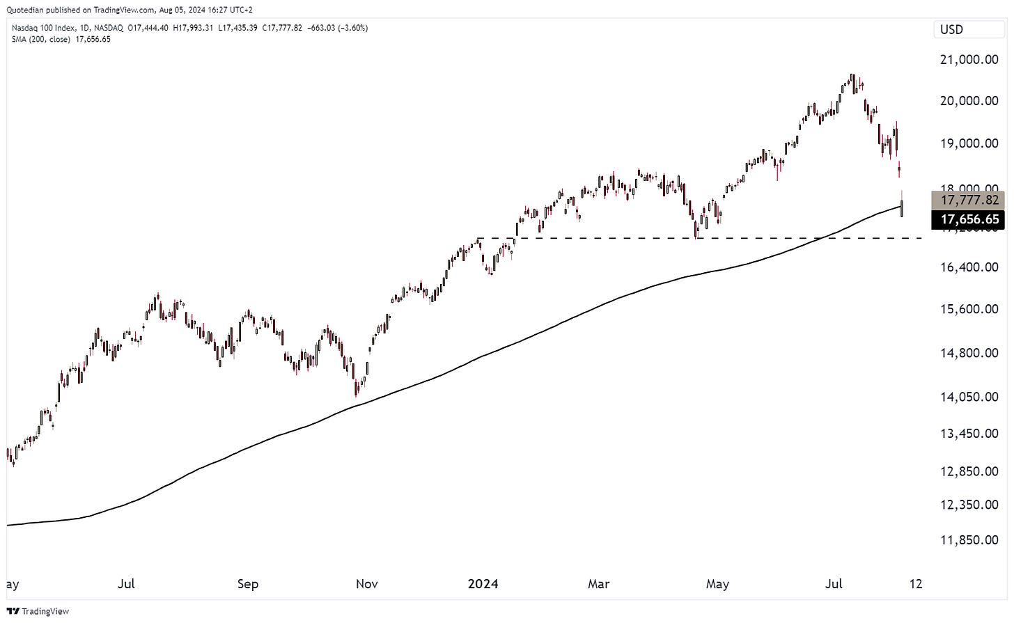
Here, at the time of writing (about half an hour into US market opening) the 10-month MA (200-day MA equivalent) has already been violated. Let’s see where the market closes, but on the daily chart the level just below 17,000 seems crucial as next support:
US small cap stocks also finally saw some rotation into them .. until it ended again end of last week :-(
The Philadelphia Semiconductor index is now up ‘only’ 95% since October ‘23, after having fallen nearly 30% since the top in early July:
The SOX index has been one of the hardest hit “popular” indices, which of course has a lot to do with the momentum-stocks play that had been going for nearly a year. (Price) Momentum investing has been very popular as of recent, but for years has been highlighted in Academia as one of the few factors to truly provide alpha on a consistent basis … until it crashes, which is just has. Here’s the iShares US Momentum Factor ETF and its most recent crashes:
In connection with that, here’s the July and YTD performance of (US) factors:
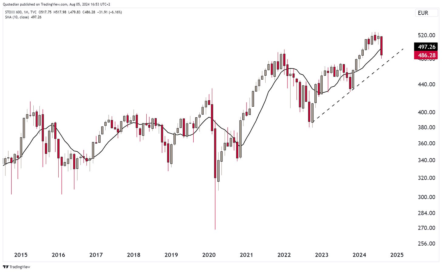
Time for some European charts now, beginning with the broad STOXX 600 Europe Index:
Again, July was an ok month, but the first three sessions in August (last candle) have been extremely painful.
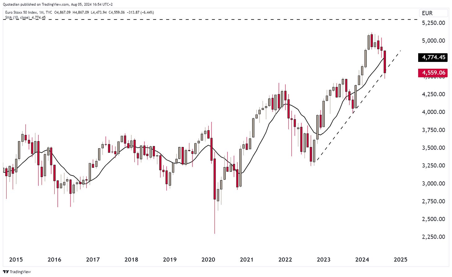
The STOXX 50 Euro index is at danger of breaking the support of the uptrend:
France’s CAC-40 has not been living up to the high standars of the Paris Olympics, now down for a third consecutive month:
In the UK, the Footsie 100 has given back all of the gains since the breakout to new ATH in March and rests upon key support:
And finally, Switzerland’s SMI has also given back over 7% after nearly reaching a new ATH in July:
Time to hop over to Asian equity markets, and of course, we would need to start with Japan’s Topix index. For purpose of effect, let’s look at the daily chart first:
Now, let’s chuck this onto a monthly chart for context:
Well, that did not improve a lot - still very painful. At least, some of the equity losses have been offset by currency gains! (you weren’t currency hedged, were you?!)
Indian stocks (BSE500) are as resilient as you would expect them, but also offer an eight percent downside ‘opportunity’ should it drop back to its 10-month MA:
Now, for completeness purpose and just before we head into the fixed income section, here are the July and YTD performance of Bloomberg’s Global sector indices:
What’s the panic all about one would be inclined to ask here …
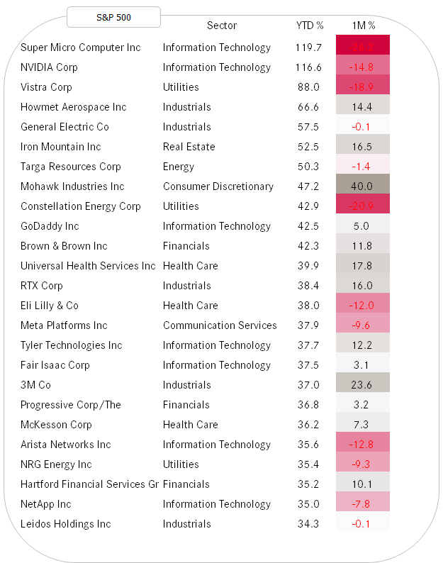
As the letter is getting to long already and we still have a lot of ground to cover, let’s cut the equity section short here by ending with the top performing stocks in the US and Europe on a year-to-date basis and how they have fared in July.
US first:
Followed by Europe:
A lot of mean reversion here,
and also some new contenders. Depending on your taste, go and check out some individual stock charts from the list above ;-)
The fixed income performance table shows it was largely a positive month for bond investors, especially for those focusing on treasury bonds:
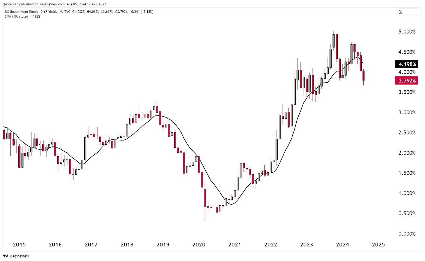
This of course as global treasury bond yields collapsed, especially after the number of (US) recession signals increased over the past weeks, culminated by Friday’s weak NFP reading. The US treasury yield quickly collapsed to an intraday low below 3.70% today (5/8/2024):
Let’s take the iShares 20+ Year Treasury Bond ETF as a proxy to see what the yield move looks like for bond prices. The weekly chart probably gives best context here:
Finally, the intermediate downtrend (black dashed line)has been broken for a more bullish picture now, helped by the price moving well above the 40-week MA. A clearer break of the black dotted line just below 100, would be needed to confirm a 10% upmove towards 110.
Sooooo, just having a thought here now
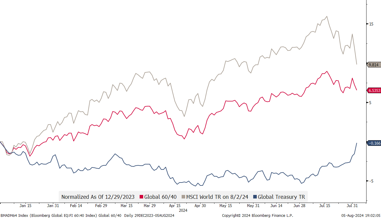
If stocks are down but bonds are up, the 60/40 portfolio should be working pretty well then this year?
Indeed!
As mentioned at the begin of this section, it was especially the NFP number last Friday that onset kind of a recession panic:
Again and again it is amazing how the market can forgo weaker economic data (see Citi Economic Surprise index below) for months,
and then suddenly one, highly manipulated number, can change the collective mind in what seems a split second.
Suddenly, the number of estimated Fed rate cuts (grey line) by year-end is above to five again:
As the markets adjust the expectation for rate cuts to the upside, yields at the short-end of the curve are finally starting to drop at a faster pace than those at the long end, pushing the 10y-2y soon back into positive territory:
And this is probably the one reason that would me most bearish on stocks. As I have shown several times in the past, it is not when the yield curve inverts that stocks come under recessionary pressure, but rather when it flattens/steepens again:
In Europe, the government bond yield move has been a bit less violent, yet still pronounced:
Similar as shown in the US yield spread chart a moment ago, the German bund spread (10y-2y) is also closing in on the zero mark:
But one of the biggest macro themes out there in the FI (and FX) space has, of course, been Japanese monetary policy.
The BoJ announced last week a rate hike of … drumroll … a full 15 basis points! Let’s put that rate hike into perspective:
Exactly!
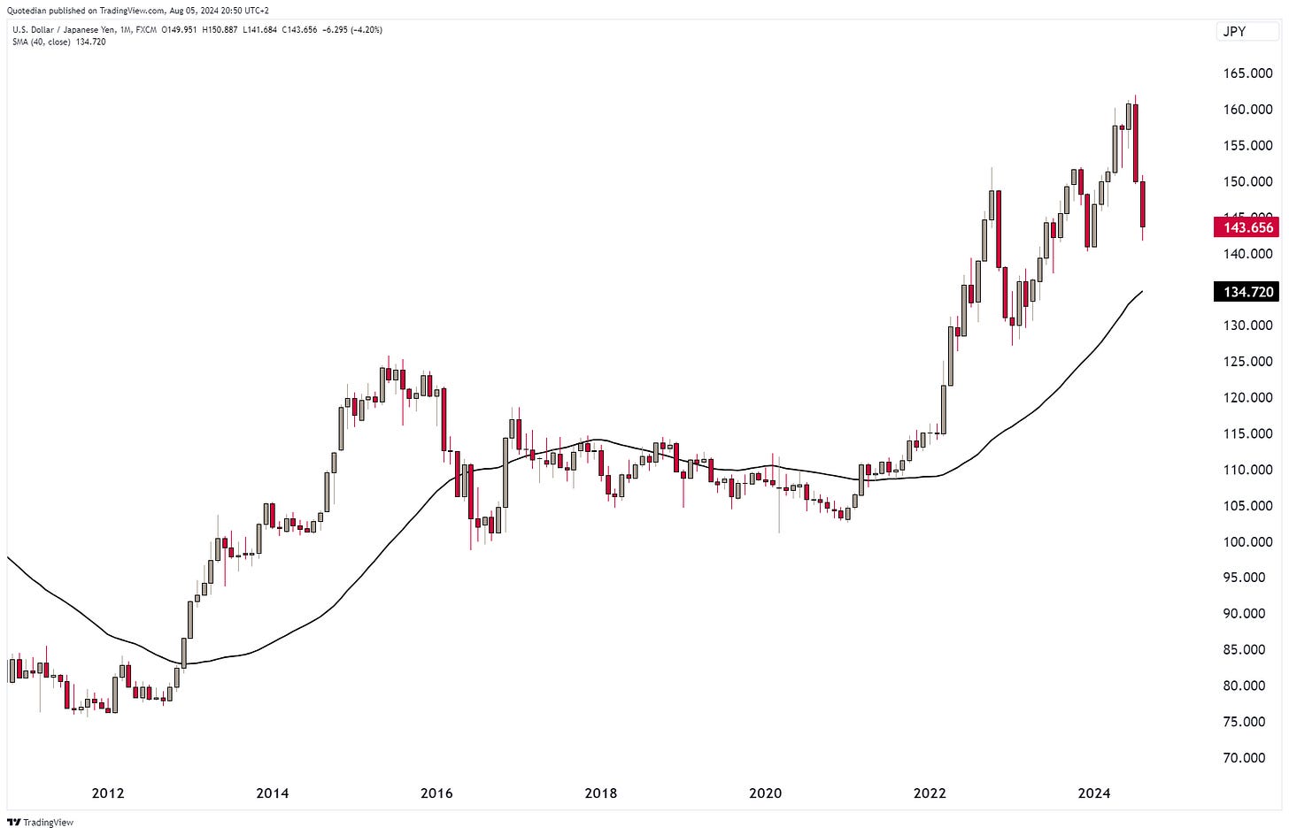
Whilst the fore-mentioned BoJ rate hike was widely expected and had been well announced for months now, it was a tipping point that accelerated the unwind of the massive Yen carry-trade further. Here’s the daily chart of the USDJPY cross-rate:
As we discussed in this space in past editions, the BoJ/MoF has proven itself extremely astute in FX trading in the past and this time was/is no exception. The central bank waited for an already strengthening currency to then double down with that hawkish rate hike, further adding fuel to the unwind fire. Top (11/7) to bottom (5/8) the currency pair lost 12.4%, which equals to 85% annualized. Absolutely massive!
Though the monthly chart on the same currency pair would reveal still some work to do:
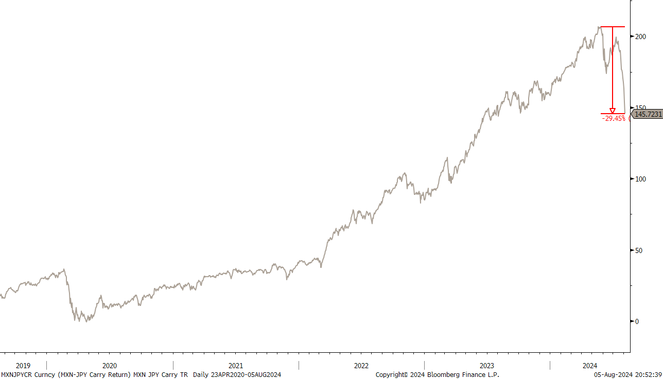
Similarly, the mother of all carry trades, short the JPY long the MXN has also further unwind potential, despite have reverted by 30% already:
The greenback by itself has been weakening on the back of a weaker economic prospect and possible dwindling interest rate differentials to other currencies. Here’s the monthly chart of the US Dollar Index, the Dixie (DXY):
The two year old range remains, but it is an important detail that the Dollar has not been strengthening despite the market turmoil of the past days. Take this as a sign that the current risk-off phase if of temporary nature only.
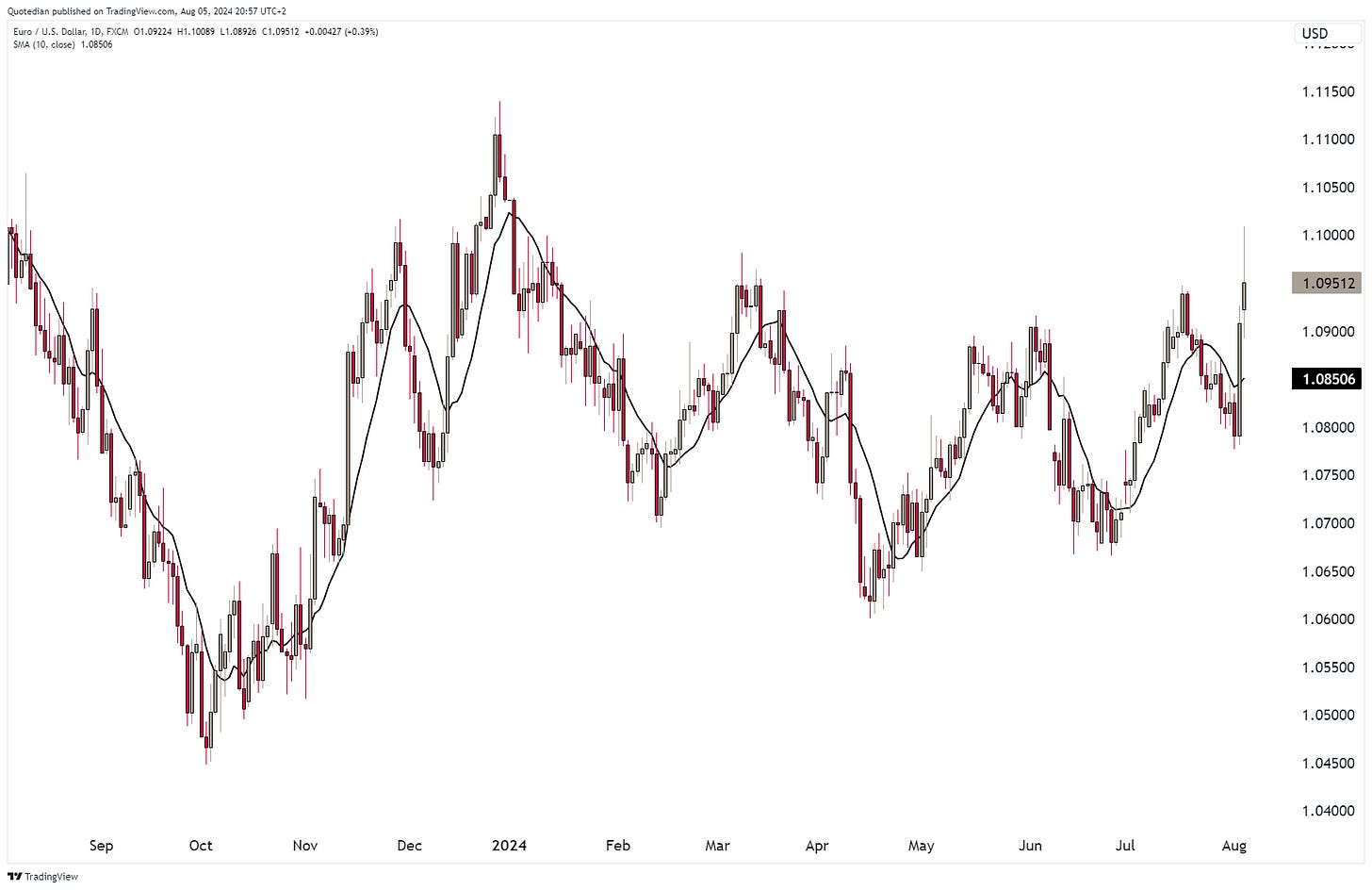
Similar, the EUR/USD remains range struck on the monthly chart too,
and the daily chart re-emphasis the lack of USD strength during the current panic moment:
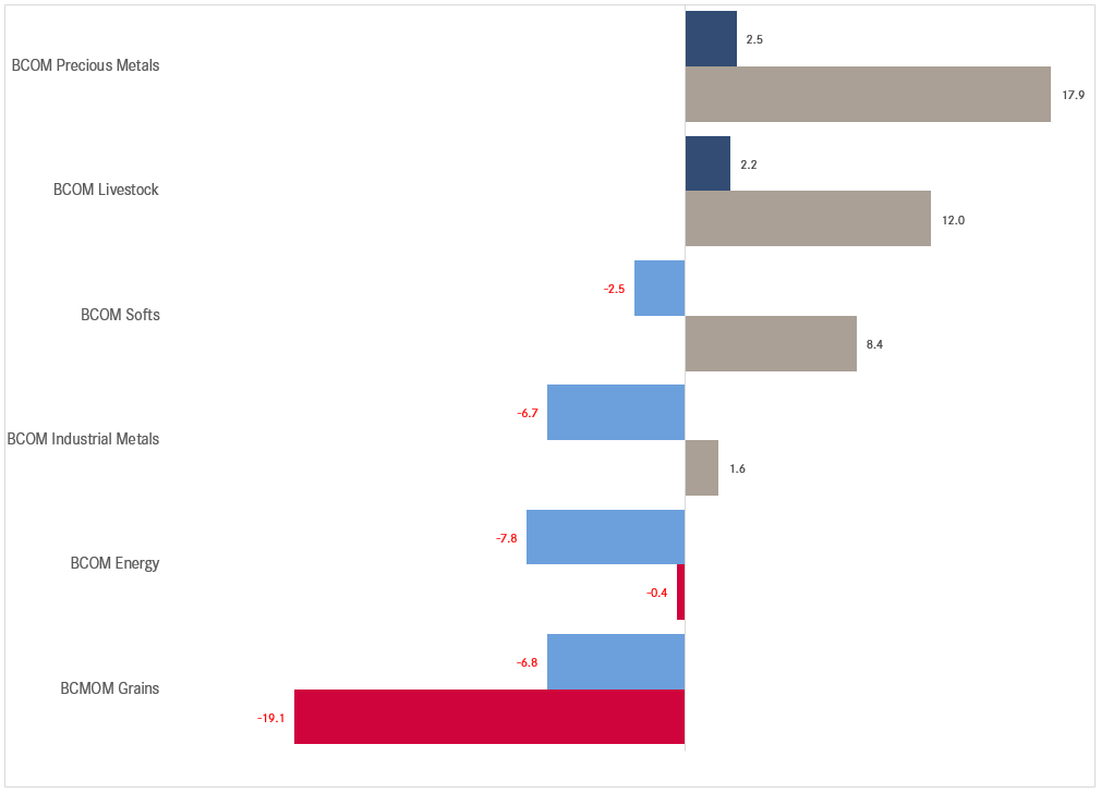
Commodities had a mixed July, with precious metals adding to already important YTD gains, whilst grains did the reverse:
But the performance chart of popular commodity futures reveals that there was more down than up in July:
Gold maintained the good momentum and was up for a fifth consecutive month in July:
Silver, with mixed features between precious and industrial, has seen its high already in May and is struggling to make more progress:
This same toppishness is very much reflected in the industrial metal per se, Copper:
Hence, copper, the metal with a PhD in economics, again had been signalling the economic weakness the rest of the market seemed to be ignoring.
The oil price was the other hint, which despite all geopolitical rumblings is refusing to go higher:
Let me start wrapping up here …
… but maybe just before sending you off in your day, a quick a reminder of some of the things going on:
US economy weakening (albeit yesterday’s (5/8) ISM was confusingly strong)
The Fed did it’s nth policy mistake by not cutting last week
The Yen-carry trade is unwinding
US 2024 election has taken many unexpected twists and turns
Geopolitics are going the wrong direction
Summer holidays are too short
Please add to this wall of worry in the comment section - let’s see how depressed we can get.
And remember, a lot is going on in financial markets, get professional help:
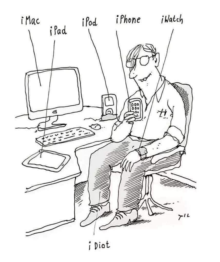
Some much seriousness up there, let’s finish with something “lighter” in the Chart of the Week section:
Everything in this document is for educational purposes only (FEPO)
Nothing in this document should be considered investment advice
The views expressed in this document may differ from the views published by Neue Private Bank AG
Past performance is hopefully no indication of future performance


