

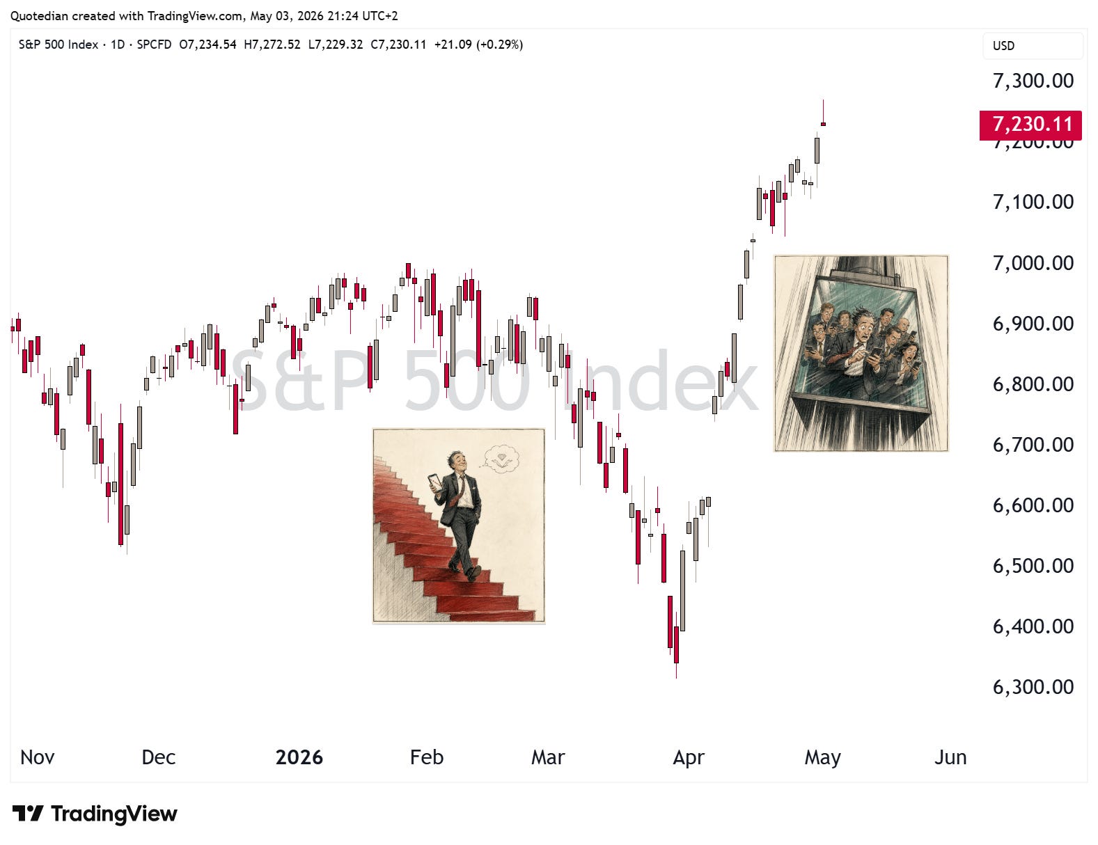
Stair Steps DOWN, Elevator UP
Vol IX, Issue 16 | A NPB Original

"The market can stay irrational longer than you can stay solvent."
— A. Gary Shilling

After a ‘gradual’ decline in March, Stocks have rebounded strongly in April
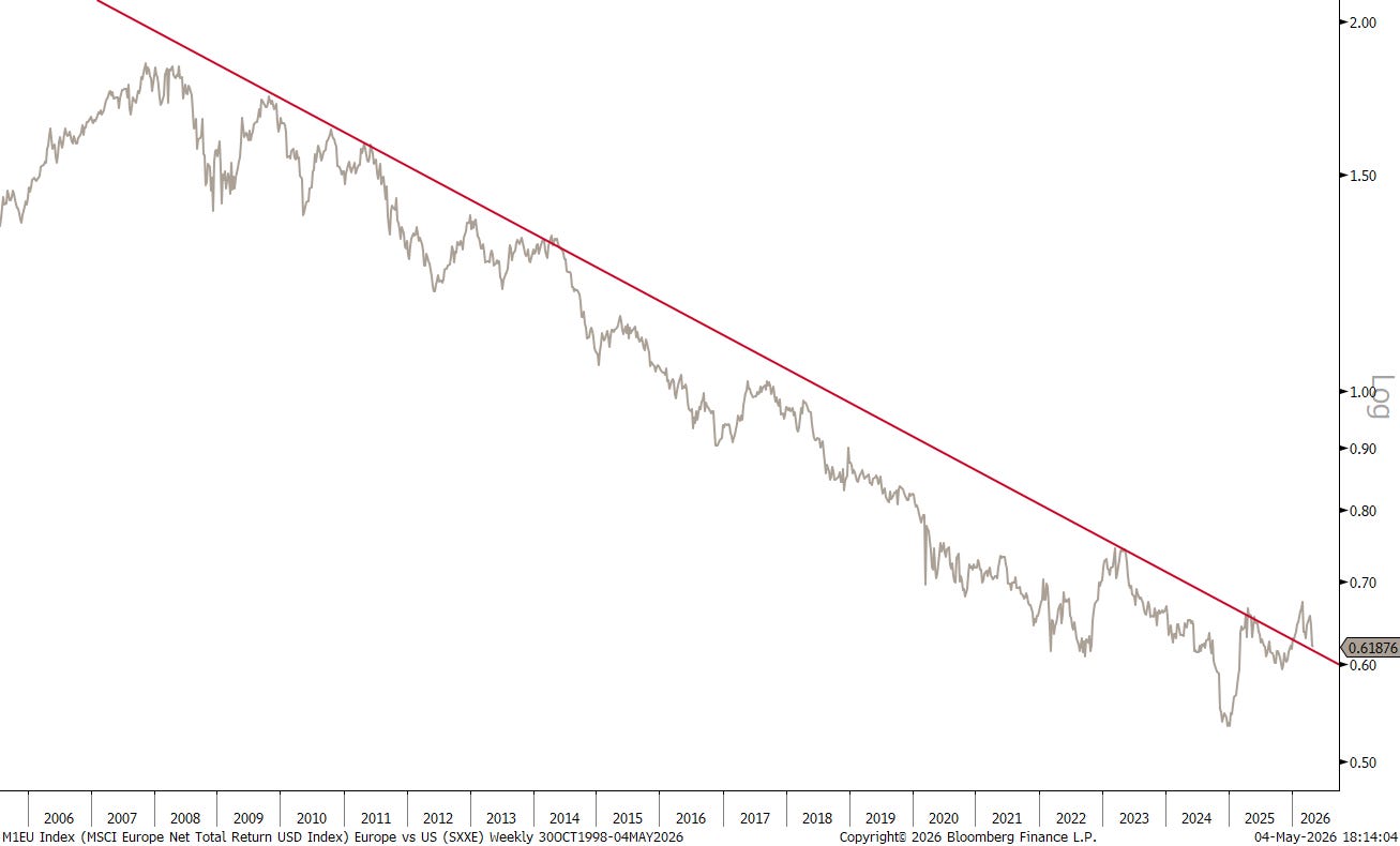
European equity markets have started to lag the US market again
Technology stocks are breaking out versus the broader market
Global bond yields remain elevated, signalling inflation fears
The US Dollar continues range bound, but its overall lack of strength maintains the bearish outlook for the greenback
Commodities have been mostly about energy this year, but watch the ags too

Of course, the old Wall street adage is: "Stocks take the stair steps up and the elevator down”, but the most recent experience has been precisely the opposite. But don’t take my word for it - check it out for yourself with the example of the S&P 500:
As a matter of fact, in the case of the Nasdaq 100, it has been the best (calendar) monthly performance since the hey-days of the Dotcom bubble:
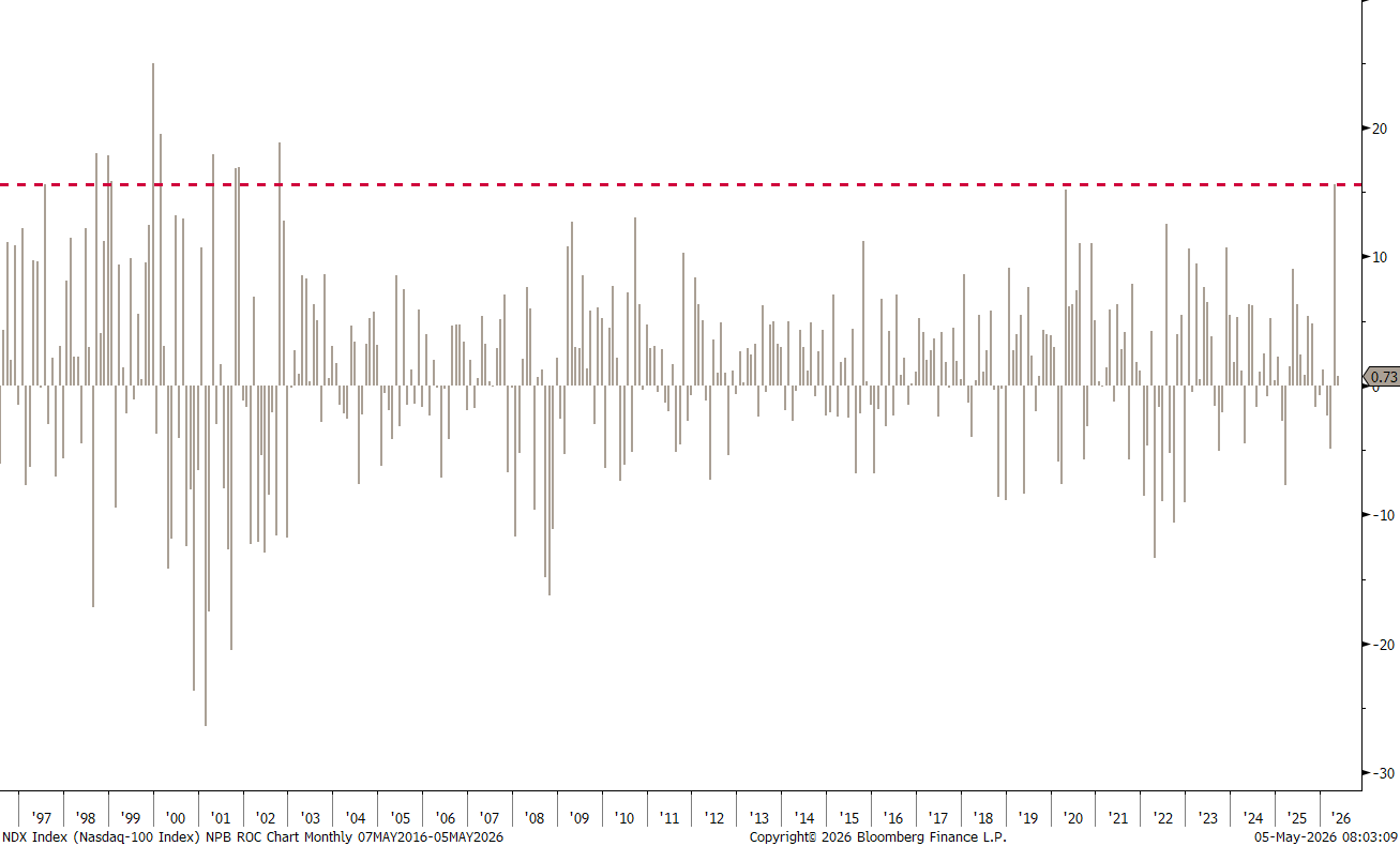
Is this normal? No.
Can it continue? Totally.
There are several ‘things’ suggesting that "Something is rotten in the state of Denmark", but this shall be a theme rant for another day. Today’s focus is, not least motivated due to one of my rare absences from markets given a brief “vacation” last week, on our usual end of month (April) reporting, with the statistical tables, monthly bar charts, and casual observations.
Hence, with just one further ado, please note that all data is downloaded on Saturday, May 2nd 2026. Many markets were closed on May 1st, but not all. Hence, YTD data is until May 2 and 1-month data is April 2 until May 2. Little difference really, but just so you know.
Now, let’s dive right in!

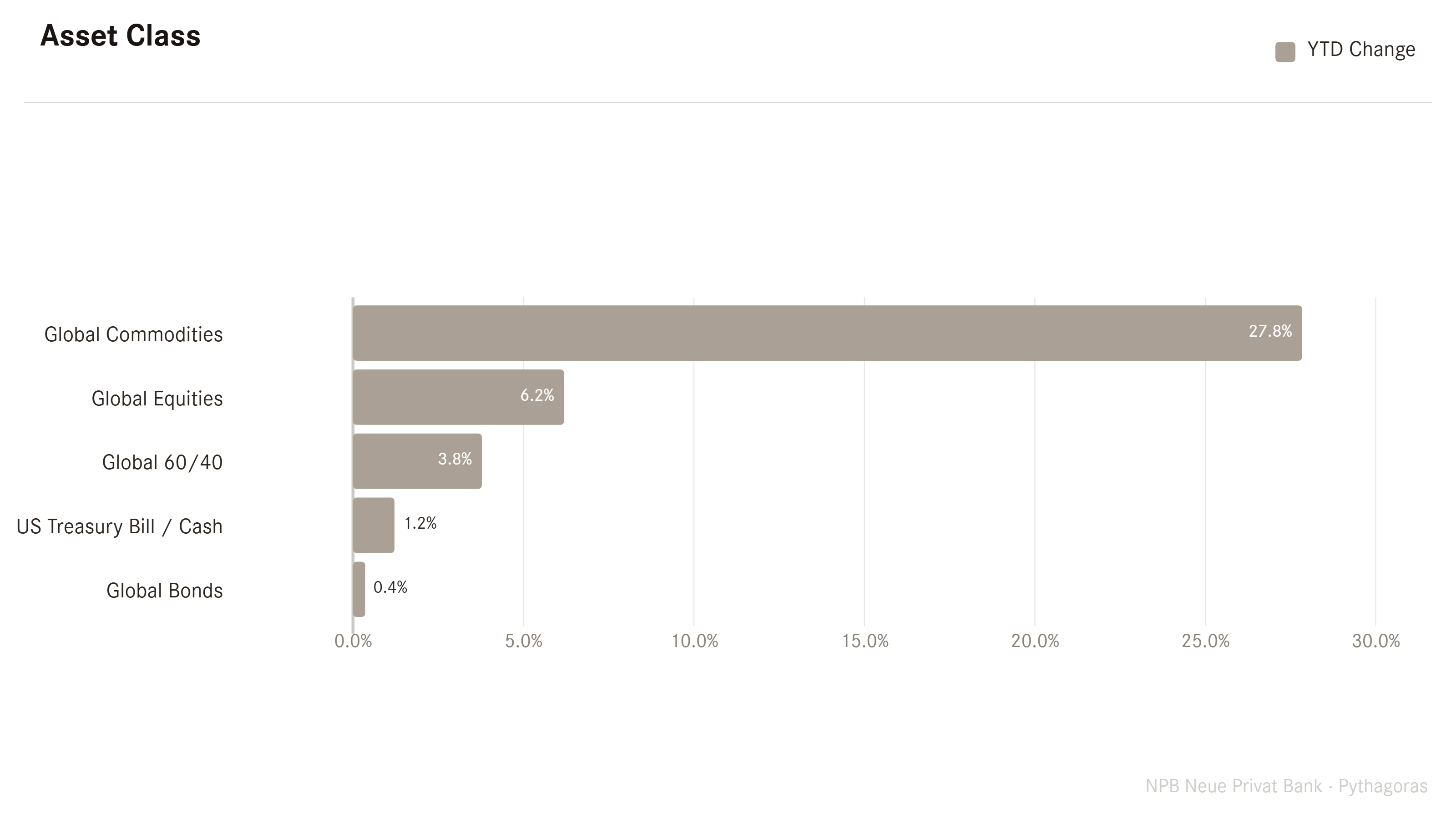
Looking at the top level, commodities continue to shoot out the lights on a year-to-date (YTD) basis:
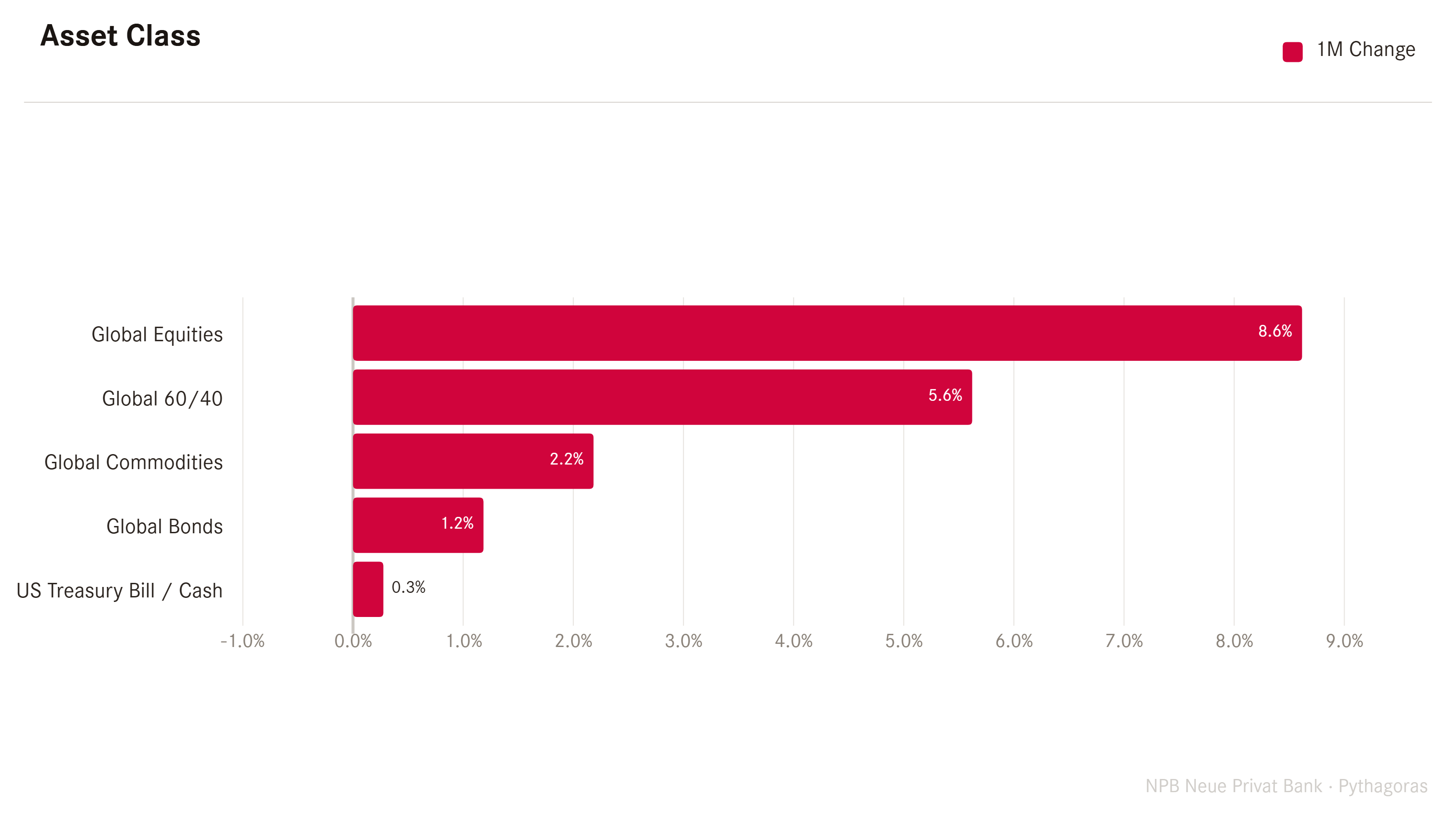
But on a monthly time frame, equities were the real star performers, bringing us back to the inverted “stairs down, elevator up” framework:
Now let us get a bit more granular on those different asset classes above, excluding Global 60/40, but including Global Currency markets and starting with equities.
On the next graph, we look at 1-month returns (red) of some of the most closely watched global benchmark indices and put them in context of YTD returns (grey):
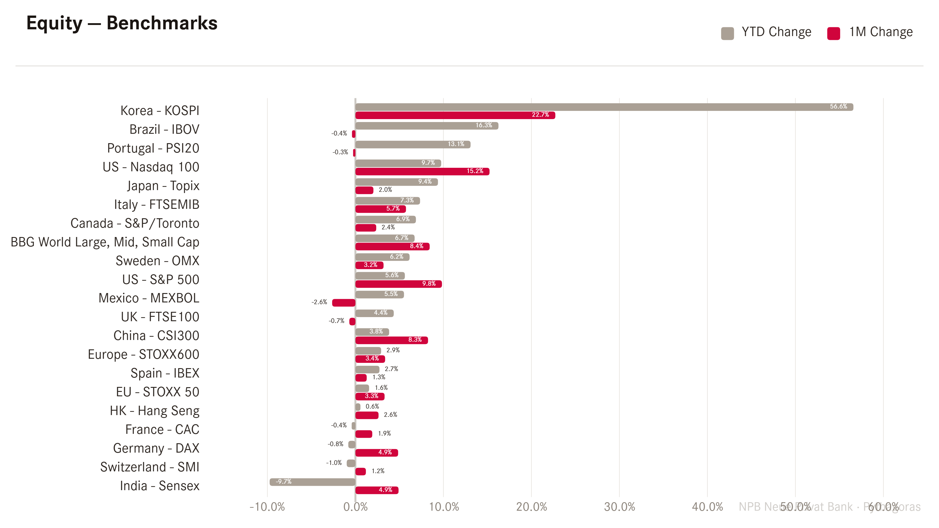
Yes, there is one index that stands out against all others, which is Korea’s KOSPI. As the daily candle graph shows, here it was elevator down and rocket ship up….
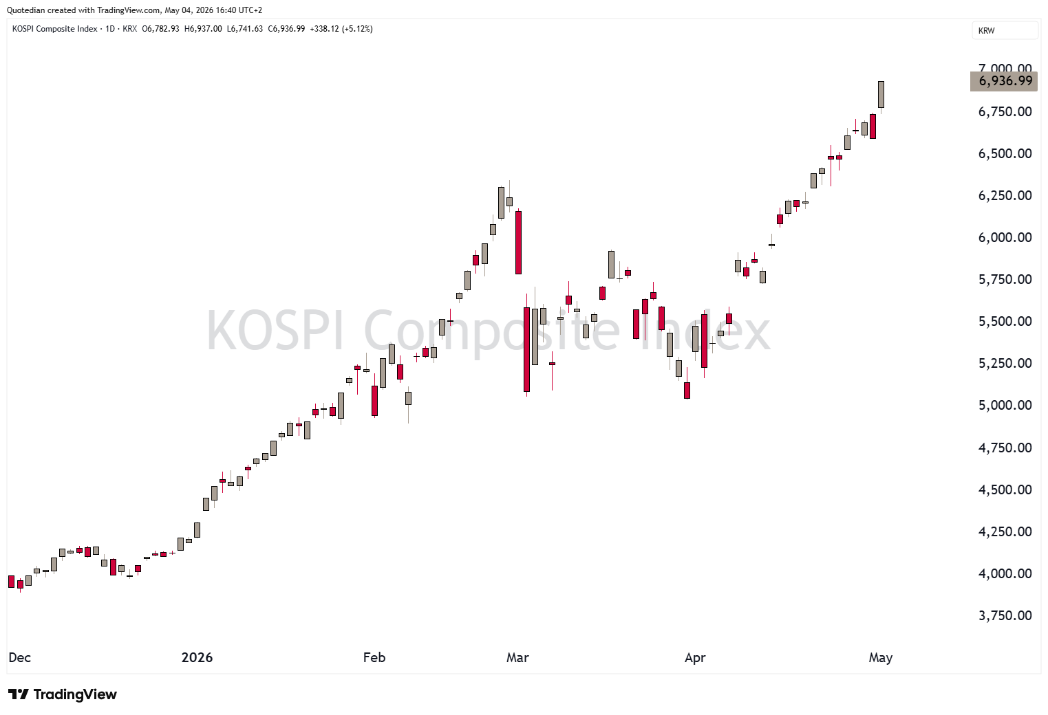
The combination of a new law that makes capital repatriation into the country highly attractive, together with the fact that the top 3 stocks,
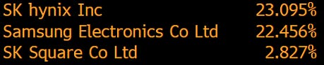
which happen to be at the forefront of the AI build-out, make up nearly 50% of the index, has led to this massive rally this year.
But let’s get back to Western markets before turning back to Asian equities. In the US, we already noticed the “Stair Down, Elevator Up” on the S&P 500. On the monthly candle chart, this looks as follows:
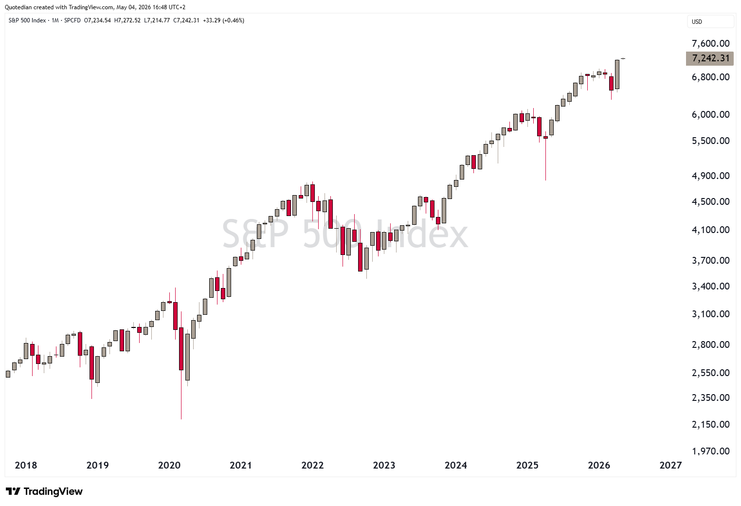
Astonishing.
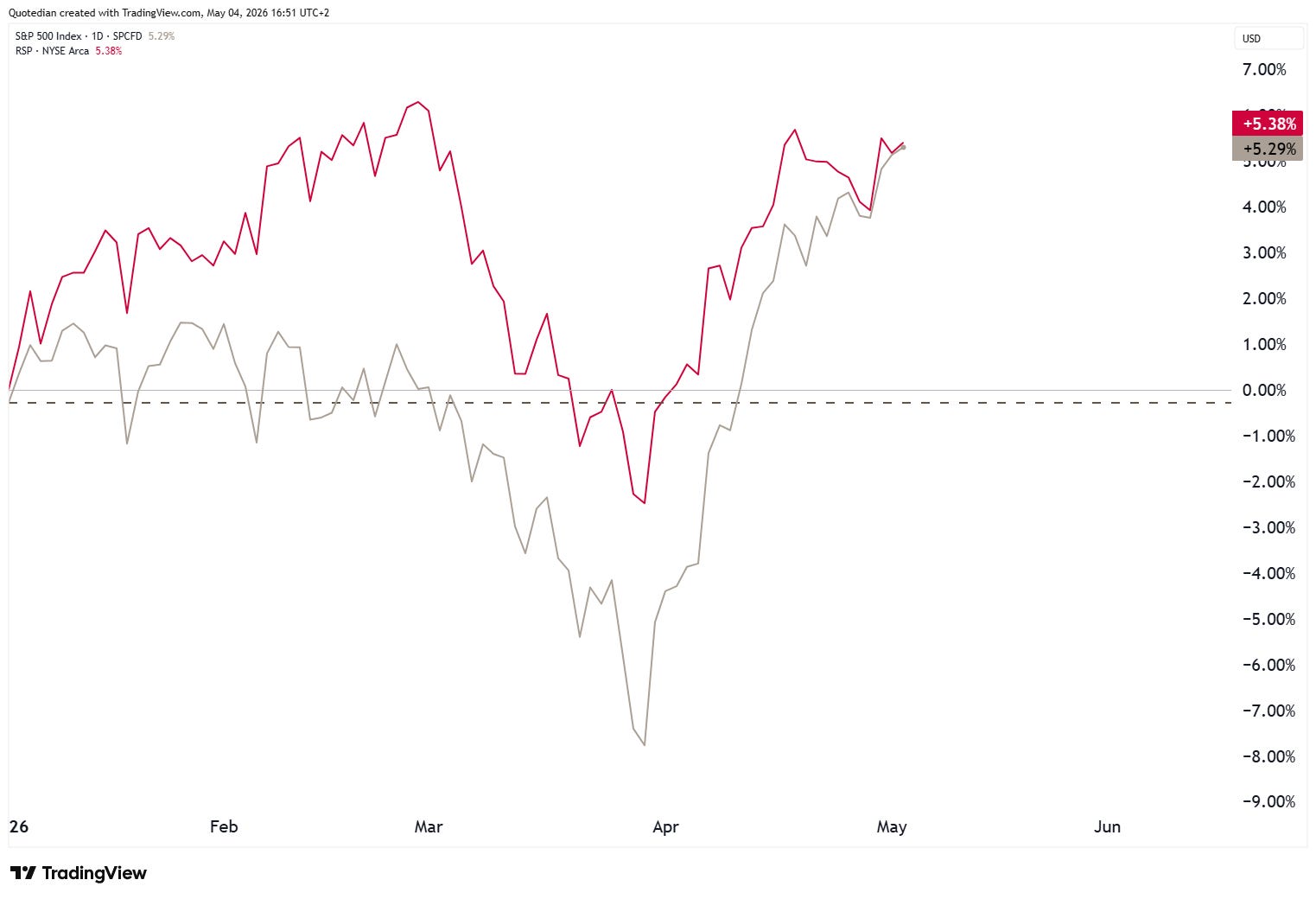
It is worth noting that since the “Iran bottom”, the normal, cap-weight version of the S&P 500 (grey) has caught up with equal-weight version (red), which had been outperforming since the beginning of the year:
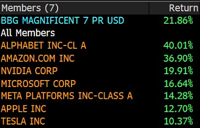
This of course means that the Mag 7 stocks are at it again:
Indeed.
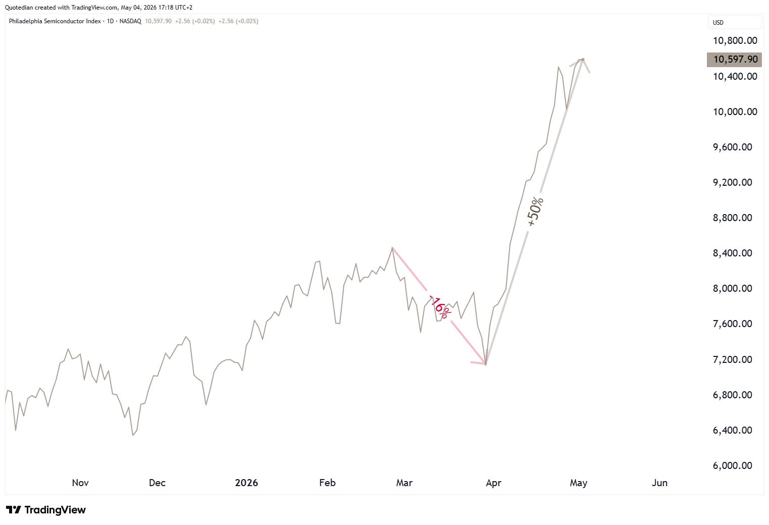
The Philadelphia Semiconductor Index (SOX) seem to be flying to another planet:
If we scroll back to our Global Benchmarks performance table, we note quite a few European markets (e.g. CAC40, DAX, SMI, others) in the bottom half to bottom third of that league table.
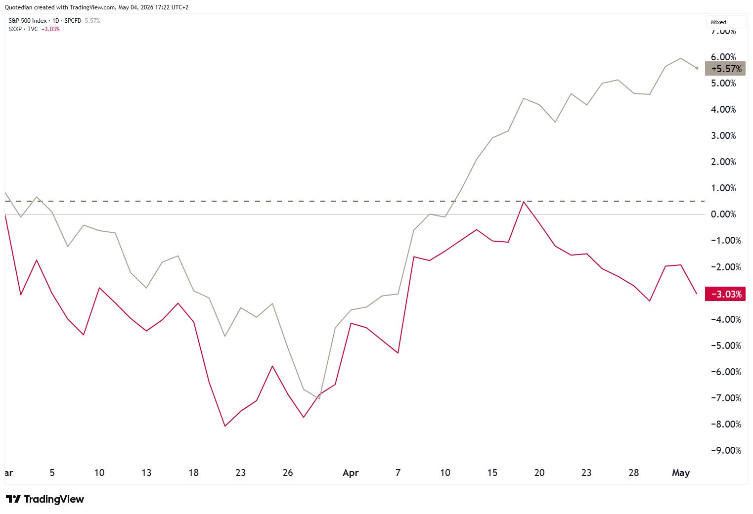
Not completely to everyone’s surprise, are the higher energy costs since the onset of the Iran conflict impacting European stocks (SXXP - red) more than their US counterparts (SPX - grey):
In that context, Thomas Henry Huxley’s “The great tragedy of science — the slaying of a beautiful hypothesis by an ugly fact” quote comes to mind, as our patriotic Europe will outperform the US theory starts falling apart:
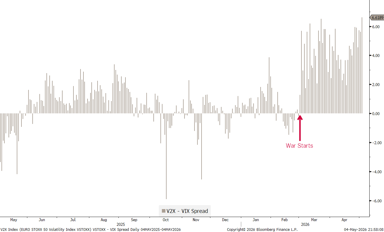
This imbalance of the impact of energy prices is not only expressed in the Europe/US stock performance ratio, but also in volatility, where European vol has been substantially higher than US vol since the outbreak of the war:
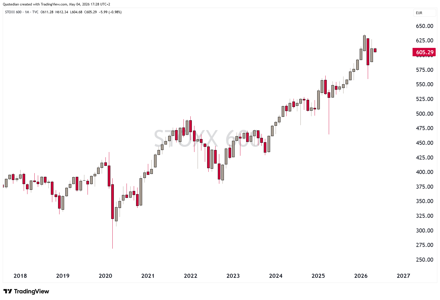
The broad STOXX 600 Europe index saw its last new all-time high (ATH) in February and has been struggling since:
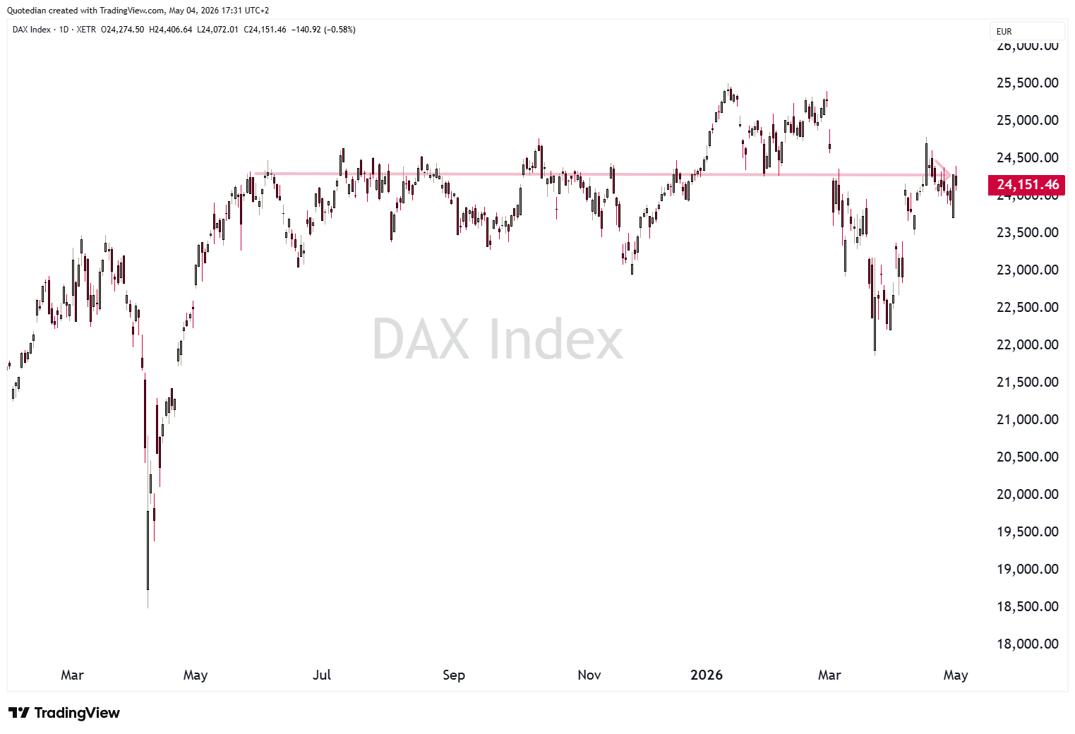
Big part of the ‘blame’ goes on the German DAX, which has made no net progress in nearly a year now:
But it wouldn’t be fair to blame the German stock market only, as their most immediate neighbours to the West, have not helped the European stock market for over two years now:
Turning to Asian markets again, Japan’s Nikkei has been strong:
HOWEVER, there is a clear divergence between Nikkei (grey) and the broader Topix (red) index, which we need to keep an eye on:
India’s stock market (BSE500) continues in its 18-month old bear market:
Turning to sector performance for a short moment, Energy was flat in April, but continues to be the clear leader YTD:
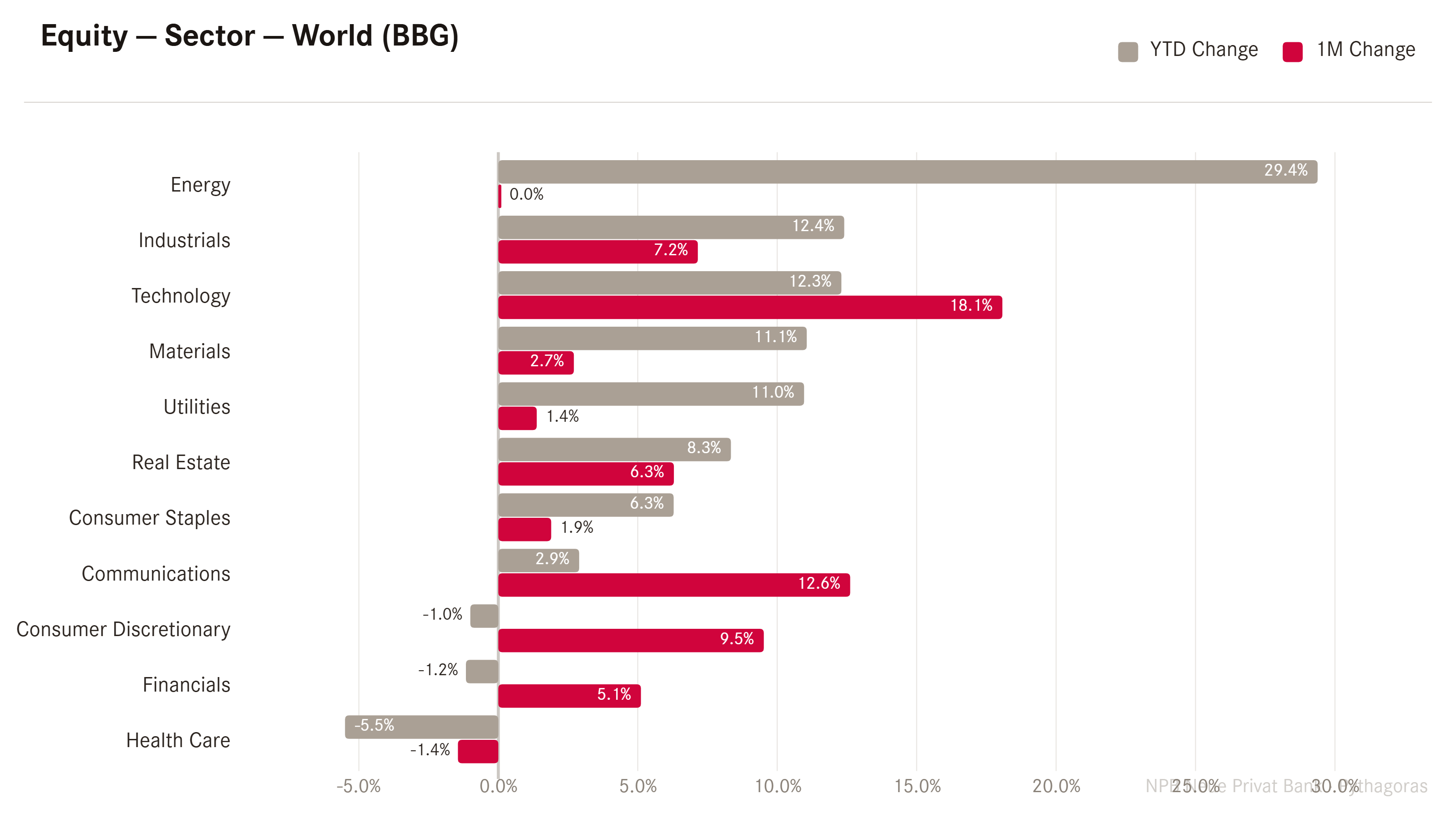
Technology has seen a meaningful rebound, and on a relative basis (XLK/SPY) we could argue that tech stocks are just breaking out of a 26 year base formation versus the broader market:
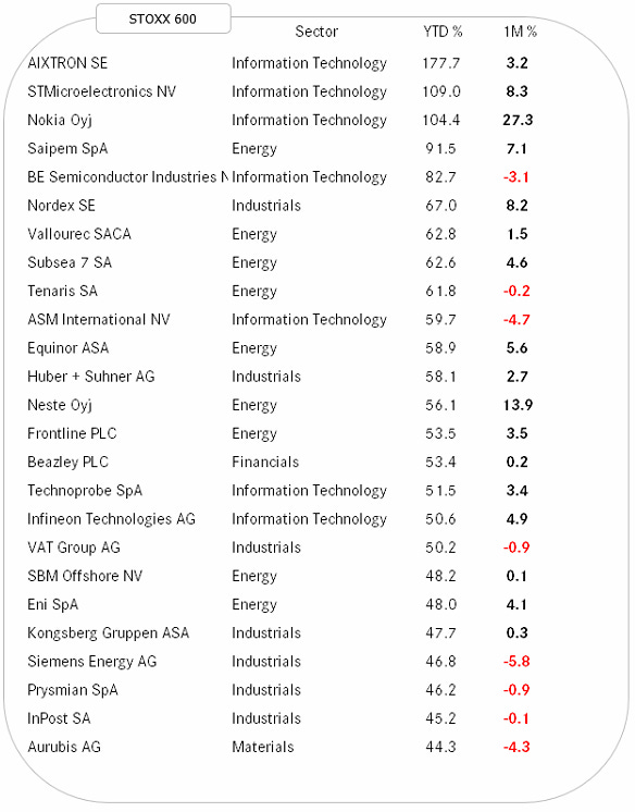
Finally, please find below the best performing stock YTD in Europe and the US and how they have fared over the past month.
Starting with the US Top 25, I would paraphrase Mark Twain by saying “Reports of my Tech’s death has been greatly exaggerated.”
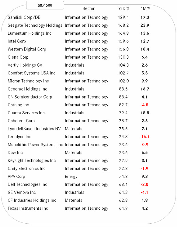
With only a few exceptions, all companies above are included in the massive AI build-out, which maybe we should be starting to call “Roman Roads 2.0” or “The Second Electrification”…
In Europe, the list also has an AI build-out tilt, though a lot of energy and energy infrastructure is thrown into the mix too:
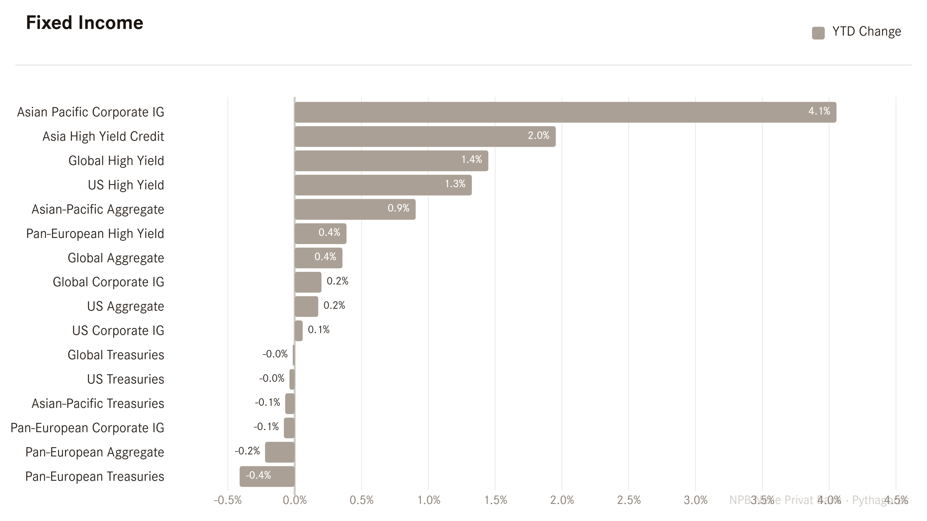
Time to turn to fixed income markets and their performance. It comes at no surprise that the equity-sensitive segment (High Yield) of the bond market is to be found at the top of the performance table, while the duration-sensitive instruments (Treasuries) are rather towards the bottom:
Bond yields refused to come down meaningfully during the strongest moments of the equity rally and have now turned higher again. Here’s the 10-Year US Treasury yield chart:
And here the same maturity on the German yield chart as a proxy for European rates:
Japan’s JGB yields are ‘quietly’ pushing higher again on all time frames:
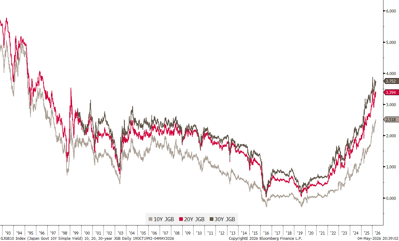
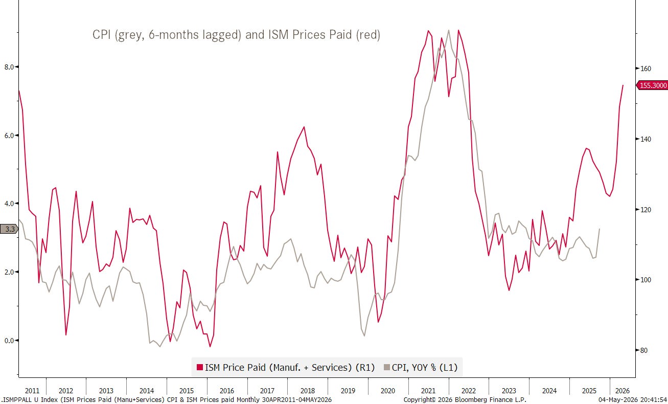
All these higher bond yields are of course because bond investors are expecting a higher level of inflation - transitory or not …
We continue to watch this chart closely:
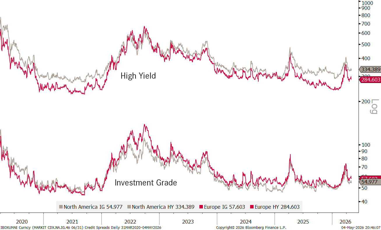
In the credit spread space, it seems investors have decided to look beyond the private credit rumblings and the AI (over)spending:
In currency markets, the USD is not fulfilling its usual safe haven function during times of kinetic warfare:
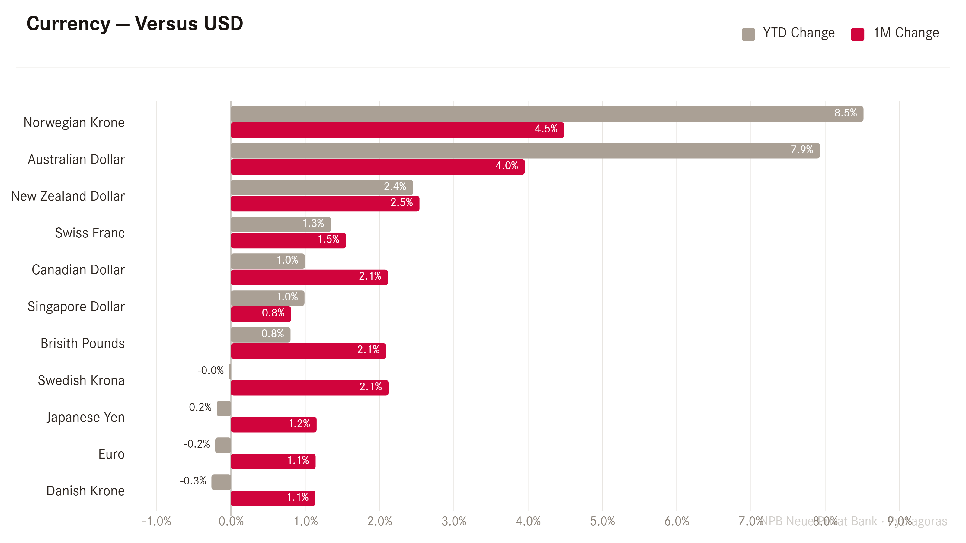
The greenback lost ground against all other developed market currencies on the above chart and shows only selective and little strength versus a few on a year-to-date basis.
The Dollar Index remains quite precisely stuck in the middle of its trading range:
Nothing to write home about on the EUR/USD chart:
The most interesting FX chart to follow continues to be the USD/JPY chart, where the MoF (Ministry of Finance) has intervened for at least a third time at 160 to strengthen the Yen, this time with a noteworthy level of success:
In cryptocurrency markets the tone seems to have shifted in May (inline with the risk-on observed in equities), though some work is still needed to get rid of those negative year-to-date returns:
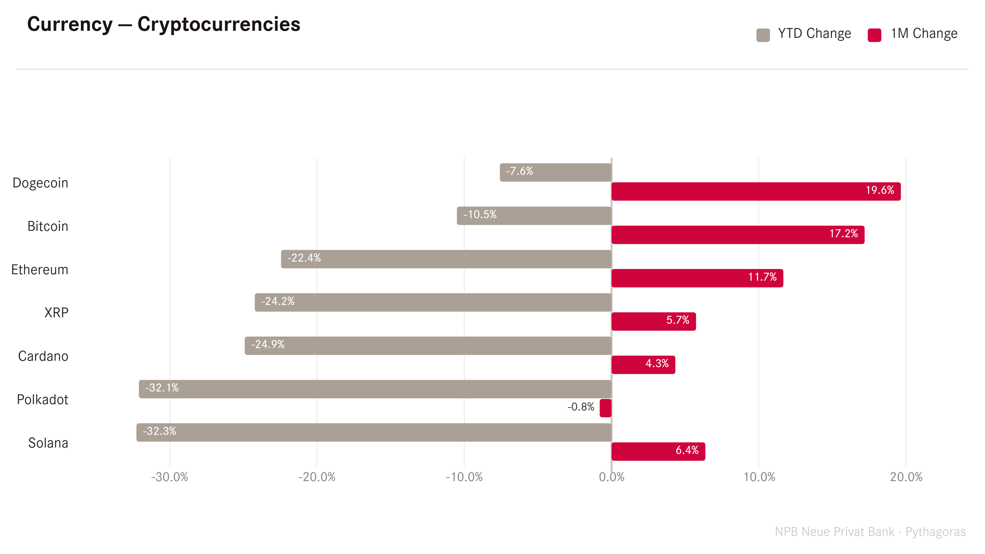
The Bitcoin chart is definitely starting to look more constructive:
And finally, let’s move into those molecule performance charts, starting with the 40,000 feet view:
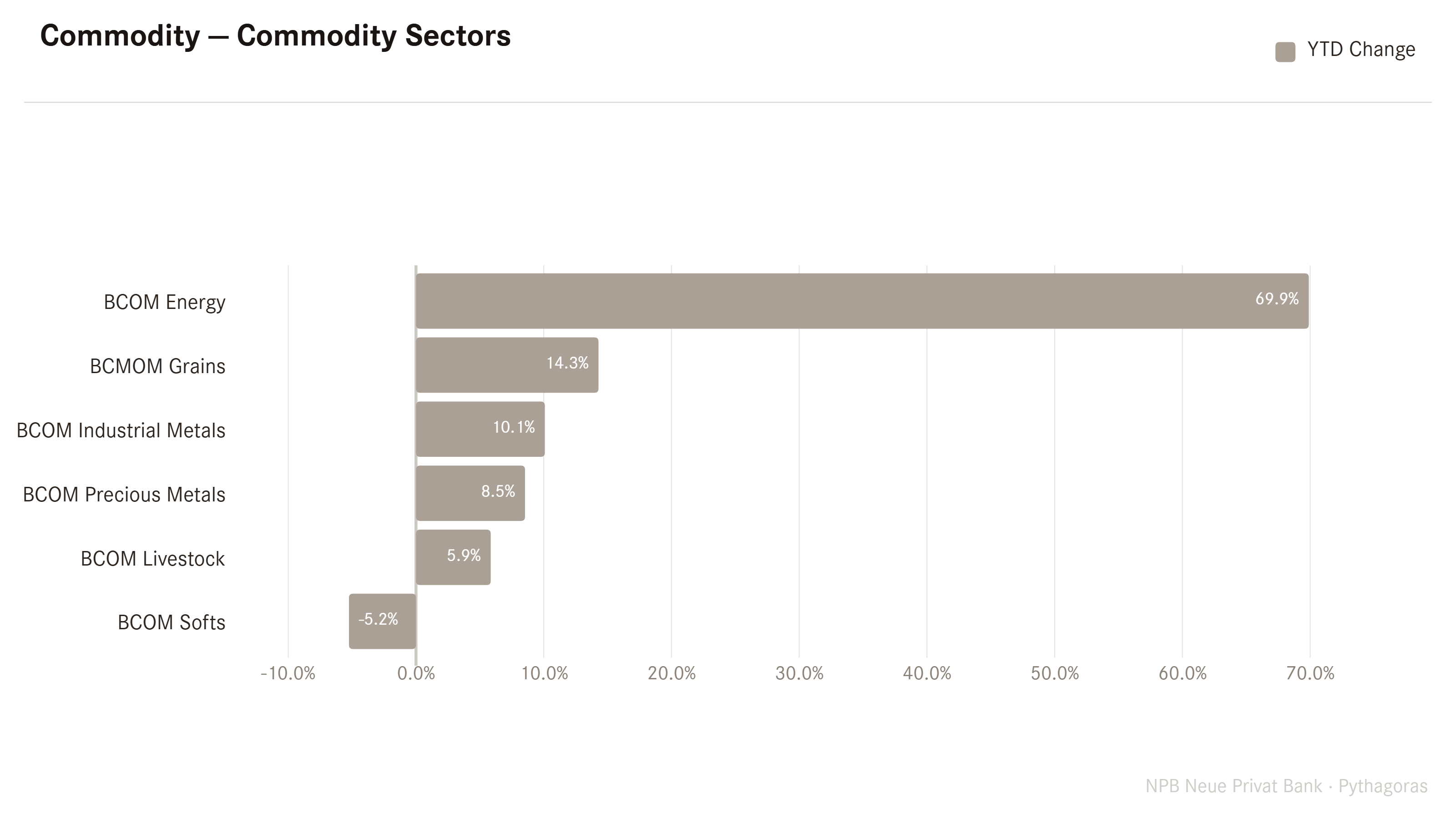
The laggard sector of the past years, energy, is now back with a vengeance.
Breaking that chart down to the next level, and looking at some of the more popular commodity futures, one cannot stop wondering why stocks in general and consumer stocks in particular are not trading lower:
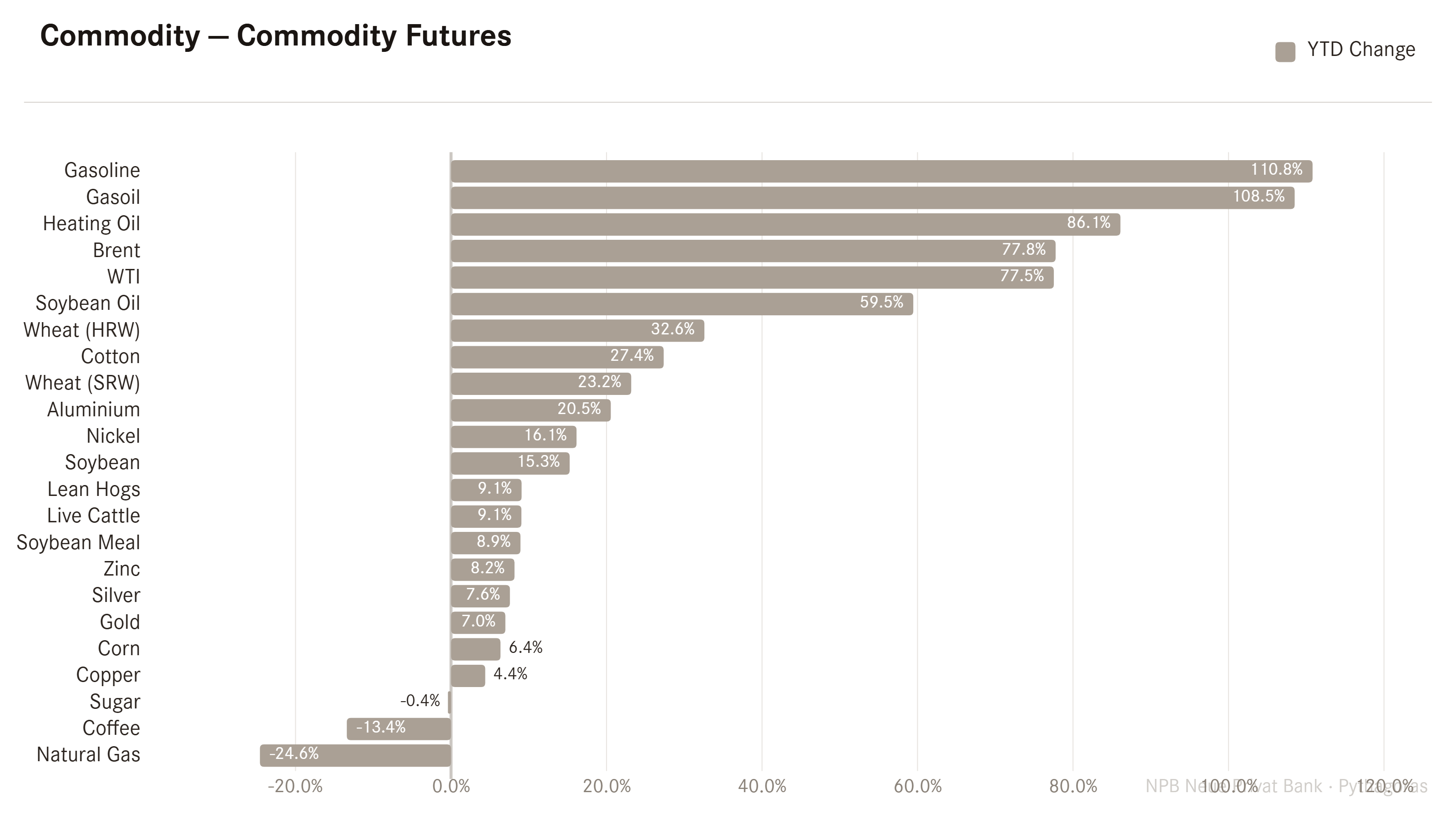
I mean, gasoline, gasoil, heating oil all substantially more expensive as are some basic food stocks such as soybeans or wheat.
Also, I give you another try to guess which direction those inflation numbers will be heading the next few months at least …
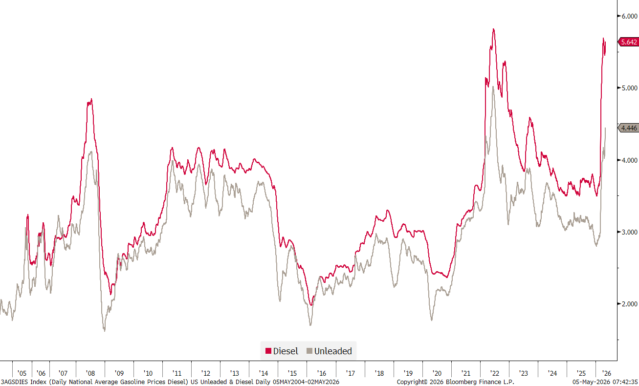
Here’s a chart of fuel prices (unleaded and diesel) in the US:
Looking into other corners of the commodity market, precious metals, lead by gold, suddenly don’t look THAT bullish anymore:
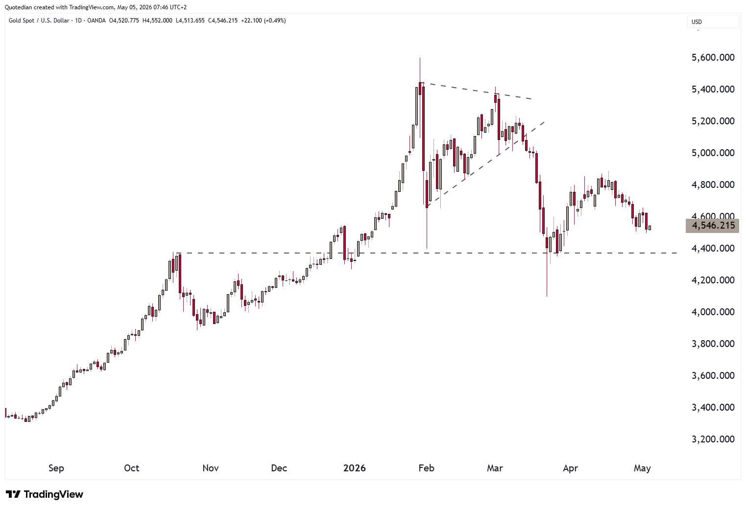
This reinforces my view that we might be in for one of those multi-month to multi-year periods of “sideness”:

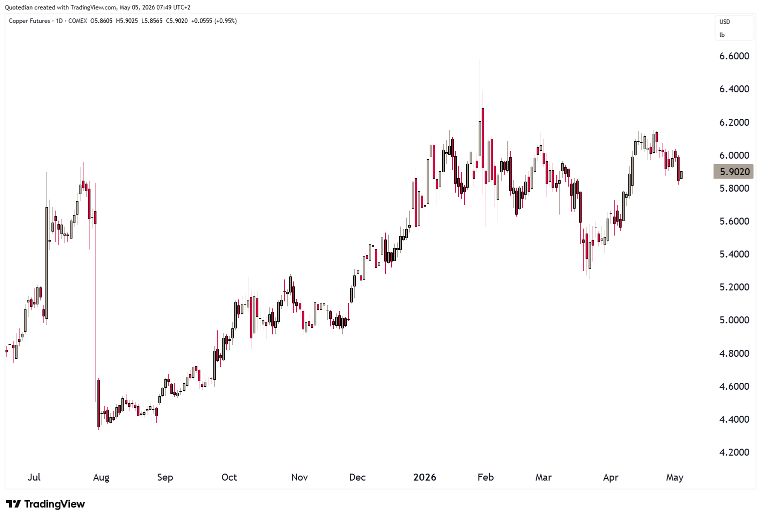
On the other hand, I continue to like copper, but only buy a clear break of 6.20:
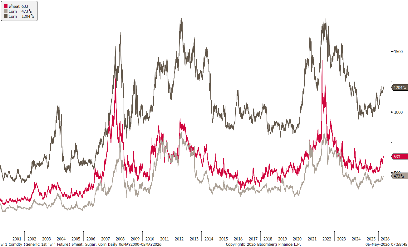
And I would also keep on eye on some of the ‘Ags’:

No squaring of circles this week, as I promised I will keep my ire and rant about markets for a later letter 😉.
In the meantime, remember this week’s Quote from the top of this letter:
“The market can stay irrational longer than you can stay solvent.”
— A. Gary Shilling

May the Trend be with You!
André

Everything in this document is for educational purposes only (FEPO)
Nothing in this document should be considered investment advice
Investing real money can be costly; don’t do stupid shit
Leave politics at the door—markets don’t care.
Past performance is hopefully no indication of future performance
The views expressed in this document may differ from the views published by NPB Neue Privat Bank AG