

Stairs up, Elevator Down
The Quotedian - Vol V, Issue 120

“The markets take the stairs up and the elevator down.”
— Wall Street Adage
DASHBOARD
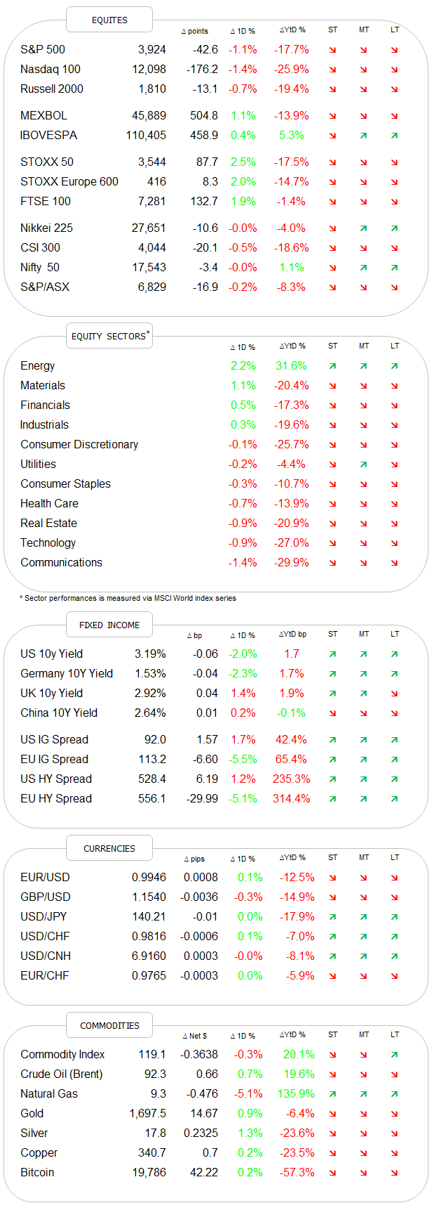
AGENDA

CROSS-ASSET DELIBERATIONS
Today’s Quotedian will be our usual weekly Sunday review despite reaching you this early Monday morning (unless you live in California, in which case I still delivered on time). Let’s dive right in!
Today’s Quote of the Day of course refers to the tendency of equity markets to slowly grind their way higher, but then take much less time to drop. Point-in-case: The S&P 500 took only about one-third of the time to correct two third of the gains it had achieved since the mid-June lows:

Friday’s downturn on Wall Street after the European closing bell was particularly unconstructive for the chart, as it negated any possible bullish interpretation from Thursday’s green candle (see chart above).
Nothing particular seems to have triggered the sell-off, other than investors likely trying to reduce risk ahead of a three-day weekend in the US (Labour Day on Monday). Nevertheless, it was an over 800 point drop top to bottom on the Dow:

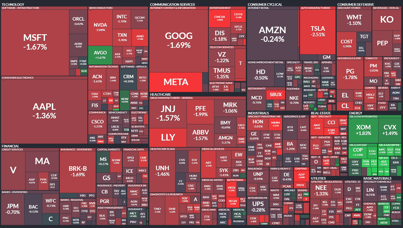
For the S&P 500, only one out of eleven sectors closed higher on the day - yes, correct, energy stocks (1.8%). These left the market carpet with a decisively red tone for the session:
As the market sell-off came very late on Friday, with only US stocks remaining open for trading, other global indices had actually a pretty decent end to the week:

But what did the full week look like for equity markets? Let’s check:
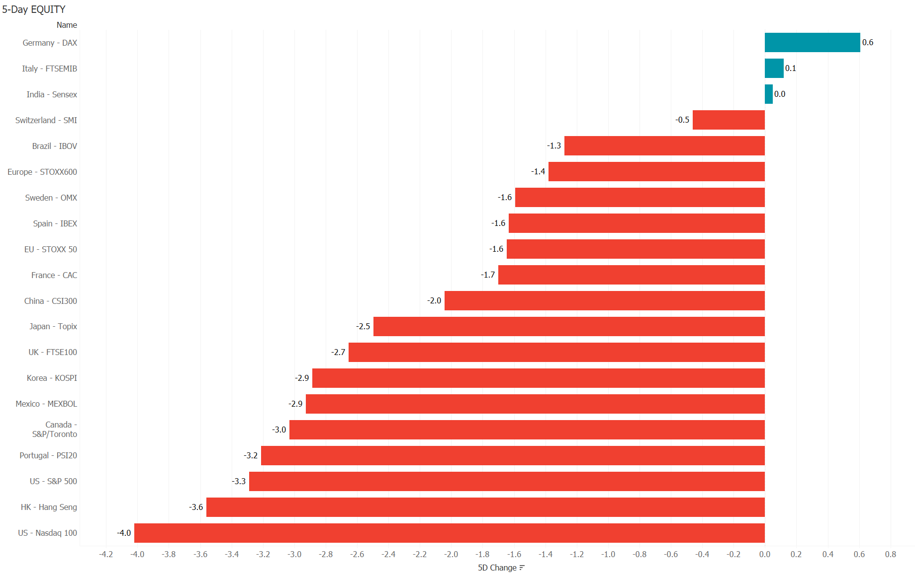
Oopsie. Not so nice actually, confirming our elevator theory …
The picture does not improve when looking at the 5-day sector performance, which produced not one green bar over the past week:

Monday could be tricky for Global stock markets given Friday’s late sell-off on Wall Street in combination with missing guidance and lower volumes due to most US investors barbecuing in their backyard.

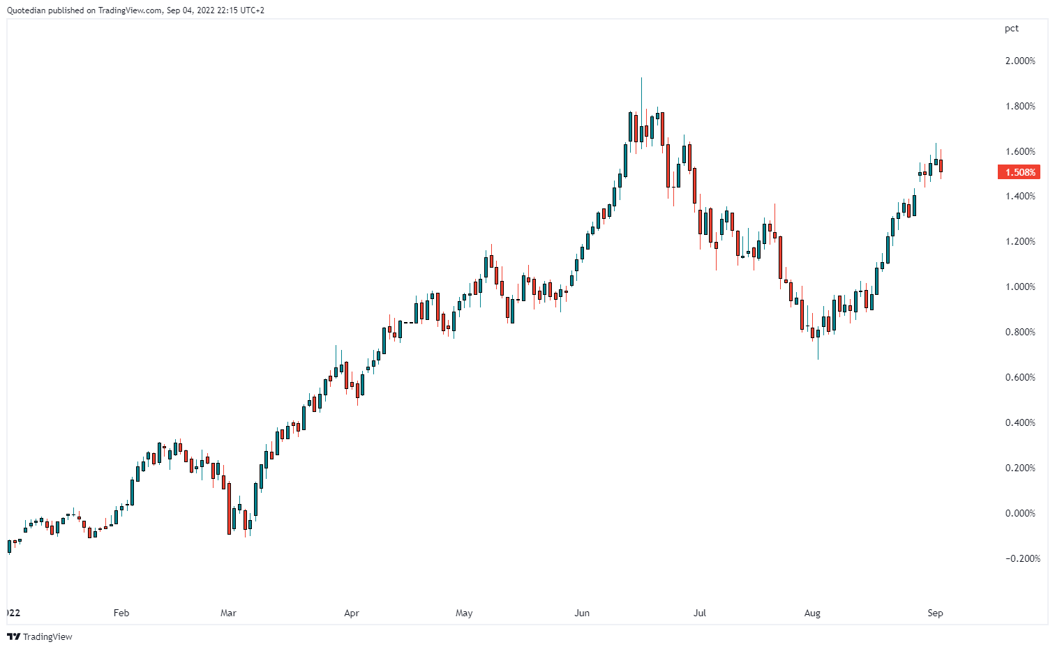
What does our 24/7 VIX proxy, Bitcoin, suggest then?

Well, Bitcoin (XBT) is trading a bit more than two percent lower than where European left it on Friday evening, suggesting some more risk-off coming. However, most of the losses came still on Friday and not over the weekend. We shall see, but here’s one more interesting chart, making the point why XBT has become such a good risk indicator:

The correlation with the S&P 500 stands now at around 0.65 - that’s pretty decent!
Ok, let’s move on into the fixed income space, where bond prices found a bit of a bid on Friday, after another week of strong headwinds. US and European yields turned lower shortly after the release of the strong Non-Farm Payroll number, suggesting some “sell the rumour, buy the fact” taking place. Despite Friday’s small reprieve for bonds, yields remain elevated though, here’s the chart on the 10-year German Bund:
But again, overall it was not a good week for long-only bond investors, with the latest sell-off pushing bonds (global aggregate) into bear market (>-20%) territory:

Interestingly enough, Friday’s yield ‘sell-off’ was bigger at the short-end of the curve in both, the European and the US curve, with the latter now seeing a more pronounced steeping process (albeit still inverted):

In the meantime, credit spreads remain elevated and seem to be closing in on the February/March 2020 COVID panic highs:

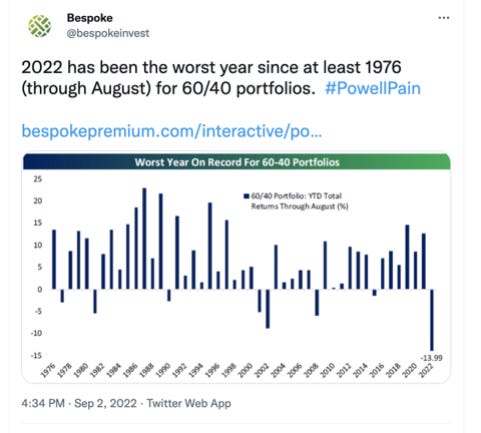
Ok, now that we have established that stocks AND bonds had another difficult week, it could be a good time (or not!) to review the performance of a typical 60/40 portfolio:
Moving on into currency markets, it was yet another strong week for the US Dollar against, well, against nearly everything:
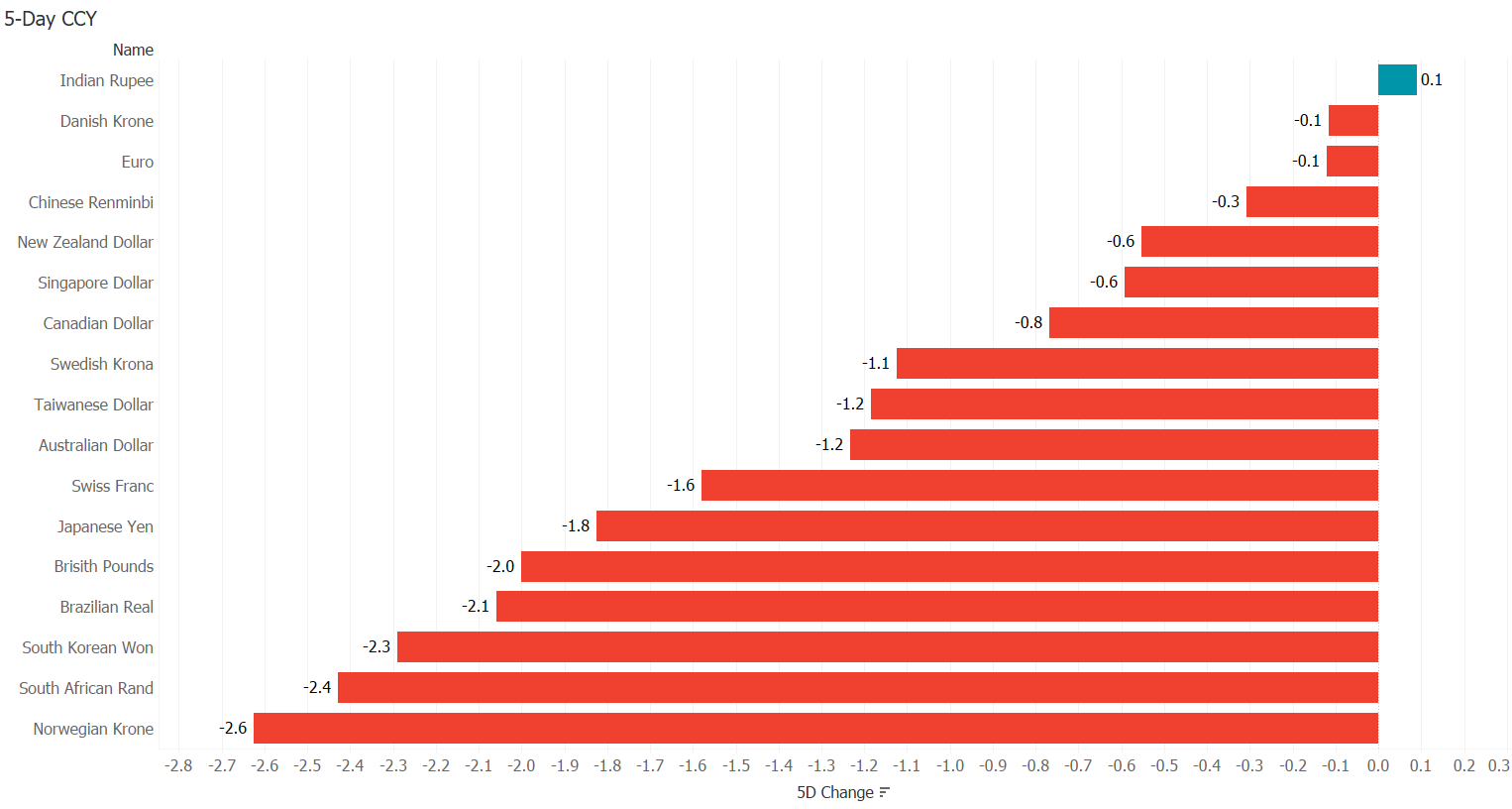
Once again, such broad USD strength is not a good signal for risky assets and cautiousness continues to be warranted.
The EUR/USD cross-rate, which had held up pretty well during most part of the week, saw a late sell-off on Friday (European evening) of nearly a big figure in just a few minutes, which I suspect had either to do with EUR65 billion household-aid package of the German government or the news that Gazprom would not switch back on the pipeline which was done for routine maintenance. or both. Here’s the intraday chart:

Technically, the cross is still holding above key support:

The other currency pair under close scrutiny this week was of course the US Dollar/Japanese Yen rate, which moved above 140 first time since 1998. And as the Yen and the Euro make up over 60% of the US Dollar Index (DXY), that measure of the greenback broke above key resistance and trades at levels not seen since 2002:

Given all the US Dollar strength, it would be no surprise to see that commodities had a tough week, as they are usually measured in USD. Here are the main commodities ‘sectors’:
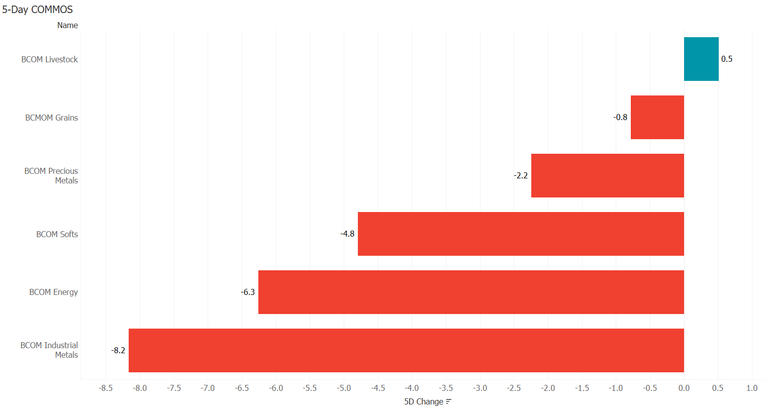
Of course, is not all this weakness attributable to the $-strength, but some genuine selling took place, especially in the metals and energy space (economic slowdown).
Silver, a metal living in the twilight zone between precious and industrials, faced some heavy selling this week:

Holding on to the $18-handle seems important on the above chart. Maybe there is some help from hedgers, which according to the following chart (courtesy sentimenttrader.com) are long to an extent that in the past led to an at least temporary upturn in the underlying price:

Gold in the meantime is holding on to crucial long-term support … for now …

Oil, after having broken above short-term resistance, thereby improving substantially the bullish outlook, gave it all back during the past few sessions and a break of key support at $85.50 (WTI) is becoming a possible scenario:

Natural gas will be interesting to follow after Russia’s decision not to bring Nordstream I back online for an undefined period. You will remember I made the point that a price convergence between US and European natural gas prices could lay ahead. Even meeting halfway would make being long the US gas a very profitable trade (I will put up the chart again later this week).
This week should give us a new PM in the UK (Monday) and positive interest rates for the first time in a long time in Europe (Thursday). But one overarching aspect to be kept in mind for the entire month is that the Fed is at peak quantitative tightening ($95 bn), which could add more strain to an already nervous market…
Have a great start to the Week!
André
CHART OF THE DAY
Here’s another data point suggesting that the US economy is in or heading towards a recession. The US Census Bureau calculates the US New One Family Houses Monthly Supply index as the ratio of houses for sale to houses sold.
Recessions have happened without the indicator hitting ten or above, but every time it did hit the 10-level, a recession did happen. Latest reading: 10.9
Stay tuned…

Thanks for reading The Quotedian! Subscribe for free to receive new posts and support my work.
DISCLAIMER
Everything in this document is for educational purposes only (FEPO)
Nothing in this document should be considered investment advice
Past performance is hopefully no indication of future performance