That was QuiCQ!
Vol VII, Issue 30 | Powered by NPB Neue Privat Bank AG
“Far more money has been lost by investors preparing for corrections or trying to anticipate corrections than has been lost in corrections themselves.”
— Peter Lynch
I had it all sorted out: 1) Come back from holiday on a Monday, but leave the “out of office” message until Tuesday. 2) No planned meetings until later in the week. 3) Phone switched to Silent Mode. In short, all prepared for a post-vacational “soft landing”.
And then this is how the screen greeted me:
Soft landing my a….
However, it turns out, the best strategy would have been to go back on holiday for another two weeks or so, as all the losses were unwound over the coming eight trading sessions:
As with the COVID-panic moment in March of 2020 or the Volmageddon event of late 2018, not being fast enough to react was the best ‘strategy’.
So, with this out of the way, let’s start with our usual monthly wrap up of performances amongst different asset classes, accompanied by mostly monthly candlestick charts.
Attention though!
The colour coding of the performance charts has changed. From previously using four colours, we only use two now. Grey is year-to-date performance in percent, red represent the performance of the month (August) just gone by. Let me know what you think of the new colour coding or if a different chart type should be used all together:
Starting with equities, hardly anything would give away the panic seen at the beginning of the month:
Only four markets closed lower on the month and Japan was even not the worst, despite that massive 12%+ sell off on August 5th.
The monthly heatmap of the S&P 500 would give away that it was not all about the Magnificent 7 only:
Which is then confirmed by a more than decent monthly performance of the equal-weight indices:
Time to pull out some monthly candlestick charts now. The S&P shows a long, lower shadow on its August candle, witness of the deep sell-off in the early days of the month:
However, the index closed at yet another new all time high for a fourth consecutive month.
The Nasdaq 100 did NOT make a new monthly closing at-time-high, however, also recovered very well from the early month losses:
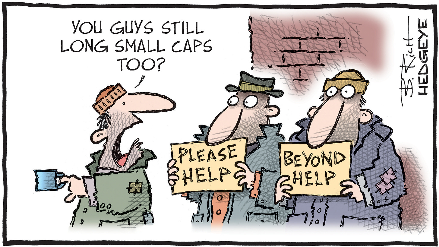
US small cap stocks (Russell 2000) closed lower on the month, but the recovery rally was important and felt satisfying:
Zooming into the daily timeframe on the same chart, we clearly see the acceleration post the Powell comments at Jackson Hole on Friday 23rd, where he hinted to the Fed interest rate policy having switched to easing:
Small cap stocks loved the prospect of lower interest rates ahead!
European stocks, as measured by the broad STOXX 600 Europe index (including Swedish, Swiss, UK stocks, etc) also managed to put in a new ATH:
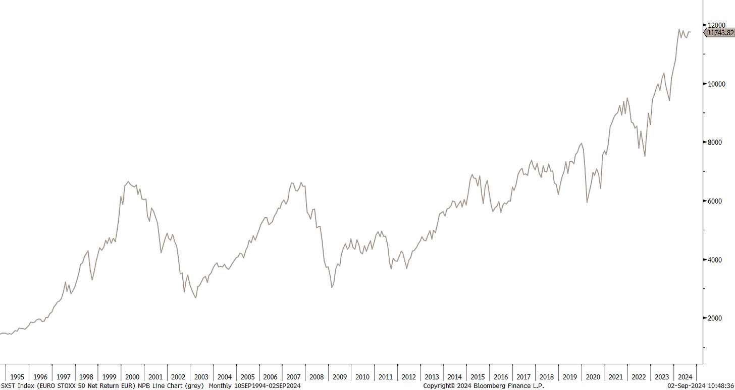
However, investors in the narrower (and financial stocks heavy) Euro Stoxx 50 Index are still waiting to see that April 2000 (not a typo!) ATH to be taken out:
This is excluding dividends though of course. In total return terms, that 2000 top is only a distant memory:
After having been stuck at 18,500 for five months, the DAX finally broke that resistance in August and closed at a new ATH:
French stocks, au contraire, continue to be a drag on the overall European market:
Swiss stocks recovered very nicely from early month weakness too and are closing in on the December 2021 ATH:
Now, check out that lower candle shadow on the Nikkei 225 monthly chart:
Recovery of the year, I would say!
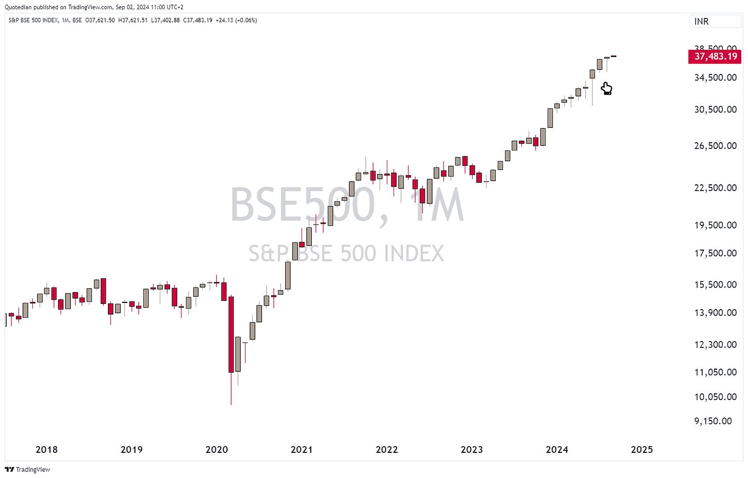
In the Indian stock market, it seems they do not do proper sell-offs …
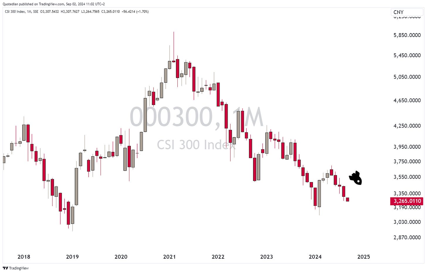
… whereas in China (CSI300) it seems that’s all the do!
Ok, time to look at some sector performances now:
Unless you are energy stocks only investor, your portfolio should have done well in August. The outperformance of health care, utilities and consumer staples is evidence of the sector rotation going on, which we had written about in our Q3 outlook (click here).
Bloomberg’s Relative Rotation Graph would suggest to continue to overweight those three sectors (plus Real Estate) and also continue to underweight technology stocks:
This possible technology stocks relative underperformance fits well with this “double top” chart we already showed a few months ago:
Are the real estate and utilities outperfomances just derived AI plays? Perhaps. But both have room to run from a chart perspective. Here are two charts on (US) real estate:
Rising price > rising 50d moving average > rising 200-day moving average and an inverted shoulder-head-shoulder formation with a price target at $50 … what’s not to like?!
And one on utilities:
Then, to finish the equity section, here are the best performing stocks on a year-to-date basis in the US and Europe and how they have fared in August.
Starting with the US:
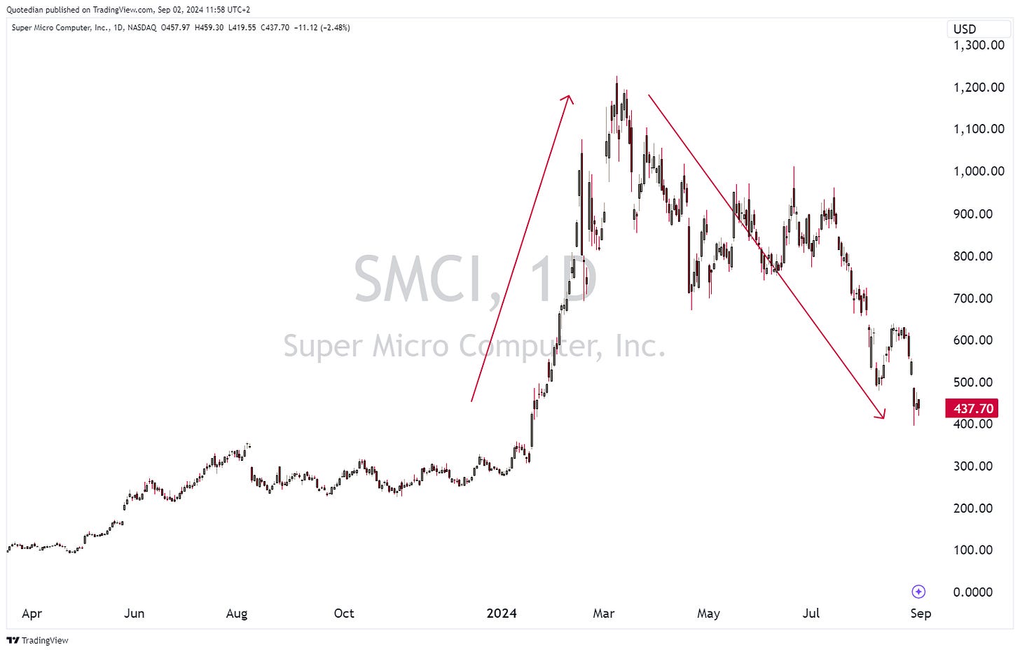
Only one stock (SMCI) really down and most of those losses came in the last week of August, as one short-seller called fowl on the company’s earnings and the company promptly had to delay the release of results:
This looks like the round trip well be completed soon …
Here’s the list of the European winners so far this year:
Still a frighteningly high number of defence companies on that list!
In the rates (fixed income) market, it was a good month for bonds, with all categories seeing further expanding their year-to-date returns:
Global treasury bonds saw the best performance in Augst, as the global yield complex continued to head lower. Here is the monthly chart of the US 10-year treasury yield for example:
At 3.85% the yield seems to be well-bid and could be the bottom of the range for the time being. Below that, the path to 3% would be open.
Rates at the shorter end of the curve (2-year) have dropped even faster,
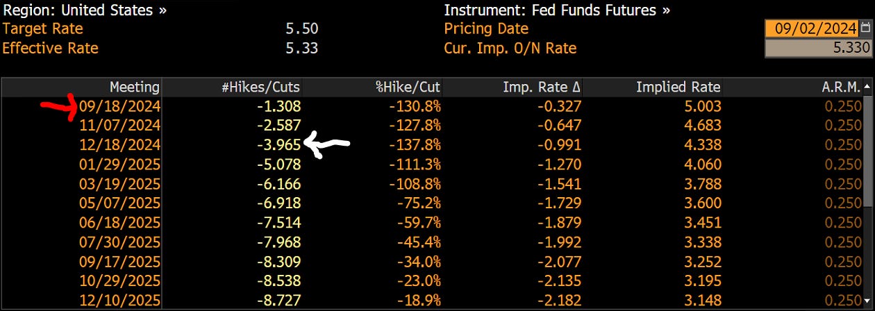
as the Fed prepares for a first rate cut later this month (red arrow):
These “odds” or “bets” on rate cuts (hikes) are derived via Futures markets. According to this, investors are positioned for four rate cuts (white arrow) in three remaining meetings until year end. That would mean the Fed needs to cut at least once by 50 basis points, which seems a bit unlikely to me right now.
We already established that rates are falling faster at the short-end of the curve, which of course makes fully sense, as shorter-term interest rates are more sensitive to the monetary policy rate. This has lead to the yield curve NEARLY “uninvert” from its record long inversion (click here):
The same is true in Europe (proxied via German Bund yields), with less than one basis point to go to end the inversion:
Credit spreads briefly blipped higher during the “end of carry trade” volatility moment of early August, but have tighten sharply again since then:
This is also reflected in high yield bond price, here proxied via the iShares iBOXX High Yield Corporate Bond ETF (HYG), which are trading sharply higher:
Of course it was in the currency complex where all the early August fun started, leading by flying Japanese Yen, as the Bank of Japan (BoJ) decided to hike rates AGAIN by a full 15 basis points to an astonishing 25 basis points (yes, I am being sarcastic):
But, as forementioned, it was enough to get the (yen)snowball rolling, pushing the USD/JPY cross quickly lower:
Though the rate is only back to about the level were rumours of an end to Yield Curve Control (YCC) started making the rounds last fall, it has been enough to unwind part of the carry trade. Here is total return index of the carry trade into the Mexican Peso for example:
Looking at the above and mentally overlaying it on top of the chart of the Nikkei, it indeed seems that someone(s) were overleveraged and forced into liquidation.
Here’s how major currencies have performed versus the US Dollar in August:
And here is the year-to-date context:
Clearly, the Greenback got bashed in August (first table above). Here’s what the monthly chart of the US Dollar Index looks like:
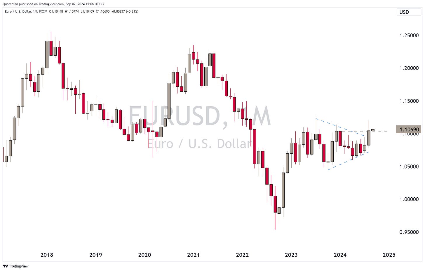
Key support above 101.00 is holding … for now. On the EUR/USD chart, the glittering wonder that is the Euro has broken out of its trading range (blue lines), but is currently retesting old resistance as new support (black line):
The USD/CHF should also get a special mention and chart here, with the strength of the Swissy for sure making some sweat break on our central bank colleagues across the Limmat river:
Despite, or amid, a weaker US Dollar, cryptocurrencies suffered too in Augst:
Bitcoin continues to “feel” like a consolidation period in a longer-tem uptrend, but a break below 45,000 would not be healthy for the (chart) outlook:
Unfortunately, Bitcoin has it weakest month in September from a seasonal point of view:
On Ethereum, that key support is much closer (approx. 10% from current) at 2,250ish:
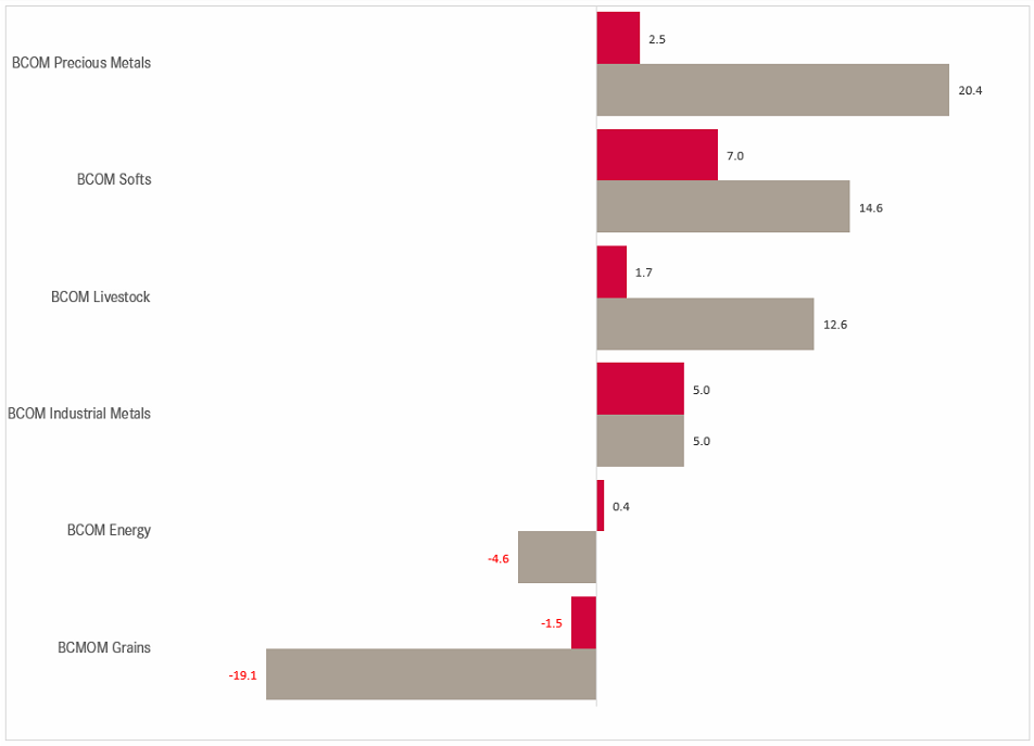
Finally, in the commodity space, precious metals continue to bring most joy to investors, though Softs had a good month too:
Let’s go one step more granular and have a look at performances of some popular commodity futures:
Soft commodities (corn, soybeans, wheat) continue to disappoint investors tremendously. Could it be tempting to catch such a “falling knife”?
Let’s check in on one individual (monthly chart). For example …. Soybeans:
Better let that knife continue to drop …
Ok, time for a gold chart now:
Gold just witnessed its highest monthly close (2,503) ever and hit an intraday all-time high at 2,532 in August. After nearly a year of unrelented upside, a pause may lay ahead.
Crude (Brent) has just ended its 10th month in a wide $75-$85 trading range, with only a few and very brief breakout attempts on either side:
As usual, there is much more to write about, but time has come to hit the send button. Make sure to look out for the QuiCQ (click here) for your daily dose of market information.
Take care,
André
Interesting chart from our friends at Research Affiliates. It shows the cumulative performance of stocks that were deleted out major market-cap weighted indices (read more here). Not only has that index beaten the s&P 500, but was actually to hold up with the performance of the Nasdaq 100. Stunning!
And in case you wondered, here are the top 30 companies in the index:
Everything in this document is for educational purposes only (FEPO)
Nothing in this document should be considered investment advice
Investing real money can be costly; don’t do stupid shit
The views expressed in this document may differ from the views published by Neue Private Bank AG
Past performance is hopefully no indication of future performance


