

Visiting Relatives
The Quotedian - Vol VII, Issue 12 | Powered by NPB Neue Privat Bank AG


“The person who turns over the most rocks wins the game.”
— Peter Lynch


There’s an old market saying that goes something like:
“You can't eat relative performance”
Perhaps.
But in my humble opinion, if you fail to observe cross-relative relationships between assets, be it asset classes themselves, or two stocks, two sectors, two interest rates, etc., you are prone to miss some important messages from Mr Market.

Feeling you miss some important market moves? We help you find them.

Contact us at ahuwiler@npb-bank.ch
Hence, as we go through our usual weekly deliberations about financial markets, let’s observe one or the other relative relationships along the way. Let’s dive right in!


First, let’s check how equities (SPY) are doing versus bonds (TLT) in the US as a global proxy:

The relative outperformance of stocks over bonds is not only persisting, it is accelerating!
Of course, we can also do that relative ratio globally. Vanguard World Stocks ETF (VT) versus Vanguard World Bond ETF (BNDW) here:
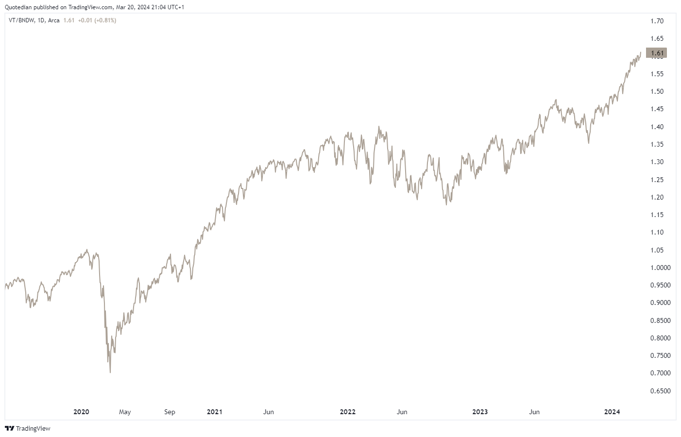
Very similar picture, though the US equity dominance in the prior chart becomes clear.
Ok, good idea! Let’s check US stocks versus Rest of the World stocks:

Except for one harsh but brief interruption in the second half of 2022, the trend has been … well … your friend!
And zooming out on this same chart right back to the end of the GFC in 2009, the idea of not overweighting US stocks versus the rest becomes even more painful:

But these kinds of ratios we look at a lot in this newsletter, let’s get a bit more sector-specific for a moment.
Here’s another way to look at relative performance comparison:

S&P 500 sector performance over the past three years, rebased to zero. And yes, the top-performing sector is Energy. Technology comes in ‘only’ second…
Now, let’s have a look at the US healthcare sector (XLV) on a stand-alone basis:

At first glance, that looks pretty ok, given that over the past few months two important resistance levels (dashed lines) have been exceeded.
Now we take a look at that same sector (XLV) relative to the broader market (SPY):

Uh, oh … that picture has changed substantially with healthcare stock breaking down to new relative lows. This is why it’s worth to look at things with different (relative) lenses …

Of course, it can also be useful to recognise new trends establishing and to see where most strength is to be found in a sector. Use case: Energy stocks. Here’s the chart of the SPDR Energy Select S&P 500 ETF (XLE):

Easy enough to see that the Energy sector is pushing against major multi-year resistance. But will it be able to succeed and push above that resistance? The following multi-chart shows Energy (XLE), Refiner (CRAK), Oil Service (OIH) and Explorer & Producer (XOP) stocks versus the S&P 500 (SPY):

The relative strength seen over the past two to three months is an encouraging sign that indeed the broader energy market (XLE) will break above that aforementioned resistance.

But let’s stay with those dirty, dirty fossil fuel stocks (XLE) for one more moment. Here is the relative chart of those non-ESG conform companies to the highly leveraged, greenwashed, beautiful clean energy-producing stocks (PBW - Invesco Wilderhill Clean Energy ETF):

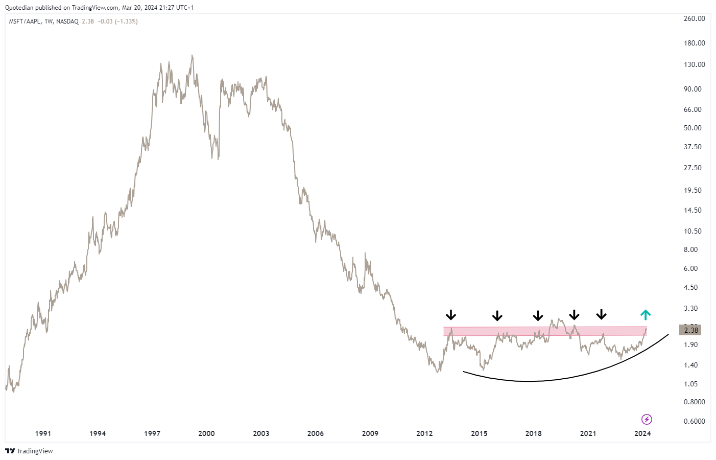
And now, we move on to the most granular (equity) level, here´s a long-term one; the chart of Microsoft (MSFT) on a stand-alone basis:

And here is the chart of the share price of Microsoft divided by the one of Apple (AAPL):

Impressive, no?
The next chart raises the question of whether a change of the guard is about to take place:

We already saw the depressing picture (for bonds) of stocks versus bond at the start of the equity section above.
But let’s see if we can find some pockets of relative joy amongst the fixed income asset class.

For example, we already know that energy stocks are pushing higher, which could be an early sign of re-acceleration of inflationary pressures. Let’s compare then Treasury Inflation Protected Securities (TIP) to ‘normal’ nominal bonds (IEF):

AHA! Maybe we are on to something.
Another thought … equities (risk-on) are doing well, hence, corporate credit (LQD) should be outperforming treasuries (TLT), right?

Following that logic, could High Yield bonds (HYG) be possibly outperforming Investment Grade bonds (LQD)?

Wohooo!


Currency markets are the relative markets par excellence, because it is never a currency you look at but always a currency in relation to another currency.
What are we seeing then?
Starting with the US Dollar (USD) relative to the Swiss Franc (CHF), and with the SNB to communicate their rate decision this morning, we see that the market may be expecting the Swiss National Bank to be a first mover in rate cuts:

Even if there is a disappointed short-term pullback if the SNB fails to deliver a cut, this currency pair seems poised to move to 0.90 over the coming days to weeks.
The US Dollar Index (DXY) which measure the performance of the Greenback relative to a bunch of other currencies, is moving deeper and deeper into the apex of its triangle:

Resolution out of this one will be fun to watch!
And then, then, there is the Yen …
Not even a dovish Fed last night was able to push the Yen meaningfully higher (the following chart is the USD/JPY chart inverted):
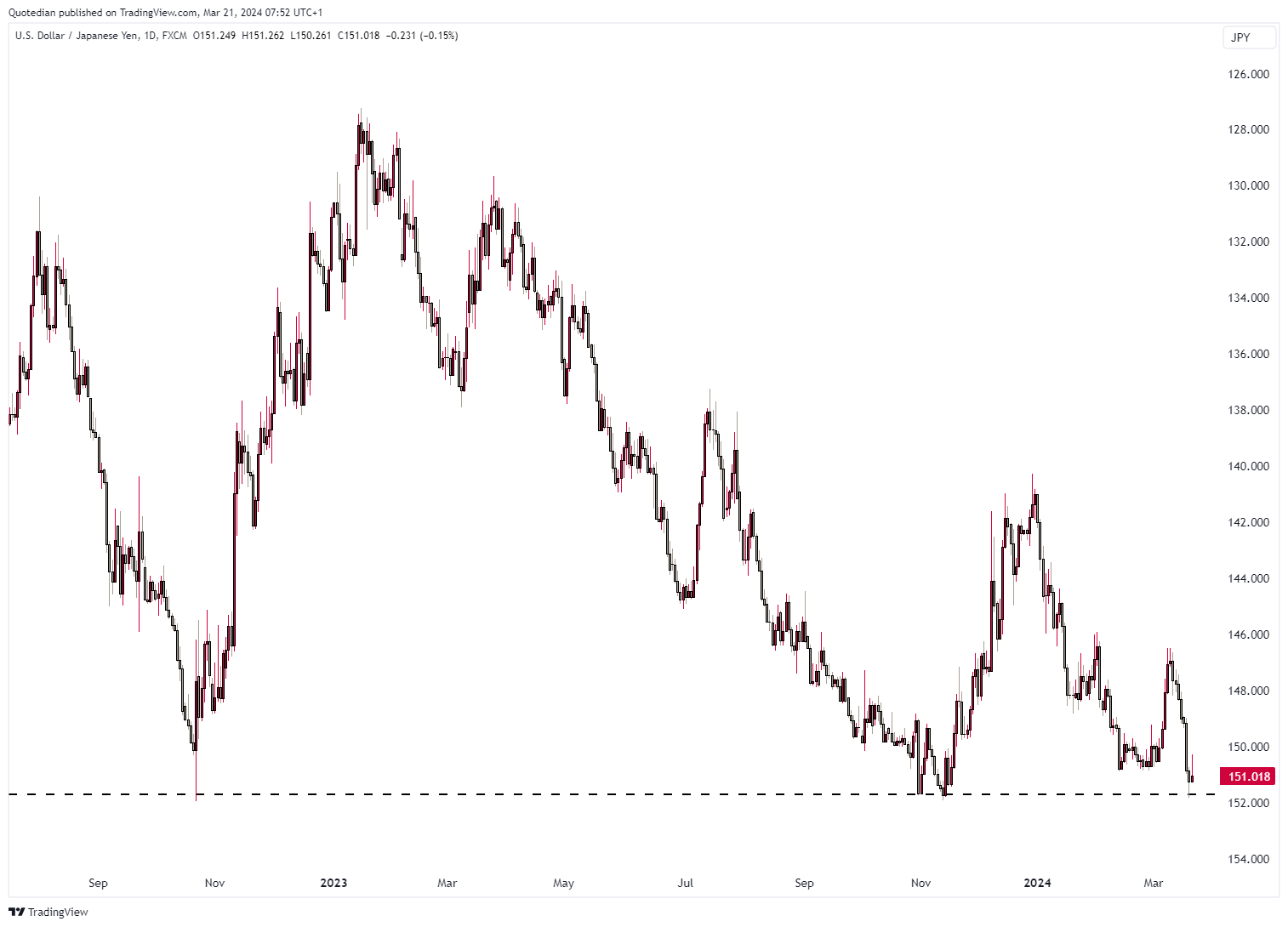
It seems the market is pushing to test the resolve of the Bank of Japan (BOJ) to intervene at the 152.00 level. A failure to do so and a push above that resistance would lead to an absolute minimum target of 160 (USD/JPY chart no inversion now):


Finally, some observations, relative or not, in the commodity space.
E.g., here’s a relative chart of THE crude oil ETF (USO) versus the S&P 500:

A failed break-down (at Ooops), combined with a rising momentum indicator (RSI - lower clip) is another arrow in the quiver of the oil bulls.
Here is a slightly longer view of crude oil (Brent), which to me looks like a bullish breakout after a multi-year consolidation:

The breakout of gold is now clear to everyone, yes?

Checking in on copper, we get a similar message regarding reacceleration of growth/inflation:

There’s much more, but we are running out of time (and GIFs). Let us finish with a look at the chart of Cocoa, which may suggest inflation or some new laws regarding harvesting going wrong - or both:

Have a great Thursday, Friday and Weekend and do not forget to hit that Like-Button (hint: it is heart shaped)!


Let’s finish off then with the chart of the day week month year decade century centuries.
Here is the S&P 500 divided by the price of Gold:


Everything in this document is for educational purposes only (FEPO)
Nothing in this document should be considered investment advice
The views expressed in this document may differ from the views published by Neue Private Bank AG
Past performance is hopefully no indication of future performance