Where has all the Volatility gone?
The Quotedian - Vol VII, Issue 10 | Powered by NPB Neue Privat Bank AG
“Be careful what you wish for, lest it come true!”
— Aesop’s Fables
Volatility in February:
Equity (VIX): -7%
EM Equity (VXEEM): -11%
Treasury Bonds (TYVIX): -5%
Corporate Bonds (VXHYG): -8%
Currency (JPMVXYGL): -14%
Gold (GVZ): -15%
Oil (OVX): -15%
You get the message … Volatility has been declining across all asset classes over the month just gone by.
This of course means that most risk asset classes must have traded higher. We’ll check on that in a moment in our usual monthly review.
But just before that, let’s ask the question what could derail this decline in volatility, i.e. rally in risky assets?
Next week’s non-farm payroll (NFP) number - unlikely
The US inflation reading (CPI) the week after - unlikely
The non-event FOMC meeting (20/3) the week after the CPI - unlikely
Investors’ overconfidence - somewhat likely
Standard & Poors’ decision to include SMCI in the S&P 500 - highly likely
An unknown unknown (aka curveball) - most likely
The other side of lower volatility is this:
S&P 500 at a record high
STOXX 600 at a record high
Nasdaq at arecord high
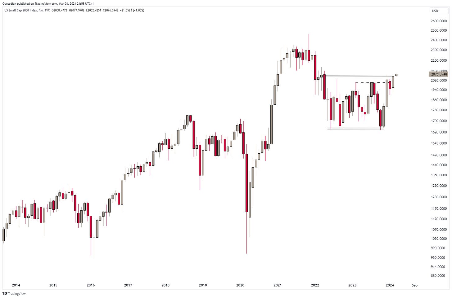
(US) Small caps at a record higher
Gold at recovery high
Bitcoin at recovery high
Hence, let’s enjoy the ongoing to the full (not forgetting our hedges/positioning), as it is also very expensive to miss the opportunities being offered to us right now.
After all, our seasonal indicator has completely failed us (so far) this year:
The next sell-off will come, as sure as day follows night, but given this stat, make sure to load up on equities as it happens:
We know. Financial markets are intimidating. But do not worry. we’re here to help and shed light.
Contact us at ahuwiler@npb-bank.ch
Hooray! February just ended, which means we get to update our statistical table and we just got in a new load of monthly candlestick charts. Let’s dive right in!
Let’s start the equity section by reviewing the performances of the most important benchmark indices around the globe. As usual, blue and light blue are month-to-date (February) performances, whilst grey and red demonstrate the year-to-date fortunes of those indices:
Checking on some monthly charts, there is a brutal bullish undertone to all of it. Let’s start with the S&P 500:
And here’s the Nasdaq:
Say what you will, but this is simply not bearish.
Now, let’s have a look at the laggards, i.e. small cap stocks:
This, clearly starts looking like a breakout lays ahead. Are you ready for it? Let’s stay with small caps, but hope over the pond to Europe. Proxying European small caps via the iShares STOXX Europe Small 200 ETF, we see a similar set-up as is the case for the Russell 2000:
European large cap (SXXP) already broke out to new all-time highs during February:
The financial stock h3eavy EURO STOXX 50 index is still about 10% away from reaching a new all-time high, but taking out the 2008 highs has been a major win:
Switzerland’s SMI continues to lag somewhat, or, put differently, has still more upside potential:
Turning to Asia now, let’s start East-most in Japan. The Nikkei just climbed above 40,000 for a first ever time this morning (4/3):
Though with the index above the upper end of its multi-year uptrend channel and the daily, weekly and monthly overbought/oversold indicator (RSI - not shown) all around 80, this feels a bit stretched now.
On the other hand, some of the strongest up moves happen with stocks being overbought and remaining overbought, as the chart on India’s Nifty index would prove:
Chinese stocks (CSI300) finally found a decent bounce (~10%) in February:
Ok, time now to turn our attention to equity sector performances. Here’s how sectors performed in February (blue and light blue) and what that means in a year-to-date context (grey and red):
Only utility stocks showed a negative performance in February, which may be a sneak peak preview to the bond market performance during the same month. Let’s check on that in a minute further down.
Consumer discretionary stocks had a stellar month, with a nearly 9% performance undoing the negative start to the year and then some. Here’s the iShares Global Consumer Discretionary ETF for reference:
Biotech stocks, which we started recommending in Q4 of last year, have taken out just about any important resistance line during February (SPDR S&P Biotech ETF):
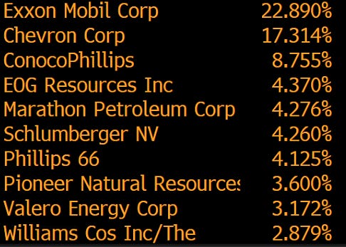
Another theme we continue to like are fossil fuel companies (yes, I really just wrote that!). Given the 40%-plus sell off in crude oil post the Russia/Ukraine-spike, oil stocks held up remarkably well. Here’s the SPDR Energy Select ETF (XLE) as proxy:
At a P/E of 11x and a dividend yield of still around 4%, this also looks attractive fundamentally. These are the top holdings in this ETF:
Or alternatively, consider the VanEck Oil Refinery ETF, with the fitting ticker CRAK:
Here’s that value versus growth proposition in one chart. Market-cap of NVDIA (red)versus the market-cap of all 72 companies in the S&P 1,500 Composite Energy index (grey):
On seconds thoughts, this has widow-maker potential:
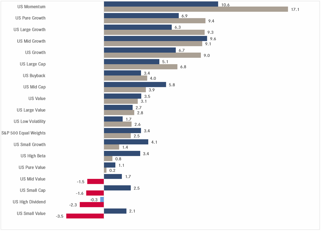
Checking in on factor performance, there is one factor to rule them all - MOMENTUM:
Which brings to our monthly performance tables of individual stocks in Europe and the US. In these tables we look at the 25 best-performing stocks in the S&P 500 and the STOXX Europe 600 index on a year-to-date basis and how they have fared over the month just gone by. Let’s see if you notice something:
Did you see it? Yes! Of the 50 stocks aobve, not one had neative performance in February!!
Strength begets strength
aka
MOMENTUM
Time to head over into the rates section…
Asian and high yield bondholders had a good month in February, everybody else suffered:
In case of the Asian bond rally, it sis probably safe to assume that this is on the back of bad news out of the Chinese real estate sector somewhat abating.
And the rally in high yield bonds (HYG - red) is clearly attributable to the stock market (SPY - grey)rally spilling over into lower-grade credit:
Interest rates in global developed markets increased during February as economic data came in firmer than expected, pressuring bond prices. Here’s the Citi Global Economic Surprise index:
And here is how the US 10-year treasury yield is reacting to this pick-up:
Its “European” equivalent (proxied via German Bund):
Swiss 10-year yields have been softer than their German counterparts, despite a surprise pick-up in inflation reported this morning (4/3):
One of the best performing bond markets continues to be Chinese government bond market, where yields just dropped to their lowest level (2.36%) I have in my data:
This constant drop in yield has then led to a substantial outperformance of Chinese government bonds (red) over those of its US (grey) and European (blue) peers over the past five years:
Let’s hop over to FX markets then now:
The currency performance table shows that after a strong start to the year for the mighty Greenback , the trend has partially reversed versus some currencies:
And talking of the mighty greenback, di you know that a comic existed where the Almighty Dollar was a superhero?
No? Me neither!
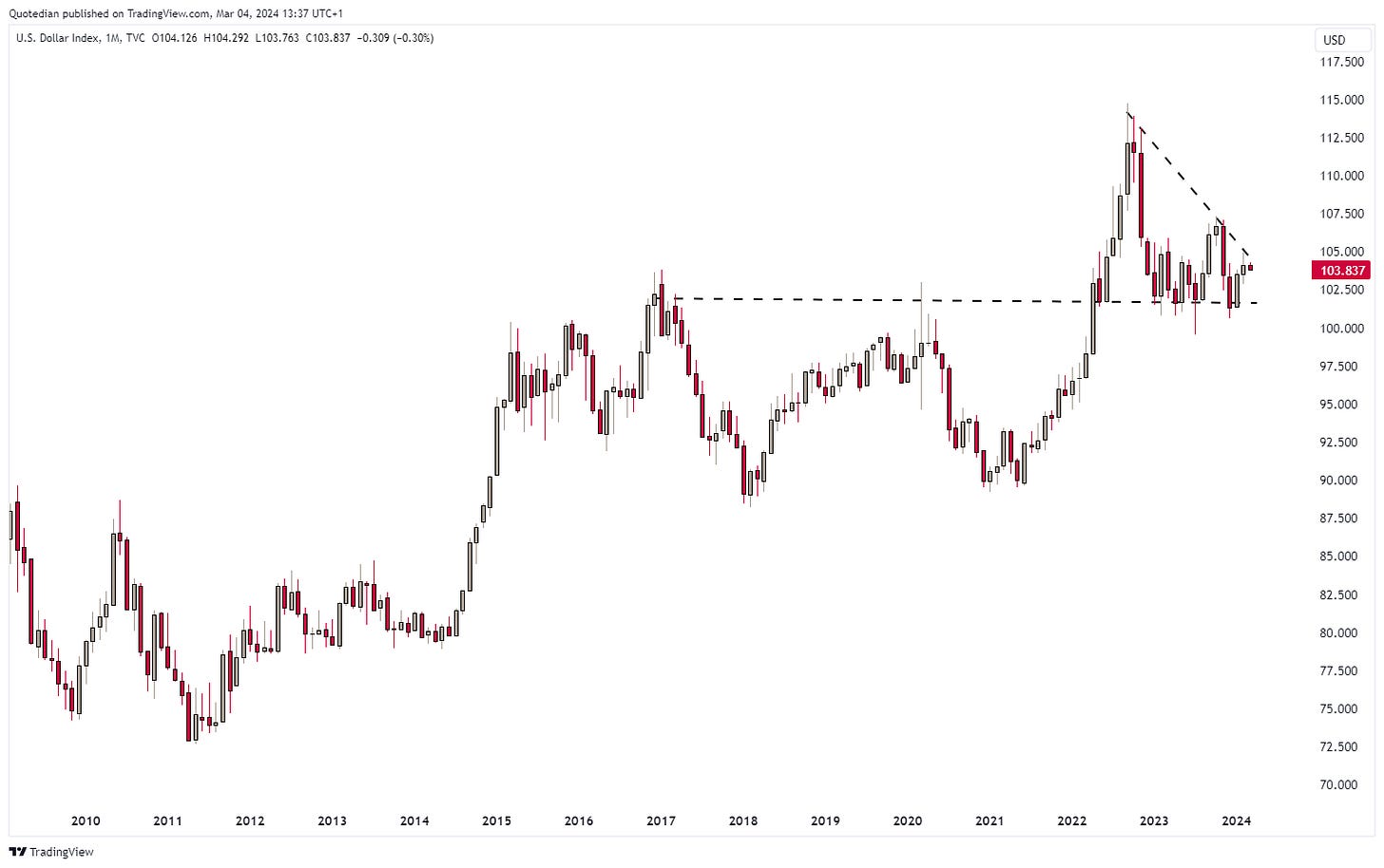
Here’s the chart of the USD Index (DXY) which seems to be coiling up for a major breakout, with the direction of such a breakout being anyone’s guess:
This move could indeed make (currency) volatility great again!
Could this move be triggered by the end (or not) of the Japanese Yen carry trade? We wrote about this in last Friday’s Quick, we you can read here:
And talking of QuiCQ - you can now sign up directly to receive your favourite daily quote and chart directly in your inbox:
Back to currencies, where the monthly EUR/USD chart reveals that this currency pair has been in a sideways consolidation for 14 months now:
And, then, of course, we have to speak cryptos …
Bitcoin it changing faster than I can copy & paste a chart …
Maybe better use a log-scale then for that chart:
Oh yes, much better!
But Bitcoin is not the only flying cryptocurrency - in fact, it is only the third best performer year-to-date at 53%:
Where will it end? Don’t know.
How will it end? In tears.
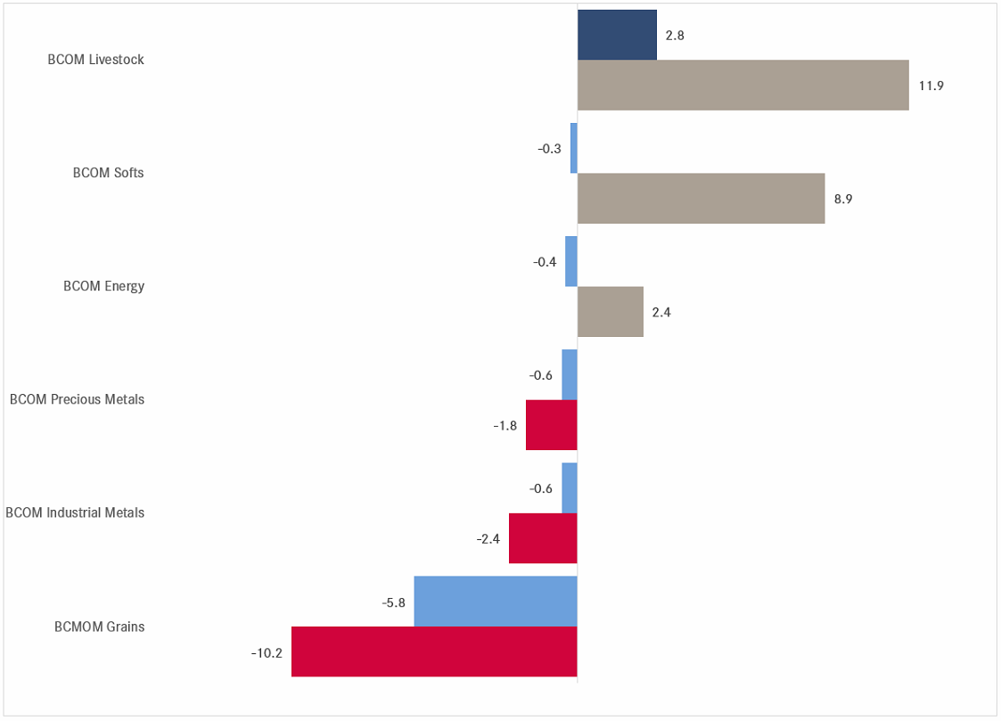
And finally, a quick glance at commodities, starting with a top-down ‘sector’ view:
Livestock is top, grains are flop. That may make up for an interseting spread chart:
Well, actually the spread (grey line) is just reverting to the mean (red dashed line).
Let’s have a look at the underlying commodities which are moving those subindices at the beginning of the section:
So, let’s check the positioning of speculators (lower clip, red) versus commercial hedgers (lower clip, grey) and see if the spread (lower clip, histogram) are at extremes. Starting with lean hogs:
Elevated, but it had been wider at other points in time (2021/2019).
Now let’s check a grain (Corn), which is at the other end of the performance table:
Here, speculators are in relation to commercial hedges at extreme short levels, which from a contrarian point of view would argue for higher corn prices.
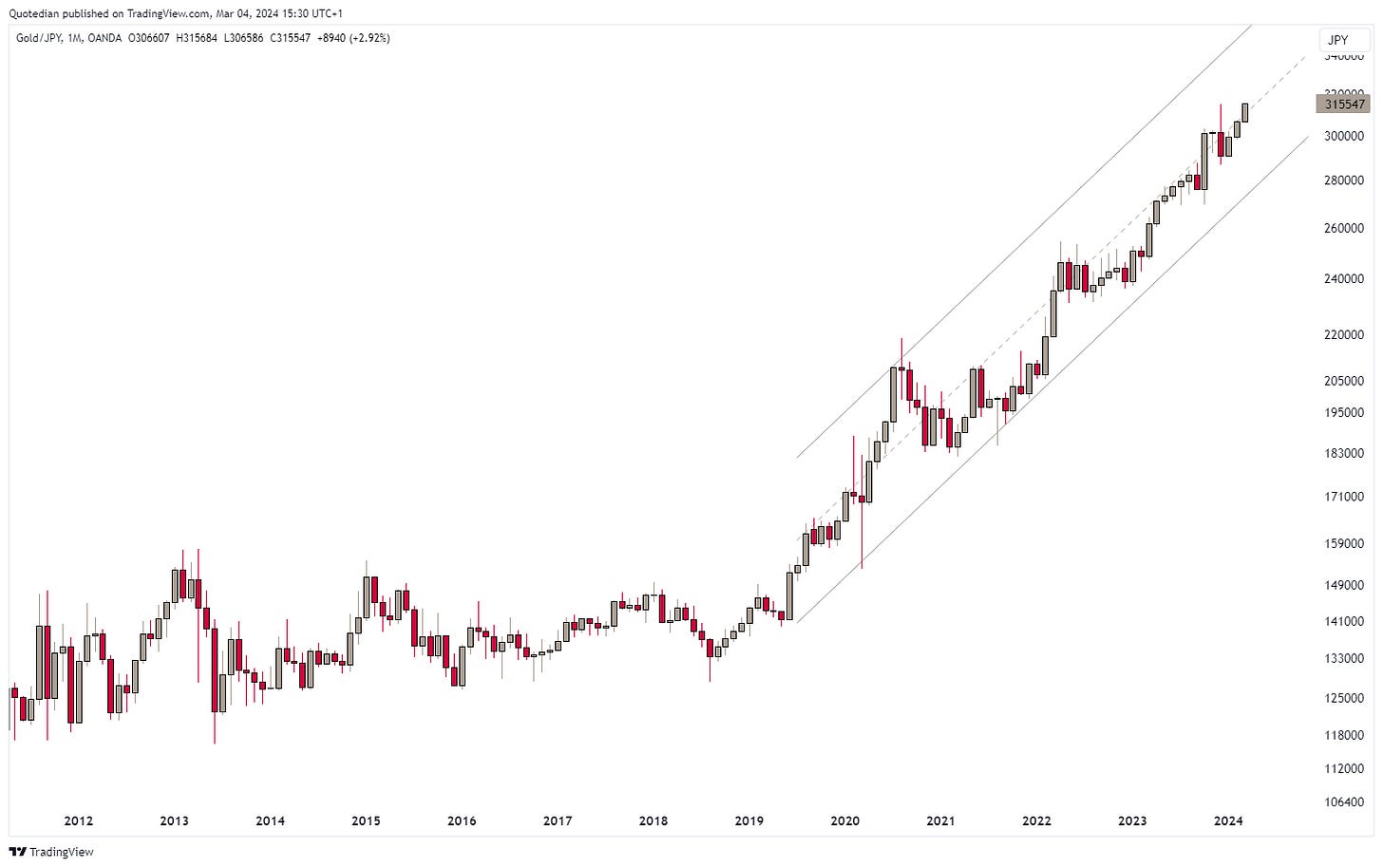
In other news, Gold (versus the USD) is attempting a new upside breakout. The monthly chart looks shiny:
If you’re Japanese (I know you’re not), Gold has bee n in a bull run for over five years already:
Oil (Brent)is trying to sneak higher again without anybody noticing:
The monthly Uranium chart shows a key reversal candle in the month of February, indicating a possible prolonged consolidation period before the next leg higher:
Ok, time to hit the send button. This is probably the most delayed Quotedian to ever to leave my inbox, having started working on it last Friday…
Hope it was worth the wait and if so, don’t forget to hit the like button at the very bottom of your screen.
Take care,
André
Last Friday the whole Fintwit community and their mothers got excited about the cover page of The Economist:
As armchair contrarians, the thought the magazine-coverpage-indicator just had given them a sell signal for the stock market.
My interpretation is this is NOT a contrarian signal and if you actually made the effort to read the article, already the introdcution gave away that this was not a bullish article:
We used magazine covers in the past to make contrarian calls too, but usually they do not come alone and are of much clearer nature:
Stay tuned!
Everything in this document is for educational purposes only (FEPO)
Nothing in this document should be considered investment advice
The views expressed in this document may differ from the views published by NPB Neue Private Bank AG
Past performance is hopefully no indication of future performance


