

Hodgepodge
Vol VIII, Issue 8 | Powered by NPB Neue Privat Bank AG
 - S16E17 Switch the Flip | Video gifs by quotes | ef69337f | 紗")
"Never invest in any idea you can’t illustrate with a crayon."
— Peter Lynch
Enjoying The Quotedian but not yet signed up for The QuiCQ? What are you waiting for?!!

Even though this week’s Quotedian will hit your inbox around 8 am on Monday morning, it had been completed on Sunday by 21:04.
Why?
For two main reasons:
A very busy Monday agenda will keep me from adding any more substance to this week’s letter
Recent past has shown that Friday’s/Monday’s see an unusual pick-up in volatility, making it difficult to make timely comments, which may be rendered useless five
minutesnanoseconds later.
Regarding the second point, German election results which are unknown to me at the time of writing but may have a major impact on markets by the time you read this, are a massive wildcard.
Plus, our go long volatility on Friday and sell it on Monday trade is very well alive, after just a brief pause for Valentine’s day …

With all this in mind, let’s take a look at this hodgepodge of financial market stuff …


Stocks have been softer over the past week, with some markets even seeing their short-term trend arrows turn downwards:

Taking it in pieces, we had discussed in Friday’s QuiCQ (click here) how the S&P 500 got rejected at key resistance after a fake breakout (aka bull trap). Here’s the updated hourly chart:

This is what it looks like then on the daily chart:

That’s a pretty ugly last candle (21/2) there! But we should have known! Here’s the seasonal pattern for February over the past thirty years:

The grey line is the 30-year average, showing that quite precisely mid-month weakness sets in. The red line is February 2025, evidencing that the weakness is coming a week too late, but is quickly catching up with the usual pattern.
One of the charts that worries me most at the moment is the following:

The upper clip shows the S&P 500 via the SPY ETF, whilst the lower clip shows the ratio of homebuilding (ITB) to real estate (IYR) stocks. For some reason, homebuilders start diverging/underperforming the overall real estate sector, giving an early warning sign to the overall market.
As usual, there is plenty to worry about, but there are also quite a few things which speak in favour of the uptrend to continue. For example, for a third consecutive week AAII (retail) bears are more plentiful then bulls:

Or, as Ryan Detrick (Carson) highlighted, the current cycle bull run is still pretty young in comparison:
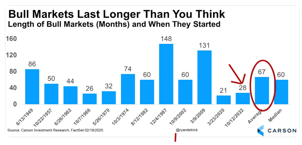
But of course, averages are just that. This is like the statistician who had his head in the oven and his feet in the freezer - on average, he was comfortable. Here’s another way to look at the cyclical bull:

Alright, time for some other markets. E.g., the Nasdaq, which got similarly rejected a resistance after a false break-out:

Taking Papa Dow into account, this increasingly starts looking like a double-top:

The key level here to watch is 41,725, which is likely to be visited. Holding there is the key to the continuation of this bull market. A break there would like induce a correction, as defined as a peak to through move of at least 10%. On the S&P 500 a possible target would be 5,500.
Let’s turn to Europe, where stocks not only continue their relative outperformance, but have actually accelerated it. Here’s the SXXP versus the SPX:

Trump’s re-election and relative aggressiveness towards Europe seems to have be kind of a wake-up call for our continent. Now, as Mario Draghi beautifully laid out in the European parliament last week, we actually need to wake up and do something:
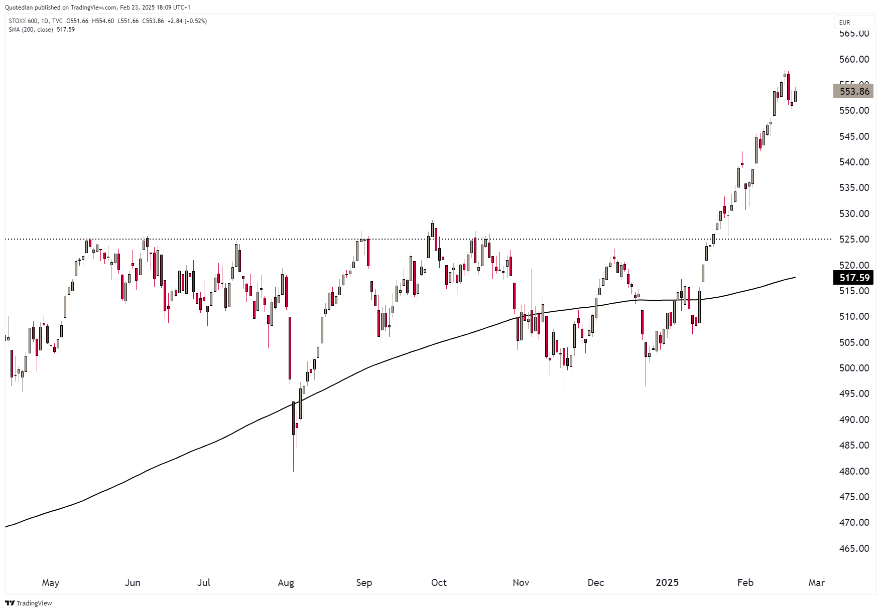
In the meantime, credit given from the stock market is high. Here’s the STOXX 600 Europe on a non-relative basis:
And here the narrower, Eurozone only focused EuroSTOXX 50:

Much more constructive than their US cousins, with the caveat that they missed most of the US downside “fun” on Friday. Let’s see today’s opening after German election results should be in…
Switzerland’s SMI had an excellent Friday, after Nestle (16% index weight) pushed more than 3% higher on the day:

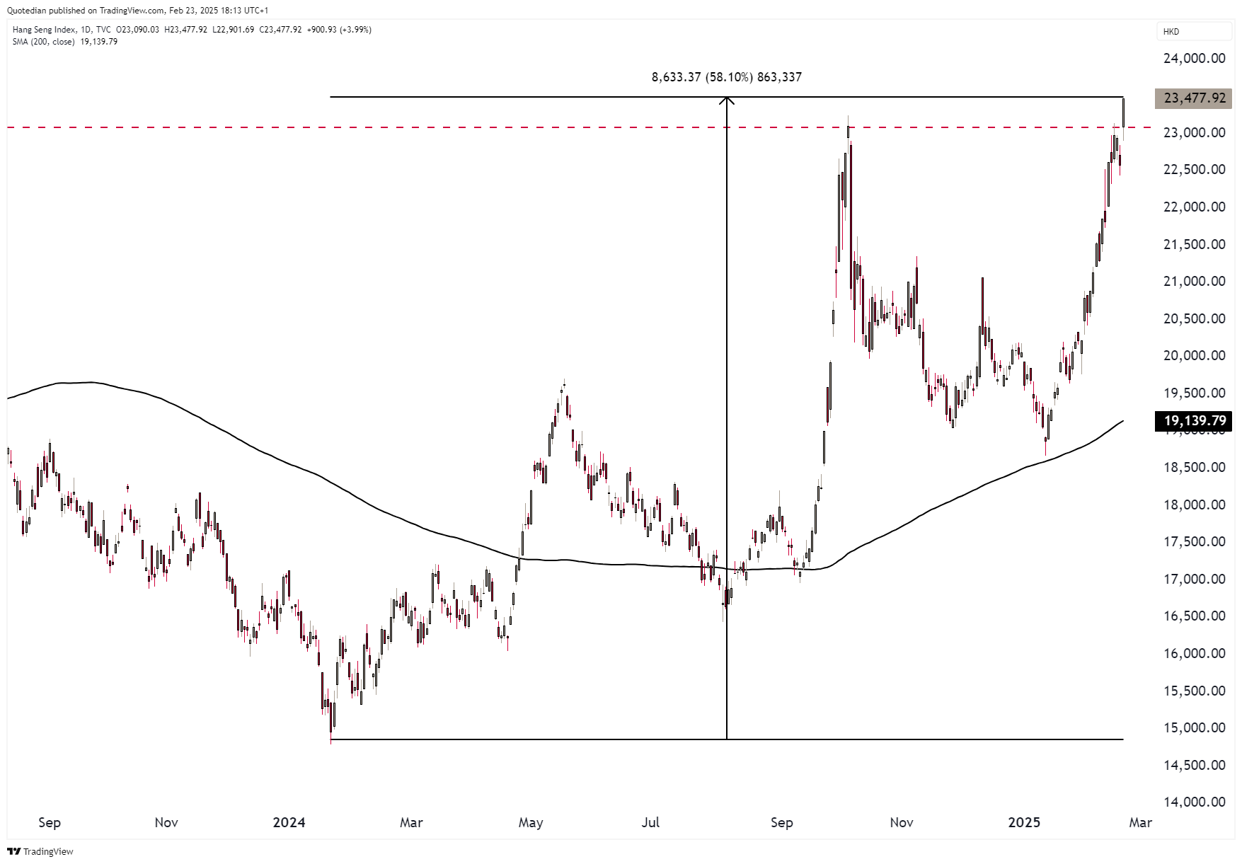
In Asia, hard to ignore, the Hang Seng Index is now up 60% from a year ago:
The rally for Chinese mainland stocks (CSI300) is a respectable 25%, but continue to be a far cry from their Hong Kong brothers:

The Indian stock market correction is starting to look to be maturing now, with a possible similar positive divergence set-up as seen in 2022 (arrows):

A quick look at sector performances over the past week now:

Mixed signals here, but the outperformance of defensive sectors such as consumer staples, health care and utilities should be observed carefully.
Here’s the chart of US consumer staples (XLP) versus the overall market (SPY):

Admittedly, the ratio is still hovering at 25-year lows, but the recent sharp upside acceleration should at a minimum be continued to be observed.
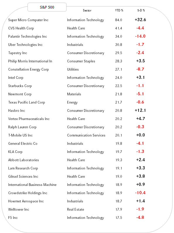
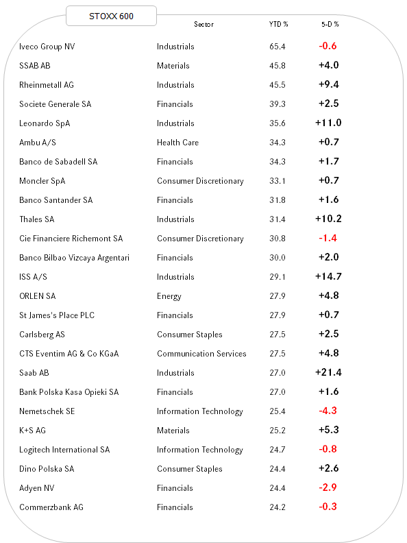
Time for an update on our best performing stocks year-to-date and how they have fared over the past week.
Starting with the US, we note a mix between trend continuation and some mean reversion:
Whilst in Europe, inline with a better index performance, it has been mostly about trend continuation:

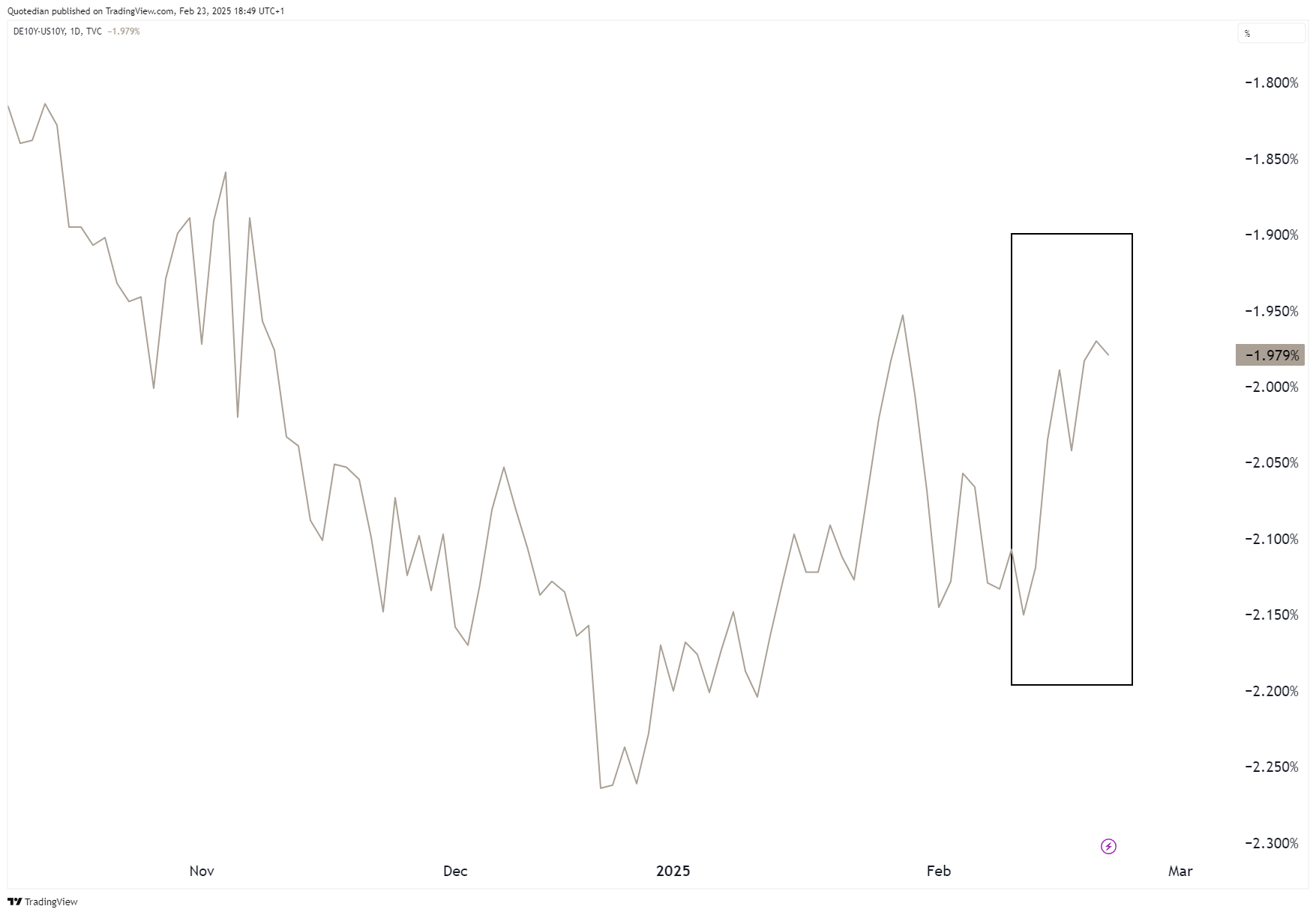
In the world of interest rates, it is fascinating to observe how expectations (higher growth for Europe versus US) have taken over from current reality (higher growth in the US than Europe), as expressed in a widening of the Bund-Treasury (10y) spread:
But let’s take it in turns. Here’s the US 10-year Treasury yield:
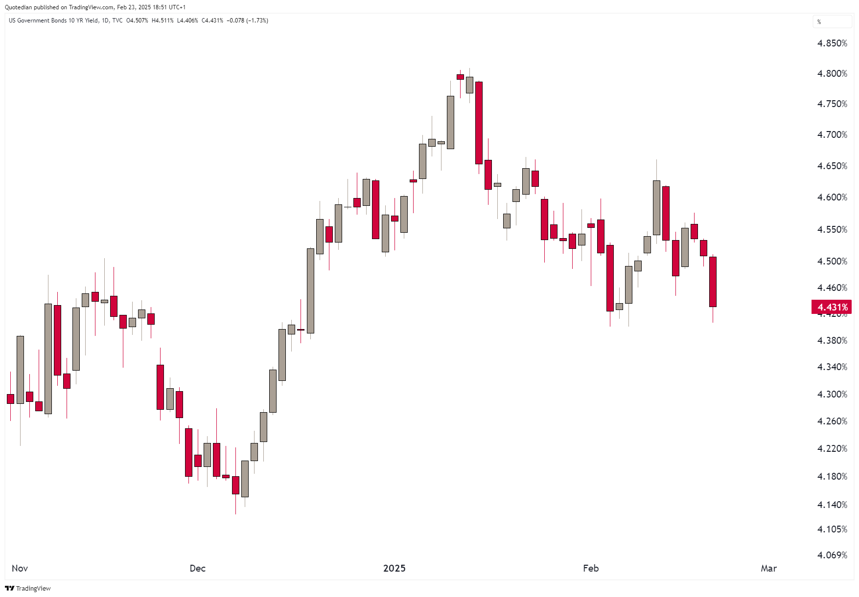
Yields dropped seven basis points on Friday, as Treasury bonds rallied on the back of falling stocks. Here’s the popular long-duration ETF play (TLT):

A possible break of the downtrend? Perhaps. But some more evidence is needed.
And now to the European aspect of yields (proxied via the German Bund):

A pretty different story, at least until that nasty eight basis points DOWN candle on Friday:

A (yield) market simply ignored too much by the international investor community is Japan’s JGB yields. The 10-year version of the JGBs hit a sixteen year high last week:

Let’s take the following chart as a segue into the FX realm. Considering the closing spread between US and Japanese bond yields (grey), USD/JPY (red) seems too high:


So, talking currencies, the US Dollar overall had a mixed week versus other major currencies:

However, looking at the US Dollar Index (DXY) chart, it is becoming increasingly evident (ah, hindsight, ain’t you beautiful) that Trump’s inauguration marked the top for the Greenback:

The point of support to observe here is 105.75 - below, all Dollar longs should be abandoned.
The EUR/USD cross saw a bit of a reversal candle on Friday, but a move above 1.05 should lead to an upside acceleration of the trend:

As already mentiond, the USD/JPY rate should face downside acceleration from here on:

Bitcoin is trapped in a range, but it increasingly feels like the last chance to buy it above 90k is approaching:


Commodities are currently pretty much smashing it, despite a small correction last Friday. Consider the Bloomberg Commodity Index (BCOM) which, despite a 30% energy weight has been breaking about any thinkable resistance:

And, as insinuated, oil is not helping the lift higher. Here’s the chart of crude (Brent):

In all fairness, another segment of energy, namely Natural Gas, has been helping the lift a fair amount:

That down 30% up 50% sequence since the beginning of the year gives the term “volatility” a whole new significance …
Gold is continuing to stampede higher and we are expecting a “blow-off” top over the coming weeks and hence have increased our exposure from neutral (5%) to a tactical overweight (7.5%):

And that’s all for this week folks, but just before we go, I would appreciate you being appreciative of all those charts I just painted, by a) hitting the like button (hint: it looks like a heart) and b) voting for my new title:

Everything in this document is for educational purposes only (FEPO)
Nothing in this document should be considered investment advice
Investing real money can be costly; don’t do stupid shit
The views expressed in this document may differ from the views published by Neue Private Bank AG
Past performance is hopefully no indication of future performance