Awkward
The Quotedian - Vol VII, Issue 16 | Powered by NPB Neue Privat Bank AG
"Erstens kommt es anders, und zweitens als man denkt"*
— Wilhelm Busch
* Freely translated - “Firstly, things turn out differently, and secondly, than you think”
*NPB focus list stocks reporting earnings are in bold
Well, now that’s awkward … (equity) markets aren’t really doing what they are supposed to do. After all, was the saying not to “Sell in May and go Away”??
Here’s are the first eight trading sessions of the month for the Dow Jones Industrial index as a representative example:
Stunned by the bullishness of the market? We were/are not. Contact us for some guidance.
Contact us at ahuwiler@npb-bank.ch
Hence, it seems we need to adapt that old seasonal adage this year to:
“Sell in May and Go Away ... isn't supposed to work this Way!”
Let’s take a speed-round through the different asset classes.
So, we have already established that equity markets have been far way more buoyant than their typical seasonality would suggest. Here is how some of the most popular equity benchmarks have fared in May (through 10/5):
Not too shabby at all, but hey, wait a moment, what’s that 6.8% performance for the Hang Seng index (HSI) at the top?!
Let’s have a look at the daily chart of the HSI:
WOW! That is even a nearly 30% rally since the bottom on January 22nd!
Let’s zoom out on the same chart for better understanding of longer-term dynamics:
That looks like a massively bullish breakout and it seems not a lot of people have been speaking about this. Couple that with the “uninvestability” of anything Chinese and we have a pretty decent case for a strong contrarian play.
Which brings me to an idea. Let’s proxy the HSI (grey) for a moment via the iShares China Large Cap ETF - FXI (red), as the correlation between the two is very high:
We do this, as for FXI we have short interest data, i.e. we can divide total short interest by shares outstanding for example to see how bearish investors are on this market:
Very bearish! As bearish as at the beginning of previous massive rallies … Or, as Sir John Templeton liked to say:
Bull-markets are born on pessimism, grow on skepticism, mature on optimism and die on euphoria.
Ok, now let’s have a look at the almighty S&P 500 index:
As we had written in our penultimate letter (Size Doesn't Matter) on April 26th:
Hence, 4,966 held and the upper resistance subsequently taken out, quickly reaccelerating the uptrend with new all-time highs (ATH) within spitting distance.
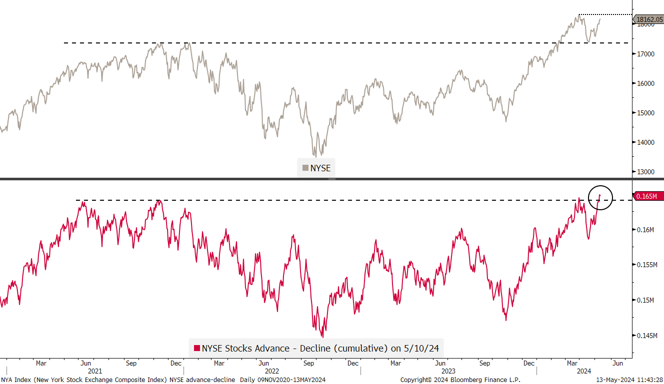
Will the S&P and other indices reach those new all-time highs? The recent breakout of breadth (advancing minus declining stocks) as seen in the lower clip on the broader NYSE would strongly suggest that the answer to that question is yes:
What’s the situation on our side of the pond then? Here’s the chart of the STOXX 600 Europe index:
WOW again! New all-time highs over the past three consecutive session already.
Are European equity markets really trying to close the valuation gap to its US peers?
Time to check on some sector performances. Let’s start with the MTD performance of global equity sectors:
All eleven sectors are up on the month, with utilities a surprising leader. Well, surprising only if you do not read our QuiCQ publication, where we have been pointing out this sector as a possible AI winner, as energy-intense data centres are popping up everywhere as the roll-out of this ‘new’ technology accelerates. Here’s the SPDR S&P 500 Utility sector ETF (XLU) a proxy:
Nice!
On the other side of the performance gamma, energy has been the weakest, albeit still positive, performer over the past few days on the back of falling crude oil prices. The SPDR Energy Select ETF (XLE) seems to be testing previous resistance as now new support:
We will discuss commodities further down, but most of us play commodities via equities anyway, so let’s look at a couple of charts in that realm.
Dr Copper for example, is ripping higher, suggesting strong economic growth and pulling copper stocks along with it. Here is the Global X Copper Miner ETF chart (indicating the largest positions), which has reached levels not seen since 2012:
Gold stocks via the VanEck Gold Miner ETF (GDX) are not back at levels from over a decade ago, but the recent break out of the triangle looks promising:
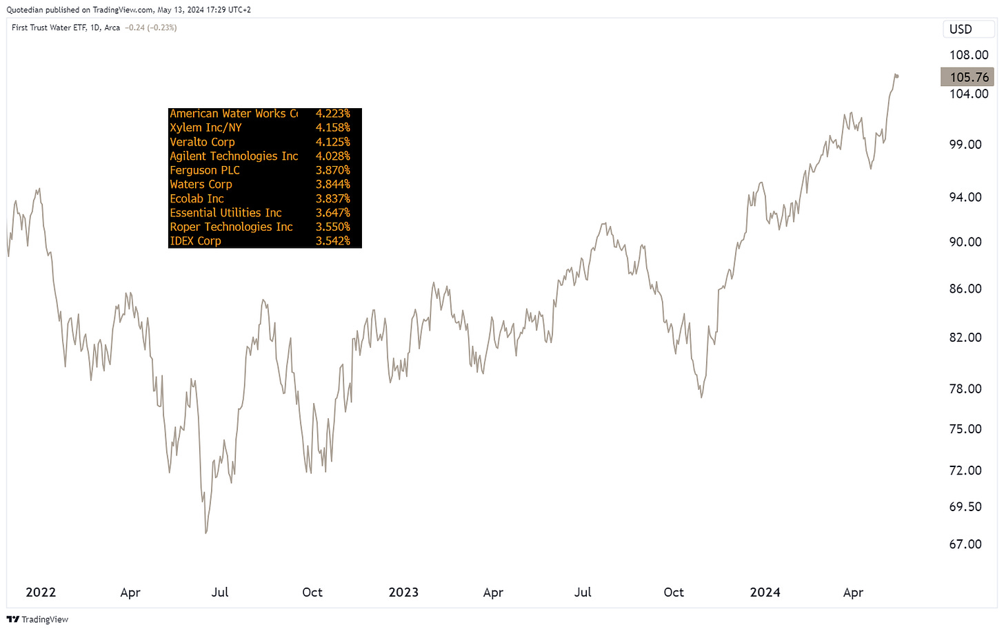
Finally, here’s another commodity-related ETF, the First Trust Water Index ETF (FIW), which is part of our high conviction positions in managed portfolios, that is steaming higher too (what a sh.tty pun!):
Finally, here the performance tables for the best performing stocks in the US and Europe on a year-to-date basis and how the have done last week.
Starting with the US list:
We note once again that leaders remain leaders or strength begets strength.
Over the European list:
The high number of Industrials is probably most attention catching here.
To finish off the equity section, it has been widely commented how volatility (VIX) has dropped back to its lower levels:
But, what is even more stunning is the the volatility of volatility (VVIX) has dropped to its lowest level since … drumroll … wait for it … drumroll … 2015!!
Using volatility as a segue into the rate section, we note on this chart from the fine folks at Goldman Sachs that Fixed Income vol is the only remaining elevated:
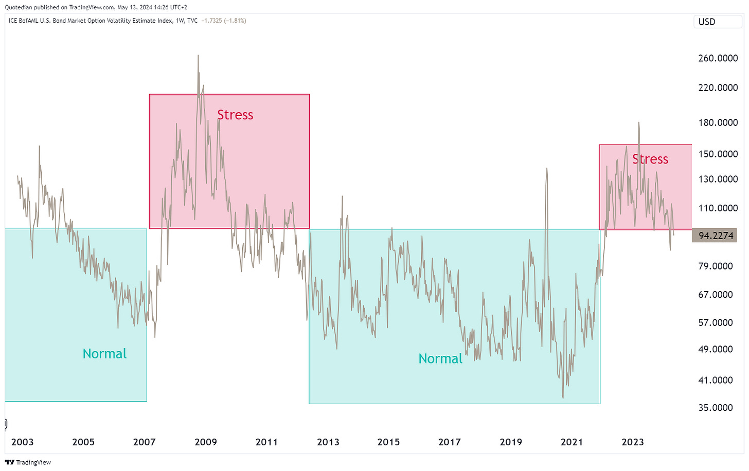
Whilst the above graph uses 3-month implied volatility to compare amongst asset classes, the more classical way to look at bond vola is the MOVE, kind of the VIX-equivalent for treasury bond markets:
Though still elevated, it is kind of slipping back into the “normal” range. TBC …
(US) Ten year yields have stalled at the 4.70% level and have dropped back below 4.50% - though are still (just about) within their defined uptrend channel:
So, what is the reason for the pullback in yields (grey)? One possible explanation is the simultaneous, respectively slightly leading retreat in oil prices (red):
It will now be interesting to see Wednesday’s US inflation number (CPI). Not because it matters, as this highly artificial and super-lagging number is nearly meaningless, but the market reaction to it for some matter does count:
Especially, as the “last mile” to normalization back to below 2% has turned out to be “sticky”. As inflation has not receded and the economy has remained resilient, despite all kind of efforts to spin the most recent employment data in a negative way, the completely, utterly and totally non-political Fed
has lost many arguments to cut rates ahead of the elections. Accordingly, the number of expected rate cuts till the end of the year has dropped from close to 7 to about 1 1/2 …
In Europe, the number of cuts by the ECB has also dropped from close to 7 but remains at 3 expected cuts, with a 95% possibility for a first cut in June:
Moving into (fiat) currency markets, I will focus only on one cross-currency pair today, namely the USD-JPY cross.
Here’s the daily chart of the Greenback versus the Yen:
Shortly after hitting the 160-level intraday (circle), the Ministry of Finance (MoF) in Japan intervened in FX markets buy buying Yen to support the currency (rectangle). Naysayers will argue that most of the terrain gained during the intervention has been given back again.
I say, be careful when betting against one of the world’s greatest currency trader ever - the MoF. The last time the BoJ/MoF intervened in currency markets was to sell JPY in the Fall of 2011. Here’s a chart of the USD/JPY again, this time inverted:
Here’s some more history of currency intervention by the BoJ/MoF:
Meanwhile cryptocurrencies continue to be in some very volatile (after all, we are talking crypto here) consolidation period. Taking Bitcoin as a proxy, the technical analysis textbook would suggest a price target of anywhere between $90,000 and $100,000 on a break above 66,000, depending on how aggressive you want to be:
Moving into the commodity section, a couple of highlights as a lot of action has taken place here lately.
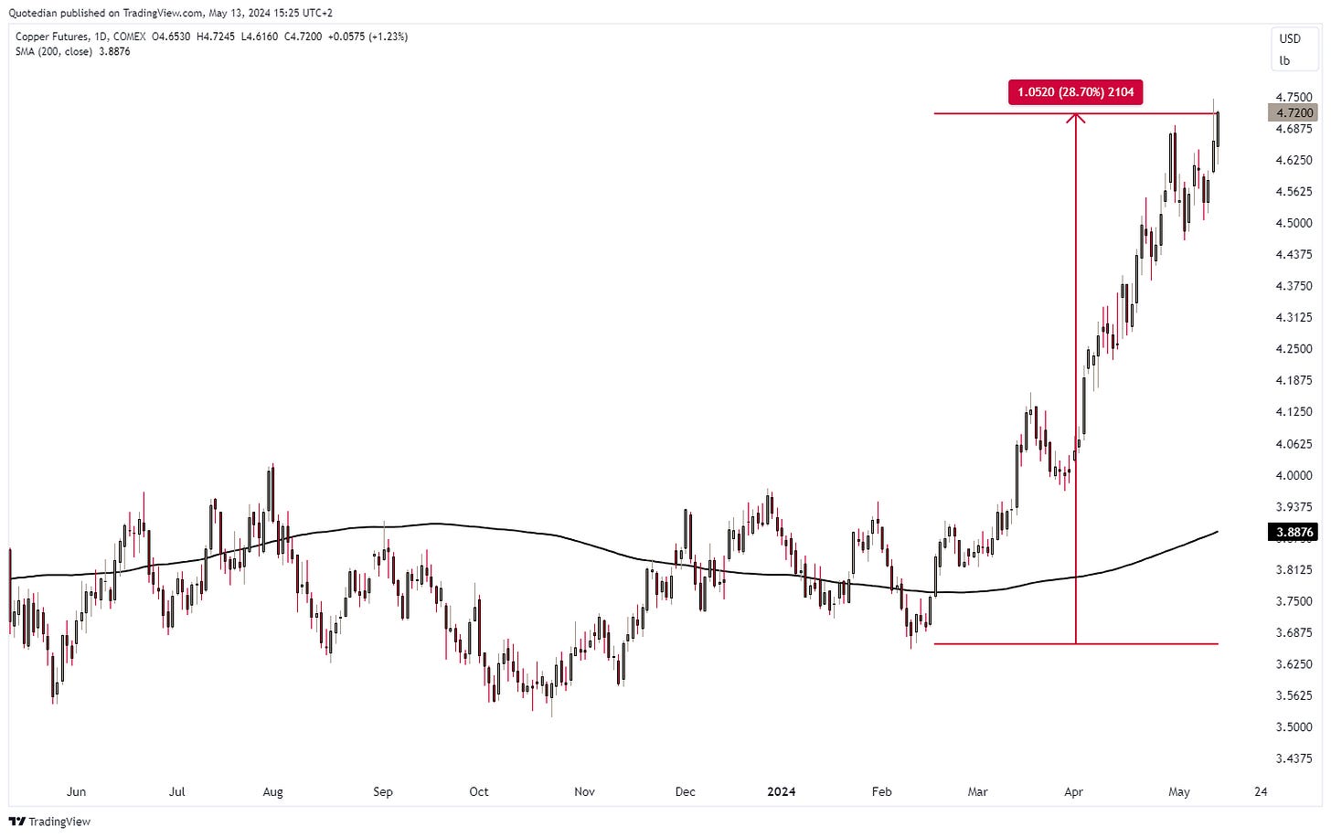
We already allured to the copper strength in the equity section, this is what it looks like on a chart:
Thirty percent in three months is a move not to be neglected. What does this look like in the longer-term perspective?
Uh-oh …despite closing in on the all-time highs of February 2022, this chart looks pretty bullish to me.
Another metal, trapped between precious and industrial, also looks ready to break substantially higher. Yes, Silver:
Gold is taking a breather, but it also feels more of a pause before a new push higher:
Here’s what else has been moving in commodity markets in May so far:
Gasoline futures had an (election) convenient drop of 8%, but are still up nearly 20% year-to-date. The top is probably in, at least until November 5th.
And finely, a lesser widely followed commodity, namely Uranium, is also creeping back into vicinity of the previous all-time highs:
Time to hit the send button. This Quotedian is leaving my outbox a couple of hours later than intended - but should still be very timely, despite all of this fast moving stuff.
André
Talking of fast-moving stuff …. are all this wildly up and down moving lines (i.e. prices) seem sometime too much to handle?
Why not take a step back and look at your favourite asset class through the lense of a 200-day moving average?
The example below on the S&P 500, showing nothing else than the 200-day MA, could have prevented a lot of hair loss:
Everything in this document is for educational purposes only (FEPO)
Nothing in this document should be considered investment advice
The views expressed in this document may differ from the views published by Neue Private Bank AG
Past performance is hopefully no indication of future performance


