Bouncy Castle
The Quotedian - Vol VI, Issue 80 | Powered by NPB Neue Privat Bank AG
“I would never die for my beliefs because I might be wrong.”
— Bertrand Russell
What a difference a week (and a bit) makes! It was only two weeks ago when we wrote in “C’est Chaud!” the following:
And a swift recovery we got! We will look at a bunch of charts in a moment, but as a little spoiler, the only remaining question is whether this is the Halloween-Indicator buy signal we have been waiting for or is it just a dead cat bounce.
Join or sell the rally? Let us help you make that decision.
Contact us at ahuwiler@npb-bank.ch
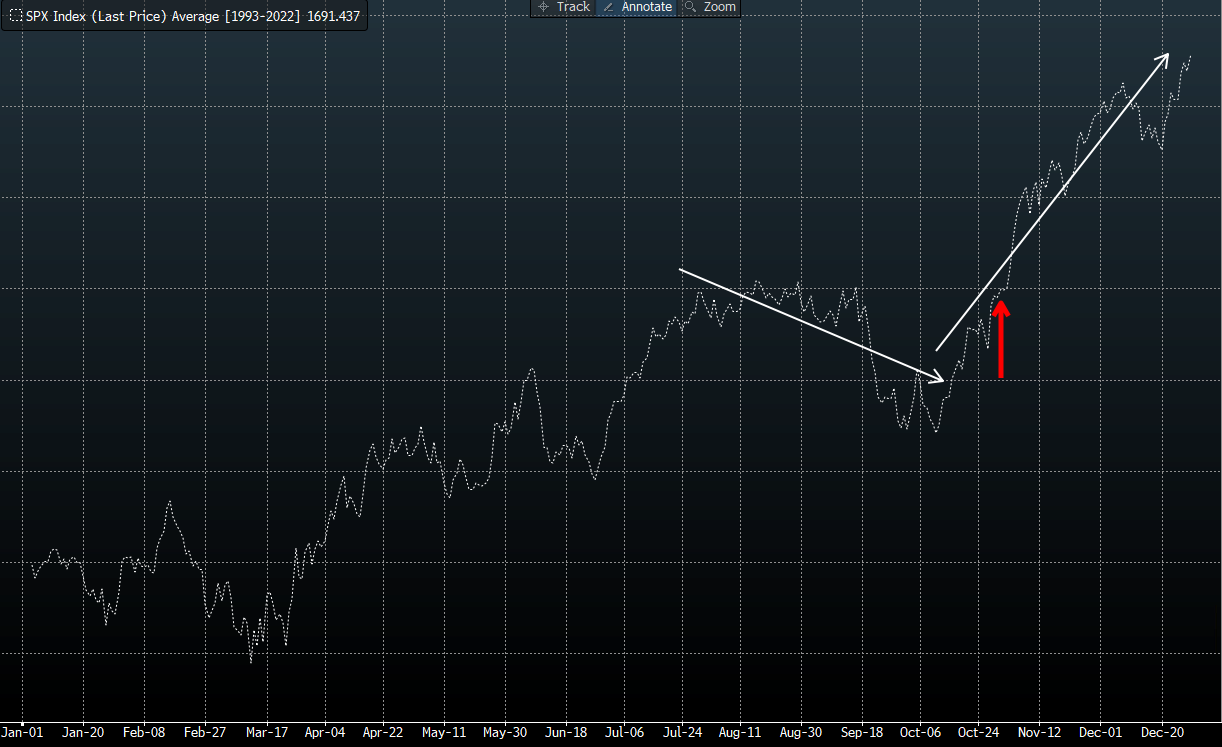
As mentioned, we have been discussing for weeks now how the seasonal headwind during the late summer/early autumn months tends to convert into a tailwind at the beginning of November, holding up into early January. The chart below depicts those head- and tailwinds (white arrows) and the Halloween inflexion point (red arrow) on the S&P 500 for the past 30 years:
And this is how this bounce looks like on the daily chart of the S&P 500:
Impressive, absolutely impressive. And also impressive how our shoulder-head-shoulder pattern worked to near perfection, including the price target which was “missed” by less than 0.75%. I will take that one off the chart now to get a clearer picture again:
Whilst we have reached a zone for a possible pause (dotted line), the really important achievement of this bounce has been the fast rebound above the 200-day moving average.
Here is what the market carpet of the same index over the past five days looks like:
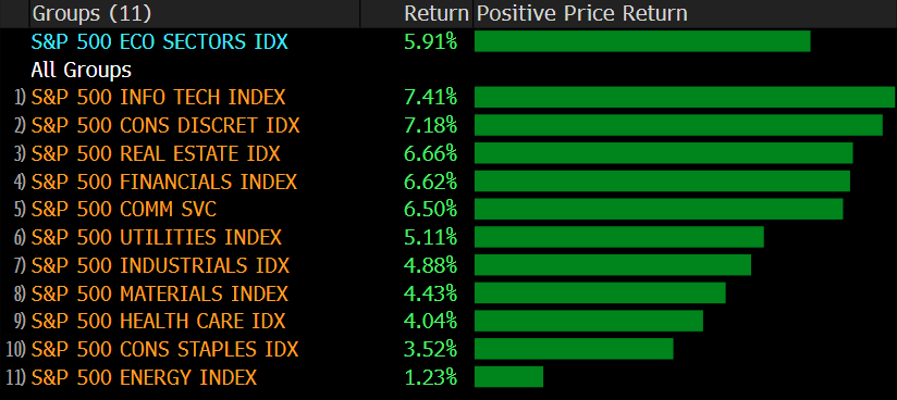
And this is what the sector performance looks like over the same period:
The chart of the Nasdaq 100 would agree with the one of the S&P 500 that a pause may lie ahead:
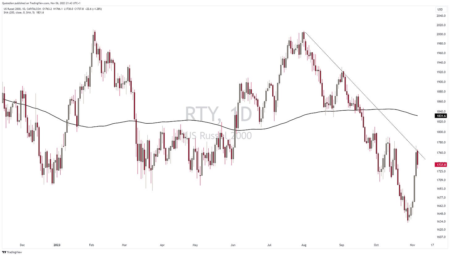
Small-cap stocks, as measured by the Russell 2000 index, had one of the most impressive rebounds, but stalled at a similar trendline as its two bigger siblings as described above:
Please note that I drew the dotted downtrend line a few weeks ago and the index adhered beautifully to it for now. Not to boast my charting capabilities, but I will soon have earned me the title “Master of Crayons”:
European stocks, as measured by the STOXX 600 Europe index, have witnessed a bouncy bounce too, though to a much lesser (weaker) extent then their US cousins:
The chart above is substantially less constructive than the one of the S&P 500 for example, especially because the shorter-term downtrend line (dotted) AND the 200-day moving average have not been exceeded yet.
Japanese stocks however show a pattern of gaping higher over the past few sessions, similar to US stocks. Here’s the Topix:
And then there’s the KOSPI!
Korean stocks are up 10% since the cycle low on October 31st, gaining five percent alone in yesterday’s session, after a short-selling ban was announced.
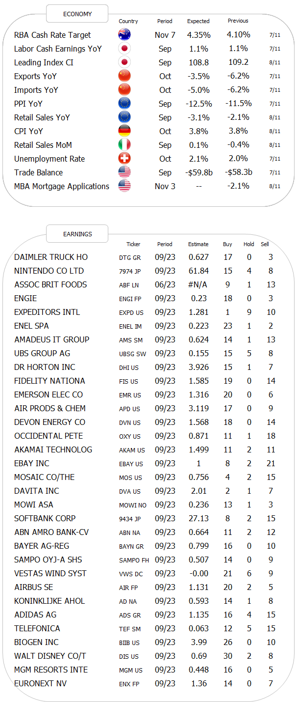
Quick Tuesday morning update - Asian markets are trading softer because _______________________ (fill in your favourite excuse here). China imports surprised to the upside, exports to the downside. The worst FOMC member ever, Neel Kashkari, told the WSJ that he would support overtightening in order to bring inflation down to 2% and UBS reported a slightly wider-than-expected loss on back of the ongoing Credit Suisse integration.
Bonds are jumping around in the bouncy castle too, and the reversal in yields to the downside (prices higher) must not envy the jump in stocks.
Point in case US yields … at one stage during Friday’s bond rally, the US 10-year yield touched 4.50% - a full fifty basis points lower than the cycle high registered on October 23rd!
All this of course on the back of a weaker-than-expected US nonfarm payroll number and a “finally” increasing unemployment rate:
The drop in yield over the past days translates into a 6% rally in our favourite US Bond proxy, the iShares US Treasury 20+ years ETF:
Though zooming out on this same chart we quickly realize there is still some work to do …
The downturn in European yields, using the German Bund as proxy for our economic area, has been a bit less dramatic, albeit as highlighted a few Quotedians ago, it started earlier:
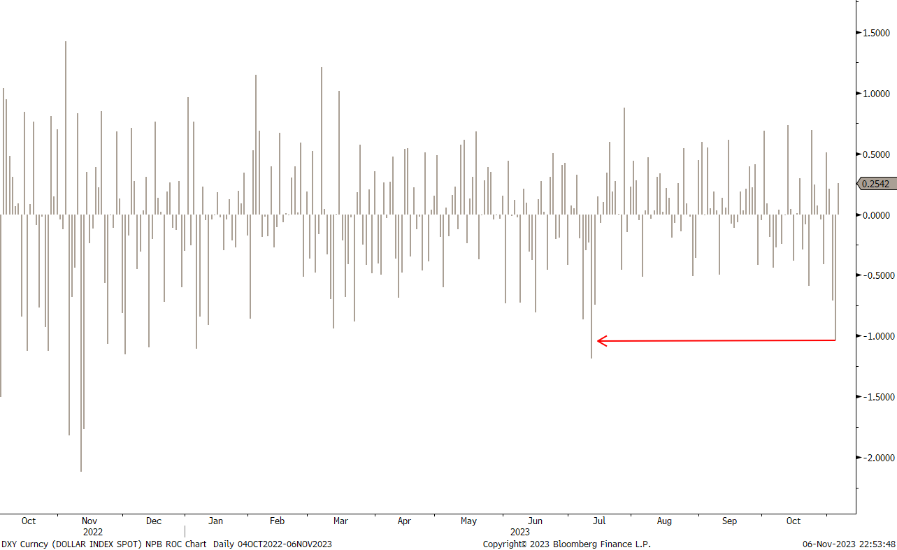
The Dollar was another victim of the soft economic data on Friday, seeing its biggest drop (DXY) since July:
On the candle chart, this looks as follows:
And translates to the EUR/USD as such:
Versus the JPY the USD continues to trade around the 150-handle. The effect (stronger Yen) from the BoJ abandoning Yield Curve Control (YCC) still has to show itself, but I continue to believe that it is only a matter of time:
Here’s the performance of the greenback versus other major currencies over the past five days:
In the commodity space, Gold has retreated a tad from recent highs, but the chart constellation remains constructive:
Similarly, Bitcoin seems to be gathering strength before a new breakout attempt to the upside:
Oil is starting to get a bit ‘slippery’ (ha ha), with one of those shoulder-head-shoulder patterns potentially forming:
$66.60 (devilish!) must hold, otherwise, we will have to put our long oil stocks on the back burner.
That’s all for today folks! Have a great Tuesday and let’s speak again towards the end of the week.
André
WeWorkDidNotWork.
Everything in this document is for educational purposes only (FEPO)
Nothing in this document should be considered investment advice
The views expressed in this document may differ from the views published by Neue Private Bank AG
Past performance is hopefully no indication of future performance


