Checking In
Volume VI, Issue 3
“The market will do whatever it has to do to embarrass the greatest number of people to the greatest extent possible.”
— Walter Deemer
DASHBOARD
AGENDA
CROSS-ASSET DELIBERATIONS
One of the main reasons I started writing a daily newsletter many, many moons ago was to keep myself abreast of what was happening in financial markets. Even for us who are exposed to financial markets on a daily basis, it is easy to miss some essential moves as we get tangled up in the quotidian fight with administrative issues (compliance, risk, rules, broken coffee machines, etc.)
I had one of those weeks I did not have in a while - one where I could not properly look at market action on any day! Of course, I heard about the US inflation number, the Chinese reopening, the Japanese rates mess and first US banks earnings, but I did not get the chance to actually check how markets reacted to all of this.
This makes writing today’s Quotedian even more fun than usual, as I get an innocent, non-biased glance at what has been going on!
But just before we get started, I want to ask you for a personal favour. Personal as it is for yourself! Some changes are going on at my end, which gives me the opportunity to remodel this space - if at all necessary…
So please give your quick vote below, selecting which would be the preferred format for The Quotedian going forward:
So please, please, pretty please cast your vote and thank you for helping shape the future of your favourite market letter 😉.
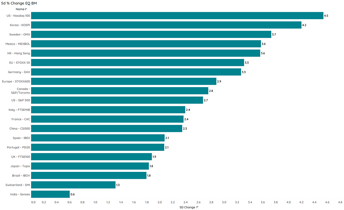
So let’s get started by checking what major global equity benchmarks have done over the past five sessions:
WOW! Not bad - not bad at all!
We are only two weeks into the new year (where the first half was going to be a catastrophe for risky assets, remember?), so let’s have a quick look at the year-to-date performance of the same benchmarks:
Ok, the message is clear - let’s have a look at some charts then.
Starting with the S&P 500, we are take note that we are back to the ‘make-or-break’ moment of tea leave readers technical analysts:
Depends on how you count, this is about the fifth time since the onset of the bear cycle that this index tries to break its downtrend line. Imagine it does do so and the market moves north of 4,100. This would not only mean that we have a pattern of higher highs and higher lows (aka bull market), but also that the bear market ended three months ago in October!
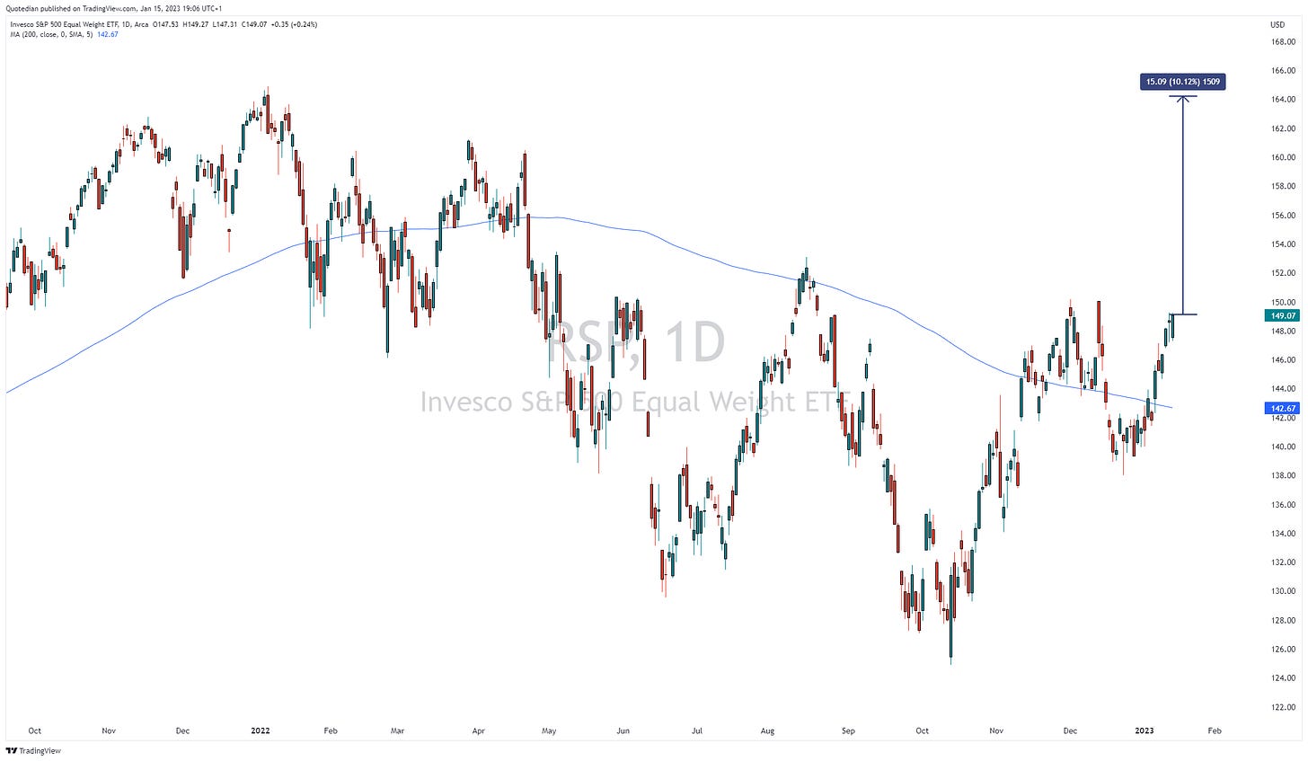
And now watch what happens if I pull out the chart of the S&P 500 equal-weight index, where Amazon, Microsoft, Apple et al have the same weight as all other index members:
Yes, ladies and gentlemen, “only” 10% away from a new all-time high! For the Dow Jones Industrial Index, that number is 7% …
So, surely with markets flying the bulls must be back pounding the table again! Well, not really … here’s the AAII (American Association of Individual Investors) weekly bullish minus bearish respondents:
Improved but for off the highs which usually would indicate too much bullishness.
Another thing sticking out on the table of year-to-date performance above is the relative underperformance of US markets. Let’s have a look at a chart of the US versus the rest of the world (MSCI):
Could it really be that US-underweighters finally get their piece of the cake too??
Well, the European equity chart (SXXP) does NOT look overly bearish, to say the least:
It seems that we poor Europeans did not only not freeze to death, but we even got a bit richer if we stayed invested in our own market. Could the better chart in Europe have anything to do with value (more prominent in European markets) outperforming growth (more prominent in US market)?
Perhaps.
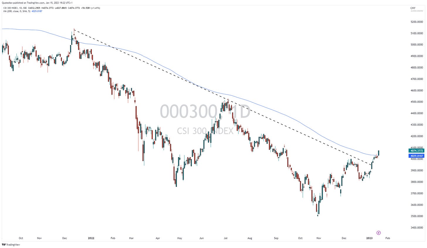
The Chinese reopening has lifted the CSI 300 above its 200-day moving average for the first time since July 2021:
So, all hunky dory then?
Well, be careful in the short-term, as the VIX is at its lowest in quite a while, and the volatility of VIX (VVIX) is showing signs of divergence:
However, there is a bullish development going on in our secret stock market indicator - check the currency section below for an update …
A good moment then to update our top 25 performing stocks year-to-date tables and their weekly performance.
Some big winners already in US, but more amazingly, not one Energy stocks which dominated the charts last year in the top 25 after the first two weeks of trading:
Even bigger winners in Europe and again, not one Energy stock:
What probably surprises most in the European table, is the good performance of real estate stocks. Are they not suffering from higher mortgage rates? Note to self: continue to observe carefully.
This serves as a good segue into equity sector performance. Here’s last week:
And here the YTD equity sector performance (Global):
Really not much to report for now, other than last year’s losers seem to have at least a week or two in the sun and vice versa. This would mean of course that bond yields should be down and bond prices up, if correlations of the past are holding up …
Well, checking YTD fixed income price performance, indeed we note that yields must be down and credit spreads narrowing:
Let’s double-check on the charts …
Here’s the US 10-year yield:
Yes, the uptrend on the 10-year yield has been challenged, confirmation of a larger downtrend for yields (uptrend for bonds) would happen below 3.30%.
BUT …
Yields would have to drop below 2% to confirm a revival of the previous disinflationary SECULAR environment:
The European fixed income market (proxied via the German bund) looks less constructive for bond prices:
And the current construction of the German yield curve (10y-2y) makes it difficult to understand the outperformance of European equities over other regions:
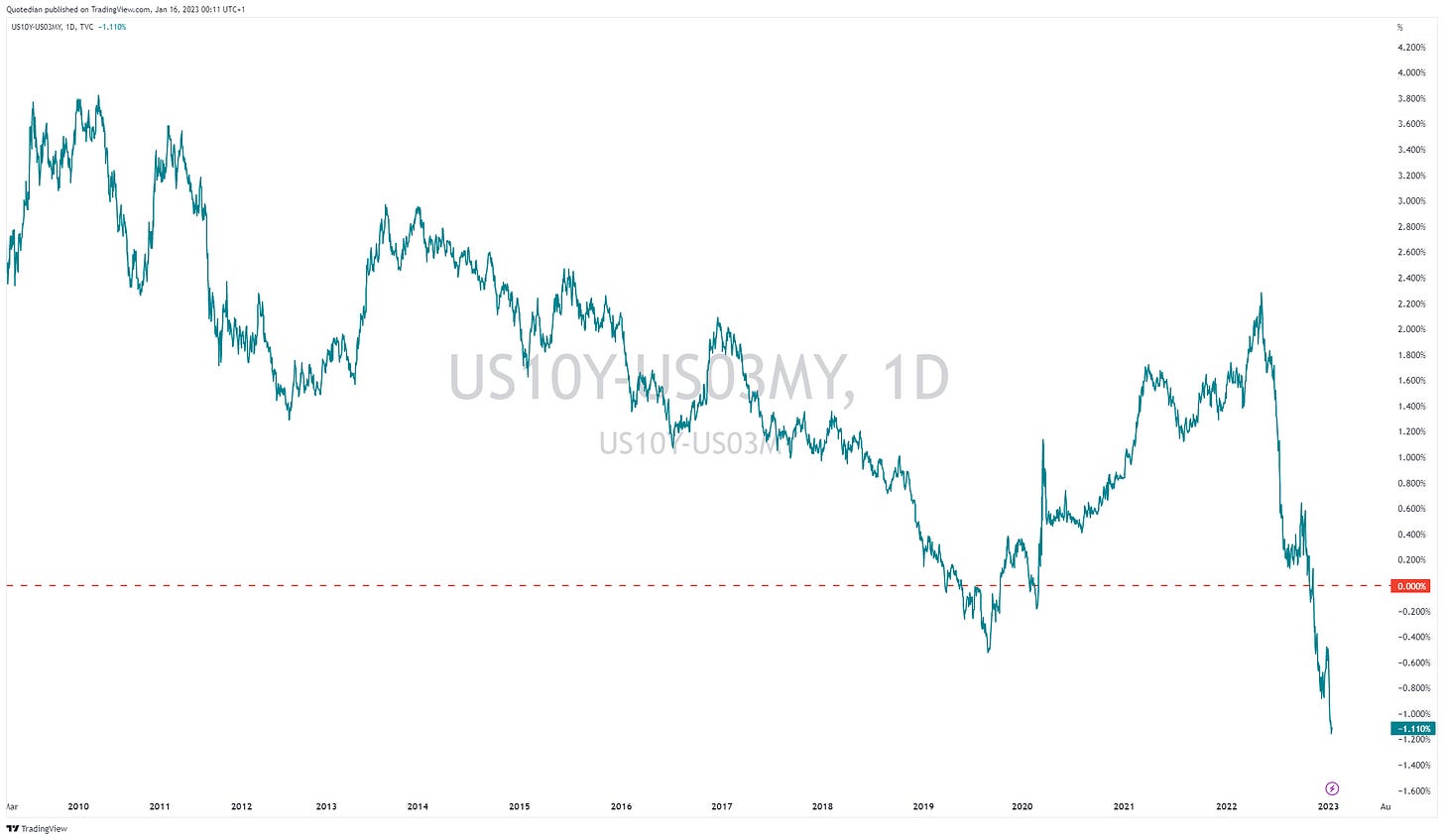
Having said that, the US curve (10y-3m) also continues to signal the worst recession ahead ‘ever’ for the US economy:
Credit spreads continue to tighten, which explains part of the bond rally, but ignores the earnings recession ahead (or not…):
After the Bank of Japan increased their ceiling on the 10y yield from 0.25% to 0.50% it took little time for the market to adapt:
Looking at the yield of the 8-year JGB yield, which is not manipulated … controller by the BoJ, we see that the market expects more ceiling easing as Kuroda exits as CB governor over the next three months or so :
10-year Japanese Yen Swap rates confirm this:
Alright, time to check currency performance. Let’s look at YTD numbers:
The US Dollar continues in retreat mode versus most other major currencies. Not a bullish chart for the US Dollar Index (DXY):
We will take a deeper dive on currencies in a future issue, but the USD/JPY chart, in conjunction with the comments on JPY rates above, is interesting:
It seems that the market assumes that the BoJ will continue to raise the rate ceiling - or outrightly abandon yield curve control (YCC).
And one more on the ‘currency’ side … in direct opposition to the VIX, which warrants caution, our secret sauce indicator, Bitcoin, says: RISK ON!
First time above 200-day MA since July 2021, that must be worth something!
Ok, it’s late and I need to hang up, so we will cut the commodity section short today. However, it is absolutely worth showing the (bullish) chart on Gold:
Encouraging is that, at least in my books, not many have been talking about this yet… stay tuned!
Ok, high time to say good night, so, GOOD NIGHT!
CHART OF THE DAY
As a small teaser to future issues and themes, here’s what the allocation my model suggests now:
Top overweight, bottom underweight.
Thanks for reading The Quotedian! Subscribe for free to receive new posts and support my work.
DISCLAIMER
Everything in this document is for educational purposes only (FEPO)
Nothing in this document should be considered investment advice
Past performance is hopefully no indication of future performance


