Crossroads
The Quotedian - Vol VII, Issue 14 | Powered by NPB Neue Privat Bank AG
“A bend in the road is not the end of the road…Unless you fail to make the turn.”
— Helen Keller
First of all, a big fat apology for not having published a Quotedian (click here) since April 2nd. Not only are markets seemingly at a crossroad, which we will deliberate about below, but so is to your favourite newsletter. The last two weeks have been extraordinarily busy as the NPB Team and I have been putting together our Q2 outlook and the accompanying chartbook, both which you can access Monday 22nd lunchtime onwards by clicking on the button below:
Generally, I find myself with less time to produce your favourite financial markets newsletter with the quality standards you deserve and I am tempted to go back to a much shorter, but daily format, as The Quotedian was born as over 20 years ago (initially called Stai[gh]t Views). And talking daily, have you checked out already our daily QuiCQ letter? Click on the button below to subscribe to our daily letter, providing you some market data (with trend arrows), a witty quote and a chart-of-the day:
So, for now the idea is to sacrifice part of my Sunday afternoon to give you a view on the week ahead plus my market deliberations in long-form (The Quotedian) and complement that with daily interesting charts (The QuiCQ).
Sounds like a plan? Leave your feedback by clicking on the button below or email me directly at ahuwiler@npb-bank.ch:
The good old Quotedian, now powered by NPB Neue Privat Bank AG
Contact us at ahuwiler@npb-bank.ch
And now to the other crossroads, i.e. the one that financial markets find themselves at. Let’s go through our usual order of asset classes, starting with equities, but first here a reminder of the colour coding:
Whilst most equity benchmark indices continue to exhibit positive year-to-date performance, all of them have seen important reversals of fortune during April:
However, as we highlighted in Friday’s QuiCQ the current ‘correction’ in equities can be described at normal and benign, given the run we had since late October of last year.
Of course, that brave statement was immediately quipped with another nearly one percent drop on the S&P 500 (2% for the Nasdaq).
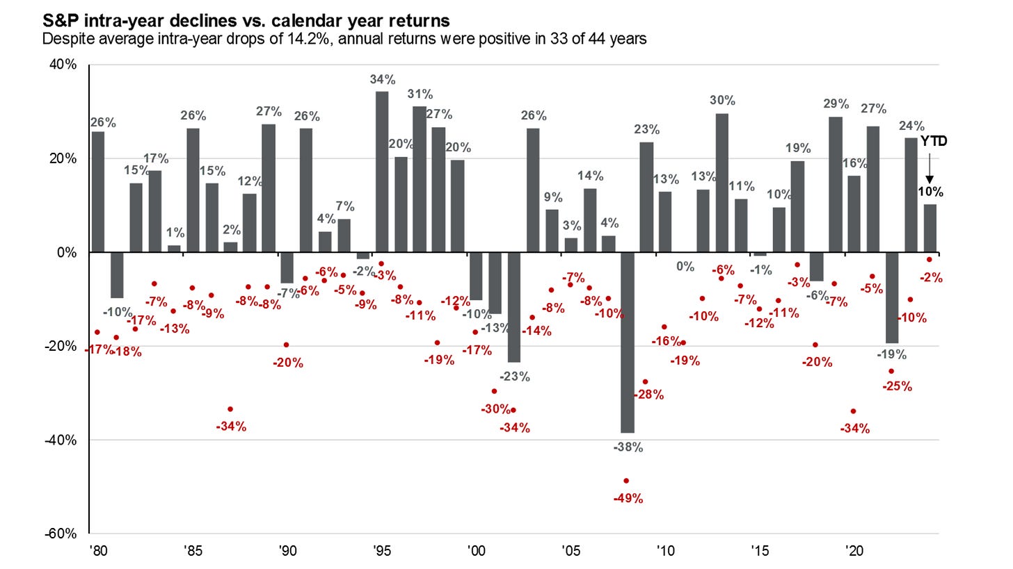
But I insist that the correction is normal, healthy and even necessary. First, remember this excellent chart from the fine folks at JPMorgan Chase Asset Management (updated to 31/3/2024):
Hence, so far we had an 5.6% drawdown so far this year and more importantly, we continue without a -2% since December 2022, which is probably a better indicator than the VIX that markets are in calm estate:
So, how far can the current correction go? Let’s have a look at the S&P 500 chart:
The 4,800 level seems like a very ‘convenient’ target, as the top of 2021 (black dashed) coincides with a 38.2% retracement of the entire bull run since October 2023. But even dropping back to 4,700, where the 200-day moving average and a 50% retracement meet, would not be scandalous.
Hence, an additional 5% correction would take the entire drawdown to about 10%, which coincides well with the average correction, returning to the JPM chart above.
And it would also coincide with an additional 5% drop in Europe, taking that market down to the 200-day MA too:
For sure, such a move would reduce investor’s complacency, which seemingly has already started correcting, looking at the latest AAII data:
So, as the current correction unfolds, it is time to have a close look at a possible change in leadership, which is one of the main themes in our quarterly outlook.
As famed technical analyst Ralph Acampora once said:
“Rotation is the Lifeblood of a Bull Market”
or, in other words, there is always a bull market somewhere.
Therefore, let’s look for rotation by checking sector absolute performances since beginning of this month first:
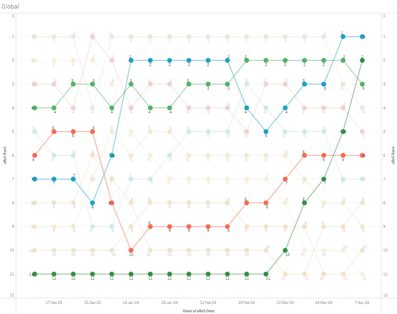
Only Energy is positive, followed by Utilities and Materials. Interesting is also that Technology, the leader of 2023, is the second worst performing sector. This would clearly hint at some rotation, but let's have a look at relative performance leaders and laggards via our very own aReS(tm) indicator before jumping to any conclusions:
Outside Communications, I see Energy, Industrial and Materials with acceleration or high momentum ranking. All very cyclical sectors, pointing to reacceleration of the economy.
Let’s cut the equity section short here by looking at some relative sector charts, by using the SPDR US sector ETFs as a proxy.
First, here are Industrials, clearly outperforming the broader market:
Materials look promising too:
Don’t be short Energy:
On the other side, technology is breaking down:
All this let’s me conclude that the Fed has little business in cutting rates this year, massive geopolitical event aside. Let’s use this as a segue into the fixed income section…
As the subtitle of this newsletter says: “Looking for the forest? Listen to the trees!”
And trees is in this case is the fore-mentioned sector rotation taking place, indicating that the Fed has no business in cutting rates. The market needed nearly four months to recognise that.
After expecting at least six cuts (or 2%) at the end of last year,
expectations are now down to less than two (or less then 50 bp in interest rate terms):
The bond vigilantes have also been signalling via the 10-year US treasury bond yields that a rate cut would be a grave error:
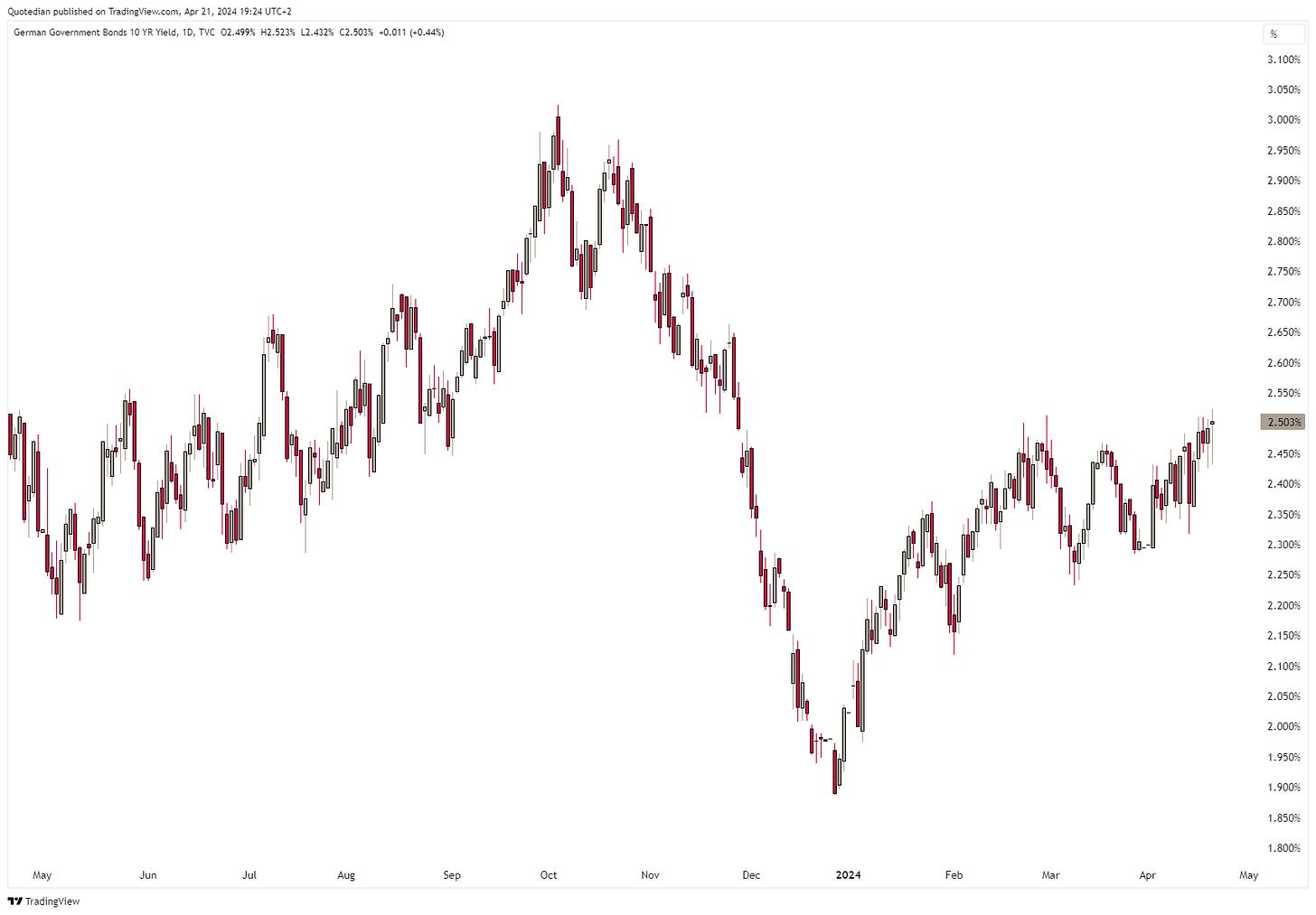
And European yields, proxied below via the German 10-year Bund, are giving a similar message of caution regarding any rate cuts to the ECB:
Credit spreads have been widening a tad recently as stocks have been correcting:
The US Dollar has decidedly broken out of its long-term triangle to the upside, sending a warning message to the equity bulls such as myself:
However, versus the Euro, the long-term trading range continues to hold:
It is hence the Yen weakness that is provoking the breakout on the Dixy:
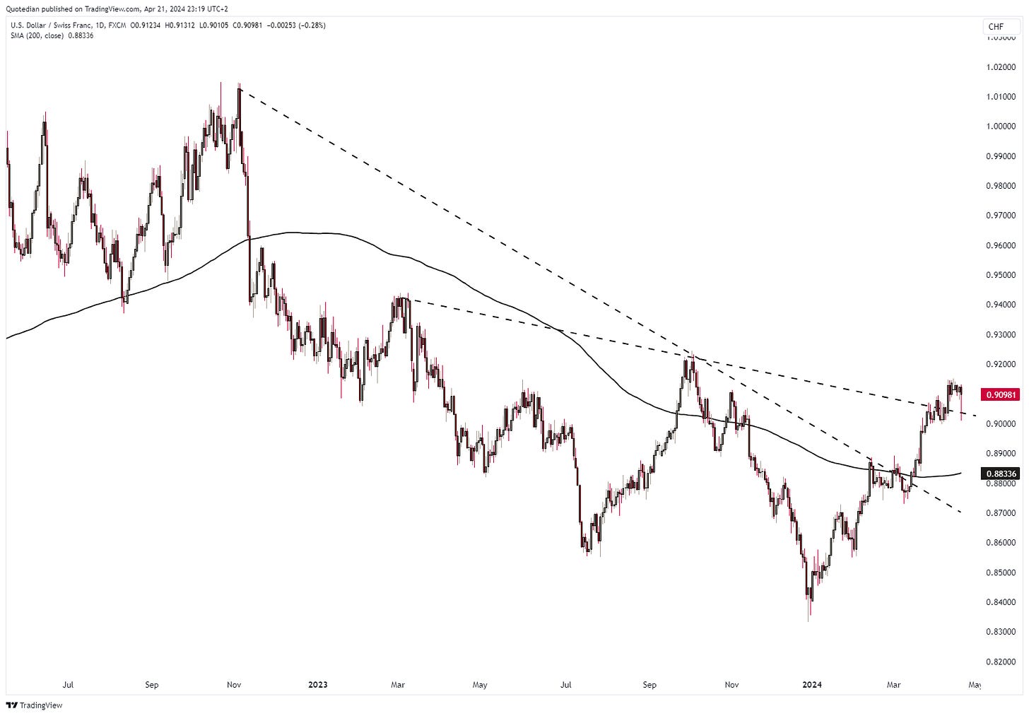
The Dollar/Swissy cross has broken most imaginable resitances:
0.9220 and 0.9420 are the next stops before parity…
To finish off the currency section, Bitcoin has been exhibiting its usual volatility going into the halving process due this weekend. Putting on my non-emotional TA hat, the following chart does NOT look like a trend reversal, but rather like a breather before the next leg up:
Which does NOT remind me of the price behaviour of Gold, which is ready to burst higher yet once again:
Gold, similar to the Greenback, is unfortunately signalling a not too positive message for risky assets.
The other possible signal Gold (and Bitcoin) are giving here is that of financial repression, aka debasement. But, this is worth an entire Quotedian in itself, which we will focus on soon. But as a preview:
Teaser 1
The Dow Jones Industrial Index priced in Gold has recently broken below its multi-year support:
Teaser 2
Bonds (TLT) price in Gold:
Avoid!
Anyhow, time to hit the send button. Happy Earth Day to all of you!
André
An interesting chart here from BlackRock, suggesting that the current pick up in volatility is not unusual in (US) election years and may persist into early summer:
Everything in this document is for educational purposes only (FEPO)
Nothing in this document should be considered investment advice
The views expressed in this document may differ from the views published by Neue Private Bank AG
Past performance is hopefully no indication of future performance


