Envy
The Quotedian - Vol VI, Issue 38 | Powered by NPB Neue Privat Bank AG
“If everything seems under control, you’re just not going fast enough.”
— Mario Andretti
DASHBOARD
AGENDA
CROSS-ASSET DELIBERATIONS
It’s time for one of our favourite editions of The Quoedian of any month - the month-end edition! Not only do we got those fine statistical tables of different asset classes and their fortunes during the month just gone by and what it means in the context of year-to-date returns, but we also get to have that look at monthly candle charts, keeping us from losing the forest for the trees!
But before we dive into the data- and chart pool, a quick explanation of today’s title:
And everybody’s envy that company called NVIDIA is:
Up 36% on the month, some cool 165% since the beginning of the year and … wait for it … 90,000% or so since IPO in 1999.
But before you get all excited and go and buy shares of NVDA on credit, here’s the thing: JIM CRAMER JUST JINXED IT!!
Twitter did not take long to react:
Anyway, enough of that - let’s start with the monthly review!
The good old Quotedian, now powered by Neue Privat Bank AG
NPB Neue Privat Bank AG is a reliable partner for all aspects of asset management and investment advice, be it in our dealings with discerning private clients, independent asset managers or institutional investors.
Adhering to our usual order, here are the performances of some of the most popular equity benchmarks around the globe (as usual, the thicker, non-transparent bars are MTD % returns, whilst the thinner, semi-transparent bars are YTD % returns):
Hhhmmm, unless you are concentrated in (a few) long-duration Nasdaq stocks, the Wall Street adage “Sell in May and go Away” may actually resonate with your equity performance.
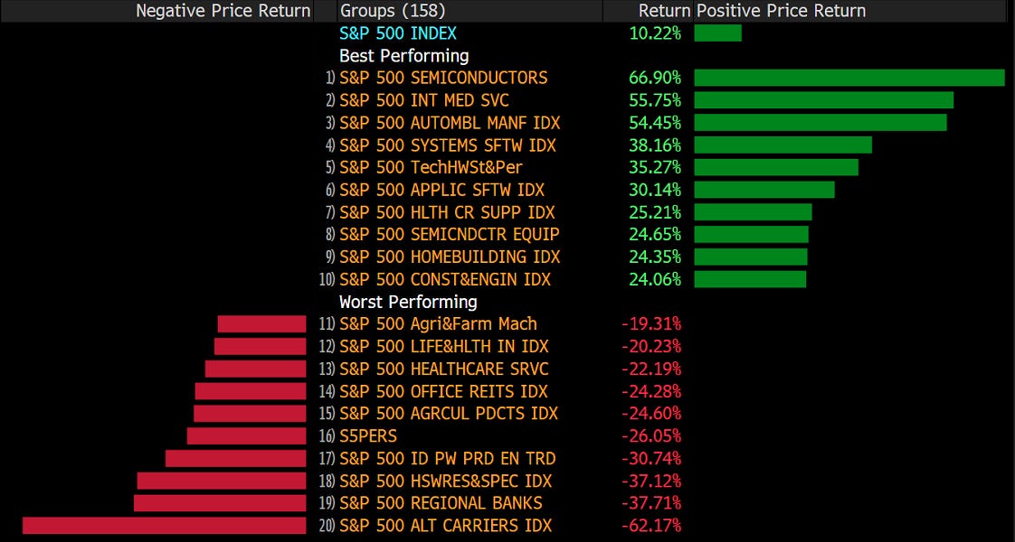
Here are the 20 top- and bottom performers in the S&P over the month of May, together with their YTD accumulated returns:
As usual, it is fair to observe that what was strong stays strong and vice versa.
Here’s of course also the European list before we turn to some monthly charts:
IDEM.
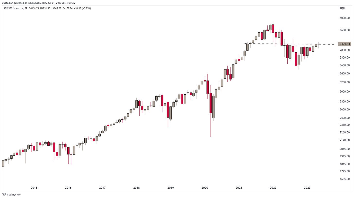
Now, let’s have a look at some monthly charts. Here’s the almighty S&P 500:
Of course one could argue that this index has now broken above key resistance levels (dashed line), but given the lack of breadth, i.e. narrowness of participating companies to the upside, I would suggest caveat emptor! The monthly heat map of the index says it all:
Ok, time to turn our attention to Europe then now. Here’s the broad STOXX Europe 600 index (including such secessionist countries as Switzerland or the UK):
As we have seen on the performance table at the beginning of the equity section, it was not such a good month for European stocks, which actually registered a key reversal (aka bearish engulfing) pattern. This is quite a rare signal on a monthly chart, as the graph below, same as above, but with key reversals highlighted in yellow, shows:
Again, the data set is not huge to say the least, but the immediate implications would be not bullish.
This kind of implies that the lid (too funny) we defined a few weeks ago on the narrows STOXX 50 index continues to be in place:
Incredible India! used to be (and probably still is) the advertising slogan of the Republic of India. And incredible it is, as the correction is already over with the Sensex about to reach new all-time highs:
And then there is this other newly found Asian champion: Japan! The Nikkei is at levels not seen since 1990:
Quite the opposite is happening in China (and HK), where stocks are back in a bear market (>-20%). Here is China’s CSI300 index:
Time to have a look at equity sector performance, but I think it will bring little surprise given the global benchmark performance seen further up in this document:
Indeed! Except for technology and closely related communications stocks, all other sectors were down at a global level in May.
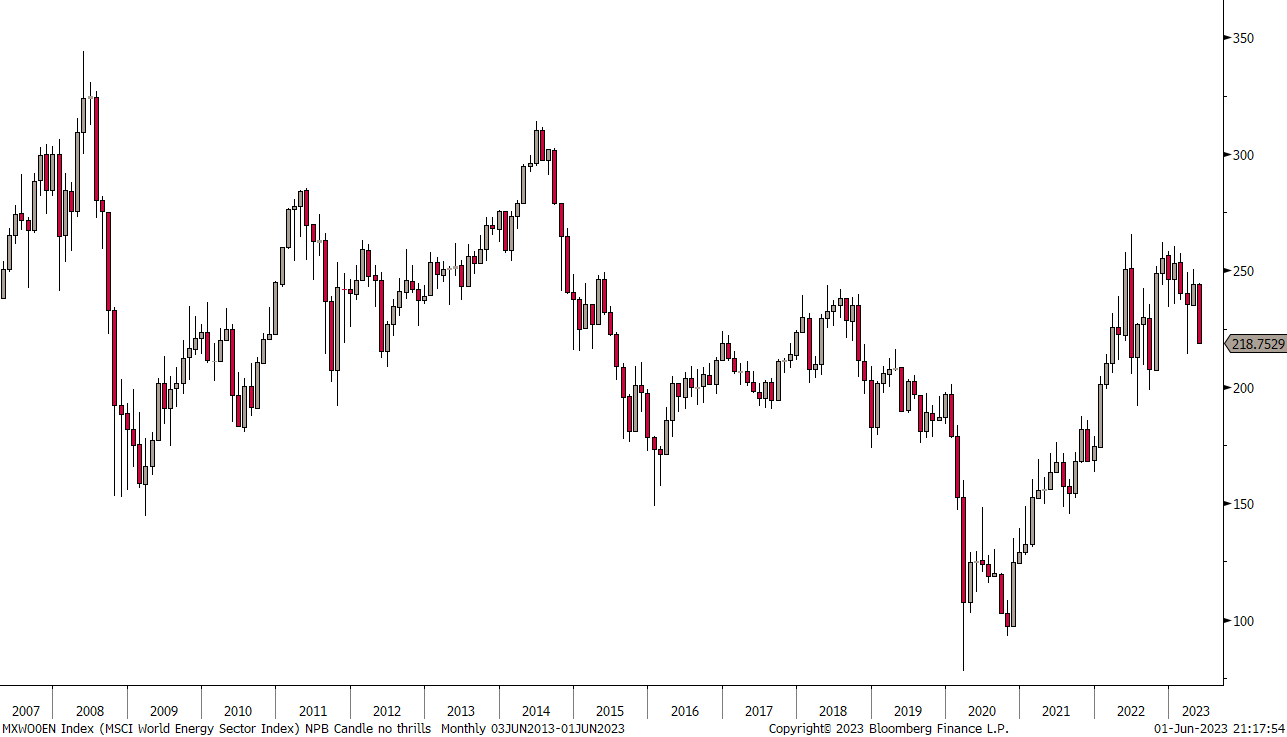
Let’s have a look at the monthly chart of the best (Tech) and worst (Energy) performers for this year so far.
The MSCI World Tech index is about 7% away from a new all-time high:
On the other side of this year’s sector performance gamma, energy stocks are down between 30% and 40% from their 2008 and 2014 peaks, and down nearly 20% from the recent “Russian Invasion” high:
Let’s do something “fun”. Here is the ratio of global technology stocks to the MSCI World index:
And here the ratio chart of global energy stocks versus the MSCI World:
Aaahh, the age-old question of mean reversion or trend following!
What do you think? Let’s poll it!
It is also instructive to look at year-to-date performances a layer or two below the usual eleven economic sectors. Here are the industry groups of the S&P 500:
And here are those of the STOXX 600 Europe index:
Ok, now let’s have a look at fixed-income markets performance:
Not a great month for most bond markets either, as yields have generally reason across the globe.
Chart-time!
Here’s the monthly candle chart of the US 10-year treasury yield:
In the great scheme of things, we are still in the consolidation phase of the secular uptrend (for yields).
Ditto for European yields, here proxied via the German 10-year Bund:
And UK yields seem to have resumed the uptrend already again:
The best (treasury) bond value seems to have been in Chinese government bonds (quite contrary to Chinese stocks - see above), though admittedly yields are now trading at the very lower end of the multi-year range:
Credit spreads have been moving sideways since the beginning of 2023, let’s not waste too much ink on this except the longer-term chart here below:
Moving into FX markets, here’s how some of the most important currencies around the globe have performed versus the US Dollar during May and what it means in the year-to-date context:
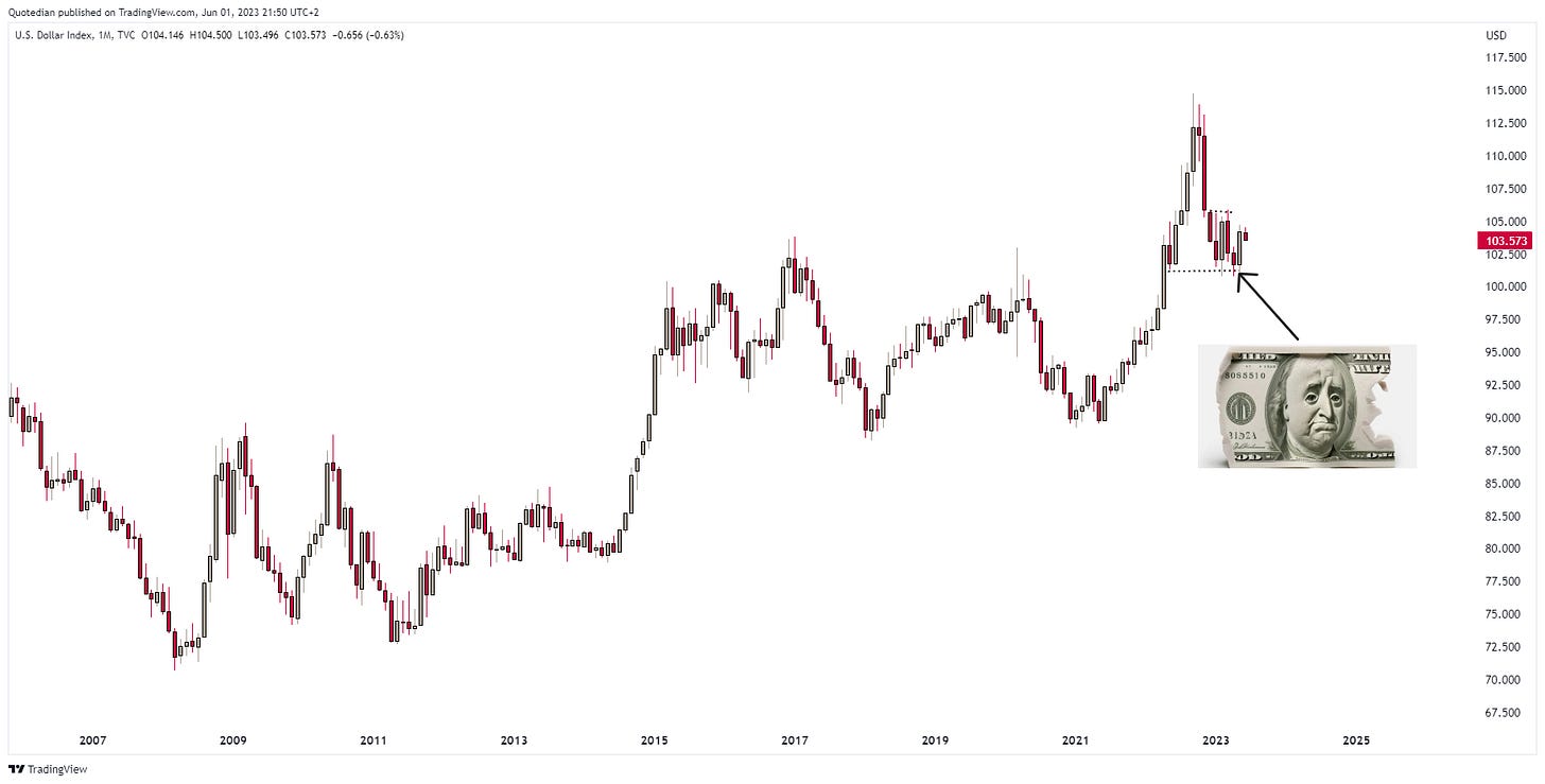
So, once again, just as the noise of the end to the US Dollar dominance got the loudest, the Greenback started rebounding. Here’s the monthly chart of the Dollar Index (65% Euro and Yen dominated):
Not too much to read from the EUR/USD chart, other than the Euro-recovery in place since the end of last year seems now to be at peril:
Similar but worse for the Japanese Yen, which continues to be the victim of Japanese monetary policy:
Finally, a quick look at commodity markets before I hit the send button. Starting at commodity ‘sector’ level, it comes at little surprise that all segments fell during May, given the Dollar strength discussed in the section above:
And probably also no surprise that energy commodities were weakest, which was already reflected in equity sector performance further up too.
Going more granular, here are the performance of some popular commodity futures:
Only Cotton and Lean Hogs (Trading Places anyone)
escaped the siren song of negative monthly performance.
Gold reached briefly an all-time high just above $2,080 the ounce during the month, but eventually got rejected again at this resistance area above $2,000:
Oil is continuing to trade somewhere around the middle of the range of the past years, but is currently poised to test the USD70 support level. Failing to hold there would likely mean a drop to $60 minimum (a recession level):
And finally, here is the depression chart for all commodity super-cyclers:
Commodity Supercycle, where are you?
Ok, enough for today.
Have a great Friday and may your best trade of May be your worst in June.
André
CHART OF THE DAY
Central banks have been buying gold for their reserves at a pace never seen below. Do they know something we don’t?
Stay tuned…
Thanks for reading The Quotedian! Subscribe for free to receive new posts the moment they are published.
DISCLAIMER
Everything in this document is for educational purposes only (FEPO)
Nothing in this document should be considered investment advice
The views expressed in this document may differ from the views published by Neue Private Bank AG
Past performance is hopefully no indication of future performance


