From Russia with Gas
Vol VII, Issue 39 | Powered by NPB Neue Privat Bank AG
"Experience is what you got when you didn’t get what you wanted"
— Howard Marks
The share of Russian natural gas in European imports has climbed to 20% year-to-date, up from 15% in 2023. Three years into the war, Europe can't kick its addiction to Russian gas, either via pipeline (throughout Ukraine) or LNG ships.
And these are the official numbers, not including “recycled” fossil fuel inputs via other countries…
Yet, European natural gas prices are up nearly double since the lows of February of this year:
Not sure what the message is here, but a) it is definitely a space worthwhile watching and b) made for a great title to this week’s Quotedian :-)
But, off we go, to our usual weekly review across asset classes …
The almighty S&P 500 “finally” closed lower on the week (-0.96%) after six weeks of continuous gains:
The weekly heatmap reveals that there were many more “down” stocks than “up” stocks:
I have checked manually and on each individual trading session of last week, stocks hitting a new 52-week high strongly outweighed those hitting a new 52-week low.
Hence, make sure, as this ‘correction’ unfolds, that you cull weak performers and add to outperformers. To give you a head start, here are the lists of strong performers YTD you may want to consider, first US,
and then Europe:
I am confident that some of the stocks pulling back in those lists are worth a consideration …
Time to look at some charts, starting with the S&P 500:
Could the index fall below 5,700 to retest previous key resistance now turned support? Absolutely! However, that would probably already provide a good initial buying area. Could a hiccup during the US election process next week provoke a deeper correction? Also absolutely! Further support can be found at 5,400 and the around 5,300 from the 200-day moving average. Probably of such a deeper correction unfolding? Trace.
The Nasdaq provided kind of a weird candle last Friday by gapping higher, producing a decent intraday rally, but then closing back at the opening level:
But important to note, that this index did NOT close lower on the week, but rather produced a small gain. Part of the ‘blame’ can clearly be placed on Tesla (TSLA), which saw its stock move 26% in only two session post their Q3 earnings announcement:
Admittedly, tech stocks have been doing well in relative terms already since early September, challenging our relative underperformance framework somewhat:
Small cap stocks, measured via the Russell 2000 had a difficult week, closing down nearly three percent and again failing to take out key resistance just below 2,300:
The following chart, comparing the Russell 2000 (grey, rhs) with US 10-year yields (red, lhs, inverted) makes clear that 1) higher yields are not helping small cap stocks and 2) it could be much worse!
Now, let’s make a sector “deep dive” for a moment …
Looking at global sectors on our proprietary aReS™ model, we see that technology has made it back up to the top spot, inline with our brief analyses higher up:
It probably does not surprise us to find energy at the bottom of the table, and even less so after today’s (28.10.) 6%-dip in the price of crude. But let’s focus on the second-worst performing sector - health care.
Staying at a global level, let’s look at the relative chart of the iShares Global Healthcare ETF (IXJ) to the Vanguard Total World Stock Index ETF (VT):
Indeed, is the relative chart hitting a multi-year low. Now, let’s get sectorial regional or regional sectorial ….. ah, you know what I mean!
Here’s our aReS™ model applied on US sectors:
Uh, oh, HC just dropped to the bottom rank here! Let’s have a look at that local relative chart then, SPDR Healthcare (XLV) divided by the Spider (SPY):
A thirteen year (relative) low!! What’s in that XLV then?
Well, some top notch names there, especially LLY of course! A back-of-the-envelope year-to-date performance analysis reveals a massive bifurcation between best and worst:
A stock pickers’ paradise, indeed! This is also one of the reasons we have been approaching the opportunity set in this market segment via a sector specific long-short fund, which in terms of risk-adjusted returns is paying off very well and should continue to do so:
Interested in knowing what Hedge Fund we use for health care exposure?
Contact us and become a client!
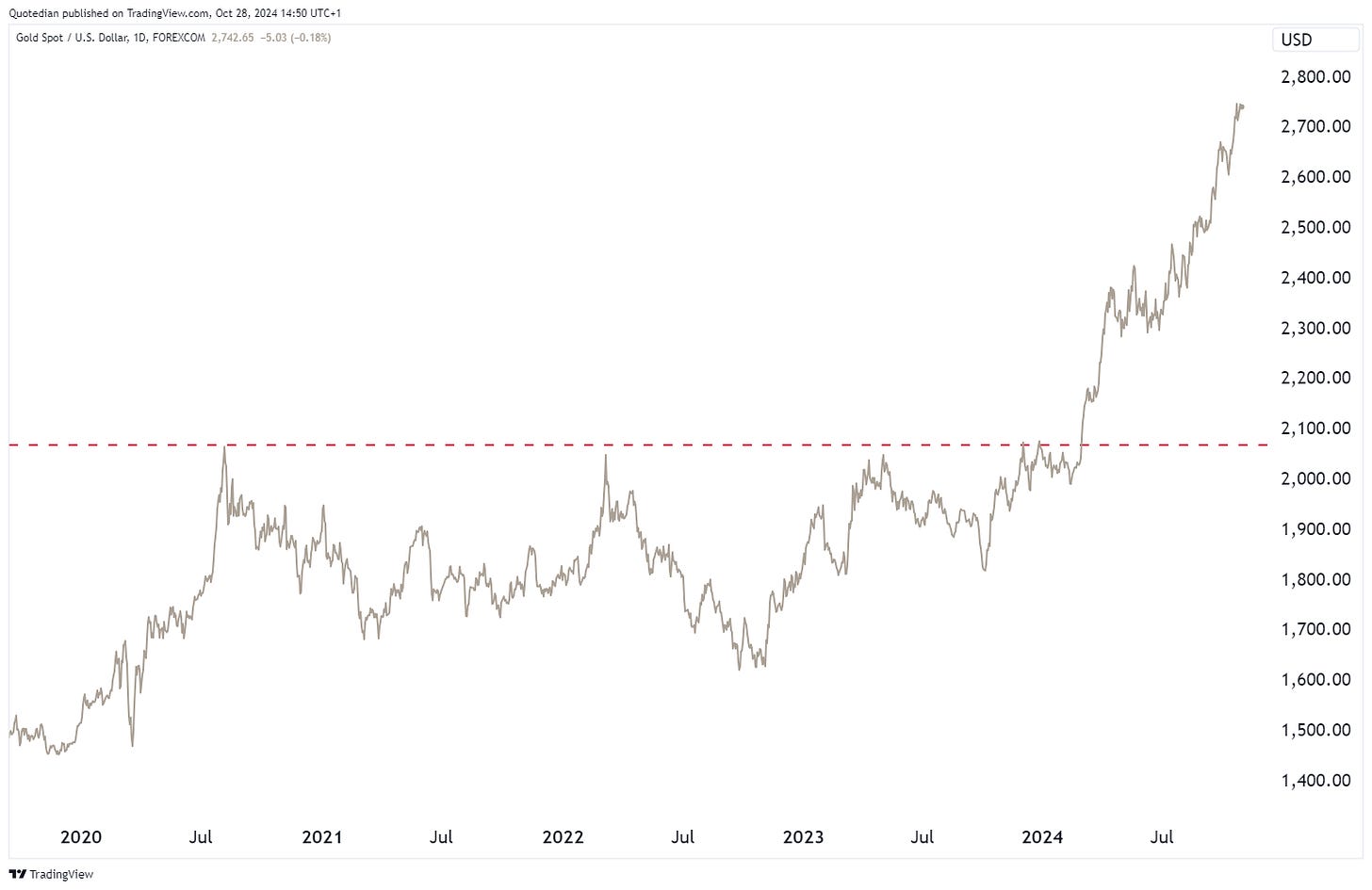
Let’s stay sector-specific one more moment —> One well-known fact is that Gold has been on a tear recently. We will look at the yellow metal in the commodity section again, but just in case you have been hiding under a non-precious rock recently, here’s a reminder:
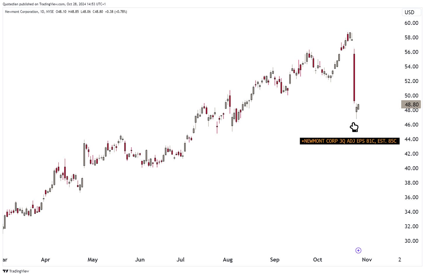
Now, it has been long said that gold mining stocks have been lagging and dissappointing over the past decades … and to that point, the largest Gold miner globally, Newmont Mining, underdelivered once again with their earnings announced last week:
I only put the pointing hand to where the earnings were announced last week, because I have a very dark humour side to me …
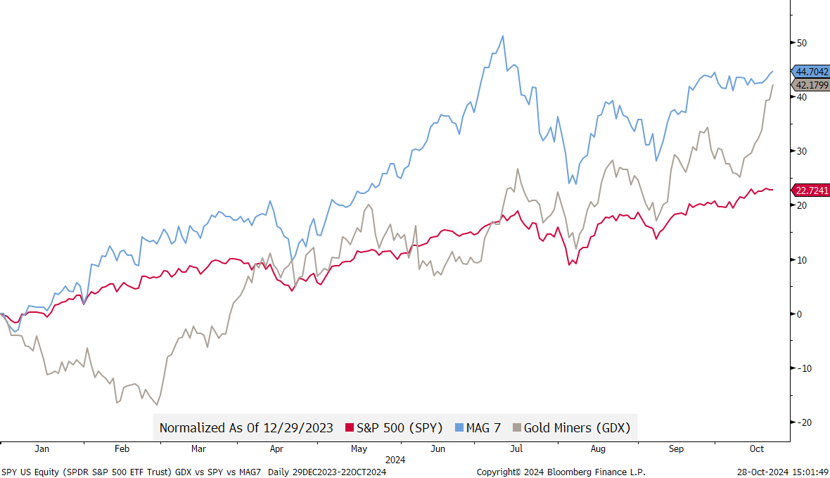
Now, let’s check the year-to-date performance (until mid last-week) of the Gold miners (GDX- grey) on compare it with the S&P 500 (SPY - red) and the Mag 7 (blue):
Not bad, eh? Nearly double the S&P 500 and close to the same as the Magnificent 7!
And now let’s compare the GDX (grey) performance with that of the actively managed fund (red) we use here at NPB to get this sector exposure onto our managed portfolios:
Close to 3000 basis points outperformance over the past year!
Want to invest like the best?
Become a client! Contact us today!
I am running out of time to cover all international markets, but I would highlight that Japanese stocks rallied close to two percent, despite (or amid) the ruling LDP party losing majority for a first time since 2009:
Finally, and to end the equity section, earnings season continues and this week we get five of the Mag 7 reporting their earnings. Here’s a US focused earnings calendar, but check our daily market letter (www.quicq.ch) for detailed updates Tuesday through Friday:
Since the FOMC 50 basis points cut in mid-September, we have seen a series of economic data that has been stronger-than-expected, making the Citi Economic Surprise indicator rising sharply:
Accordingly, that very crowded trade of three more cuts into year end,
is emptying itself pretty fast, as rate cut expectation have fallen to well below two:
Another interesting observation was done by the always fabulous Jim Bianco, eponym of Biancoresearch:
This is the seventh time the Fed started a rate-cutting cycle since 1989. No other cycle has seen as big a rise in 10-year yields in the wake of the initial cut.
Why? Perhaps the market is signaling the Fed moved too far and too fast in cutting rates 50 basis points.
Interestingly, rates rose by similar levels in the first 38 days after the initial rate cuts in 1995 (orange) and 2001 (cyan). Those cuts were somewhat rejected as unnecessary and feeding the stock market bubble (which peaked in March 2000).
Here’s the accompanying chart:
We wrote last week on several occasions about the Trump Trade (TT) in our daily The QuiCQ (e.g. click here) and how it may have gotten ahead of itself:
Clearly, the outlier, pain trade would now be a slim Harris win. Whilst we would not advocate to make a massive bet on such an outcome, a small, lottery ticket sized wager is tempting. Plus, the current set-up would “play” well into our risk-reduction enacted on portfolios at the beginning of the quarter, giving the scenario of the losing party not conceding a low probability, but high impact.
We already briefly spoke about the Japanese general election in the equity section. From Bloomberg:
Japanese Prime Minister Shigeru Ishiba promised Monday to restore political stability in a bid to maintain power, after his ruling coalition failed to win a majority in the lower house for the first time since 2009.
Whilst stocks rebounded, the country’s currency clearly took a beating. Versus the US Dollar, the Yen dropped nearly one percent, but since the lows has recovered a tad again:
Nevertheless, with this mornings intraday move, the currency pair has now quite precisely recovered 61.8% of its entire move lower:
Must hold here (the JPY) comes to mind.
Kind of the same is true for the EUR/USD, which would be at danger to falling to 1.06 should 1.0775 give:
The USD/CHF is really, really toppish and is probably not lower already only due to the greenback exhibiting so much strength against most other currencies:
Bitcoin-evangelists continue to hold their breath waiting for a breakout above 70k:
For me, it’s a WHEN, not an IF.
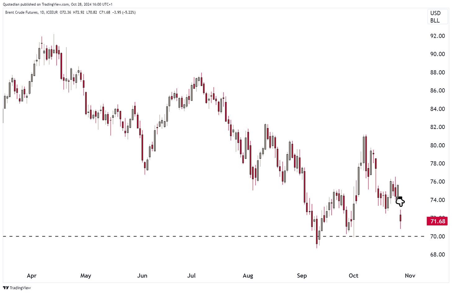
Despite having started typing today’s letter yesterday Sunday, I have ran out of time for much more. Definitely we need to show a chart of crude oil (Brent for example) though, as the black gold is down more than six percent after Israel “played nice” in their retaliation on Iranian targets:
The multi-year chart shows that we are on key support:
Time to hit the send button, please leave your feedback on today’s issue in this mini-poll:
FWIW, here’s a chart of Gold (grey) and of Gold adjusted for inflation (red):
Just fun, no message or conclusion.
Everything in this document is for educational purposes only (FEPO)
Nothing in this document should be considered investment advice
Investing real money can be costly; don’t do stupid shit
The views expressed in this document may differ from the views published by Neue Private Bank AG
Past performance is hopefully no indication of future performance


