

Game of Thrones
The Quotedian - Vol VII, Issue 23 | Powered by NPB Neue Privat Bank AG


"When you play the game of thrones, you win or you die. There is no middle ground."
— Cersei Lannister


Somebody was pushed of his throne last week:


Thinking about it, more than a push it probably was a ‘voluntary’ jump … without a parachute!
But as we showed in Friday’s QuiCQ (click here), not all the bets went in favour of Trump, but new contenders appeared (e.g., Newsom):

As I am typing most of this on Sunday afternoon, France is still at the polls in their first round snap election call - will there be another throne shuffle soon?

The good old Quotedian, now powered by NPB Neue Privat Bank AG

Contact us at ahuwiler@npb-bank.ch
Alright! After this “Saving Private Ryan” opening scene like start to this week’s Quotedian, let’s calm down matters a bit - or at least make them seem less bloody. And for that, nothing better to make our usual month-end round across the long-term monthly charts. ‘Coz as we know, if you’re nervous about the short-term, zoom out, and find your Zen in the longer-term charts.

But just before we get started, a quick reminder of the color coding in our performance charts:

Aaaaaand … off we go!

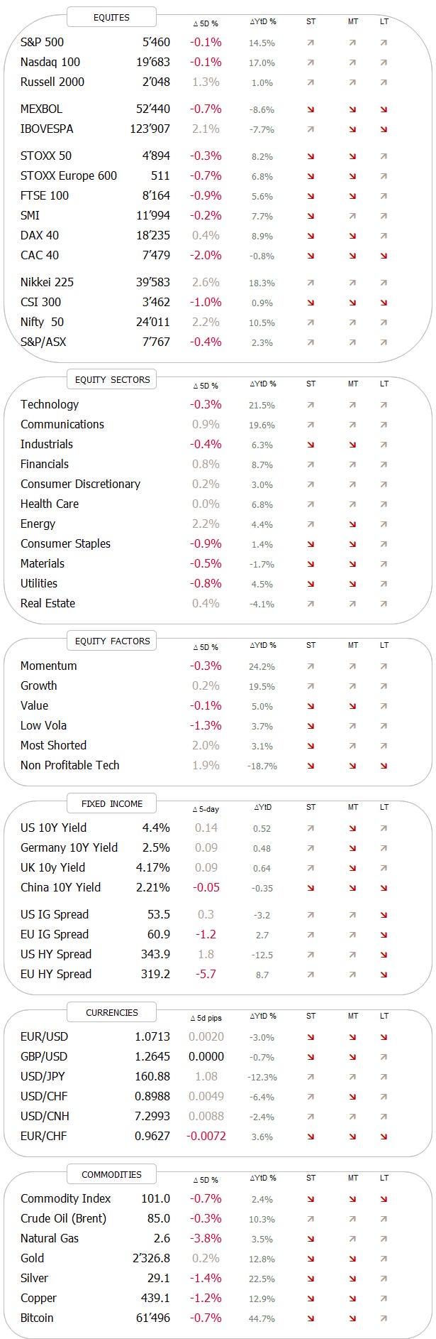
As usual, starting with the most widely followed global benchmark indices and sorted top-down by year-to-date performance, we see the following picture:

As you may have noted :-) I have added four equal-weight indices, just to show the “narrowness” of this year’s market rally … so far!
What stands out first in the table above is that a about two third of markets actually showed negative performance in June - most of them being European. The sell-off in our markets here was mostly provoked by the capriciousness of one particular French president, who like a spoilt brat called for a snap election after the European election outcome was exactly as everybody expected.

Again, as I am typing England is losing to the Slovaks, and Macron may be doing the same at the ballot box, as France citizens may very well show him an educated middle finger.

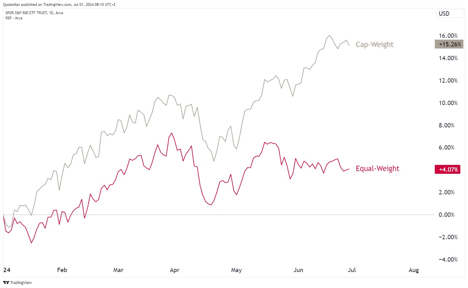
But back to our equity benchmark performance table… the other thing that sticks out (no pun intended with the finger mentioned above) is the performance gap between the cap-weighted indices and their equal-weight versions. This is how this performance gap looks like on a chart for the S&P as an example:
However, rather than assuming that this lack of participation in the rally, i.e. narrow breadth and hence, an imminent turn lower for stock markets, I would chose the more positive interpretation here, which is, that most of the market has still a major catch-up potential.
In that context, let’s have a look at some monthly charts now.
Bright, blue sky is the only interpretation here for the S&P 500:

Idem for the Nasdaq:


Hoping over to our side of the pond, June produced a negative candle for the STOXX 600 Europe Index, but the chart still looks very constructive:

The Euro Stoxx 50 is closing in on the all-time highs set in … drumroll… April of 2000!

Which of course can be interpreted as that the rally is just about to get started after 25 years of sideways …

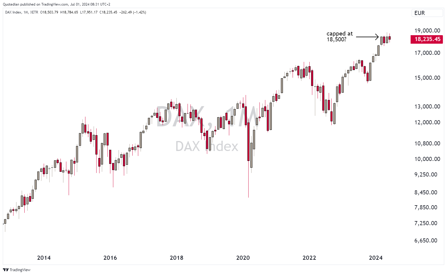
German stocks are struggling to break above 18,500 though:
It was a horrible month for French stocks, with the CAC 40 closing below its 10-month moving average (approx. 200-day MA equivalent):

Early Monday morning addition: it seems that the outcome of the French first round election is as expected with an important win for Marie Le Pen’s far right, but other parties expected to scramble together in order to avoid a majority after second round voting. CAC futures are hence up meaningfully pre-market opening.
In Switzerland, I would expect the SMI to reach 13,000 during the coming summer months:

Over in Asia, the Nikkei has been consolidating for three months now,

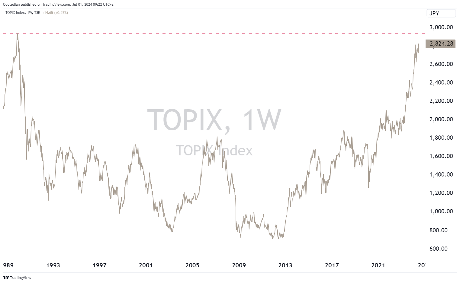
However, the broader, less technology-focused Topix index has been ticking undeterred higher:

Less than 5% to go to reach the all-time high set in December of 1989:
That’s quiet a long time for a market not to reach a new all-time high. For those amongst old enough (but not too old) to remember that far back, this is what was “en vogue” in 1989:
George H. W. Bush is sworn in to become the 41st President of the United States
Salvador Dali dies (84)
Tiananmen Square protests and massacre
The Berlin Wall falls
Aaaandd probably most important:The Simpsons airs for a first time

Ok, after this attack of nostalgy, back to some of the Asian equity markets. Here’s the monthly chart of the Hang Seng Index, showing that Hong Kong stocks have been treading water in June:

Not so India’s BSE500 index though, which closed the month up nearly 7%, after a volatile, election-related June:

Time now to look at some sector performances. Here’s how June and the year so far went for the Bloomberg Global sector indices:

The positive performance in technology and communications stocks stand out, but here also the rally continues to be led by a selected few. Point in case the following comparison chart between the S&P 500 Technology cap-weighted (grey) and its equal-weight version (red):

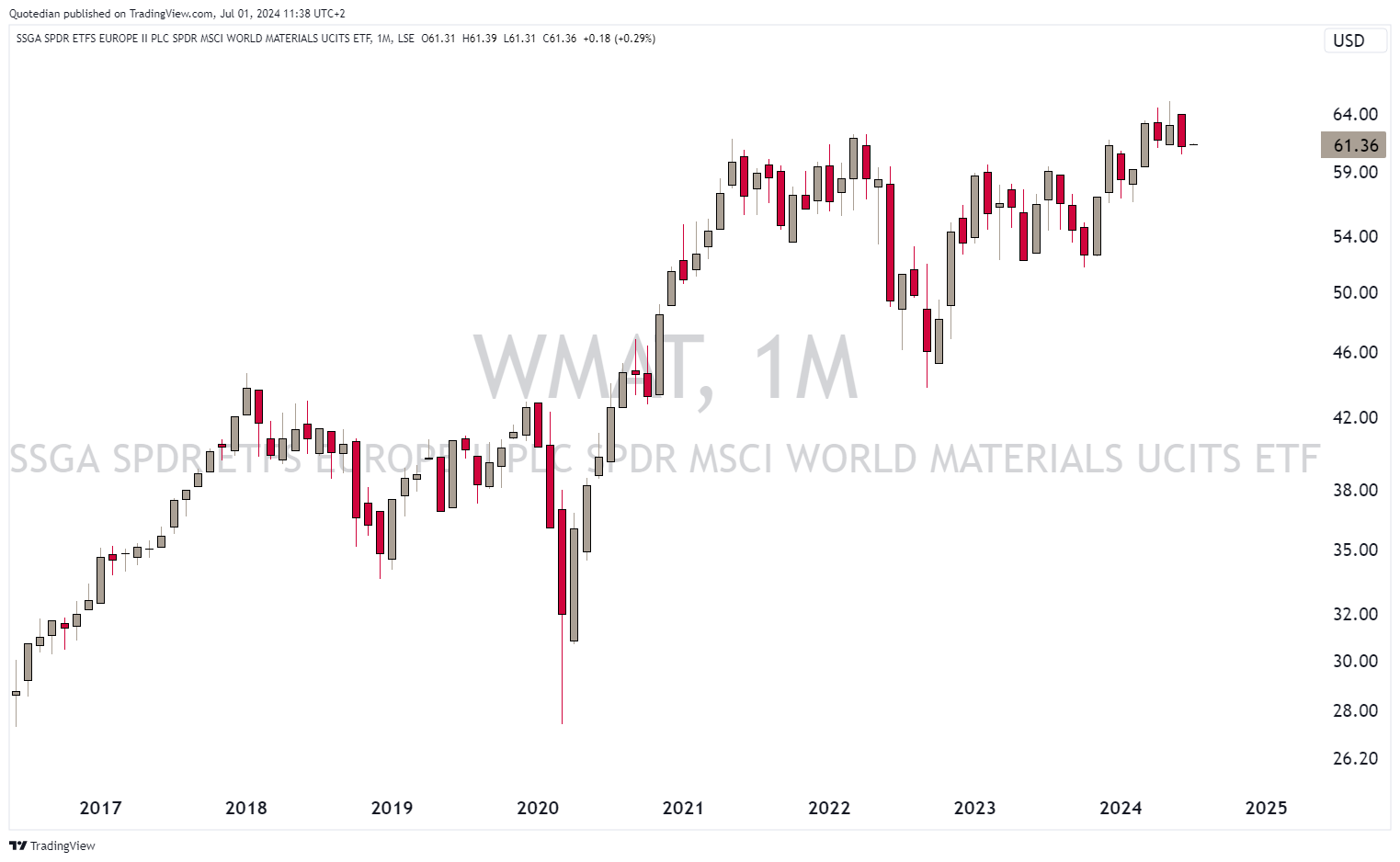
On the losing side, materials stocks seemed to have had a massive down-month (-3.9%), pushing year-to-date performance into negative territory as the rally in commodities faded. Though looking at this sector’s performance on the monthly chart via the SPDR MSCI World Materials ETF, it doesn’t have a bearish feel to it:
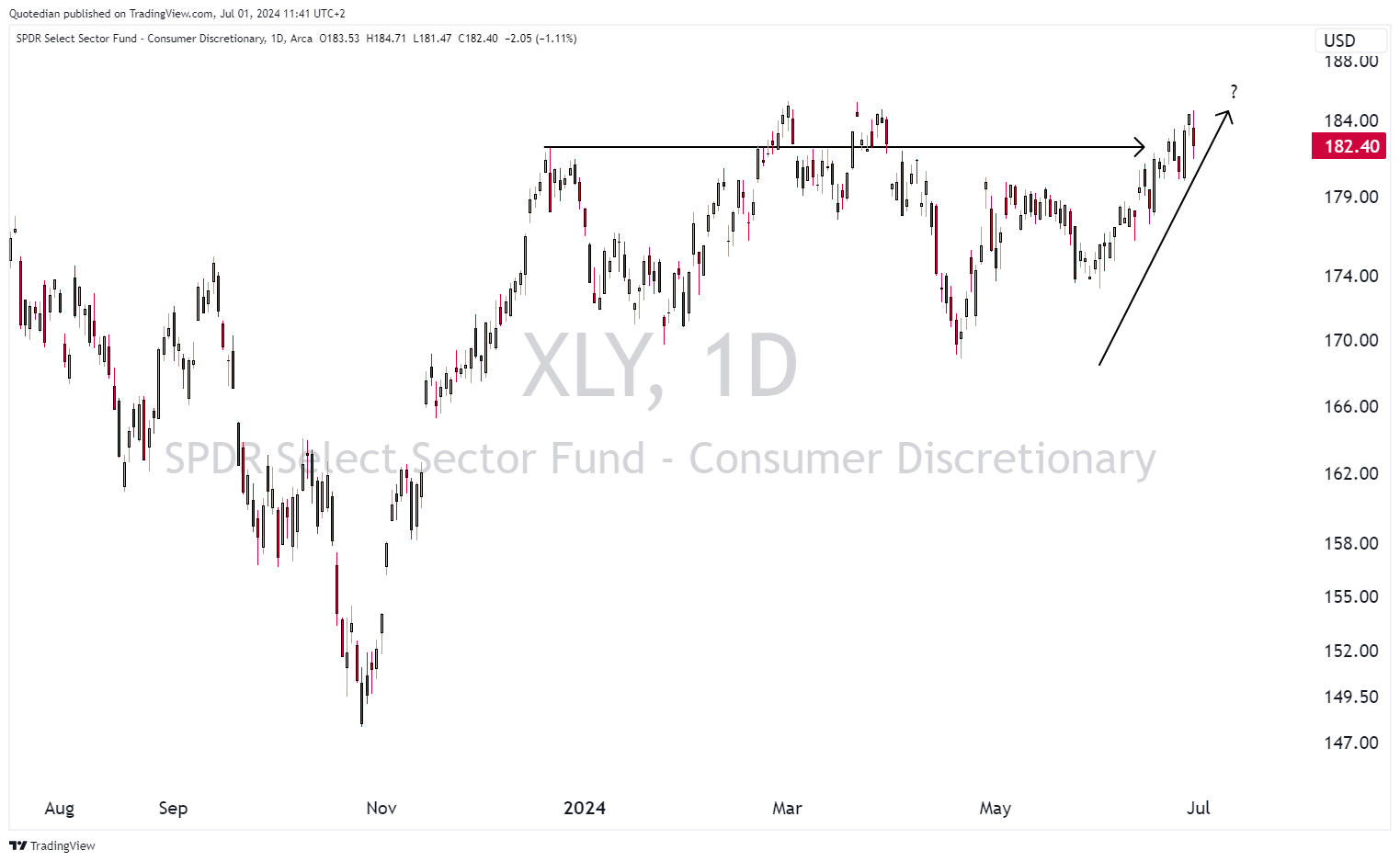
Zooming in on some daily sector charts, we see some that seem ready for a break higher after several months of consolidation.
E.g., discretionary stocks:
Or Health Care:

Or Financials:

and so on …
Simultaneously, cyclical stocks seem to be breaking higher versus defensive shares as the GS US Cyclicals vs Defensives chart below would attest:

Let’s end the equity section, with a look at the best performing stocks and how the have done in June.
Starting with the US list:

Most stocks have continued to propel higher, though Utilities stocks saw some profit taking.
European (stock market AND political) leaders saw a bit a reversion to the mean in June, which fits the benchmark performance picture shown at the beginning of this section:

And with this, we hand over to Bond…


Here is the performance table for fixed income instruments, which quickly reveals that it was a good month for credit risk but not such a good month for interest rate risk:
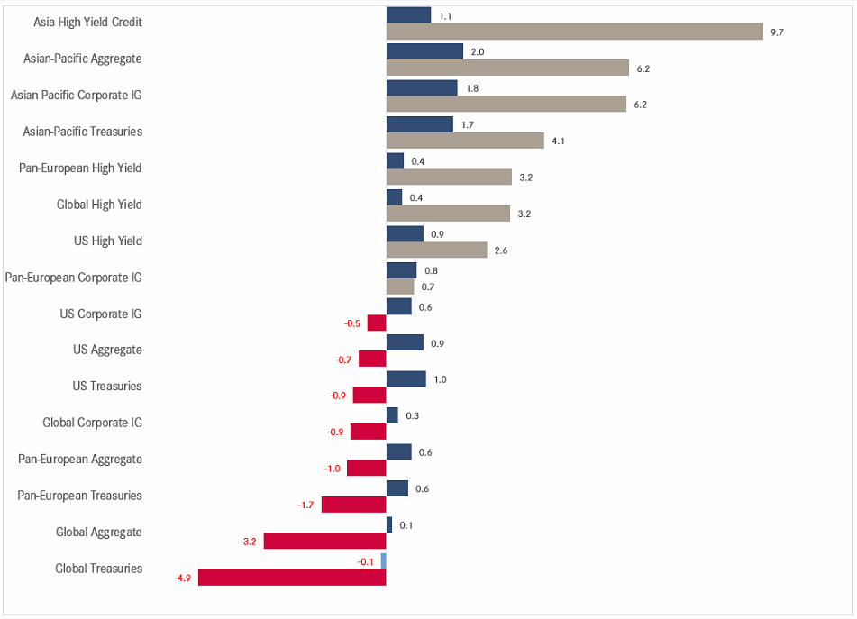
Being anything Asian was also a good proposal in June (and YTD!). Let’s have a quick look at that Asian High Yield index, which of course is coming out of a massive sell-off in 2021 and 2022:

A bit more than half of the loss retraced … more upside should lay ahead for the patient investors.
Whilst US Treasuries yields (Tens below) closed the month lower, they did see a massive 15 bps spike on the last trading day of June (see inset daily graph):

That jump in yields came after two better-than-expected sentiment readings (U. of Michigan Sentiment & Chicago PMI). Overall, our at the beginning of the year “muddle through” scenario seems to be working out pretty well on the rates side:

German yields are also rallying this morning, despite lower inflation readings in most Bundesländer, but amid a stronger manufacturing PMI also reported earlier today. The monthly chart shows a sideways consolidation of more than 18 months now:

The credit spread of French over German bonds is narrowing this morning, as Marie Le Pen won the first round elections, but maybe to a lesser extent than some feared:

Swiss bond yields dropped in June, as the SNB surprised with a second rate cut as outlined in last week’s Quotedian (click here):

Talking of interest rates, here is a recent attempt of mine to show central banking hiking (red) and cutting (green) cycles since early 2020:

Clearly, we have been moving into a easier monetary policy cycle since end of last year, with the exception of Japan, Indonesia and Taiwan which are going the other way and the notable absence of the UK and the US.
Considering the latter of the two (US) for a moment and remembering that the Fed has a dual mandate, full employment (U-3 rate, red) and inflation (core PCE, grey), we could start wondering what the FOMC is waiting for:

Inflation is falling and unemployment rising …

A lot will depend on coming Friday’s NFP number, but I think a finally softer number will give the Fed an excuse to talk dovish at the July 31 FOMC meeting and then to cut at the September 18 meeting. Let’s observe how the cutting probability changes by next Monday:

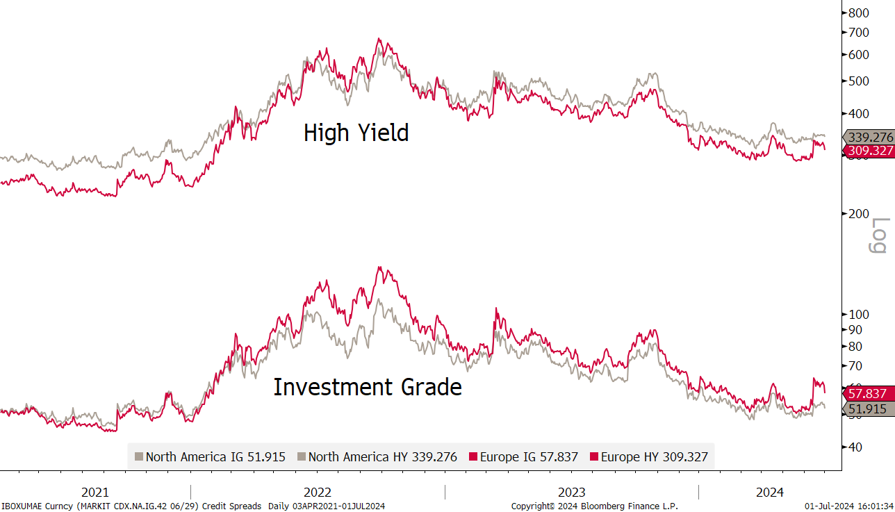
Credit spreads, which had widened in Europe, are normalizing again:

Running strongly behind schedule, it is time to look at some currency performances and charts. Year-to-date, the US Dollar is stronger against basically all other major currencies:

And June was mostly more of the same (notable exception the South African Rand):

On the monthly chart, the EUR/USD cross continues to look awfully uninspiring:

Not so USD/JPY though, which continues to hit multi-decade highs (lows for the JPY):
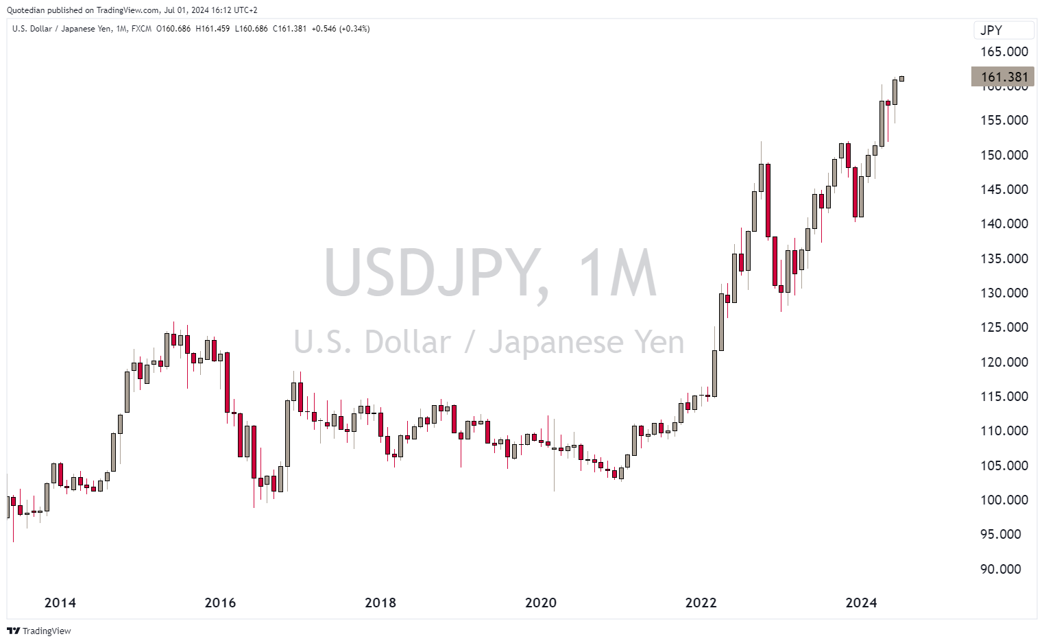
Bank of Japan, where art thou?

Depending which method you take, the Japanese Yen is now 49% (Big Mac), 70% (OECD) or 118% (CPI) undervalued versus the Greenback. Here’s the OECD version:

The EUR/CHF reversed in June and temporarily dropped below 0.95, which was probably one of the main motivations of the SNB to cut rates for a second time:

Ok, a quick glance at cryptocurrency performance before we head over into the commodity section:
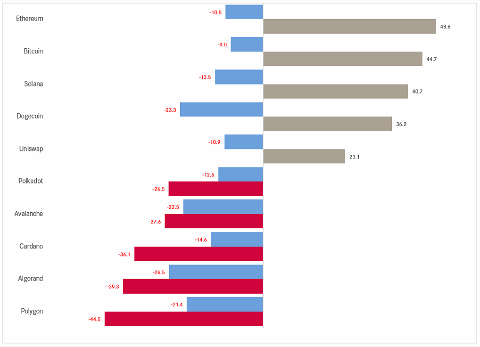
We see a very mixed picture on a year-to-date basis (grey & red bars), but a very unified negative performance for June (blue).
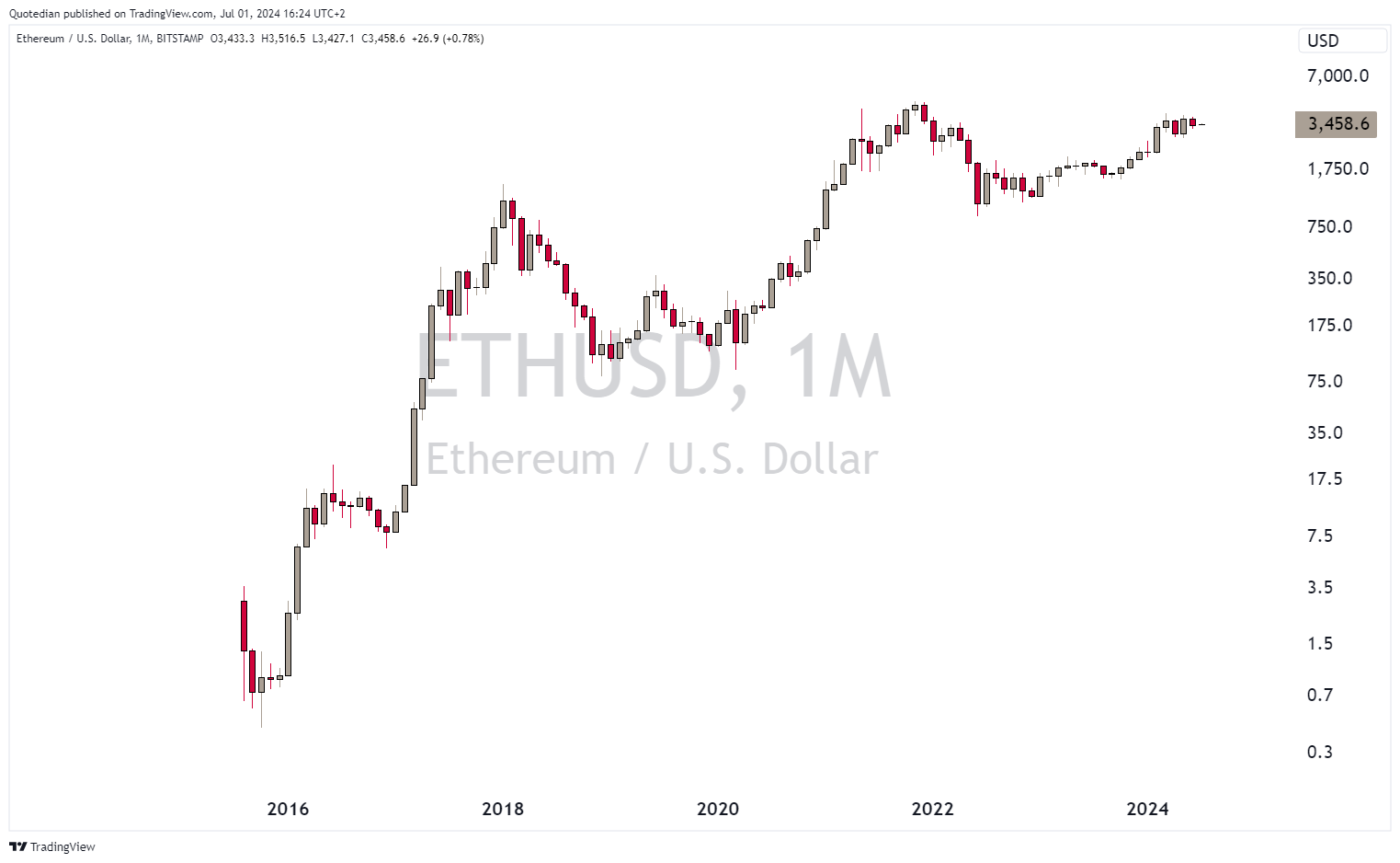
Putting the current “correction” into a monthly candle chart, changes the perspective substantially. Here’s Bitcoin:

Ethereum has probably the most constructive chart:

Let’s start the section with a quick glance at segment performance:

Nobody seems to eat grains (Soybean, Corn, Wheat) anymore.
Let’s drill down a bit further by looking at some popular commodity futures markets:

Hhhmm indeed the various grains down double-digit, while lean hogs (bacon) is up over 30%. Are people too optimistic about the Mounjaro/Wegovy effect?

Let’s have a look at gold now, which is consolidating at a high level, but continue to look bullish as long as >$2,000:

As mentioned a week ago, even a drop below key support at 2,280 and subsequent correction to 2,160 would not endanger the longer-term uptrend.
Copper has stalled at key resistance on the monthly chart,

but could be turning higher again now, looking at the daily chart:

Not a lot to read on the monthly chart of crude (Brent):

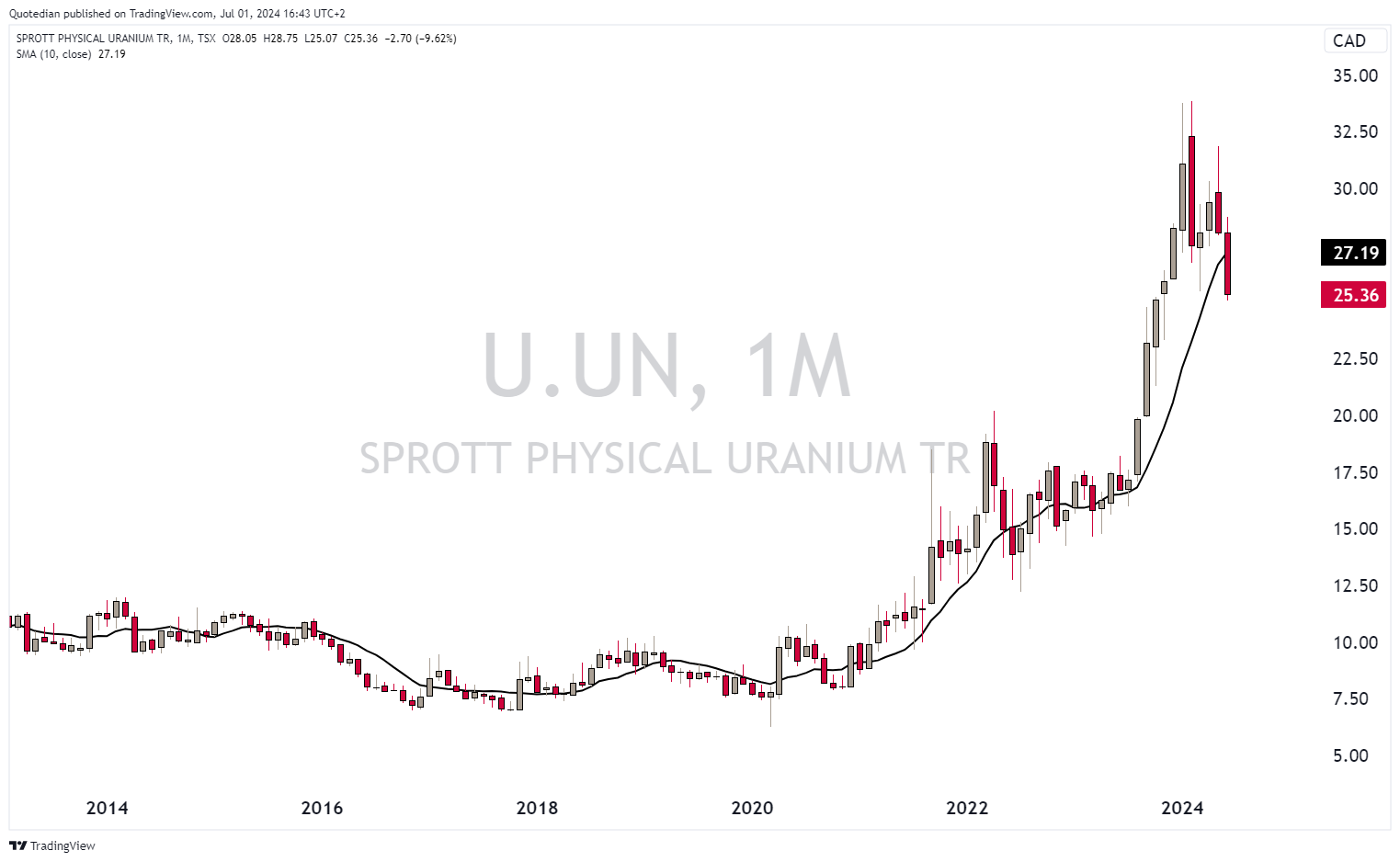
Uranium prices (via the Sprott Physical Uranium ETF) have been falling and are now below their 10-month moving average:
And finally, Avocado prices, in case you were wondering, are up according to their usual seasonal strength, but the swings are seemingly becoming wider:


Ok, time to hit the send button. Please as usual, make that small effort and click on “LIKE” at the bottom of the page. My gratitude shall be granted!
Have a great week,
André

Everything in this document is for educational purposes only (FEPO)
Nothing in this document should be considered investment advice
The views expressed in this document may differ from the views published by Neue Private Bank AG
Past performance is hopefully no indication of future performance