


“There are three kinds of lies: lies, damned lies, and statistics.”
— Benjamin Disraeli

This week’s letter will be shorter than usual (no need to thank me 😏) as I am in full preparation mode for our Quarterly Investment Committee meeting in a few days, the outcome of which I hopefully will be able to share with you next week.
Hence, today’s letter will hold some statistical end-of-month (September) tables and a potpourri of charts I stumbled over and found interesting enough to share.
But just before, a truly important poll, to which I ask all of you for your kind participation.
Over the past two years or so, I have been splitting the Quotedian between its weekly version (www.thequotedian.com) and a ‘daily’ issue (www.quicq.ch). Please let me know if we should continue with this split, or if you prefer bringing it back to one publication again:
Ok, onwards…
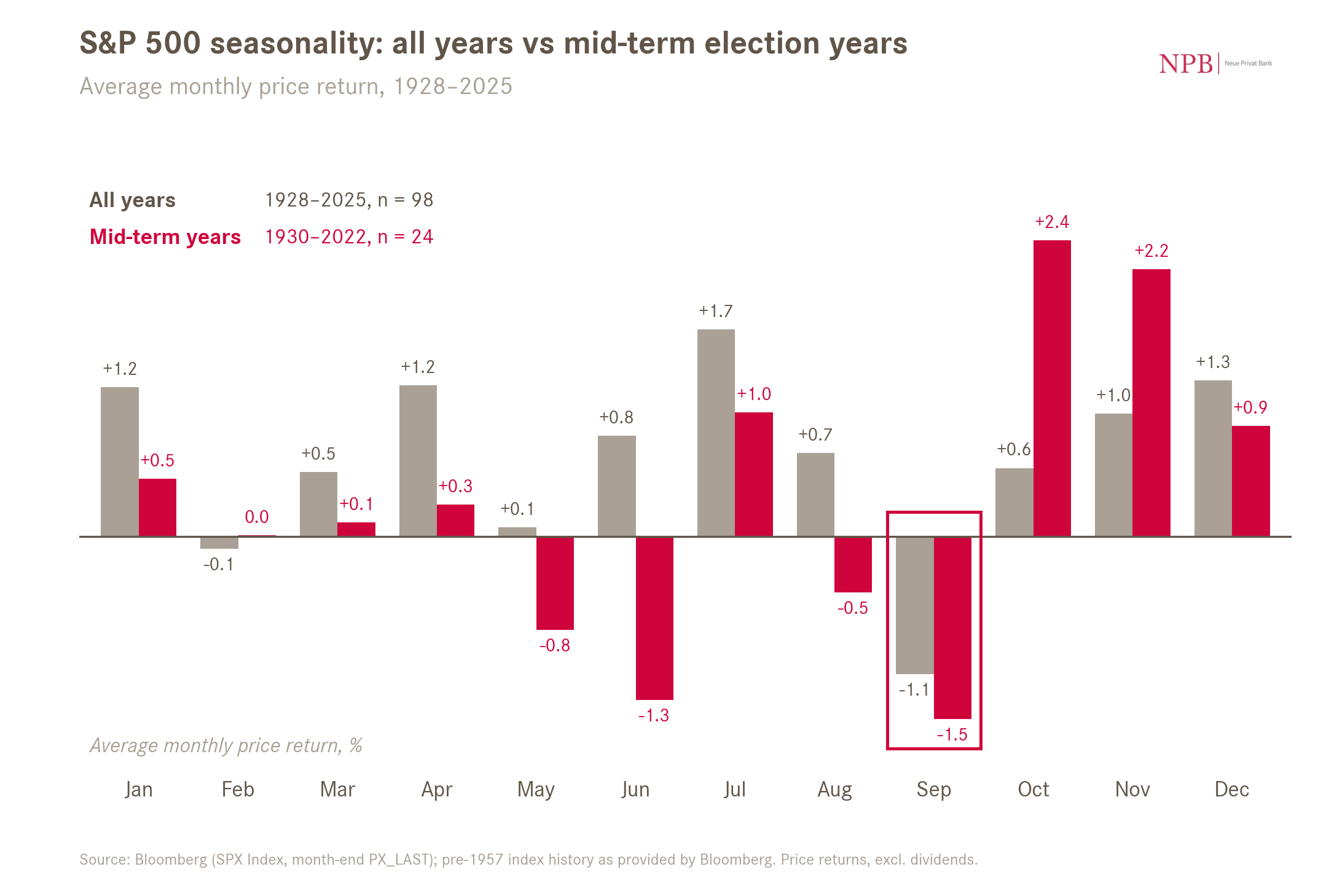
Starting with equities, September should have been rocky, especially in mid-term election year:
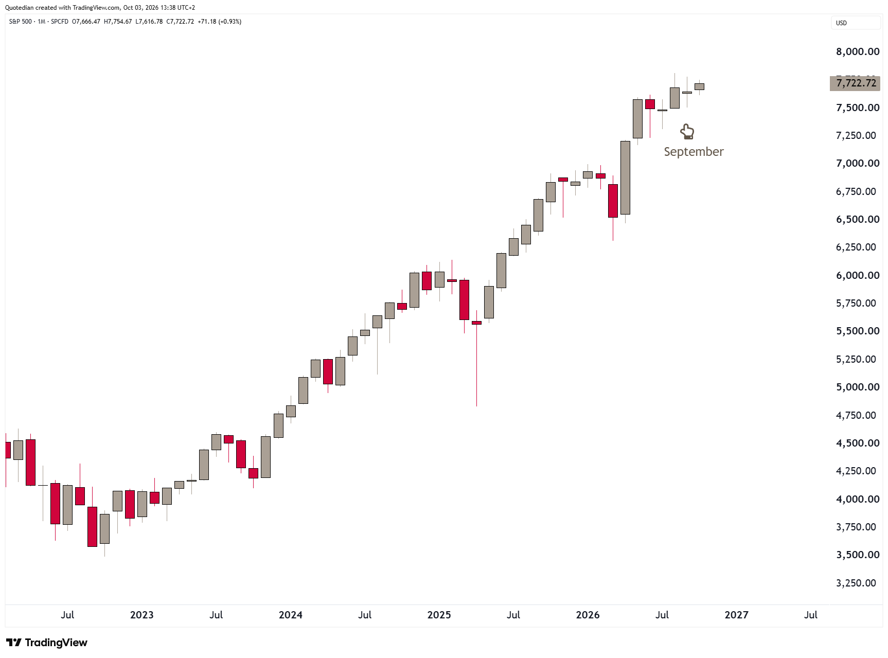
But, hey, what happened here? The S&P was actually flat on the month:
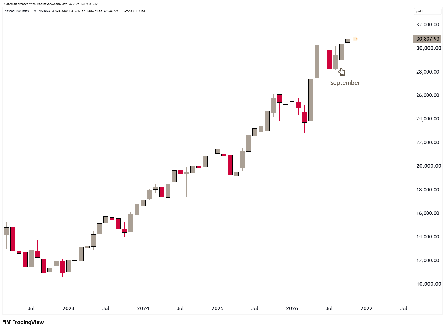
And the Nasdaq-100 even advance more than three percent, closing the month at a new all-time high:
This of course reminds us immediately of the story of a man who was six feet tall drowned crossing a river that was, on average, only five feet deep.
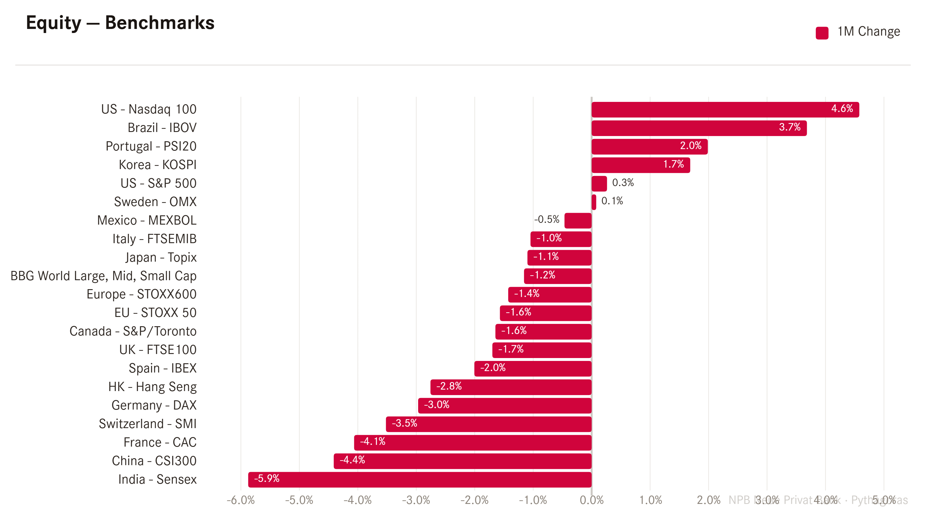
The reality, most global investors ‘felt’, was quite different:
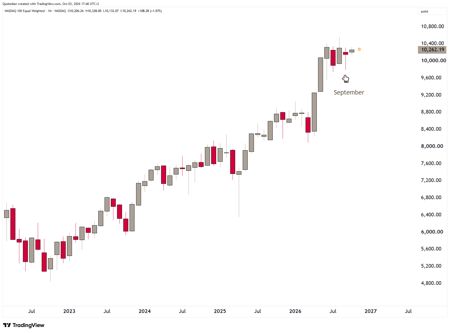
And more so, when checking in on the two previously highlighted indices in their equal-weight version, the picture suddenly changes.
The Nasdaq for example was not up 3%-plus, but rather small down:
And the S&P 500, instead of being flattish, gave back a full five percent and closed the month at the lows:
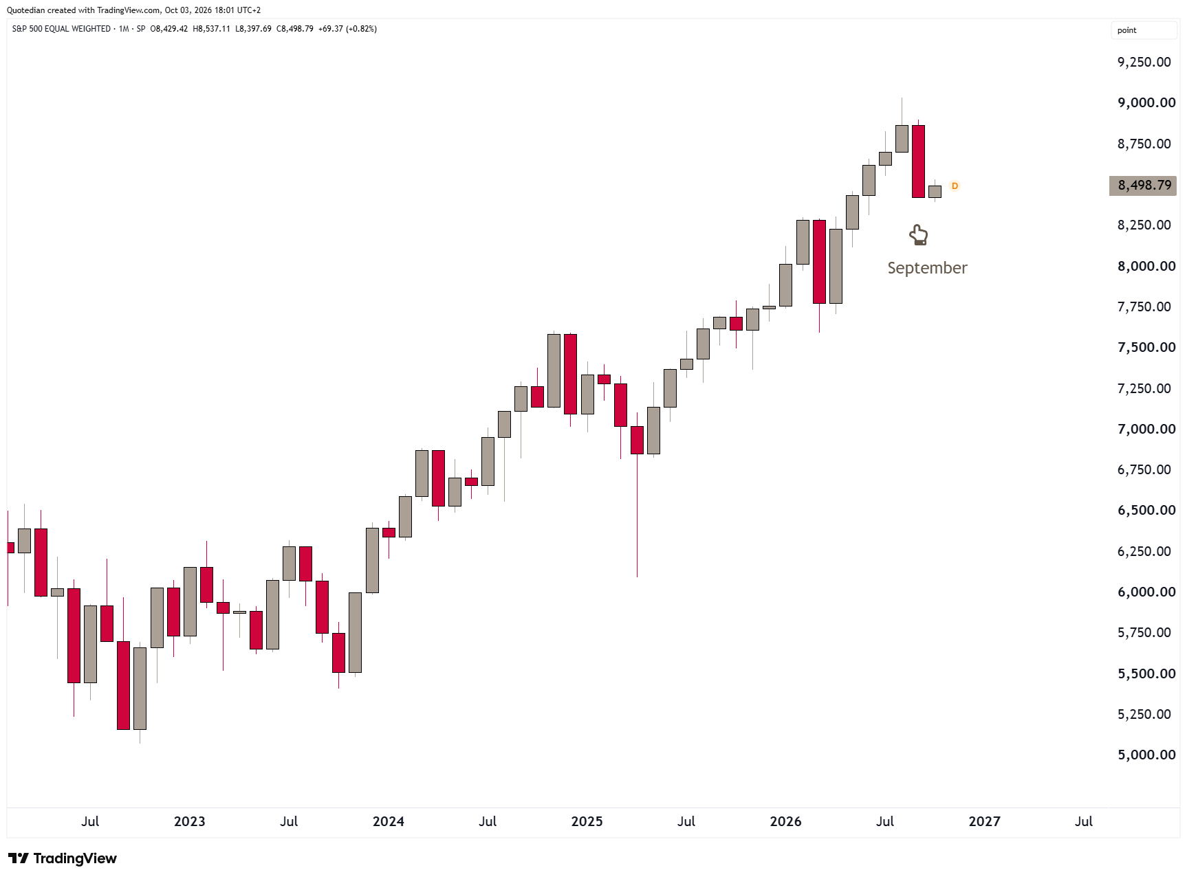
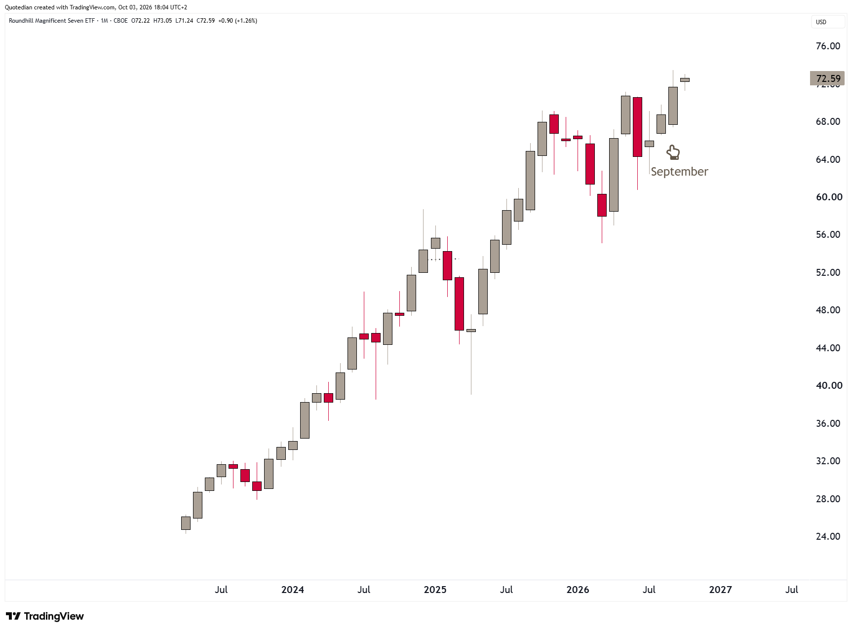
In other words, once again, it was only the largest cap stocks that pulled the market higher, and if you had a well-diversified portfolio, that probably did not pay off. Here’s the monthly chart of the Magnificent Seven:
The big mover of the month were of course interest rates, which we will discuss in a moment. But one direct victim of interest rates were small cap stocks (Russell 2000 below), which per se tend to have a higher level of debt and hence are more impacted by changes in rates:
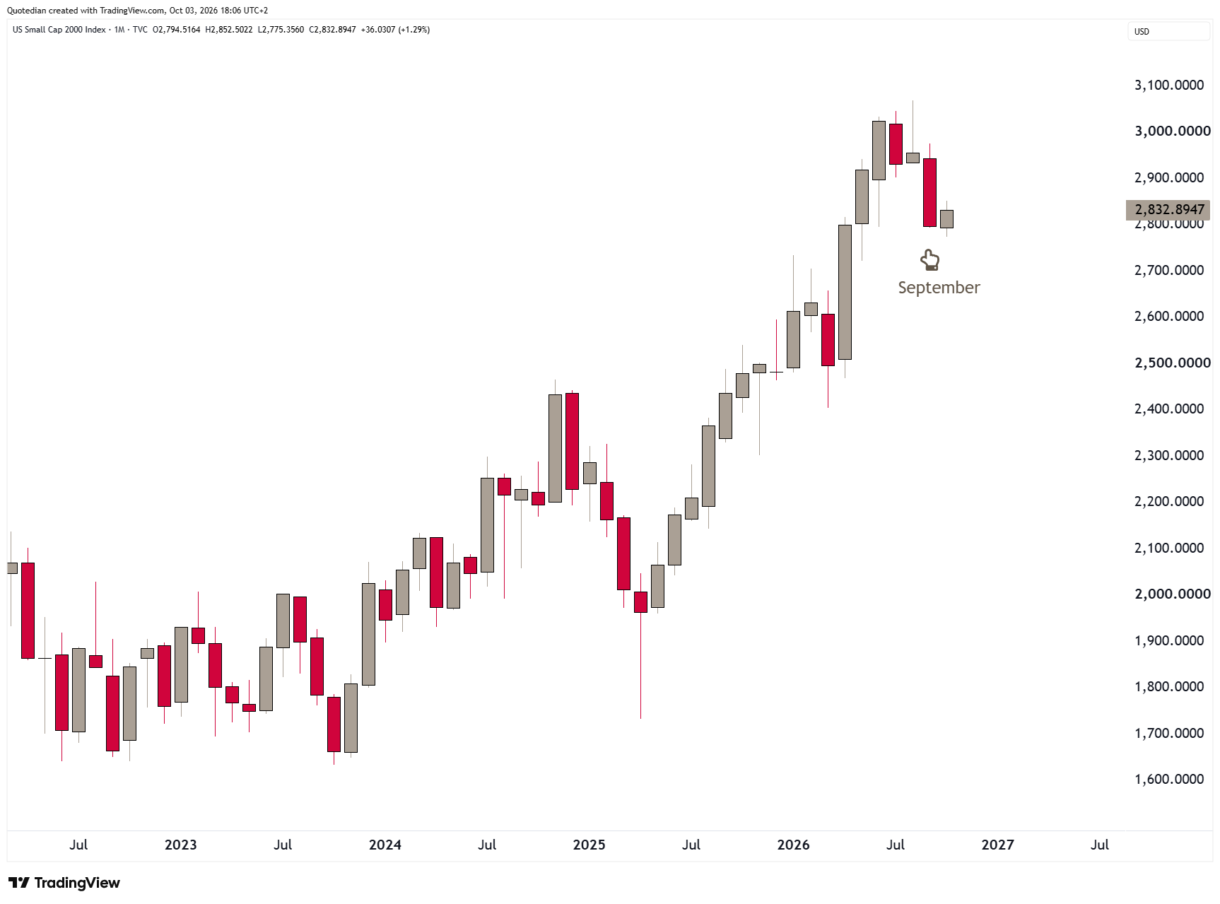
Less than 500 stocks out of the 2,000 closed higher on the month, meaning more than three quarters of the index trended lower.
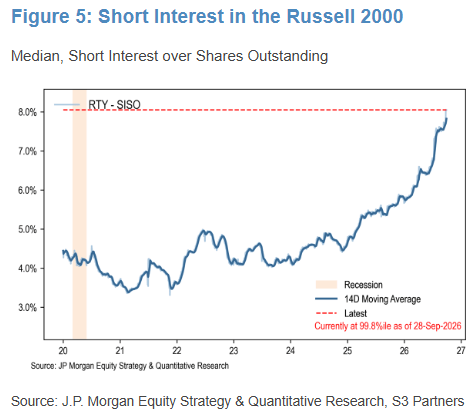
It is then interesting to observe that the short interest in the Russell 2000 is at its highest since the beginning of this decade, according to this chart created by JP Morgan:
Also very interesting, when we create an equal-weight index of interest rate-sensitive sectors in the US (Financials, Staples, Utilities, Real Estate), we note that it is at oversold levels, which in the past were good moments to enter at least for a short-term countertrend rally:
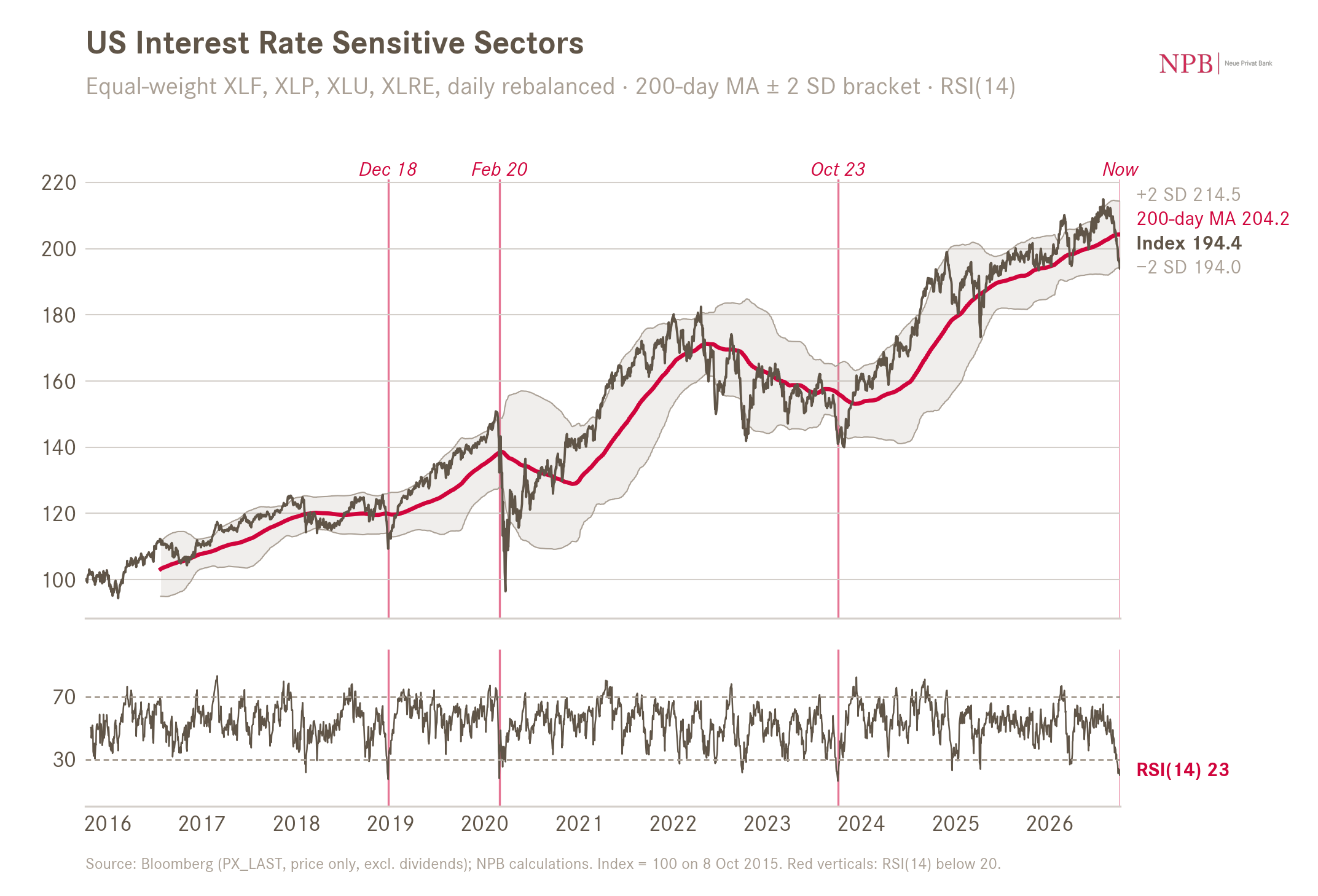
Worth a try? Probably.
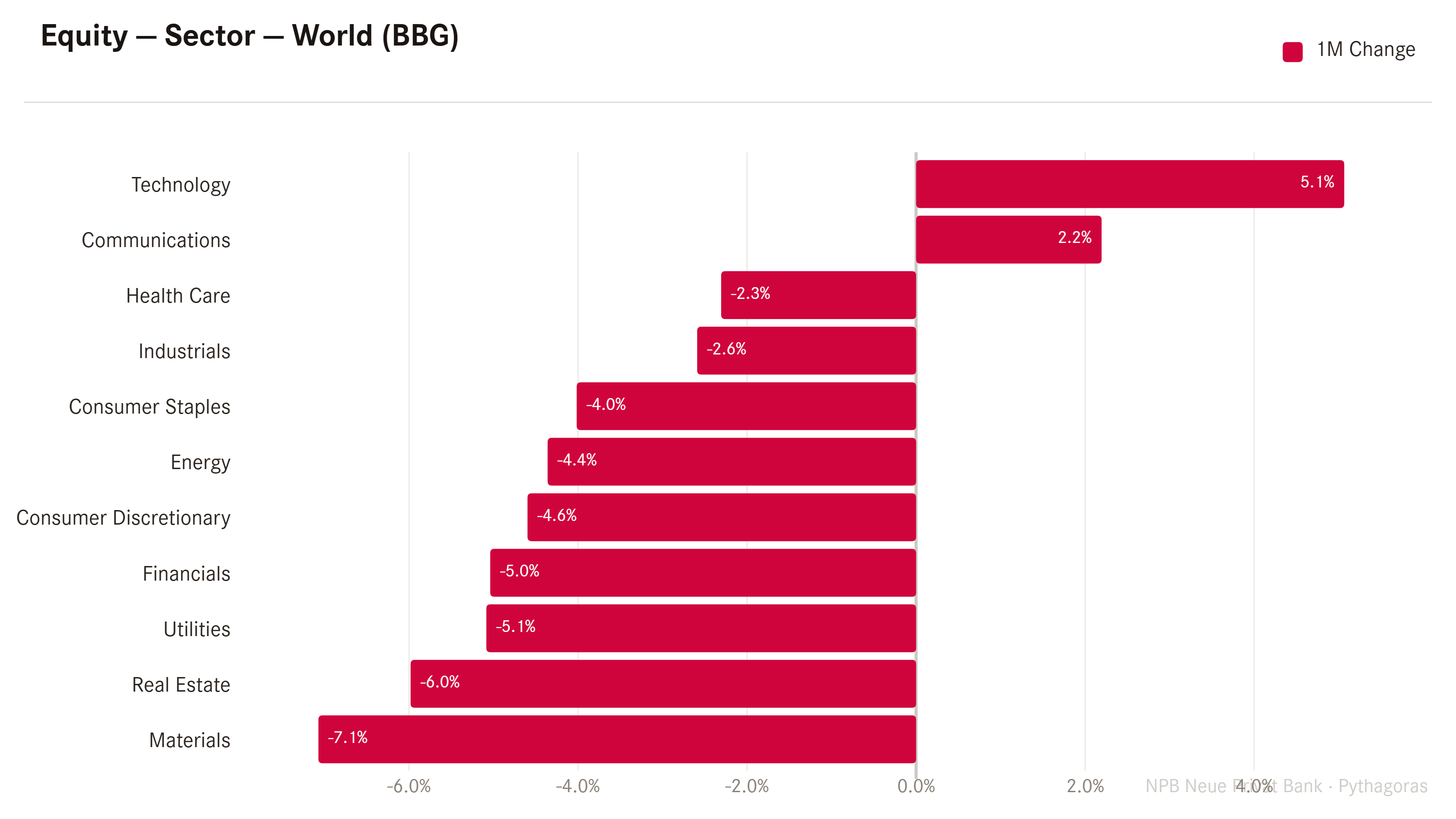
As we are talking sectors anyway, here are the global sector performances for September, carrying little surprise in terms of the positive sectors:
This year, energy stocks (SPDR Energy Select ETF - XLE - red) have served well as a hedge to the sell-off in bond markets (iShares 20+ year Treasury Bond ETF - TLT - grey):
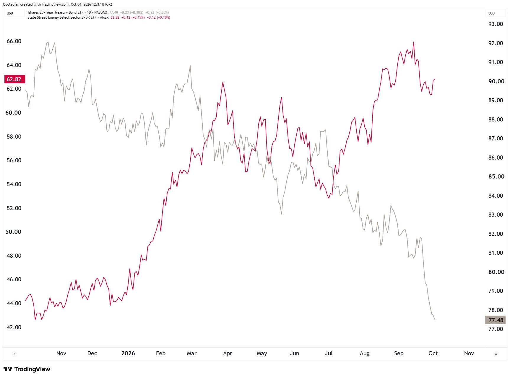
Which in other words mean that yields have moved in lock-step with energy stocks:
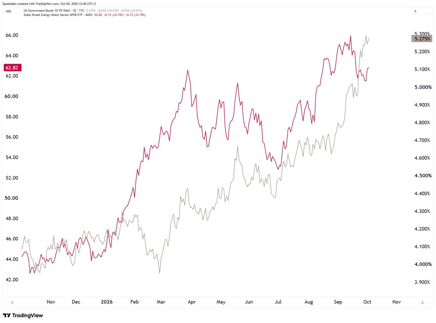
However, this correlation may have found its end now, when focusing on the last few weeks:
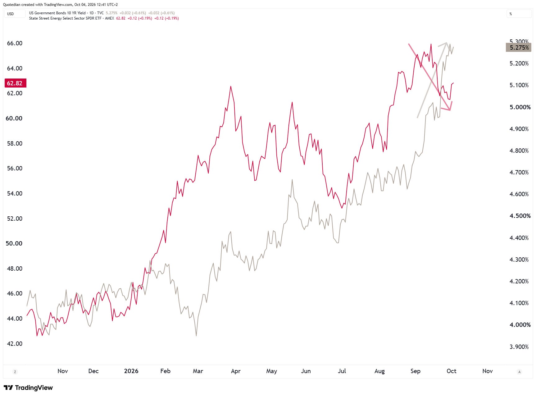
Which means that bond yields are not moving higher due to elevated energy prices now, but probably rather due to solid economic growth:
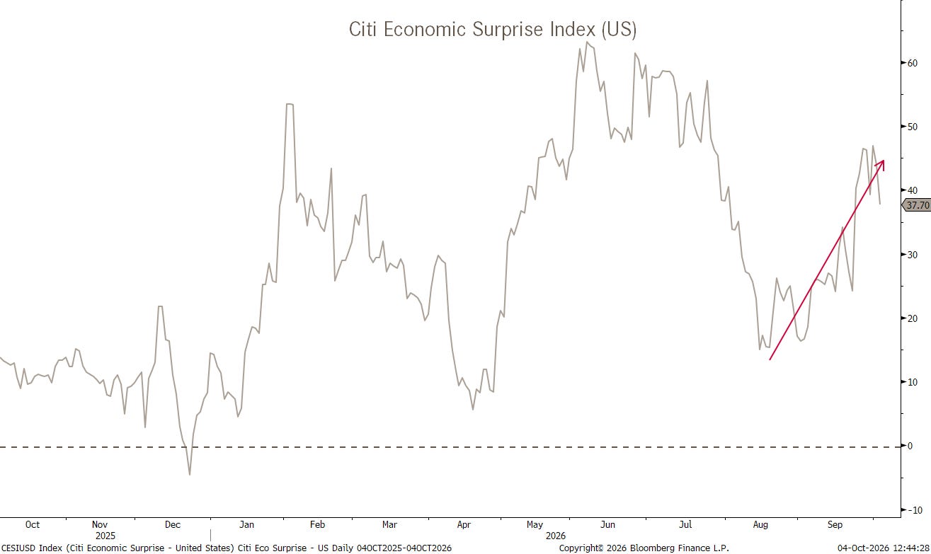
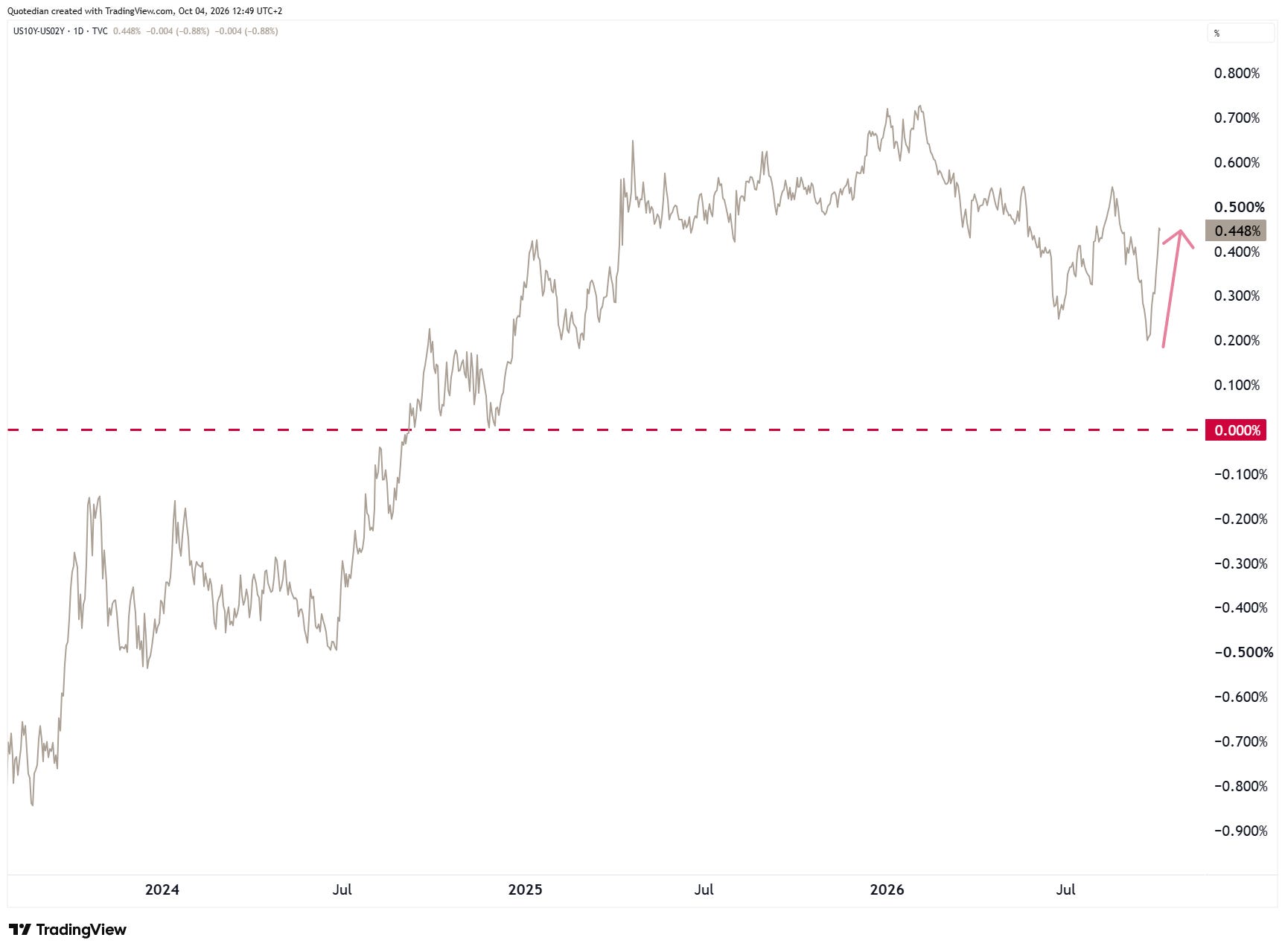
Having said that, last week’s economic data was a tad softer than expected, helping to bring down market expectation of future rate hikes at least a little bit:
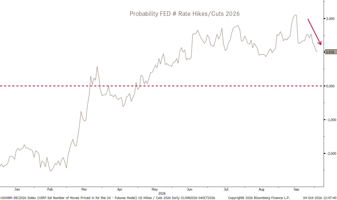
This in turn has led to a re-steepening of the yield curve (10y-2y):
Staying on government bond yields for a moment, nous devons parler de la France…
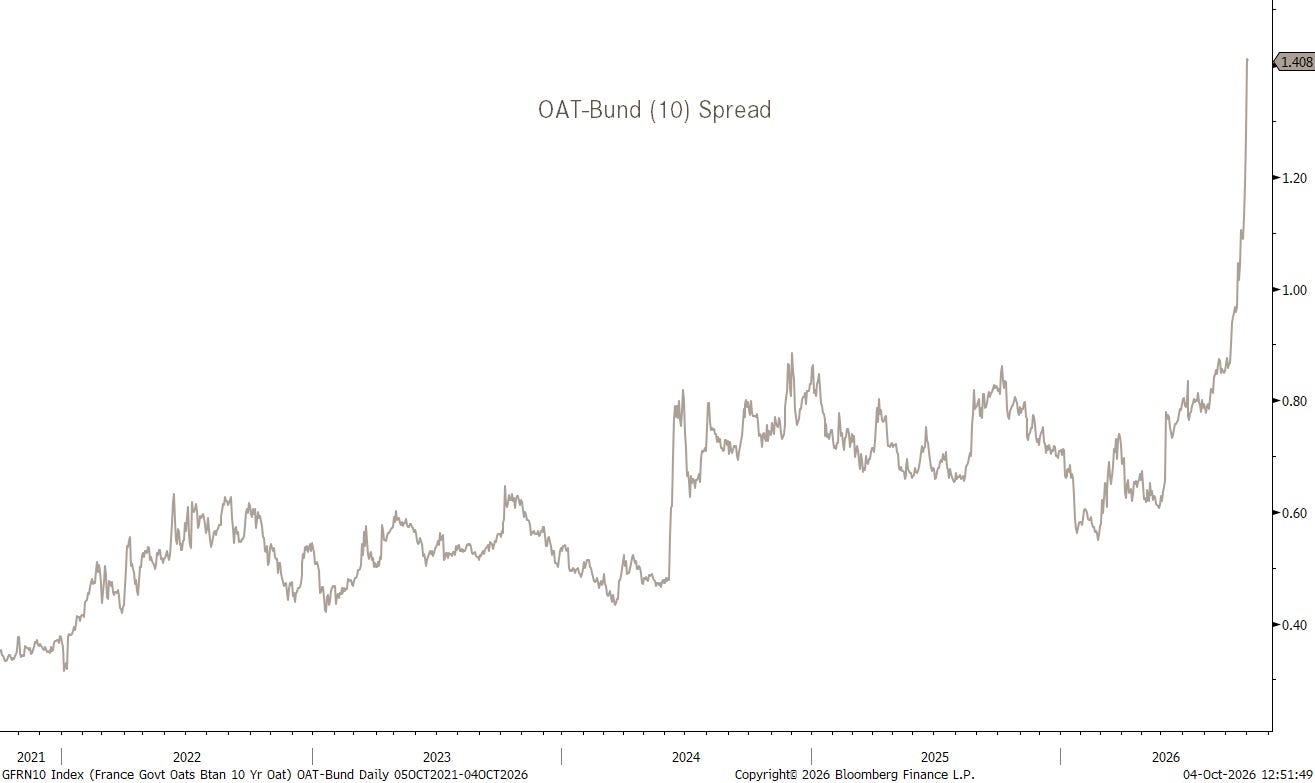
Not good!
Zooming out on the same chart reveals the extent of the disaster:
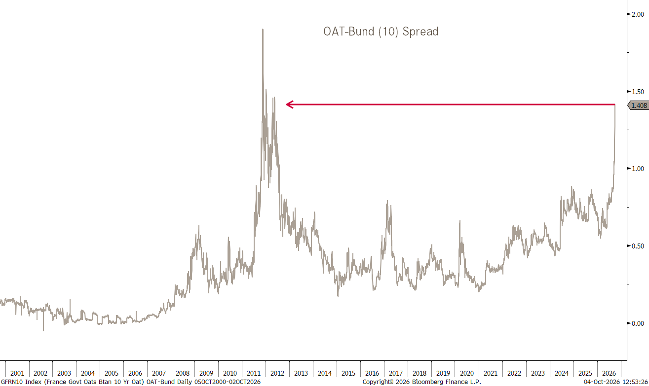
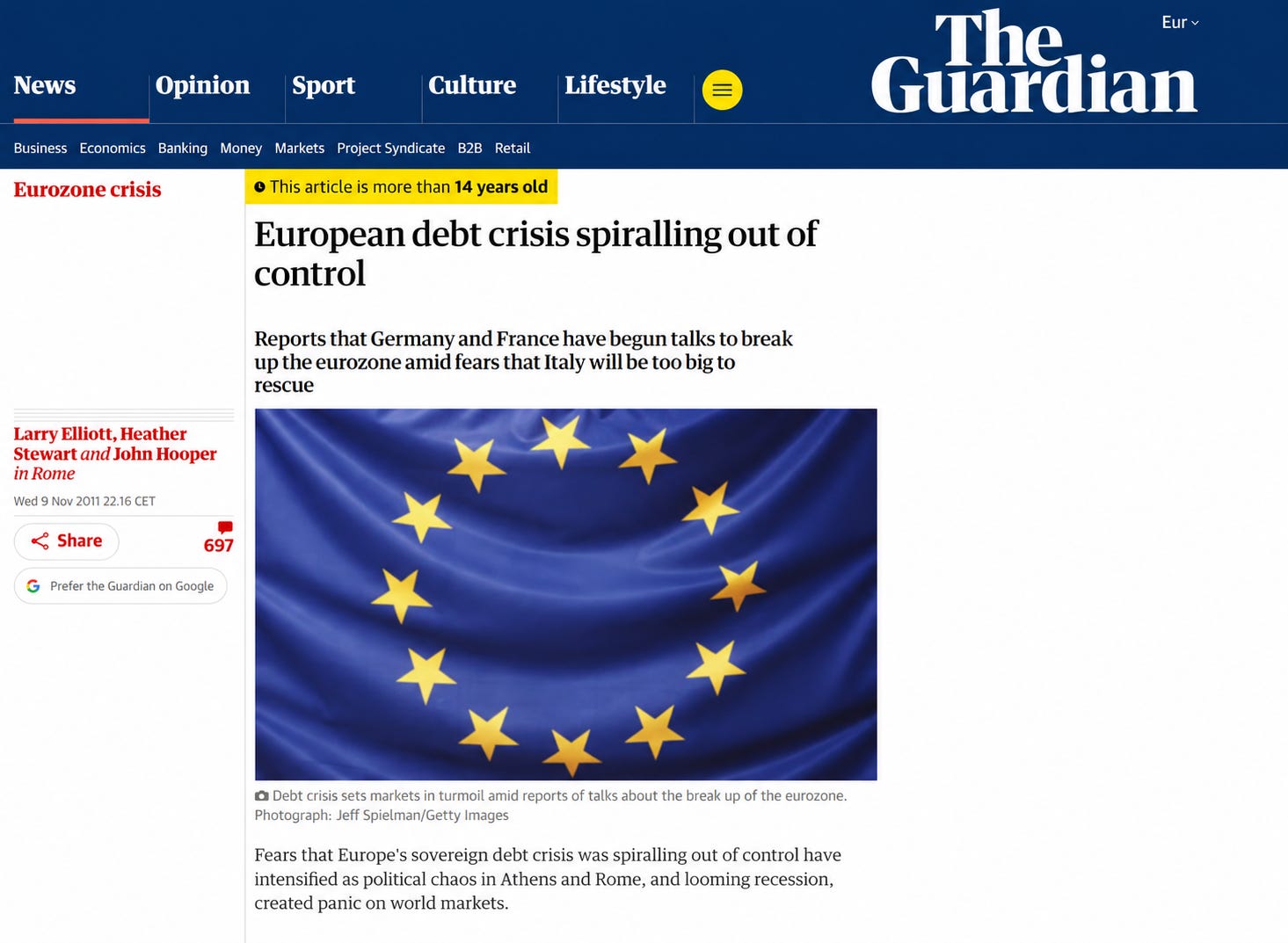
2011 levels. Remember 2011? This was the story:
Hence, the falling EUR/USD cross rate is probably not purely to a strengthening US Dollar anymore:
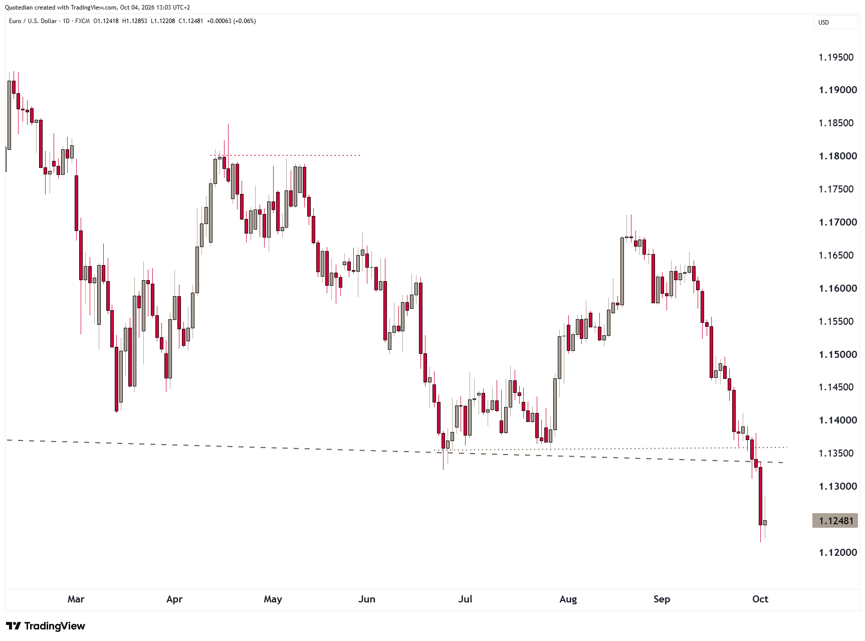
The break below 1.1330 forces us (me) to review our (my) bullish outlook on the currency pair, as the danger to a deeper sell-off into the 1.07 range has increased massively:

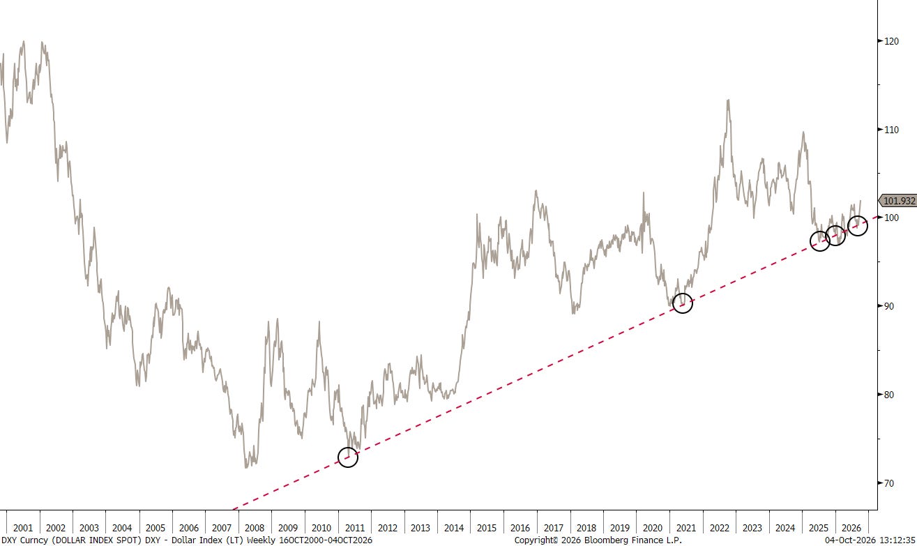
Amazingly Annoyingly, that trendline on the US Dollar Index (DXY) has held up well:
Even more amazingly annoyingly, we just should have followed this chart, which compares the current, second Trump term of the US Dollar to his first one:
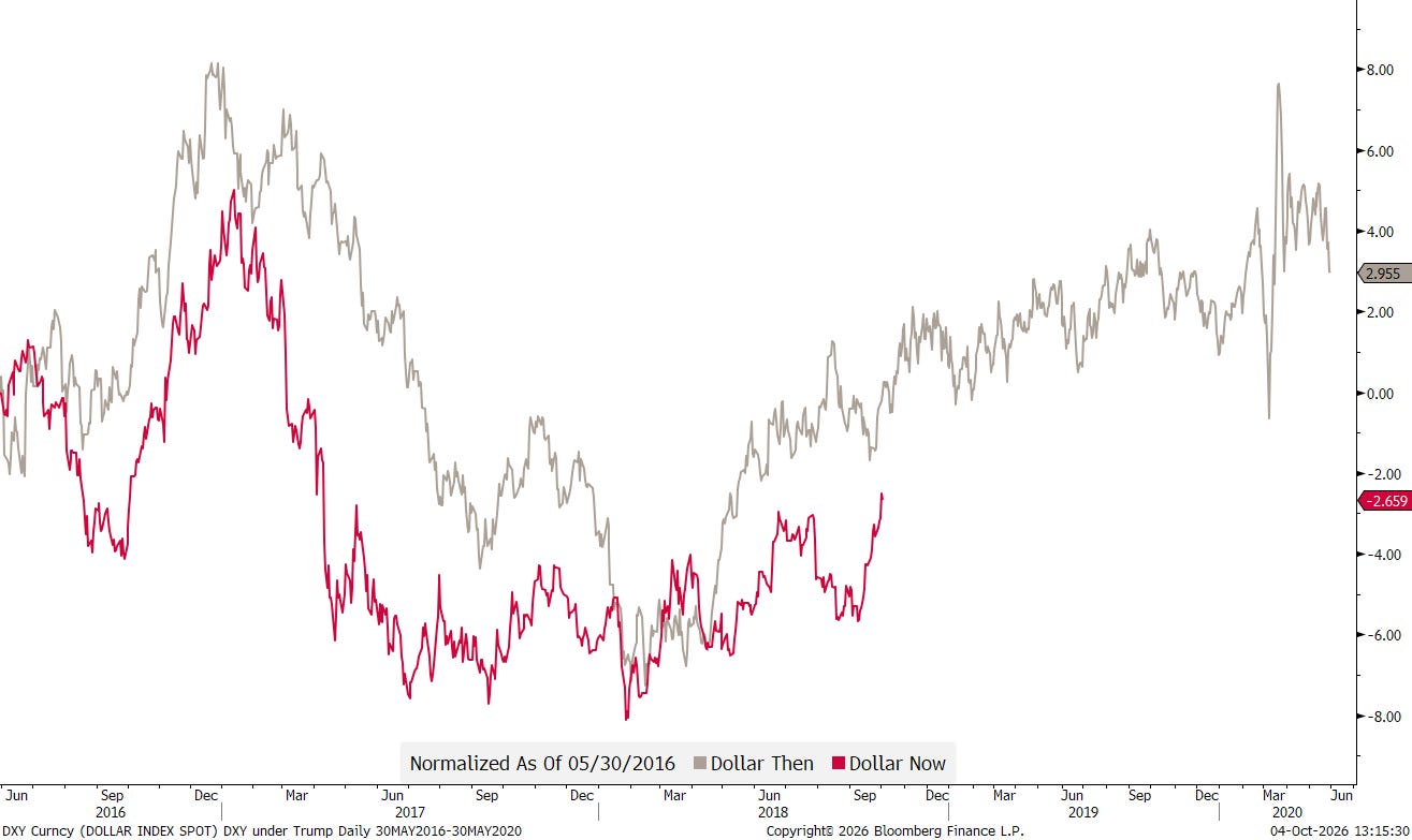
Sometimes, it’s just easy …
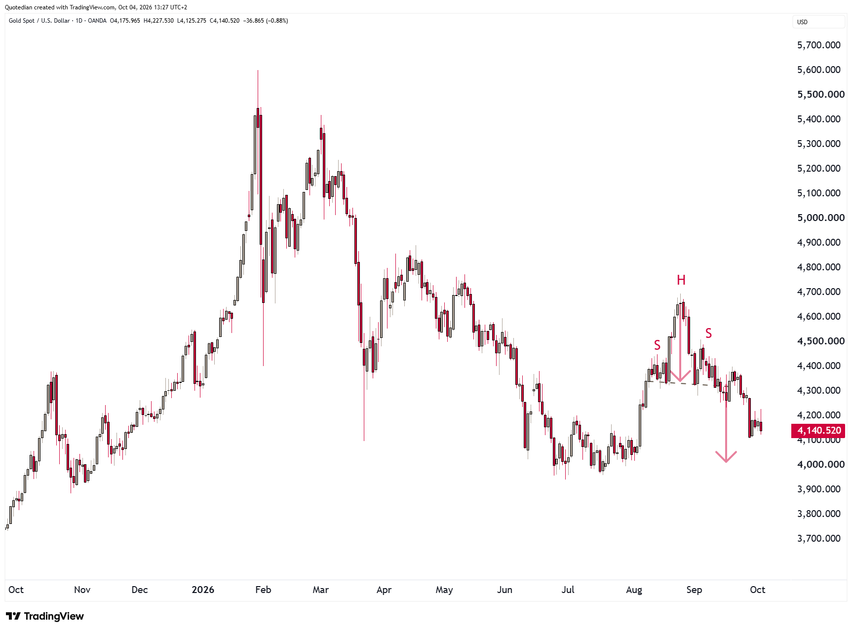
The Dollar strength is also pushing Gold, Silver and other precious metals lower. All of them show negative YTD performance now:
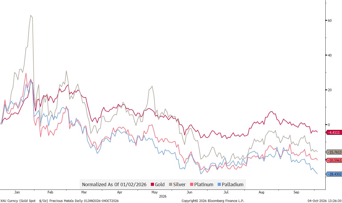
Gold seems poised to fall back to the $4,000 mark:
So perhaps September really could have been worse. The indices survived, after all. But breadth collapsed, small caps suffered, bonds were battered, sovereign risk resurfaced and the Dollar broke higher. As our unfortunate six-foot gentleman discovered, averages can be comforting right up until you step into the deep end.
That’s all for this week - as mentioned, keep an eye out for our quarterly investment outlook, due sometime later this week.
May the Trend be with You!
André

The Important One:
Everything in this document is for educational purposes only (FEPO)
Nothing in this document should be considered investment advice
Investing real money can be costly; don’t do stupid shit
Leave politics at the door—markets don’t care.
Past performance is hopefully no indication of future performance
The views expressed in this document may differ from the views published by NPB Neue Privat Bank AG
The Legal One: