Macro Rules!
The Quotedian - Vol VI, Issue 65 | Powered by NPB Neue Privat Bank AG
“And Summer's lease hath all too short a date”
— William Shakespeare, Sonnet 18
Actually, today’s title does NOT refer to computer programs or Excel macros, but rather to fact that August, at least the first half, was a return to markets driven by macro events.
To resume, macro events had been absent for the larger part of a decade, courtesy of central banks constant (QE) interventions. Comes 2022 and the announced end of QE and maybe even the promise of some QT and suddenly yields, FX & co all mattered again. Then comes 2023, and puff, it’s all about the equity FOMO and YOLO again.
But a series of events (BOJ’s beginning of the end to YCC (Yield Curve Control), Fitch’s US debt downgrade, the Treasuries announcement of longer-duration issuances) made interest rates and FX matter again and have an influence on equities —> Macro!
Let’s see if this more “normal behaviour” environment prevails, or it’s all just back to dart throwing…
Looking for some of the best macro-thinking in town?
Contact us at ahuwiler@npb-bank.ch
So, without (hardly any) further ado, let’s get to the wrap-up of the month just gone by and check where financial markets stand in terms of performance and the longer-term, monthly charts. As a quick reminder, thick bars are the month-to-date (MTD) %-performances, while the finer, semi-transparent bars represent year-to-date (YTD) %-performances.
Off we go…
[This will be a longer-than-usual read, so why not put some music about August in the background for company]
A quick glance at the performance map of some of the closest followed equity benchmarks around the globe reveals that August has lived up to its reputation as a difficult month, with all but one (PSI20) giving back some of their decent YTD gains:
Some ‘things’ stick out immediately:
The weakest markets on a YTD basis (China & HK) were also the weakest in August
Ignoring the small Portuguese market for a moment (Desculpe!), some of the strongest markets on a YTD basis (e.g. Nasdaq, Japan) held up best in sextilis
UK’s FTSE-100 3.4% drop in August takes the index into negative territory on a YTD-basis, joining only Chinese and Hong Kong stocks to “achieve” that
The S&P 500, was down 1.8% after four consecutive up months, but up over four percent from the intra-month low
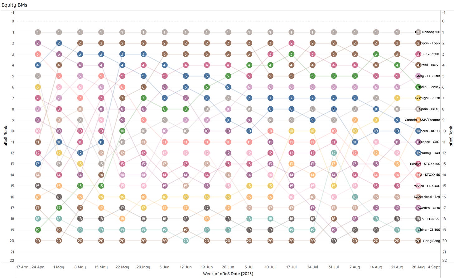
Our momentum-based ranking model (aReS) then holds little surprise to what is top-ranked (Nasdaq & Topix) and what makes up the weakest part (CSI300 & HSI):
As a reminder, each dot represents the weekly ranking of the indices depicted on the right-hand side, with the chart above looking back about four months. E.g., since April, the Nasdaq has been the best place to invest in, whilst for example, Germany’s DAX index has been falling in ranks, as it got stuck at the 16,000 level:
Time to look at some monthly charts!
Starting with the S&P 500, the monthly chart reveals a bullish AND a bearish future from a TA (technical analysis) point of view:
Bullish: The move from the COVID lows into the 2021 top could be interpreted as a pole, with the correction into October 2022 being the flag. TA would dictate a price target of approximately 5,800 (+28%) from here.
Bearish: The last candle (August ‘23) is in Japanese Tealeaf Candlestick reading called a ‘Hanging Man’ and is interpreted as a sign of a waning bull market.
Not out of convenience (or maybe just a little bit) I think I will stick with the bull case…
The next monthly chart, the Nasdaq 100, I will throw onto a log scale, just to avoid any cases of vertigo in my loyal readership:
I will also not calculate the theoretical price target from the hypothetical pole-flag-pole pattern, but it’s … higher … much higher …
European stocks (SXXP), whilst seemingly going for a bullish resolute, seem so “stuck” with their 15% advance since … 2007!
I am not being fair by not counting in (taxed) dividends, but in pure price advance, that’s less than 1 percent per annum…
Let’s turn to Asia, and look at one of its worst performers, China Mainland’s CSI300, first:
Grasping at straws, maybe (x3) there is a point to be made for a looming inverted shoulder-head-shoulder pattern.
Let’s compare this with one of the best-performing Asian markets … India!
Verdict: Not stuck!
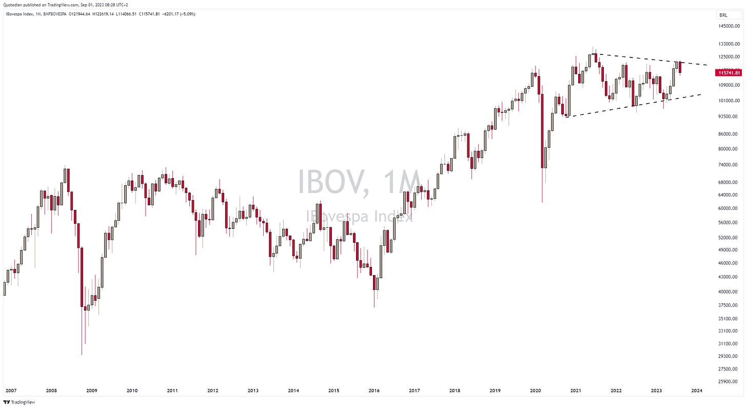
Let’s look at one more chart out of Latin America, namely Brazil’s Bovespa index:
It has been a wild, but sideways stuck, up and down for Brazilian equity, but the further we move into the apex, the more likely a (upside?)resolution will come. Nearly there now…
Ok, the time has come to review global sector performance, which unsurprisingly reflects a negative MTD, put a positive YTD picture:
Similarly, as the benchmark indices further up, the strong YTD-performers (Technology, Communications) gave back relatively little in August, whilst already weak performing sectors (Utilities, Real Estate) added to their woes. One stand-out would be materials, which gave back more than half of their YTD-gains and was the second weakest sector (China related?).
The sector holding up best in August, but showing a relatively weak YTD performance, was Energy. As mentioned several times over the past weeks and last time on Thursday in “Energy is Life”, energy stocks are currently one of our favourite segments. The resilience in August catapulted the sector up on our relative rat-race table:
As a general sectorial observation, cyclicals seem to have restarted their relative outperformance path versus defensive sectors, which is, of course, constructive for the entire equity asset class (investors are not hiding in defensive as they did from December 21 to December 22:
Last but not least, to finish the equity section, let’s look at the best-performing stocks in Europe and the US. In the past, we used to look at the top 25 stocks on a YTD basis and checked their fortune over the past five trading days. This time around we will still look at the top YTD performers, but see how they have behaved during the month just gone by.
Let’s start with European shares:
Given the weak performance of the Footsie, it is surprising to see four UK stocks in the top 10. Otherwise, defence and semiconductor stocks continue their outperformance.
Now let’s turn to US top performers:
Nearly 240% for NVDA, FFS (excuse my French)! The sector dominance of the top performers comes as little surprise.
BUT, what really caught my attention on both tables, is that during the weak month of August for stocks, a vast majority of the top performers have continued to show positive performance contribution.
This reminds me of #2 of my top 5 investing principles:
“Strength begets strength”
Time to hit the bond trading floor and check out what has been going on there:
Monthly performance reflects well the various narratives that have been taking place in August:
Asian High Yields suffered under a new wave of sell-offs in the Chinese real estate sector
Treasury bond prices softened under a higher interest rate regime
High-yield bonds (ex-Asia) and investment-grade bonds fared relatively well, given the late-month recovery in equity markets
Let’s look at some charts…
Despite the yield sell-off in late August, the chart of the US 10-year treasury yield is unequivocally bullish:
Bullish for yields that is of course = bearish for bond prices.
The best argument for bondholders for a possible correction in yields is that we are maybe in the fifth wave of an Elliott impulsive wave, with an ABC correction following (note: I am not a fan of Elliot Wave patterns):
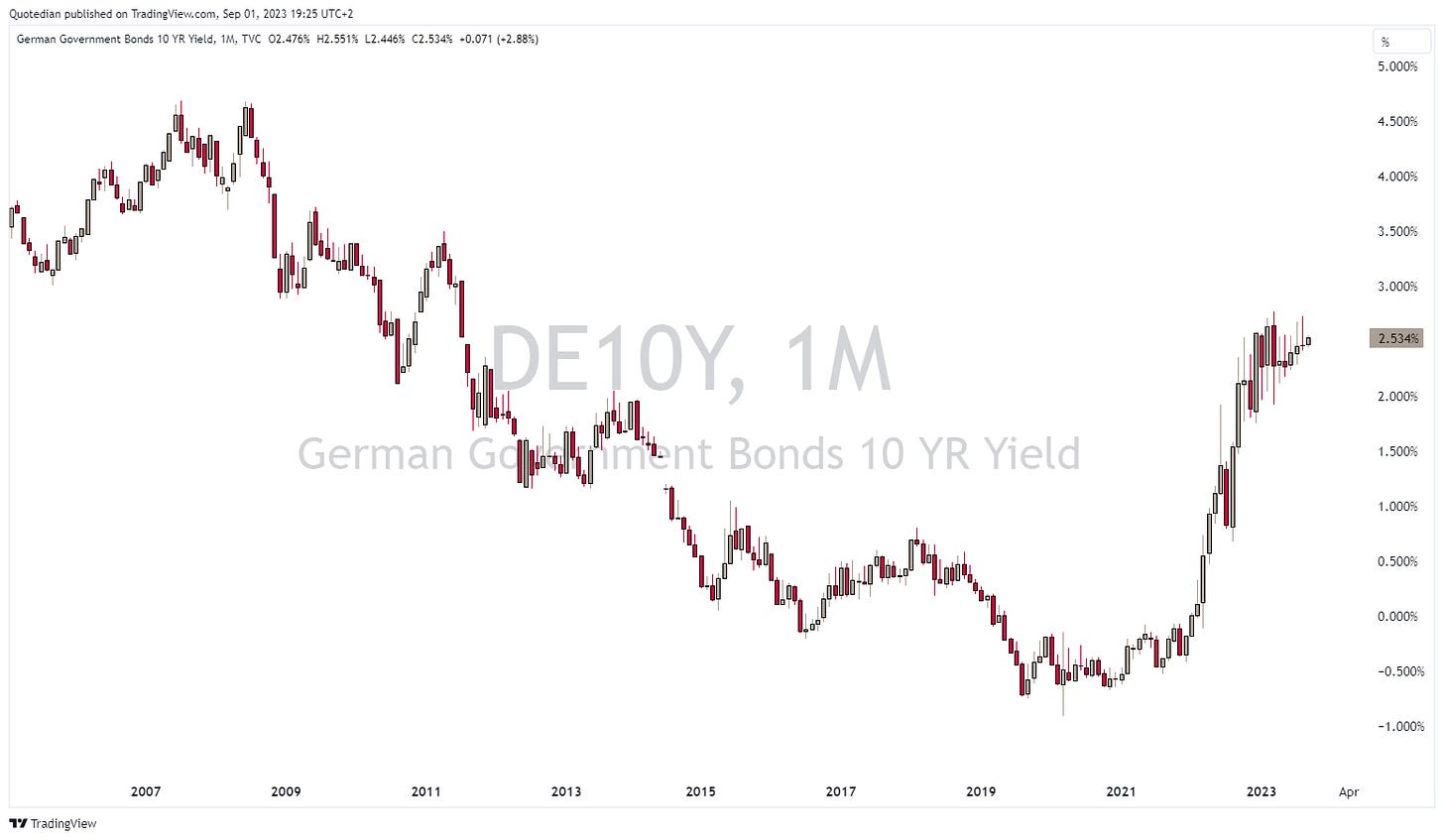
The chart of German yields, as a Eurozone proxy, is a bit more ambiguous, but also seems to point to higher yields:
Looking for another bullish yield chart? Look no further than Japan’s 10-year JGBs:
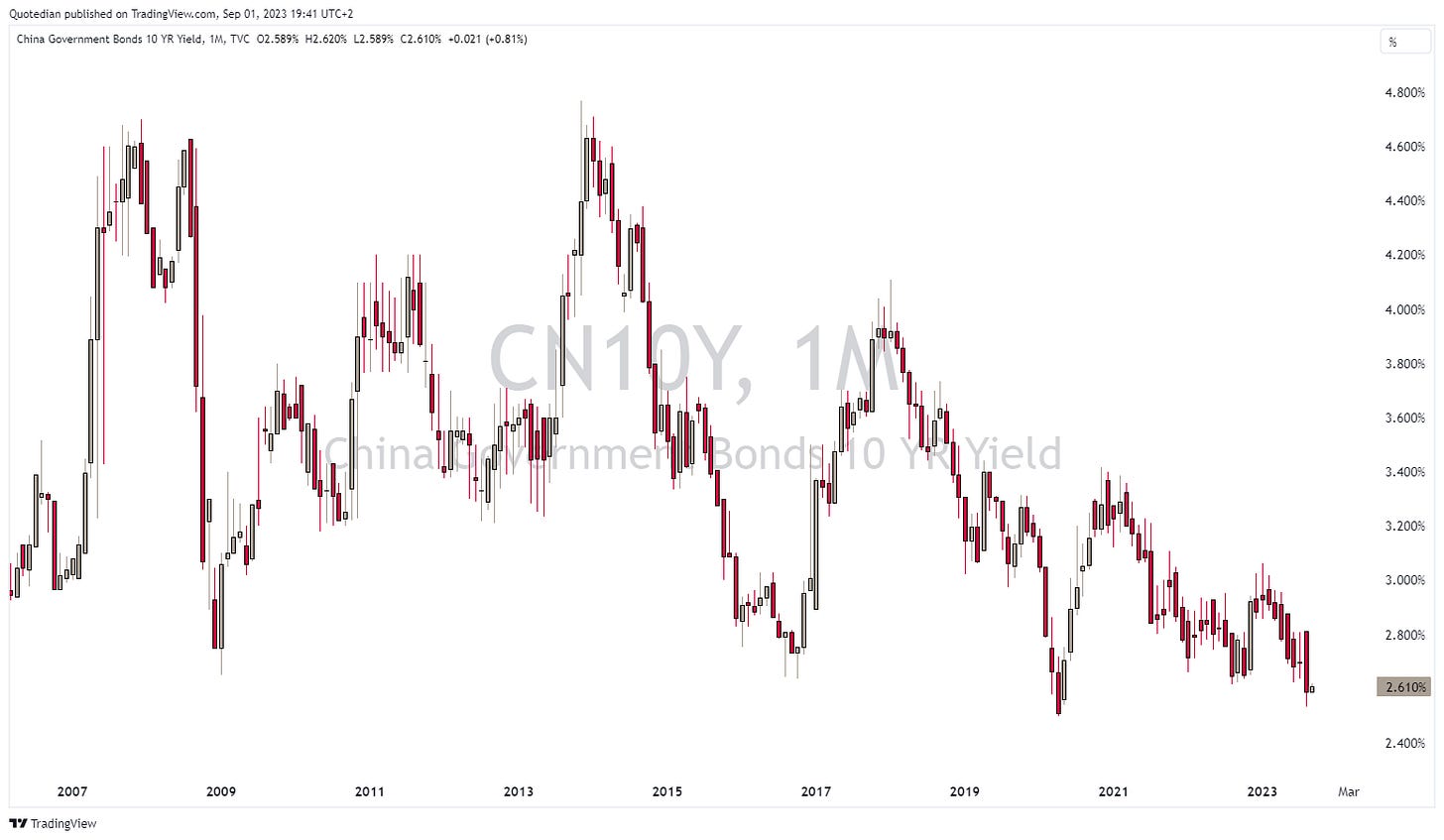
The only market bucking the trend of higher yields is to be found in China:
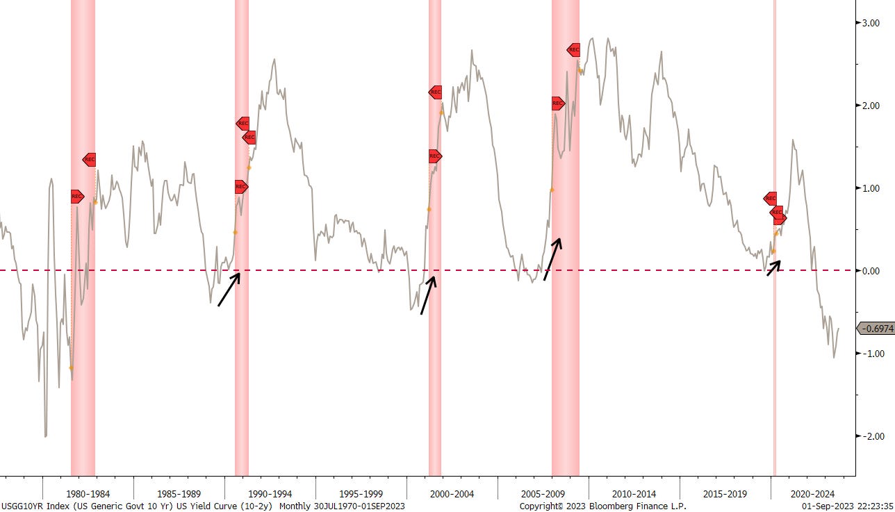
Looking at yield curve inversions, the US curve (10y-2y), despite some recent steepening, continues to be as inverted as in the early 1980s, when 3-month T-Bills traded around 15%…
What a beautiful chart now. Over 100 years of credit spread history, via the Mood’s Baa - Aaa indices:
According to this, credit spreads are a tad below historic average. But maybe we should include “modern” financial history only? Say since 1980 something?
Same result. Let’s move on…
Turning to currency markets, a quick explanation on the following performance chart first: All numbers are %-performances of the US Dollar versus the currency indicated. I.e., the Japanese Yen has weakened 11% YTD and 1.5% in August versus the USD. With that knowledge:
Overall, the US Dollar had a strong month, except for the Euro and two other ‘Dollars’ (NZD/AUD).
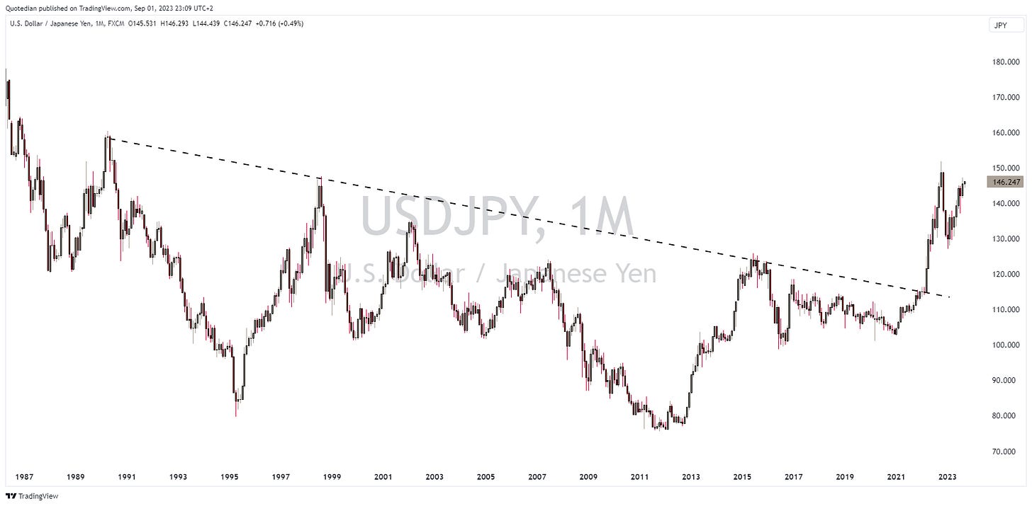
As mentioned, the JPY continued to weaken versus the USD (and probably everything else). Here’s the very long-term USD/JPY chart:
Let’s have a quick look at currency valuations from a JPY viewpoint via the PPP (Purchasing Power Parity) method, which is an even more useless timing tool than the price-earning ratio on equity indices:
In short, the JPY is undervalued against everything. I insist, PPP is NOT a good timing tool, but still makes looking a long JPY, short something very attractive. Maybe not a good idea versus the Swissy, which enjoys a ‘specific’ status, but a long JPY versus short GBP, why not?
A quick last note on the US Dollar, which is now in its 9th month of nothingness as measured by the Dollar Index (DXY):
Best strategy here? Do nothing, be patient and wait for the breakout.
Your suffering is nearly over now, as we turn to the last asset class on our agenda - commodities.
First, let’s look at commodity ‘sectors’, where our favourite segment, energy (remember?) had the best monthly performance to brag about:
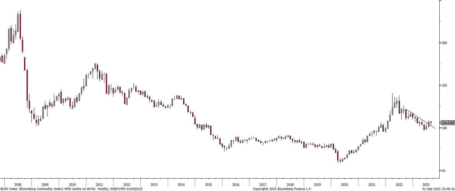
But overall, commodities seemed not to have had a great month. Let’s check the Bloomberg Commodity index on a monthly chart for confirmation:
Indeed, last month saw the overall commodity index retreat but hopes for commo bulls remain that the break of year-and-a-half downtrend is still valid.
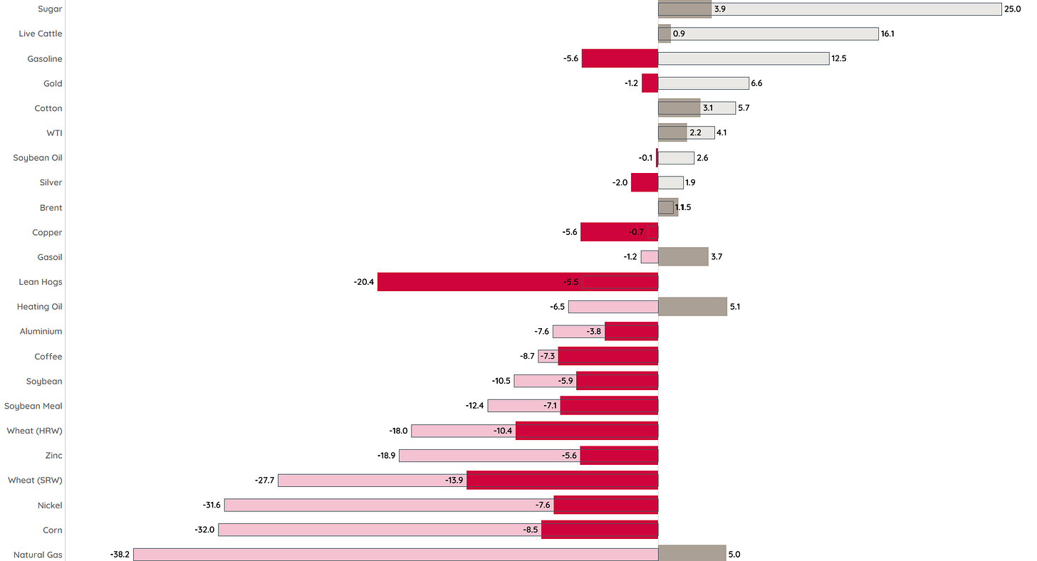
Let’s go a bit more granular, by looking at some popular commodity futures performances:
Again, energy elements were some of the better-performing pockets, though in the case of natural gas for example, it seems but a drop of water on a hot stone in terms of YTD-performance comparison.
One commodity that is not on the table above, frozen orange juice, has been going juicy parabolic, since the beginning of this year:
What do retirees in Flordia and Valencia know that we don’t know???
As shown in Energy is Life on Thursday, the 50-day moving average (MA) crossed above the 200-day MA earlier this week, whilst on the monthly chart, prices crossed above the 10-month moving average already two months ago:
The drawdowns in the US from the Strategic Petroleum Reserves have stopped for now,
but there’s a lot of refill to be done:
We (I) are (am) bullish.
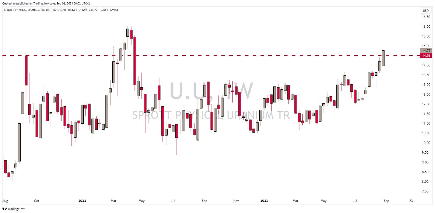
Another source of life we like is nuclear. Here’s the chart on the Sprott Physical Uranium ETF, which looks super-constructive:
Let’s have a quick glance at the yellow metal. On a daily chart, Gold looks a tad frustrating:
However, zooming out to the monthly chart, all’s fine:
Ok, for me it’s Friday midnight and time to hit the save button. Quick re-read tomorrow and you should have this in your inbox Saturday lunchtime. Make sure to study all, there will be a surprise exam on Monday.
Have a great weekend and a successful September!
André
Everything in this document is for educational purposes only (FEPO)
Nothing in this document should be considered investment advice
The views expressed in this document may differ from the views published by Neue Private Bank AG
Past performance is hopefully no indication of future performance


