MAYhem? MAYday? MAYhap ...
The Quotedian - Vol VII, Issue 15 | Powered by NPB Neue Privat Bank AG
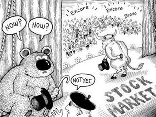
“A bull market is a bull. It tries to throw off its riders.”
— Richard Russell
Welcome to our monthly review, where we look at all the performance tables showing April performances in a year-to-date (YTD) context, combining this by taking a step back and looking at everything from a longer-term perspective via the monthly charts. Calm is the secret to surviving storms in a water glass.
Too many sleepless nights when investing? Speak to us to regain your well-deserved peace-of-mind.
Contact us at ahuwiler@npb-bank.ch
As a reminder, here a legend to the table and charts to follow:
A quick glance at the performances for major asset classes very quickly reveals what April was about:
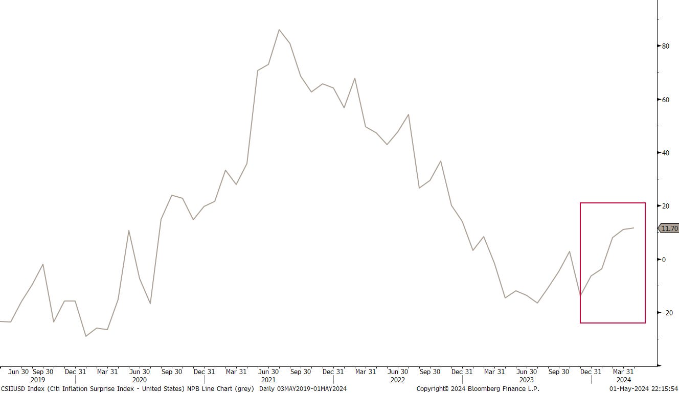
It is quite clear that inflation surprises, at least in the US, happened to the upside
which led, or maybe better said, was indicated by rising commodity and falling bond prices. Stocks, a bit less important in all of this (yes, yes, hear, hear), were the collateral damage as risk off mood took over and after five (!) consecutive months of higher gains, the perma-pessimits finally got a day in the sun.
Let’s use this as a segue into the equity section:
Let me start with (and don’t miss the “Let me end with …” further down), that of course, equity markets got a bit a head of themeselves, which we witness by the following perfomance chart, which shows, that despite the April drawdown, YTD gains for most markets continue to be “above norm”:
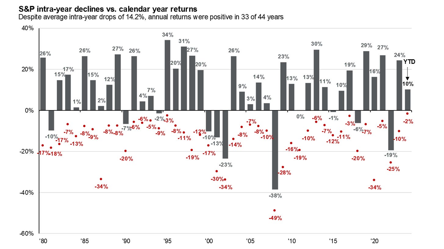
At the risk of boring you ‘ad nauseum’, let me repeat this fantastic chart from our friends at JPMorgan Asset Management, as it just brilliantly puts all drawdowns into perspective:
I do not want to be a perma-bull either, and warn all of our clients and readers of the perils ahead, but today’s situations is indeed one of the most classical “climbing the wall of worry’":
Ok, time for some monthly charts. Let’s start as usual with the almighty S&P 500:
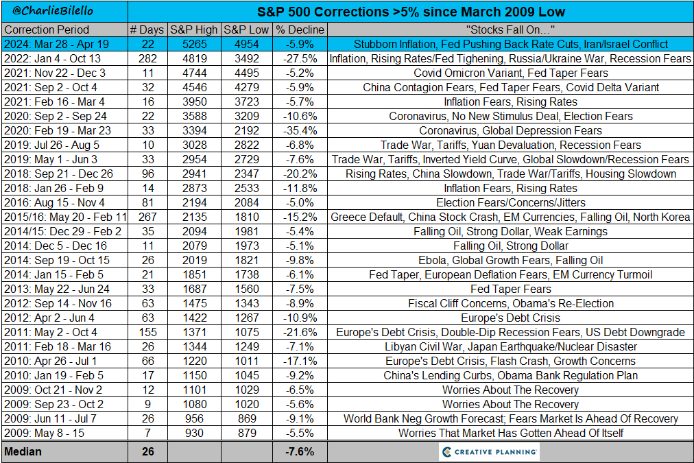
Is this one candle, the beginning of the end to the bull cycle? I doubt it. A pull back to 4,750ish (~5%) would be the absolute norm (refer to the JPM chart above again). Below that level, there is still some time to take risk of the table, or in other words, below 4,900 you should be considering adding risk with a thight stop.
On the larger picture, even a drop down to 4,180 (red, sad face) would not concern me for the longer-term trend. Below THAT, we would need to talk however.
In Europe, the situation is similar for the STOXX 600 Europe Index; only a drop below 430 (-14%) would be of concern for the longer-term uptrend:
Switzerland has been a disappointing market performer, at least to us, as we hold an overweight, despite the SNB having been a first mover on rate cuts:
This is mostly due to index structure disappointing news/performance/results from heavyweights suchs as Swatch, Roche or Nestle. Nevertheless, we remain constructive on this market, especially in the industrials, health care and financials.
The UK market made headlines this month, as a new all-time high was reached by the FTSE-100:
But be careful, of which index you choose, as 1) the FTSE-250 (mid-cap) is offering quite a different picture:
and 2) putting the FTSE-100 in other curreny terms (e.g. CHF) is not quite what it seems if you were not (expensively) hedged:
Turning to Asia, we find more of the same … key reversals after multi-months interrupted upside. Here’s Japan’s Nikkei for example:
The black-dotted line is the previous 1989 high, but the drop below that would not concern me overly until the 10-month simple moving average (SMA) would be broken too.
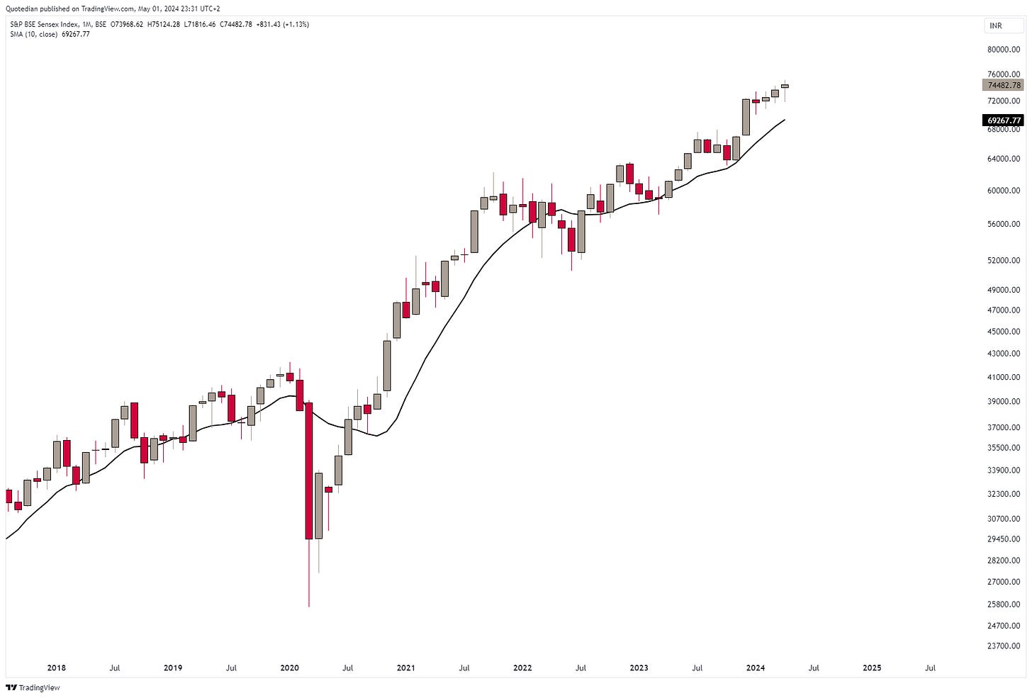
The Indian stock market is, well, the Indian stock market:
The only day it is expensive is the day you buy?
But, of course, there is also China, to upset all the bullishness…
The CSI 300 is yet again having another attempt at breaking out of the three year downward trend spiral:
To put a bullish spin on this, the (US) internet bubble burst also took three years to “unwind”… stay tuned and maybe try a tactical long on a break above the dashed line … sentiment definitely accompanies you!
Let’s turn briefly to sector performances now:
Reversals abound, except maybe for Energy and, surprisingly, Utilities!
Why surprisingly? Well, utilities (red) and bonds (grey) trend to move in tandem and April has been difficult for the latter:
The recent divergence is eye-catching! Possible culprit for the correlation disconnect? Yes, you are correct, it is AI!!
I think the best explanation for the Utility strength is the realization by investors of the enormous energy needs to build out the AI-theme. Third derivate wins! Or, as usual, in a gold rush, buy the shovel providers…
As we are kind of talking bonds now anyway, let’s head over into the fixed income section, but of course, not before leaving you with the tables of best performers YTD in the US and in Europe, and how they have fared in April.
Here are the US top performers first:
Some mean-reversion amongst chip-makers (SMCI, NVDA, MU), but overall, winners have remained winners.
Now Europe:
A bit more mean-reversion (aka correction) evident there, but still some surprising strong performers. Check especially the banks!
Now, let me end the equity section with, despite the recent headwinds and all the climbing-a-wall-of-worry thingy, tailwinds for stock markets remain prevalent. Some more downside (5-7%ish) may be necessary, but unless key levels (see above) break, keep on adding on weakness.
As we outlined in our latest Global Tactical Asset Allocation for Q2 and especially in the accompanying Chartbook (see below), we know in which Quadrant of the economic cycle we NOT are. Check out page 93 below:
And this is then reflected in YTD, but especially also the April performance of the different fixed income pockets:
Only High Yield is clinging on to YTD gains, thanks to the hefty equity rally and accompanying yield compression in the first three months of the year.
The monthly chart of the US 10-year Treasury yield shows that upside pressure has prevailed since the beginning of the year, but it was the breakout higher in April that really hurt bond investors:
Here’s the monthly chart of the iShares 20+ Year Treasury Bond ETF as proxy for (US) bond prices:
That’s a 50%+ drawdown over the past nearly four years. Now that is what I call a bear market, a ‘Ursus Magnus’ actually!
Yields at the short-end of the curve have been keeping up, leaving the yield curve flat, but still inverted:
The probability of rate cuts has continued to diminished as much in Europe as in the US:
Though the ECB hinted strongly at a rate cut on June 6th, the bond market is signaling that such a cut may not be the best of ideas. Here’s the 10-year German Government bond yield as proxy for Europe:
Only 30 basis points from the monthly closing high in September of ‘23 and with the yield curve also still inverted,
the ECB may be at the point of committing a policy error (kind of a reverse-Trichet error of 2007 …)
In Europe, only Swiss bonds have provided some “joy” to investors:
But the only real ‘oasis’ for bond investors remain Chinese Government bonds, where yields continue to compress, pushing bond yields higher:
However, only currency hedged investors really profited, as the Renminbi weakened significantly over the past 10 years.
In Japan, yields have also started rising again and are likely to challenge the October 2023 highs in short:
Finally, and for completeness purposes only, here’s the chart of credit spreads, which have been widening in April, as the performance table at the onset of the section outlines.
In currency markets, the US Dollar had a strong run against most currencies during April:
Of course, does the Yen weakness stand out above all. Here, versus the Greenback:
For those of you who have been following my missive for years now (which are most of you!), know that whilst I am not a Technical Analysis evangalist, it does form an important part of my investment framework. Yet, even myself am stunned and surprised again and again, how often TA “works” or at least imposes an important risk overlay to investment decisions. Consider what I wrote a month ago in “April Fool’s”:
We are now at intervention levels - but should the BoJ fail to do so, we have price targets north of 160:
And indeed, did we get a brief glimpse to above 160 on April 29th:
Magic!!
Despite the Dollar strength in April, does the EUR/USD cross remain range bound:
The monthly Dollar-Swissy chart looks like higher prices (parity?) may lay ahead:
Let’s also have a quick look at cryptocurrencies and their fortunes so far this year and in April:
Now, all together: V-O-L-A-T-I-L-I-T-Y does no justification to moves on cryptos!
And we have arrived at our final destination of our monthly asset class performance review - Commodities! Let’s have a look at sector performance first:
Recall those rising yields? The positive inflation surprises? The sputtering stock market? And now, this massive upside one-month moves in all commodity sectors bar one … inflation anyone?
As we highlighted in our Global Asset Allocation review for Q2 of 2024 (see below), inflation may be reaccelerating early than we would have ‘hoped’ for:
Our quote of the quarter in the Chartbook, sums it all up in two sentences:
“Inflation is like toothpaste. Once it's out, you can hardly get it back in again. So, the best thing is not to squeeze too hard on the tube.”
Karl Otto Pöhl
Here are the YTD and April performances of the most popular commodity futures:
Actually it is a shame I did not add Frozen Orange Juice to the table above too, as it would have been the second best performer this year just behind Lean Hogs …
a “Trading Places” total recall!
Anyway, attracting all the attention in April was without a doubt Gold:
Having said that, that April candle (circled red) has in Japanese Candlestick reading potential for marking a shooting star top. For now, the strength found in the first three days of May or negating a reversal, but we will need to wait until the end of the month to be sure.
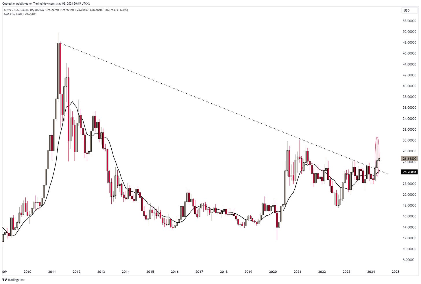
Silver saw a similar shooting star pattern in April, but zooming out on the monthly chart leaves us with an overall bullish assessment:
Oil (Brent) has fallen out of its immediate uptrend channel (shaded area), but continues to trade above previous resistance (dotted line) now turned support:
That upturn in industrial metal prices was just gargantuan in April (arrow) and would hit to an important economic expansion underway:
One more before it is time to hit the send button. Here’s a chart on the overall commodity (BCOM) complex:
The chart for confirming the commodity super-cycle starting in 2020 starts to look favourable again, but some more upside work needs to be done for final confirmation.
Have a great Friday, Weekend and May!
André
This Quotedian was written over three days since April 30, as I was on holiday and only got limited time to dedicate my musings to your favourite newsletter. A lot of things happen in financial markets over three days, but as we are looking at monthly charts in this issue, the short-term noise is of second nature.
One issue that arose will writing that is important though is the “rumour” about BoJ/MoF interventions, selling USD and buying JPY. Memes such as the one below would suggest that market participants are getting a bit carried away and a major reversal may indeed lay at hand.
Everything in this document is for educational purposes only (FEPO)
Nothing in this document should be considered investment advice
The views expressed in this document may differ from the views published by Neue Private Bank AG
Past performance is hopefully no indication of future performance


