Melt-Up
The Quotedian - Vol VII, Issue 17 | Powered by NPB Neue Privat Bank AG
"The most bullish thing the market can do is go up."
— Paul Montgomery
Ok, before we start, please all equity bears, get up on your feet hind paws and leave the room …
Now, please all perma-bears get up on their paws and leave the room too
Phew, that’s better. Now bulls, let’s enjoy the ride!
Are you like us an optimist? Let’s talk. Are you are market pessimist? Let’s talk urgently!
Contact us at ahuwiler@npb-bank.ch
As long-time readers of this space will remember, I have two favourite investment book titles for their respective titles alone (and both books are in my all-time top 10 too for content):
Triumph of the Optimist
Being Right or Making Money
Both are important always and never mutually exclusive. Today’s focus will be on the first, not forgetting the latter.
Let’s dive right in!
As mentioned, this will be a bullish letter, but do not forget, that
a) this is an outlook for the next three to six months, not days or even minutes
b) sentiment is already starting to get stretched on some accounts
c) and as John Maynard Keynes said: “When the facts change, I change my mind - what do you do, sir?”
With that out of the way, and starting with US markets, the Dow Jones Industrial index, a gentleman with 128 years of market experience, closed above 40,000 for the first time ever.
David Elias wrote in 1999 that the Dow will hit 40,000 by 2016, which is once again confirmation that you can give a price target or a time frame, but never both together:
This is what 128-years of history look like on the chart:
But probably better readable on a logarithmic y-axis:
What probably stands out most is that the GFC was a walk in the park in comparison to the sell-off during the great depression …
Now, the Dow is by design a very flawed index, as it uses a price-weighted calculation methodology. What that means is that shares with a higher price get more weighting than those with a lower share price - complete nonsense of course. It also does not include dividends; were dividends be included the Dow would be less than a thousand points away from reaching the 100,000 mark!
Maybe Mr Elias referred to the Dow including dividends in his 1999 book? In such a case, he would have been spot on!
Ok, on to the one benchmark to rule them all - the S&P 500:
Simply not bearish, as the April correction was very contained and did not reach minimum targets (red oval) that would have been “obvious”. And now, we are back in melt-up mode. As we highlighted at the beginning of the year, chances for a major “accident” on the US stock market are reduced in an election year, and the liquidity-providing hand of the Treasury departments/Federal Reserve bank seems to be doing its “magic”.
As pointed out in last week’s Quotedian (“Awkward”), the cumulative advance-decline line ratio on the NYSE was a good hint that stocks will reach a new all-time high soon. The same happened on the S&P 500, where the advance-decline line (lower clip - red) hit a new ATH a few sessions before prices (upper clip - grey) followed:
Now, let’s have a look if there has been a change in leadership since the April 19th market bottom.
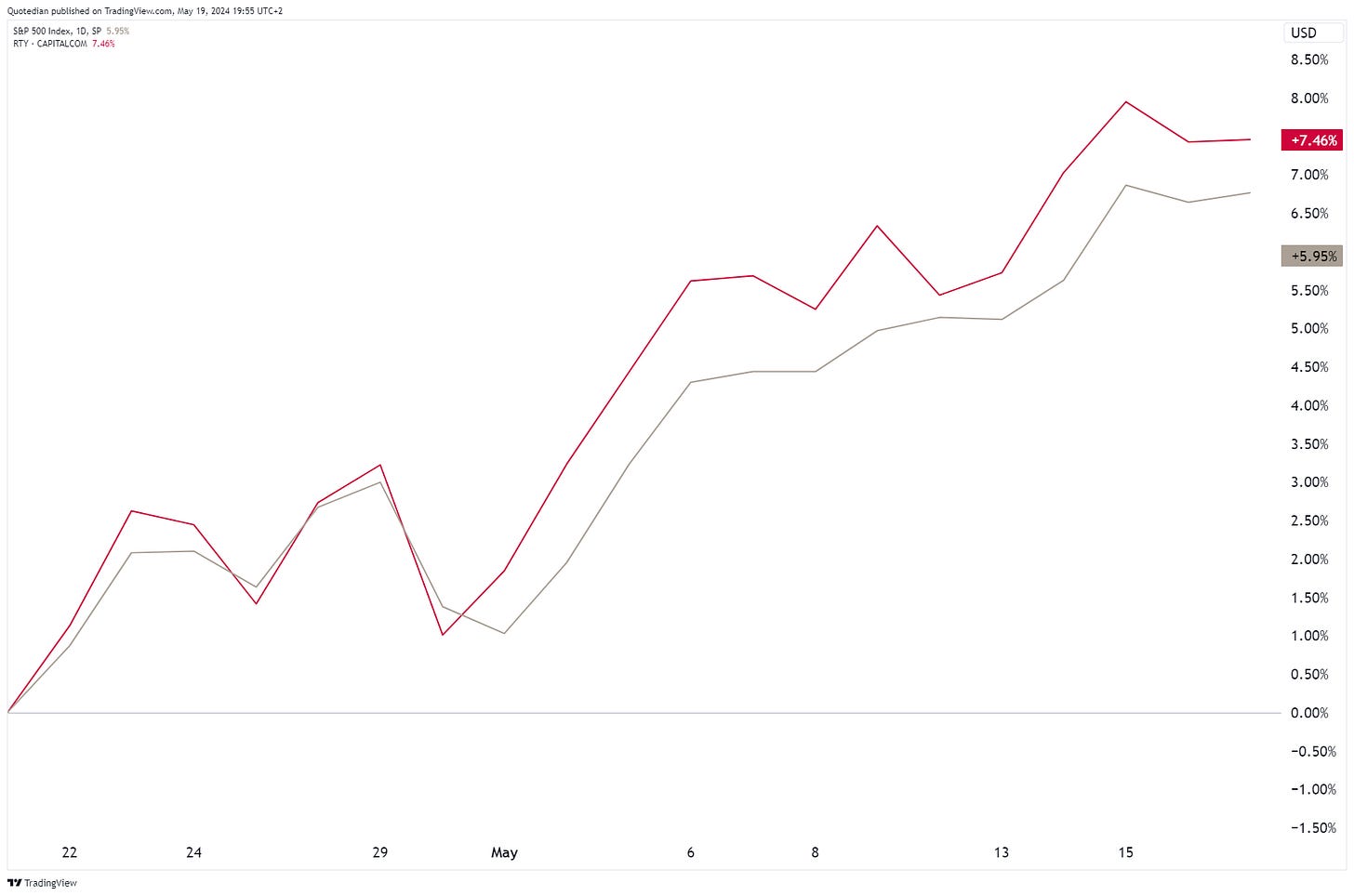
First, small versus large cap stocks in the US:
Small cap (Russell 2000 - red) is making an effort to show some relative strength versus large cap (S&P 500 - grey)!
Any change in sector leadership over the same period? Let’s check:
Utilities and Real Estate are clearly two “unexpected” sectors amongst the top three, but probably most important is that all eleven sectors are steaming ahead.
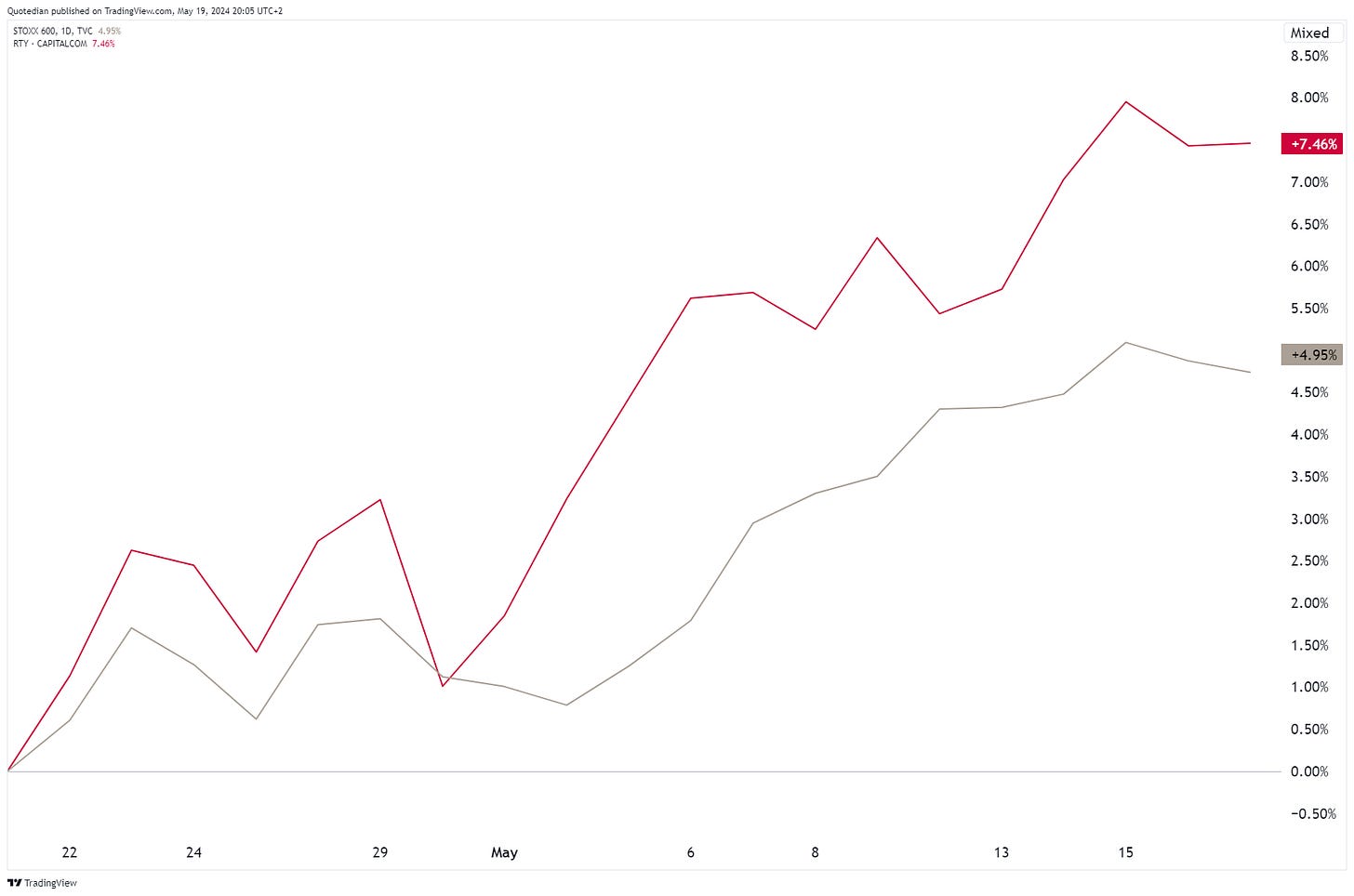
Finally, let’s see if let’s see if there has been any change in leadership between the US (grey) and the European market (red):
Oh, WOW!
European stocks seem to have been extraordinarily strong. Let’s have a look at them in isolation. Here’s the STOXX 600 Europe index:
As expected, and highlighted in our Quarterly Outlook,
the Swiss equity market has started to outperform strongly:
Let’s take this opportunity to do a regional comparison:
You know I have been (bullishly) writing about China lately, but let’s have a look at emerging markets first:
Thirteen (!) years of nothingness - pretty depressing. Let’s have a relative look, by dividing EM stocks (EEM) by US stocks (SPY):
On this shorter-term chart, the recent breakout looks very promising. Zooming out on the same chart, you have to squint to see that breakout:
Now, let’s talk China for a moment … we have written about this market-non-grata on several occasions, last time here. With all the bullish signals in place, and despite an NPB in-house underweight rating on the region, I still wonder if at the next sell-off we are at the circled moment:
Alright then. Time to have a look at some individual stocks now, starting with the Top 25 performers in the US and Europe on a year-to-date basis, and how they have fared over the past five trading sessions. Starting with US stocks:
We find the ascent of utility stocks fascinating. The explanation as we have highlighted on several occasions is probably the extra-needed electricity for the roll-out of AI and the long-term story is definitely intact. Having said that, short-term, the rally seems somewhat extended. Here’s the SPDR US Utilities Select ETF (XLU):
This proxy on Utilities is the second most overbought over the past ten years … While we have several utility stocks on our equity focus list (NEE, BKW) don’t rush after them just now … be patient and buy on a pullback.
Here’s the list of the top 25 stocks on a YTD basis in Europe:
Here, the performance of Bank stocks stands out. And in direct contradiction to the overbought point we just made on XLU above, the Amundi Euro STOXX bank ETF was its most overbought (RSI) level ever in early April, and today is 8% higher than then:
As Ed Seykota said: “There is nothing more bullish than an overbought market that continues to go higher”.
To finalize the equity section, we remember that the past week was dedicated to the revival of the MEME stocks, such as AMC:
+235% / -62% - Volatility gremlins at their best!
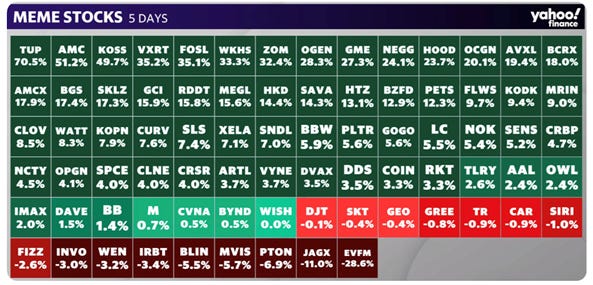
But AMC was not the best-performing MEME stock last week … here’s the “Top of the Pops”:
Tupperware (TUP) is go!
Ok, enough of equity markets going higher and higher …
Bonds are trying some form of bottom-building after the ugliest bear market on record:
With the proxy for longer-term treasury bonds (TLT) down 51% top to bottom, the safe-haven aspect of this asset class is a species in danger…
Zooming in on this same chart, we notice that the TLT is at a critical juncture to confirm continuation of the uptrend:
Let’s not get emotional or think of ourselves as super-forecasters, but rather just watch how this plays out …
Putting the same in yield terms, this is what the US 10-year treasury yield looks like:
The uptrend in yields has been violated (black circle), but has held above the 200-day moving average (red circle). Confusing? Yes! Hence, as mentioned, step aside and wait for how it unfolds.
The yield curve itself continues to be inverted in the US,
and in Europe:
Credit spreads are contracting again on the back of the equity rally:
Maybe a better way to look at this is via iShares iBoxx High Yield ETF:
A break above 78 would be useful here from a technical analysis point of view.
In the currency space, the US Dollar has been losing some ground over since the beginning of the month:
This is what the US Dollar Index chart looks like:
The juncture here at the red circle is pretty interesting, with support coming from the uptrend line (red dashed) the 200-day moving average (black) and the 38.2% Fibonacci retracement of the upmove since the beginning of the year. Stay tuned on this one!
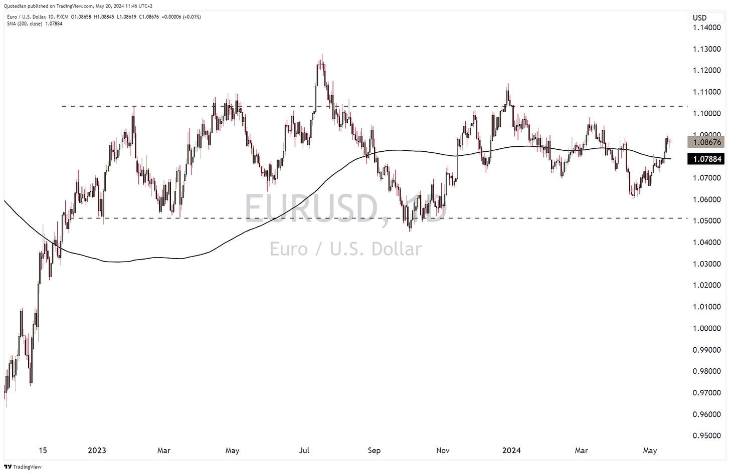
The EUR/USD cross continues to move within its wide trading channel:
18 months and counting …
Cryptocurrencies seem also to have resumed their uptrend:
The Bitcoin chart looks very bullish after breaking out of the consolidation triangle (black dotted lines):
But even better momentum seems to be in Solana:
And finally to commodities, where a firework is taking place amongst precious and industrial metals:
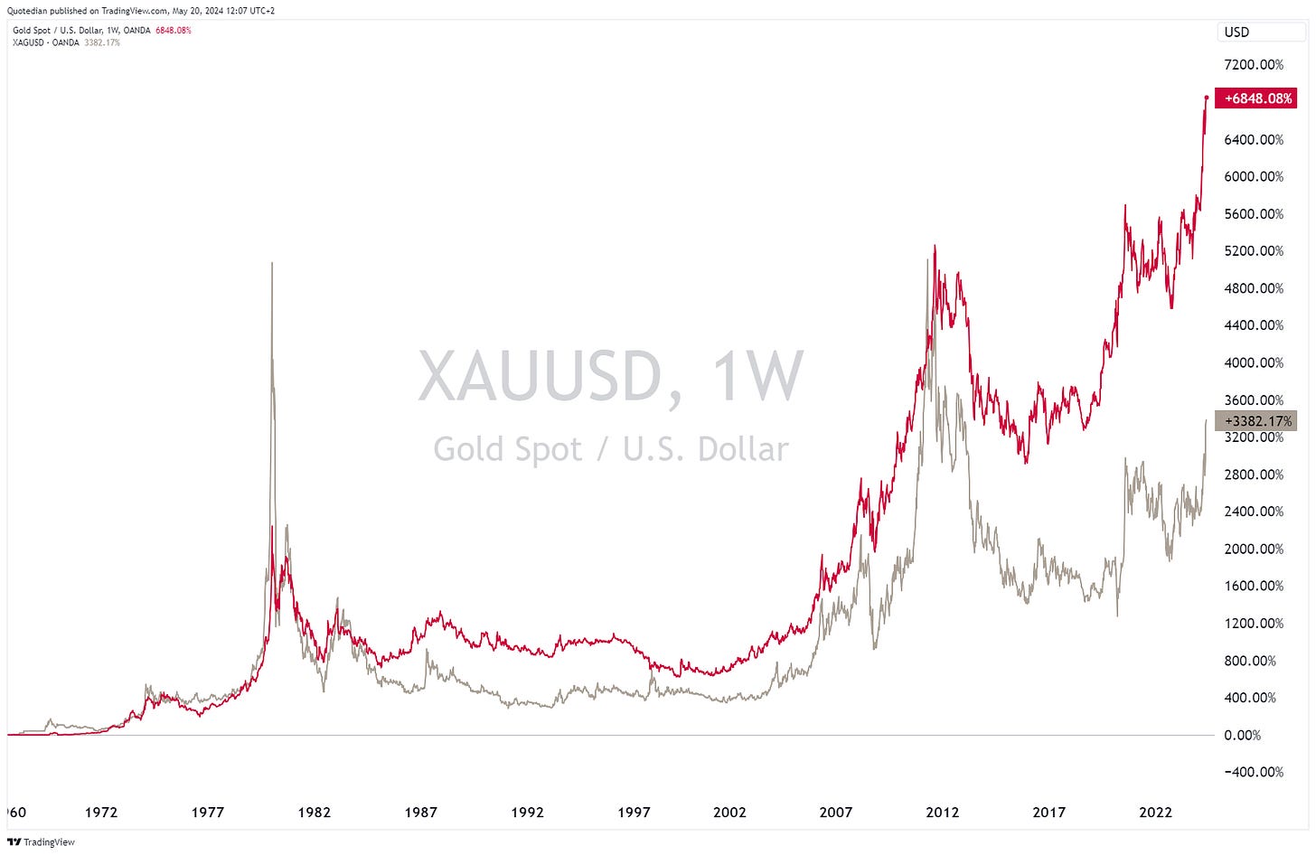
As we highlighted in a QuiCQ on April 4th (see here), Silver (grey) offered a nice catch-up play on the (then) recent breakout in Gold (red). This is now quickly unfolding:
Of course, is Silver, as all other metals too, now short-term overbought, but don’t forget to opt in on the next correction:
But we also highlighted (here) the catch-up potential for Platinum (blue), which is playing out nicely now:
OK, wife and kids are shouting hungrily at me now,
hence time has come to hit the send button. And for you, it is time to hit the Like button. Thank you!
Have a nice remaining Pentecost day!
André, the Finfluencer ;-)
Everything in this document is for educational purposes only (FEPO)
Nothing in this document should be considered investment advice
The views expressed in this document may differ from the views published by Neue Private Bank AG
Past performance is hopefully no indication of future performance


