Rediscovering Price Discovery*
The Quotedian - Vol VI, Issue 79 | Powered by NPB Neue Privat Bank AG
*First Blood, Part I - Bonds
“One of the funny things about the stock market is that every time one person buys, another sells, and both think they are astute.”
— William Feather
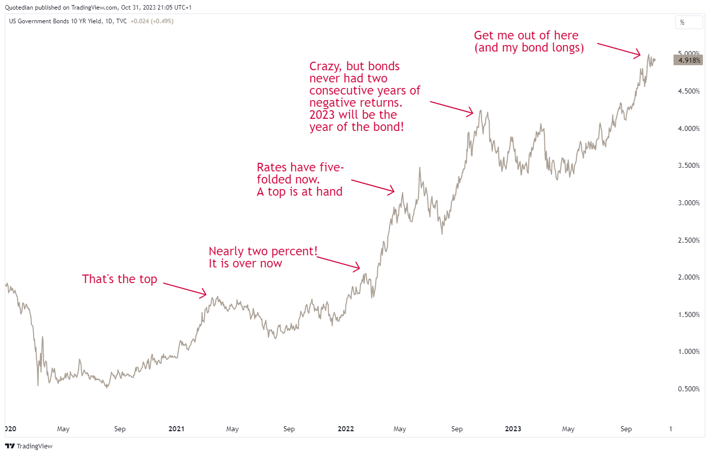
As mentioned in the last Quotedian four days ago (“C’est Chaud!”), today’s title refers mostly to the price action that has been going on especially in the bond markets over the past two, nearly three years.
(Nearly) Nobody expected yields to go as high as they have gone so far, and the thought process must have been something along these lines when looking at the US 10-year Treasury yield:
Even I was a bit sceptical about my own analysis when we forecasted a 5% price target for the Tens in Q1/Q2 of this year.
Of course, for most investors, the inverse picture of the one above is the relevant one and where the true price discovery is taking place. As usual, we use the immensely popular iShares 20+ Year Treasury bond ETF as a proxy for bond performance:
As a reminder, and for comparison purposes, the S&P 500 dropped only a few percentage points more than the “safe” treasury bonds during the Global Financial Crisis from 2007 to 2009:
Are yields to go higher yet from here? Perhaps. Have we reached a short-term cycle top in yields though? Perhaps.
As our Q4 CIO Outlook published three weeks ago highlights, we have started increasing cautiously the duration of the bond part, mainly as we fear that the sequel to this “bond” movie, called “Rediscovering Price Discovery - First Blood, Part II - Equities” could be released in early 2024.
As always, know your risk capability (not the same as risk appetite!) and apply a risk management framework. In other words, have strong convictions, but hold them loosely.
Need help with your risk management and investment discipline?
Contact us at ahuwiler@npb-bank.ch
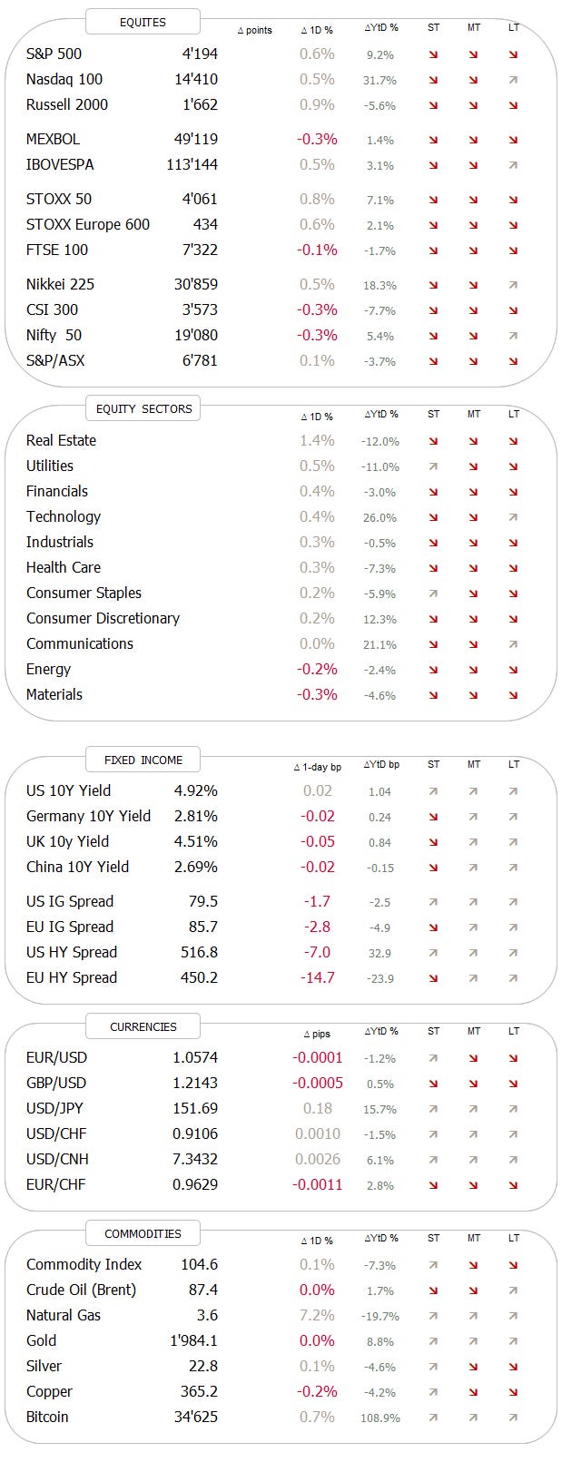
Anyway, after this lengthy introduction, we get started with our monthly review, where we look at the October and Year-to-Date performances for different assets and also take a longer-term look at some key markets with the help of monthly charts.
I have given the statistical tables a slightly new look and hope you like it:
As a quick heads-up, grey/red bars represent year-to-date performances in %, whilst blue/light blue bars represent the October performances in percent. All statistical tables are sorted by descending MTD performance, to focus more on the month just gone by.
And down the rabbit hole we go!
Starting by reviewing some of the most widely followed equity benchmarks around the globe, we note that this equity price discovery may have already started:
All markets (notable exception Portugal) were down give or take a minimum of two percent, with the export-focused markets of Switzerland and South Korea taking the hardest beating.
The question is whether these moves were big enough to push markets into correction territory (most, yes!) and if key support zones were taken out and further losses lay ahead more or less immediately (close call for now).
Or will, the end-of-year dynamics in the form of favourable seasonal patterns give us a last hurrah, before the correction of 2024?
Let’s look at some charts to find out.
Starting with the one index to rule them all, the S&P 500 bellwether, I’ll throw in one daily chart as an exception:
For now, the index stopped its drop just one percent shy of our price target and has had two constructive sections since, just about at the time when seasonals (Halloween Indicators) indeed should become more favourable.
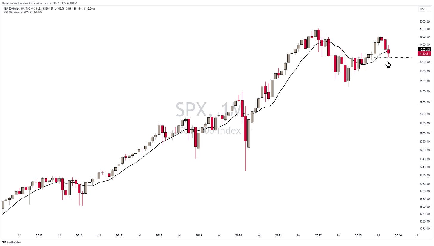
Ok, but as established at the outset, this is the monthly review where we look at longer-term charts. Hence, here’s the same S&P again:
The bad news first: this index has closed below the 10-month moving average (MA), which we use as a proxy of the 200-day MA on the monthly chart. Not bullish.
The good news is, that the index rebound quite precisely on the 4,100 pivot-point. Not bullish, but a sign of hope.
The chart of the Nasdaq 100 is decisively more bullish, not only having rebounded from the 10-month MA, but also having managed to see its monthly close above it:
We discussed many times how these longer-duration stocks surprised with their strength in an environment where interest rates (10y) reset from 0.5 to 5.0 percent, but it became clear that it is (was) the Magnificient Seven leading this wolfpack. However, as we already started noting last week, some of these heroes have been shot in their back during the current earnings shoot-out. Here’s the not updated table from last week on this:
Small-cap stocks have been an absolute drag since rates started rising, and the explanation lies here:
At least, for now, it seems that the Russell 2000 as representative of small-cap stocks has been able to find a (not THE) bottom at previous support levels:
Turning to European stocks … it gets more depressive.
The broad STOXX 600 Europe index closed for a second consecutive month below the 10-month MA and it is discouraging trying to try lines of support on the chart:
Let’s just burry that overweight Europe versus US debate for now:
Wake me up when that small dotted line on the chart above is crossed from below - not before. And let’s also not talk about that valuation difference BS between the two - the graveyard is full of falling knife catchers.
Time for a quick look at some Asian markets. The Nikkei had now four consecutive months of negative returns, but thanks to its steep ascent in the first half of the year still trades above the 10-month MA:
Chinese stocks, in the following proxied via the Xtrackers Harvest CSI 300 China A-Shares ETF, may have found some intra-month support, but continues to look just awful:
Indian stocks continue to defy gravity:
Okay then, now let’s check on the equity sector performance in October and for the year so far:
Interestingly enough, only utility stocks, usually tracking bond prices, were able to eke out an every-so-tiny gain during October. Consumer discretionaries and energy stocks, the latter much to my dismay, were the big losers. And only Tech, Communications and Discretionary stocks still carry positive year-to-date returns.
A quick look at my favourite sector, energy, via the SPDR Energy Select ETF quickly reveals that it does not look too bad from a technical point of view:
We can put it down as correction after four strong months within a wider consolidation pattern before the next leg up.
And staying with energy for a moment, the 5% and change drop in the XLE, representative of the dirty fossil fuel world, is nothing as compared to the 22% drop in renewable energy stocks (S&P Global 1200).
I think I have shown this chart in the past, but it remains “impressive”:
And finally, to wrap up the equity section, here are the popular (popular because I say so) tables of the top-performing stocks YTD and their behaviour over the month just gone by in the US and Europe.
Starting with the US, we note that some leaders this year have seen major reversals, whilst others enjoyed further gains:
Some interesting, lesser-known names have been popping up on the European list:
Now to fixed income markets, which undoubtedly have taken centre stage not only this month or this year but really for the past three years.
Our usual performance update:
It has not been a good month for most bond market segments, as the lighter blue bars indicate. And year-to-date it also continues to be a very fragmented market, with most pockets where we Westerners are invested (Treasury, Corporate) showing a negative performance. Only high yield, which is probably not a big overweight in many portfolios, held up so far this year. And btw, in our most recent CIO Outlook, we recommended increasing credit quality of bond allocations by reducing HY exposure…
Here’s the monthly chart of the US 10-year treasury yield, where we suddenly lose a lot of confidence regarding our call on a cyclical (read: short-term) reversal:
And the following chart, zooming out on the same 10-year yield, does not help a lot to regain that confidence again:
As we established further up:
Strong convictions, loosely held - Paul Saffo
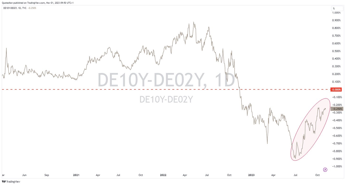
What soon could become a problem to equity markets, is the de-inversion, i.e. normalization/steepening of the yield curve:
As I have pointed out many times over the past 18-months (and during previous inversions), it is not the inversion that is the problem, but the steepening after the inversion. The following chart does a good job of describing that:
In Europe, rates, proxied via the German 10-year Bund, had a volatile month with no net progress to the up- or down-side as the last candle on the following chart reveals:
An intra-month chart highlights that volatility:
And also here, the inversion is coming to a close:
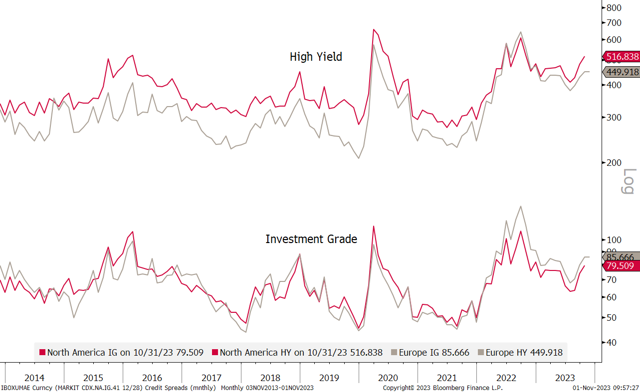
Credit spreads have been on the rise (finally!) and should remain under close scrutiny:
This is another way to look at credit spreads (BBG US HY YTW minus 5-year Treasury Yield) and gives a bit more historical data:
By this measure, credit spreads are just below the long-term average (red line), but tentatively ‘feel’ like they’re ready for a move higher.
Translating this to high-yield bond prices, we observe the popular iShares iBoxx High Yield ETF (HYG):
Closing in on key support …
Turning to currency markets, the following table shows the performance of the US Dollar versus the listed currency:
In other words, the greenback has been able to add to YTD gains in October versus many currencies. The Danish Kroner, British Pound, Euro and Swiss France were some of the currencies able to buck the trend and a special mention goes to the South African Rand (ZAR), which reduced YTD losses by nearly a fourth. Was the Springboks’ World Cup win the reason for that?
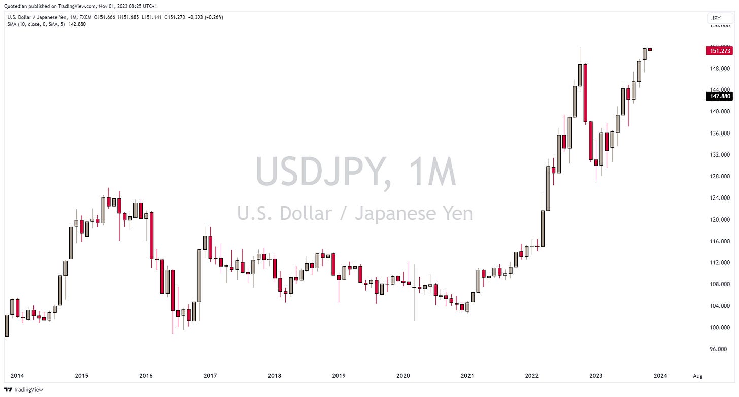
But, of course, the talk of the town is the Japanese Yen, especially right on the last two trading days of the month. The BoJ announced that it will soften its 1% cap on the 10-year, i.e. it is not really a cap anymore. The Japanese Yen thanked with a new multi-year low:
For me, there are only two possible scenarios here:
Japanese yields continue to rise, with ensuing compression of spreads to other countries’ yields leading to repatriation of capital and hence a much stronger Yen.
I am wrong.
Probably the latter (sigh).
Both, the EUR/USD and the GBP/USD crosses have been quite the non-event in October, so we’ll just put up the two monthly charts for the gallery without any further comment:
Actually, on second thoughts, both charts look like the US Dollar could show some further strength, i.e. on both charts the Euro and the Pound could be signalling more weakness ahead.
Let’s finish the currency section with a look at Bitcoin, which is kind of cross between currency and commodity and use it as a segue into the next section:
That big, fat candle at the right of the chart is worth the 27% rise that this cryptocurrency saw in October alone, bringing the year-to-date gain to 108%!
Moving into commodities, let’s have a brief glance at commodity ‘sector’ performance first:
Most striking on the table above is that the two ‘metals’ are at opposite ends of the performance spectrum in October. Gold & Co. shine, whilst Dr Copper and friends are painting a gloomy picture ahead.
Let’s look at the performances of the underlying to the above:
Natural gas and Gold stand out to me on the upper edge of the table, whilst WTI/Brent and other energy-related surprise me for being at the lower end of the gamma. Time to consult some tea leaves charts …
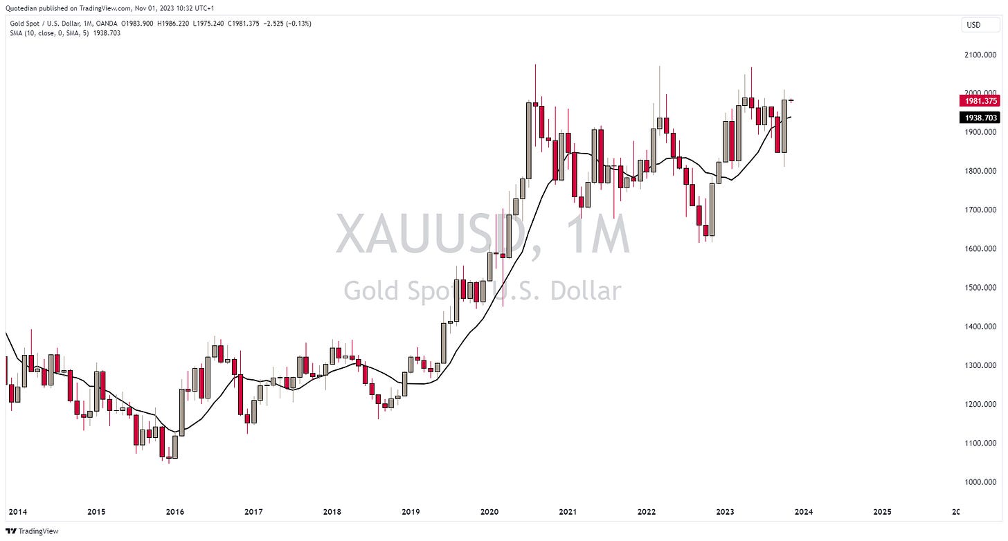
Here’s Gold:
Well, on a closing basis, that is the second-highest close … ever!
As mentioned, the weak performance of crude is a tad surprising, given geopolitical rumblings, but the chart continues to look constructive:
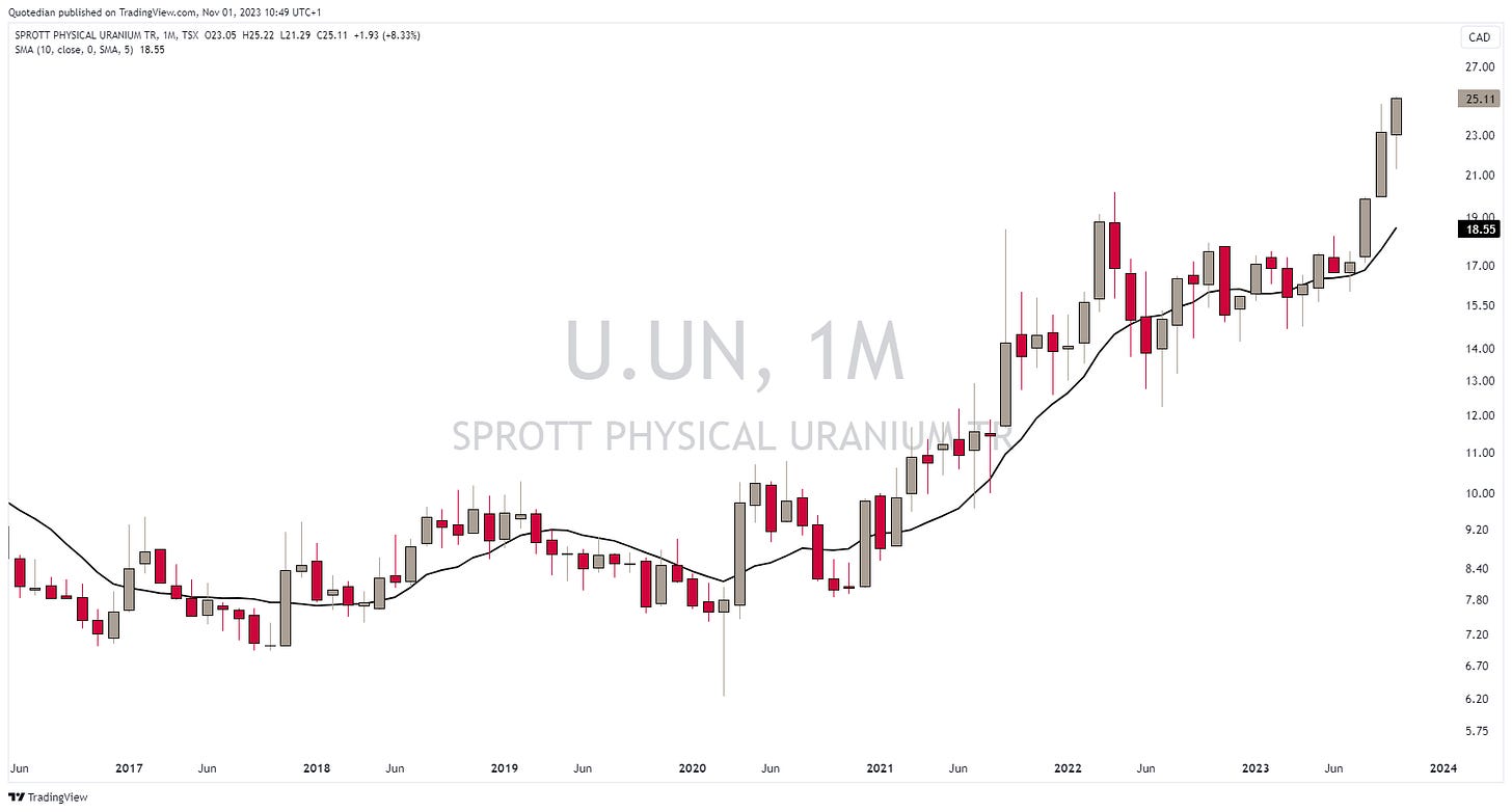
Another “commodity” I would to highlight before closing out, is Uranium, which as been on an absolute tear. The Sprott Physical Uranium ETF is one way to follow price, though history is rather short, as two or three years ago the underlying of this Trust changed somewhat:
Good ways to proxy the price of uranium are however the charts of either Yellow Cake listed in London,
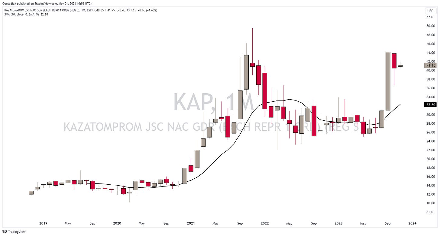
or Kazatomprom, also London listed:
Ok, time to hit the send button. Do not forget to hit the ‘Like’ button at the bottom of the mail (only if you ‘Liked’ of course), or leave your comments in the comment section.
Stay safe,
André
Today’s theme was about how investors are rediscovering the hard lesson of price discovery - for now mainly focused on the bond market.
Here’s one brutal example of that process:
On June 24th 2020, with interest rates at rock bottom, the smart people in the Austrian treasury department decided to launch a 100-year bond. Not a bad idea, given that the yield on the German 10-year Bund as proxy for Euro-Area rates was at MINUS 0.44%.
The yield offered on this 100-year bond was approximately 0.70%.
Who, tell me who, right in his mind would buy this? Turned out quite a few… sigh!
This bond trades today at 36.50, down 64.50% since issuance, and down 75%+ for that poor sole who decided to pay the top at 140 in late 2020:
Learning is expensive in investing …
Everything in this document is for educational purposes only (FEPO)
Nothing in this document should be considered investment advice
The views expressed in this document may differ from the views published by Neue Private Bank AG
Past performance is hopefully no indication of future performance


