"There’s no such thing as information overload only failure to filter."
— Anonymous
DASHBOARD
AGENDA
CROSS-ASSET DELIBERATIONS
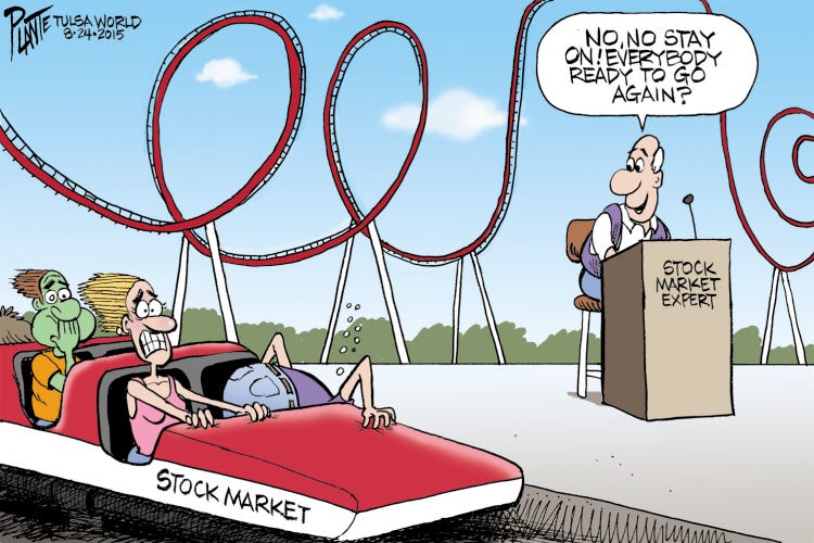
What better title to the month we have just passed in financial markets - a true roller coaster indeed!
As we have just finished the third month of the year, we have our usual monthly- and year-to-date statistical tables to review, plus we take, also as usual, a look at some longer-term monthly charts.
So, let’s dive right in, there’s a lot to review. Should you wish to listen to some music during your read, here are two fitting songs (click on link):
and
Burna Boy - Rollercoaster (feat. J Balvin)
The good old Quotedian, now powered by Neue Privat Bank AG
NPB Neue Privat Bank AG is a reliable partner for all aspects of asset management and investment advice, be it in our dealings with discerning private clients, independent asset managers or institutional investors.
Starting with equities, first a quick reminder regarding the graphical display: Fatter bars are the March performance numbers; thinner semi-opaque bars are the year-to-date developments - all in %. With that in mind, here are some of the most important equity benchmarks around the globe:
Given that we had a major banking crisis during the month, accompanied by a twenty-five and fifty basis point rate hike in the US and Europe respectively, that is quite a respectable and probably somewhat surprising outcome.
The best-performing index for the month AND the ongoing year is the NASDAQ 100. The logic seems to be that as the market’s expectation has shifted from four more rate hikes into September
to rate cuts starting as early as in the third quarter of 2023:
And as the Fed will cut (as per market expectations) this of course means that we need to buy long-duration assets, such as tech stocks in the Nasdaq. Of course, it seems that Nasdaq-FOMO buyers are not asking why the Fed should be cutting within the next few months. My guess would be either because of a recession or an expansion of the financial crisis - neither seems to be a good argument for risk assets.
In any case, let’s not complain about what the market does, but analyse the movements and see where we can squeeze out some extra p
erformance. Here’s the monthly chart of the Nasdaq just discussed:
There is no denying that this chart has just become a whole lot more constructive. Not only does a bottoming process seem to be in place, but the index has moved back into its secular uptrend channel AND above the 10-month moving average (the 200-day equivalent, more or less).
Pulling up the chart of the S&P 500 now, we note that the 10-month MA is turning higher similarly, but the most notable point is that this index has gone nowhere over the past eleven candles (i.e. since May 2022):
Maybe a good moment to compare performance of the ‘normal’ cap-weighted S&P 500 (SPY) to the equal-weighted version (RSP) over the past year:
It seemed as if the equal-weight version (red line) was finally able to break out of the shadow of the five or six largest stocks in the index, but all of the temporary outperformance was given back in February and March.
The chart of US small-cap stocks is not as constructive as the previous two just observed:
An argument could be made that the index has not gone anywhere since late 2018 (dashed line).
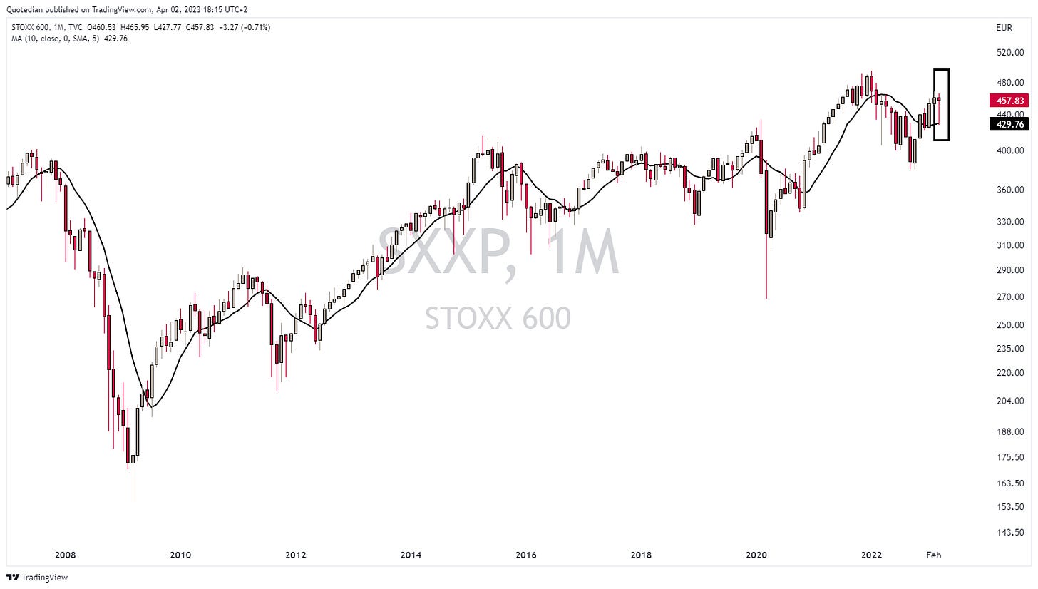
Hoping over the Atlantic to Europe, the last candle on the chart of the STOXX Europe 600 index (SXXP) speaks for itself regarding the intra-month volatility:
Let me show you that last candle as a line chart:
In Asia, the Japan’s Nikkei ‘feels’ like it is ready to break higher:
Whilst the Chinese Mainland equity (CSI 300) comeback has stalled somewhat:
India’s BSE500 remains elevated, but looks a bit heavy to me:
As anecdotal evidence, I had more visits from India equity fund managers over the past two months than previously in my entire career together. Usually not an overly bullish signal …
Ok, let’s see then if some of the extreme intra-month volatility has left its mark on equity sector performance:
Good! Over sixteen percent dispersion between best and worst - which means that indeed the financial crisis can be evidenced in sector performance. For one, long-duration stocks (technology, communication) up on expected lower rates and financials down based on the woes happening. Sector allocation continues to matter a lot!
Let’s have a look at a few charts, starting with European Banking (BNK) performance:
The index stalled right at the decade-old resistance, took a 20%+ hit from there, but was able to recover about half of the losses by month's end.
US stocks have recovered less from their dip and overall look ‘heavier’ on the chart:
But, of course, they had also fared much better since the end of the GFC in 2009.
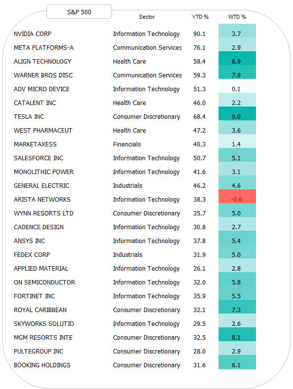
Before turning to fixed-income markets, let’s finish the equity section with our weekly review of the best-performing stocks on a year-to-date basis. Here are the TOP 25 stocks in the S&P 500:
That NVIDIA-thingy is just out of this world. Here’s the monthly chart of that stock:
And here’s the European list:
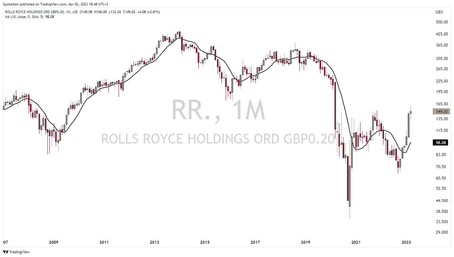
Here’s the chart of the best-performing stock (Rolls-Royce) in the STOXX 600 Europe index:
Ok, let’s accelerate a bit, as its getting late (as usual). Here’s the performance table for the most important fixed income segments around the globe:
Turns out that the (mini) financial crisis distress has been very good for fixed-income assets. Clearly, Mr Market is now expecting a central bank pivot regarding the hiking cycle. This will probably accentuate itself even more over the coming months, as inflation numbers will come in lower. Ride the wave as long as its last, but strategically keep in mind that inflation is like toothpaste … once it’s out of the tube it is very difficult to get it back in. What happened in March and the governments/central banks’ reaction to it is net inflationary down the line…
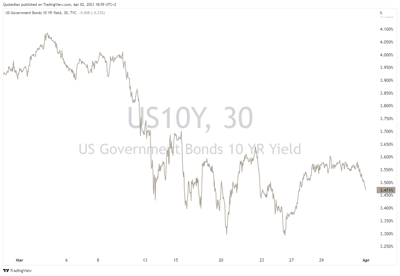
Here’s the chart of the US 10-year Treasury yield:
On this monthly chart it does seem a lot, but zooming in we see that the yield drop was close to 90 basis points at one stage during the month:
The curve (10y-2y) has steepened over the months, which as a reminder is not good news (unless you like recessions):
I will not show the chart again, which proves that recession starts after yield curve inversion as the curve steepens again, but you can look at it here (about two-thirds down the letter).
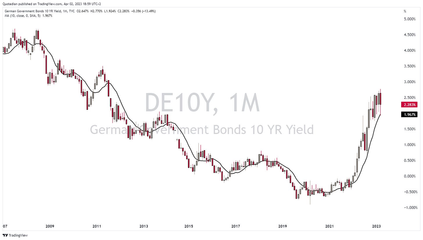
On our side of the Atlantic, German 10-year yields (as proxy for European yields) have also come down, though a tad less so:
Steepening (10y-2y) has also been observed, albeit some of it has been undone again:
Call me a Cassandra,
but credit spreads seem nowhere wide enough to reflect a probably still ongoing financial crisis and a looming recession:
Let’s move quickly into currency markets, which have been relatively calm during March:
Cleary, the US Dollar has been on the retreat versus most other major currencies, not least versus the Euro,
and the Japanese Yen:
Though clearly, neither chart is conclusive regarding the prevailing trend.
Another currency standing out is the Norwegian Kroner, which has lost more than three percent versus the Euro, probably on the back of a lower oil price:
Finally, a brief look at commodities, starting with the major commodity ‘sectors’:
Similar to the equity sector performance chart, there is an important and hence exploitable performance difference between best (precious metals) and worst (energy).
Moving a notch more granular, here are the performances of some commodity futures:
One chart standing out is the one of Gold, which just saw its second highest monthly closing EVER (highest was in July 2020):
Oil (Brent) has recovered from a breakdown, but also signals rather towards recession:
Time to hit the send button and to open that bottle of Meursault!
Cheers.
Don’t agree on the wine? Leave your comment here:
CHART OF THE DAY
Let’s finish on some (potentially) good news. March, being seasonally a difficult month, turned out to be quite ok as we observed above.
April, it turns out, is one of the best months for equity markets. Horray!
Thanks for reading The Quotedian! Subscribe for free to receive new posts the moment they are published.
DISCLAIMER
Everything in this document is for educational purposes only (FEPO)
Nothing in this document should be considered investment advice
The views expressed in this document may differ from the views published by Neue Private Bank AG
Past performance is hopefully no indication of future performance


