


Staring into the Abyss
The Quotedian - Vol VI, Issue 73 | Powered by NPB Neue Privat Bank AG


“If you stare into the Abyss long enough the Abyss stares back at you.”
Friedrich Nietzsche
"Everybody has a plan until they get punched in the mouth."
— Mike Tyson


Today’s second QOTD is probably one of the most overused in this newsletter, but yet, despite being a bit dramatic in describing my Sunday it helps explain why the planned weekend Quotedian never left my Outbox.
A Quotedian was the plan and a fantastic, prolonged lunch at Zurich lakeside under a beautiful autumn sun was the “punch in the mouth”.
But do not despair, as you have the latest edition of your favourite macro investment newsletter already in front of you - hence, let’s dive right in!

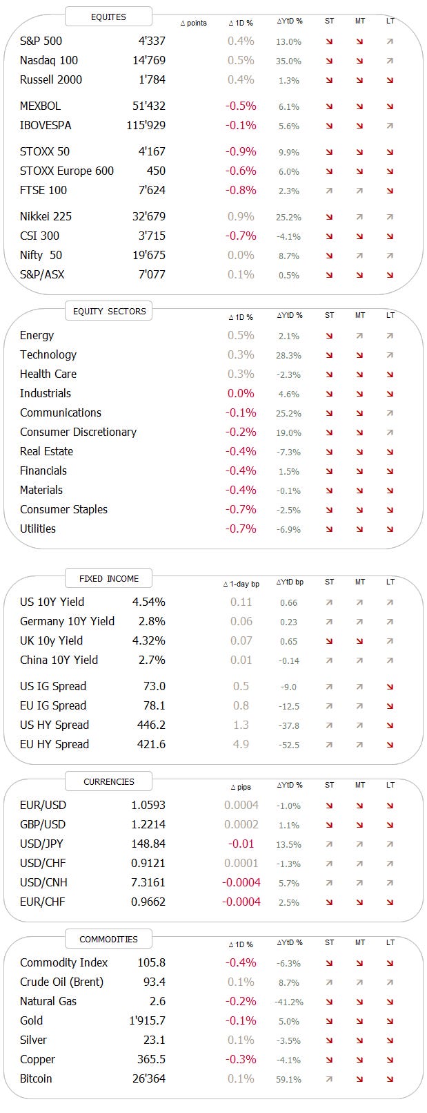
Let me start the equity section with a performance review of global benchmark indices from last week:
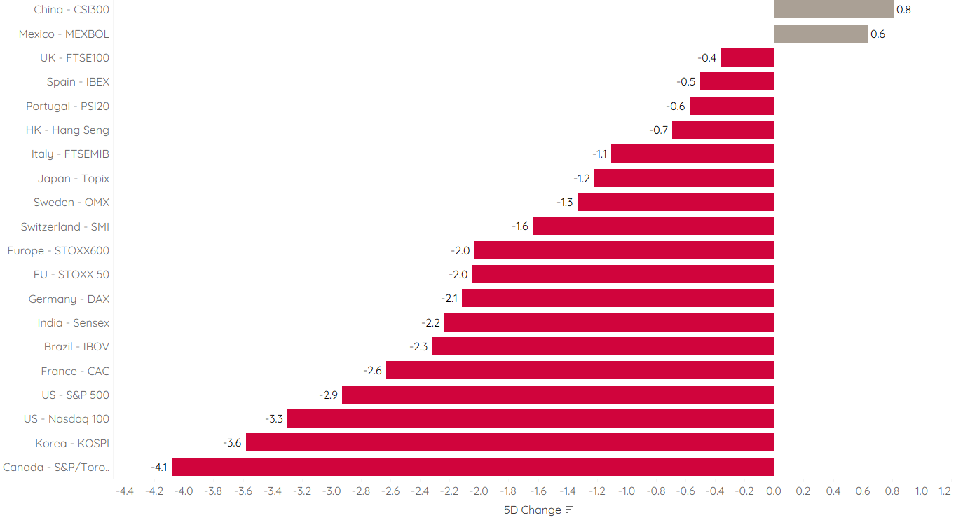
Unless investors were strongly overweight Chinese (unlikely, given the extremely sour sentiment towards that market) or Mexican (probably neither) stocks, their equity portfolio probably took a beating last week. Not only were most equity indices down by up to 4%, many of the high-performing stocks this year also saw their fortunes (temporarily) reversed. Here are 25 top-performing stocks YTD in the S&P 500 and their behaviour last week for example:

As I highlighted in Friday’s brief update, ‘Easy Now …’, stocks are about to worsen their visual aspects on the charts substantially.
First of all, again looking at the S&P 500, our shoulder-head-shoulder pattern has been “activated” via the break of the neckline (black dashed), whilst simultaneously the 100-day moving average (not shown) and the lower line in the sand (red dashed) have also been violated:

On the following chart, we zoom out a bit further to include all of 2022 and we get a good idea of how important the current level is:

By the way, the S&P 500 has now its first drawdown in excess of five percent since March:

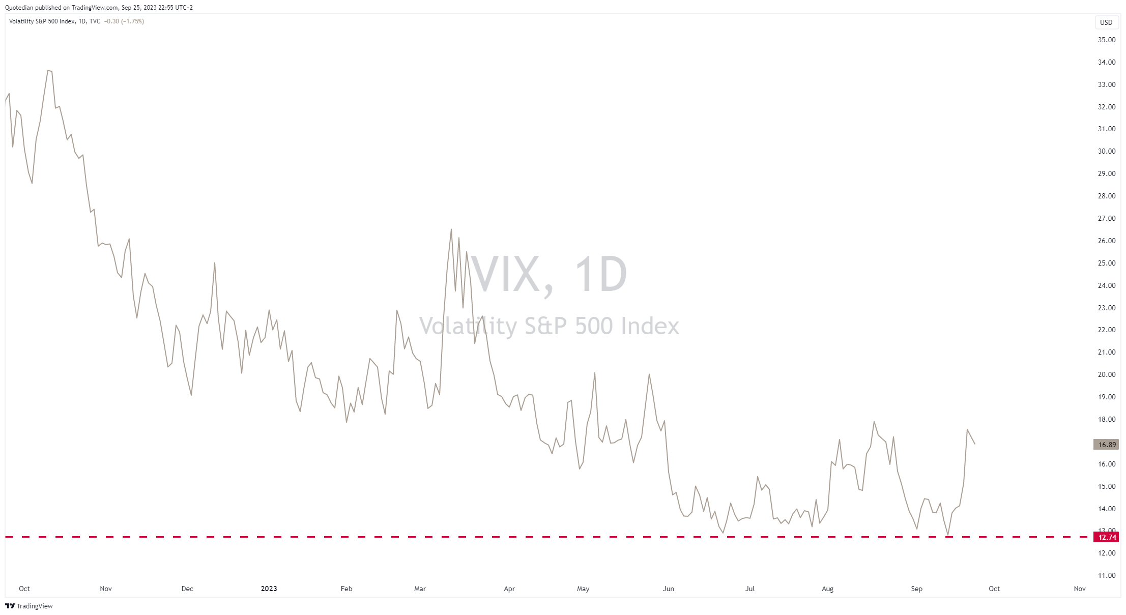
After the VIX hit a new cycle low two weeks ago, signalling too much complacency amongst investors, it now has spike again, but is still not in panic mode:
The Nasdaq 100 is in a similar precarious situation:

On both charts, all hope is not lost, but you will agree that we are kind of staring into an abyss.
As discussed on several occasions, small-cap stocks have been performing much worse than their large/mega-cap cohorts. Here’s the Russell 2000 index:

And here is the Russell 2000 ETF (IWM) to S&P 500 ETF (SPY) ratio:

Theory has it that small-cap stocks perform better over time as investors should get compensated for increased volatility and reduced liquidity, but that trade has not been working for the past ten years now and all in all, we are back to the levels of 2003.
In Europe, overweighing small cap has also not been working over the past two years, but overall the track record going back to 2002 is substantially better than for their US counterparts. Here’s the chart via the MSCI indices:

Staying in Europe for a moment, the SXXP gives a similar “staring into the abyss” picture right now. Break of key support here would/could mean a similar three to six percent correction as in the US:

As you have noted by now, we are talking pretty little about yesterday’s session today, but rather taking a slightly a bigger picture look (not monthly charts big look, we reserve that for Sunday/month-end).
However, one thing to mention is the astonishing resilience of stock markets this Monday, with US equities even “rallying” in the last hour of trading:

This is surprising given the constant sell-off in duration we have observed on Monday and which we have a closer look at in the next section.
Hence, is Monday’s equity strength resilience or negligence? Asian stock market performance and Western markets futures would indicate more of the latter this early Tuesday:


As mentioned towards the end of the Equity Section, interest rates are on the move again, and this time around it seems to be long end pulling yields higher:
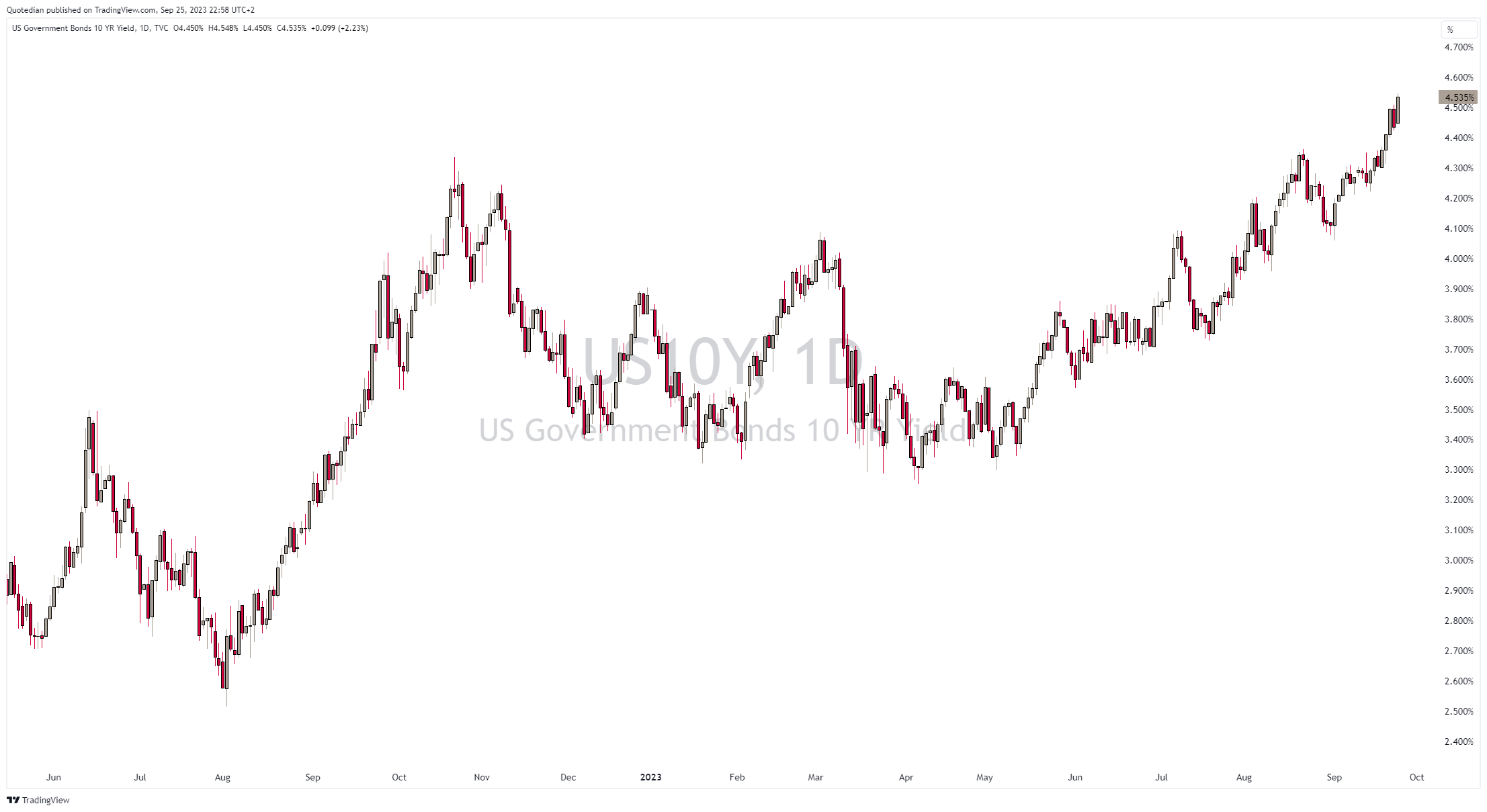
Or check out the thirty year treasury:

The trend is your friend until the very end …
This, of course, means that bonds are selling off and indeed we can observe how the popular ishare 20+ year Treasury ETF has stopped staring into the abyss, but has rather stepped right into it …

Now, sentiment has turned extremely bearish on bonds and Thursday’s volume on this ETF was the highest since the panic days of COVID over three years ago:

Capitulation anyone?
Having said that, the US 10-year treasury is now on its way to produce the third consecutive year of negative returns:

This happened zero times over the past nearly 100 years …
It is true that in bond investing it is said that the intitial yield, i.e. the yield available at the day you buy a bond is a good indication of the return you will get. Hence, investing today close to 5% as compared to two years ago close to 0%, your chances for a positive return are substantially higher. But of course it has been painful in the meantime for you existing bond holdings. As we are all reminded, duration and convexity DO matter!
Anyway, the increase in yields at the longer end means of course that the inversion of the yield curve is reversing:

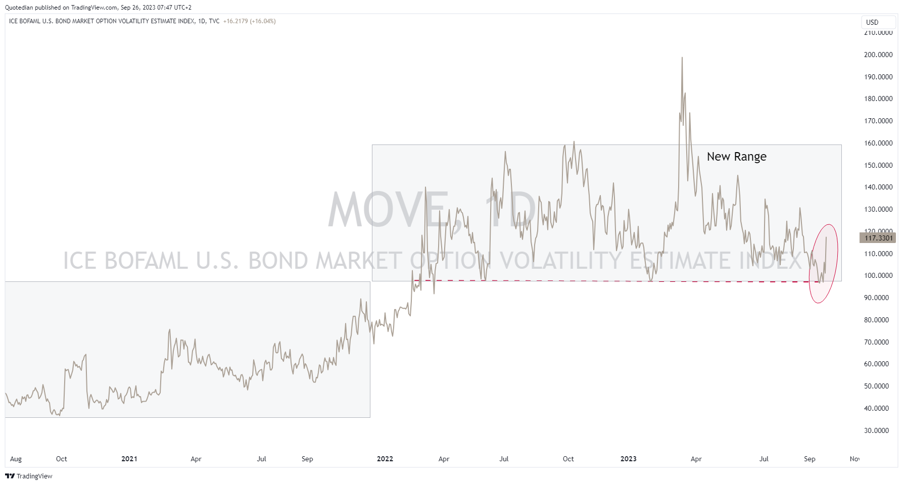
And who has been paying attention to my ranting in the past (few, I know), will remember that it is when the yield curve steepens from inversions that market volatility picks up. See VIX above and see MOVE (the bond market’s VIX-equivalent) below:
There’s much more to say about the current sell-off in bonds, such as a looming US government bond sell-off for example, but I will keep some thunder for later this week, latest this weekend during the monthly review.

Did I already mention further up that the trend is your friend? That is nowhere as much true as for currency markets. Consider here the daily chart of the US Dollar Index:

Up 6.5% since mid-July with 35 up candles versus 14 down candles. A (largely time-insensitive) Renko charts shows a beautiful picture of trends:

The US Dollar index (DXY) is largely made up of Euros and Yens (~66%), here is the picture versus the Euro only:
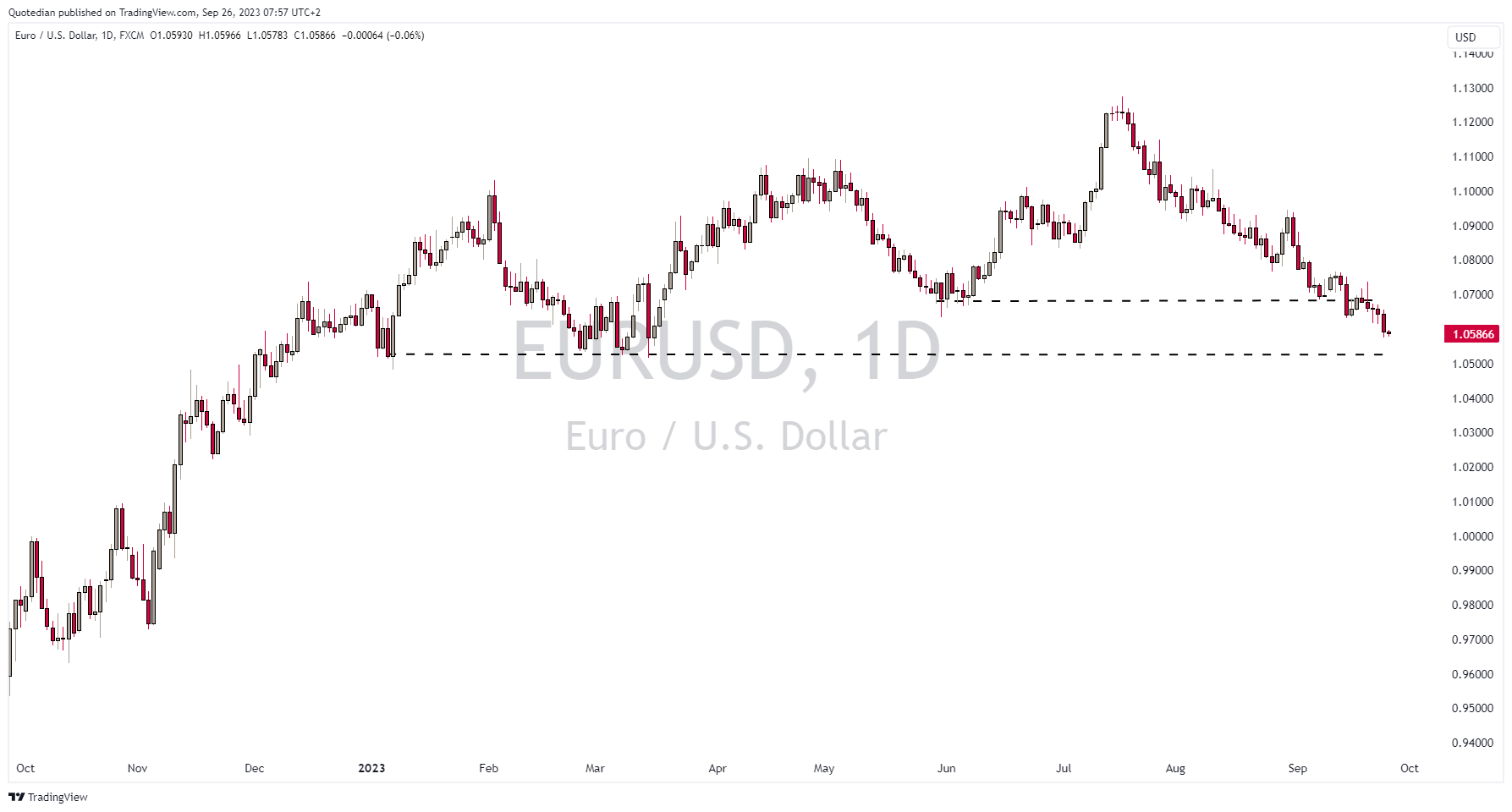
First key support has given away, 1.05 is the next border to the canyon for the best view into the abyss.
One more for the currency section, as we bragged about going short the British Pound versus the US Dollar should the rate drop below 1.23:

Hence, putting our credibility where our mouth is, we have added the GBP/USD short to our trade blotter. However, be ware! The currency pair is pretty oversold on the daily chart already, so maybe be cautious before putting some real money there.

In the commodity complex, oil is pausing at a seemingly good place to do so:

As you know by now, I think it is indeed only a pause, even though several economic sticks could provoke a prolonged pause. But in the meantime, oil is working off an overbought condition on both, the daily and the monthly chart.
Time to hit the send button!
Enjoy your Tuesday,
André

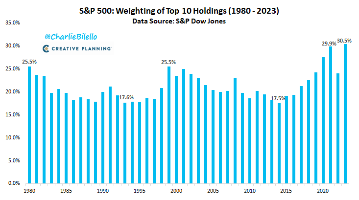
Today’s chart of the day shows how the 10 largest stocks in the s&P 500 make now up more than 30% of the index weight. Such concentration is rarely good - let’s see who the largest weights are by the end of the decade:
BONUS CHART:
In relation to the above, we have spoken on several occasions about the Magnificent Seven (MSFT, TSLA, NVDA, GOOGL, AMZN, META, AAPL). The following chart shows that eliminating those seven stocks out of the S&P 500, the S&P 493 would basically be flat year-to-date:

The bottom line is of course that if you buy the S&P 500 you buy a bunch of expensive stocks making up over 30% of the index and carrying an average P/E of 50.
Stay tuned …


Everything in this document is for educational purposes only (FEPO)
Nothing in this document should be considered investment advice
The views expressed in this document may differ from the views published by Neue Private Bank AG
Past performance is hopefully no indication of future performance
"This has happened zero times in the last 100 years" . Ominous words tgat investors should consider more carefully. We are approaching uncharted waters as the US approaches insolvency. Many more unpleasant "firsts" are ahead in the coming years. Gold will prove to be the only refuge, which is why many central banks are buying.