Truss 0 - Lettuce 1
The Quotedian - Vol V, Issue 151
“History, in general, only informs us of what bad government is.”
— Thomas Jefferson
DASHBOARD
AGENDA
CROSS-ASSET DELIBERATIONS
It’s Friday, and it once again has been a very long week full of (market) excitement, so without further ado, let’s dive right into our usual routine of reviewing the different asset classes of the past few hours!
European equity markets managed to cling on to early gains, ending the day in positive territory (ex-UK stocks). Though once the European closing bell rang, their US counterparts quickly started falling, ending the day about three-quarters of a percentage point (S&P) lower:
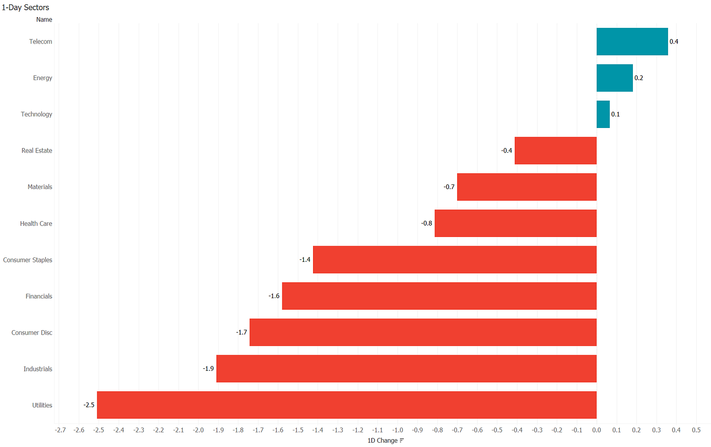
Three out of the eleven sectors managed to eke out a gain,
whilst market breadth as measured by declining versus advancing was about the same as the previous day (3:1), which also had seen stocks decline.
Remember our S&P 500 chart analysis from Monday? For now, only (1) has been exceeded as resistance, and the failure at (2) remains in place
However, and zooming in on the chart above, the failure as described above, give us two excellent “lines in the sand” when trying to guess the short-term future of stocks. For one, resistance is at 3,748, whilst support is at 3,584
With the most recent closing price pretty exactly in the middle of these two points, a break of either side will give a good indication of the immediate future direction for stocks.
Asian stocks are on the defence this morning, with many regional indices down on the day, though most of them ‘only’ about half a percentage point. European and US index futures are lower to about the same extent.
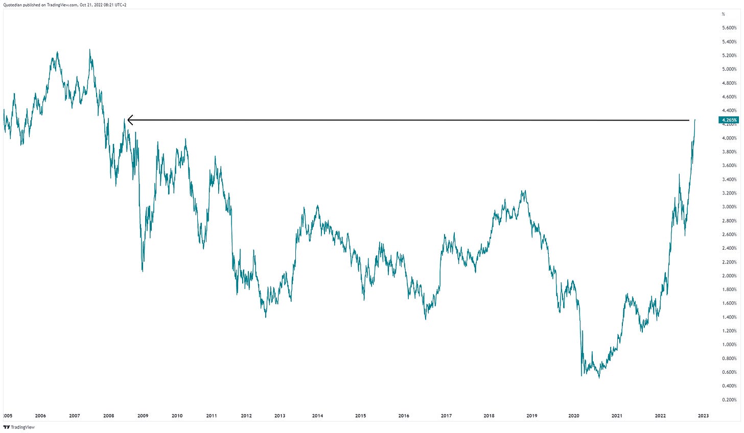
The most surprising aspect about yesterday’s (US) equity sell-off is, as it was during the previous session, how contained it was, given the massive 10 basis point rally observed in bond yields and the new cycle highs in the same:
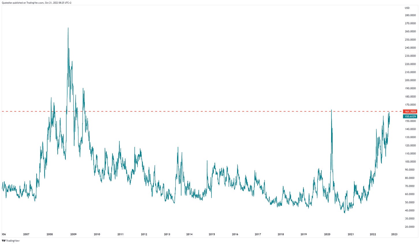
As a matter of fact, this “dispersion” between bonds and stocks is also very visible when comparing the closely watched volatility indices of either (MOVE vs VIX):
Despite using two different y-scales the chart crime committed is minor, as the picture clearly shows how elevated one (MOVE) is versus the other (VIX).
As a matter of fact, MOVE is at the same levels of distress as it was during the heights of the COVID panic moment and at similar levels to the average of the GFC:
So, what is the right way to look at this? Are equities ignorant to the dangers signalled by the bond market and will eventually catch up to the downside? Or should we interpret the equity resilience as bullish, given the turmoil going on in fixed-income markets and will head higher once bonds calm down?
You know what, let’s poll this!
As usual, your vote is absolutely confidential, with nobody having access to your cast - not even me! Hence, VOTE - the more, the merrier!
In currency markets, the US Dollar has seen some renewed strength and however uncomfortable this strength is for risky asset classes, the TA handbook’s standard interpretation of a triangle as shown on the US Dollar Index chart below (light green lines) is that of a (trend) continuation pattern:
The jury still stands out, but the odds are shifting in favour of a US Dollar move higher.
Of course, does a lot of Dollar strength on the Dollar Index (DXY) come from weakness on the JPY/USD chart, now firmly above the 150 level:
Little going on in commodity markets, with the exception perhaps of US Natural Gas, where the recent price reversal is astonishing (and probably somewhat surprising):
As an aside, UK and European gas prices jumped 22% and 7% respectively yesterday, on worries regarding planned price caps given the political turmoil going on.
One more before we go … in yesterday’s review of the US housing market, it would probably also have been worth to look at the chart of lumber for any clues. Planks of wood are probably the most important commodity input into US house construction, so message from that corner should always be listened to:
However, there is not too much to be read out of this, other than prices had already collapsed, together with house construction stocks (ITB/XHB).
Ok, time to hit the Send button. Before you are off the enjoy your well-deserved weekend, make sure to cast your vote in the poll above, so we can discuss the results on Sunday evening, in the weekly review edition of The Quotedian.
Stay safe!
André
CHART OF THE DAY
Let’s finish off where today’s Quotedian started, i.e., picking on the poor Brits. Careful now, before all you POMS on this list unsubscribe, amongst others, I also have a British passport, which kind of entitles me to have a critical view on self. Or so I hope.
Due to excessive government changes,
it has become very popular to compare Britain’s political system, with the one in Italy. By all means, even the mighty Economist has a front page on this:
Sadly enough, FT Alphaville has the right title and assessment on this comparison:
This brings us to our final “Chart of the Day” for this week:
Over the past twenty years, excluding interest payments on government debt, Italy has been running a budget surplus similar to that of Germany. It has shown much more frugality than the UK:
Britaly? You wish.
Thanks for reading The Quotedian! Subscribe for free to receive new posts and support my work.
DISCLAIMER
Everything in this document is for educational purposes only (FEPO)
Nothing in this document should be considered investment advice
Past performance is hopefully no indication of future performance


