Up, Up and Away
The Quotedian - Vol VI, Issue 74 | Powered by NPB Neue Privat Bank AG
"October. This is one of the peculiarly dangerous months to speculate in stocks. The others are July, January, September, April, November, May, March, June, December, August, and February."
— Samuel Langhorne Clemens
It’s October! Though temperature-wise it feels like late August, max early September! And it is this latter month we will review today, but let’s start today’s review with a quiz:
Looking for help to solve the market riddle?
Contact us at ahuwiler@npb-bank.ch
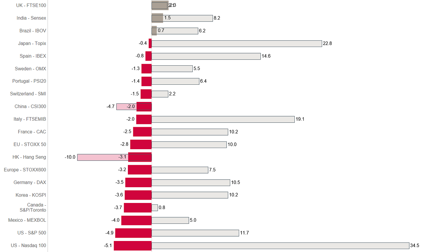
As usual, in our month-end observations, the thicker bars are month-to-date %-performances (MTD), whilst the thinner, semi-transparent bar represent year-to-date %-performances (YTD). And we will look, also as usual, at a bunch of monthly charts in order to refresh our 40,000 feet view of what’s going on.
Off we go!
Starting with a look at some of the most widely observed global equity benchmarks, we note that September lived up to its seasonal reputation as most markets corrected meaningfully:
All markets, with the exception of China Mainland and Hong Kong, can still show positive year-to-date returns, though most are now ‘only’ single-digit returns or just around the 10% mark.
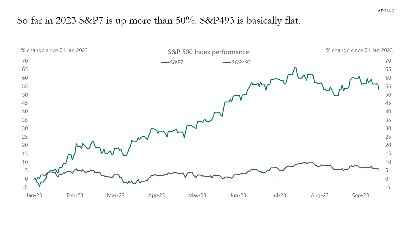
But, as we observed in last week's issue titled “Staring into the Abyss”, leadership in this equity rally has been very thin, i.e. a few stocks are responsible for most year-to-date gains. Here’s the COTD of the aforementioned Quotedian, which illustrates the problem well:
Let’s start with a look at UK stocks (FTSE100), which not only was the best-performing market in September but actually got enough ‘lift’ to produce a positive year-to-date return again:
Whilst September was positive, the Footsie continues to be caught in some complex sideways consolidation, with little progress in either direction.
Staying on this side of the Atlantic, we note that the narrow EuroSTOXX 50 index continues to be stuck below the 4,600 level it had already reached back in 2007:
Or even worse, this same index is over 20% below its 1999 highs:
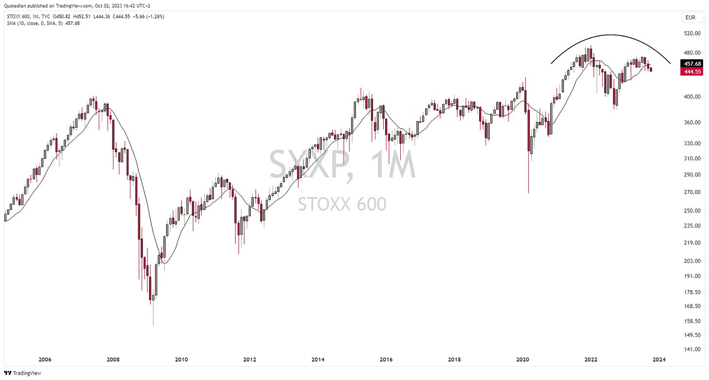
Looking at the broader Stoxx 600 Europe index (SXXP), which includes Swiss and British equities amongst others, the longer-term chart looks a bit friendlier than the above, though the visual impression is one of a topping formation:
Trouble ahead?
Ok, let’s jump over to the other side of the pond to have a look at how US equities are faring.
Let’s start with the S&P 500:
The chart also feels a bit heavy, but the SPX has technically one big advantage over its European peers, which we just reviewed. The index continue to trade above its 10-months (ca. 200 days) moving average (MA)…
Even more constructive in that aspect is the chart of the Nasdaq 100, which trades 5% above that 10-months MA:
But here also the chart looks heavy and a deeper correction cannot be ruled out for now.
And to contradict myself immediately on this statement, here are two charts providing some “hope” on the outlook for equities:
The first chart looks at the S&P 500 volatility index (VIX) this year (grey line) comparing it to the average (red line) of the past 30 years. It shows that volatility picked up in mid-summer right as it should have suggest by seasonality and is about the reach the zenith after which volatility should ebb again:
The second chart looks at at the S&P itself and also suggest that stocks could get a seasonal tailwind here:
Ok, time for a quick glance at some Asian markets, where Japan continues to be regional leader, despite a small correction in October. Here’s the chart of the TOPIX, which has a price target of approximately 2,660 (+14%) from the pole-and-flag formation:
Looking at the Nikkei and taking the long, long, long view we note the index is nearly back to its bubble-highs - some 35 years later!
India’s Sensex continues its ascent from bottom left to top right, with hardly any bump in its path:
Finally, one of the weaker markets this year is China, where the CSI300 index seemingly cannot find a lift-off:
Time to have a look at equity sector performance, which leaves us following picture on a global level:
Except for energy stocks, all sectors either reversed gains or added further to negative year-to-date performance. Technology and consumer discretionary saw some of the largest losses, but continue to carry healthy double-digit YTD returns. Given where bond yields are, it continues to be surprising how well these two long-duration sectors have been holding up. Something that is not true for utility stocks, which often are considered “competition” to bonds, due to their usually generous dividend policies.
The following chart compares the fortunes of the SPDR Utilities ETF (XLU) to that of the iShares 20+ Treasury bond ETF (TLT):
This serves as a good segue into the fixed-income section.
The fixed-income performance table looks like Nightmare on Elm Street for bondholders:
The state the obvious, rising yields are of course the main cause of falling bond prices, albeit credit risk may be starting to contribute negatively to the performance picture too, as credit spreads widened in September:
As we have discussed on several occasions, yields are heading higher - here’s the 10-year US treasury yield:
This is up, up and away #1
What is somewhat worrisome is that yields are rising as the economy is seemingly slowing down. This is ominous and dangerous, as it could be a sign that the US Treasury Department cannot find buyers for the papers they issue. The Federal Reserve Bank then becomes the “forced” buyer and yield curve control could indeed become a ‘thing’ in the US.
Let’s look at the chart above once more, zooming out even further for perspective:
We do not have as much history for German rates (on the financial information system I use at least), but the picture is very much the same as for their US counterparts:
Now let’s zoom in again on that same chart:
Interest rates in the UK have also started to re-accelerate again:
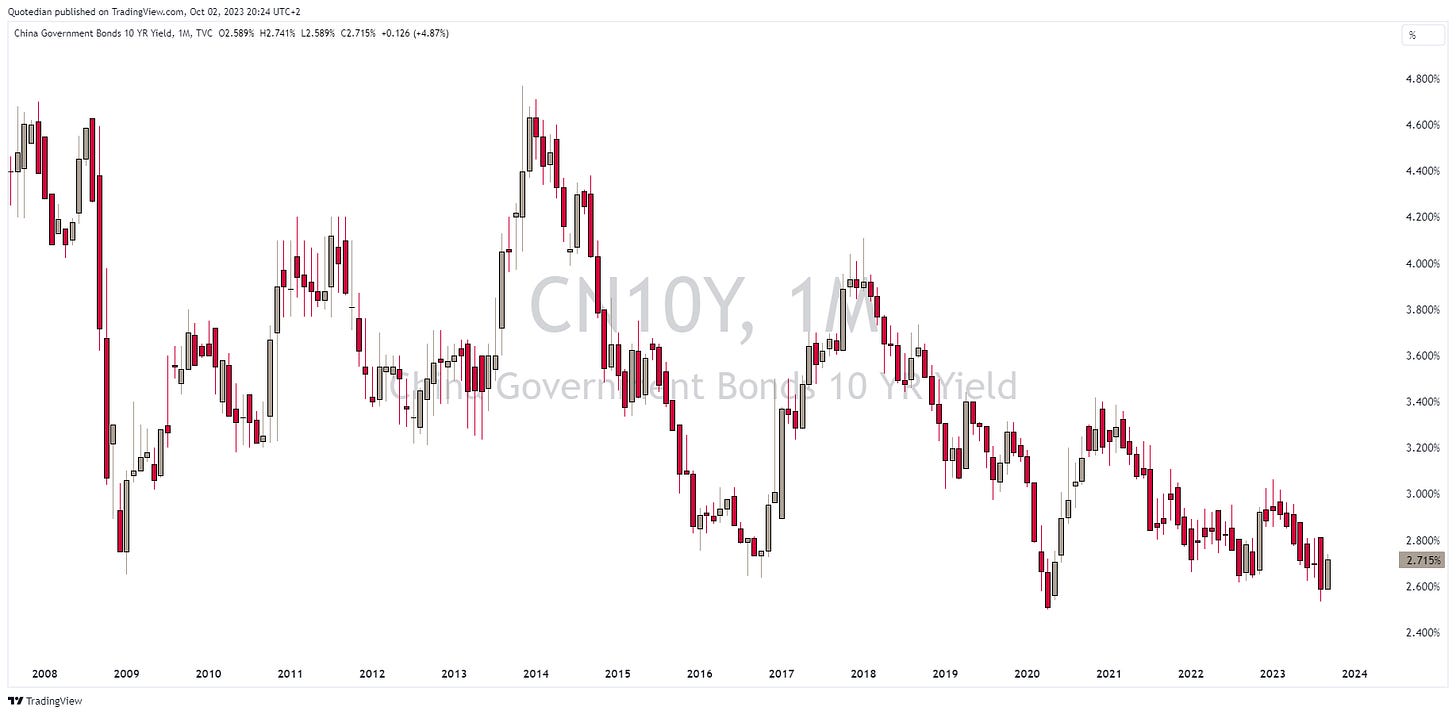
One of the few major economies with flat or falling rates continues to be China:
Checking in on currency markets, the performance table reveals that the immediate death of the US Dollar has been greatly exacerbated:
This Dollar strength can be partially explained by rising rates and the Fed’s “higher for longer” hint at the last Fed meeting. However, a flight to safety could also be the reason for the rise in the greenback and could be an early warning sign for other asset classes. Watch closely!
Let’s look at the chart of the US Dollar Index (DXY) first:
Up, up and away #2
The USD strength has pushed the EUR/USD cross below the 10-months moving average again,
whilst the UDS/JPY rates is marching towards 150.00:
Both, the Japanese Yen and the Chinese Yuan (see below) are at levels where intervention by their respective central banks are of elevated likelihood:
It doesn’t seem a lot on the monthly chart, but the British Pound is 10 big figures lower than in July:
Unfortunately for the GBP, the dominant eight-year cycle continues to point lower for another full year:
Given the strength of the US Dollar, Bitcoin is holding up pretty well:
And if you are a frustrated crypto investor waiting for XBT to move higher again, just keep in mind that Bitcoin is actually up 70% so far this year …
Finally, let’s have a look at the commodity complex, starting with commodity ‘sectors’ first:
Energy commodities were the big winners in September, which we have already seen reflected in the equity sector performance further up. Precious metals are on the other side of performance spectrum, with gold and silver down five and eight percent respectively:
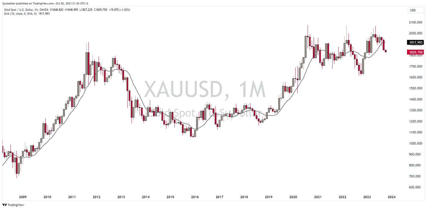
Here’s the monthly chart on Gold, with the yellow metal now falling steeply after having failed to surpass the $2,000 level:
Clearly are sharply higher real rates (nominal rates - inflation) creating a lot of headwinds for Gold:
Oil is up close to 30% (Brent) since June, a move that took most observers by surprise:
To me, the risk continues to be to the upside. Hence we define this as up, up and away #3
One commodity, Frozen Orange Juice, is up nearly 240% over the past three years:
Spoiler alert! But even that is dwarfed by Olive Oil’s 325% ascent:
These are up, up and away #4 and #5
Ok, that’s all for today. I hope the tables and charts in this document are useful to you, and I invite you to leave your feedback and/or comments in the comment section:
And, of course, do not forget to hit that like button towards the bottom of this mail. Thank you!
André
US 10-year yields (grey line) are now higher than Greek 10-year yields. Just saying …
Solution to today´s quiz:
Olive oil is up 27% over the past three months!
Everything in this document is for educational purposes only (FEPO)
Nothing in this document should be considered investment advice
The views expressed in this document may differ from the views published by Neue Private Bank AG
Past performance is hopefully no indication of future performance


