

USA's BBB
Vol VIII, Issue 18 | Powered by NPB Neue Privat Bank AG
“You can ignore reality, but you cannot ignore the consequences of ignoring reality.”
— Ayn Rand
Enjoying The Quotedian but not yet signed up for The QuiCQ? What are you waiting for?!!

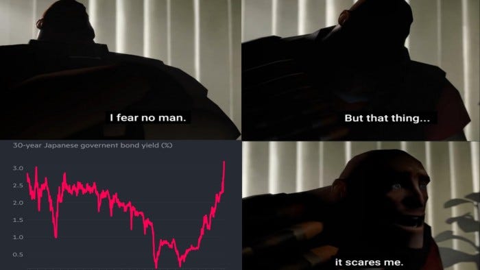
Maybe we discovered this week that US President Trump is actually indeed a visionary and/or has at least a very shrewd sense of humour.
After all, calling his budget proposal a Big Beautiful Bill can be nothing else than foreseeing what the US government future debt rating might be - BBB.
All jokes aside, this aint’ going the right direction:
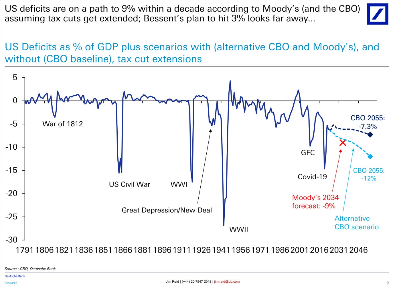
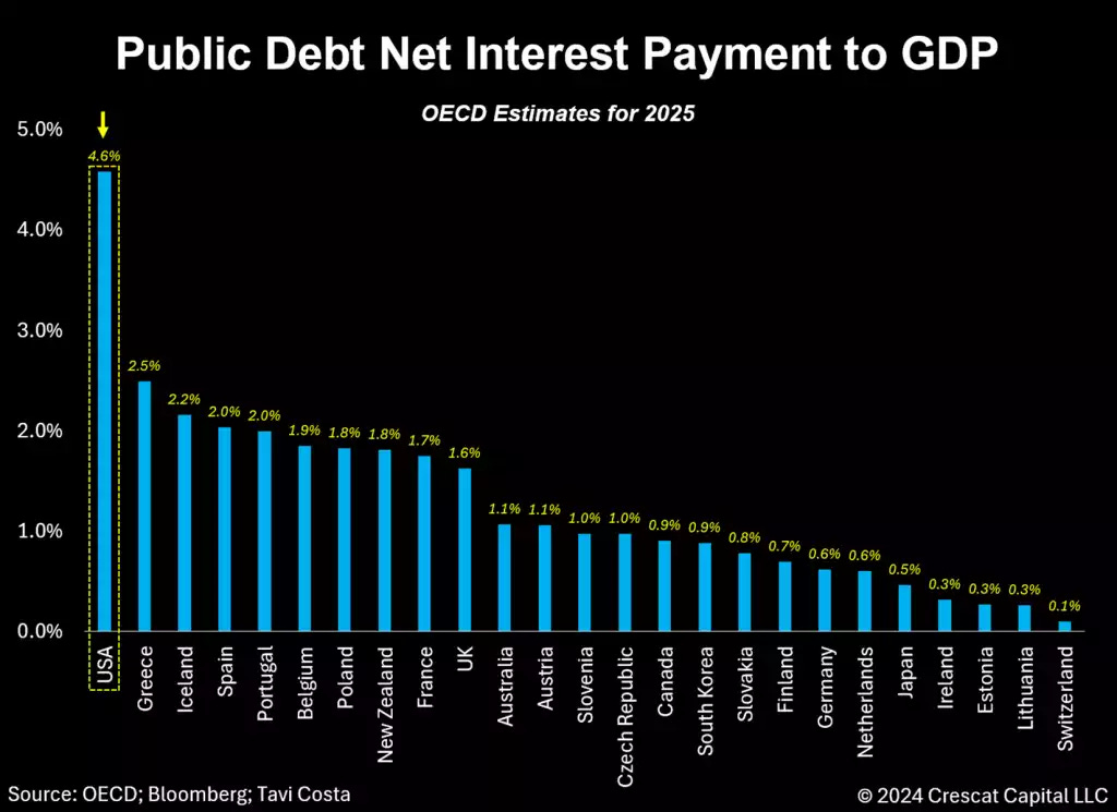
As net interest payment for US debt is soaring towards 5% of GDP,
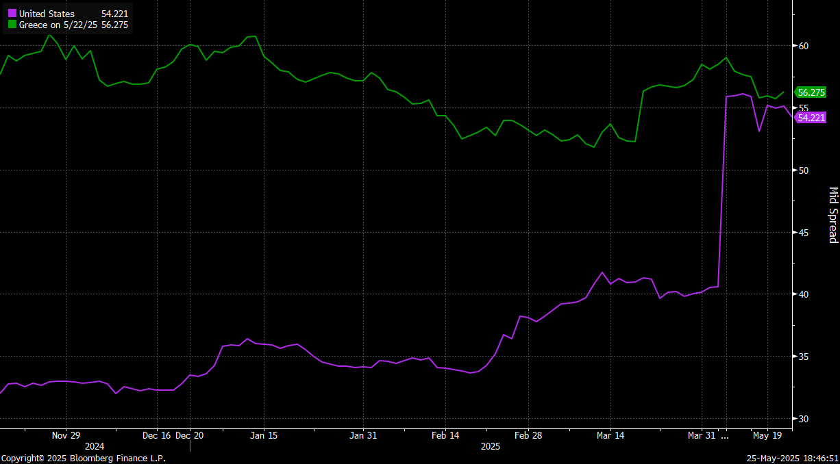
the market is starting to revolt in full revolution mode. Point in case - cost of US Default insurance is now about the same as the one for Greece,
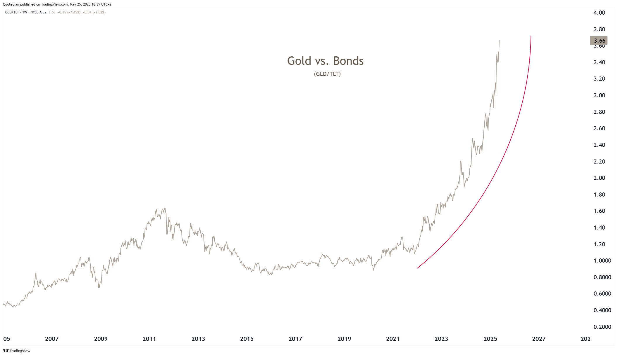
but the most obvious and worrying chart that a ‘Happy End’ is becoming an unlikely outcome, is that of Gold (GLD) to US Treasury Bonds (TLT) ratio, which is going parabolic:
So, before we turn to our usual cross-asset deliberations, let’s have a quick poll about the future of US debt:

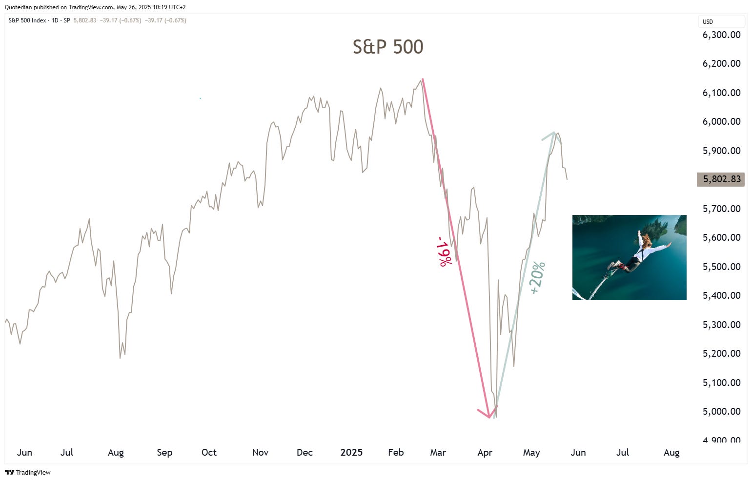
Equity markets have not been a rollercoaster-ride this year …
Much rather it has been a bungee jump, with a sharp decline

followed by a nearly a steep and fast recovery:

So, where next?
After the down, up is it down again from here?
That was definitely what it looked like on Friday, after Trump threatened 50% tariffs on Eurozone countries.
But as he has reversed (or at least put on hold) that decision already again on Sunday, the futures chart looks substantially more constructive than towards the end of last week:
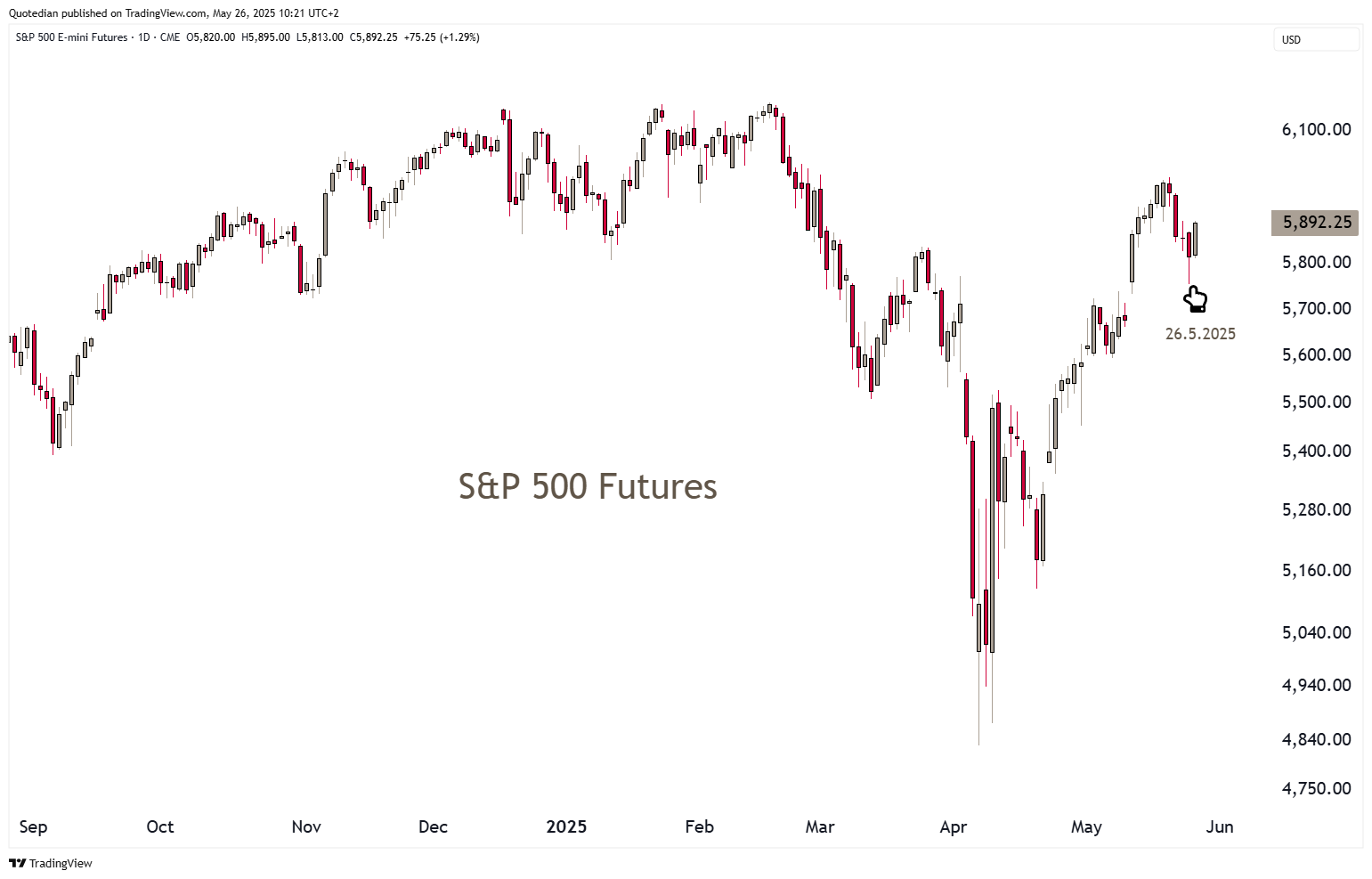
Now, having said that, today is a public holiday (Memorial Day) in the US and the stock market is not opening until tomorrow Tuesday. That leaves a lot of time for Presidential Executive Orders and other social media posts…
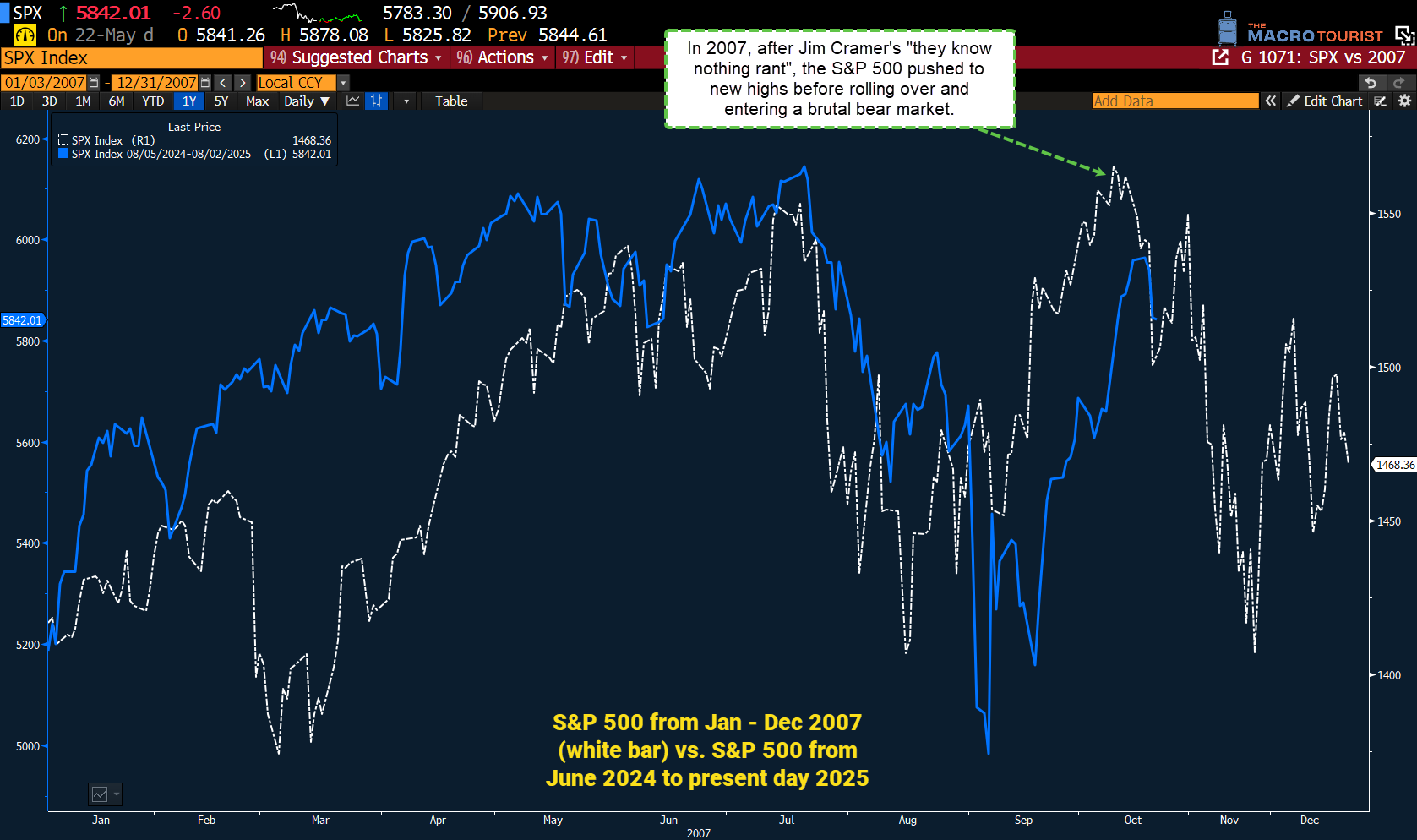
One chart that had been making the rounds last week was this one, suggesting that market may roll over again from here:
It was US President Harry Trueman who shouted:
“Give me a one-handed economist! All my economists say, ‘On the one hand... on the other.’”
Hence, in the spirit of this wisdom, here’s the chart that is “on the other hand” to the chart just above:
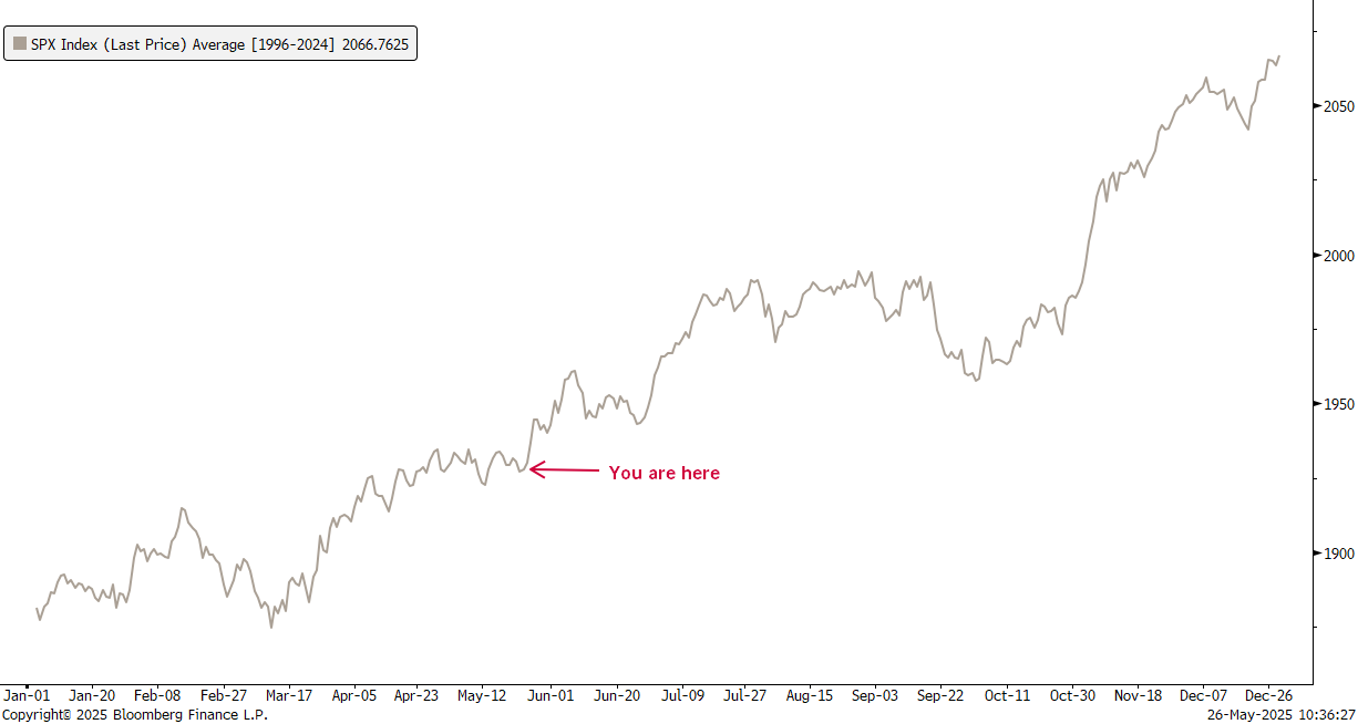
It shows the seasonality pattern of the S&P 500 over the past 30 years and suggest, that now is actually quite a good moment to load up on stocks …
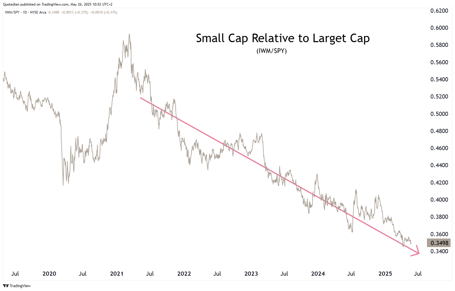
Small cap stocks (Russell 2000) have been rejected at key resistance,
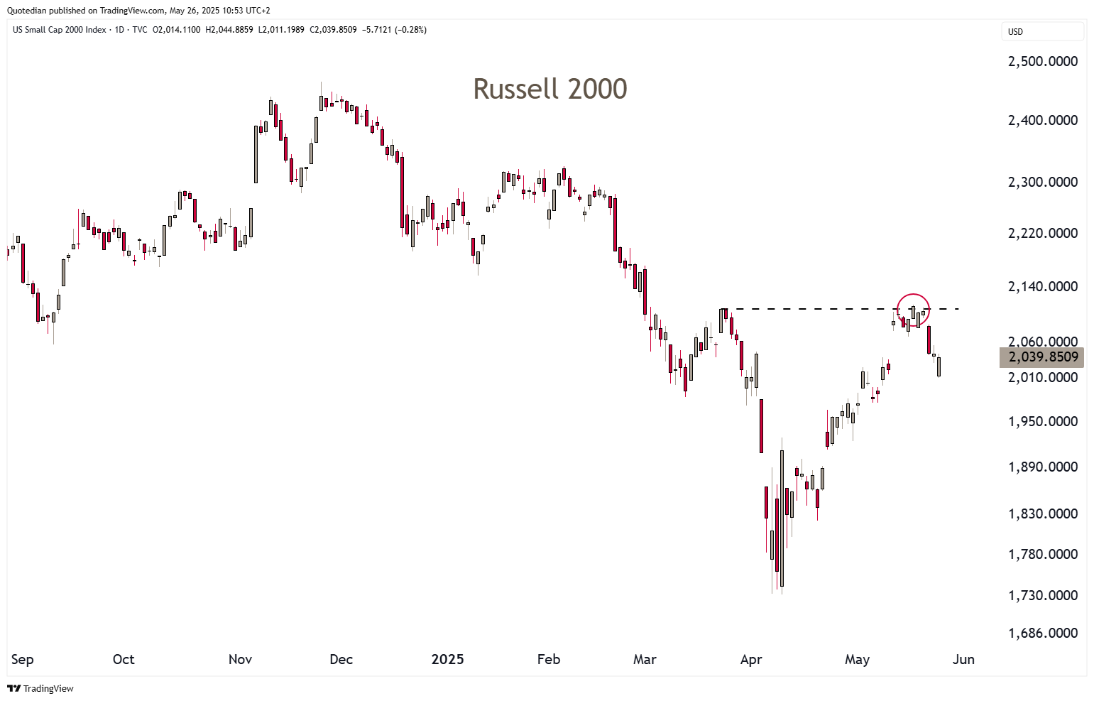
and continue there multi-year underperformance to large cap stocks:
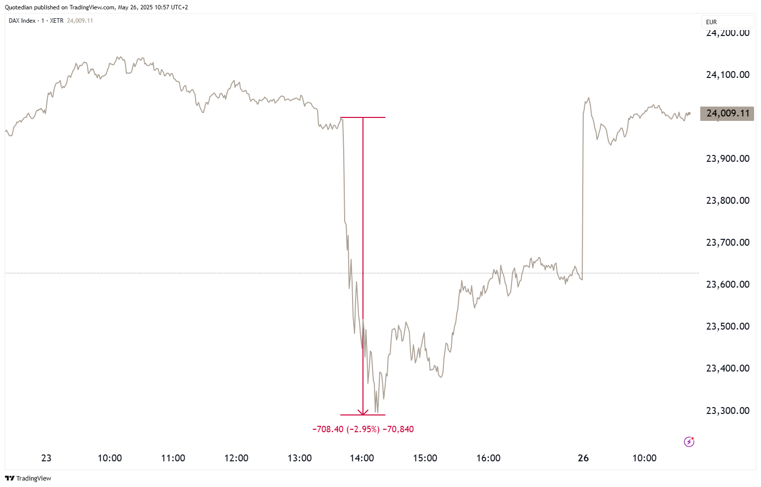
In Europe, the STOXX 600 is recovering today from a very volatile Friday:
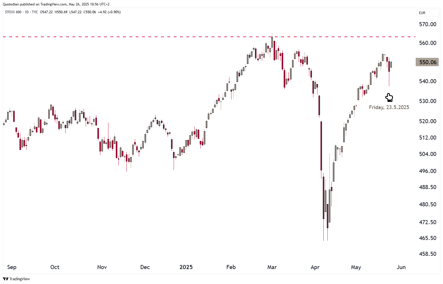
Germany’s Dax dropped more than 700 points (3%) in a question of minutes, as Trump’s Tariff Tantrum continued, only to have fully recovered by Monday morning, as I am typing these words:
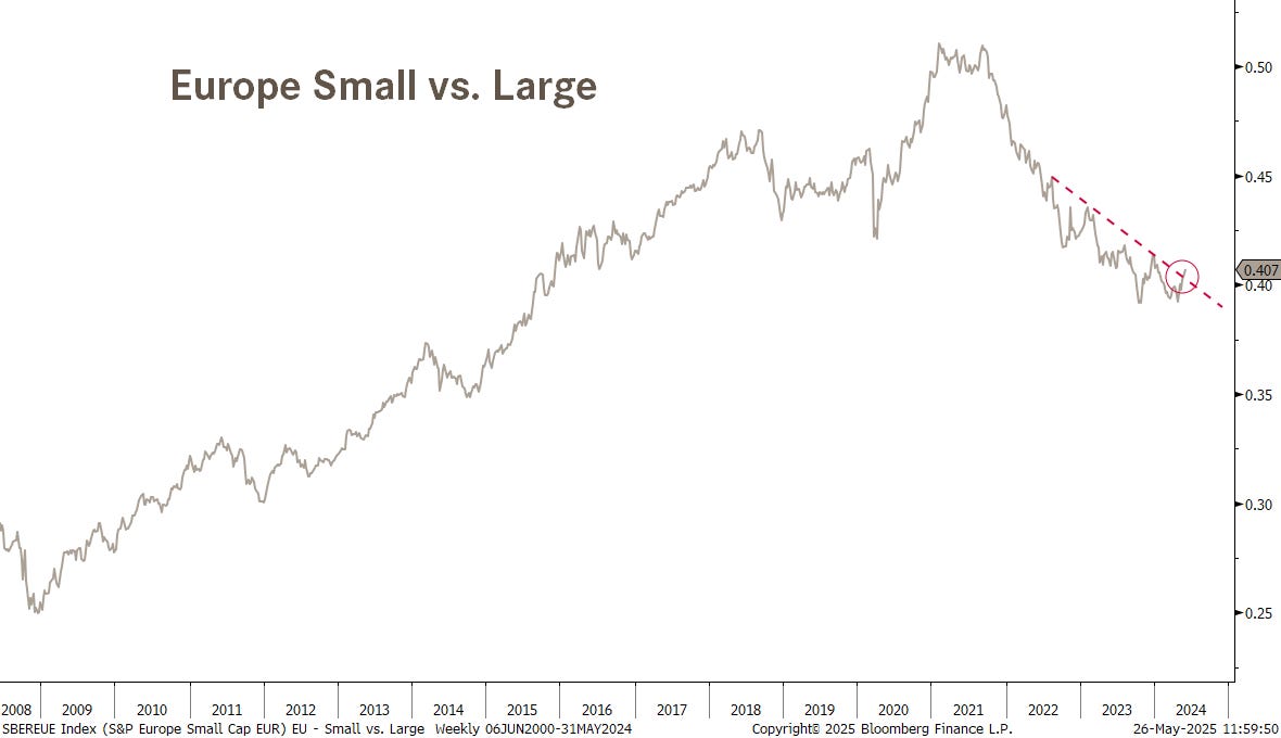
European small caps have been underperforming large caps stocks too, just as their US cousins, but there is a clear attempt underway to rupture that multi-year downtrend:
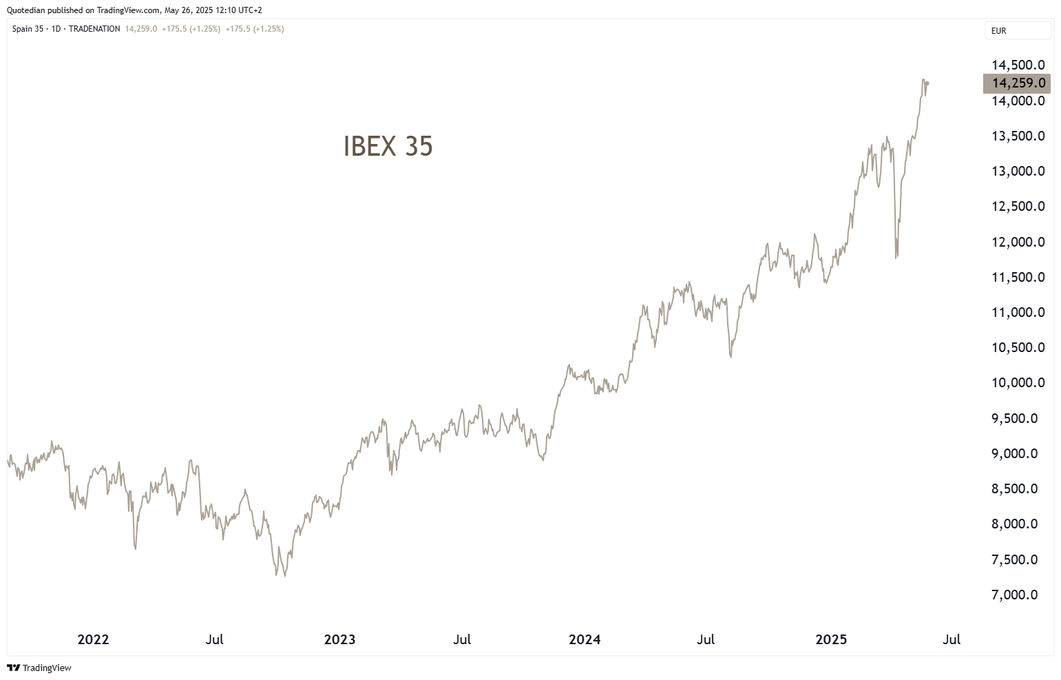
Spain’s IBEX 35 is up 23% year-to-date and has doubled since over the past two and a half years:
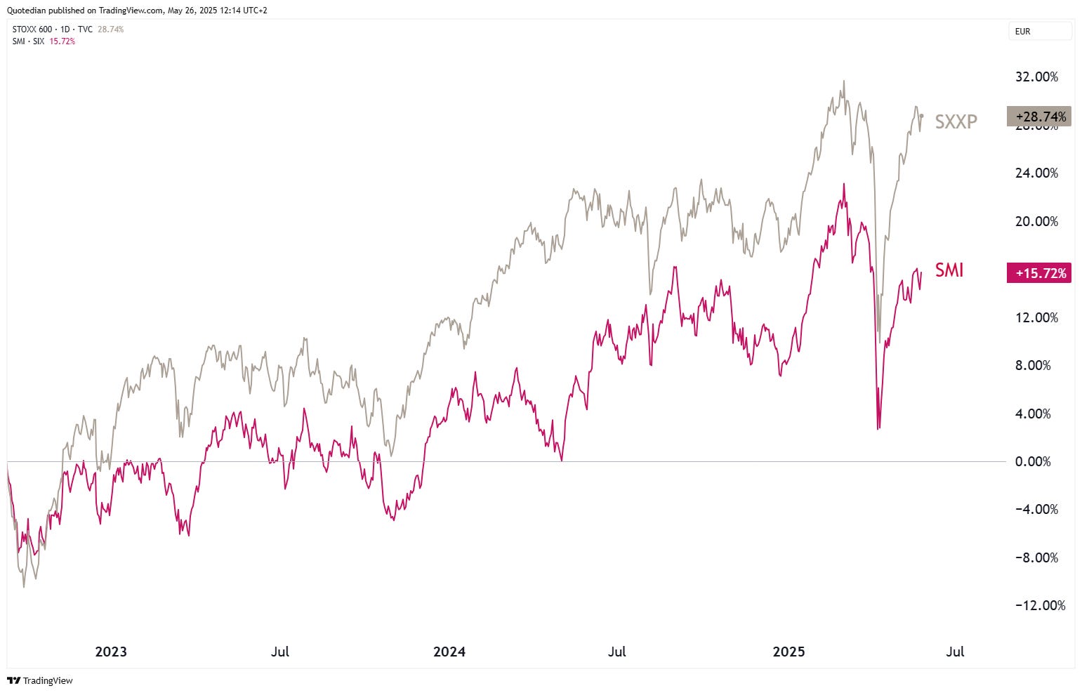
Swiss stocks continue to lag since the current cyclical bull started back in autumn of 2022:
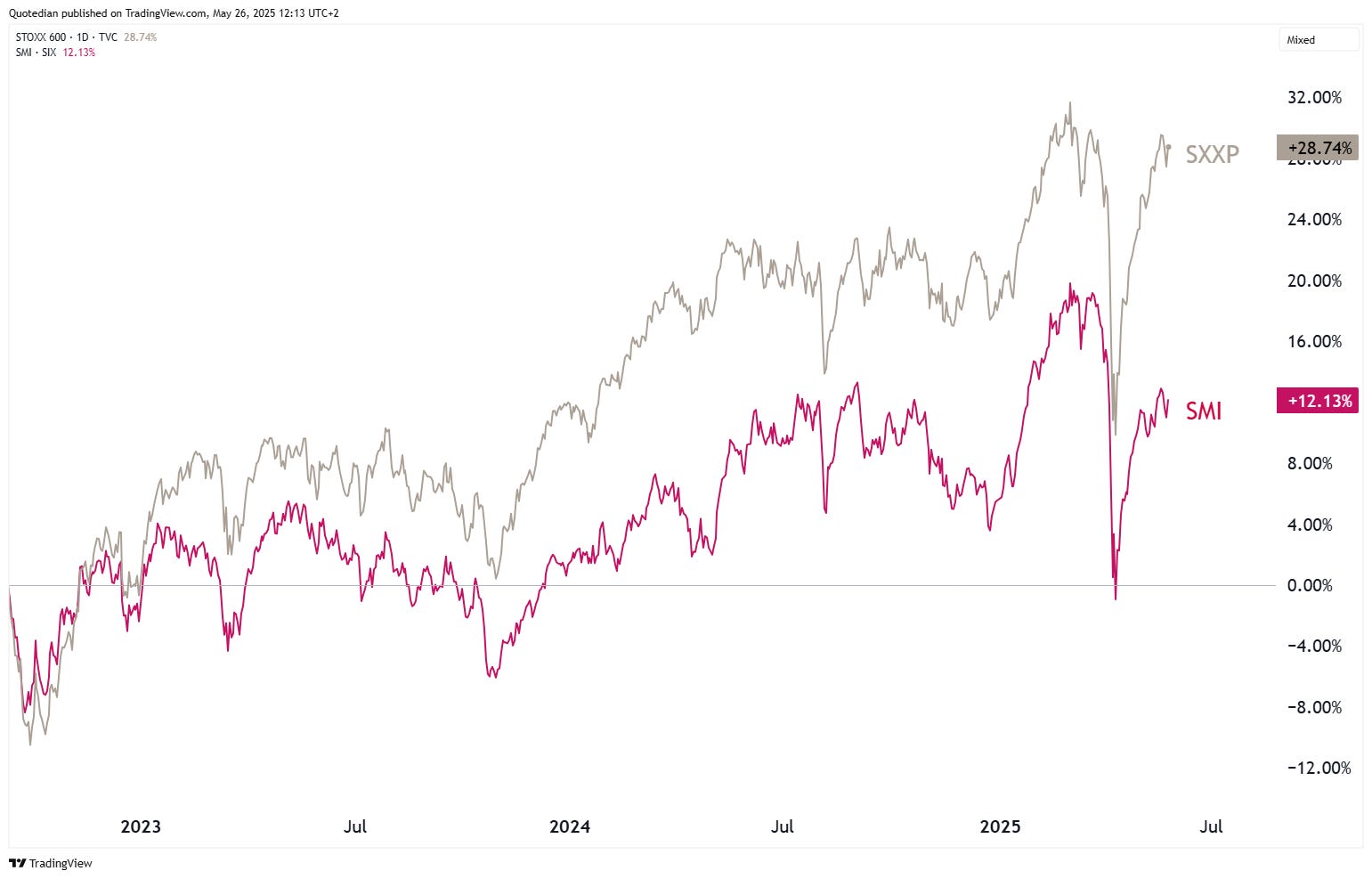
Even when measure in EUR:
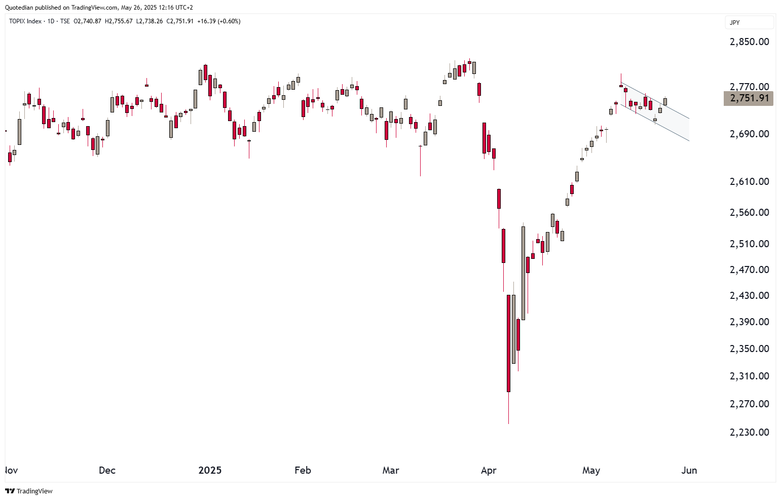
In Asia, Japan’s Topix index may be preparing for the next leg up:
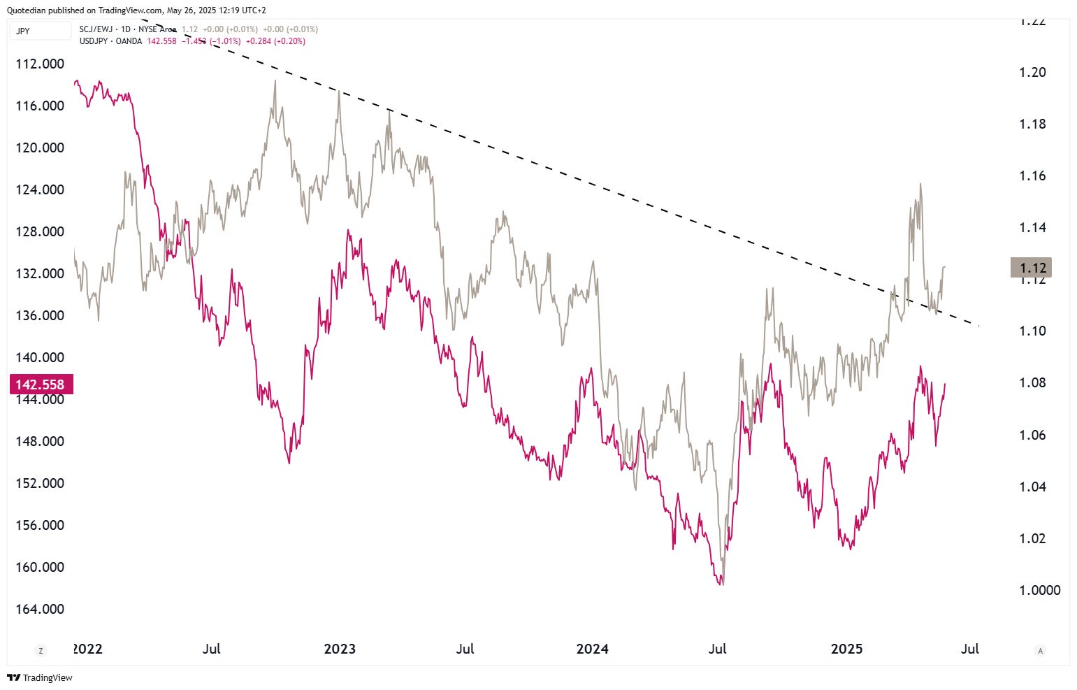
Small cap stocks in Japan have started to outperform their large cap peers (grey line in both following two graphs),
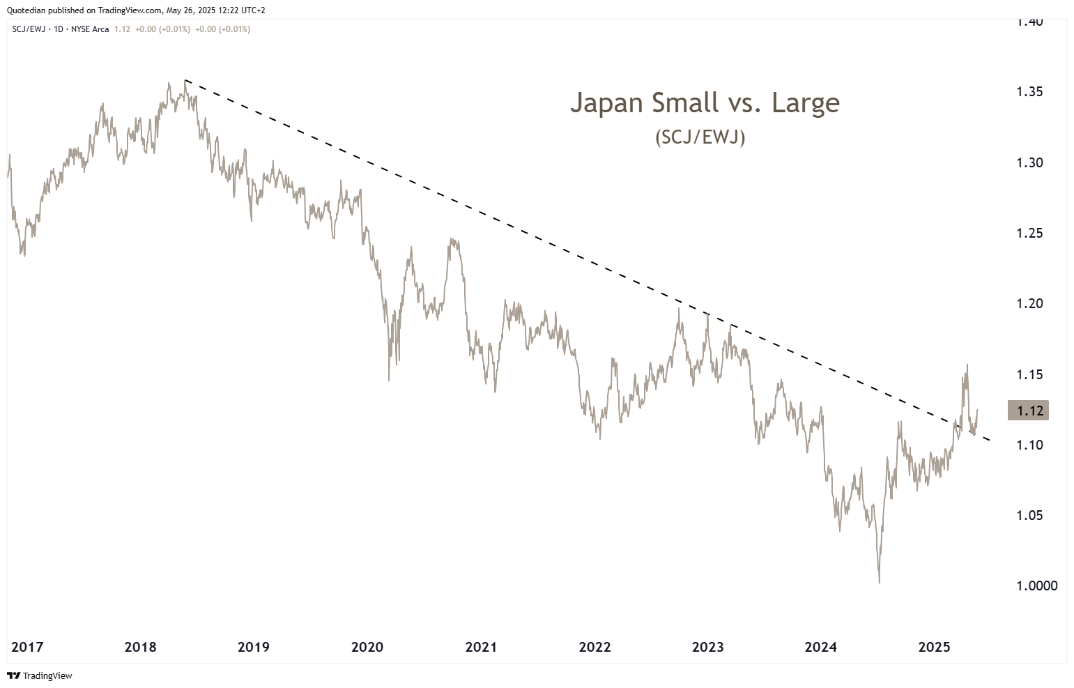
which is probably directly attributable to a strengthening yen (red line, inverted scale) and the reduced exposure of small cap stocks to international trade:
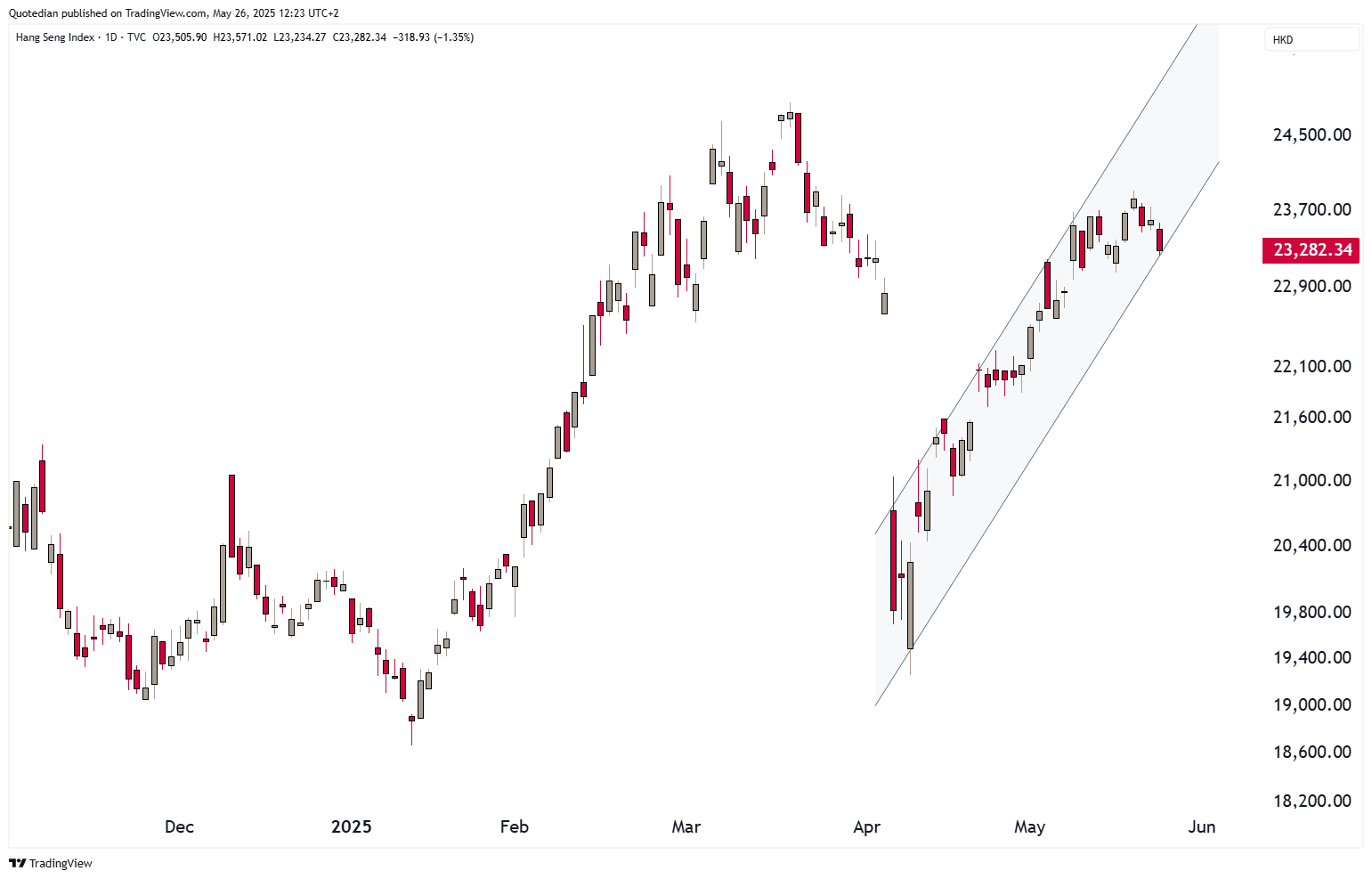
Hong Kong stocks (HSI) seem a little ‘tired’, but for now continue to move within the short-term uptrend channel:
India’s BSE-500 surpassed its 200-day moving average two weeks ago, then kind of retested it as support last week and now seems ready to steamroll higher:
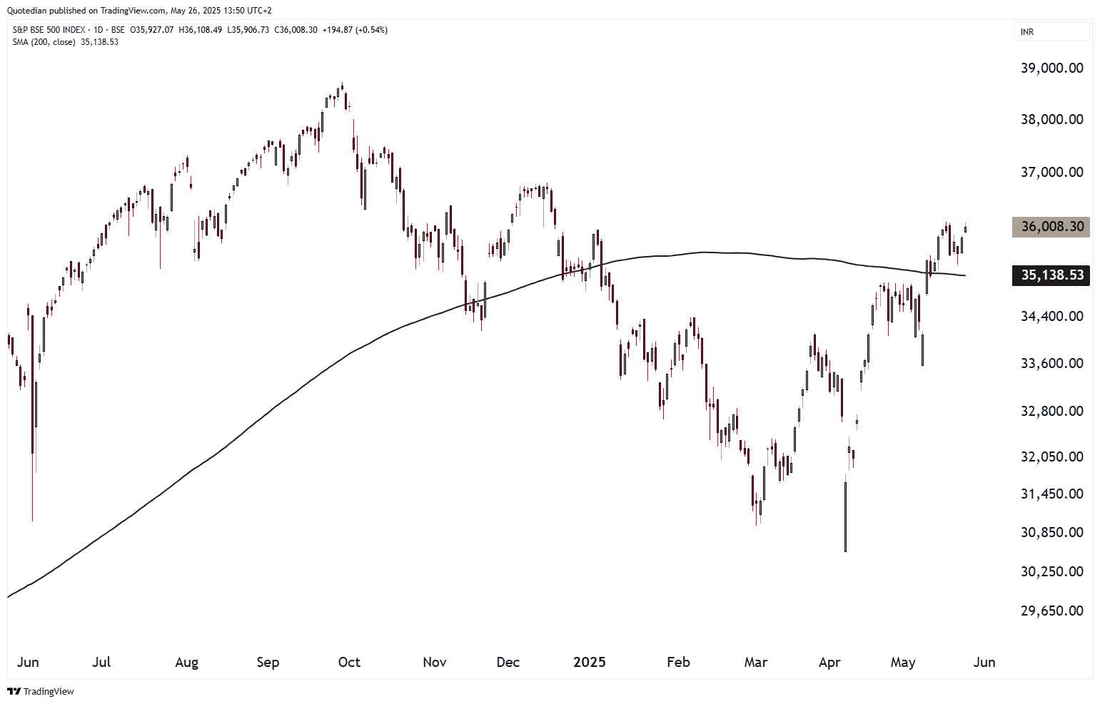
Don’t try the short side here, to say the least…
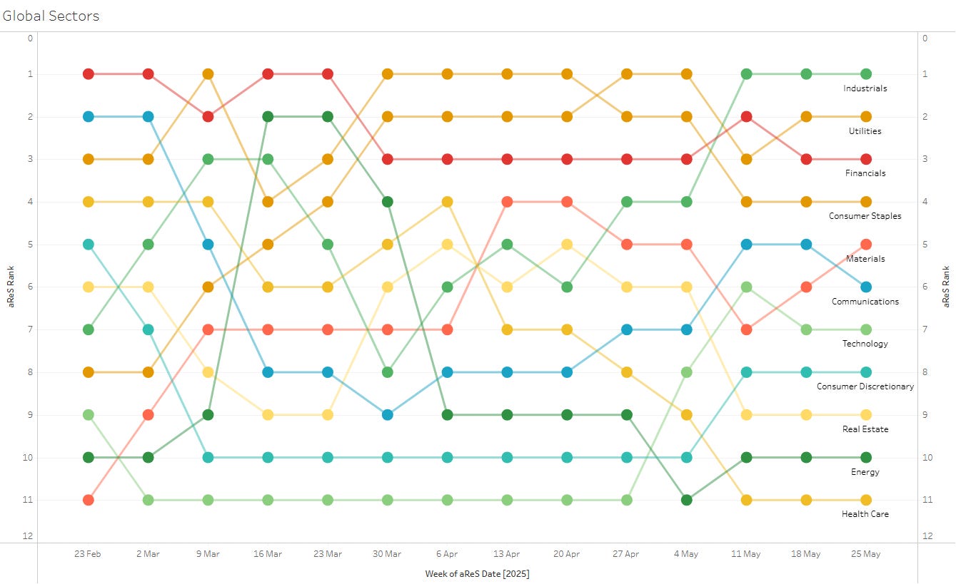
Turning to the equity sector side of matters, we note that industrials have been in the lead now for three weeks (Global sectors):
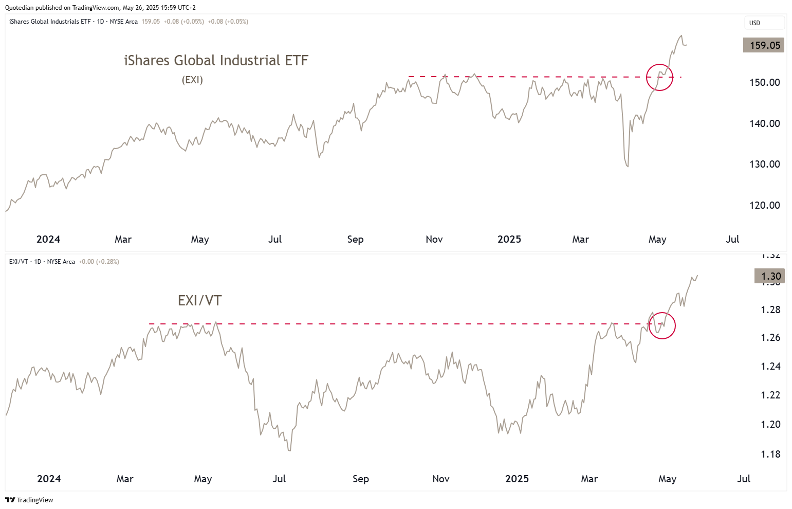
We already had shown a chart highlighting the absolute AND relative strength of the US industrial sector in a QuiCQ (click here) a week or so ago. Here’s an updated version, using a Global Industrial ETF (top - absolute / bottom - relative):

We already started this letter by discussing the worrying debt trend in the US (and they are not alone). Let’s have a look at some additional “fun” charts…

For starters, on February 5th of this year, one certain US Treasury secretary aka Scott Bessent said the following (I paraphrase):
The president wants lower rates" … "He and I are focused on the 10-year Treasury and what is the yield of that."
The chart below shows the different US yields across the term structure. Green is now, brown dotted was 5th February 2025:
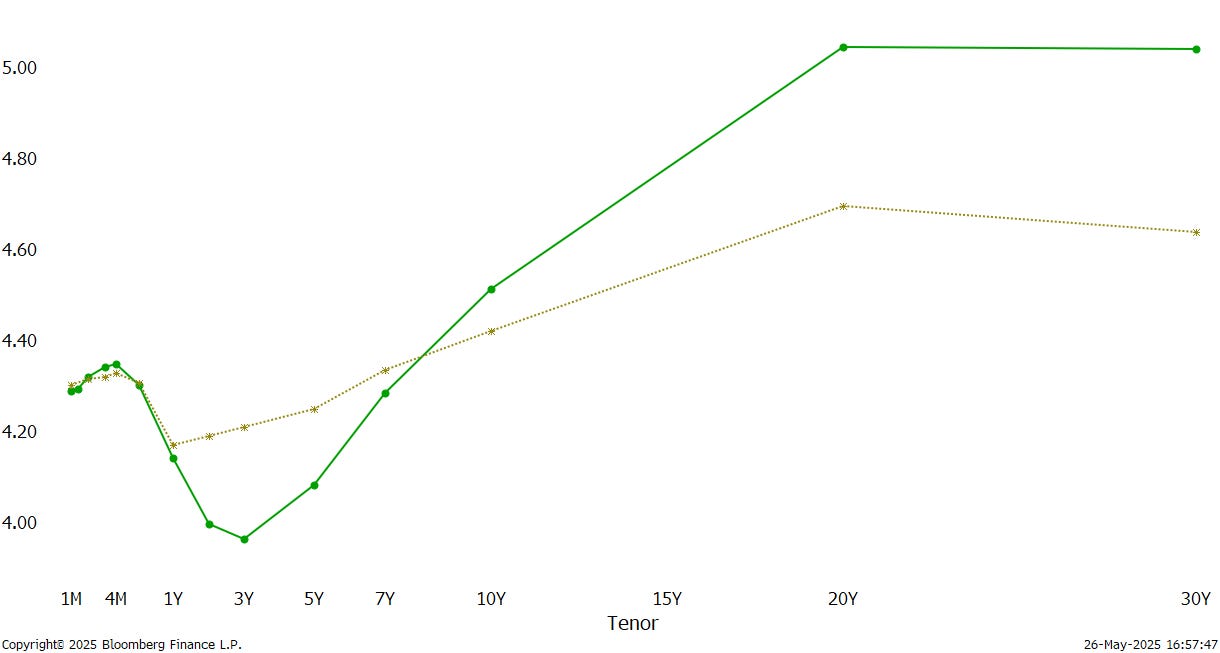
Something did not quite go to expectations, it seems.
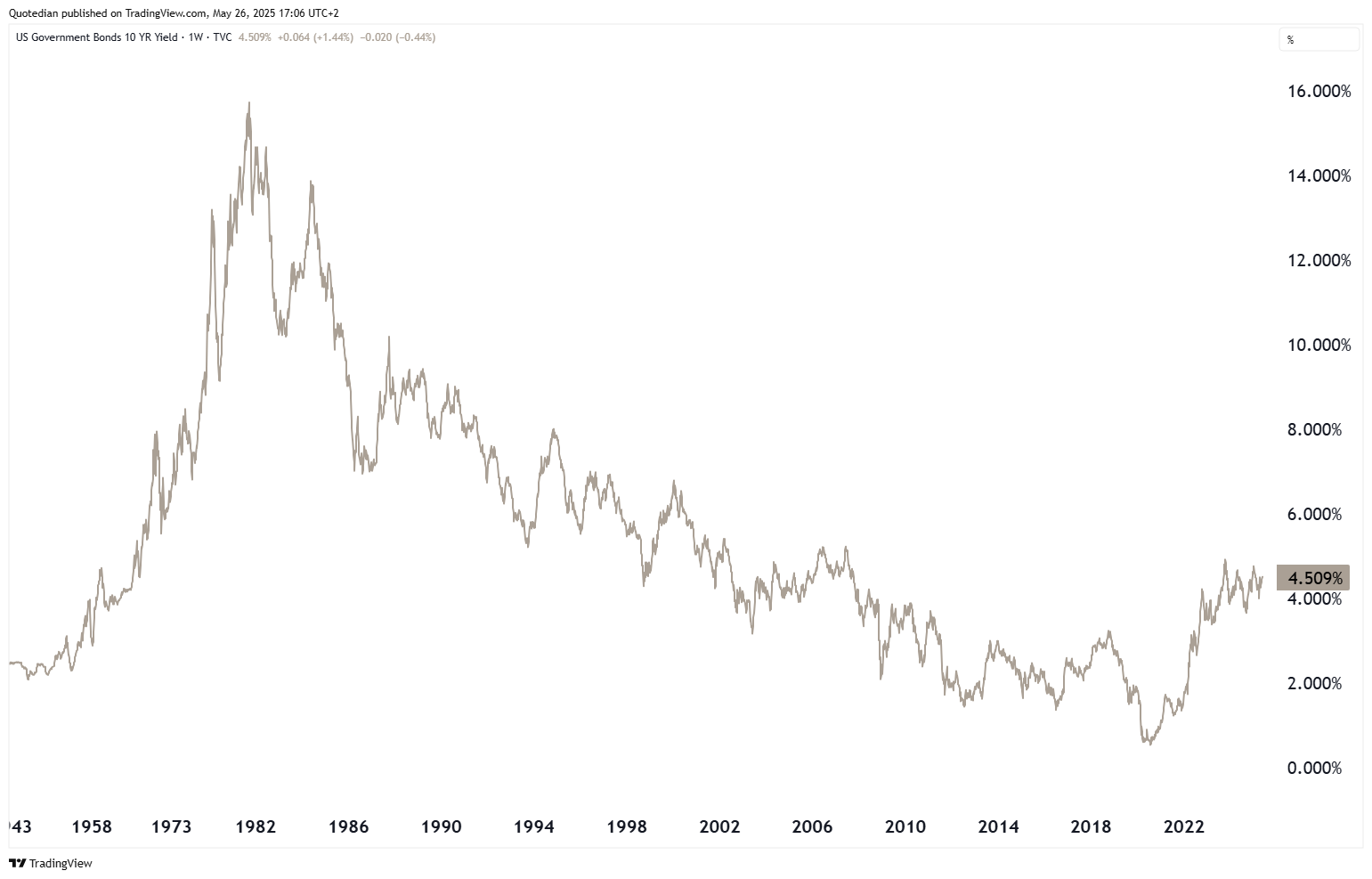
Nominal yields may still be off their cycle highs,
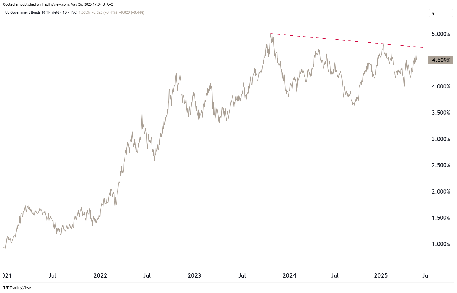
but zooming out on the same chart is scary:
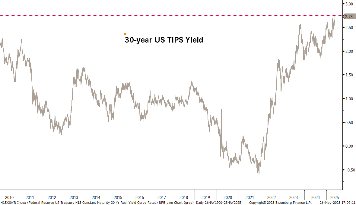
But probably worst, and also most overlooked, yields on 30-year TIPS (nominal - inflation) are at all-time highs:
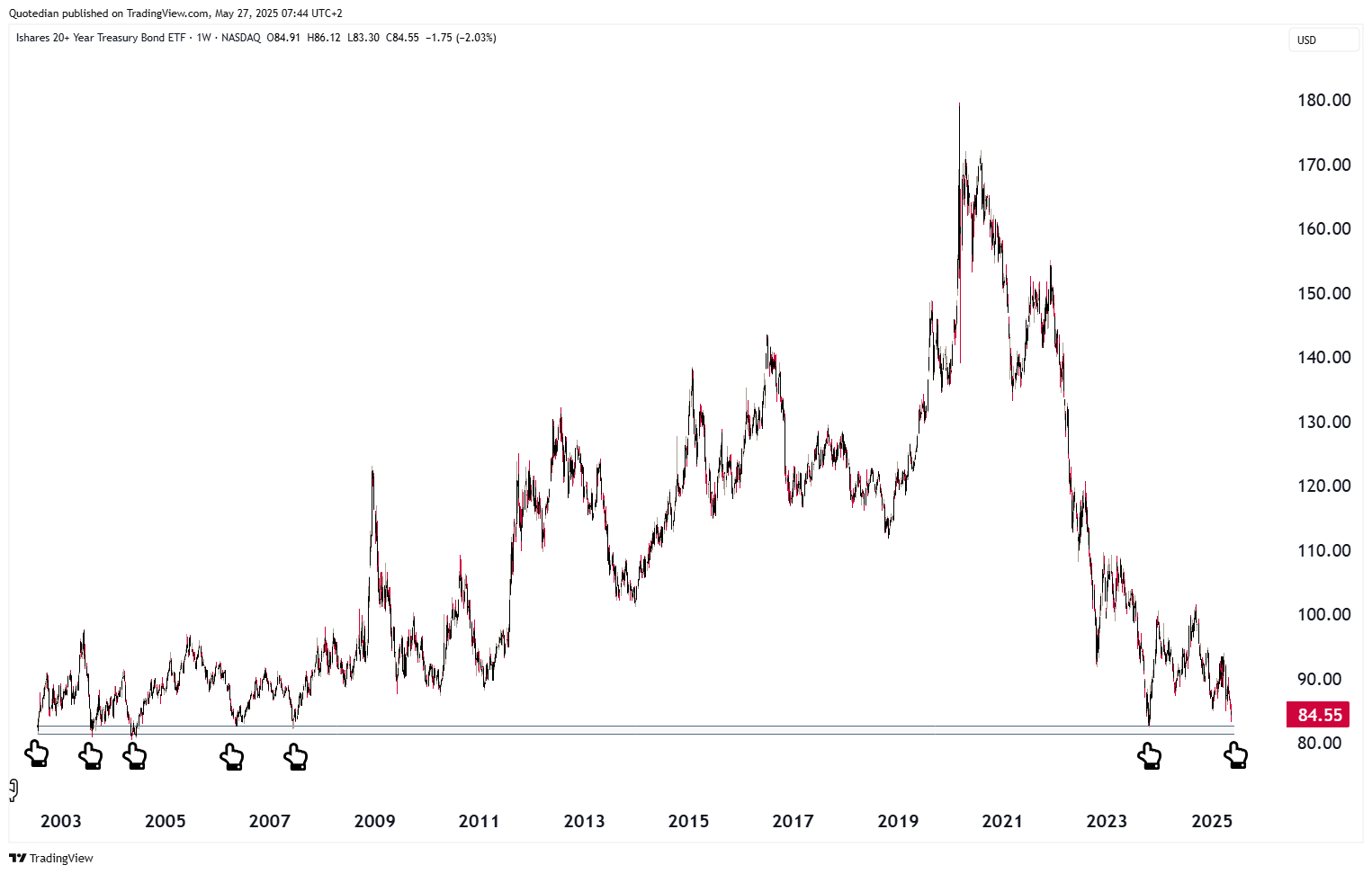
Upside pressure in yields of course means heat to the downside for prices and in that context is one of the most widely followed long-duration ETFs (TLT) approaching key support again:
An other country with a radically different yield picture than only a few months ago is Japan. Consider the 40-year JGB yield for example:
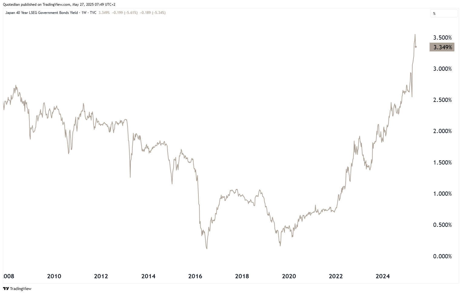
Whilst it is sharply lower this early Tuesday morning (27.5.2025) on rumours that the MoF (Ministry of Finance) is ‘smelling’ out bond prices for a possible intervention, yield has increased by about 25x over the past five years.
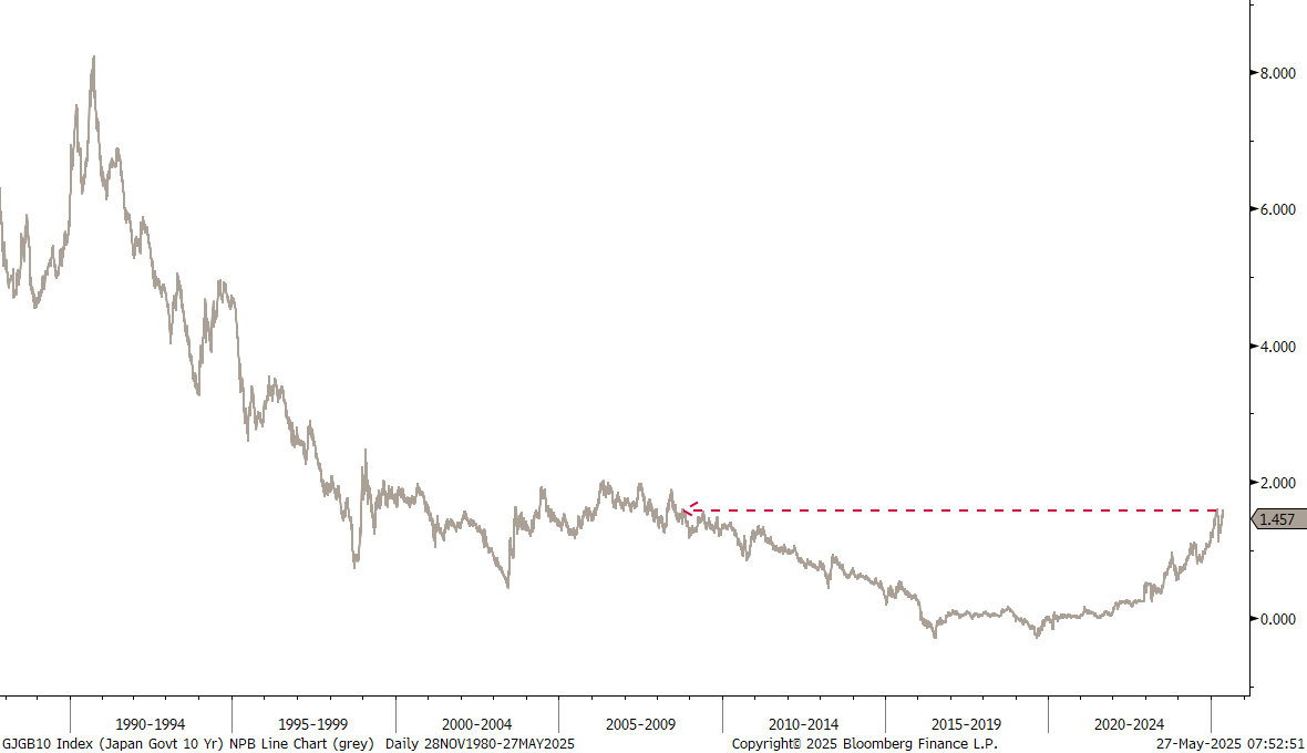
Similarly, the 10-year version of the same bond just had hit its highest level since 2008 a few days ago:
Zooming in though, the chart suggest a possible double top …
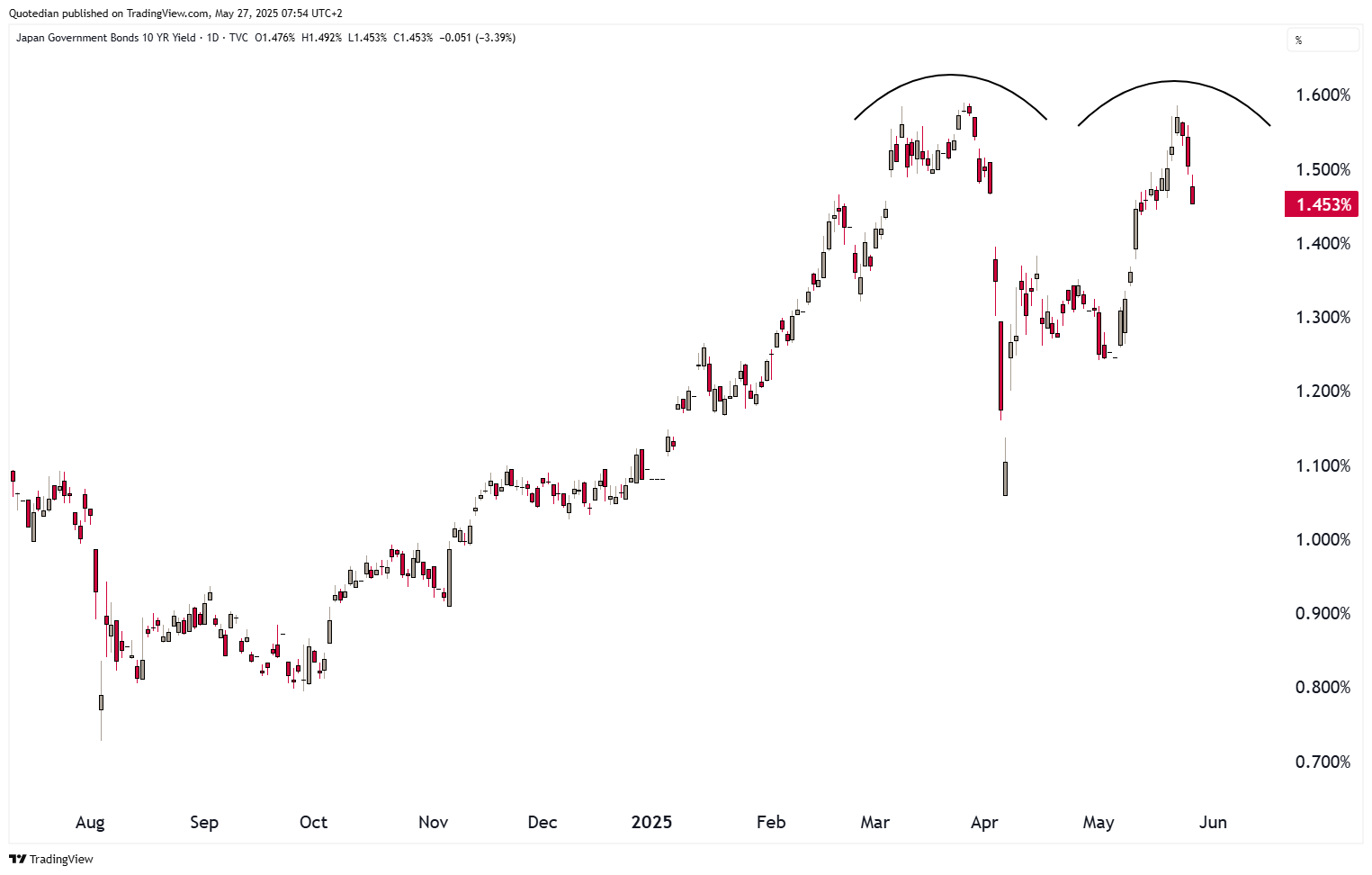
… for now …
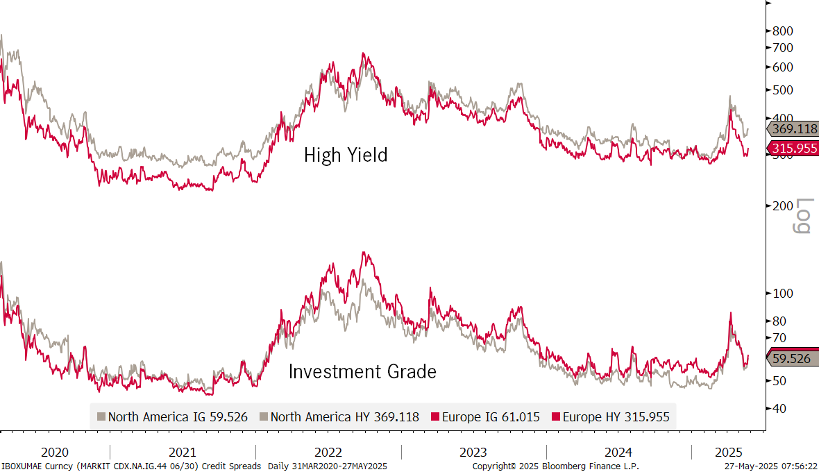
Finally, credit spread albeit well down from their April panic level, have been ticking a tad higher again over the past few sessions:

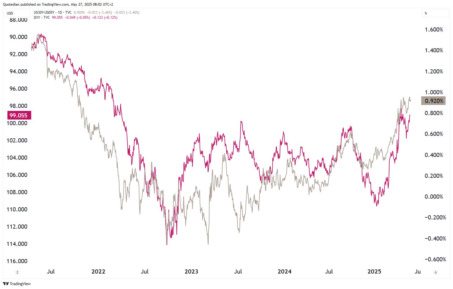
In the currency space, it seems that the steepness of the yield curve (e.g. 30-5 year yield spread - grey line) is driving the US Dollar (red line - inverted):
The EUR/USD seems on its way higher again:
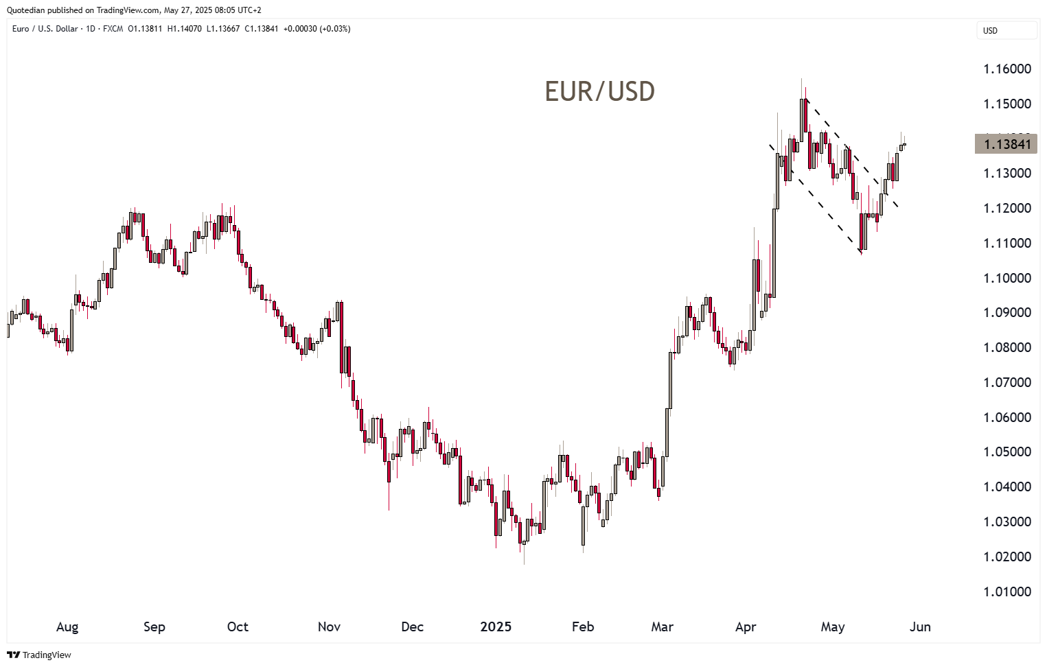
The most conservative target price calculation, would count this cross to go to 1.1800 …
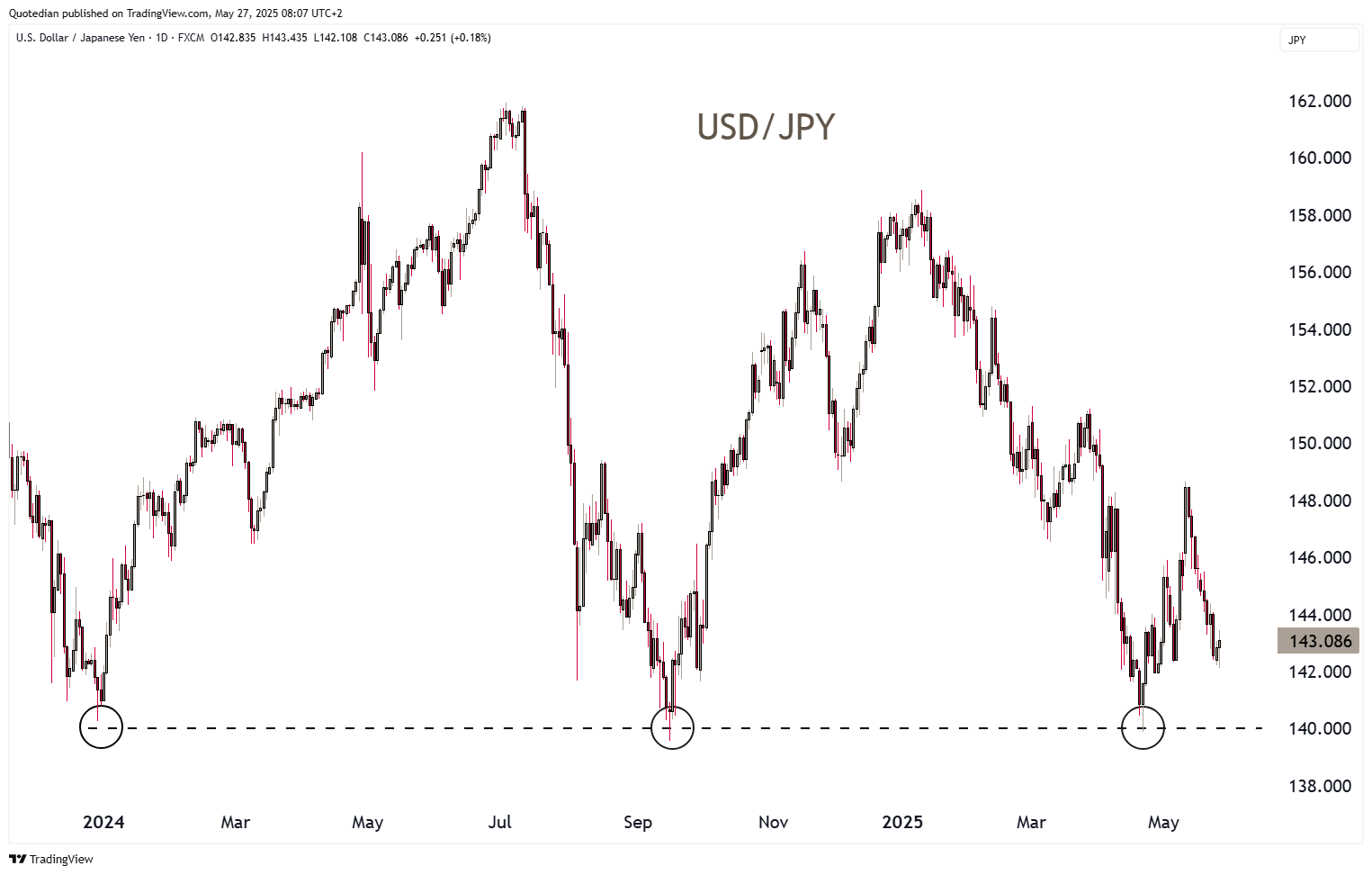
The USD/JPY is a tad higher this morning on the back of BoJ/MoF interventions rumours, but expect the 140.00 support to be “under attack” soon again:
Finally, to finish the currency section and serving as a segue into the commodity department, here’s an interesting chart from TS Lombard, showing how currency reserve status holds for about a hundred year, before another currency gets that privilege:


The problem then with the preceding chart is: “Who or which currency would then take over from the US Dollar now??”
I do not see an obvious candidate - hence, could it possibly be Gold?
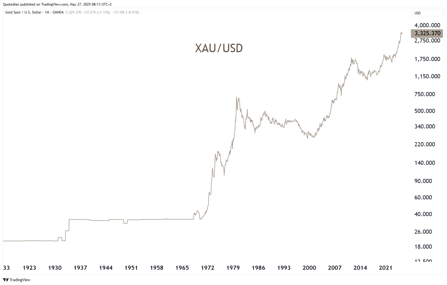
Is the barbaric relic to make a major comeback as nations are drowning in debt?
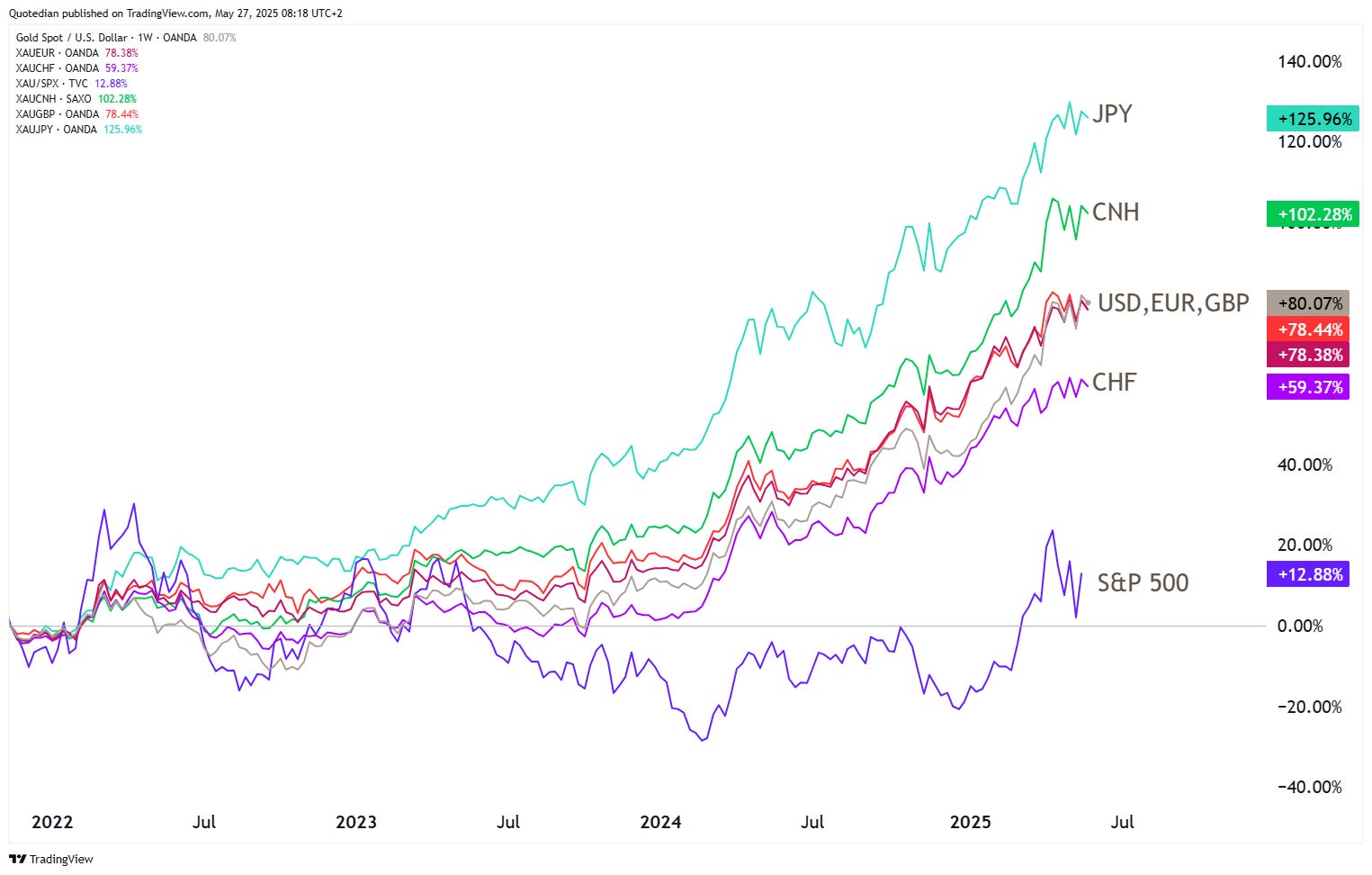
After all, Gold is not only up versus the US Dollar over the past two years:
Ok, that’s enough torture for one week. Same time, same place, next week. And don’t say I didn’t warn you.

In reality, you need no other Disclaimer than the one above, but just in case:
Everything in this document is for educational purposes only (FEPO)
Nothing in this document should be considered investment advice
Investing real money can be costly; don’t do stupid shit
Leave politics at the door—markets don’t care.
Past performance is hopefully no indication of future performance
The views expressed in this document may differ from the views published by Neue Private Bank AG