Price leads Narrative
The Quotedian - Vol VI, Issue 85 | Powered by NPB Neue Privat Bank AG
"Show me the charts and I'll tell you the news."
— Bernard Baruch
We fellow Quotedian readers spend a lot of time looking at price action (aka read the tape, aka stare at the charts, aka tea-leave reading, etc.), to deduct where asset prices could be moving over the short-, medium- and long-term time horizons.
We spend very little to no time discussing the headlines, corporate news or experts’ opinions… and if so, mostly from a contrarian angle (especially in the case of the latter).
Because we know, that price creates narrative.
Need help reading the charts and tea leaves?
Contact us at ahuwiler@npb-bank.ch
November and Movember are done and dusted and it’s time to look back at the month just gone by.
Simultaneously, with eleven months done and only one to go, we also take a look at how different markets have fared so far in 2023, plus we take the long view with our series of monthly charts. As usual, this should be fun!
Before we start with the equities review, a quick reminder on how the performance statistics “work”:
Blue/Light Blue Bars represent the November %-performance
Grey/Red Bars reflect the YTD %-performance
Performances are sorted YTD from largest to smallest
With that out of the way, let’s look at some of the most important equity benchmark performances around the globe:
Without a shadow of a doubt, unless you were unlucky enough to be China overweight, it was difficult not to create a very positive performance contribution in November (dark blue bars).
Fourteen out of the nineteen benchmark indices above now exhibit double-digit performance and only two markets remain negative year-to-date.
Let’s look at some of those longer-term, monthly candlestick charts, starting with the almighty S&P 500:
That is a nice, big, constructive candle there at the very right of the chart (Hint: it is November 2023).
Even more impressive, is the chart and November candle of the Nasdaq 100:
Let me change that to a log-scaled chart, given the nearly 16-folding of the index since the end of the GFC:
Absolutely, utterly, completely impressive. The index is five percent away from the following two achievements:
a new all-time high and
a 50% year.
Small-cap stocks (Russell 2000) turned higher right where they had to (key support) and showed a nearly 9% performance for the month, but in the bigger scheme of things, continue to lag their large-cap peers:
Let’s hop over to our side of the pond and have a look at the STOXX 600 Europe index:
A break above the upper trendline could be very constructive here!
The narrower STOXX 50 looks even better:
Scrolling back up to the performance table above, we note that two ‘European’ markets, UK and Switzerland, are the third and fourth worst-performing markets out of those 19. Albeit both exhibit small positive YTD performances, but in both cases thanks to November.
Here’s the chart of the FTSE-100 first:
Recently, I have been hearing increasingly that sentiment on UK economy, politics and stock market is so bombed out, that the Footsie could become a contrarian-call outperformer. Perhaps. But in the meantime, UK investors have suffered about ten yours through nothingness. And that’s being nice about it …
And here’s the chart of Switzerland’s SMI, which continues to look unhealthy:
Maybe it is the fault of some big weights in the index, Roche and Nestle for example (also check the previous Quotedian “The Crash”), that pull the SMI down? Hence, let’s have a look at the broader SPI index (213 constituents):
Nope. Same same.
Ok, ‘nuff of that, over to Asia. Here is Japan’s Topix index:
The index is up a mighty 25% and ended November at a new multi-decade high, BUT, in US Dollar terms, the year-to-date gain is reduced to some 11 percent and the chart looks slightly different when converted to USD (though still constructive):
Indian stocks did in November what Indian stocks do best, which is drifting higher:
And finally, shall we exercise the painful act of looking at Hong Kong shares? Come on, let’s do it! 3…2…1…GO:
Ok, over to sector performance now:
Despite a new cycle high in interest rates, with the US 10-year treasury briefly hitting the 5%-handle, long-duration sectors Technology and Consumer Discretionary have done surprisingly well. On the other side of the performance gamma we meet defensive sectors Consumer Staples and Health Care, and making a bit more sense, Utilities, which are often considered a bond proxy.
The following (monthly) chart, showing the relative performance of US technology stocks (XLK) to the S&P 500 (SPY), reveals just how well tech stocks have done:
Since breaking out of a huge base formation in 2015, it has been mostly one-way for tech stocks. As the saying goes:
“The wider the base, the higher in space”
The other point of interest on the above chart is that we are now where we topped out 23 years ago … That’s a long-time for buy-and-hold, or, as the other saying goes:
“On the long run, we are all dead”
Fancy a look at factor performance? Yes?! I knew it!
Using US factors as proxy for the rest of the world:
Not much comment here other than growth, large and beta/momentum were beautiful here, whilst the defensive stuff was the ugly duckling.
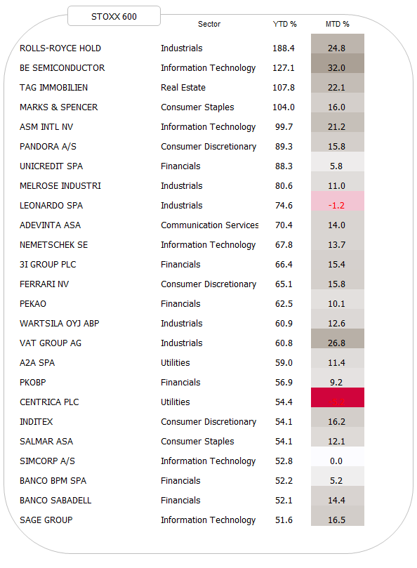
Finally, to close out the equity section, let’s have a look at the 25 best performing stocks year-to-date and how they have fared in November.
Here’s that stat for the S&P 500:
And here is the one for the SXXP:
I will say, what I have repeated ad nauseam in this space over the years, one thing:
Strength. Begets. Strength.
The prove is above. Write it down, glue it to your screen, read it every day, several times. Then invest.
For bonds, no doubt, it was a NOVEMBER TO REMEMBER:
Many subsegments of the bond market above had such a strong month that it lifted the year-to-date performance right into positive territory. As matter of fact, using the Bloomberg US Aggregate bond index as a proxy (most historic data available), bonds just had their best month since 1985:
But the real star in the fixed income space in November was the high yield segment, profiting double from a decrease in level of interest rates and a contraction in credit spreads as investors got more comfortable with risk on.
But let’s take it step by step, looking at rates first. Here’s the monthly chart of the US 10-year Treasury yield:
A few things stand out: a) indeed we just witnessed an immense reversal candle which b) in the past two years initiated a consolidation period, but c) a lot more downside would be needed to disrupt the secular uptrend in yields.
The chart of the US 2-year treasury, which are the bond yields closest to the FOMC policy, looks a bit different:
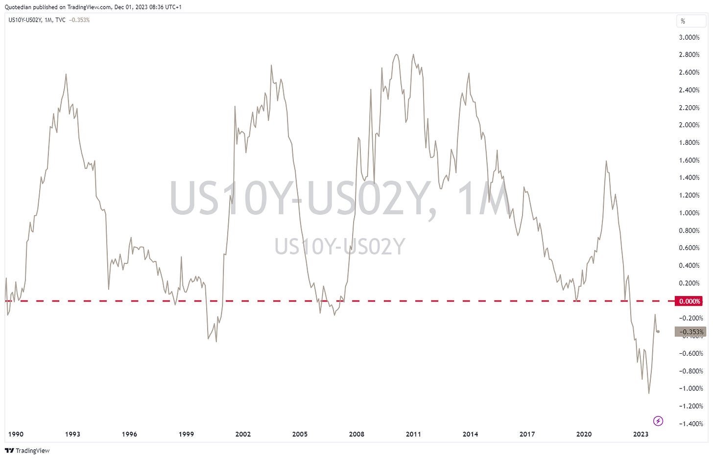
Yields here dropped “only” 40 bp in November, as compared to the 60 bp drop on the Tens, which lead to a stop in the steepening process of the spread we had been witnessing since June:
Over here in Europe, using the German 10-year Bund, yields have also reserved meaningfully (-36bp) maybe initiating a multi-period consolidation period of the secular uptrend:
And similar to its US cousin, the 10y-2y spread steepening has also seen somewhat of a pause:
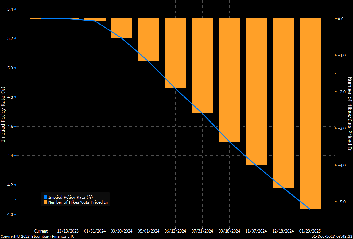
It was mainly softer inflation numbers, which lead to a decrease in yields, with investors now expecting a full five rate cuts into January 2025:
Having said that, the market had been expecting rate cuts since early Q2 of these year, which so far have failed to materialze:
Most expected recession ever, anyone?
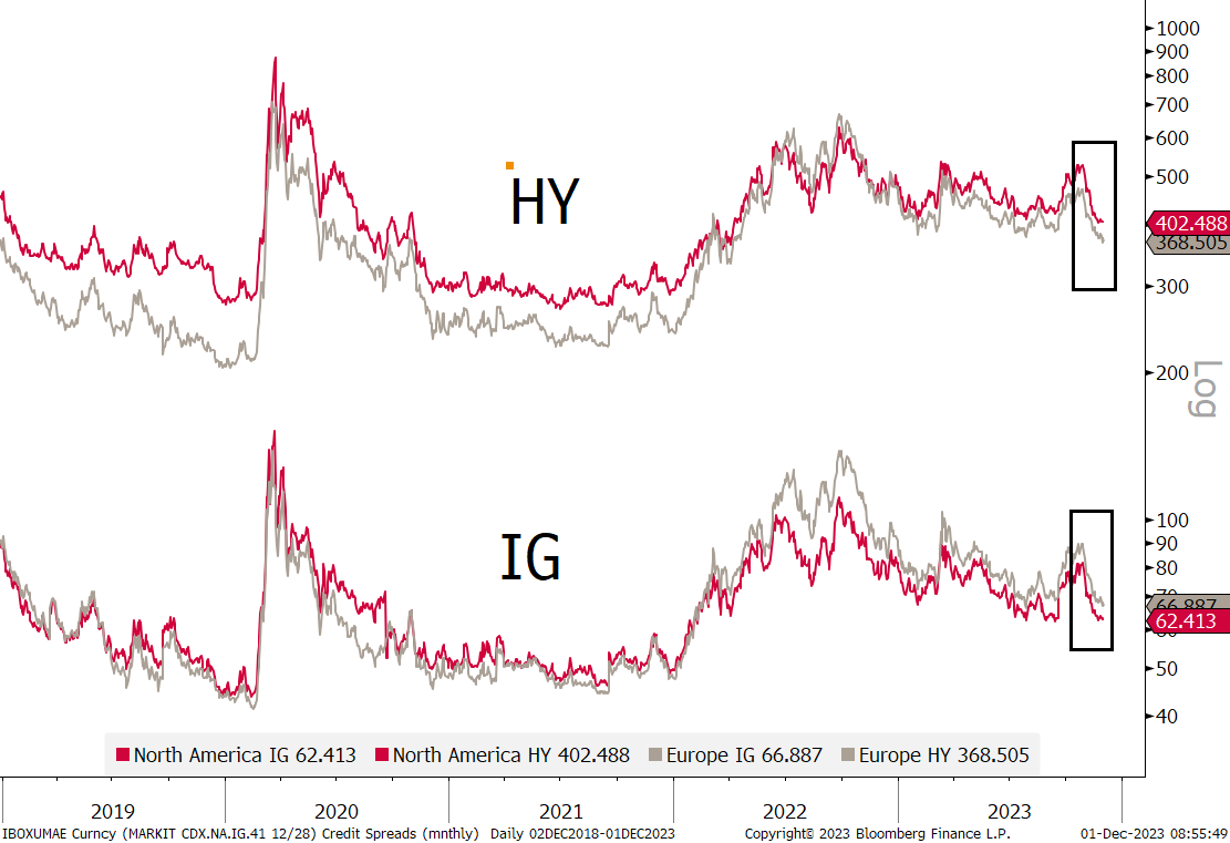
Moving to credit spreads, here’s a five year chart, of investment grade (IG) and high yield (HY) spreads in the US and Europe, showing the recent contraction:
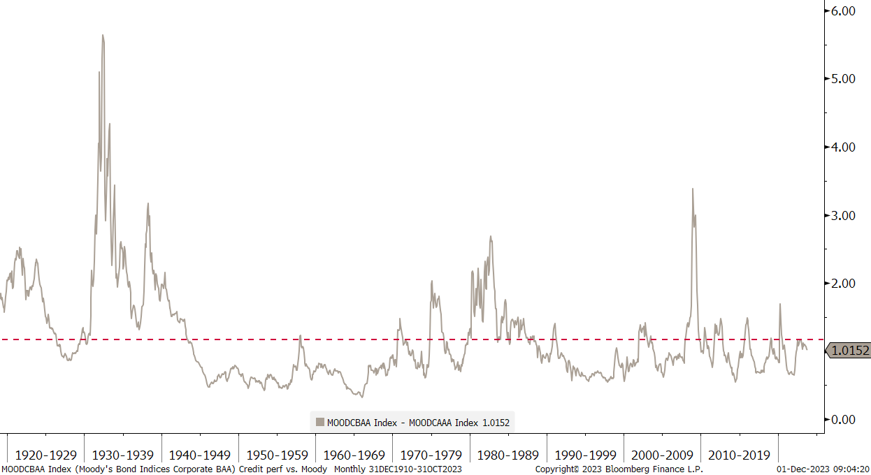
Let’s try and put this in a very long-term perspective, via the Moody’s AAA - BAA spread:
Who is not a sucker for a financial chart going back over a hundred years?!
Before we hop over into the FX wild west, let’s have a look what all the yield and spread mumbo-jumbo above actually means for bond prices.
For treasuries, we use the iShares 20+ Year Treasury bond ETF (TLT). Nice recovery (+10% November!) but still in a clear downtrend:
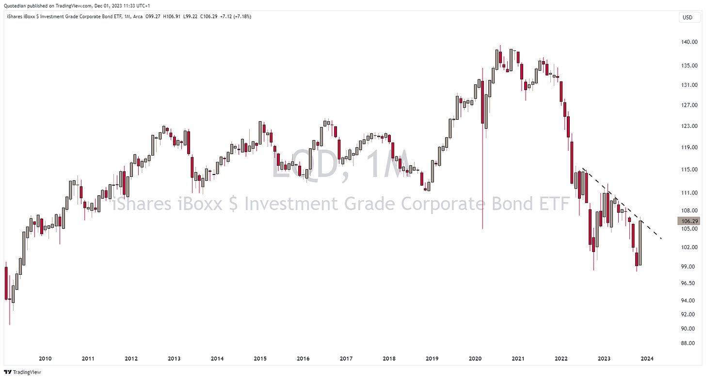
For investment grade corporate bonds, we take the iShares iBoxx $ Investment Grade Corporate Bond ETF (LQD) as a proxy:
Close, but no cigar!
And finally, for the high yield space, we study the iShares iBoxx High Yield Corporate Bond ETF (HYG):
Uh, oh, interesting!
Moving into currency markets, the following table shows the performance of the US Dollar as compared to other major currencies:
E.g., the Dollar declined 1.9% versus the Japanese Yen in November, but is still up over 13% as compared to the Yen.
It stands out then that the greenback was week against nearly everything (INR and ZAR being the only exceptions), which fits well into the narrative of risk-on, lower US rates, equity rally, etc.
Let’s have a look at the US Dollar Index (DXY) first, which you will remember, is made up by two thirds of the Yen and the Euro:
It seems the Dixie is heading towards the 102 pivot point (dotted line).
Checking in on the EUR/USD cross, the chart shows that this currency pair has once again bounced on the seemingly all important 1.05 support line (
Moving towards the downward sloping long-term trend line at 1.15ish? Perhaps.
And here is another perhaps. Has the USD/JPY finally topped out?
The British Pound had a very decent performance versus the greenback also during November, enough to make the 2022 autumn drop below the 1.20. seemingly only an “oops” event (for now), but not enough to get the currency out of its secular downtrend:
Bottom is planned for Q1/Q2 2025, remember?
Let me also throw in here performances of cryptocurrencies, before we head over into the final section:
Assuming few of us hold Solana, let’s share the joy with those who do hold Bitcoin via this chart:
Conclusion: Secular bull markets absolutely still underway …
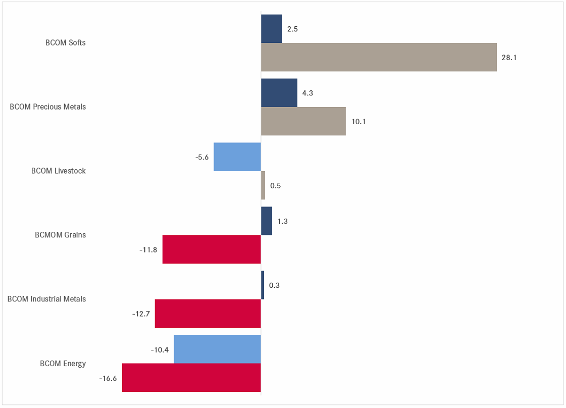
Ok, in the commodity section, let’s see how this super-cycle pronouced by may in 2022 is going. Starting with commodity ‘sectors’:
Hhmmm three up, three down on a year-to-date basis …
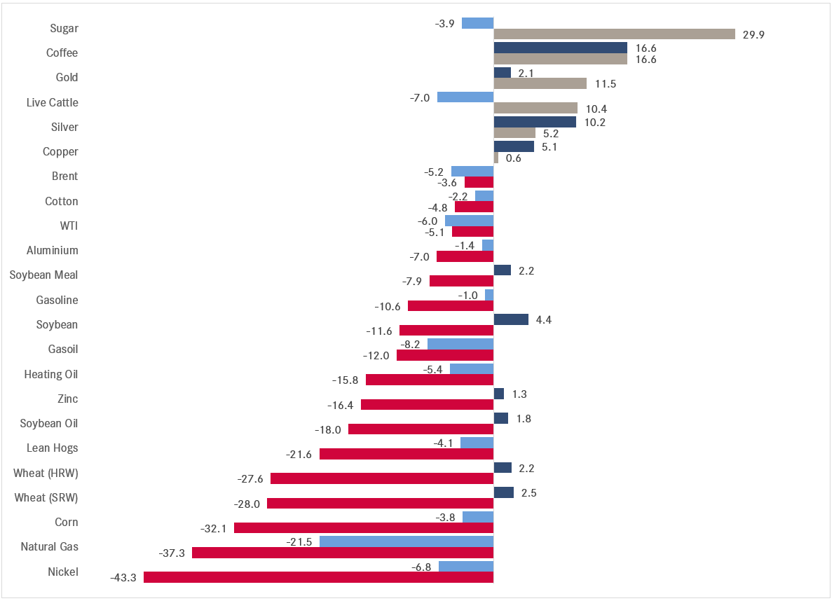
Maybe, looking at the underlying commodity futures:
Ouch, neither super nor cycle!
Let’s pull out a long-term chart for context. Using the Invesco DB Commodity ETF as proxy, we note that the reinitiation of the uptrend starting in June (pointed hand) has been interrupted for now:
There is a clear danger that a more complex a-b-c correction is unfolding, which would take prices below the $21 level. However, secularly (years to decades) there is still a good argument to be made for further upside.
And talking upside, one ‘commodity’ (actually a currency really) that seems in a mood to head higher, is Gold:
The yellow metal just had its highest monthly closing price since …. waitforit … EVER and not a lot of people seem to be talking about it (or, alternatively, I listen to the wrong people ...).
Seeing Gold marching higher should not come as a surprise really, given its downside resilience (grey line) as real rates (red line, inverted) for shooting higher:
Should real rates continue to fall, the sky seems the limit …
Oil, which is currently a bit of my personal Waterloo, seems to listen more to the economic weakness ahead rather than to OPEC+ induced supply constraints and probably needs a few more months of consolidation before a possible next leg up:
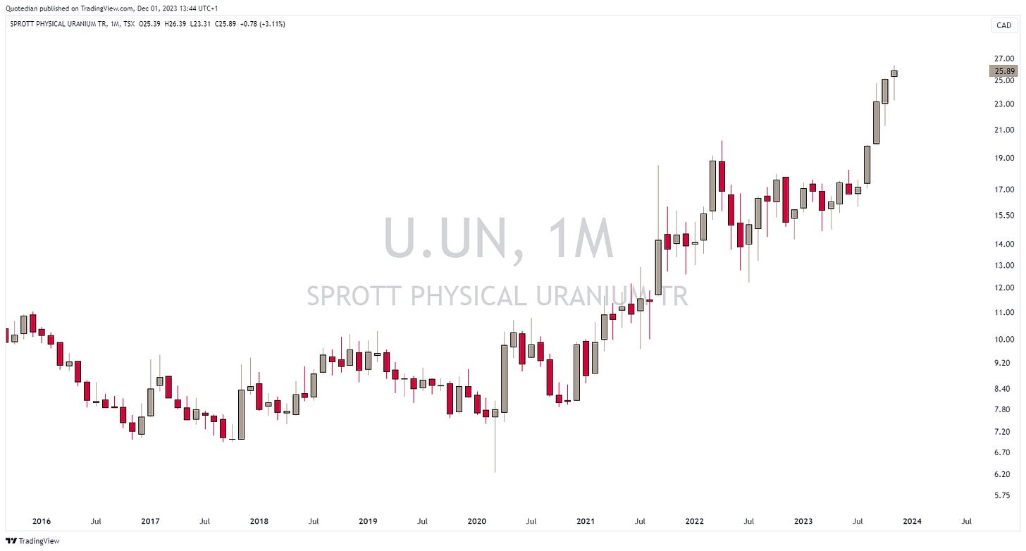
One more and we’re done. Uranium! Here’s the Sprott Physical Uranium Trust as a proxy:
A bit stretched now, but overall feels like BTFD.
Ok, time to hit the send button. And you, please do not forget to hit the like button towards the bottom of this mail. Thank you!
Have a great weekend and see you next week.
André
Nearly a year ago, in a post called “Ex Ante” I showed this chart:
The point was that for a first time in over two decades, Wall Street strategist actually forecasted a negative return for the coming year (2023).
This is the outcome with one month to go in the year:
Let’s call it up 20%. Absent any major, major accident in November …
So, what are these strategist and their crystal balls forecasting for 2024 now then?
For reference, the index closed yesterday at 4,567….
Let’s revisit this stat towards the end of December, when the sample size should be a bit bigger.
In the meantime, the point here is NOT to ridicule strategist and their obligation to sputter out year-end-targets one year ahead, but rather that:
Price creates the narrative, not vice versa.
Everything in this document is for educational purposes only (FEPO)
Nothing in this document should be considered investment advice
The views expressed in this document may differ from the views published by NPB Neue Privat Bank AG
Past performance is hopefully no indication of future performance














Great Quotedian this one