Ex-Post
The Quotedian - Vol VII, Issue 1 | Powered by NPB Neue Privat Bank AG
"If Santa Claus should fail to call, bears may come to Broad and Wall."
— Yale Hirsch
Happy New Year All!
Before we get started, a not-so-gentle reminder that we are still waiting for your outrageous 2024 prediction (click here for instructions - starting right after the NPB “ad” in the top quarter of the letter).
Most of you will prefer to preserve relative anonymity, so send me an email to ahuwiler@npb-bank.ch instead of posting directly in the comment section.
C’mon - give yourself a push - this will be fun!
In good old Quotedian tradition (if you do something for a second time it can be called tradition, no?) we start the year by looking back at the year just gone by - a year that we could call “The Year That Wasn’t”:
It wasn’t the year where the global economy was hit by a massive recession
It wasn’t the year where the banking crisis led to a breakdown of the global financial system (you may not agree on this if you are/were a “Credit Suisser”)
It wasn’t the year where the real estate market collapsed due to higher interest rates (you may disagree if you have been trying unsuccessfully to sell a house in Luxembourg for over a year)
It wasn’t the year where we froze to death in Europe because we decided to cut our own supply off
Above all, it wasn’t the year where to stock market collapsed into oblivion because (insert your favourite scary scenario here) ____________________
How did your investment year go? Not satisfied? Contact us!
Contact us at ahuwiler@npb-bank.ch
So, let’s take the next few minutes to review all our favourite asset classes and their performance in December and for the entire year 2023.
And then make sure to tune back later this week (Thursday-ish), when we continue with the 2-year tradition of launching the Ex-Ante 2024 version of everybody’s favourite newsletter, taking out our respective crystal balls, tea leaves and Tarot cards to gain a glimpse into fortunes of financial markets in 2024.
Right before we take a deep dive into the different asset classes, let’s check out first how a global multi-asset portfolio would have performed in those different classes:

Hence, to the surprise of many, equity was the best-performing asset class, no doubt heavily influenced by some specific regional markets and even more so by some heavy swinging stocks.
Global bonds beat cash (proxied via USD T-Bills) and commodities turned out to be a big disappointment.
Let’s have a look at the details …
In equities, we start our review by looking at the performances of some of the most important benchmarks around the globe:
Last month we briefly discussed how the Nasdaq 100 (NDX) may achieve a double-whammy by reaching a new all-time high AND producing a 50%-plus return year. Well, it achieved that rare feat on both accounts!
Yes, of course, the result was skewed to the Mag 7, and the NDX equal-weight (red) index did lag the market-cap (grey) version by 20%, but still, a 30% return is not a bad outcome in any case:
The monthly candlestick chart continues to move from bottom left to top right,
with the 10-month moving average (fine red line) has served as an excellent guideline when to be long or out/short the index.
Turning to the almighty S&P 500, we see a similar bullish, higher moving chart, with the fine difference that the index for now has been rejected at the previous all-time high:
But some other indices also deserve a notable mention, not least the European ones, where many more than respectable 2023 results.
Italy (28%) and Spain (23%) stand out as top performers, but a special mention should go to the DAX index, considering that Germany had been in a technical recession for two quarters last year:
The constellation of a recession with the stock market hitting a new all-time high proves the adage that “the stock market is not the economy, and the economy is not the stock market”.
Summing European markets up in the form of the STOXX 600 Europe index, here is what our market looks like in the long-term framework:
Nearly an all-time high!
Another special mention goes to the Japanese equity market, which is seeing the Nikkei hitting new decade highs:
True, a lot of the stock market’s strength comes from a weaker Yen and in US Dollar terms the rally loses a bit of its shine:
Nevertheless, given where we are coming from …
…this is still quite remarkable.
Of course, we also need to look at the worst performers of last year; Hong Kong and Mainland China, two closely related markets.
Here’s the monthly chart of the Hang Seng index:
And here is the equivalent of its ‘comrade’, the CSI 300:
Not pretty pictures, especially in the last six months.
So bad it’s good (like the Sharknado movies) or never catch a falling knife? Time will tell…
The final local market we pay quickly attention to is India. The Sensex ‘only’ made the middle of the table in the chart at the beginning of this section, but given a massive scandal (Adani) hit that market in Q1 of last year, this chart is much more than respectable:
Alright then, time to take a look at global sector performance:
Despite strongly advancing bond yields right into October, long-duration sectors such as Technology, Communications and Consumer Discretionary never gave away their early found leadership.
Chronologically, the outperformance of long-duration stocks was sustained indeed by the Magnificient Seven through a) their sheer weight in the indices, b) their popularity and last but not least c) passive investing (i.e. everybody buys yet more and more of the same). The proof is in the pudding charts:
The chart above shows the S&P 500 (SPY, grey, rhs), the S&P 500 equal-weight index (RSP, red, rhs) and the inverted 10-year US treasury yields (blue, lhs). Clearly, the market-cap weight of the S&P 500 outperformed over the entire period, influenced by those Mag 7. But see what happenend once yields topped (bottomed) out on October 19th:
The equal-weight index outperformed, as investors shifted from the generals to the soldiers!
At the bottom end of the sector performance gamma, we find utility stocks, which despite a strong rally into year-end as bond yields retreated, still clocked a negative YTD return. Energy stocks were clearly another disappointment, especially to me as they were (and still are) one of my stronger conviction calls.
As this is the yearly review report, let me also spoil you with an additional chart, going one level down from sector performances to (US) industry-level performance:
Hence, the moment has arrived where we have a final look at the top performing stocks of 2023 in the US and Europe and how they have done in December.
Starting with the US top 25:
And continuing with the wider European area:
Finally, a quick glance at factor performance:
Given what we learned further up, there is little surprise that high beta out- and low vola underperformed.
Turning to the fixed-income complex, it definitely has been a year of two tales. The pretty friendly year-end performance table masquerades just how difficult a year it has been:
All hunky-dory, no? Even the worst-performing item (US treasuries) showed a respectable YTD return (4.1%)
But the following chart of the iShares 20+ Treasury bonds ETF illustrates just how much of a bastard last year was for bond investors:
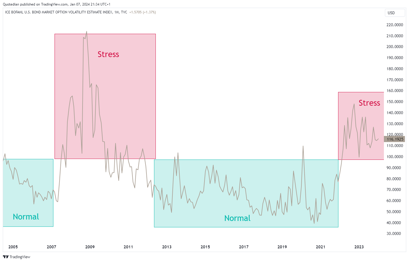
The difficult environment for fixed-income investments was also clearly reflected in the MOVE index, which is the VIX-equivalent for bonds:
Undoubtedly, (US) government bonds were, and still are, in STRESS mode.
Let’s look at some yield pictures now.
For example, the US 10-year Treasury yield monthly chart to get started with:
A small victory lap here for all of us at the Quotedian family: We jointly quite early identified the 5%-handle as a possible price target last year and that is exactly what we got!
The picture now, from a fundamental AND technical viewpoint is a bit more foggy,
but let’s talk about this towards the end of the week in the Quotedian titled “Ex-Ante”.
Now to rates here in Europe, proxied by the German 10-year Bund yield:
Here similarly, a price target of 3% was briefly reached and a strong reversal ensued. The ‘fog of war’ is dense here now…
So, all-in-all we note that duration risk for bonds (and stocks) was a rollercoaster last year, but scrolling back up to the FI performance table, we see that the high yield pocket was the leader. Hence, the following chart of credit spread (IG & HY) should show falling lines during 2023:
Bingo!
Alright, time to turn to FX markets then.
In the following chart, the performance of the currency mentioned is measured versus the US Dollar:
This, as a first observation, is pretty interesting, as about half of the currencies either out- or underperformed the greenback.
The best performer, our beloved Swissy, touched briefly the 2015 lows versus the USD, and seems to be closing in on the 2011/2012 monthly closing lows:
Versus the Euro, the mightiness of the Swissy is even more obvious:
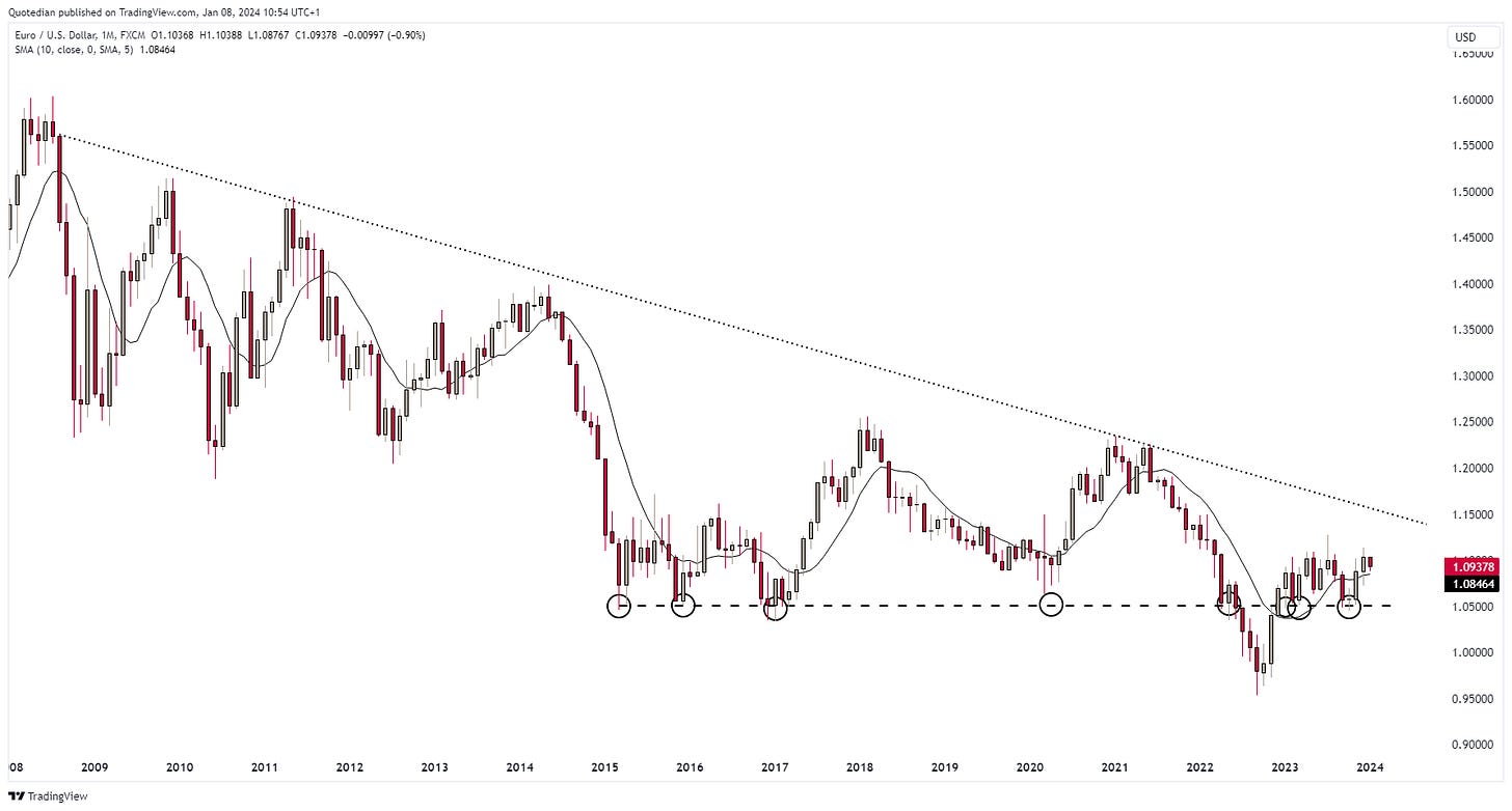
Turning to the EUR/USD cross, a quick correction and big sorry regarding the performance table at the beginning of this section. The Euro did not decline 3% versus the US Dollar in 2023, but rather appreciated by the same percentage. I noticed this error too late and could not manually adjust the table anymore. Culpa mea!
In any case, it was a really range bound year for this currency pair:
One currency pair, that definitely DID NOT see a sideways year was the US Dollar/Japanese Yen. Let me show you the intra-year moves before giving the long- and the very long-term context:
Up 16% and down 7% (ignoring all the squabbles in between) are HUGE moves for currencies, especially for G7 currencies.
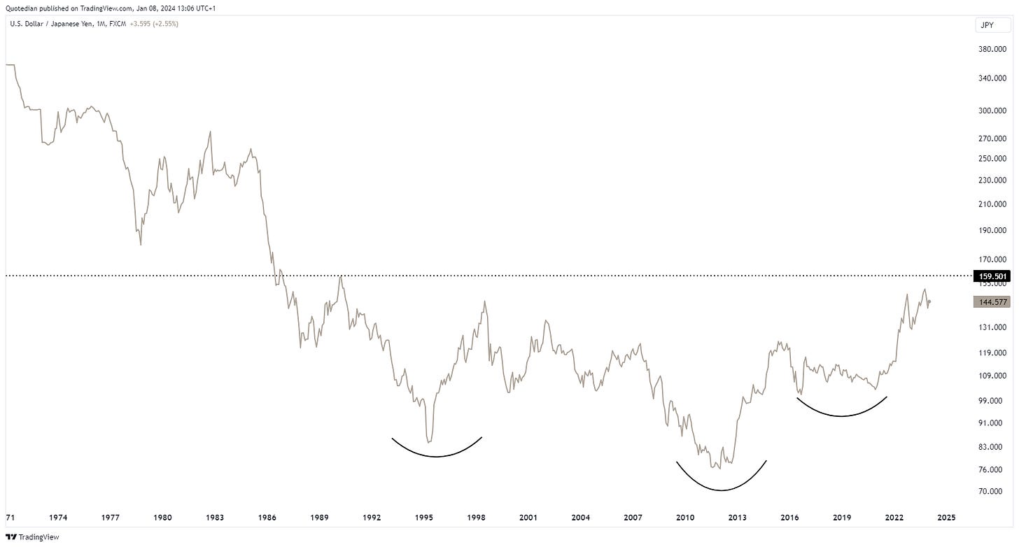
Looking at the longer-term (monthly) candle chart, we see that the Yen has been weak versus the Dollar,
but looking at an even longer-term chart, we could argue that next resistance may be just below 160 (another 10%-plus from here).
Or, completely unemotionally, a mega-base has been forming, with a break above 160 setting a long-term price target to… never mind!
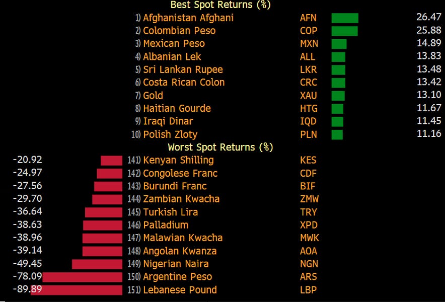
And just before we have a quick glance at cryptocurrencies, let’s have a look just for fun at the best- and worst-performing currencies globally, with no filter set:
Some prominent currency codes there in the upper (MXN, PLN) and lower (TRY, ARS) half there, but possibly most striking is the difference between two precious metals: Gold (+13.1%) and Palladium (-38.6%)!
Ok, crypto time!
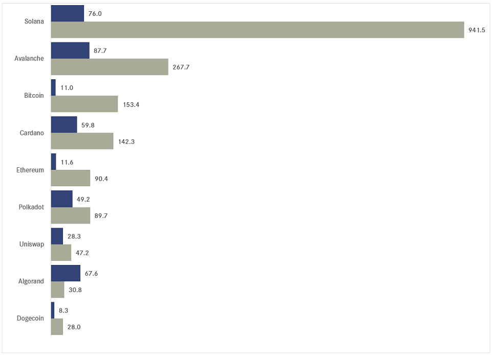
Here’s the performance table for some popular cryptocurrencies:
I assume most of us, if we have any crypto at all in our portfolios, will have Bitcoin, so let’s have a look at the monthly chart.
However, I cannot make up my mind whether to show a normal scale chart,
or a log-scaled chart:
Clearly, the second chart completely hides the gut-wrenching moves since the start of the new decade:
I think this chart serves perfectly as a role model to explain investment mathematics (aka volatility gremlins) to newcomers …
Heading into the final section (ex-COTD) of this first letter of the year, let’s quickly check how commodity ‘sectors’ fared in 2023:
Assuming that most of us with a direct commodity exposure will probably hold precious metals in some form, rather than barrels of crude oil, the bad year for overall commodities may have not been so bad for our portfolios.
However, as the following performance table of popular commodity futures shows, it also depended WHICH precious metal you held:
Surprisingly enough, if you had decided at the beginning of 2023 to invest your commodity allocation view commodity-related equities, it didn’t really matter whether you invested into gold (GDX, grey) or energy (XLE, red) stocks:
I will actually cut short here, with the promise to have a look at the long-term charts of some commodities such as Gold and Crude in our Ex-Ante post due later this week.
So, make sure to…
You may still be wondering about today’s “Quote of the Day”, which indeed is an old Wall Street adage, backed by some hard data.
As you may know, Yale Hirsch, the founder of the Stock Trader’s Almanac, coined the "Santa Claus Rally" in 1972. He defined the timeframe of the final five trading days of the year and the first two trading days of the following year as the dates of the rally.
These seven days have historically shown higher stock prices 79.2% of the time, reflected in the S&P 500. Read more here.
However, according to the following table, when the S&P 500 return was negative over that Santa Claus period, it lead more often than not (4 versus 2) to losses for the entire calendar year:
Unfortunately, this is what the S&P did over this Santa Claus period:
BUT, we still have an opportunity to be saved by the January Barometer (though it does not look to promising so far), which we will discuss in early February.
Everything in this document is for educational purposes only (FEPO)
Nothing in this document should be considered investment advice
The views expressed in this document may differ from the views published by Neue Private Bank AG
Past performance is hopefully no indication of future performance


