New High Score
The Quotedian - Vol VII, Issue 19 | Powered by NPB Neue Privat Bank AG
"Know how to listen, and you will profit even from those who talk badly."
— Platurch
After a difficult month for financial markets in April, May started on a remarkably better tone, as we outlined here and here.
However, the last week of May, suddenly put investors at bay, as higher interest rates started unnerving equity investors.
See that “Wall of Worry”? We help you climb it!
Contact us at ahuwiler@npb-bank.ch
Hence, with equity markets falling and bond yields rising, many question marks were suddenly raised.
Even your favourite and most bullish market observer got a bit nervous on Thursday.
However, after European markets closed on Friday, Wall Street did a “Real Madrid”,
and resurrected from the dead. Here is last week’s tick-by-tick graph for the S&P 500:
So Friday’s rally felt a lot like this:
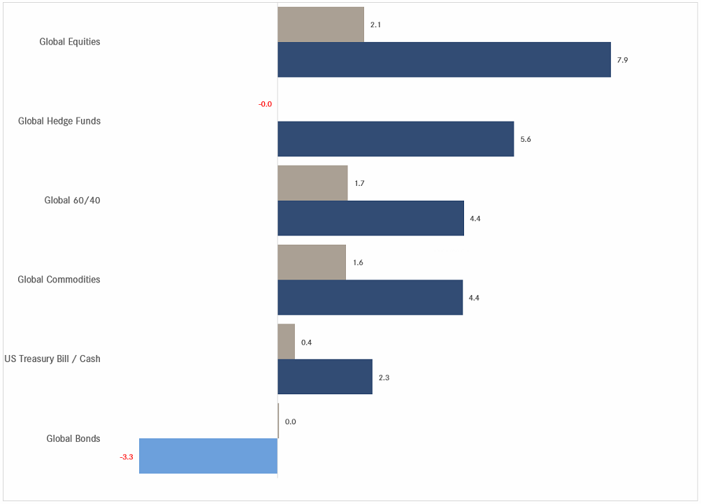
Anyway, this is the end-of-month edition of the Quotedian and we shall focus on the longer-term side of things. As usual, performance graphs contain month-to-date (MTD - grey/red) and year-to-date (YTD - dark blue/light blue) percentage bars, sorted top-down by YTD performance. E.g., the graph below shows the %-performances for major asset classes, but please take note, there is no red bar for negative MTD performance, as, well, there was none in May:
Alright then, let’s get started then!
As indicated above, most global benchmark indices showed a positive performance in May:
The almighty S&P 500 gained another 2.9% to bring YTD-returns into double-digit territory (10.9%), making the following statistic an important hallmark for market bulls, and, of course, a graveyard for the naysayers:
With the help of Friday’s rally, the S&P 500 closed at a monthly new all-time high, aka it set a NEW HIGH SCORE, which is clearly not bearish:
The same feat was achieved on the Nasdaq 100, which left an ever bigger outside reversal pattern (i.e. where the body of the last candle fully exceeds highs and lows of the immediately preceding candle) on the chart:
But for the mother of all outside reversal candle patterns, we need to pull up the monthly chart of the Philadelphia Semiconductor index, better know as the SOX index:
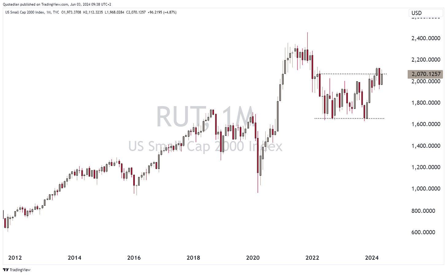
Small cap stocks in the US (Russell 2000) however continue to struggle:
The underperformance becomes even more obvious in relative terms, when we divide small cap stocks (RUT) by large cap stocks (SPX):
Let’s use this as a segue into European markets and check if the same relative underperformance of small cap stocks (S&P Europe Small Cap) versus large cap stocks (S&P Europe 350) exists:
Well, to spin a positive tone on this, the underperformance has only been going on for 4-5 years … so far …
Now, let’s have a look at the broader STOXX 600 Europe index:
Yet, another NEW HIGH SCORE on this gaming platform too ;-)
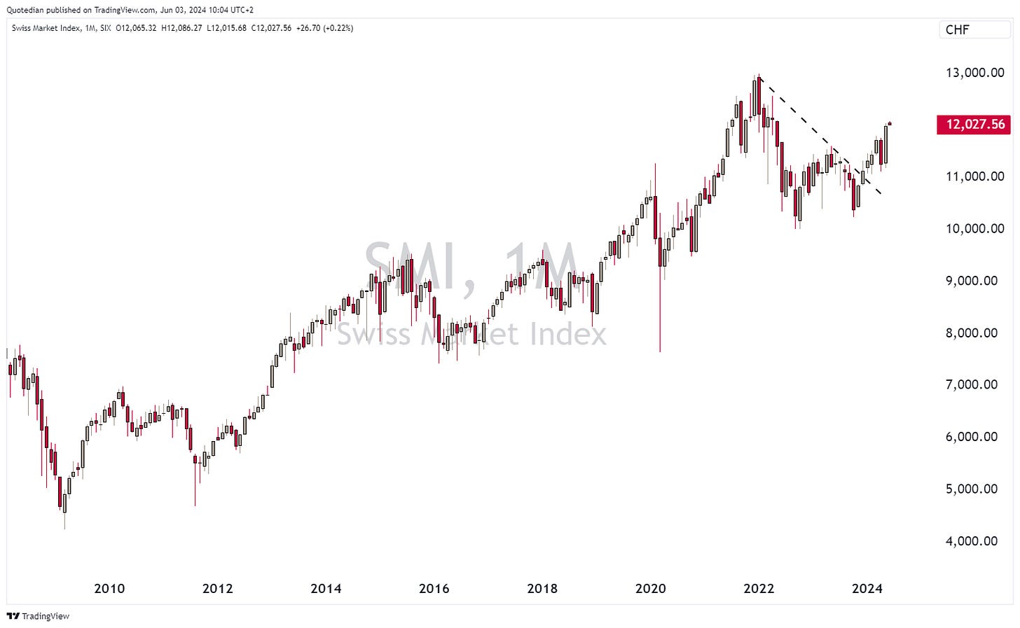
Swiss stocks (SMI) still have a bit of work to do to celebrate a new ATH,
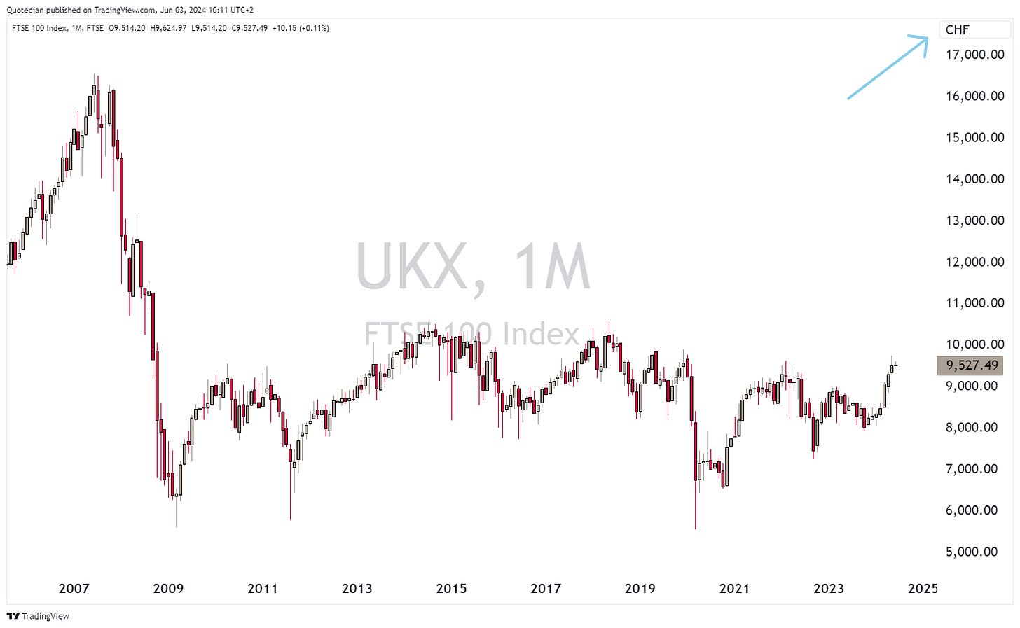
whereas the UK’s FTSE-100 has had an ATH monthly closing high for a third consecutive month in May:
Even though for an unhedged Swiss Franc investor into the Footsie 100, the picture looks quite different:
Also, the FTSE-100 is obviously “plagued” by international large cap stocks, which have profited from a generally weaker Pound and are not so exposed to the UK economy. The FTSE-250 mid-cap segment chart, which IS exposed to the domestic economy, is still some distance from a new ATH:
Albeit, it is looking good from a technical point of view.
Time to hope over to Asia, where Japan’s Nikkei 225 has been in April and May digesting the strong gains since November last year:
Chinese stocks, as measured by the Hang Seng China Enterprises Index (HSCEI), faced a strong intra-month reversal lower (red arrow), but still managed to eke out a small gain on the month:
For now, the chances for a rally-continuation remain in place.
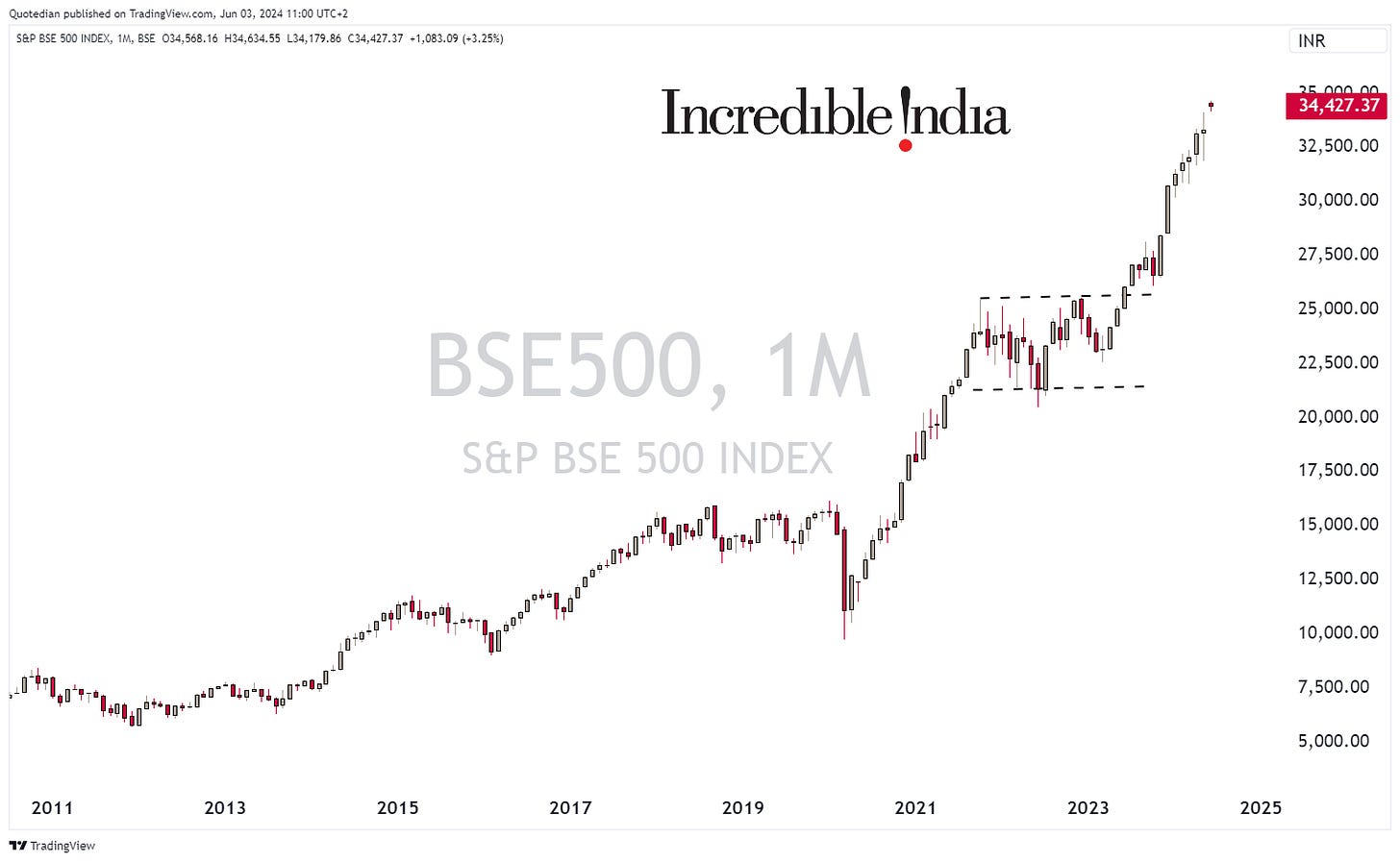
And the last, but definitely not least, there is the Indian stock market. With the confirmation of a landslide win for PM Modi in the election which just ended over the weekend, stocks have hit a new all-time high this morning:
Ok, time to look at some sector performance now. Here are the May and YTD performances for the eleven main sectors:
Only consumer discretionary stocks ended the month lower, which we also had discussed in the preceding Quotedian (“Potpourri” - about half way down the screen).
Looking at the iShares Global Consumer Discretionary ETF (RXI), we note that on the monthly chart nothing seems to be terribly wrong:
These have been the largest detractors in May in the ETF:
As we are talking individual stocks now, let’s have a look at the best performing stocks year-to-date and how the have fared in May.
Here is the US list to get us started:
I find it super-interesting to find so many utilities stocks amongst the top performers, especially in an environment where bond yields are rather pushing upwards again. Clearly, has the market caught up to the “AI needs a lot of energy” theme we highlighted a few times in the past.
Here’s the list of the top performing European stocks now:
It stands out on each lists that only one stock (Chipotle & Galp) did not further add to gains in May.
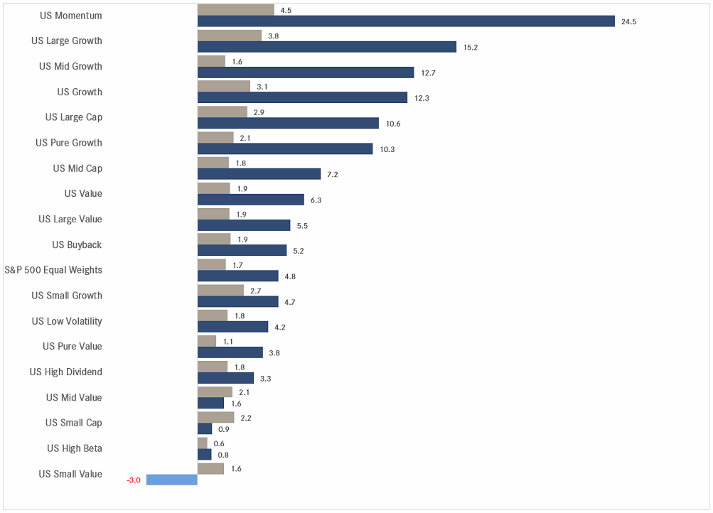
And, as now we are suddenly speaking of factors (Momentum), here the performance table for factors YTD and MTD:
Ok, time to head over into the Fixed Income sections.
But given the performance of the bond market over the past few years, the term “fixed income” is becoming somewhat satirical … here’s the iShares 20+ Year Treasury Bond ETF since yields bottomed out in 2020:
As we are talking NEW HIGH SCORE gaming language today, maybe the ticker for the above ETF should be changed from TLT to TILT?
Looking at the performance over the entire fixed income spectrum, we note that High Yield is generally up on the year (and the month) and anything more exposed to the interest rate levels (treasury, aggregate) tends to show a negative performance:
Let’s look at some longer-term yield charts now, starting with the US 10-year Treasury yield:
That nearly 60 bp push higher in yields in April (pointed hand), was undone by nearly half, but this is not a chart that looks bearish. Well, yes, it does, but bearish for bond prices. Here’s the Generic 10 year Treasury future:
It does not “feel” like the final bottom is in …
Over in Europe, here is the 10-year German government Bund as proxy for the Eurozone:
This chart is not (yield) bearish either, nor is the one of the shorter 2-year yield:
Yet, the market still expects a ECB rate cut later his week:
Basically, because Lagarde told them so …
And talking of France … the following headline hit the newswire late Friday afternoon/evening:
Fiscal discipline has been on the poorer side over the past few years, further exacerbated by public spending during the COVID crisis:
I wonder whether the French-German 10-year yield spread is wide enough?
In Switzerland, the fixed income markets was slightly surprised, as SNB boss Jordan made a serious of hawkish comments on a visit to Seoul, such as
CHF weakness if inflationary
which may force SNB to sell foreign reserves
r-star is likely higher and inflationary
…
The Swiss 10-year Government Yield touched nearly 1% for a brief moment, but has since then retreated again:
Credit spreads have been tightening again, albeit a slower pace than observed over the previous year or so:
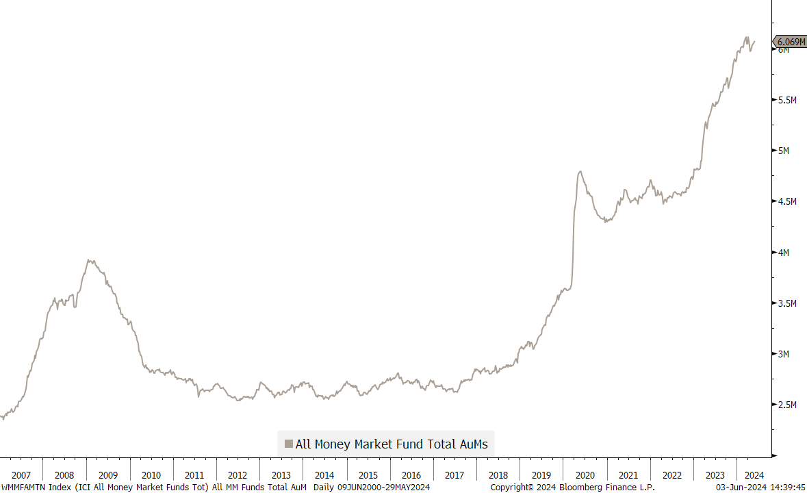
Here’s one more chart to finish of the bond section:
There are currently USD6 Trillion in Money Market funds. Those could potentially flow into longer-term fixed income instruments should investors get vary of the roll-over risk (i.e. lower interest rates).
Or, it may just flow back into the stock market …
In the following chart, the %-performance of the USD against the currency in the y-axis is shown. I.e., the Greenback is up 11.5% versus the Yen over the year, but lost slightly in May:
The Nordic currencies (NOK, SEK) were the biggest winners over the month, but also continue to be amongst the three most undervalued as derived via the Purchasing Power Parity:
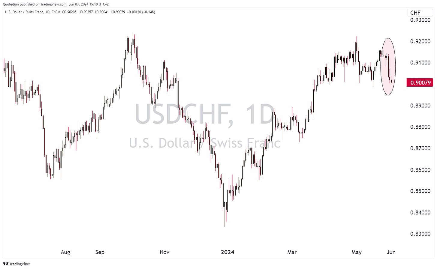
Another winner for the month was the Swiss Franc, which gained ground versus the US Dollar upon the Swiss Nationalbank President’s comment as outlined in the fixed income section above. For visual effect, I show you the reversal on the daily chart,
as the monthly chart continues to be utterly boring:
On the USD/JPY, 160 seems to be the new 152, i.e. the level where the BoJ/MoF is prepared to intervene:
The chart looks horrible for the Yen, but for now, I keep my faith in the monetary authorities in the land of the rising sun to defend their currency.
In the cryptocurrency space, Ethereum was the major winner amongst the big swingers:
Rumours of the approval for a new ETF on Eth pushed this crypto higher:
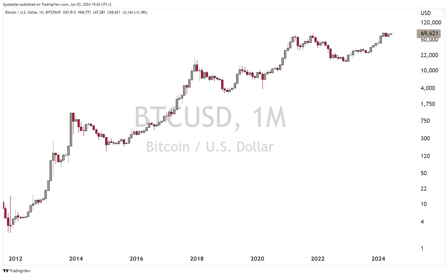
Bitcoin continues to consolidate recent gains at high levels, but the monthly charts looks undeniably bullish:
Alright, let’s wrap up with a few performance and monthly charts in the commodity section. Here are commodity “sectors” first:
Precious and not so precious metals have fared well again, and are clearly the two top performing segments for the year.
Gold, whilst always retreating from intra-month highs, has put in three consecutive new monthly all-time high closes:
But Silver was the real start in May, clocking in a 15%+ performance on the month:
As I mentioned in a QuiCQ (www.quicq.ch) note, the silver chart is starting to show blow-off top potential.
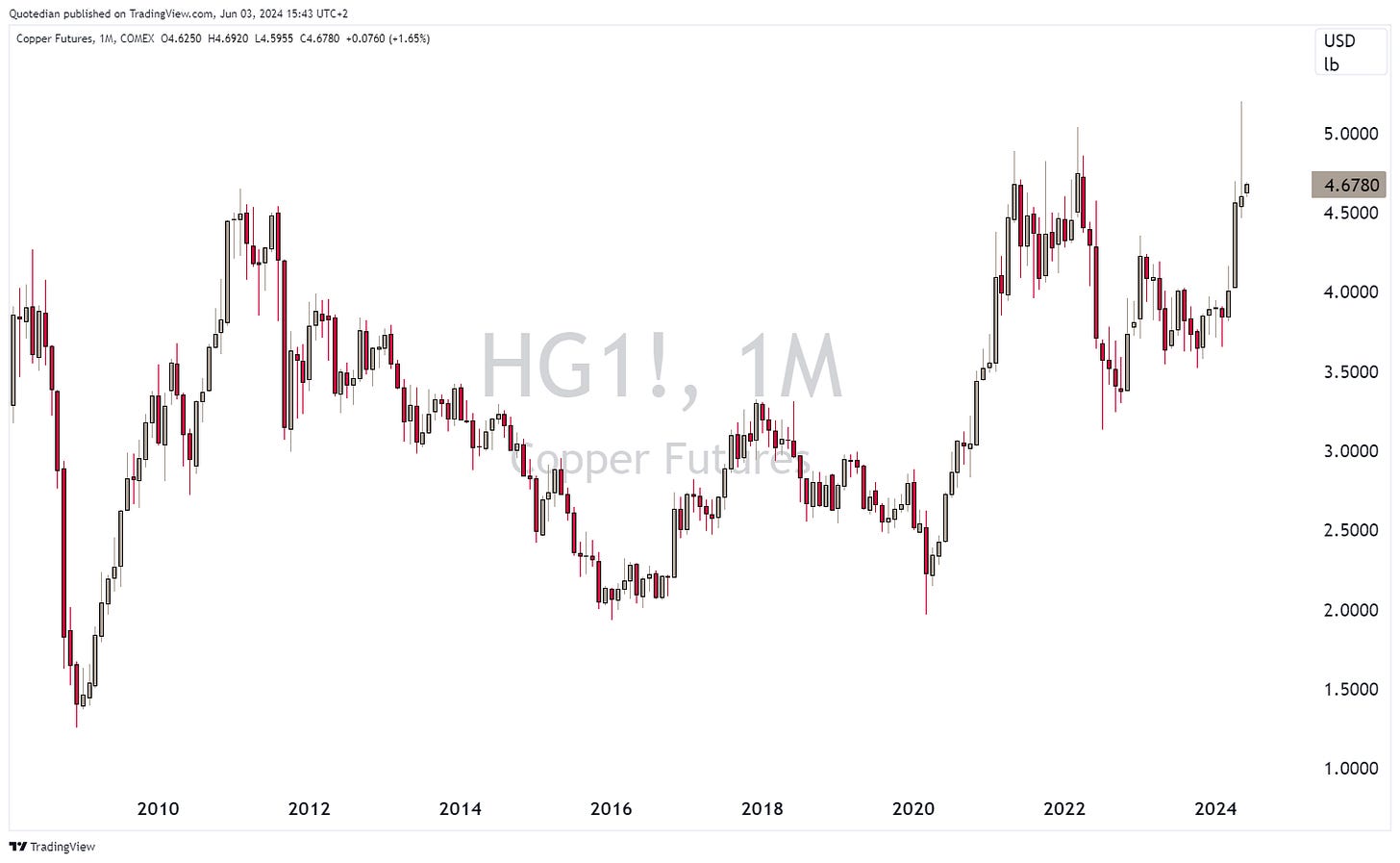
On the other hand, copper may be doomed after CNBC ran this show last week:
Or maybe it will be just a much needed short-term correction, in order to bring down speculation again:
Finally, here is also the performance table for the most widely followed commodity futures:
Ok, time for me to hit the send button and for you to hit the like button. Have a great start into the week and the month and remember: “Don’t leave home without a stop loss”.
I forgot where I picked up the chart below, so kudos to whoever shared it. And I let you figure it out for yourself …
Everything in this document is for educational purposes only (FEPO)
Nothing in this document should be considered investment advice
The views expressed in this document may differ from the views published by Neue Private Bank AG
Past performance is hopefully no indication of future performance


